LS EX #10 So what now?

As this exploration semester comes to an end, I find myself thinking about what comes next especially in terms of the master thesis. And I keep returning to the same internal conflict or questions i ask myself
How do I choose a topic that I really care about, without feeling like I’m doing it a disservice through design or focussing too much on the topic rather than the communication design aspect.

As in my bachelor thesis I had a topic I really did not care about a lot, it is important to me to find something like this that really interests me, but yeah, where do I find the link to design, or the loophole so to say. I think thats my main question with finding a good topic for myself.

Working on gendered space felt meaningful but I also felt like touching and important issue only on the surface level. But it is something I think about and experience constantly, how people perceived as female navigate public space, how protest can happen in subtle ways, how design can be used not to decorate, but to disturb. But the deeper I got into it, the more I felt exactly this pressure:
Am I doing this topic justice? Is a poster enough? Is communication design the right tool—or does it risk flattening the complexity of what I want to say?

I don’t have a clear answer yet. I know I might want to continue exploring feminist protest forms, everyday power dynamics, and how public space can be questioned or reclaimed. But I also want to become more confident in how I design for these themes and how to find a tone, a form, a system that doesn’t simplify the issue, but opens it up.

Maybe the thesis can be a space to investigate exactly this tension of not just what I want to say, but how I want to say it. And maybe how the act of designing can already part of the message.

So next steps: Research, research, research ! in any form, even if its just observing the outdoors and what other people created. Maybe experiment with formats beyond posters, spatial interventions, digital layers, collaborative elements. Something that lets me both explore the topic and the medium.

Looking forward to the moment I have found something!

Over and out, enjoy your summer, Lina

LS EX #9 Lets be realistic

After putting up the posters, I was curious to see what would happen next. Would people scan the QR code? Would someone find the project on Instagram? Would there be messages, comments, questions, anything?

Spoiler: not really.

I had imagined that once the posters were in the public space, they might trigger a second layer of interaction, maybe something that moves the project beyond the physical and into the digital. The QR code was meant to be that bridge. But in reality, that bridge was barely crossed. A few scans here and there, no noticeable Instagram engagement. Mostly silence.

To be fair, it makes sense. People don’t usually stop and scan QR codes in the street, especially if they’re not immediately clear or inviting. And while the posters were visually striking, they weren’t screaming for attention in the way commercial advertising does. I didn’t want them to. But it also meant they stayed within that subtle space which was too quiet maybe, for interaction.

This isn’t a bad thing, it is a learning.

Visibility doesn’t equal engagement. Just because something is seen doesn’t mean it sparks action. And just because someone walks past a poster doesn’t mean they’ll take out their phone, scan a code, and follow the project. It requires more: more friction, more curiosity, more clarity or maybe even more provocation. If I would do it again, I would rethink the QR strategy entirely. Make it more present, more tempting. Maybe even confusing or funny enough to trigger a response. The posters asked questions, but the QR code didn’t. It was just there, passively waiting.

The experiment still feels valuable. It reminded me that communication design doesn’t end with the object. It continues or fails in how people relate to that object and thats actually the really hard thing to find out. And how much effort we expect from an audience that is actually just trying to get from A to B.

LS EX #8 Putting them out in the wild

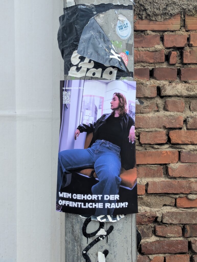
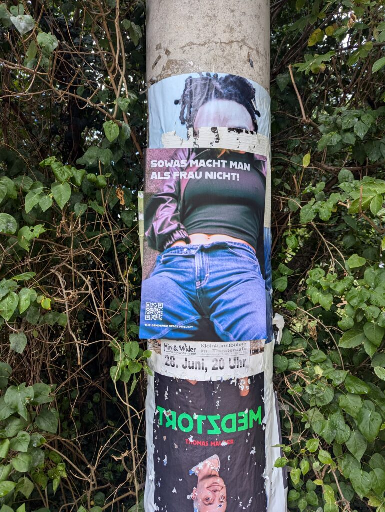
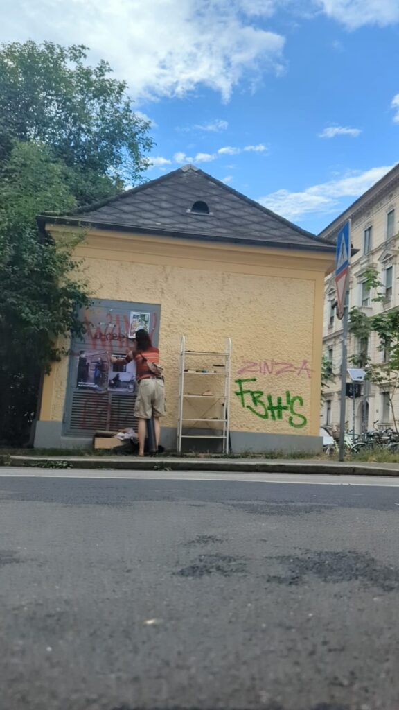
I put up the posters in areas close to my home, places I walk by often and that are pretty central. The idea was to stay in proximity so I could later observe reactions, but also to choose spots where I knew the posters wouldn’t be removed immediately. Somewhere visible, but stable and often next to other posters.

The actual act of putting them up felt surprisingly awkward. It was just me, the posters, and a roll of tape. Even though it was legal and harmless, I felt hyper-aware of being watched. I caught myself thinking: What if someone asks me what I’m doing? What if they think the posters are badly designed or too shallow? What if they just don’t take it seriously? Or if I even like my own project? If it is worth to be put up in the streets
That inner voice was unexpected. I believe in the project, but standing there with tape in my hand made me suddenly doubt everything.

Reactions in the moment were minimal. No direct confrontations or dramatic responses. Still, there were subtle moments of people slowing down a little, looking for a second longer than usual. One or two seemed to take in the message, even if briefly. Of course, part of me was hoping for a stronger reaction. Maybe someone engaging with it critically, or even aggressively. something that I could point to as “impact.” But that’s rarely how it goes.

Looking back, I think the strength of these posters might lie in exactly that random space inbetween: creating small interruptions. A moment of irritation. A tiny nudge. Not a confrontation, but a small question to ask oneself; just enough to make someone think about it, even if only for a second and maybe that’s enough for now.

Experiment #8: F1 Branding analysis

As part of my research and experiments, I’ve been paying closer attention to how big motorsport brands, such as F1, position themselves visually. Its current branding, redesigned in 2017, is minimal, bold, and sleek. On the surface, it looks simple. But the more I study it, the more I notice how strategic that simplicity really is. The logo itself (the red double-stroke “F1”) is clean, forward-leaning, and symmetrical, with a built-in sense of motion. It’s basically a design metaphor for speed. There’s no ornament, no shading, no nostalgia. Just movement. This was a big shift from the previous logo, which was black and slanted and had an almost early-2000s video-game vibe. The new branding feels more timeless, more corporate, but also somehow more open. The type system (a custom font, “F1 Regular”) is geometric, modern, and extremely consistent. Paired with a controlled color palette (although mostly red, black, and white, sometimes yellow), it creates a very unified look across all platforms, from digital content to physical event signage. Every element seems engineered to convey speed, innovation, and control.

But what’s most interesting to me is how this branding reflects a cultural shift. DixonBaxi talked in their OFFF keynote about the new F1 visuals that they did about wanting to move away from an overly masculine, exclusive image and toward something more inclusive and futuristic. They didn’t try to make F1 look “friendly,” but they did try to make it look progressive, so more about data, tech, and possibility. Still, even though the branding is more refined now, it still speaks in a pretty masculine visual language. It’s clean and cold. Sharp and confident. There’s very little softness, irregularity, or emotional tone. And while that may align with the F1 brand’s values, it also leaves me wondering what’s still missing. What would it mean for F1 to visually communicate teamwork or emotion or community more clearly? Could it still feel fast, but also more human?

Key Takeaways:

  • F1’s current branding is a masterclass in consistency and restraint
  • Simplicity in design can carry a strong message
  • Visual identity shapes how people perceive not just a sport, but the culture around it

2.10. Reflection & What Comes Next

It started with a clear goal: to understand how event branding works — or doesn’t. Through blog posts and field research, I explored not just the visual systems behind events, but the real-world presence (or absence) of those identities.

Over the course of this semester, I moved from research into hands-on exploration — starting with OFFF Barcelona as a real-life case study. I examined OFFF’s bold digital identity and anticipated how it might translate into physical space. However, once on-site, I was met with an unexpected lack of branding presence, which sparked deeper reflection on the essentials of event design. I compared expectations with reality and defined what strong event branding should deliver. OMR Hamburg served as a powerful contrast, showing how branding can be executed to perfection across every touchpoint. Then, through my volunteer experience at UEFA EURO 2024, I gained firsthand insight into branding at a massive scale— structured, consistent, and nationwide standardized. Finally, I converted all these experiences into key takeaways for what truly matters in event branding.

A Personal Takeaway

Despite some disappointment with OFFF’s branding, the trip to Barcelona itself — and OFFF with all its incredible speakers and creative energy — was a huge inspiration. It offered more than just material for my master’s thesis. It gave me input for my design practice, thinking, and direction, also for my personal future.

Throughout the semester, I realized that branding — in all its complexity — is something I genuinely enjoy working on. Not just as a system of logos and color palettes, but as a way to shape experience, identity, and emotion.

It became increasingly clear to me: I want branding to be a core part of my master’s thesis. Whether it’s a cultural project, a sports concept, or something (yet) completely unknown — I want to dive deep, create with intention, and explore how identity can be brought to life across all mediums.

Struggles

Still, I can’t help but admit: I’m not sure if I went in the right direction.
Maybe I took a wrong turn along the way, or I focused too much on case studies and not enough on personal experimentation. Or Maybe it needs to be more sports-related as that was my initial idea and this thesis is something i really want to identify with. Perhaps it will be something more cultural.
I’m not even sure what exactly is bothering me — only that I’m not as convinced anymore as I was earlier in the process. And that’s probably okay, but I might need some time to figure out the WHY.

Future Perspectives

The next chapter begins soon: an Erasmus semester in Detroit. I’m looking forward to immersing myself in a new city, new culture, and a completely different creative scene.

I am hoping that this experience will unlock fresh energy, new inspiration, and a clear(er) vision for my thesis. Something that combines what I’ve learned so far — with something that challenges me even more and lets me identify myself with the project. Let’s see what comes next.


“There are three responses to a piece of design: Yes, No, and WOW! Wow is the one to aim for.”
Milton Glaser

#10 Creative Thinking

Creativity doesn’t always come from hours of research, long deadlines, or perfectly written briefs. Sometimes, all it takes is a silly idea, a strange prompt and a timer. In a field where creative work is often associated with efficiency, target groups, and polished outcomes, it can be incredibly refreshing to intentionally do something pointless for a change. Not in spite of the silliness but because of it.

A Real-Life Example: Silly Design Sprint

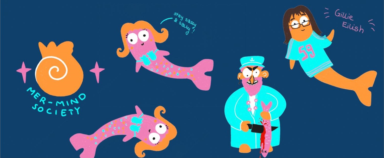
At a recent event called the Silly Design Sprint (organized by a freinds of Communication Designer  Christina Lamprecht), I experienced this firsthand. Each participant received an absurd prompt  and weh ad the evening to create something creative. I created illustrations. No goal, no pressure just following the idea. And surprisingly, some of the results were genuinely good. But more importantly, it felt creatively refreshing.

That event inspired me for this blogpost and to deal more with this topic. You can see me outcomes here.

Why Absurd Tasks Unlock Creative Thinking

When we allow ourselves to dive into deliberately nonsensical or humorous challenges, we bypass one of the biggest blockers in creative work: the inner critic. That voice asking, „Does this make sense? Is this professional enough? Can I show this to someone?” goes quiet once it’s clear that this isn’t about results.

And that brings real benefits:

  • Less pressure, more curiosity:

Without expectations, we open up to playful exploration and unexpected directions.

  • Time limits spark momentum:

When you only have 30 to 90 minutes, there’s no room for overthinking. You just create.

  • Absurdity disrupts pattern:

 A weird prompt like „design the packaging for a pizza brand aimed at penguins” breaks mental routines. That’s where fresh ideas live.

Like any skill, creativity improves with training. And small, silly, time-boxed exercises are the perfect workout. They help you:

  • generate ideas faster
  •  think in concepts, not just details
  • rediscover the joy of creating (outside of pressure or purpose)

This isn’t about abandoning structure entirely. It’s about regularly creating space for creative freedom.

Conclusion: Less Sense, More Ideas

Being silly isn’t the opposite of being creative,  it’s often the shortcut to getting there. Short, absurd exercises train the creative brain and bring lightness into the process. In a world that often takes design too seriously, a little nonsense can lead to surprisingly meaningful ideas. This project really inspired me to make more stuff like this.

#9 Creating My Own Procreate Brushes

As an illustrator working digitally on my iPad, I quickly realized that the brushes you use can make or break your workflow and final style. While there are countless amazing brushes available, I wanted tools that felt truly personal and matched exactly how I like to work. So I took the plunge and started creating my own Procreate brushes from scratch, including all the textures, brush shapes, and settings.

Why Create Custom Brushes?

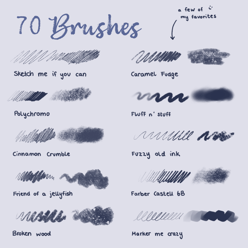
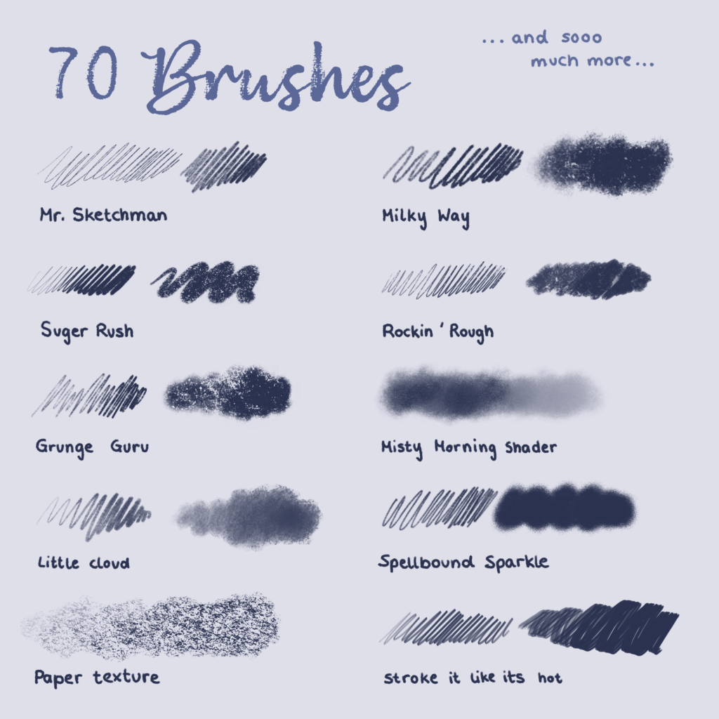
Using ready-made brushes is great, but sometimes they don’t capture the unique look or feel you’re aiming for. By making my own brushes, I can control every detail and develop tools that fit my drawing style perfectly. For me, the focus was on three main brush types:

Watercolor Brushes: To mimic the organic flow, blending, and subtle textures of real watercolor paints.

Colored Pencil Brushes: For soft, grainy strokes that vary with pressure and capture the tactile feeling of traditional colored pencils.

Ink Brushes: Crisp, fluid lines with just the right amount of texture and sharpness, sometimes mimicking a real ink pen or brush.

The Creation Process

I started traditionally by working with real media: painting with watercolors, drawing with pencils, and inking on paper. Then I scanned these textures and brush marks to create the texture maps and brush shapes needed in Procreate. This base made the brushes feel much more authentic and lively.

In Procreate’s brush studio, I experimented extensively with:

  • Texture behavior: Balancing randomness and stability so the brush strokes don’t feel repetitive or “stamped.”
  •  Pressure and tilt sensitivity: To allow natural variation in stroke weight and texture.
  • Blending and wetness: Especially important for watercolor brushes to simulate how paint bleeds and mixes.
  •  Spacing and jitter: To add organic feel and irregularity to strokes.

(here you can see a few examples from the pencils I created)

Putting Them Into Practice

Once my brushes were ready, I began using them exclusively in my illustrations. It’s incredibly satisfying to paint soft watercolor washes that flow naturally, add textured colored pencil details, or draw sharp ink lines that still feel hand-drawn.

This level of control lets me explore my style more deeply and brings my artwork closer to my vision.

Final Thoughts

Creating your own Procreate brushes is a rewarding journey that helps you understand the nuances of digital painting tools and develop a personal artistic voice. It can be a bit time-consuming, but the payoff is huge, both creatively and technically.

I’m happy to share my experience and use my brushes in my illustration (as you can see here).