In this final post, I’m sharing a short video documenting the process behind the first prototype of the Focus Lamp. I started with a quick proof of concept to explore the core interaction: placing the phone in a dock to trigger a shift in light and attention. From there, I moved on to a more refined version, improving both the physical design and the technical setup.
This is still just the beginning. The prototype is far from finished, but it marks an important step in translating abstract ideas, about distraction, focus, and calm technology, into something tangible. There’s a long way to go, but I’m excited to continue exploring how physical objects can gently support more mindful and intentional use of technology.
I’ve proceeded to improve the lamp’s physical design and technical implementation after creating the initial proof of concept to test the fundamental interaction loop. The objective at this point is to make the prototype more like the final experience, which I envision to be soft, ambient, emotionally soothing, and user-friendly.
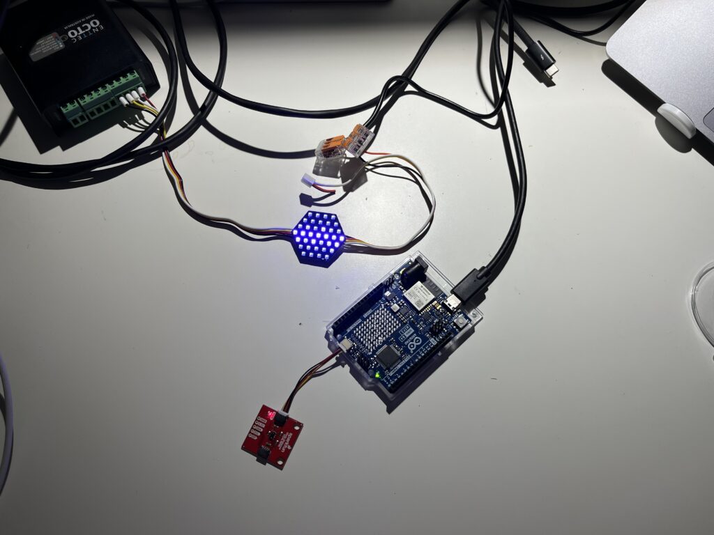
Shifting from ZigSim to Arduino + Sensor
In this step of the prototype, I moved away from using ZigSim with the mobile sensor, to using an Arduino board with a proximity sensor. The sensor detects when the phone is placed in the dock and sends this data to Max/MSP, which then triggers visual feedback in Resolume Arena. This allowed for a more modular and scalable system: the phone becomes a passive actor in the setup, while the lamp actively reflects the user’s engagement or disengagement with it.
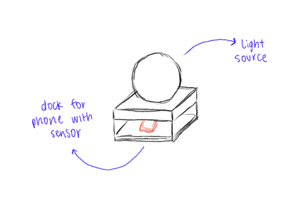
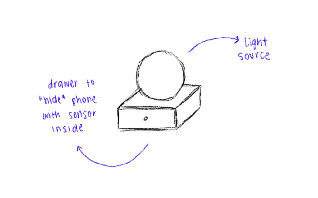
Redesigning the Dock
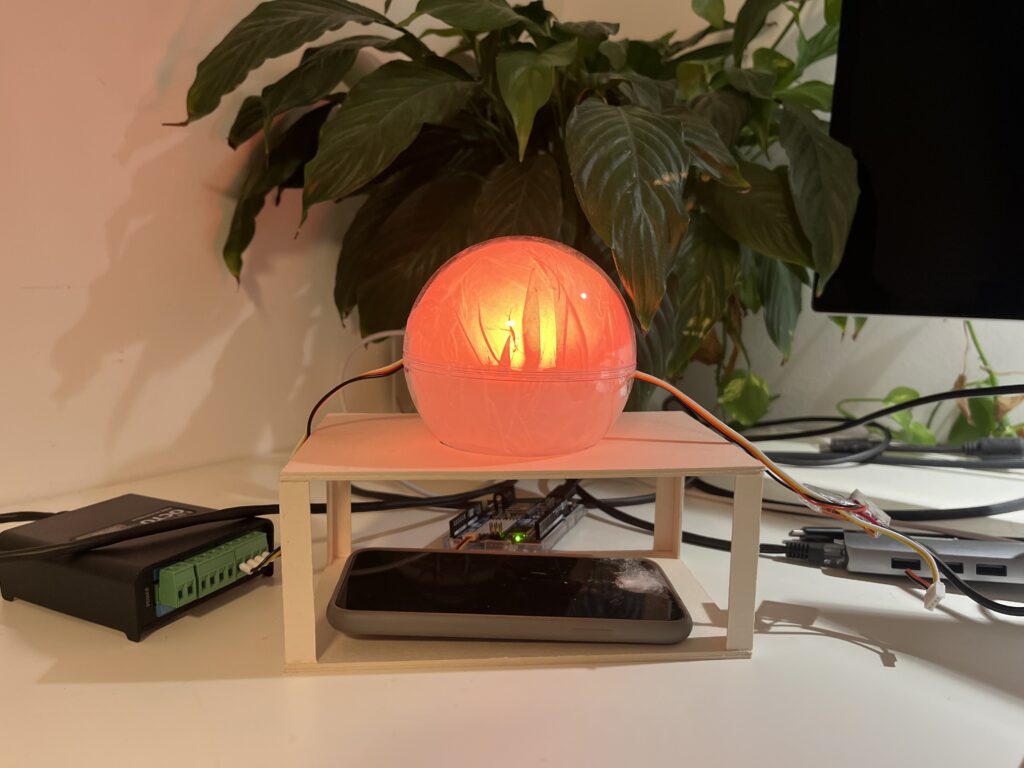
Since the first prototype of the dock was too big and bulky, I shifted toward a rectangular, low-profile dock that takes up less space and fits more naturally into the physical environment of a desk. When I built the second prototype, I realized that it wasn’t high enough, because you almost couldn’t put the phone in it. When I built the third prototype, I made it a bit higher so that you could put the smartphone in easily.
The lamp
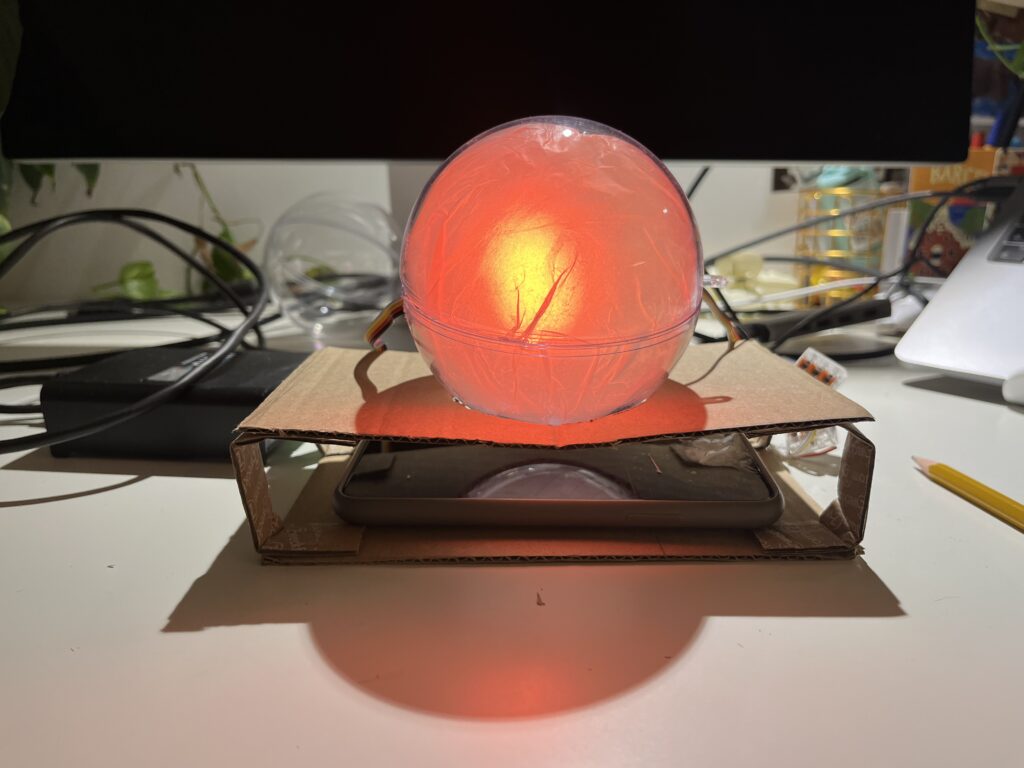
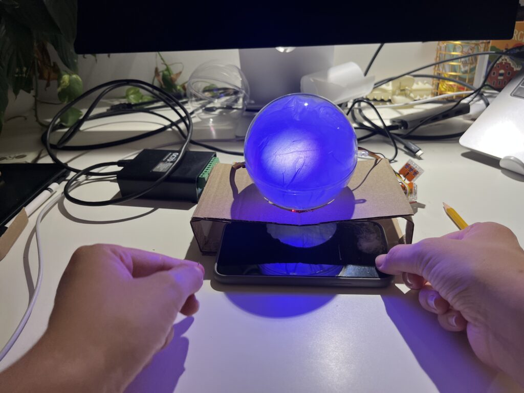
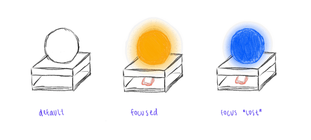
In the first prototype, I experimented briefly with using transparent paper to diffuse the LED strips, and I decided to take that idea further. For this version I put a LED hexagon into a see-through sphere. To avoid hard and direct light, I lined the inside of the sphere with transparent paper, softening the light and creating a much more ambient, almost lantern-like glow. This resulted in a less like “technology” and more like calming object. The light is still the primary feedback. When the phone is placed on the dock, the LED hexagon glows with a gentle, diffused light, signaling the beginning of a focus session. Is the phone removed the color of the light changes – not to shame the user, but to offer a reflective signal. This fits the principles of Calm Technology: feedback is present but not dominant. The lamp becomes a kind of behavioral mirror – always gentle, never forceful.
Some more thoughts – Creative Prompts
In the last session Birgit suggested an interesting shift in perspective – what if distraction wasn’t always something negative, but could actually hold meaning? That idea really stuck with me. I haven’t implemented it into the prototype yet, but I’ve been thinking a lot about it, especially because I know how common it is, especially in creative fields, to feel guilty when we’re not being “productive” or working on something for school. That guilt is exactly what I don’t want people to feel when they use the Focus Lamp.
As someone who works creatively, I’ve often noticed how much time I can end up spending on my phone, especially on social media. And after a while, I started to feel like I was losing a bit of my spark and creativity. That feeling is part of what inspired this project in the first place. So now I’m considering integrating an app after all, not as the main feature, but as a gentle companion to the lamp.
The idea is that if someone is in focus mode and still picks up their phone, instead of being punished or shamed, they’re offered a creative prompt. Something light and inspiring to nudge them in a different direction during that moment. For example: “Draw what’s around you for 10 minutes,” “Read 10 pages of something,” or “Stretch for a few minutes.”
It’s not about blocking the phone or enforcing discipline. It’s about helping people reconnect – with their creativity, their bodies, their curiosity – especially in those moments when they’re about to drift into passive scrolling. It should just be a small nudge, maybe in the right direction.
I also began sketching out ideas for how the lamp could look like. I think I decided to go into round and soft forms quick, since they intuitively feel more calming and emotionally inviting than angular or rigid shapes. I feel I was guided more by the emotional tone of the object – a gentle presence on the desk – than by the function for now.
Some initial inspirations:
Lava lamps: their fluid, continuous motion has a calming and almost hypnotic effect, which aligns perfectly with the idea of supporting focus without creating stress.
Organic shapes: neutral, timeless. These shapes don’t scream “technology,” which is important for creating a non-intrusive and emotionally grounding experience.
Japanese lanterns and soft-diffuse paper lights: I love the ambient softness and the quiet presence they have in a room.
I didn’t only sketch the shape of the lamp itself but also how the dock, where you put the phone, could look like. The first try was a square shape which fits the phone – but then as soon as I cut the cardboard, I realized the whole lamp + dock is probably too big, because it would take up a lot of space on the desk.
First Quick and Dirty Prototype
To move from the abstract idea and the theories and frameworks in the background to a tangible experience, I built a quick proof-of-concept prototype using ZigSim, Max/MSP, Resolume Arena and a basic lightning setup with some led-strips for the quick testing for now. This is actually less about the design of the lamp but more about the technology in the background and the core interaction loop:
Phone placed on dock > soft, calming light is triggered
Phone removed from dock > light changes
I also experimented with using transparent paper as a diffuser to soften the LED light, aiming to create a more ambient and less direct glow.
This was just a quick prototype as a proof of concept for the interaction loop.
Next steps
Prototyping with Arduino
Integrate a proximity sensor to detect whether the phone is in the dock or not.
Redesign the dock and where to put the phone + sensor
Use a different source of light which is smaller than the LED strips
build a prototype of the lamp itself
Experiment with softer shapes and better light diffusion to create a calming, ambient presence that supports focus
In this blogpost I want to explore the ideas, theories and frameworks which shape the concept behind my prototype. I am diving into psychology behind focused work, the design of calm interfaces, and how we might nudge behavior without enforcing strict rules.
The Flow State – The foundation of deep creative work
One of the central concepts driving this project is Flow, a term coined by psychologist Mihaly Csikszentmihalyi, who describes it as “a state in which people are so involved in an activity that nothing else seems to matter” [1] It’s the sweet spot where challenge meets skill, and our attention becomes fully aligned with the task at hand.
Csikszentmihalyi outlines eight components that typically make up these experiences:
The task is something we believe we can complete
We can fully concentrate on the task
The task has a clear goal
It provides immediate feedback
There is a deep, but effortless involvement that blocks everyday worries and frustrations
We feel in control of our actions
Self-consciousness disappears, but paradoxically we feel more ourselves afterward
Our sense of time shifts: hours feel like minutes and the other way round [2]
The interplay of these elements creates a type of enjoyment so fulfilling that people are willing to invest significant effort just to experience it. [2] However, the modern digital environment, especially smartphones, disrupt the conditions needed for flow. Every notification, every swipe, every quick scroll breaks our attention and concentration and makes it harder to return to a state of deep immersion. In his book, Csikszentmihalyi writes: “[…] attention is our most important tool in the task of improving the quality of experience.” [3]
This project is about protecting that attention, not by eliminating distractions entirely (which isn’t realistic), but about creating the right conditions for focus and flow to happen more easily.
Calm Technology – Supporting, Not Distracting
Another concept that influences the project is Calm Technology, which was introduced by Mark Weiser and John Seely Brown (1995) in their paper “Designing Calm Technology”.
It is a design philosophy focused on integrating technology more seamlessly into daily life by using peripheral awareness rather than demanding our full attention all the time.
Today, most digital tools overwhelm us by constantly competing for our focus and attention, creating a sense of stress and distraction. Calm Technology on the other hand is about designing for both our center and periphery of attention, allowing us to shift our focus naturally when needed.
The periphery are things we are aware of without actively focusing on them. For example, when driving, we might not actively think about the engine sound, but we notice if it suddenly changes. Calm technology uses this same principle: subtle, non-intrusive cues that live in the background and only surface when needed. This allows us to stay aware without feeling overwhelmed.
Eventually, they argue that designing for calmness is essential in a world of constant digital noise and distraction. It’s not about removing information but about designing it to fit better with how people naturally divide their attention. [4]
Persuasive Design – Nudging, Not Controlling
My approach is informed by persuasive design, which incorporates principles from psychology, like motivations and cognitive biases, and turns them into practical strategies for designing products.
“Persuasive design can help:
Users in decision making
Designers communicate more clearly
Nudge users in the right direction
Help users to develop skills
Drive users end or begin new habits” [5]
A key framework here is BJ Fogg’s Behavior Model (FBM) that helps designers and researchers understand how to change human behavior through technology. He sees three factors that need to be there at the same time for the behavior to happen:
Motivation + Ability + Triggers = Behavior
Fogg points out that the goal of persuasive design is not to manipulate or shame users into behaving a certain way. Instead, it’s about gently guiding behavior, ideally in line with what the user already wants to do, like staying focused or being more intentional with their time. [6]
Literature
[1] Mihaly Csikszentmihalyi, Flow: The Psychology of Optimal Experience (Harpercollins, 1990), 4.
[2] Mihaly Csikszentmihalyi, Flow: The Psychology of Optimal Experience (Harpercollins, 1990), 49.
[3] Mihaly Csikszentmihalyi, Flow: The Psychology of Optimal Experience (Harpercollins, 1990), 33.
[5] Eddie Kim, “Persuasive Design: Nudging Users in the Right Direction,” Medium, December 6, 2021, https://uxdesign.cc/persuasive-design-nudging-users-in-the-right-direction-5af4a6f8c06f.
[6] B. J. Fogg, “A Behavior Model for Persuasive Design,” in Proceedings of the 4th International Conference on Persuasive Technology, (April 2009): 1–7.
When I sit down to do work, I often only find myself deep in a rabbit hole of Reels or TikToks or reorganizing my phone, only after 30 minutes into the task. And to be honest even while working on this blog post I got distracted several times by my phone. This is why I decided to explore the topic of distraction in a digital life but I think it is also broadly relevant, since I feel like a lot of people struggle with getting distracted easily these days.
Are we living in an attention crisis?
There is a rising discourse around attention crisis, brain rot and digital burnout, since our days are increasingly fragmented by notifications, being constantly online and temptation of endless scrolls. In his book Stolen Focus, Johann Hari, talks about the effects of this crisis such as reduced productivity, heightened stress levels and even a weakening of our capacity to build deep and meaningful relationships. [1] A study from Microsoft says that our attention span shrank from 12 seconds in 2000 to 8 seconds nowadays, leading to humans having a shorter attention span than a goldfish. [2]
On average, people spend 4.5 hours a day on their phones [3], with 2.5 of those hours dedicated to social media. [4] Big tech companies like Meta and Google generate revenue by maximizing user engagement, turning out attention into a profitable business model. As a result, we get bombarded with dopamine-driven feedback loops that make it extremely hard to put the phone away to concentrate on a single task. [5]
Spending so much time on social media and doom scrolling for hours also affects people. In October 2024 “Brain Rot” was chosen for the Oxford Word of the Year. Brain Rot refers to the cognitive decline and mental exhaustion experienced by individuals, particularly adolescents and young adults, due to excessive exposure to low-quality online materials, especially on social media.“ [6]
Brain rot is an emerging concern among adolescents and young adults navigating today’s tech-saturated word. Marked by symptoms such as brain fog and reduced concentration, this condition seems to worsen with excessive screen time and constant exposure to trivial online content, ultimately contributing to a decline in cognitive function. [6]
Creative professionals like designers, writers, artists, musicians need uninterrupted time to enter a state of flow, where ideas can surface and evolve without constant context-switching. But even with productivity tools, focus apps, and “Do Not Disturb” settings, our smartphones still act like behavioral magnets. They promise us connection, innovation, and escape and they’re designed to be hard to ignore. Notifications, dopamine loops, and habit-forming UX patterns pull us away from the present moment, often without us realizing it.
So, the central question guiding my prototype this semester is: How might a tangible interface reduce smartphone-related distractions for creative professionals?
The Concept: A Lamp That Helps You Focus
Rather than building yet another app to solve the problem, I want to explore a physical, ambient object that supports intention and presence in a gentle, non-coercive way. My prototype will be a lamp/phone dock – a small, aesthetically calming object that lives on your desk and invites you to temporarily “put the phone away” without demanding rigid rules or screen-time shaming.
The lamp will produce a gentle, ambient light when the phone is in the dock; it may change color gradually to show how much time was spent in focused mode. The lamp may respond softly by changing its color temperature, dimming slightly, or providing a quite auditory cue if the phone is taken out too often. These feedback loops are intended to raise awareness, encourage behavior, and support the user’s initial goal of remaining focused on their job rather than to punish.
Why a Tangible Interface?
I’m interested in how tangible interaction, physically placing the phone somewhere, seeing a change in your environment, can help ritualize focus in a way that’s more embodied and emotionally resonant than tapping a digital button.
What’s next?
In my next blogpost I want to look at some theories and frameworks such as:
Theory of Flow
Calm Technology
Persuasive Design
After getting into those theories and frameworks I am going to start with the first simple prototype.
My goal isn’t to eliminate distractions entirely, that’s unrealistic and probably undesirable. Instead, I’m curious about how design can create moments of pause. How can we introduce friction in a respectful, aesthetic, and emotionally intelligent way? How might we design tools that gently invite reflection, rather than enforce rules?
Literature
[1] Johann Hari, Stolen Focus: Why You Can’t Pay Attention – and How to Think Deeply Again (New York: Crown Publishing, 2022)
[2] Microsoft Canada Consumer Insights Team. Attention Spans: Consumer Insights. Spring 2015. Toronto: Microsoft Canada.
[3] Fabio Duarte, “Time Spent Using Smartphones (2025 Statistics),” Exploding Topics (blog), June 5, 2025, https://explodingtopics.com/blog/smartphone-usage-stats.
[4] Josh Howarth, “Worldwide Daily Social Media Usage (New 2025 Data),” Exploding Topics (blog), June 5, 2025, https://explodingtopics.com/blog/social-media-usage.
[6] Ahmed Mohamed Fahmy Yousef et al., “Demystifying the New Dilemma of Brain Rot in the Digital Era: A Review,” Brain Sciences 15, no. 3 (March 7, 2025): 283, https://doi.org/10.3390/brainsci15030283.
Last semester, I explored how interaction design can combat loneliness – or more optimistically, how it can foster meaningful connection. With that in mind, I was particularly looking forward to the talk “Digital Intimacy: Feeling Human in an Artificial World” by Lutz Schmitt. It turned out to be a deeply thought-provoking session that challenged not only how I think about technology and intimacy, but also how I view my role as a designer.
Schmitt began by unpacking the idea of intimacy. Often, we associate intimacy with physical closeness or romantic relationships, but he broadened the concept: intimacy is really about emotional presence, trust, and vulnerability. With that foundation, he posed a compelling question: how can we design for that kind of closeness when people are physically apart?
To answer this, Schmitt presented a range of tools aimed at bridging emotional distance. These included connected sex toys, wearable devices like vibrating wristbands that signal touch or presence, and products like PillowTalk, which lets you hear your partner’s heartbeat remotely. What struck me was the emphasis on “small intimacies” – a gentle reminder that sometimes it’s the subtle gestures, that carry the deepest emotional weight.
One of the most impactful moments was Schmitt’s discussion of the “privacy paradox.” He pointed out that while these technologies can feel deeply personal, they also involve the sharing of incredibly sensitive data. In our pursuit of emotional closeness through digital means, we may be compromising privacy in ways we don’t fully understand. As designers, it’s tempting to focus on what’s emotionally compelling without fully considering the ethical implications. Schmitt’s reminder was clear: emotional design isn’t just about connection – it’s about responsibility.
A particularly complex and concerning topic was the growing use of AI companions. Schmitt described how people, especially those feeling isolated, are increasingly forming bonds with AI agents such as Replika. These tools are designed to feel responsive, empathetic, and emotionally supportive – and in many cases, users begin to treat them as if they were real relationships. While this might provide short-term comfort or serve as a form of accessible mental health support, I find this trend deeply problematic. These interactions can lead to a kind of emotional dependency, where users withdraw from real-world relationships and instead engage with systems that at the end of the day serve corporate interests, not human well-being.
What I appreciated most was the balanced tone of the talk and its honesty. Schmitt didn’t romanticize technology, but he didn’t dismiss it either. Instead, he encouraged us to reflect more deeply: how do our tools make people feel – not just functionally, but emotionally, physically, and psychologically? For me, the talk was both inspiring and unsettling. It highlighted the immense power designers have to shape human connection, while also reminding us of the ethical terrain we’re navigating. In short, “Digital Intimacy” wasn’t just about tools or interfaces – it was a call to design with empathy, with care, and with a clear-eyed view of the trade-offs we ask users to make.
At this year’s WebExpo in Prague, one of the talks that stood out most to me was Nadieh Bremer’s session titled “Creating an Effective & Beautiful Data Visualisation from Scratch.” With no prior experience using d3.js, I didn’t quite know what to expect. I was mainly curious about how data visualisation could be approached from a design perspective. But what Nadieh shared was much more than a technical intro, it felt like a live deep dive into creative thinking, problem-solving, and visual storytelling.
What set this talk apart was its format. Rather than giving a traditional slide-based talk, Nadieh did a live coding session. She started with a completely empty browser window and built the data visualisation from the ground up using d3.js. This format made the talk feel refreshingly honest and grounded. It was engaging to watch her work through the logic in real time – narrating each decision as she went, pointing out potential issues, and offering insight into how she solves problems as they arise. This transparency made the whole process feel approachable, even though I was unfamiliar with the tool.
What I appreciated most was how she balanced the technical with the creative. It wasn’t just about writing functional code; it was about shaping something visually appealing and meaningful. Nadieh showed how, with a bit of imagination, SVG can be used in unconventional and expressive ways. The result wasn’t a generic bar chart or pie graph – it was a visually rich and thoughtfully composed visualisation that clearly communicated the underlying data while also looking beautiful.
Her message about simplification really resonated with me. I often struggle with the tendency to include too much information in my designs, believing that more content adds value. Nadieh’s approach showed the opposite: that complexity can be made understandable through clarity, and that thoughtful visual design can make even dense data feel intuitive. She emphasized that effective data visualisation doesn’t just display information – it tells a story. And when done well, it can communicate more with less.
Beyond the content, I also want to mention how well-structured and calm her presentation style was. Live coding can be stressful to watch (and probably to do), but she created a relaxed atmosphere that made it easy to follow along. Even when something didn’t work immediately, she explained why and showed how to fix it – normalizing the trial-and-error nature of coding.
Overall, this talk was a highlight of WebExpo for me. It was both inspiring and informative, offering practical insights into a tool I hadn’t encountered before. It made me want to experiment with data visualisation myself and gave me a clearer sense of how design can play a crucial role in making complex information understandable, and even beautiful.
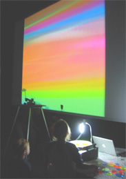
The paper introduces spinCycle, an interactive music performance system by Spencer Kiser. It uses a turntable and colored plexiglass disks which are placed on the spinning turntable. A camera tracks their color and position and transforms those visual patterns into sound in real time. This System creates a unique mix of visual design, sound and interactivity.
On the technical side, spinCycle uses a webcam to capture the rotating disks, and a patch built in Max/MSP/Jitter processes the video feed. The system applies edge detection to identify when and where each color appears, triggering the corresponding sound connected to the color. A live visual feed is projected during the performance, so the audience can directly see how the visual patterns control the music and therefore the connection between color and sound.
The system can function as a drum machine or sine wave generator. In the drum machine version, each color triggers a different sound (kick, snare, hi-hat). In the sine wave version, each color is hard coded to a sine wave. In this option it is also possible to overlap disks to form secondary colors and harmonies.
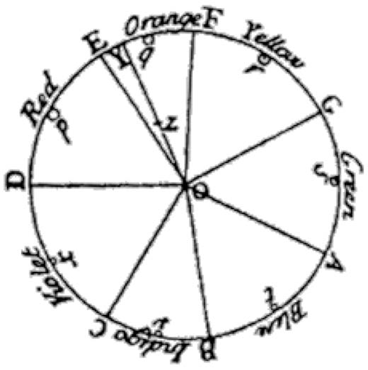
I found it fascinating that the idea of connecting color and sound goes back to ancient cultures, including the Chinese and Persians. In the west, Sir Isaac Newton tried to map colors to musical tones with his “Opticks” in 1704. He made a connection between their mathematical relationship to each other and the relationship between the notes of the musical scale.
My thoughts on spinCycle
I think spinCycle is a fun concept that nicely blends visual art, physical interaction, and sound design. Coming from a visual design background, I sometimes find it challenging to fully grasp the logic behind sound design. That’s why I like this approach of using visual patterns to generate sound which creates a direct and intuitive connection between what you see and what you hear.
What I especially like is that the interface seems very playful and intuitive. It invites you to experiment with colors and spatial arrangements, making sound creation feel more like visual composition. For me, this is a fun and experimental way to make sound design more approachable for visual designers. I also find it fascinating to consider how each color can take on a mood or character through its associated sound. Many people naturally associate colors with certain emotions, and by layering sound onto color, it adds a new emotional dimension. For instance, a soft sine wave could enhance the calmness often associated with blue, while a sharp snare might amplify the energy or urgency linked to red. This creates an opportunity to explore how visual and auditory elements can work together to express emotion in a multisensory way.
However, after reading the paper, I still have some technical questions. While the concept is clear, I feel the technical implementation — especially the way video input is converted into sound — isn’t described in much detail. Since I’ve worked with Max/MSP before, I’m really curious to see how the patch is built. It would be helpful to see how the video tracking, color detection, and sound triggering are structured within the patch.
Overall I think spinCycle is a very fun and creative tool, which I would love to try it myself.
In my last ten blog posts I researched about loneliness and social isolation, focusing on how we as interaction designers can combat loneliness and how we can design for connection. I started by defining loneliness and social isolation, discussing how they are measured, and sharing statistics on who is most affected and their impact on mental and physical health. I then introduced the Theory of Third Places, and how important public spaces are for well-being and social connectedness. This led to an exploration of Human-Centered Design for public spaces and how interaction design can help shape these environments to encourage social interactions. Since a large part of our lives takes place online already, I want to take a more analog approach but still does not forego a digital aspect. This brought me to interactive installations and how they can strengthen social interactions in public spaces. I looked at how to design engaging interactive installations and key factors to consider ensuring people participate and connect with each other.
Prototyping
The first task in Design & Research 2 was to create three lo-fi prototypes, ideally linked to our Master thesis. To be honest, I am not sure if I want to continue with this topic for my Master Thesis, but for now my three prototypes are connected to it.
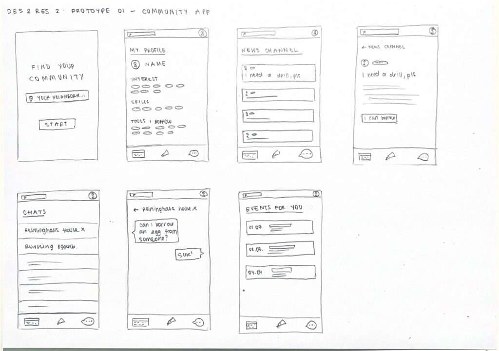
Prototype 01 – COMMUNITY APP
Although I wanted to take a more analog approach to the topic of loneliness, I wrote down all ideas that came to my mind and the first one was a community app. An app where you can connect with people in your neighborhood. You can find people with the same interests and hobbies, borrow tools you don’t own, arrange pet sitters while you are on vacation, get help with household repairs and discover local events.
Prototype 02 – SMART SOCIAL BENCH
A bench equipped with a small display that lights up when someone sits down, signaling an invitation for others to join. The display offers small conversation prompts such as “Tell me about your day” or “What’s your favorite song?” to encourage interaction. Additionally, a two-player mini games are included to further facilitate engagement and interaction.
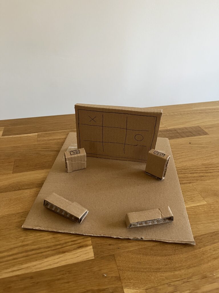
Prototype 03 – INTERACTIVE INSTALLATION
The last prototype is what I already thought about during the first semester – an interactive installation. A large screen installed in a public space, accompanied by two interactive tablets or screens that allow people to play mini games together, such as Tic-Tac-Toe for example. The setup is designed to encourage spontaneous social interactions among strangers or friends passing by. To make the space more inviting and inclusive, seating options are added nearby, providing a comfortable spot for people to watch the game, cheer on players, or even join in when a new round begins. This setup transforms the public space into a casual, engaging meeting point, fostering social connection through play and shared experiences.
Speed Dating
For the next class of Design & Research 2 we had to bring one of our prototypes. Since I already wrote about interactive installations, I brought my third prototype. We did a speed dating where we talked about our prototype with a different person every round to get more different insights, feedback and ideas. In the five rounds we got different task: guessing what the prototype was, suggesting additional features, describing it as if it is a dating profile, imagining a TED Talk about it, and reflecting about the most unexpected feedback.
Insights
Everyone I spoke with understood that my prototype is an interactive installation designed for two people to engage with each other.
One person suggested that instead of having a large screen with two control elements, I could use multiple small tables with built-in screens, allowing more people to interact rather than just two.
The description of the installation’s dating profile would be: Fun hanging out with.
Since I want to place the installation in a public space, I need to consider changing weather conditions and use waterproof materials. Additionally, the individual components should be securely built to prevent theft.
Interactive installations can transform public spaces into hubs of creativity and connection. Yet, designing interactive installations that do more than capture attention — that genuinely engage people — requires more than just technical expertise. It takes a deep understanding of human behavior, user experience, and the dynamics of engagement. Designing for engagement means creating experiences that are intuitive, immersive, and meaningful; it means creating work that users will interact with and connect to on a deep level.
Only when people are truly engaged, can we as designers create an environment that allows for lasting memories to be made, shared with others, and revisited. As I’ve described in my previous blog posts, fostering engagement in public spaces can reduce social isolation and strengthen the sense of belonging. The goal is not just to capture attention but to transform fleeting moments into moments of connection.
User Experience in Interactive Installations
User experience is fundamental to the success of any interactive installation. It includes emotional, physical, intellectual, and social aspects, making each experience distinct and significant. UX is informed by various fields, as noted by several experts like Nathan Shedroff and Don Norman, who emphasize the need to design for emotions, enjoyment, and meaningful interactions. UX cannot be simplified to separate components; rather, it arises from the interaction among people, technologies, activities, and the broader social and cultural environments. 1
Understanding Engagement
Building on the foundation of a solid user experience, engagement takes it a step further by ensuring that users aren’t just interacting but becoming fully immersed in the experience. Engagement is not just participation – it is about ensuring that the interaction flows. Shedroff identifies five key features of engagement: identity, adaptivity, narrative, immersion and flow.
Identity: “Identity is needed for authenticity in the experience and expression of the self. The authenticity of an experience is about ensuring experiences are real, or realistic, and consistent.”
Adaptivity: “Adaptivity is to do with change and personalization and with changing levels of difficulty, pace and movement.”
Narrative: “Narrative is to do with telling a good story, with convincing characters, plot and suspense. Narrative is not just about fiction, however. […]”
Immersion: “Immersion is the feeling of being wholly involved within something, with being taken over and transported somewhere else. You can get immersed in all manner of things (such as reading a book) so immersion is not about the medium; it is a quality of the design.”
Flow: “[…] flow is the sense of smooth movement, the gradual change from one state to another.” 1
How to Design for Engagement
Know your Audience Knowing and understanding the target audience is crucial to creating engaging and interactive installations. It makes a big difference whether the audience consists of children, tech-savvy individuals, or a broad general public, as each group requires a specific and tailored approach. The better the installation is adapted to the needs and abilities of the audience; the more likely people are to actively engage with it.
Prioritize Intuitive Interactions It is important that interactive installations are designed to be intuitive and straightforward. Research on intuitive interactions in public spaces shows that overly complex and confusing interfaces and interactions can hinder user engagement. 3 Affordances play a crucial role here, as they define the relationship between the design of an installation and the user’s capabilities. According to Norman in “The Design of Everyday Things”, perceived affordances are particularly important — these are the action possibilities that are made obvious through design. 4When an installation’s affordances are clear and aligned with users’ expectations and abilities, it enhances ease of use and promotes more meaningful interaction, ultimately improving user engagement.
Accessibility and Inclusivity To truly engage diverse audiences, designers must ensure installations are accessible to everyone. This includes providing physical access, sensory accommodations, and possibly language-neutral designs. 5
Storytelling Good storytelling engages the user by creating an emotional connection and leaving lasting impressions. Through experiences that evoke strong emotions — such as awe, joy, sadness, or curiosity — strong engagement can be fostered. A compelling story, whether abstract or real, gives people the feeling of purpose and discovery. Through emotional resonance, the experience becomes not only memorable but also increases the likelihood that people will share it, thereby amplifying its impact. 6 7
Incorporating Multisensory Experiences Incorporating multisensory experiences into interactive installations enhances user engagement by appealing to multiple senses, such as sight, sound, touch, and even smell or taste. This approach creates more immersive and memorable experiences. 8
Personalization Personalization in interactive installations significantly enhances engagement by allowing participants to shape the experience through their actions. It could be visual feedback, sound, or even changing environmental elements. Customizing the experience empowers users, making them feel more connected and involved, as their choices directly influence the outcome. 9
Enjoyment Designers are increasingly focusing on integrating pleasure into their designs alongside usability, enhancing both emotional and hedonistic appeal. The focus is on creating enjoyable experiences by addressing physical, social, and psychological aspects in design. Don Norman also emphasizes these factors in improving user experience. Additionally, gamification principles explore how different types of fun — such as challenging, relaxing, meaningful, and social—drive engagement, enjoyment, and learning, highlighting the emotional impact of well-designed interactive experiences.1
Aesthetics Aesthetics is rooted in the appreciation of beauty, how things are sensed, felt and judged. It plays a significant role in interactive installations. Experiences can be divided into pragmatic attributes (effectiveness and efficiency) and hedonic attributes (emotion and enjoyment). Emotions are the core of experiences, as they are closely intertwined with cognition, motivation and action. 1
Social Interactions Social interactions play a crucial role in increasing engagement in interactive installations, particularly through collaboration. These social dynamics shape how participants connect with the installation and each other, enhancing their overall experience. Installations become more engaging when they allow people to share the experience, leading to deeper emotional connections. 10
As designers, our task is beyond creating eye-catching installations — we are shaping the future of public spaces. So, as we move forward, let’s ask ourselves: how can we continue to break barriers and design experiences that invite people to engage not just with the technology, but with each other, building a more connected and inclusive world?
Inspired by the acclaimed 21 Balançoires (21 Swings) installation, The Swings: An Exercise in Musical Cooperation is a standalone, touring musical installation designed for international audiences. This interactive artwork features a series of musical swings that create harmonized melodies when used collectively. Certain musical patterns emerge only through cooperation, encouraging participants to synchronize their movements with others. It’s a playful experience that fosters connection and collaboration from the very first swing. With The Swings, participants engage their entire bodies to make music, fostering a sense of togetherness and shared ownership of public space. The result is a large-scale, collective instrument that unites people of all ages and backgrounds. Designed to transform urban environments, festivals, and special events, this installation offers a unique approach to communal music-making. Since its debut in 2011, the original 21 Swings installation has drawn millions of visitors to Montréal’s Quartier des Spectacles, where each swing moves an average of 8.500 times per day. 11
It draws the public in positive ways. It made our city feel like a genuine urban destination.
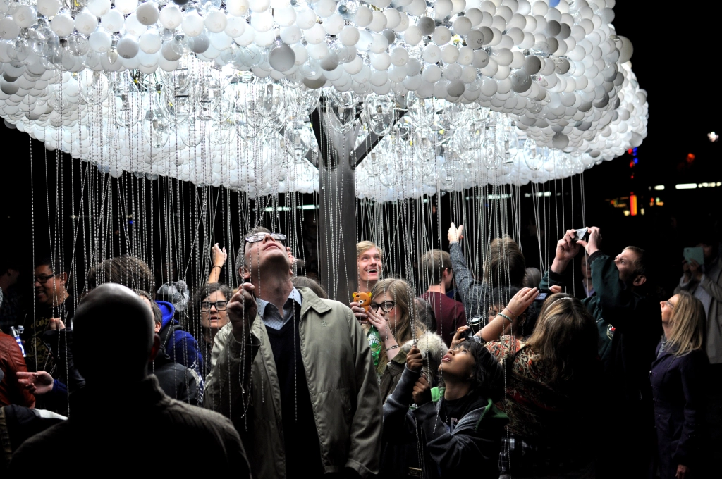
CLOUD is an interactive light sculpture, composed of 6.000 repurposed incandescent bulbs. Using pull-chain switches, participants work together to animate bursts of light, creating a shifting display reminiscent of lightning.
Blending playfulness with collaboration, CLOUD transforms viewers into performers, illustrating how individual actions contribute to a greater whole. The artwork offers both participation and contemplation, as those beneath the sculpture shape its movement while others observe the evolving patterns. Drawing on the universal imagery of rain clouds, CLOUD transcends cultural and language barriers, inviting shared wonder and connection. 12
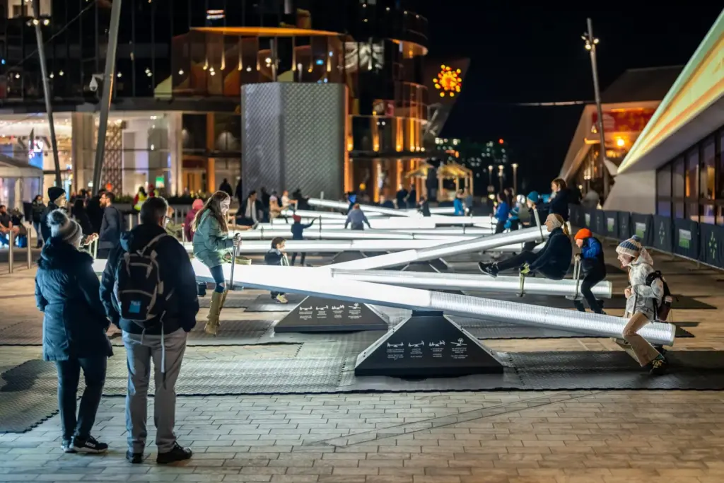
Impulse invites you into a playful, multisensory experience centered around a childhood classic: the seesaw. This interactive installation features a series of seesaws that respond to movement with shifting lights and sounds, transforming public space into an ever-evolving spectacle. More than just a playful ride, Impulse is designed with intentionality. Inspired by serialism — a structured musical composition technique — the installation creates dynamic zones of energy and tranquility, ensuring a harmonious blend of motion and sound.
Encouraging play, laughter, and connection, Impulse fosters a shared experience that brings people together, turning a simple act of movement into a joyful expression of community. 13
Sources
[1] D. Benyon, Spaces of Interaction, Places for Experience. 2014. doi: 10.2200/S00595ED1V01Y201409HCI022.
[2] N. Shedroff, Experience Design, a Manifesto for the Creation of Experiences. New Riders, 2009, pp. 9–10.
[3] L. Hespanhol and M. Tomitsch, “Strategies for intuitive interaction in public urban spaces,” Interacting with Computers, vol. 27, no. 3, pp. 311–326, May 2015, doi: 10.1093/iwc/iwu051.
[4] D. Norman, The Design of Everyday Things: Revised and Expanded Edition. Hachette UK, 2013.
[5] „What is inclusive design?“ https://www.inclusivedesigntoolkit.com/whatis/whatis.html
[6] „What is Storytelling?“, The Interaction Design Foundation, 30. November 2024. https://www.interaction-design.org/literature/topics/storytelling?srsltid=AfmBOooli8H26zn96VkuoNycaHkmn_oTQgdY-NcWh1BKTjmWxgABHoDz#how_storytelling_works_in_design-1
[7] M. L. H. M. Hanapiah und S. M. Nasir, „A Systematic Review towards Evolution of Interactive Storytelling and Audience Engagement in Films“, International Journal Of Creative Multimedia, Bd. 5, Nr. 1, S. 55–73, Apr. 2024, doi: 10.33093/ijcm.2024.5.1.4.
[8] L. Lin and L. Lu, “Research on the Design of Multisensory Interactive Experiences in Museums Based on Embodied Cognition,” in HCI International 2024 Posters, C. Stephanidis, M. Antona, S. Ntoa, and G. Salvendy, Eds., vol. 2119, Cham, Switzerland: Springer, 2024, pp. 1-10. [Online]. Available: https://doi.org/10.1007/978-3-031-61966-3_23.
[9] B. Moggridge, Designing Interactions. The MIT Press, 2006.
[10] J. Schell, The Art of Game Design. 2008. [Online]. Verfügbar unter: https://dx.doi.org/10.1201/9780080919171