The advent of variable fonts has revolutionized web typography, offering unprecedented flexibility and efficiency in digital design. By leveraging CSS attributes, designers can now adjust font weight, style, and width dynamically, eliminating the need to embed multiple font files. This innovation not only enhances creative possibilities but also improves website performance by reducing load times.
Streamlining Web Typography
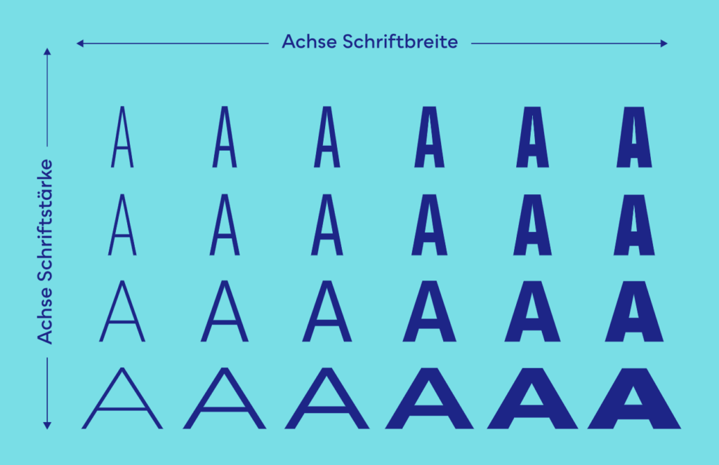
In traditional web design, each font weight or style required embedding a separate font file, increasing the website’s loading time and potentially impacting user experience. Variable fonts, however, consolidate these styles into a single file. Designers can modify attributes like Light to Bold or Condensed to Extended without loading additional resources. This reduces the strain on bandwidth and ensures faster rendering of text, creating a seamless user experience.
Infinite Possibilities for Creative Expression
Variable fonts provide incredible control over letterforms. For instance, font width can now be adjusted via CSS numeric values without distorting the design’s integrity. This precision ensures that letters maintain their aesthetic quality, avoiding the “stretched” or “compressed” look common with traditional fonts. Beyond width, attributes like stroke thickness, italicisation, slant, and even optical sizing can be customised, opening up limitless design opportunities while preserving the essence of the typeface.

Variable fonts are not just a tool for better performance—they are a canvas for creativity, enabling designers to create dynamic, responsive, and visually stunning typography that elevates the digital experience.
Source:
https://www.lukas-rudrof.de/blog/variable-fonts-potenzial-webdesign (img1)
https://www.clementcases.com/articles/britney-typeface (img2)