Impulse #3 Daniel Bauer

My third Impulse is about our meeting with Daniel Bauer, which turned out to be much more insightful than I expected. From the moment we started talking, it was clear that he had a very good sense of what makes a story emotionally engaging and how certain narrative decisions can shape the way an audience connects to a film. One of the first things he recommended was reaching out to Yue-Shin Lin, especially in relation to our topic of discrimination. He felt that her expertise could add depth to our project and help us approach the subject with more nuance. I immediately understood what he meant, because the topic is sensitive and it requires perspectives from people who are professionally and personally involved in that field.

After that, Daniel talked a lot about what makes characters and stories relatable. He explained that relatability is not just a stylistic choice, but something that is strongly connected to psychological principles. He mentioned empathy, cognitive fluency, social comparison processes, context shifts and narrative transportation. At first, these terms sounded quite academic, but the way he explained them made them very accessible. Empathy, for example, is about whether we emotionally understand or feel with a character. Cognitive fluency basically describes how easy or difficult it is for viewers to process what they see. Social comparison happens automatically, because people tend to compare themselves to characters on screen. Context shifts can open up fresh ways of looking at familiar topics, and narrative transportation is what happens when a story pulls us in so deeply that we forget the world around us.

What I found interesting was how naturally Daniel linked these ideas to filmmaking. He made it clear that these psychological processes are not abstract theories but actually influence how people respond to films. He used the example of the film Adolescence, which he said resonated strongly with him. Hearing him talk about it helped me understand how important emotional honesty and clarity are. A film does not need to be overly complicated or full of dramatic twists to work. It needs to create a feeling that stays with the audience, something they can relate to or recognise in themselves.

For me, one of the biggest takeaways from the meeting was the idea of really knowing the target audience. Daniel said that if you want your film to have an impact, you need to know who you are speaking to and what kind of emotional experience you want to create for them. This means thinking beyond the story itself and considering how every decision supports the atmosphere, the tone and the overall message. It also means being intentional about how the viewer should feel at certain moments and how the film guides them through that emotional journey.

Overall, the meeting reminded me that filmmaking is not only about visuals or structure. It is also about psychology, emotion and understanding how people experience stories. Daniel helped me see that these aspects are not separate from the creative process but a fundamental part of it. I left the conversation with a much clearer idea of what matters in our project and how we can shape the film so that it truly resonates with the people who watch it.

Impulse #2 Framework

After Watching a lot of Wandering DP Episodes (https://www.youtube.com/@wanderingdp) I took my notebook and wrote down the basics, that he talks about all the time.

He calls it the Framework and he presents it as a practical system that guides the entire process of lighting and visual design. Patrick, also known as The Wandering DP, uses these six core elements to approach every scene in a clear and efficient way. The Framework gives filmmakers a structured method, especially when time, equipment or the location itself impose limitations.

1. Upstage Lighting and the Pareto Principle
The first component of the Framework is Upstage Lighting. This means placing the main light on the far side of the subject in relation to the camera. Upstage lighting shapes the face naturally and introduces pleasing shadows that help define the subject within the space. Patrick connects this idea to the Pareto Principle because he believes that this method provides most of the visual quality with very little effort. It is fast to set up, reliable in almost any situation and instantly produces a cinematic look. In demanding situations where decisions must be made quickly, this approach becomes extremely valuable.

2. Point of Control
The second element is the Point of Control. This idea is about recognising which elements in a location can be controlled and which cannot. Every room has fixed conditions such as window placement, wall color or natural light direction. Patrick suggests starting by identifying the element that is least controllable. Once this is understood, all other choices can be made around it. This mindset stops filmmakers from fighting the location and instead encourages them to work with what is available. It creates clarity and helps build a stable lighting plan.

3. The Lighting Triad
The Lighting Triad forms the third part of the Framework. It consists of the key light, negative fill, edge light and ambient. The key light defines the emotional direction of the scene. Negative fill is used to remove unwanted spill and strengthen contrast. The edge light separates the subject from the background and reinforces depth. Ambient light provides the base atmosphere without competing with the more intentional lights. When these four components work together, the scene gains structure, dimension and balance. Patrick views the triad as the core toolkit for almost any lighting situation.

4. Room Tone
The fourth component is Room Tone. This is the gentle lifting of shadows in a controlled and natural way. Room tone does not mean simply flooding the space with uncontrolled ambient light. Instead, it is a subtle adjustment that makes the environment feel realistic and prevents overly harsh contrast. By shaping the shadows carefully, the cinematographer can guide attention and maintain visual harmony.

5. The L of the Room
The fifth concept is the L of the Room. Patrick encourages shooting in a way that shows two walls of the space whenever possible. Displaying the corner or depth of a room helps the viewer understand its shape and dimensionality. It adds realism and makes the visual world feel lived in and grounded.

6. Salt and Pepper
The final element is Salt and Pepper. This refers to adding small variations of light and shadow throughout the frame. These details keep the image interesting and dynamic. They act like a visual rhythm that guides the viewer’s eye and prevents the frame from feeling flat.

Together, these six components form Patrick’s Framework, a structured, efficient and creative approach to lighting that supports both the technical craft and the emotional experience of a film.

Impulse #1 Movie Afternoon

My first Impulse Post is about an afternoon I spent with Magda and Noah watching a series of short films. We had planned the session mainly to see different approaches to campaign films and socially critical storytelling, but it turned into something much more interesting. We ended up not just watching films but really discussing what makes certain stories stay with us and why others, even when technically impressive, do not leave the same emotional mark.

We went through a mixture of campaign videos, social awareness films and artistic shorts. The overall production quality was high in almost all of them. You could tell that the filmmakers cared about their topics and that a lot of work went into cinematography, editing and sound. Yet despite this level of craft, only a few of the films truly resonated with me. This surprised me because I assumed that technical excellence alone would strongly influence my reaction. Instead, I noticed that films with flawless visuals sometimes felt distant or overly polished, while simpler ones with emotional clarity had a much stronger impact.

After every film we paused to talk about what worked well and what did not. These discussions were surprisingly honest and open. All three of us had different backgrounds and preferences, and that made the conversation more interesting. Sometimes one of us connected deeply with a film that the others found unremarkable, and other times we all reacted in exactly the same way. Through these reactions we slowly started to identify patterns.

By the end of the afternoon we realised that a few specific criteria were consistently important for us. One of them was the number of protagonists. Films felt stronger when they focused on one or two characters rather than trying to spread attention across many. This made the emotional connection more direct, because the film had the time and space to explore a character’s inner world. Another important factor was the intelligence of the story. We liked narratives that had a twist or a surprising detail but still remained grounded in reality. When a film tried too hard to be clever, it often lost emotional authenticity. When it was too straightforward, it sometimes felt predictable.

What worked best for us were the films that took a real-life issue or problem and presented it through a relatable and emotionally engaging story. This combination made the message feel more grounded and impactful. Instead of feeling like we were being lectured, we experienced the issue through a human perspective. It became less about the abstract concept and more about what that concept means in someone’s life. Films like Break the Cycle of Disadvantage or The Robbery showed exactly how powerful this approach can be. Both managed to take a social topic and embed it into a story that felt honest, personal and human.

In the end, the afternoon taught me something important about filmmaking. A film does not need to be complicated or visually overwhelming to make a point. What it needs is emotional clarity and a connection to experiences people can understand. When a story is built around real human moments, even a short film can feel meaningful and stay with the audience long after it ends.

My favorite films where:

Impulse #4 Harry Potter Exhibition London

While I wrote the Blogpost to the Spiderwick Books I got the idea to wrote about an other fantasy world. This Year in May I visited togehter with my sister the Warner Brothers Studio Tour in London. It’s an immersive, behind-the-scenes experience that lets you step inside the real sets, props, and artwork used to bring the Harry Potter films to life. Of course I’d love to see all the bog sets, costumes and requesites but there where also a lot of concept art and illustrations which is really intresting. That’s really interesting, and I want to record my memories in this blog article and gather further inspiration on this and, of course, share it.

A Deeper Dive at the Concept Art – My Take Away from the Tour

One of the most impressive parts of the Harry Potter Studio Tour is the huge amount of concept art and illustration work that was created for the films. Many visitors come for the big sets, but the real magic starts much earlier with the artists who imagined the world long before a single scene was filmed.

TAt the Harry Potter Studio Tour, you quickly realize that the art is not just decoration, it’s part of the story itself. The concept art, illustrations, and sketches helped the filmmakers decide how the story would look, feel, and even work emotionally.

Before a single scene was filmed, artists drew Hogwarts, Hogsmeade, the Burrow, and the Forbidden Forest. These drawings weren’t just ideas on paper they defined the tone of the story.

  • A dark, twisted sketch of the Forbidden Forest tells you it’s dangerous.
  • A cozy, warm illustration of the Burrow tells you it’s a safe, loving home.

By looking at the illustrations first, the filmmakers could see the story visually. It helped them decide where characters should go, how scenes should be lit, and what emotions each space should create. Concept Art is very often used to created and finally build architekture, rooms or sets. One really cool set is the tiny hogwarts castle at the end of the exhibition. Depend on when you are visiting the exhibition, there could be snow around it. What stuck in my mind is that this iconic Hogwarts castle model (1:24) was built by a team of 86 artists and crew and was used for wide exterior shots in many of the films. There were many bright windows, and I checked how many of them were installed. 2500. And thats a lot of tiny glass.

One design duo also stuck in my mind because I found their art very impressive. MinaLima designed an incredible number of props: from potion books to newspapers such as the Daily Prophet to candy wrappers. Over 40 different editions of the Daily Prophet were created, and to make it look old, it was dipped in coffee after printing. It’s nice to see that graphic designers also have a place in such a great film project (so maybe there’s still hope). If you intrested in such Art, looked at their work it’s so inspiring and fascinating.

Creature design tells personality and story

Concept art was especially important for magical creatures. Every sketch helped the filmmakers understand how a character behaves, thinks, and feels.

For example:

  • Dobby’s sketches show him scared, happy, or mischievous. Seeing these expressions on paper first helped the filmmakers bring him to life in a way that felt real.
  • Buckbeak’s designs explored strength, grace, and fear. Choosing the right look made the story believable the audience immediately understands who the creature is without explanation.

Illustrations like these are a storytelling tool. They guide how the audience experiences characters and the world.

Art helps tell emotion and atmosphere

Every painting, drawing, and sketch in the tour contributes to the story’s mood and atmosphere.

  • Shadows, colors, shapes, and textures show fear, joy, mystery, or wonder.
  • The smallest details, like a crooked sign in Diagon Alley or a book cover in the library, make the world feel real and lived-in.

This is why illustration isn’t just “pretty art” it’s essential storytelling. The world on paper tells the audience where the story lives and how it should feel, before a single line of dialogue or special effect exists.

Illustration bridges imagination and reality

The Harry Potter films started as books, which rely on imagination. Concept art translates those imaginative ideas into something tangible. It’s the bridge between the author’s words and the visual world on screen.

Without this art, Hogwarts might look different every time, creatures could feel inconsistent, and the story might lose its emotional clarity. The illustrations give the filmmakers a shared visual language that everyone on set can understand.

Conclusion

Illustration and concept art are the backbone of visual storytelling at the Harry Potter Studio Tour. They don’t just show what things look like they shape the story, define the characters, and set the emotional tone. For anyone interested in storytelling, art, or design, seeing these sketches and paintings is inspiring because it shows how much power art has in bringing a story to life. And, of course, it’s worth it for all the wizards among you to take a day trip there and experience the feeling of living history for a day.

Impulse #3 Spiderwick

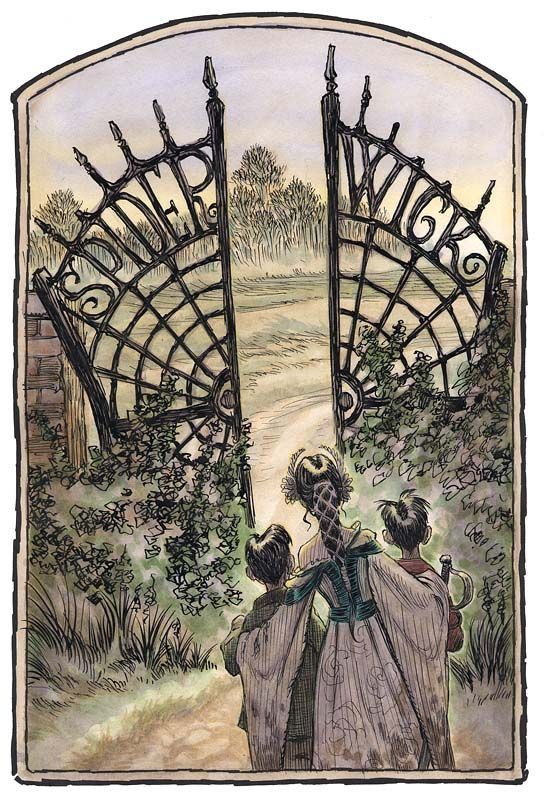
One of my favorite book series in my childhood was the Spiderwick Chronicals. Its written by Holly Black and illustrated by one of my role model illustrators Tony DiTerlizzi. Ever since I read the books as a child, I have been fascinated by his art style and the way he draws, which seems so easy and joyful at the same time. I think his art in this book was one of the reasons why I started drawing as a child and why I still love to lose myself in imaginary worlds today. I recently reread the books and remembered how much I enjoyed them, especially the illustrative narrative style.

How the Illustrations Made the Spiderwick Books so Special

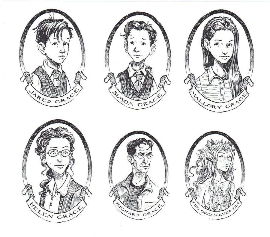
The Spiderwick series is one of those children’s book series you don’t forget easily. This is not only because of the exciting story about Jared, Simon, and Mallory Grace, but also because of the illustrations that make every book feel like a little adventure. The drawings by Tony DiTerlizzi are a big reason why the series became so successful.

Why the illustrations are so important

Many children’s books have a few small pictures here and there. Spiderwick is different: the illustrations are an important part of the story. They show the magical creatures the children discover and make the world feel more real.

DiTerlizzi’s style looks a bit like old scientific sketches: detailed, careful, sometimes beautiful, sometimes a bit spooky. Because of this, it feels almost as if these creatures were actually studied and recorded somewhere

Was this a new Way of Narrative Book at this Time

Of course, illustrated books have always existed. But for older children and young teens, it was unusual to have so many pictures in a novel especially pictures of such high quality.

Spiderwick sat right in the middle:

  • more illustrations than normal novels,
  • but more serious and atmospheric than a typical picture book.

This mix felt fresh and new at the time. Another illustrated book from my childhood I can remember pretty well was Alice in Wonderland. (Maybe I should study this book at some point as well, cause there are a lot of differnt versions of it. ) But this novel was not especially for children. It was more a new way to present the classic books.

Why Spiderwick became so successful

There are several reasons I found why the series was so popular that they even made a film out of it:

1. The pictures made the story feel real

The drawings looked like they came from a real field guide about fairies and goblins. Many children loved this “found notebook” feeling.

2. The books were quick and fun to read

Each book was short, fast-paced, and exciting. The illustrations helped set the mood right away.

3. The style was perfect for the age group

Many children don’t want “kids’ books” anymore, but big text-only books can feel too difficult. Spiderwick was exactly in between.

4. The magical world felt unique

Holly Black’s ideas and Tony DiTerlizzi’s artwork fit perfectly together. The fairy world felt new, interesting, and beautifully designed.

Tony DiTerlizzi – the artist behind the magic

Tony DiTerlizzi was already known as a fantasy illustrator before Spiderwick. He loves old fairy drawings and classic natural studies, and you can see that in his art. For Spiderwick, he didn’t draw “cute” creatures. Instead, he created beings that look like they could really be hiding in the woods or the garden. This mix of fantasy and realism attracted many readers.

My Take Away

Without the illustrations, Spiderwick would not be the same. The drawings give the series its special character and played a big part in its success. They make the world feel real and alive, and they helped the books stand out from many others.

Books like Spiderwick are also the reason why I enjoy illustrated books so much. I love it when the artwork has soul and personality, just like in this series. Looking at books like these inspires me for my own creative work. They help me understand what truly works, what feels meaningful, and what makes a story stay in someone’s mind.

Impulse #2 Originality and AI

Following on from my thoughts in my previous blog post on “Sketchbook,” I looked into the topic of AI and illustration in more detail and came across Eileen Isagon Skyers’ TED Talk. I found her ideas very interesting and similar to my own, which is why I would like to share them here.

What does originality mean when machines can generate images?

That’s the question she is asking the audience. Eileen Isagon Skyers explores how AI is changing art and creativity. Her key points are:

  • Originality may now be collaborative, layered, and concept-driven rather than purely hand-drawn.
  • AI produces images that are both familiar and uncanny, blurring lines between human and machine creativity.
  • Artists working with AI often act as curators, shaping output by selecting, refining, and guiding the machine.
  • Questions arise around authorship, emotion, representation, and bias: who defines originality, and whose stories are told?

Why this matters for Illustrators

Originality in art is changing. It is not just about drawing perfectly but about showing your own voice, making choices, and putting intention into your work. Illustrators today often guide ideas and improve the results instead of creating every detail by hand. What really matters is emotion and story. AI can make pictures, but it cannot capture real experiences or true feelings. It is also very important to think about representation, to consider whose stories are shown, which visual traditions are included, and which are left out.

AI aka creative thief

When talking about the originality of AI artworks, one must of course also ask where AI gets its references from. That’s right – from all of us. Caught up in the AI and art bubble, I came across two more TED Talks that deal with precisely this topic. One by Ed Newton‑Rex on how AI “steals” creative work and another by Melody Liu on the ethics of AI art. Both show that AI can create impressive images, but it raises serious questions about originality, authorship, and fairness.

AI learns from existing artworks, often without permission. This means that styles, images, and ideas created by real human artists are used to train machines that can then produce new work. On one hand, this can inspire new creativity and speed up the illustration process. On the other, it risks taking away recognition, income, and the personal voice of artists.

Another issue is emotion and story. AI can combine shapes and colors perfectly, but it cannot capture lived experience, personal feelings, or the soul an artist puts into their work. Without that human element, art can feel empty. Finally, representation is also a concern: AI reflects the biases of its training data, so some voices and cultural traditions are left out, while others dominate.

How to protect your art

Ed Newton‑Rex also talks about how artists can protect their work from being used by AI without permission. One important step is to be aware of where and how you share your art online. Artists can use copyrights and licenses to make clear how their work can be used. Another idea is to add signatures or branding so people can see which work is original. Newton‑Rex says it’s important for artists to have a say in how their art is shared online, so they can protect both their voice and their income.

My take away

Of course, everyone knows by now that AI steals from real artists, but it’s easy to ignore and these talks really made me realize that I need to keep it in mind before posting anything online, especially on Instagram or Pinterest. My opinion on AI hasn’t really changed since my last blog post, it feels like most people talking about AI in a good way as “art” aren’t really illustrators or working artists. Still, I’m sure there are positive ways to use AI creatively without losing the soul of art, and I probably need to explore that side more. All three TED Talks I watched were really interesting and raised a lot of important questions. There are definitely many more talks out there on this topic for anyone who’s interested. I’m not sure if I want to explore this topic more deeply at this point, but maybe it could be part of a research.

Impulse #1 Sketchbook by Disney

I didn’t expect much when I turned on the Disney show “Sketchbook” but then I got completly hooked. Each episode follows a Disney artist who talks about their own story while showing how they draw a famous character. From Simba and Olaf to Mirabel from Encanto. But the best part isn’t really the drawing itself. It’s everything that happens in between the work. The stories, the emotions, the reflections on art, creativity and life of the artists.

What “Sketchbook” Is Really About

The Show isn’t like a “how to learn drawing” show or anything, its about the stories behind the drawings. You can watch how a few simple lines slowly turn into a living figure, and it becomes clear that every drawing carries a piece of the artist’s personal story.

For example, Gabrielle Salonga explains how she drew Mirabel and what it means to her to represent her Latina background at Disney. Eric Goldberg, the animator behind Genie from Aladdin, talks about how he brings humor to life through movement. It’s amazing to see how much personality and emotion are hidden in these drawings.

What Inspired Me the Most

What really touched me was how openly the artists talked about their insecurities. These are people who’ve worked on legendary films (which the most artsit can just dream of) and yet, they still admit to doubting themselves sometimes.

That hit home for me, because it reminded me on myself and the reason why I draw. Not to be perfect, but to express something real and a part of myself. To make visible what can’t be said in words or whats in my imagination. In a world of pressure and selfimprovment, you always have to remind yourself that you don’t have to be perfect. Art is not about being perfect but about the stories and personalities behind it. Most people quit because they think that they are not good enough, seeing millions and millions of perfectly beatiful drawings and artworks everyday. Especially pintrest or instagram hit me hard everytime I open the app, actually searching for inspiration but ending up in selfdoubt and an artistic crisis. In this digital and over-sharing world its hard to go back to old ways for just sit down and draw what you see or feel.

The Moment I Started Thinking About AI and Art

While watching “Sketchbook,” I suddenly became so aware of how deeply human art really is. Every line, every stroke carries emotion, intention, and soul. And to be honest, I got really sad about it. In a time where AI-generated art is everywhere – flawless, polished and absolutly perfect – this series reminded me of what AI can’t do: feel.

An algorithm can analyze, imitate and combine styles. Draw flawless, polished and absolutly perfect pictures about everything you can imagine. Of course at this point it is still making mistakes, but it will be improving in the next years and there wont be such mistakes anywhere anymore.
But this drawings can’t pour childhood memories into a line. It doesn’t know what it’s like to feel nervous before starting a new piece, or the rush of joy when a character or a imaginary place suddenly “comes to life.”

That’s what I find so sad, that with too much automation, art risks losing its emotions, its imperfections, its soul. Even when we use AI and its making a mistake, why we call it a mistake? How we can define mistake in art? Real artworks are living from this kind of mistakes. And with AI, art isn’t just losing there soul – it’s losing there imperfection. Thats what it makes them to artworks.

“Sketchbook” reminded me how much life can exist in a single pencil stroke – something no machine will ever truly replicate. And from this thought I am so inspired, that I am thinking about to use it for my masterthesis. Because the real question is: why you should draw a damn complex picture of a dragon or something else, when you just can create it within a minute and one click on the keyboard.

A New Approach Idea

I am really struggeling to find a proper Masterthesis Idea, because everything I want to do, is really hard in the implementation and in most cases don’t have a really new approach, espescially when it comes to the research. But thinking and writing about this AI topic makes me really emotinally and it’s easy to write about it. So perhaps I could use this as a new approach for my thesis. Usually I avoid every topic with AI most of all when it’s about creating illustrations with it. It makes me feel really sad and anxious. I am scared that we can’t get jobs or that art won’t be appriciated that much anymore. But (as with every problem in life) avoiding it won’t make it disappear. Maybe we as artist are in charge to find ways to live with it, perhaps even to work with it. I think I am not the only Illustrator who feels that way. And maybe right in these toughts are beginnings for new methods. How we can see AI not as threat but as allie, to make concepts more easy or use it as inspiration, basis or part of an artwork. I will think about this idea and how it maybe could be combined with my original topic.

Final Thoughts

However, back to where these thoughts are started – “Sketchbook” isn’t just a typical documentary and I can recommend it to everyone who is intresented in animation films, illustrating or the art business in general. It feels like a honest conversation between artists, full of inspiration, vulnerability and emotions.

My takeaway in one sentence:
“Sketchbook” reminded me that art is most beautiful when it has a soul and no algorithm will ever replace that.

03.03: Gibt es den einen Weg einen guten Horrorfilm zu leuchten?

Passend zu einer der großen Fragen, die Daniel Bauer in der Feedback Runde aufgeworfen hat, möchte ich heute mit der Zusammenfassung des ersten Papers starten, um einen profunden Überblick über den state-of-the-art Research zum Thema Leuchttechniken in Horrorfilmen zu bekommen.

Die Grundhypothesen des zugrunde liegenden Papers lauteten zu beweisen, dass auch Lichtkonzepte, die generell für die Darstellung positiver Szenen, Filme oder Charaktere verwendet werden, in Horrorfilmen funktionieren können. Dies wurde an insgesamt vier großen Beispielen festgemacht.

  • Das Brechen mit klassischen Lichtstrukturen: Ammer gibt an, dass mit klassischen Lichtkonzepten, wie low-key und high contrast, einfallendem Licht aus Fenstern oder schwachen, unsaturierten Farben, die üblicherweise für Horrorfilme benutzt werden, gebrochen werden kann, um die wirklich furchteinflößenden Szenen hervorzuheben. Als Beispiel gibt er an, dass “gute” Vampire, also jene die nur Tierblut trinken um Menschen nicht zu verletzen, in den Twilight-Filmen stets softer geleuchtet sind als ihre blutrünstigen Kollegen, um denen nicht den Spuk zu nehmen.
  • Intensität des Keys und Key-to-Fill-Ratio: Auch hier argumentiert Ammer, dass ein höherer Kontrast im Gesicht, wie er eigentlich genutzt wird um Charaktere, düsterer zu machen, nicht immer der richtige Weg ist. Er argumentiert, dass in Shining etwa, in der Szene als Jack Nicholson sich endgültig dem Bösen zuwendet, er durchgehend mit einem Frontlight beleuchtet ist. Also einer Methode, bei der das gesamte Gesicht gleichmäßig ausgeleuchtet ist und die eigentlich allerhöchstens in Beauty-Kampagnen vorkommt, nicht aber im Kino und schon gar nicht im Horror. Dies soll es laut Ammer möglich gemacht haben jegliche Mimik von Nicholson während seiner Verwandlung nachzuvollziehen.
  • High-Key-Lighting: Außerdem streicht er heraus, dass Schlüsselszenen in Horrorfilmen manchmal ganz bewusst nicht dunkel und kontrastreich, sondern hell und kontrastarm dargestellt sind, obwohl man diese Gestaltung eher in Feelgood-Filmen erwarten würde. Als Beispiele nennt er die Duschszene in Psycho und das Folterlabor in Saw. Damit möchte der DP laut Ammer erreichen, dass man auch wirklich alles vom schrecklichen Horror sieht und nichts in der Dunkelheit verschwindet.
  • Die Wirkung von Farben: Zu guter Letzte streicht Ammer heraus, dass verschiedene Farben in verschiedenen Situation auch andere Bedeutungen haben können, was mich sehr an den Kuleschow-Effekt erinnert hat. Orange etwa, ist eigentlich die Farbe eines warmen Sonnenuntergangs, wirkt in Zusammenhang mit einer Leiche aber giftig.

Fazit

Das Paper war spannend und hat definitiv den Punkt unterstrichen, den auch Daniel Bauer aufgebracht hat. Aus diesem Grund werde ich die Bibliographie auch stärker an das Horrorthema anpassen und für die folgenden Blogposts versuchen, klassischere Lichttheorien in Horrorfilmen mitsamt ihren jeweiligen Wirkungen herauszuarbeiten.

vgl. Ammer, Sawsan Mohammed Ezzat Ibrahim: Content Analysis of Lighting and Color in the Embodiment of Fear Concept in Horror Movies: A Semiotic Approach. In: Information Sciences Letters 2020, Volume 9, Issue 2, http://dx.doi.org/10.18576/isl/090210.

3.4 IMPULSE #4

On November 6th, I visited CoSA as part of the Project Work 3 gamification lectures. We explored “FLiP”, an exhibition about financial literacy. A topic that doesn’t naturally interest me, but still, I thought that seeing it through an interactive format might make it easier to understand and maybe even enjoyable. But even though the exhibition was interactive, I found it hard to stay engaged.

The exhibition used a lot of quizzes, screens, and points to keep visitors engaged. In theory, that sounds fun, but for me, it didn’t really work. Every time I answered a quiz, I earned points, but that didn’t make me feel more curious or motivated. There was just too much information on each screen. Sometimes I clicked random answers just to move on, not because I wanted to, but because I was overwhelmed. The same thing happened with the exhibit featuring a rotating screen, where you had to answer yes-or-no questions. This alternative screen made me feel dizzy after a while, so I couldn’t stay until the end. The interaction was simple, but the information behind it was again too much and hard to follow.

This experience made me think more about accessibility in interactive exhibitions. What happens when someone gets dizzy or tired, or just feels overloaded by too much information? What about kids or people with dyslexia or ADHD who might find all the text and flashing visuals too much? And what about visitors with visual impairments? I didn’t notice any tactile elements that could help them experience the exhibition in a different way.

Even though the exhibition didn’t fully capture me, there were still parts I really liked. I enjoyed the overall layout and the color coding of the different finance topics. One exhibit asked you to manage the expenses of an average Austrian family. That one was quite fun and easy to understand. I liked how you could see the results of your decisions immediately, visualized in a balance scale that showed expenses and savings in real time. It made the topic feel more concrete and relatable. Another moment I remember was the bicycle exhibit. I don’t remember exactly what it was about, but you had to use a bicycle pedal with your arms for the experience to continue. It was tiring but also fun and one of the few moments that felt truly interactive in a physical way, and that helped me connect more to what I was doing.

Looking back, I realized how important it is for exhibitions to make learning feel light and approachable. Just adding interactivity isn’t enough if the experience still feels heavy or confusing. Interaction should make you feel part of something, not just like you’re completing tasks. Clear visuals and thinking about different kinds of visitors can make all the difference.

AI was used for corrections, better wording, and enhancements.

IMPULSE: Graz Museum – “Demokratie! Heast?!”

Exploring Interactive Media and Communication Design in Public Space

As part of one of our class activities, I visited the “Demokratie! Heast?!” exhibition at the Graz Museum. The exhibition focuses on how people can participate and express their opinions in today’s world. It was an interesting mix of media, sound, and interaction not a typical museum experience, but something that invited visitors to think and take part.

I spent around two hours there with my classmates, and what I really liked was how interactive the whole exhibition was. Instead of just reading information or looking at objects, we were encouraged to touch, listen, and move around. The space felt like a combination of education and play serious topics presented in a way that was easy to connect with.

One installation that impressed me most was the cat in the glass box. At first, I thought it was just a decoration, but then we were asked to stand in a specific spot, and different text, effects and items suddenly came to life through projection. It wasn’t a real cat inside of course. meanwhile items looked really impressive and worked really well in concept with the “fake cat sculpture” because of the way the inside projector worked with the glass and light. The installation explained — the famous theory about whether the cat in a closed box is dead or alive until observed. It was a smart way to explain a complex idea visually, and it made me curious about how the projection was created and synchronized with the model.

From work perspective, this installation gave me a strong impulse for my own research. It showed how interactive project can be designed and how storytelling can transform abstract theories into something understandable and engaging. I also started thinking about how projection mapping and AR could be used in similar ways to make hidden information visible, or to give digital “life” to physical objects.

Another part that I found inspiring/interesting was how the exhibition balanced education and experience. The topic of theories, history and research can feel complicated or even boring if presented traditionally, but the designers of the exhibition managed to make it approachable. The use of visuals, sound, and space created a rhythm that kept people engaged.

I would like to learn more about the technical side of installations like the cat box but I could not find anything similar in YouTube ( explanation videos ) — how the projection system works inside the glassed box , how motion and light are timed, and what software was used. It is really interesting how much work goes into combining artistic ideas with technical precision, something I also want to explore in my AR prototype development.

So overall “Demokratie! Heast?!” didn’t just show information it made people feel involved in it and work for creating something with people and share it maybe even on social media just like I did with the picture I uploaded here.


References:

  1. Graz Museum – “Demokratie! Heast?!” Exhibition
  2. About Schrödinger’s Cat Thought Experiment