Key Takeaways:
Color and illustration style carry strong cultural codes.
Visual softness can still communicate strength and intention.
It’s easy to challenge visual norms with very simple interventions.
For the Formula Student Spritzerstand, I was asked to make a poster. Usually, the team uses the classic combo of red and black, with clean-cut type and car photos. I kept the red from the CI but added pink, used hand-drawn illustrations, and made it intentionally softer and playful.
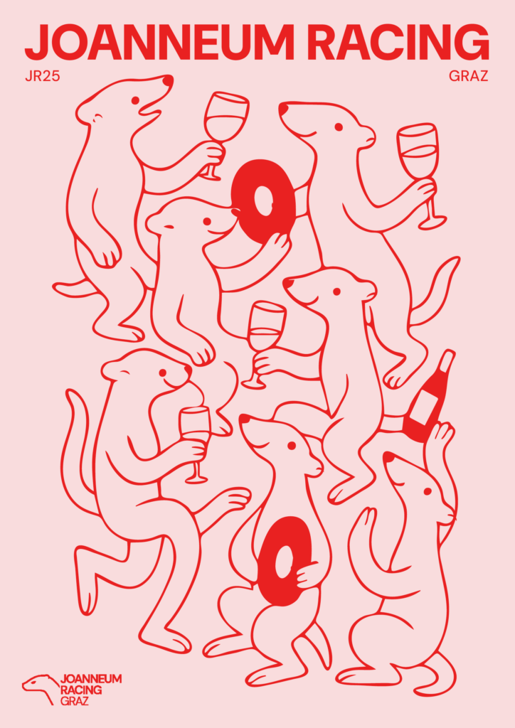
It felt like a radical move even though I only changed a few elements. And it made me think about the idea of visual authority. Why does a playful, softer design immediately seem less serious? Why is pink still coded as unserious or “unprofessional” in motorsport environments? Sadly, due to some miscommunication within the team, the poster has not been used for the Spritzerstand yet (but it probably will be used in the next semester), so I didn’t get to see the general reactions to it. But for my thesis, this is a strong entry point: how is motorsport visually gendered? And what happens when we redesign it with a different visual voice? I’m thinking about creating a small visual system based on this poster (maybe as part of an alternative event concept or campaign) to explore how small design choices change the entire tone of communication.