In an industry dominated by hyper-feminine and hyper-masculine branding, Aesop stands out as a benchmark for gender-neutral design. The luxury skincare brand has cultivated an aesthetic that feels both refined and universal, proving that effective design doesn’t need to rely on traditional gender cues. But what makes Aesop’s approach so successful? And what can other brands learn from it?
Stripping Away Gendered Clichés
Many skincare brands lean heavily on gendered marketing—soft pastels and floral motifs for women, dark packaging and bold typography for men. Aesop rejects this binary entirely. Instead of relying on color-coding or stereotypical imagery, the brand embraces minimalism, neutral tones, and functional elegance.
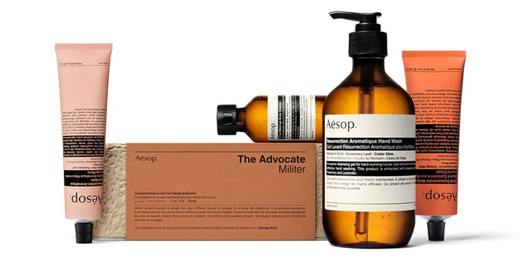
- Packaging: Aesop’s signature amber bottles and uniform labeling eliminate gendered visual cues, making the products feel accessible to all.
- Typography: The brand uses clean, sans-serif fonts with consistent, evenly spaced lettering—avoiding decorative or aggressive typefaces often associated with gendered branding.
- Fragrance: While many brands market scents as distinctly “masculine” or “feminine,” Aesop’s botanical blends are designed to be universally appealing, balancing earthy, herbal, and citrus notes.
By prioritizing simplicity and consistency, Aesop creates a design language that feels timeless, sophisticated, and non-exclusive.
Designing for Experience, Not Gender
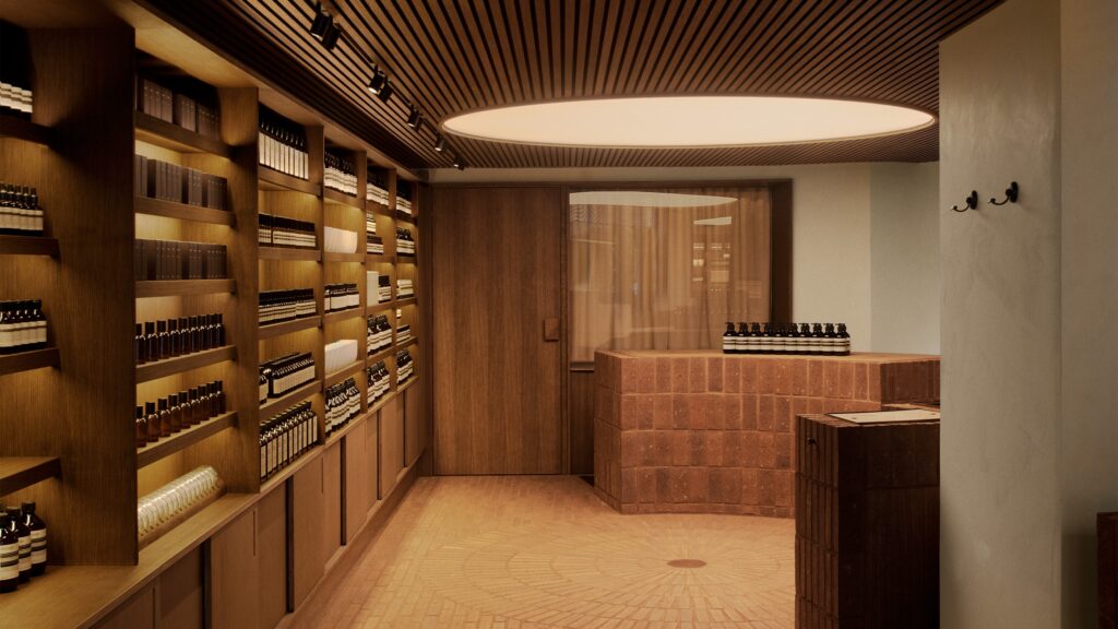
Aesop’s gender-neutral approach extends beyond packaging—it’s embedded in the brand’s entire retail experience. Each store is uniquely designed to reflect its local surroundings, reinforcing the idea that Aesop is for everyone, everywhere.
- Neutral Materials: Stores favor natural materials like wood, stone, and metal, rather than stereotypically “masculine” industrial designs or “feminine” luxury aesthetics.
- No Gendered Sections: Unlike many skincare retailers that divide products into men’s and women’s categories, Aesop organizes by function and need—ensuring that customers select based on skincare concerns, not societal expectations.
- Consultation-Driven Shopping: Aesop’s retail experience is centered around personalized consultation rather than gendered marketing, reinforcing a human-first approach to beauty and self-care.
This philosophy ensures that every customer feels equally considered and valued, regardless of gender identity.
What Other Brands Can Learn
Aesop’s success in gender-neutral design isn’t just about aesthetics—it’s about rethinking how brands communicate with their audiences. Here are key takeaways:
- Function Over Stereotypes: Instead of designing for “men” or “women,” focus on what the product does and how it benefits the user.
- Consistency is Key: A clear and minimalist design language ensures that branding feels cohesive and inclusive.
- Experience Matters: Beyond visuals, consider how retail spaces, digital touchpoints, and customer interactions reinforce a neutral, welcoming brand identity.
Why Aesop’s Approach Works
Aesop proves that gender-neutral design is not about being bland—it’s about being intentional. By stripping away unnecessary gendered cues and focusing on quality, functionality, and experience, the brand has built an identity that resonates across demographics.
As more industries move toward inclusivity, Aesop stands as a powerful example of how brands can create design-first, human-centered experiences that transcend gender norms.