In my previous blog posts, I explored risk communication, data visualization, and the RiskLIM project, all centered around one essential question: How can we communicate climate risks in a way that is clear, accessible, and action-driven?
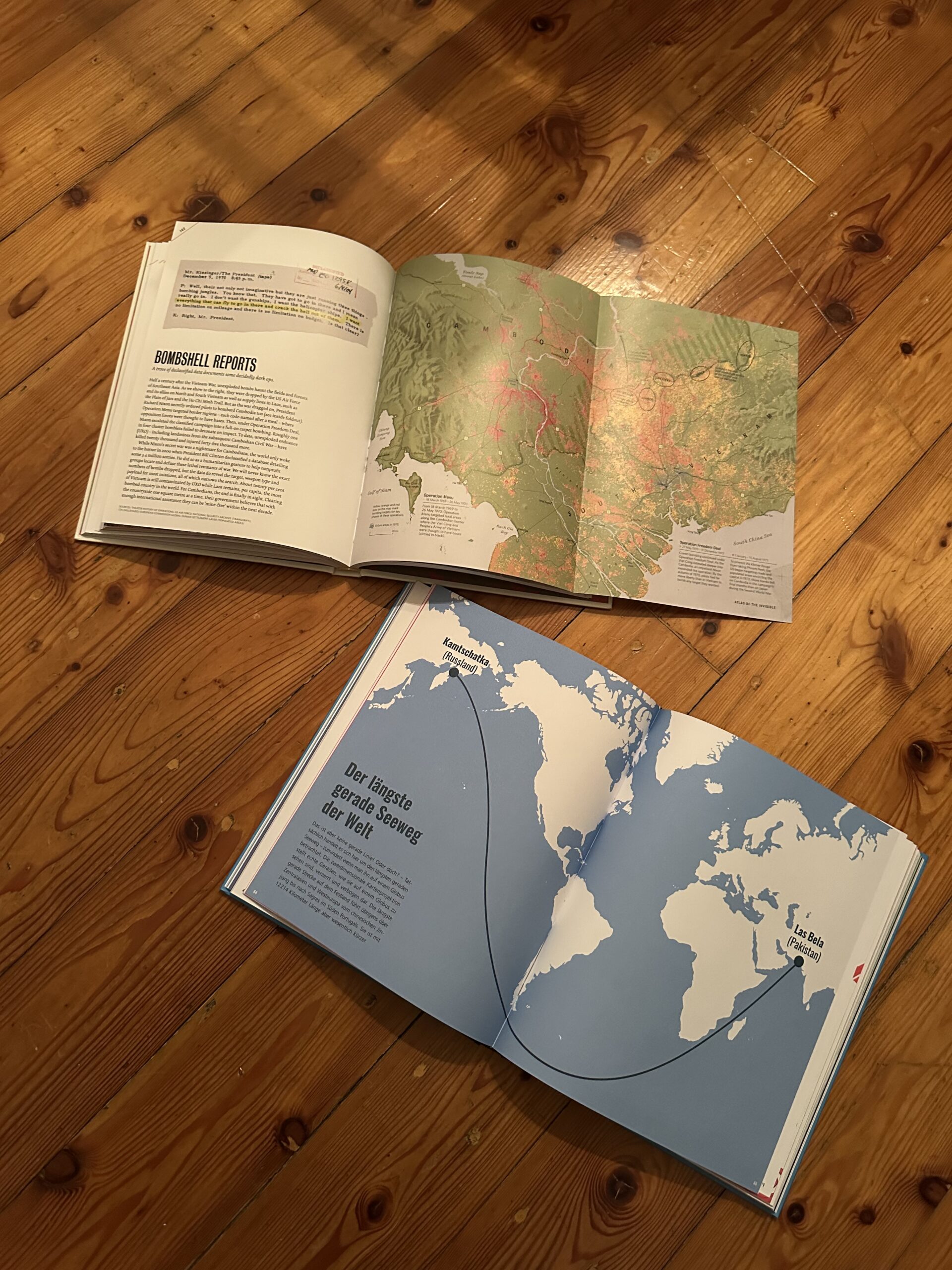
Scientific reports and raw data alone are not enough. The way we visualize and present climate risks determines whether people ignore the information or act upon it. While researching this topic, I came across two fascinating books: Atlas of the Invisible by James Cheshire & Oliver Uberti and 100 Karten, die deine Sicht auf die Welt verändern by Hoffmann & Campe. Both books illustrate how maps and data visualization can reshape our understanding of the world, revealing hidden patterns and making abstract issues tangible.
Their core message is also at the heart of RiskLIM: climate risks are not always visible, but that doesn’t mean they aren’t real. The challenge is to make them undeniable—so clear, so well-visualized, and so engaging that people feel compelled to act.


Why Visualizing Climate Risks Matters
One of the biggest challenges in climate communication is that risks often feel distant and abstract. Rising temperatures, melting glaciers, or shifting wind patterns don’t necessarily seem like urgent problems when they unfold over decades. Data alone doesn’t create urgency—visuals do.
Both Atlas of the Invisible and 100 Karten showcase how maps, diagrams, and interactive tools can help people see the connections they might otherwise overlook. These books are filled with visualizations that turn hidden global patterns into something concrete, localized, and understandable.
A striking example from Atlas of the Invisible is a map showing how global wind patterns have shifted due to climate change. Wind is invisible to the human eye, but the visualization makes it clear, urgent, and real. In 100 Karten, a similar approach is taken to show unexpected global connections—such as mapping food supply chains or the true size of countries when projections are corrected. Both books reveal that how we map the world influences how we perceive it.
This is precisely what risk communication needs to do—transform invisible environmental changes into something tangible that demands attention.
Risk Communication in Action: Lessons for RiskLIM
The RiskLIM project focuses on improving how climate risks—such as avalanches and snow loads—are communicated. But what can it learn from these books and other powerful visualizations?
NASA’s Climate Time Machine is a great example of how data can be made engaging and exploratory. This interactive tool allows users to see how sea levels, CO₂ levels, and temperatures have changed over time, making climate change undeniable. RiskLIM could apply a similar strategy by developing an interactive risk map that illustrates how avalanche or flood risks evolve over time, helping communities prepare for potential dangers before they happen.
Another example is Ed Hawkins’ “Show Your Stripes”, a simple yet powerful visual representation of global temperature trends. Instead of overwhelming people with complex graphs and numbers, this design reduces climate change to a sequence of colored stripes, moving from blue to red as the world gets warmer. The simplicity of this design makes it universally understandable. RiskLIM could take inspiration from this approach and create a visual early warning system that instantly communicates climate threats in a way that everyone can grasp at a glance.
Risk communication also needs to be personal and localized. Maps that show global trends are informative, but they often fail to create a sense of urgency. People need to see how their own homes, towns, or regions are affected to feel compelled to act. A customized local risk indicator—where users enter their location and immediately see how their area is impacted by climate risks—would make the information far more relevant and actionable.
Beyond just making climate risks visible, risk communication must also create an emotional connection. The way information is presented can mean the difference between awareness and inaction. Atlas of the Invisible and 100 Karten show that visual storytelling is just as important as the data itself. A map, when designed effectively, does more than just inform—it engages, persuades, and motivates.
From Understanding to Action: A Call for Smarter Risk Design
Climate data alone won’t change the world. But how we visualize and communicate that data can. If RiskLIM could develop an interactive map like NASA’s Climate Time Machine, or a risk indicator as intuitive as “Show Your Stripes”, it could bridge the gap between scientific prediction and public action.
Both Atlas of the Invisible and 100 Karten demonstrate that maps can challenge perceptions and change how people see global risks. They remind us that what we see—how data is presented—shapes what we believe and how we react.
The future of risk communication is not just about displaying climate data—it’s about designing it for action. By making the invisible visible, we ensure that the consequences of climate change are no longer distant or abstract, but urgent and real. The world of risk communication is evolving, and designers have a unique opportunity to shape how people see—and respond to—these challenges. Now is the time to use design as a tool for awareness, engagement, and most importantly, action.
Reference
Cheshire, James; Uberti, Oliver: Atlas of the Invisible – Maps & Graphics That Will Change How You See the World, Dublin, 2021
100 Karten, die deine Sicht auf die Welt verändern, Hoffmann und Campe Verlage, Hamburg, 2019