Proto05 // Questionnaire for donation eligibility

Creating a user-friendly questionnaire is essential for gathering valuable insights while ensuring a smooth experience for respondents. In my recent experience with the “Meine Blutspende” app, I encountered significant pain points that highlighted the importance of effective design in questionnaire development. This is why I want to specifically focus on the questionnaire part for my final prototype.

One of the main issues was the terrible formatting of the questionnaire. The red background combined with poorly chosen font colors made the text difficult to read. This lack of readability can lead to frustration and disengagement, causing users to abandon the questionnaire before completion. Proper contrast between text and background is crucial to ensure clarity and maintain user attention.

Additionally, the center-aligned text contributed to the readability problem. Left-aligned text is generally easier for users to follow, as it allows for a more natural reading flow. When designing questionnaires, it’s vital to consider typography choices and alignment to enhance user comprehension.

Another critical aspect of questionnaire design is the clarity of the questions themselves. Users should be able to quickly understand what is being asked without ambiguity. This can be achieved by using straightforward language, avoiding jargon, and breaking down complex questions into simpler, more digestible parts. Providing examples or context can also help clarify what is being asked.

Questionnaire Checklist

I’ve created a checklist for my final prototype to help me focus on the main points of creating a clear questionnaire.

  1. Clear Purpose
    • = to determine if an individual is eligible to donate blood.
    • Provide explanation: Align each question with eligibility criteria established by health authorities.
  1. User-Friendly Formatting
    • Use a clear, readable font size and style.
    • Ensure high contrast between text and background colors for readability.
    • Keep the layout simple and organized, avoiding clutter.
  1. Logical Flow
    • Organize questions in a logical sequence (personal details, health history, travel history).
    • Group related questions together (medical conditions, medications).
  1. Question Clarity
    • Use straightforward language and avoid medical jargon.
    • Phrase questions clearly to minimize confusion
  1. Question Types
    • Utilize a mix of question types (yes/no, multiple-choice) for variety and engagement.
  1. Progress Indicators
    • Progress bar or percentage indicator to show how many questions have been completed.
    • Clearly display the total number of questions at the top.
  1. User Engagement
    • Use engaging visuals or icons to make the questionnaire more appealing.
  1. Accessibility Considerations
    • Ensure the questionnaire is accessible to all users, including those with disabilities (e.g., screen reader compatibility).
    • Use simple language and avoid overly complex sentence structures.
  1. Thank You and Follow-Up
    • Conclude with a thank-you message, acknowledging the respondent’s time and effort.
    • Provide information on the next steps or how to proceed if they are eligible to donate.

Inspo

https://dribbble.com/shots/25655004-Personalized-Nutrition-Questionnaire-UI

https://dribbble.com/shots/25655004-Personalized-Nutrition-Questionnaire-UI

https://dribbble.com/shots/22995446-Form-progress-pills

https://dribbble.com/shots/9985976-Questionnaire
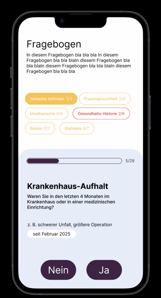
Quick design

My experience with the “Meine Blutspende” app underscored these points, demonstrating how poor design can hinder user engagement. Ignore the colors please. I’m also not sure about the category pills.

Anyway… tomorrow is my donation appointment. Let’s see how that goes. I know my last post will be late but at least I’m donating blood, what about you???

Proto04 // User Flow

Now that I’m starting to get deeper into the prototyping process I have decided to create a mind map using physical post-its to visualize the user flow. While I typically rely on digital tools like Miro or Figma for convenience, trying out physical post-its offered a refreshing change. I found that having something tangible in my hands, even if it was just paper and pen, helped boost my creative flow. Within just 10 minutes, I was able to outline the most important aspects of my app.

However, I still prefer digital methods because I enjoy drawing arrows to illustrate connections between different flows, which wasn’t feasible with post-its. For future projects, I might consider using a large sheet of paper to combine the tactile experience with the ability to create more detailed visual connections.

Something that came to mind while thinking through the process was the aspect of gamifying the donation process a little bit. I want to incorporate some statistics and maybe a point system for inviting friends to donate.

Carhartt_Treatment_Final_Final_V23

7 blog posts in and my project is already finished. Who would have thought? Not me. But nevertheless, what happened over the past weeks, and how did my project change from the beginning?

The topic, a spec commercial for Carhartt, is still the same. Also, the message I want to convey is unchanged, but the method has evolved. From fast paced, energetic cuts to slow, long standing shots that tell their own story with no need for fancy, fast edits.

I was already pretty far into my research and had laid the groundwork for the treatment, but I changed a lot of things in the meantime. The text changed partially, and the images I think completely. And after a lot of feedback, the treatment now seems very understandable. What I wanted to achieve is a treatment that directly tells the story, sets the vibe, and provides a rough guide through the scenes. Just what a treatment should do but often misses.

My previous ones didn’t work so well in comparison, in my opinion, because I now had the time and resources to put in more work and really make my vision clear, even for people who had never seen the concept before. That used to be something I struggled with. For me, my vision is always clear, but others often didn’t understand it. Not because they couldn’t, but because I communicated it poorly. Or maybe not even poorly, but I left out things that were obvious to me because I already knew them. Others didn’t.

That is definitely the biggest learning from the past month: take your time and make it clear for everyone. The client doesn’t know what you have in your head, no matter how good the idea. It must be clear with a simple PDF, understandable even for people who are not filmmakers, not photographers, not designers, but people with different backgrounds.

#6 Prototype

Reflection

At the start of this semester, I was uncertain whether to stay with my original concept or move on to something new. Now, having decided to base my project on the book Beklaute Frauen, I feel much more confident in my direction.

Engaging in conversations with others, especially conducting that first interview, was very important. It revealed to me that I might have been focusing the wrong medium for my story, which in turn led me to rethink my approach.

With these insights, I arrived at the idea of an interactive installation and was inspired by the work of audio-visual artist Philipp Artus. His translation of user input into abstract visual forms helped me see new possibilities for my own prototype.

Through the prototyping process I learned that I need to bind the narratives of these women more deeply to the visitor’s interactions, perhaps even making this connection into an auditory dimension.

Of course, all of this is based on finding an exhibition venue willing to host my work. I still need to determine whether I can secure a official exhibition spot or whether I should explore alternative ways to present the installation without one.

#6 Final Prototype and Video

Have fun with this Video to find out what my actual Prototype is.

Reflection

This project began with a vague idea to visualize CO₂ emissions — and slowly took shape through cables, sensors, and a healthy amount of trial and error. Using a potentiometer and a proximity sensor, I built a simple system to scroll through time and trigger animated data based on presence. The inspiration came from NFC tags and a wizard VR game (yes, really), both built on the idea of placing something physical to trigger something digital. That concept stuck with me and led to this interactive desk setup. I refined the visuals, made the particles feel more alive. I really want to point out how important it is to ideate and keep testing your ideas, because there will always be changes in your plans or something won’t work etc. Let’s go on summer vacation now 😎

#5 Vizualisation Refinement and Hardware Setup

Over the past few weeks, this project slowly evolved into something that brings together a lot of different inspirations—some intentional, some accidental. Looking back, it really started during the VR project we worked on at the beginning of the design week. We were thinking about implementing NFC tags, and there was something fascinating about the idea that just placing an object somewhere could trigger an action. That kind of physical interaction stuck with me.

NFC Tag

Around the same time, we got a VR headset to develop and test our game. While browsing games, I ended up playing this wizard game—and one small detail in it fascinated me. You could lay magical cards onto a rune-like platform, and depending on the card, different things would happen. It reminded me exactly of those NFC interactions in the real world. It was playful, physical, and smart. That moment clicked for me, I really like the idea that placing something down could unlock or reveal something.

Wizard Game

Closing the Circle

That’s the energy I want to carry forward into the final version of this project. I’m imagining an interactive desk where you can place cards representing different countries and instantly see their CO2 emission data visualized. For this prototype, I’m keeping it simple and focused—Austria only, using the dataset I already processed. But this vision could easily scale: more countries, more visual styles, more ways to explore and compare. Alongside developing the interaction concept, I also took time to refine the visualization itself. In earlier versions, the particle behavior and data mapping were more abstract and experimental—interesting, but sometimes a bit chaotic. For this version, I wanted it to be more clear and readable without losing that expressive quality. I adjusted the look of the CO2 particles to feel more alive and organic, giving them color variation, slight flickering, and softer movement. These small changes helped shift the visual language from a data sketch to something that feels more atmospheric and intentional. It’s still messy in a good way, but now it communicates more directly what’s at stake.

Image Reference

Image 1 (NFC Tag): https://www.als-uk.com/news-and-blog/the-future-of-nfc-tags/

Image 2 (Wizard Game): https://www.roadtovr.com/the-wizards-spellcasting-vr-combat-game-early-access-launch-trailer-release-date/

Business Management x Customer Experience x Data Visualisation: 1st prototype

In the current digital era, Customer Experience has evolved with multichannel support, chatbots, self-care, and virtual assistants to reduce customer effort, driving the development of Customer Relationship Management tools. However, while significant investments have focused on empowering AI-assisted agents, the role of managers has been largely underserved.​

I’m designing a solution to empower the “Augmented Manager”, equipping leaders with advanced tools and analytics to optimize real-time-onsite–remote-team performances and deliver outstanding results in an increasingly complex, tech-driven customer experience ecosystem.

Beside.you is a Software As A Service (SaaS) solution, is developed to simplify decision-making and boost efficiency for managers.

By solving the biggest business challenges, with intuitive functionalities simplifying Steering, Performance management, and resources’ Growth, it is shaping a future whereall business tools work seamlessly together, unlocking unmatched operational excellence for organizations everywhere.

This small demo showcases some parts of the product experience that is offered beginning with Steering on its macro micro levels:

#5 Exponat-Konzept

Die Frage “wen und wieso soll die Webseite jemanden interessieren” aufgekommen ist, tendiere ich etwas dazu, aus dem Projekt ein interaktives Exponat zu machen. Es wäre super, wenn das Teil einer Ausstellung sein könnte, in der feministische Themen einen Platz haben. Wie auch immer ich eine Ausstellung in Graz so ca im Juli-September 2026 finde, die genau meine Arbeit mit ausstellen wollen würden. Ich denke, dass Menschen die zu solchen Ausstellungen kommen, ohnehin schon ein Interesse an einer Arbeit für dieses Thema mitbringen und daher auch motiviert sind, Informationen zu den Künstlerinnen zu erhalten.

Ich finde zum Beispiel die Arbeiten von Phillipp Artus immer ziemlich beeindruckend. Er ist ein audio-visueller Künstler aus Berlin. Das erste mal habe ich vor 2 Jahren seine Arbeit Aquatics in Berlin gesehen und letztes Jahr bei Klanglicht habe ich die Arbeit Flora gesehen. Hier mehr zu seinen Arbeiten: https://philippartus.com/work

Ich finde Phillipp Artus schafft es immer sehr elegant, einen User Input über ein Interface zu abstrahieren und in eine abstrakte Weise in Form von Kunst wiederzugeben.

So könnte das Exponat aussehen

  • Intro
    ein Vogel­schwarm aus etwas Partikel ähnlichen (aber vielleicht keine Partikel weil schon so viel gesehen) formt sich langsam zu dem Schriftzug „Beklaute Frauen“, der Autorin des Buches und mich als Visualisiererin – begleitet von einem sanften, atmosphärischen Sound­scape.
  • Touch-Stele: Auswahl einer Biografie
    Auf der Stele erscheinen Porträts ausgewählter Frauen aus dem Buch als kleine Karten (wie so Spielkarten oder tarot karten? Blöde idee?).
    Ein Antippen lässt:
    • Titel und Kurz-Anekdote (1–2 Sätze) aufklappen
    • Eine generative Illustration daneben auf der Wand animieren
  • Generatives Storytelling an der Wand
    Jede Frau bekommt ein eigenes “Key Visual” – mit Infos zu:
    • ihren Lebensdaten (Jahr, Ort, Beruf)
    • einem charakteristischen Zitat
    • Durch Streichen auf der Stele kann man Parameter verändern:
      • Farbe (z. B. Pastelltöne für Schrift­stellerinnen, dunkle Töne für Wissenschaftlerinnen)
      • Bewegungsgeschwindigkeit (ruhige vs. dynamische Animationen)
  • Interaktive Timeline
    Unten an der Wand läuft automatisch eine Zeit­linie aller Protagonistinnen ab. Beim Drüberfahren hält der Zeitstrahl für die jeweilige Person an und spielt ein 15-Sekunden-Audio­snippet (Voice-Over oder O-Ton), in dem ein kurzer Lebens­abschnitt erzählt wird.

Das waren jetzt meine ersten Gedanken zur Ausstellung, es ist aber noch sehr roh und ich muss da noch viel drüber nachdenken. Bzw. wäre ich auch dankbar für die Info, ob das überhaupt realisierbar wäre. Ob es denn eine potentielle Ausstellung dafür gäbe. Klanglicht wär natürlich fetzig, aber kann mir nicht vorstellen, dass die da eine Studentin eine so große Installation machen lassen.

Hier noch ein Foto von mir mit dem Buch:

#2.06 Final Video

In this final post, I’m sharing a short video documenting the process behind the first prototype of the Focus Lamp. I started with a quick proof of concept to explore the core interaction: placing the phone in a dock to trigger a shift in light and attention. From there, I moved on to a more refined version, improving both the physical design and the technical setup.

This is still just the beginning. The prototype is far from finished, but it marks an important step in translating abstract ideas, about distraction, focus, and calm technology, into something tangible. There’s a long way to go, but I’m excited to continue exploring how physical objects can gently support more mindful and intentional use of technology.