How to „Motion Identity“ – Der Prozess

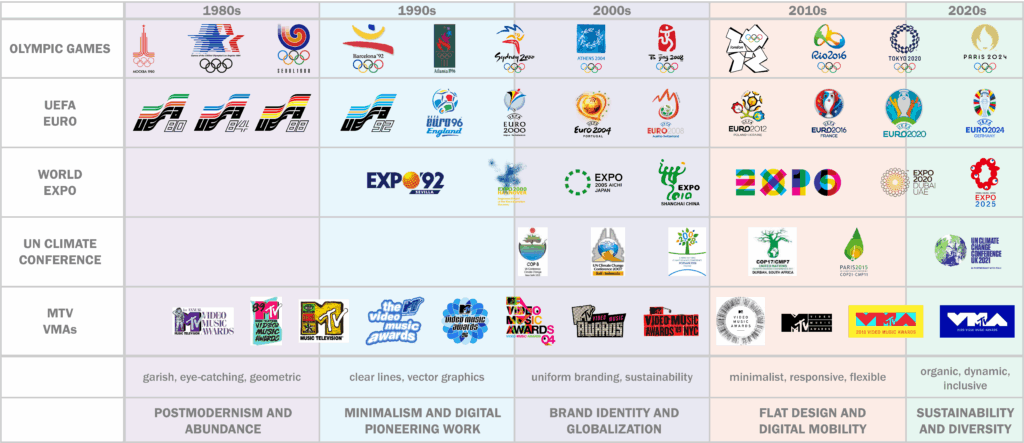
Nachdem im ersten Blogpost nur grob der Themenbereich genannt wurde, hier noch einmal offiziell: Ich werde mich in diesem Semester mit dem Thema Motion Identity beschäftigen und im Zuge dessen natürlich auch eine entwickeln. Davor gibt es aber noch einiges zu Recherchieren und zu Analysieren! Zuerst schauen wir uns den groben Prozess der Erstellung einer Motion Identity an und finden raus, was da denn alles dazu gehört!

Anders als klassisches Motion Design, das eher projektbasiert, ästhetisch/funktional gestaltet wird, geht es bei der Motion Identity um ein tieferes, systemisches Verständnis für die „Bewegungs-DNA“ einer Brand. Die Entwicklung einer professionellen Motion Identity hat verschiedene Stufen im Designprozess, der Strategie aber auch kreatives Experimentieren und technisches Know-how. In großen Braning-Agenturen wird Motion-Design und die Motion Identity schon zu Beginn des Designprozesses mit-konzipiert und beeinflusst die Brandgestaltung maßgeblich, ähnlich wie Typografie, Farben und Komposition.

In diesem Blogpost möchte ich den Workflow dokumentieren, den ich mir für dieses Projekt zurechtgelegt habe, um eine Motion Identity zu entwerfen.
Wir betrachten – weil ich noch unsicher bin worauf es schlussendlich hinaus läuft – zwei zentrale Szenarien:
1. Den Aufbau einer neuen Brand + Motion Identity von Grund auf
2. Die Integration einer Motion Identity in eine bestehende Markenwelt


Bevor es los geht schauen wir uns ein paar Beispiele an, um uns ein Bild davon zu machen, was uns am Ende dieser Reise erwartet:

Examples Motion Identitys

Deezer: https://koto.studio/work/deezer/

Spotify Wrapped: https://vucko.co/project/spotify-wrapped-2022

Faculty: https://koto.studio/work/faculty/
(guiding principles for motion: “balanced,” “straightforward,” and „bright.” >> symmetrical, light-driven ripples of color using our 50/50 threshold to make elements grow in an outwards motion from the center)
Electric Love Moodley: https://moodley.com/work/electric-love-festival-branding

Sock: https://koto.studio/work/sock/

Pairpoint https://koto.studio/work/pairpoint/

Instagram: https://www.itsnicethat.com/news/studio-dumbar-instagram-digital-120324

Motion Identity FIBA (Basketball): https://www.designmadeingermany.de/#185245

Motion identity Google Gemini: YOUTUBE Google – Welcome to the Gemini Era
https://youtu.be/_fuimO6ErKI?si=6Ds_PRxbj-LSl6ic

Netflix: https://thrumotion.com/netflix/

Zu genaueren Analysen verschiedener Motion Identities kommen wir dann wahrscheinlich später im Prozess!


Also, wie komme ich von Zero zu einer gelungenen Motion Identity:


Herangehensweise 1: Aufbau einer Brand + Motion Identity von Grund auf

Vgl. Koto 2025; Vgl. Gleave Dawncreative 2024

1. Phase: Briefing und Strategie — Das Fundament der Motion Identity

Die erste Phase bei der Erstellung einer Motion Identity besteht aus Recherche zur Marke und Positionierung. Man beginnt hoffentlich auch damit, ein detailliertes Briefing einzuholen, in dem die Stakeholder den Umfang, die Ziele, den Zeitrahmen und das Budget des Projekts definieren (Vgl. Never Sit Still o.D.).

Inhalte des Briefings:

  • Wer ist die Marke?
  • Was sind Vision, Mission und Werte?
  • Wer ist die Zielgruppe?
  • Was sind zentrale Touchpoints (Website, App, Social Media, Videos, etc.)?
  • Welche emotionale Tonalität soll die Marke vermitteln? (z. B. verspielt, ernst, exklusiv, technologisch)
  • Welche Stilistik verfolgt das statische Corporate Design bereits?
  • Gibt es bestehende audiovisuelle Markenassets?

Ziel ist es, die Positionierung und den emotionalen Markenkern zu erfassen.
„Motion reinforces a brand’s personality. To do that, you have to be very clear on just what that personality is“ (Vgl. Gleave Dawncreative 2024).

Diese Grundlage bestimmt später, welche Persönlichkeit ind den Formen oder auch Bewegungsmustern (z. B. verspielt, ruhig, präzise) entwickelt werden.
Ein hilfreiches Werkzeug wenn es um Motion geht, sind z.B. Positionierungsskalen (Vgl. Gleave Dawncreative 2024), um visuelle und motion-relevante Attribute festzulegen. Zb.

Einfach ↔ Komplex >> Klarheit vs. Vielschichtigkeit

Zugänglich ↔ Exklusiv >> Breitenansprache vs. Premium

Traditionell ↔ Modern >> Klassisch vs. Zukunftsgewandt

Verspielt ↔ Ernst >> Locker vs. Seriös

Diese Skalen beeinflussen nicht nur Farbwahl und Typografie – sondern es lassen sich auch die späteren Bewegungsverhalten (z. B. dynamisch vs. ruhig) ableiten.

Schritt 2: Entwicklung der visuellen Identität

Auf Basis der strategischen Positionierung entsteht das visuelle Designsystem (darauf wird hier nicht genauer eingegangen):

  • Logo(s)
  • Typografie
  • Farbwelt
  • Iconografie
  • Raster- und Layoutsystem
  • Grafische Elemente (z. B. Linien, Muster, Illustrationen)

Dabei ist wichtig: Schon beim statischen Design an Bewegung denken!
Wie wird sich das Logo bewegen? Wie harmoniert das Layout mit Motion Transitions?

Schritt 3: Erste Motion Exploration

Diese Phase konzentriert sich auf Forschung und Entwicklung der Bewegung. In diesem explorativen Stadium werden experimentelle Bewegungsstudien durchgeführt, um zu entdecken, wie sich bestehende Markenelemente bewegen und interagieren. Wie Never Sit Still betont, ist dieser Schritt entscheidend für die Entwicklung von Motion Principles, die die Grundlage eines Motion-Systems bilden (Vgl. Never Sit Still o.D.).  

Die Entwicklung einer klaren Botschaft für dein Motion Design wird den Großteil der Entscheidungen bestimmen. 

– Welche Geschichte soll die Bewegung erzählen? Kann sie die Markenwerte und die Persönlichkeit bzw. das Produkt oder die Dienstleistung erklären?

– Soll die Bewegung in den Produkten selbst vorkommen oder nur in der Kommunikation und im Marketing verwendet werden?

– Welche Emotionen sollen geweckt werden? Soll die Bewegung nur eine funktionale Unterstützung sein, oder soll sie ausdrucksstark sein?

– Was wollen wir an der Marke hervorheben? Ist sie mit einer bestimmten Kultur, einem Stil oder einem Genre verbunden?

Zu den wichtigsten Aktivitäten in dieser Phase gehören:  

  • Bewegungsstudien für Logo-Dynamiken, Typografie-Verhalten und illustrative Elemente.  (Wie kann das Logo auftreten/verlassen?)
  • Erstellung von Bewegungsprototypen mit verschiedenen Tools wie After Effects, oder Figma.  
  • Vergleichende Analyse mithilfe von Skalen zur Definition des Bewegungsstils: billig vs. teuer, verspielt vs. ernst, traditionell vs. modern (Vgl. Gleave Dawncreative 2024). 
  • Emotionale Mapping: Welche Art von Bewegung erzeugt das gewünschte Gefühl? Welche Art von Energie soll die Marke vermitteln?
    (Welche Bewegungsstile spiegeln die Marke?
    Verspielt = bounce, unvorhersehbare Bewegungen; Premium = langsam, subtil, minimal; Technologisch = präzise, linear, geometrisch)

Schritt 4: Entwicklung der Motion Principles

Dieser Schritt überführt das Experimentieren in ein kohärentes System. Motion Principles definieren wie Bewegung das Verhalten und den Tonfall der Marke unterstützt, während Motion Mechanics spezifische Animationsstile und -verhalten beschreiben (Vgl. KOTO 2025).  

Motion Principles definieren typischerweise:  

– Geschwindigkeit und Rhythmus (langsam, schnell, elastisch)  

– Richtung und Bewegungsachse  

– Energiedynamik (hüpfend, fließend, scharf)  

Motion Mechanics umfassen:  

– Spezifische Techniken wie Slide-Ins, Bounce-Ins, Fade-Outs, Zooms  

– Easing-Funktionen (ease-in, ease-out, ease-in-out, linear)  

– Wiederholende Verhaltensweisen (Oszillation, Pulsation, Rotation)  

Diese Definitionen gewährleisten Konsistenz über alle Formate und Ausgaben hinweg. Dieser Grundbauplan für das spätere System ist vergleichbar mit einem Styleguide für visuelle Gestaltung. (Vgl. Never Sit Still o.D.; Vgl. IBM Design Language 2023)

Schritt 5: Aufbau eines Motion Systems

Sobald die grundlegenden Prinzipien festgelegt sind, ist eine Verfeinerung erforderlich, um Skalierbarkeit und Praktikabilität sicherzustellen. Basierend auf den Prinzipien entsteht also das Motion System: Ein systemischer Baukasten, der genau definiert, wie sich welche Elemente bewegen.

Beispielhafte Module:

  • Logoanimation
  • Typo-Ein- und Ausblenden
  • Übergänge zwischen Content-Blöcken
  • Lower Thirds
  • UI-Elemente: Buttons, Toggles, Formfelder

Auch die Easing-Kurven werden standardisiert:
(z. B. ease-in-out für organische Übergänge, bounce für dynamischen Effekt)

Tipp: Entwickle „Motion Mechanics“ – wiedererkennbare Bewegungsmuster mit Alleinstellungsmerkmal.

Zu dieser Phase gehört:  

– Testen über verschiedene Plattformen hinweg (Web, Mobile, Video, Print)  
– Anpassung der Bewegungsparameter basierend auf Nutzerfeedback und Zugänglichkeitsstandards  
– Festlegung von Bewegungs-Hierarchien (z. B. primäre Bewegungen für große Übergänge, Mikro-Interaktionen für UI/UX)  (Vgl. Never Sit Still o.D.). 

Bestandteile eines Motion Systems:

  • Timing-Logik (Geschwindigkeit, Taktung)
  • Easing-Kurven (z. B. ease-in, ease-out, linear)
  • Transitions (Ein-/Ausblendungen, Slide-Ins etc.)
  • Standardanimationen (Hover, Click, Load, Scroll)
  • Typografie-Animationen (Fade, Scale, Slide, Letter-by-Letter)
  • Logoanimationen
  • Formfeedback-Animationen (Fehler, Erfolg)
  • Soundintegration (falls vorgesehen)

Example Motion-Guidelines:

Klarna: https://brand.klarna.com/motion#wordmark-animation 
Vevo: https://brand.vevo.com/motion/
Github:  https://brand.github.com/motion-identity/motion-guidelines

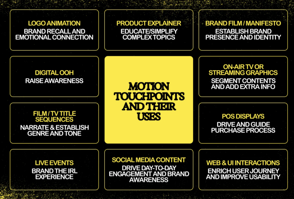
Zu berücksichtigende Motion-Touchpoints

Es gibt eine große Bandbreite an Motion, die in unterschiedlichen Kontexten und mit unterschiedlichen Absichten eingesetzt werden kann.

Bei der Entwicklung eines Motion-Systems oder der Guidelines ist es hilfreich, eine Vorstellung davon zu haben, wie Marken typischerweise mit Bewegung umgehen. Hier also ein kleiner Cheat-Sheet von KOTO (https://offbrandkoto.substack.com/p/reel-talk-the-power-of-branded-motion), der die typischsten Anwendungsfälle für Motion in einer Brand festhalten.

https://offbrandkoto.substack.com/p/reel-talk-the-power-of-branded-motion

Schritt 6: Erstellung eines Motion Toolkits

Ein Toolkit sorgt für die Skalierbarkeit und Anwendung im Alltag:

  • Templates. & Animationsvorlagen  (z. B. Social Clips, Präsentations-Openings)
  • Masterdateien/Quelldateien (After Effects, Figma, Lottie JSON)
  • Motion Guidelines als PDF mit detaillierten Bewegungsprinzipien, -mechaniken und Anwendungsbeispielen (inkl. Timing-Tabelle, Easing-Library)
  • Komponentenbibliothek
  • ev ein Präsentationsdecks für interne und externe Stakeholder (Vgl. Never Sit Still o.D.)  

Dadurch wird die Anwendung im Team vereinfacht – von Design bis Video Editing. Dieses Toolkit ist entscheidend für die Markenkonsistenz, insbesondere wenn mehrere Teams oder Agenturen an der Inhaltsproduktion beteiligt sind. 

Schritt 7: Anwendung & Testing

Nun erfolgt der Rollout in allen Medienformen. Die Anwendung des Motion-Identity-Systems in realen Szenarien ist der ultimative Test für seine Wirksamkeit. Dazu gehören:  

  • Website und App-Interaktionen  (Hover-Zustände, Button-Klicks, Seitenübergänge)  
  • Social Media Content  (Intro/Outro-Karten, kinetische Typografie, animierte Infografiken)  
  • Videoproduktion (Intros, Outros, Transitions)
  • Broadcast- und Präsentationsvideos, Pitchdecks (Logo-Animationen, Erklärvideos, Lower Thirds)  

Schritt 8: Pflege & Weiterentwicklung

Motion Identities sind kein statisches Projekt – sie leben mit der Marke mit. Marken entwickeln sich weiter, und das sollte auch ihre Bewegungssprache tun. Bewegungssysteme solltenmodular und erweiterbar sein, um sich an zukünftige Markenerweiterungen und neue technologische Medien anzupassen (Vgl. KOTO 2025).  

Regelmäßige Audits und Feedback-Zyklen können helfen:  

– Veraltete Bewegungs-Assets zu identifizieren  

– Die Zugänglichkeit und das Nutzererlebnis zu verbessern  

– Sich an sich ändernde Markenstrategien anzupassen  

  • Feedback sammeln (User, Team, Performance-Metriken)
  • Iterativ optimieren
  • Neue Templates anlegen
  • Plattformanforderungen anpassen

Tipp: Auch Accessibility-Kriterien (z. B. „reduce motion“ Systemoptionen) sollten regelmäßig geprüft und angepasst werden.

Herangehensweise 2: Integration einer Motion Identity in eine bestehende Marke

Vgl. Gleave Dawncreative 2024; Vgl. Never Sit Still o.D.

Schritt 1: Analyse der bestehenden Marke

Zunächst muss klar sein:

  • Was ist die aktuelle Markenpersönlichkeit?
  • Welche Emotionen vermittelt das Design?
  • Welche Positionierung liegt vor?

Positionierungsskalen helfen auch hier zur Einordnung: „Wenn die Marke ernst, minimal und technologisch wirkt – wie muss dann Bewegung gestaltet sein?“ (Siehe oben)

 Schritt 2: Motion Audit

Gibt es bereits Bewegungen?

  • Videos?
  • Microinteractions im Interface?
  • Transitions?

Oft zeigt sich: Es gibt Inkonsequenz, die durch ein konsistentes Motion System gelöst werden kann.

Schritt 3: Motion-Ziele definieren

  • Welche Funktion soll Motion erfüllen?
    • Storytelling?
    • UX-Optimierung?
    • Brand Recognition?
  • Welche Emotion soll transportiert werden?
  • Wo soll Bewegung auftreten – wo nicht?

 Schritt 4: Motion Prinzipien festlegen

Basierend auf der bestehenden Brand:

  • Easing-Typen
  • Timings
  • Energielevel
  • Animationscharakter

Wichtig: Bewegung muss das ergänzen, was die visuelle Marke vorgibt.
[Details siehe Prozess oben]

 Schritt 5: Animation der zentralen Brand-Elemente

[Details siehe Prozess oben]
Alle weiteren Schritte wie oben


Und “few common mistakes to avoid” als Liste von KOTO (Vgl. KOTO 2025):

Don’t overdo it: Too much or overly flashy motion can be distracting. Treat motion like any other design element—focused and intentional. Always return to your strategy to create meaningful movement instead of digital clutter.

Don’t neglect the bigger picture: Every piece of motion should align with your overall strategy and strengthen your brand identity. Ignoring this can weaken your brand’s impact.

Don’t underestimate quality: If you don’t have the resources for high-quality motion design, stick with polished static designs. A professional-looking static asset is always better than poorly executed motion.

Accessibility is key: Motion design should include everyone. Add audio captions where needed and use Harding-FPA tests to ensure flash-heavy videos are safe for those with epilepsy.

Zirka so würde ich im Prozess dann auch vorgehen… hoffe ich! Wir werden sehen!
Weiter geht es damit, Inspiration zu sammeln und eine Brand zu (er-)finden, mit der ich arbeiten möchte!

Quellen:

  • KOTO 2025
    KOTO (18.02.2025): Reel talk: the power of branded motion design. In: offbrandkoto, https://offbrandkoto.substack.com/p/reel-talk-the-power-of-branded-motion (zuletzt aufgerufen am 16.03.2025)
  • Never Sit Still o.D.
    Never Sit Still (o.D.): Motion Branding. In: Never Sit Still, https://neversitstill.com/motion-branding(zuletzt aufgerufen am 16.03.2025)
  • Gleave Dawncreative 2024
    Amy Gleave (05.07.2024): Building a motion identity. In: dawncreative, https://www.dawncreative.co.uk/insight/building-a-motion-identity/ (zuletzt aufgerufen am 16.03.2025)
  • Dickinson 2024
    Dickinson, Peter (13.03.2024): How do we understand Motion Design, Motion Identities, and Motion Systems: Enhancing Brand Presence. In: Linked.in, https://www.linkedin.com/pulse/how-do-we-understand-motion-design-identities-systems-peter-dickinson-uzbje/ (zuletzt aufgerufen am 16.03.2025)

    *Zuhilfenahme von ChatGPT: Die KI wurde zur Übersetzung, Korrektur und Formulierungshilfe von Texten verwendet. Alle Inhalte wurden anschließend eigenständig ausgewertet, überarbeitet und in den hier präsentierten Beitrag integriert.

Motion Identity – Was, Warum, Bedeutung

Motion Identity
Was, Warum, Bedeutung

Wir leben in einer zunehmend visuell überladenen, lauten und digitalen Welt.
Sei es Social Media, Web oder täglich benutzte Apps und „In a world where watching big screen while holding little screen is a relatable feeling, motion is essential, not optional.“ (Vgl. KOTO 2025).


Deshalb wird auch von Brands und Marken erwartet, dass sie auf dynamische, einprägsame und emotional ansprechende Weise mit ihrem Publikum kommunizieren. Viele Marken tendieren immer noch dazu, erst an ihre Motion-Language zu denken, wenn sie plötzlich einzelne bewegte Elemente brauchen, weshalb es oft keine oder wenig Guidelines dafür gibt. Brands starten deshalb jedes mal aufs neue von Null, wenn es um die Konzeption bewegter Elemente geht, was den Prozess ineffizient macht und in einer „moving-image-first“-Welt durchaus für Schwierigkeiten sorgt. Hier kommt die Motion Identity (auch bekannt als Motion Branding oder Motion Design Systems) ins Spiel. 


Was ist Motion Identity?

Die Motion Identity ist ein Teil der Visual Identity eines Unternehmens und bezieht sich auf die gezielte und strategische Anwendung von Motion Design auf verschiedene Markenelemente.

Bewegung wird so als wichtiger Kern-Bestandteil der Markenidentität (Corporate und Visual Identity) betrachtet. Während klassische Markenidentitäten primär visuelle Komponenten wie Logo, Typografie, Farben oder Bildsprache definieren, erweitert eine Motion Identity diese Elemente um eine bewegte und dynamische Dimension: Sie beschreibt, wie sich eine Marke bewegt – also, wie sich Logos, Typo, Icons, Layouts und visuelle Elemente im digitalen Raum verhalten (Vgl. KOTO 2025).

Diese Bewegungsmuster sind nicht nur Deko, sondern kommunizieren die Werte, den Charakter und die Haltung einer Marke auf eine subtile und emotionale Art. Die Bewegungen sind wiedererkennbar, präzise definiert und konsistent über alle Kanäle/Touchpoints hinweg.  Man nennt es auch eine „Motion Language“ – ein Set aus Bewegungsprinzipien, das über alle Kanäle hinweg Anwendung findet.

Ein solches System entsteht nicht zufällig, sondern durch exploratives Design und präzise Definition in Form von Motion Guidelines, Toolkits und definierter Animationstechniken. (Vgl. Never Sit Still o.D.)

Warum ist eine Motion Identity wichtig?

Wir leben in einer „motion-first world“: Marken werden heutzutage überwiegend in digitalen und bewegten Kontexten wahrgenommen, sei es in Apps, auf Websites, durch Reels, TikToks, Instastories, Showcases, Onboarding Screens oder Werbevideos. Die Ära der rein statischen Corporate Identity naht dem Ende und was früher als eine Ergänzung der Markenidentität galt, ist heute einer der erste Kontaktpunkte: Motion. (Vgl. KOTO 2025)
Bewegung wird immer mehr zu einem der primären Informationsträger. Im Gegensatz zu statischen Branding-Elementen fangen Bewegungselemente die Aufmerksamkeit der Betrachter:innen viel schneller ein, vermitteln Emotionen mit zusätzlichen Nuancen und schaffen immersive Markenerlebnisse. (Vgl. Gleave Dawncreative 2024)

Motion Identity spielt eine entscheidende Rolle bei der Steigerung der Markenwahrnehmung. Wenn sie effektiv umgesetzt wird, fördert sie die Wiedererkennung, verstärkt zentrale Markenbotschaften und verbessert das Nutzererlebnis. (Vgl. KOTO 2025).  

Motion Identity überbrückt auch die Lücke zwischen Storytelling und Branding, denn Motion Design und Bewegung ist wie dafür geschaffen, Geschichten zu erzählen. Storytelling kann den Wert eines Produktes um bis zu 2706% steigern (https://www.go-globe.com/storytelling-statistics-trends-infographic/#:~:text=Furthermore%2C%20research%20indicates%20that%20stories%20have%20the%20potential%20to%20boost%20product%20perception%20by%202%2C706%25), und schon minimale Transitions (zB im Logo) können eine eben solche Geschichte erzählen! (Vgl. KOTO 2025)

Ein starkes Motion-System bietet einen Rhythmus und Stil, der emotional mit den Nutzern resoniert und den Charakter der Marke symbolisiert. An einem heruntergebrochenen Beispiel erklärt, könnte eine Premium-Marke langsame, sanfte und bewusste Bewegungen und Übergänge verwenden, um Eleganz und Raffinesse zu vermitteln, während ein Tech-Startup schnellere, modularere Bewegungsverhalten einsetzen könnte, um Agilität und Innovation zu signalisieren (Vgl. Gleave Dawncreative 2024).  

Vorteile von Motion Identity:

  1. Emotionale Wirkung: Motion ruft sofort eine emotionale Resonanz hervor und transportiert Tonalität und Markenwerte genauso schnell und sogar schneller als Text oder Farbe.
  2. Erhöhte Wiedererkennbarkeit: Logoanimationen, gut eingesetzte Bewegungsmuster oder Transitions erhöhen den Wiedererkennungswert, besonders auf Social Media oder im UX-Kontext.
  3. Informationsvermittlung: Animation unterstützt die kognitive Verarbeitung, denn sie können Hierarchien deutlich aufzeigen, Abläufe erklären und Nutzer:innen durch komplexe Inhalte führen.
  4. Differenzierung: In einem überladenen digitalen Umfeld ist Bewegung ein starker Differenzierungsfaktor und eine eigene Motion Identity hilft womöglich dabei, sich von der Konkurrenz abzuheben.
  5. Anpassen ist einfach: Motion-Systeme können in allen Formaten flexibel angewendet werden – von Microanimation bis Showreel
  6. Consistency in UX: Bewegungsmuster können Navigation, Feedbackmechaniken und Benutzerführung standardisieren und verbessern, was besonders in Apps und auf Websites wichtig ist.

Motion ist also mehr als nur ein Stilmittel – Es ist ein strategisches Werkzeug im Branding (der Markenbildung). „Motion reinforces a brand’s personality“ – das bedeutet, dass die Art der Bewegung genau auf die Markenwerte abgestimmt sein muss: verspielt, klar, ruhig oder dynamisch. Eine einfache Slide-in-Animation kann professionell oder verspielt wirken – je nach Kurvengeschwindigkeit, Timing, Form oder Typo. (Vgl. Gleave Dawncreative 2024)

How much motion does a brand need?

Nicht jede Marke braucht spektakuläre Animationen. Die Menge an Animation hängt von der Persönlichkeit der Marke und vom Anwendungskontext ab:

  • Low-Motion – Animierte Brand-Assets:  Schon ganz dezente Bewegungen können die Werte einer Brand vermitteln, z. B. durch typografische Transitions oder reduzierte Logoanimationen. Startet man mit den Basics und dem Motto „Keep it simple“ reicht es schon, sich mit dem Logo, Symbolen und ev. Überschriften zu beschäftigten
  • Mid-Level Motion – Motion Systems: Man empfiehlt immer zumindest das basis-level an Motion in einem Branding zu beachten, ultimativ lassen sich aber schnelle und praktische Sets und Systeme für Motion erstellen. Diese sogenannten Motion Systems machen es einfacher, die Bewegungen „up-zu-scalen“, ohne dauerhaft Dinge neu erfinden zu müssen. Durch ein Set an Assets rund um das Thema Motion, kann so vieles abgeleitet werden.
  • High-Motion Brands — Guidelines und Toolkits: Marken mit vielen digitalen Kontaktpunkten (wie Tech-, Media- und Lifestyle-Unternehmen) brauchen oft eine sehr ausgeprägte Motion Identity und ein gut anwendbares Motion System.
    Es bietet sich an „accessible and straightforward“ Guidelines zu entwickeln, die dem Team und allen Beteiligten erklärt, wie sich die Brand bewegt. Das stärkt nicht nur das Brand-System, es ermglicht auch ein flexibles Anpassen und Erweitern.
    Sogenannte Motion Toolkits werden für „motion-heavy industries“, wie Live-TV verwendet. Hier werden editierbare, automatisch anpassbare oder sich ständig updatende Dateien erstellt, die schnell (oder sogar in Echtzeit) mit Daten und Eingaben arbeiten. 

Die Regel lautet wie so oft „As much motion as necessary – not as much as possible.“, denn zu viel Animation wirkt überladen und kann ie Nutzer:innen wie auch die Technik überfordern. Ziel ist es, genau so viel Bewegung einzusetzen, wie es der Markenbotschaft, der Plattform und dem Publikum entspricht.

Motion Design vs. Motion Identity vs. Motion System

Das hier ist auch der richtige Moment um die Begriffe ein wenig voneinander zu differenzieren:

Motion Design, ist die Gestaltung einzelner bewegter Inhalte – z. B. Videos, Transitions oder Animationen. Hier liegt der Fokus auf der Kreativität und visueller Umsetzung.
Motion Identity, ist die strategisch definierte Bewegungssprache einer Marke – Sie ist systematisch, konsistent und auf Markenwerte abgestimmt und damit ein Teil der Markenidentität.
Motion Systems sind technisch-kreative Frameworks die aus Prinzipien, Guidelines, Tools und Templates bestehen. Sie definieren, wie und wo Bewegung markenkonform eingesetzt werden können. (Vgl. Dickinson 2024)

Schlüsselelemente eines Motion-Identity-Systems   

–  Motion Principles: 
Grundlegende Regeln, die die Verwendung von Bewegung über verschiedene Markenelemente hinweg steuern. Sie definieren Timing, Geschwindigkeit, Richtung und Easing-Kurven. 

–  Motion Mechanics: 
Spezifische Techniken wie Slide-Ins, Fade-Outs, Bounce-Effekte, Skalierung und Rotation, die ein visuelles Vokabular für Bewegung bieten. 

  • Motion Behavior: 
    Die kinetische Signaturpersönlichkeit einer Marke – ihr Rhythmus, Tempo und ihre Elastizität.  
  • Anwendungsrichtlinien: 
    Diese gewährleisten die Konsistenz bei der Anwendung von Bewegung über digitale, gedruckte und umgebungsbezogene Touchpoints hinweg (Vgl. KOTO 2025; Vgl. Never Sit Still o.D.).  

Abschließend ein Bild mit ein paar der wichtigsten Touchpoints der Motion Identity:

https://offbrandkoto.substack.com/p/reel-talk-the-power-of-branded-motion

Conclusioooo

Motion Identity nicht mehr nur eine oberflächliche, ästhetische Verbesserung, sondern viel mehr ein zentraler Bestandteil moderner Markensysteme! Sie verleiht einer Marke eine Stimme und verbessert sowohl die visuelle Kommunikation als auch die Nutzerinteraktion. Da sich die digitalen Medien immer weiter entwickeln, wird auch die Motion Identity eine immer wichtigere Rolle in der Bereitstellung konsistenter, emotional ansprechender und user-centered Marken spielen.

Recommendation: Read “OFF Brand Reel talk – The power of branded motion design”, because it might just be all one needs to know, like WOW! https://offbrandkoto.substack.com/p/reel-talk-the-power-of-branded-motion

Quellen:

*Zuhilfenahme von ChatGPT: Die KI wurde zur Übersetzung, Korrektur und Formulierungshilfe von Texten verwendet. Alle Inhalte wurden anschließend eigenständig ausgewertet, überarbeitet und in den hier präsentierten Beitrag integriert.

2.1 Summary Semester 1 // Evolution of Graphic Design Review

Overview Logo Evolution 1980s – 2020s


1980s – Postmodernism and Abundance

Design Traits: Bright neon colors, geometric shapes, cluttered patterns
Influences: Pop culture, Memphis style, commercialization
Impact on Events: Bold, colorful logos (e.g., 1984 LA Olympics)

1990s – Minimalism and Digital Pioneering Work

Design Traits: Clean lines, vector graphics, early digital design
Influences: Rise of the internet, software like Photoshop & Illustrator
Impact on Events: Simpler, cross-media logos (e.g., FIFA, early COP branding)

2000s – Brand Identity and Globalization

Design Traits: Flexible, consistent branding, early flat design
Influences: Global market demands, focus on sustainability
Impact on Events: Unified branding for global events, emphasis on eco-consciousness

2010s – Flat Design and Digital Mobility

Design Traits: Flat, clear, mobile-optimized, responsive logos
Influences: Material Design, digital-first approach
Impact on Events: Interactive, media-adaptive designs (e.g., Olympics, World Expos)

2020s – Sustainability, Diversity

Design Traits: Organic shapes, inclusive visuals, dynamic logos
Influences: Sustainability, diversity, emotional connection
Impact on Events: Logos reflect global awareness and inclusion (e.g., COP, Expos, MTV becomes more subdued)

From Idea to Concept – The Final Project

After deciding to focus on 3D audio, I began shaping the project into a concrete concept. The result? Echoes of Addiction – Breaking Boundaries Through 3D Audio, a 3D audio concept album that explores addiction and dependency through immersive sound design and innovative production techniques.

The idea behind the album is to take listeners on an emotional journey, sonically representing different phases of addiction – from denial and isolation to dependency and recovery. Through spatial sound placement, dynamic movement, and immersive textures, I aim to create an auditory experience that goes beyond traditional music production. The goal is to make the emotional states of addiction tangible through sound.

Sound Design as a Narrative Tool

To achieve this, I will experiment with various sound design techniques that enhance the themes of the album. Some examples may be:

  • Ambisonic and Field Recordings: Capturing real-world environments and spatial depth to create immersive atmospheres that reflect emotional states. For example, the feeling of isolation could be represented by a vast, empty soundscape with distant, echoing voices.
  • Granular Synthesis: Breaking down recorded sounds (e.g., vocals, guitars, ambient noises) into tiny grains, which can be stretched, scattered, and manipulated across the 3D space to create a fragmented, distorted reality—symbolizing confusion or addiction-induced dissociation.
  • Spectral Processing: Transforming recognizable sounds into ghostly, abstract versions of themselves to reflect loss of control and mental instability. For instance, vocals could be decomposed and restructured into eerie, flickering echoes, representing the overwhelming thoughts in an addict’s mind.
  • Modulation and Dissonance: Using amplitude and frequency modulation to create tension, while the interplay between dissonant and consonant harmonies mirrors the chaos and clarity within the addiction cycle.
  • 3D Audio Movement: Sounds will not remain static but move dynamically around the listener, reinforcing the psychological aspects of addiction. A whisper circling the head, for example, could represent obsessive thoughts or withdrawal-induced paranoia.

By combining these techniques, I want to push the boundaries of what a concept album can achieve. The sound design will not only shape the individual songs but also serve as a connective tissue, creating transitions and atmospheric interludes that guide the listener through the emotional arc of the album.

Bringing the Project to Life

From a technical standpoint, I will work with both Ambisonics and Dolby Atmos to create a fully immersive experience. The challenge will be to ensure that the album translates well across different formats – from 3D speaker setups to binaural headphone mixes and even standard stereo. This will allow as many people as possible to experience the album’s message and emotional depth.

The production process will follow a structured timeline:

  1. Research & Concept Development – Deep diving into 3D audio techniques and defining the sound design approach.
  2. Songwriting & Pre-Production – Refining compositions while experimenting with 3D audio integration.
  3. Recording & Sound Design – Capturing performances, field recordings, and designing immersive sonic textures.
  4. Mixing & Finalization – Creating the 3D audio mix, testing binaural and stereo compatibility, and refining the album’s overall sonic identity.

This project is more than just an academic exercise; it is an artistic statement that merges my passion for music, immersive sound, and storytelling. Now that the concept is finalized, the next step is bringing Echoes of Addiction to life.

A Sudden Change of Direction – A New Focus on 3D Audio

Sometimes, things change unexpectedly – and that’s exactly what happened with my master’s project. I had already explored different ideas, including building my own studio monitors or a binaural microphone. But then, my focus suddenly shifted.

For some time now, I’ve been deeply fascinated by 3D audio and how sound can be experienced not just in stereo but in a fully immersive space. The more I explored the topic, the more I realized that this was something I truly wanted to dive into. However, making the final decision wasn’t easy.

About two weeks before my project expose was due, I had an inspiring conversation with Mr Sontacchi. His words gave me the confidence I needed and reinforced my belief that my growing interest in 3D audio was not just a temporary fascination but a real opportunity for my master’s project. This conversation gave me the final push to fully commit to this idea.

Then, I had an epiphany: Why not connect this passion with something I already love? My band, Flavor Amp, is currently working on a concept album about addiction and dependency. Since we want the music to be deeply emotional and immersive, integrating 3D audio into the production seemed like the perfect way to amplify the storytelling aspect of our songs.

Instead of focusing on hardware development, I decided to explore how 3D audio combined with Sound Design can enhance emotional storytelling in music. I want to experiment with different techniques, from Ambisonics to Dolby Atmos, and find out how spatial sound design can strengthen the narrative of our album.

This decision was a turning point for me. It wasn’t just about choosing a project; it was about following a passion that connects my studies, my creative interests, and my band’s music. The next step? Developing a concrete plan and shaping the project into something truly meaningful.

Narrowing Down My Project Ideas

At first I have to say that it was really hard for me to find a topic because I had not enough time to think about it and it’s a hard decision. But there are two main topics which I’m really interested in:

  • Developing and building my own microphone – “Kunstkopf Mikrofon” – like the Neumann KU100
  • Developing and building my own studio monitors

At the moment, I’m focusing more on the studio monitors, that’s the reason why I chose this topic for my second blog post. But I have to say that I’m not 100% sure which topic I will choose.

The “studio-monitor-project” combines my passion for sound quality with a desire to better understand the technical and artistic nuances of audio production. While I am new to the technical aspects of speaker design, I am excited to explore this field and gain knowledge in this area.

Core Purpose

The core purpose of my project is to create a pair of high-quality, custom studio monitors that I can use in my personal work. This project allows me to explore the intersection of acoustics, design, and audio technology.

Goals

  • Technical Learning: Build a foundational understanding of speaker design, including acoustic principles, driver selection, cabinet construction, measurements, …
  • Practical Application: Design and assemble functional monitors using ready-made drivers, amplifiers, and other components
  • Innovative Elements: Integrate an innovative aspect into the design. I’m still considering ideas such as using sustainable materials, exploring transaural speaker technology, or creating a modular design for easy upgrades and customization
  • Aesthetic and Functional Design: Create a design that balances professional audio quality with aesthetic appeal
  • Documentation and Sharing: Document my process and share it with people, which are interested in this topic

Relevance

This project holds personal significance for me as it helps me to widen my horizon and to dive into a (for me) unknown topic, which I’m really interested in. On a broader scale, it explores how accessible and customizable high-quality audio solutions can be created by individuals. Adding an innovative aspect also makes this project suitable for this FH-project, such as sustainability and evolving audio technologies.

Reference Works

I have drawn inspiration primarily from:

  • A project report from the Institute of Electronic Music and Acoustics (IEM), which provided valuable insights into transaural audio
  • Discussions and shared experiences in DIY speaker forums, where enthusiasts offer practical advice and troubleshooting tips

Planned Work Techniques

To structure my approach, I’ve broken the project into distinct phases:

  1. Research Phase: Deepen my understanding of acoustic principles and explore potential innovative aspects like sustainability or modularity
  2. Concept Phase: Create a mind map of possible designs, features, and materials
  3. Design Phase: Finalize the cabinet shape and dimensions, select drivers, and identify suitable amplifier modules
  4. Prototyping Phase: Build a prototype, test the sound, and refine the design
  5. Final Construction and Testing: Build the final version, measuring, measuring, measuring…

Open Questions

Several challenges remain, such as:

  • Deciding which project I’m going to choose

In terms of the “studio-monitor-project”:

  • Deciding which innovative aspect to prioritize and how to implement it effectively
  • Ensuring compatibility between all components
  • Balancing budget constraints with the desire for high-quality components

Over the next few weeks, I plan to:

  1. Decide for a project
  2. Research…

01_Exploring Projection Mapping: The Start of the Journey

Why Projection Mapping?

I’ve been interested in projection mapping for a while now, but I never got around to trying it so far. It always seemed like one of those things that required a lot of technical knowledge, and I wasn’t sure where to start. This semester, I finally decided to change that and use it as my practical project. My plan is to document the whole process—from figuring out the basics to creating a finished projection. Since I have no experience with projection mapping or the software involved, I will be starting completely from the start. 

The idea would be to project onto different kinds of flower bouquets hereby working with a different more organic shape to project onto That makes things a bit more difficult because flowers aren’t flat, so I’ll need to be more precise to make it work and maybe do a bit of trial and error to achieve the visuals I want. But before I even get to that part of the project, I need to figure out which software I will be learning to use for this project.

Right now, I don’t have a clear concept yet, just a rough idea of the direction I want to go in. I know I want to create something immersive and simply learn more about projection mapping. I like the contrast between nature and digital projections, and flowers seem like an interesting choice because they’re delicate and always changing. That also makes them a challenge, since most projection mapping is done on flat, static surfaces. I have no idea how well this will work, but that’s part of the reason I want to give it a try.

When researching projection mapping, I quickly realized that there are a lot of ways to approach this but also a lot of different softwares to learn and use. Three of the most commonly used programs that spoke to me are MadMapper, Resolume, and After Effects. Each of them has a different focus, so choosing the right one depends on the specific needs that it can be used for.

Choosing the Right Software

  • MadMapper for example is one of the most well-known tools for projection mapping. It’s designed specifically for this purpose, making it a strong candidate. It allows users to easily map visuals onto different surfaces, and from what I’ve seen so far, it seems relatively intuitive when starting to learn it.
  • Resolume is often used by VJs and performers who need real-time video editing and projection. It has strong capabilities for live performances, which makes it different from MadMapper. However, I’m not sure if it’s the best option for a pre-planned, artistic projection onto flowers and it also seems a bit more complex to get into as a beginner.
  • After Effects is an industry-standard tool for animation and motion design. While it’s not a projection mapping software per se, it allows for highly detailed animations. The downside is that it doesn’t work in real-time, meaning I’d need to pre-render all visuals before projecting them onto the surfaces I plan on using. This could be fine in general however when using different flowers I would constantly have to go back and forth. 

My next step will be to test them out and see how they function in practice. I expect that hands-on experimentation will give me a clearer idea of which tool fits best.

First Practical Steps

To get started with the practical part, I plan to do some small projection tests. Rather than jumping straight to mapping onto flowers, I will begin with a flat surface as they are easier to start with. This will help me understand the basic workflow of the software I choose and allow me to focus on the technical side before adding any more complexity to the whole project.

When starting to test simple projections, I will create a basic shape or animation and project it onto a blank wall or another flat surface to understand how the software works. Following that, I want to experiment with 3D surfaces. Once I am more comfortable with flat surfaces, I will move on to objects with different textures and shapes to see how projection mapping handles uneven surfaces. Another option would be to try different software, where I could compare MadMapper, Resolume, and After Effects to see which one feels most intuitive and produces the best results. However, I might already decided what platform I want to use based on the previous research I did for each of them. After deciding on the software, I will begin designing the visuals for my projection that will be later used for the flowers. Following that will be a lot of trying out and testing, supported by learning from different tutorials and research.

Challenges and Considerations

One of the biggest challenges I think I will encounter is getting into the platform I will choose as well as working with organic shapes later on in the project. Unlike traditional projection surfaces like buildings or screens, flowers are delicate and constantly shifting in shape when using different ones. This means I need to find a way to adapt the projections dynamically or carefully plan around their natural form.

Another technical challenge will be aligning the projections accurately. Since flowers are small and three-dimensional, any misalignment will be much more noticeable than on a larger, flat surface. I may need to experiment with different positioning techniques or adjust the projection settings frequently.

From a creative perspective, I also need to consider what kind of visuals will work best on such an unusual surface. The question is do I want to focus on abstract patterns, realistic imagery, or something completely different? This will be part of my exploration in the coming weeks.

Next Steps

As I move forward, I’ll keep documenting both my research and practical progress. My next steps will focus more on refining the concept and understanding the technical side of projection mapping.

  • Continue researching projection mapping on organic objects, especially how light interacts with different textures like flowers, fruits, and fabric
  • Compare software options: After Effects and MadMapper seem the most relevant, but I want to understand their limitations before committing to one
  • Develop a clearer creative direction, looking at how textures and colors can enhance natural forms
  • Start thinking about technical challenges, like how to align projections correctly on uneven surfaces and how different materials react to light

Measuring the Carbon Footprint of Websites

Introduction

In today’s digital world, websites are an essential part of communication and branding, yet their environmental impact is often overlooked. Every webpage consumes energy, through data centers, user devices, and data transmission. This entry explores how we can measure and reduce the carbon footprint of websites through simple optimizations.

Practical Exercise: Testing Website Carbon Footprints

Step 1: Measuring CO₂ Emissions of Websites

To understand the environmental impact of different website designs, I analyzed three websites using the Website Carbon Calculator:

  1. Wikipedia (https://www.wikipedia.org/) – A text-heavy, minimalistic site.
  2. Apple (https://www.apple.com/) – A high-design, image-rich site with animations.
  3. H&M Online Shop (https://www.hm.com/) – A dynamic e-commerce platform with extensive tracking and interactivity.

Initial Findings:

  • Wikipedia: ~0.02g CO₂ per visit – highly efficient due to minimal design.
Website Carbon Calculator: Wikipedia
  • Apple: ~0.54g CO₂ per visit – significant energy use due to high-resolution visuals.
Website Carbon Calculator: Apple
  • H&M: ~1.5g CO₂ per visit – the highest footprint, likely due to third-party tracking, interactive elements, and large product images.
Website Carbon Calculator: H&M

These numbers reflect the per-visit emissions, meaning that on a global scale, these websites generate tons of CO₂ per year, depending on their traffic.

Step 2: Estimating the Impact of Optimizations (Using Apple.com as an Example)

To see how much a website’s footprint could be reduced, I modeled potential optimizations for Apple’s homepage.

Before Optimization (Apple.com Homepage)

  • Page size: 5.1 MB
  • Estimated CO₂ per visit: 0.54g CO₂
  • Annual emissions estimate (1M daily visits): ~197 tons of CO₂

Possible Optimizations & Estimated Impact:

OptimizationEstimated Size ReductionNew CO₂ per VisitPotential Annual Savings
Image Compression (WebP instead of PNG/JPEG)~30% reduction0.42g CO₂~43 tons saved
Lazy Loading & Caching~10% reduction0.38g CO₂~19 tons saved
Reducing Animations & Tracking Scripts~20% reduction0.30g CO₂~79 tons saved

After Optimization (Theoretical Best Case)

  • New page size: ~3 MB
  • New estimated CO₂ per visit: ~0.30g CO₂
  • Annual emissions estimate (1M daily visits): ~109 tons of CO₂ (a ~45% reduction!)

These calculations demonstrate how even basic changes, like compressing images and reducing animations, could make a website significantly more sustainable.

Key Learnings & Takeaways

 Web design choices have a measurable environmental impact.
Simple optimizations can cut CO₂ emissions almost in half.
Sustainable design isn’t just about print, digital design matters as well.

Resources

Prototyping II: Image Extender – Image sonification tool for immersive perception of sounds from images and new creation possibilities

Expanded research on sonification of images / video material and different approaches:

Yeo and Berger (2005) write in “A Framework for Designing Image Sonification Methods” about the challenge of mapping static, time-independent data like images into the time-dependent auditory domain. They introduce two main concepts: scanning and probing. Scanning follows a fixed, pre-determined order of sonification, whereas probing allows for arbitrary, user-controlled exploration. The paper also discusses the importance of pointers and paths in defining how data is mapped to sound. Several sonification techniques are analyzed, including inverse spectrogram mapping and the method of raster scanning (which already was explained in the Prototyping I – Blog entry), with examples illustrating their effectiveness. The authors suggest that combining scanning and probing offers a more comprehensive approach to image sonification, allowing for both global context and local feature exploration. Future work includes extending the framework to model human image perception for more intuitive sonification methods.

Sharma et al. (2017) explore action recognition in still images using Natural Language Processing (NLP) techniques in “Action Recognition in Still Images Using Word Embeddings from Natural Language Descriptions.” Rather than training visual action detectors, they propose detecting prominent objects in an image and inferring actions based on object relationships. The Object-Verb-Object (OVO) triplet model predicts verbs using object co-occurrence, while word2vec captures semantic relationships between objects and actions. Experimental results show that this approach reliably detects actions without computationally intensive visual action detectors. The authors highlight the potential of this method in resource-constrained environments, such as mobile devices, and suggest future work incorporating spatial relationships and global scene context.

Iovino et al. (1997) discuss developments in Modalys, a physical modeling synthesizer based on modal synthesis, in “Recent Work Around Modalys and Modal Synthesis.” Modalys allows users to create virtual instruments by defining physical structures (objects), their interactions (connections), and control parameters (controllers). The authors explore the musical possibilities of Modalys, emphasizing its flexibility and the challenges of controlling complex synthesis parameters. They propose applications such as virtual instrument construction, simulation of instrumental gestures, and convergence of signal and physical modeling synthesis. The paper also introduces single-point objects, which allow for spectral control of sound, bridging the gap between signal synthesis and physical modeling. Real-time control and expressivity are emphasized, with future work focused on integrating Modalys with real-time platforms.

McGee et al. (2012) describe Voice of Sisyphus, a multimedia installation that sonifies a black-and-white image using raster scanning and frequency domain filtering in “Voice of Sisyphus: An Image Sonification Multimedia Installation.” Unlike traditional spectrograph-based sonification methods, this project focuses on probing different image regions to create a dynamic audio-visual composition. Custom software enables real-time manipulation of image regions, polyphonic sound generation, and spatialization. The installation cycles through eight phrases, each with distinct visual and auditory characteristics, creating a continuous, evolving experience. The authors discuss balancing visual and auditory aesthetics, noting that visually coherent images often produce noisy sounds, while abstract images yield clearer tones. The project draws inspiration from early experiments in image sonification and aims to create a synchronized audio-visual experience engaging viewers on multiple levels.

Software Interface for Voice of Sisyphus (McGee et al., 2012)

Roodaki et al. (2017) introduce SonifEye, a system that uses physical modeling sound synthesis to convey visual information in high-precision tasks, in “SonifEye: Sonification of Visual Information Using Physical Modeling Sound Synthesis.” They propose three sonification mechanisms: touch, pressure, and angle of approach, each mapped to sounds generated by physical models (e.g., tapping on a wooden plate or plucking a string). The system aims to reduce cognitive load and avoid alarm fatigue by using intuitive, natural sounds. Two experiments compare the effectiveness of visual, auditory, and combined feedback in high-precision tasks. Results show that auditory feedback alone can improve task performance, particularly in scenarios where visual feedback may be distracting. The authors suggest applications in medical procedures and other fields requiring precise manual tasks.

Dubus and Bresin review mapping strategies for the sonification of physical quantities in “A Systematic Review of Mapping Strategies for the Sonification of Physical Quantities.” Their study analyzes 179 publications to identify trends and best practices in sonification. The authors find that pitch is the most commonly used auditory dimension, while spatial auditory mapping is primarily applied to kinematic data. They also highlight the lack of standardized evaluation methods for sonification efficiency. The paper proposes a mapping-based framework for characterizing sonification and suggests future work in refining mapping strategies to enhance usability.

References

Yeo, Woon Seung, and Jonathan Berger. 2005. “A Framework for Designing Image Sonification Methods.” In Proceedings of ICAD 05-Eleventh Meeting of the International Conference on Auditory Display, Limerick, Ireland, July 6-9, 2005.

Sharma, Karan, Arun CS Kumar, and Suchendra M. Bhandarkar. 2017. “Action Recognition in Still Images Using Word Embeddings from Natural Language Descriptions.” In 2017 IEEE Winter Conference on Applications of Computer Vision (WACV), 978-1-5090-4941-7/17. DOI: 10.1109/WACVW.2017.17.

Iovino, Francisco, Rene Causse, and Richard Dudas. 1997. “Recent Work Around Modalys and Modal Synthesis.” In Proceedings of the International Computer Music Conference (ICMC).

McGee, Ryan, Joshua Dickinson, and George Legrady. 2012. “Voice of Sisyphus: An Image Sonification Multimedia Installation.” In Proceedings of the 18th International Conference on Auditory Display (ICAD-2012), Atlanta, USA, June 18–22, 2012.

Roodaki, Hessam, Navid Navab, Abouzar Eslami, Christopher Stapleton, and Nassir Navab. 2017. “SonifEye: Sonification of Visual Information Using Physical Modeling Sound Synthesis.” IEEE Transactions on Visualization and Computer Graphics 23, no. 11: 2366–2371. DOI: 10.1109/TVCG.2017.2734320.

Dubus, Gaël, and Roberto Bresin. 2013. “A Systematic Review of Mapping Strategies for the Sonification of Physical Quantities.” PLoS ONE 8(12): e82491. DOI: 10.1371/journal.pone.0082491.

Blog 1: Lo-Fi Prototyping & Speed-Dating Reflections: Designing an Elevator for a 1000-Story Building

Introduction: A Thought Experiment in UX Design

How would you design an elevator interface for a 1000-story building? While this scenario may seem surreal, it presents an exciting challenge in user experience design. Inspired by a Google interview question, I decided to explore this concept and create a lo-fi prototype. The goal was to think through the navigation experience in such an extreme case, considering how users would interact with the system efficiently and intuitively.

Defining the Context & Target Users

To make this concept work, I first established some basic assumptions:

  • The building serves both residential and office purposes, potentially housing thousands of people
  • Multiple elevators exist, but each one needs a way to direct users efficiently
  • The elevators operate using a restricted access system where only authorized individuals can reach specific floors

The target users would include:

  • Residents – People living in the building
  • Employees – People working in office spaces
  • Visitors – Guests visiting residents or businesses
  • Security Persons – Ensuring safety and restricted access where necessary

The Prototype: Navigating this big Skyscraper

My prototype focused on the elevator interface, aiming to make navigation simple despite the overwhelming number of floors. In that 20 Minute Prototype Session was included:

  1. Entry Screen – Users authenticate using an NFC card, PIN, or biometric login to verify access / Guests login via their name and the name of the host
  2. Floor Selection – A personalized interface displaying only authorized floors to reduce cognitive overload
  3. Elevator Assignment – Users are directed to a specific elevator to optimize efficiency
  4. In-Elevator Controls – A secondary screen inside the elevator allows floor changes or emergency actions, ensuring flexibility mid-ride
Entry Screen
Floor Selection
Elevator Assignment
In-Elevator Controlls

Speed-Dating Prototype Discussion: Key Takeaways

The Speed-Dating session provided invaluable feedback from different perspectives. Here are some key insights:

1. Initial Reactions – What Problem Am I Solving?

  • Many participants struggled to recognize the interface as an elevator control system
  • Some assumed it was a hotel check-in or a security login screen
  • The concept of restricted floor access confused some users

2. Feature Suggestions – What Would You Add?

  • Instead of buttons labeled Save and Cancel, participants suggested clearer icons like a checkmark and a [X]
  • Emergency contact options were missing and should be easily accessible
  • Accessibility concerns arose, suggesting the need for a tactile number pad and Braille support

3. If My Prototype Had a Dating Profile…

  • The elevator system would market itself as “Your fastest and most efficient ride to success” or “Seamless mobility, one floor at a time.”
  • While the system served everyday users, i think the real customers would be building developers looking to optimize user flow in high-rise buildings

4. Future Vision – What Would Make This TED-Worthy?

  • While no 1000-story buildings exist today, high-rise architecture continues to evolve
  • Future cities may require advanced wayfinding systems, making this prototype a glimpse into possible urban design challenges

5. Unexpected Feedback – What Surprised Me?

  • The first login screen was misleading, making users think they were logging into a website rather than an elevator
  • Participants felt that unauthorized users could bypass security by following someone into restricted floors
  • The experience was unusual since most people are accustomed to standard button-based elevator panels

Final Thoughts & Next Steps

Exploring this extreme scenario was a fun and thought-provoking design exercise. However, given its impracticality, I won’t continue developing this prototype. Instead, I want to shift my focus to real-world mobility and wayfinding challenges, potentially designing solutions for navigation in large public spaces like airports, malls, or grocery stores.

This experience has reinforced how UX design is about clarity, accessibility, and user expectations. Designing for mobility is not just about efficiency, it’s about making interactions intuitive and seamless.

In the next blog post, I will explore potential project directions that build upon the learnings from this prototype.