Impulse #2: Computer Vision in UI/UX

After diving into Picard’s vision of emotionally intelligent systems, I now found a more technical and practical perspective on how computer vision is already reshaping UI testing. The research paper Computer Vision for UI Testing: Leveraging Image Recognition and AI to Validate Elements and Layouts explores automated detection of UI problems using image recognition techniques, something highly relevant for improving UX/UI workflows today.

Img: Unveiling the Impat of Computer Vision on UI Testing. Pathak, Kapoor

Using Computer Vision to validate Visual UI Quality

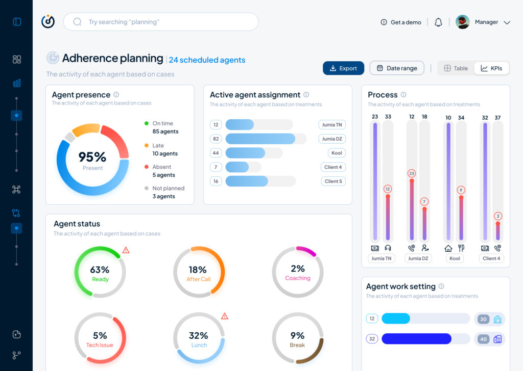
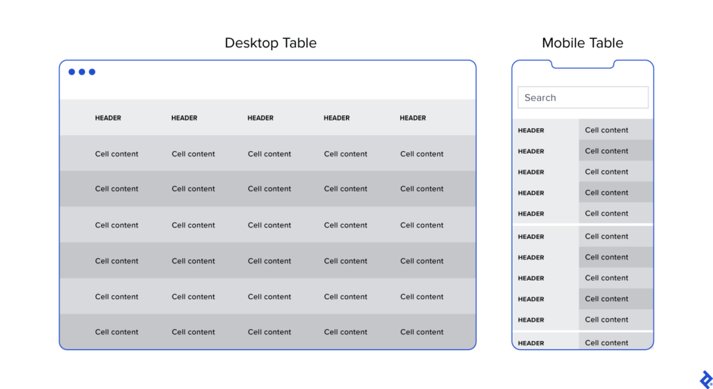
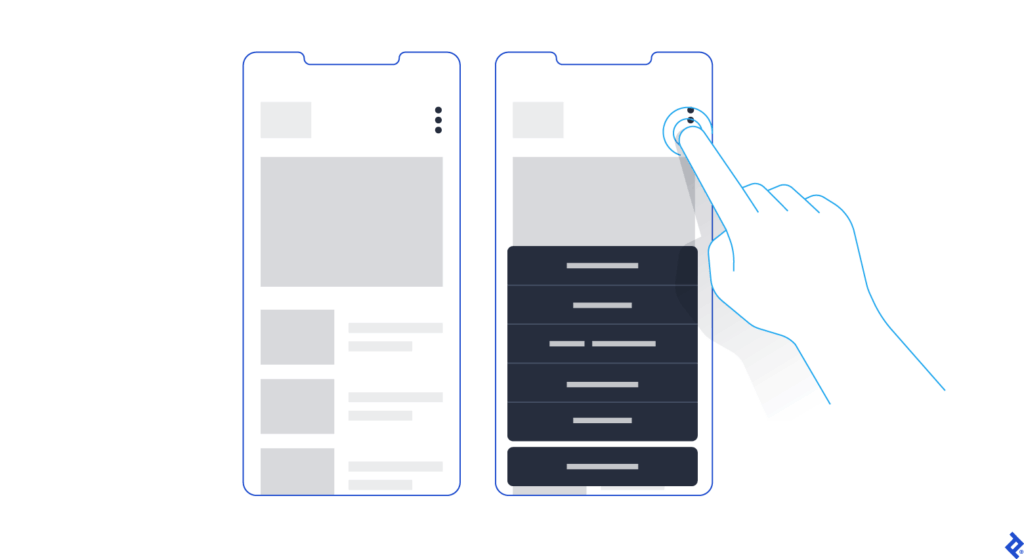
The authors explain that traditional UI testing still relies heavily on manual inspection or DOM-based element identification, which can be slow, brittle and prone to human error. In contrast, computer vision can directly analyze rendered screens: detecting missing buttons, misaligned text, broken layouts, or unwanted shifts across different devices and screen sizes. This makes visual testing more reliable and scalable, especially for modern responsive interfaces where designs constantly change during development.

One key contribution from the paper is the use of deep learning models such as YOLO, Faster R-CNN, and MobileNet SSD for object detection of UI elements. These models not only recognize what is displayed on the screen but verify whether the UI looks as intended, something code-based tools often miss when designs shift or UI elements become temporarily hidden under overlays. By incorporating techniques like OCR for text validation and structural similarity (SSIM) for layout comparison, the testing process becomes more precise in catching subtle visual inconsistencies that affect the user experience.

Conclusion

This opens a potential master thesis direction where computer vision not only checks whether UI elements are visually correct but also evaluates user affect during interaction, identifying frustration, confusion, or cognitive overload as measurable usability friction. Such a thesis could bridge technical UI defect detection with affective UX evaluation, moving beyond “does the UI render correctly?” toward “does the UI emotionally support its users?”. By combining emotion recognition models with CV-based layout analysis, you could develop an adaptive UX testing system that highlights not only where usability issues occur but also why they matter to the user.

Source: https://www.techrxiv.org/users/898550/articles/1282199-computer-vision-for-ui-testing-leveraging-image-recognition-and-ai-to-validate-elements-and-layouts

Business Management x Customer Experience x Data Visualisation: 1st prototype

In the current digital era, Customer Experience has evolved with multichannel support, chatbots, self-care, and virtual assistants to reduce customer effort, driving the development of Customer Relationship Management tools. However, while significant investments have focused on empowering AI-assisted agents, the role of managers has been largely underserved.​

I’m designing a solution to empower the “Augmented Manager”, equipping leaders with advanced tools and analytics to optimize real-time-onsite–remote-team performances and deliver outstanding results in an increasingly complex, tech-driven customer experience ecosystem.

Beside.you is a Software As A Service (SaaS) solution, is developed to simplify decision-making and boost efficiency for managers.

By solving the biggest business challenges, with intuitive functionalities simplifying Steering, Performance management, and resources’ Growth, it is shaping a future whereall business tools work seamlessly together, unlocking unmatched operational excellence for organizations everywhere.

This small demo showcases some parts of the product experience that is offered beginning with Steering on its macro micro levels:

Testing & Iterating using Lean UX: ‘Macro’ Steering Dashboard

As part of my SaaS project, one of the user interfaces that had to be done is the Steering dashboard but it required a lot of back and fourth of feedback, iterations and meetings to finally come to a great enough version in terms of functionality and business but as a product designer and using Lean UX as a methodolgy , at some stage I had to do an iteration test.

Macro and Steering are the fundamentals of what consists this interface, they serve the business internally as much as they serve it externally with clients and prospects.

Macro: refers to the holistic overview of an insights dashboard and its part of the macro-micro dynamic that I’m using as a system thinking for the whole project.

Steering: provides a real-time view of every KPI needed to make better decisions and steer the business towards a better course.

This testing/iteration process shows the first level of a user interface that required little user interview, user feedback and zero iteration but it served as a good foundation and a stepping stone to a later version that will pave the way to the “final” iteration.

The first version was even called ‘Adherence Planning’ which was an innacurate term of what we are trying to achieve and also because it defined only one aspect of the whole dashboard.

It had the basic insights that we want to show without much output but it was limited, inefficient and not value driven on a business level.

So after much stakeholder’s feedback we iterated that version to a much effective version that visualised the data in a much more functional manner and I did that through designing the work force performance gauge chart, rearranging the cards to suit the data monitoring priority, tweaked the charts and their colors on a UI level for more effective anomaly identification, streamlied the data visualisation with proper alerts identification and finally made the 3 dots ‘kebab’ compartment the drawer where every additional setting is hidden, and here is where I arrived:

The Steering Dashboard is now much more structured and serves the decision making business goal on a decent level, every KPI can be checked and monitored in real time along with checking the business performance in terms of profit and loss through the “Work force performance” gauge.

What I learned

A disruptive data vizualisation product can never be done, but through proper UI UX design, testing, iterating and coming up with the optimal solutions, it can reach a certain level of efficient structure that will propel it to achieve some of the business goals that were far further in the roadmap of the product experience and all of the above can only be done through collaboration and proper communication within a team.

All and all, I’m just getting started and i’m thrilled to work more on the refinement of both my skills and everything that I get involved in

What I learned as the Best Practices For Designing an Intuitive Mobile Dashboard

A mobile dashboard may not offer the full functionality of its desktop counterpart, but it can still provide users with a scannable view of top-line data and statistics to let them make informed decisions. It can also give managers and executives the necessary tooling to quickly approve orders, contracts, and procedure and policy documents.

I drew from experience and other proficient UX Designers some of the best practices and key aspects that designers can use to design better mobile dashboards:

Smooth Navigation

Let’s start with navigation as this is how users will get acquainted with your dashboard and find the information they’re looking for. If the navigation for your mobile dashboard is clumsy or disjointed, or your search bar or navigation menu isn’t well suited to touch-based interactions, you are likely to turn off users.

Visual prioritization is key. Responsive mobile dashboards should communicate information quickly and prioritize it in a clear visual hierarchy. Another dashboard design best practice is using the principle of progressive disclosure to reveal information only when the user needs it.

Consider space, button styles, and the user’s first impression when converting a desktop design into its mobile counterpart. (Coinbase)

This mobile dashboard effectively uses space to prioritize the most essential options. Crucial buttons from the left-hand panel on desktop become the bottom navigation bar on mobile, a standard for mobile menus as the position falls into the “Z” page scanning pattern where users’ attention tends to land.

Responsive Tables and Charts

Designing responsive mobile tables and charts can be a challenge, but in my experience, the customer satisfaction it provides is worth it.

Generally, I advocate for responsive web designs that send a single code set to all devices but use fluid grids and media queries to change the appearance of elements based on a device’s size and orientation. This common and effective method is used in mobile dashboards to collapse table row headers into column headers in a set of stacked, standalone cards that can be scrolled through vertically. The approach offers an elegant mobile presentation that avoids squishing cells, while allowing the user to quickly peruse large amounts of data.

Button Design

Arguably, one of the biggest challenges in creating a responsive mobile dashboard is sizing and arranging buttons. Why? Because, unlike on desktop, you touch them, rather than select them with a cursor or keyboard command. They need to be big enough and spaced out enough to be tapped comfortably, and, due to the limited screen space, some will have to be collapsed into sub-menus or even hidden.

Kebab menus save space on mobile screens by enabling users to access hidden buttons.

Standard button design principles should apply to your mobile designs. I tend to divide button design into two main principles: You should present buttons in a range of styles (sizes, colors, and shapes) that denote their relative importance through visual cues; and the text label or icon associated with a button should connote its semantic meaning and intended function—for instance, whether the button affirms an action, selects a tool, navigates to a new page, or cancels an action.

But you may have important buttons that can’t be hidden. As an alternative to the kebab menu, you could simply increase the button size to meet the mobile guidelines and then stack them vertically. Another alternative would be to leave the most crucial buttons at full size and make secondary buttons smaller by replacing the text label with an icon. When considering which technique to use, decide which buttons are most essential on each page.

Conclusion

When the project scope and budget allow, it’s most efficient to consider how a responsive mobile dashboard will look and function as you’re building out the desktop version. This will save time and development costs later in the product life cycle, and it will also help ensure brand consistency across devices. It’s also paramount to recruit a skilled developer to assess the feasibility of various design approaches, and, where needed, define CSS rules for reconfiguring tables and charts. Above all, try to faithfully recreate as much of the desktop experience as you can: You may have to eliminate some features and functionality, but it’s important not to dumb down the design and to follow the UX design process.

Mobile dashboard UI shouldn’t be an afterthought. If designed with care and foresight, mobile dashboards can provide significant value to users.

Empty States: Why They Drive Business Change and Why They Matter in UX

Empty states are often overlooked in UX design, but they can be drivers of substantial business benefits, and if done right, contribute to a more compelling user experience.

One of the UI UX patterns that I came across while working on my data viz project was the pattern/notion of Empty States which can be obsolete for some designers because they may see it as redundant or sometimes they don’t know that its a notion that should be contributing to the user experience as a whole.

Here are a few empty state examples:

Searching for something in Gmail and getting no results.

A new Dropbox screen where no files or folders have been created.

The resulting screen after completing all tasks in a to-do list manager.

Getting an error screen in Slack when a command isn’t supported.

Starting a new social networking account and there are no connections.

Types of Empty States

Here are four types of frequently encountered empty states:

  • First use – Occurs with a new product or service when there is still nothing to show, such as a new Evernote or Dropbox account.
  • User cleared – Occurs when users complete actions such as clearing their inbox or task list, and the result is an empty screen.
  • Errors – These occur when something goes wrong, or when there are issues such as a mobile phone going offline due to network problems.
  • No results/No data – No data found UI design occurs when there is nothing to show. This can happen if someone performs a search and the query is empty or there isn’t data available to show (when filtering for a date-range that has no data for example).

The Benefits of Using Well-designed Empty States

Designing well-thought-out and useful empty state illustrations and screens can help drive product engagement, delight users, and reduce churn. This decreases the chances of losing users to competitor products, thus leaving them frustrated or lost.

When applied to empty state design, these principles can be of great benefit to a business—for example, an increase in product satisfaction, and the lowering of abandonment rates.

Here are three additional areas that can also benefit from good empty state design:

  • User onboarding – Provides an opportunity to build trust and continued use of the product in addition to an elevated user experience.
  • Brand building – Generates awareness and promotes the company in order to build increased brand equity.
  • Personalization – Can be playful, fun, serious, or dynamic in various states of use; creates a sense of a personal touch.

The benefits of well-designed empty states cannot be underestimated. They not only contribute to a compelling customer experience, but as windows of opportunity to keep customers happy and engaged get shorter and shorter, they are just plain good business.

Conclusion

It’s easy to overlook empty states (or empty screens) in UX design because they occur infrequently and aren’t always well understood. However, the benefits to their inclusion are understated because they enhance the user experience and help create a more cohesive product.


What I learned as the Core Principles for Designing Better Quantitative Content

Clutter and confusion are not attributes of data—they are shortcomings of design. – Edward Tufte

Michael Friendly defines data visualization as “information which has been abstracted in some schematic form, including attributes or variables for the units of information.” In other words, it is a coherent way to visually communicate quantitative content. Depending on its attributes, the data may be represented in many different ways, such as a line graph, bar chart, pie chart, scatter plot, or map.

It’s important for product designers to adhere to data visualization best practices and determine the best way to present a data set visually. Data visualizations should be useful, visually appealing and never misleading. Especially when working with very large data sets, developing a cohesive format is vital to creating visualizations that are both useful and aesthetic.

Principles

Define a Clear Purpose


Data visualization should answer vital strategic questions, provide real value, and help solve real problems. It can be used to track performance, monitor customer behavior, and measure effectiveness of processes, for instance. Taking time at the outset of a data visualization project to clearly define the purpose and priorities will make the end result more useful and prevent wasting time creating visuals that are unnecessary.

Know the Audience


A data visualization is useless if not designed to communicate clearly with the target audience. It should be compatible with the audience’s expertise and allow viewers to view and process data easily and quickly. Take into account how familiar the audience is with the basic principles being presented by the data, as well as whether they’re likely to have a background in STEM fields, where charts and graphs are more likely to be viewed on a regular basis.

Visual Features to Show the Data Properly


There are so many different types of charts. Deciding what type is best for visualizing the data being presented is an art unto itself. The right chart will not only make the data easier to understand, but also present it in the most accurate light. To make the right choice, consider what type of data you need to convey, and to whom it is being conveyed.

Make Data Visualization Inclusive


Color is used extensively as a way to represent and differentiate information. According to a recent study conducted by Salesforce, it is also a key factor in user decisions.

They analyzed how people responded to different color combinations used in charts, assuming that they would have stronger preferences for palettes that had subtle color variations since it would be more aesthetically appealing.

However, they found that while appealing, subtle palettes made the charts more difficult to analyze and gain insights. That entirely defeats the purpose of creating a visualization to display data.

The font choice can affect the legibility of text, enhancing or detracting from the intended meaning. Because of this, it’s better to avoid display fonts and stick to more basic serif or sans serif typefaces.

Conclusion

Good data visualization should communicate a data set clearly and effectively by using graphics. The best visualizations make it easy to comprehend data at a glance. They take complex information and break it down in a way that makes it simple for the target audience to understand and on which to base their decisions.

As Edward R. Tufte pointed out, “the essential test of design is how well it assists the understanding of the content, not how stylish it is.” Data visualizations, especially, should adhere to this idea. The goal is to enhance the data through design, not draw attention to the design itself.

Keeping these data visualization best practices in mind simplifies the process of designing infographics that are genuinely useful to their audience.

Disruptive Data Visualisation: From a Sketch to a Lo-Fi Wireframe to a Hi-Fi Wireframe

Introducing Beside You: the Augmented Managment software that will later be introduced as a SaaS (Software as a Service).

Initially, working on this project has been a ride since the beginning, being the sole product designer at a company that specializes in customer experience and business management along with a team of full stack devs and data scientists meant that we either we will get things done or we will get things done.

One of the early challenges was to convert a data driven platform to an intuitive and cohesive interface that offers the ease of analysis and ultimately efficient decision making.

One of the ‘Pre Design Sprint’ Data Interface that I found when I came onboard.

One of the early challenges was to convert a data driven platform to intuitive and cohesive interface that offers the ease of analysis and ultimately efficient decision making.

Sketching consisted of building a skeleton that will overaly the first foundation that will eventually convey the design language that the software will adopt and in the meantime everything has to be succintly explained to the stakeholders in order for them to grasp the design system and for me to extract more insights from them since they will be the first users of the software.

Moving on to a low fidelity wireframe with the intention of giving more meaning and structure to the interface meant that progress is happening and things are starting to evolve in terms of results from the ideation and the user interviews. Also, the latter gave me the playground to begin building the design system from the layout, color palette, and typography to the spacing and the accessibilty.

First draft of the dashboard’s lo-fi wireframe

Moving on to a highfidelity wireframe that paved the way to add real data to the interface that allowed us as a team to get a realistic first look on how the software will behave in terms of data visualisation and user navigation and from there began our first user test which will give us a direction to make the right adjustments and iterations.

First iteration of the dashboard’s hi-fi wireframe

To conclude, this article is a condensed version of what actually happened and the process behind creating a data driven product from the ground up, otherwise I will have to write a journal that won’t serve nobody but nonetheless it is always beneficial to write about a design process that was complicated and challenging at times, the benefits are a documentation and a clarity that will even pave the way to iterate better on the next stages of the product life cycle.

Small Details, Big Impact: How Microinteractions Keep Users Engaged

Those small, subtle animations or responses embedded in user interfaces are quietly revolutionizing digital design. These seemingly minor details can make or break an experience by holding user focus and adding delight, particularly when catering to short attention spans.

Let’s take a look into what microinteractions are, their role in maintaining user engagement, and how to implement them effectively.

What Are Microinteractions?

Microinteractions are small, contained product moments designed to accomplish a single task or provide feedback. Think of the “like” button on Instagram, the loading animation on YouTube, or the vibration your phone makes when toggling between modes.

They might seem insignificant, but their power lies in their ability to provide feedback, enhance usability, and inject personality into digital products.

Role in UX Design:

  • Feedback: Inform users that an action has been completed successfully (a checkmark when a form is submitted)
  • Guidance: Show users what to do next or highlight key features (animated tooltips)
  • Engagement: Create moments of delight to keep users intrigued

How Microinteractions Hold User Focus

Microinteractions work particularly well for short attention spans because they provide:

  1. Instant Feedback: Users are reassured their action has been registered. For example, a thumbs-up animation confirms a “like”
  2. Seamless Transitions: Animations such as loading skeleton screens (which mimic the layout of the actual content) make waiting feel shorter than traditional spinners
  3. Engagement Through Playfulness: A well-placed animation can surprise and delight users, creating positive reinforcement to keep interacting

Best Practices for Microinteractions in Short Attention Spans

  1. Keep It Subtle: Avoid overloading the interface with animations, they should enhance, not distract.
  2. Prioritize Speed: Ensure microinteractions are fast and efficient, aligning with the limited patience of today’s users
  3. Make Them Functional: Delightful design is essential, but utility should remain the priority.
  4. Test and Iterate: Regularly test microinteractions to ensure they’re intuitive and effective for your audience


Literature:

https://medium.com/@aemd2donchev/enhancing-user-engagement-with-advanced-micro-interactions-a-deep-dive-into-an-essential-web-d9040772f235

https://ruttl.com/blog/enhancing-user-engagement-and-satisfaction

https://uxdesign.cc/micro-interactions-why-when-and-how-to-use-them-to-boost-the-ux-17094b3baaa0

https://www.interaction-design.org/literature/article/micro-interactions-ux?srsltid=AfmBOoqKKY1EVplgrHsOAcIs2V444EiTtmizTwvCjw6biE0720ujLp3i

https://www.nngroup.com/articles/microinteractions