IMPULS #2: Junge Schweizer Grafik

Museum für Gestaltung, Zürich
Besuch am 09.11.2025

Ich bin nach Zürich gereist und dort ins Museum für Gestaltung (Toni-Areal) gegangen. Dort läuft gerade die Ausstellung „Junge Grafik Schweiz!“, in der Arbeiten von Designer:innen Mitte 20 bis Mitte 30 gezeigt werden – also hätte quasi ich sein können, wenn ich was gscheites studiert hätte (spaaaaß).

Die Ausstellung zeigt die aktuelle Schweizer Grafikszene: Zwölf Studios und Gestalter:innen – u.a. Data-Orbit, Dirtygraphik, Outline Online, Studio 11×1, Unstated oder Office Ben Ganz – wurden eingeladen, jeweils einen eigenen Raum bzw. eine Installation zu gestalten. Statt klassischer Poster-Schau fühlt sich das eher wie eine Reihe kleiner Welten an, die man hintereinander betritt: mal sehr digital, mal super haptisch, oft beides gleichzeitig. Durch ein ausgeklügeltes CI fühl es sich aber immer noch wie eine zusammengehörige Exhibition an und nicht zusammengewürfelt.

Was wurde gezeigt?

Es geht um das super interessante Überschneidung aus Tradition und Technologie: Schweizer Rasterstrenge trifft auf experimentelle Typo, AI, Creative Coding und sehr viel Bewegtbild.
Nachdem ich selber im Exhibition Organisationsteam für ESC bin, hab ich auch fleißig dokumentiert und mitgeschrieben. Das ist mir besonders hängen geblieben:

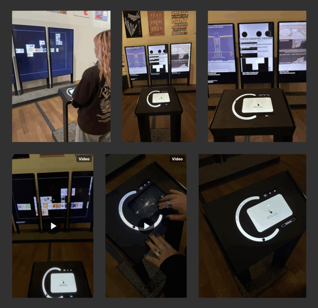
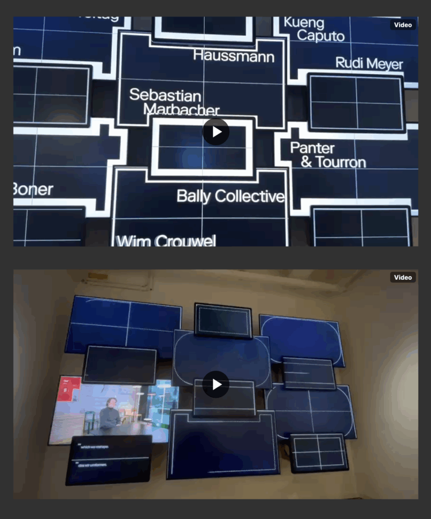
  • Multi-Screen-Setups statt „ein großer Screen“
    Mehrere Bildschirme in verschiedenen Formaten waren fast überall – und es hat mich überrascht, wie wenig „seamless“ das eigentlich sein muss, um gut zu funktionieren. Oft waren die Screens einfach aneinandergereiht oder übereinander geschichtet, teilweise mit harten Kanten.
  • Eine Interview-/Loop-Installation
    Besonders fasziniert hat mich eine Arbeit, in der Interviews und Studio-Porträts auf einem ganzen Grid aus Screens verteilt waren. Die Übergänge haben jeweils angekündigt, welches Studio als nächstes auftaucht, und dann wurde auf einen der Bildschirme „hineingezoomt“, wo das eigentliche Interview lief. Daneben ein kleiner Screen nur für Untertitel. Hat super funktioniert.
  • Sound im Ausstellungsraum
    In einem Bereich wurden gerichtete Lautsprecher eingesetzt, die den Ton jeweils zu einem Screen „schicken“. Das ist im großen Raum spannend, weil man direkt vor dem Screen relativ klar hört, ein paar Schritte weiter aber nur noch einen leisen Soound wahrnimmt.
  • Analog & Digital als Wand-Collage
    Mehrere Räume haben Poster, Bücher, Plakate mit digitalen Screens gemischt: Screens an die Wand gelehnt, Regale in leichter Schräglage, Bücher wie in einem Bookshelf, dazu Overlays, Transparenzfolien, kleine Karten, die man mitnehmen kann. Dieses Prinzip „Wall of Stuff“: Comdes-Wall, Poster-Archiv, Private-Projekte-Ecke fühlte sich extrem nah an dem, was ich mir für unsere eigene Masterausstellung vorstellen kann.
  • Typo-Wand mit Mini-Screens
    Eine Arbeit war im Grunde eine große Typo-Wand („Fonts are tools…“) mit vielen kleinen Screens, die sich wie dreidimensionale Typoblöcke davor in den Raum geschoben haben. Meine Erkenntnis: Kleine Screens können im Raum in Kombination mit Analogem sehr stark wirken.
  • Web / Interface im Großformat
    Ein anderer Raum hat Websites und Interfaces auf riesigen Screens gezeigt – inklusive Scroll-Situationen und Videoloops. Das war für mich als jemand, der viel im Web arbeitet, ein Reminder: Man kann digitale Oberflächen auch ganz cool ausstellen, wenn man sie gut skaliert, in ein klares Raster setzt und die Umgebung (Rahmen, Hintergrundfarbe, Anordnung) mitdenkt.

Link, falls sich jemand für die Ausstellung interessiert:

https://museum-gestaltung.ch/de/ausstellung/junge-grafik-schweiz

Product V: Image Extender

Dynamic Audio Balancing Through Visual Importance Mapping

This development phase introduces sophisticated volume control based on visual importance analysis, creating audio mixes that dynamically reflect the compositional hierarchy of the original image. Where previous systems ensured semantic accuracy, we now ensure proportional acoustic representation.

The core advancement lies in importance-based volume scaling. Each detected object’s importance value (0-1 scale from visual analysis) now directly determines its loudness level within a configurable range (-30 dBFS to -20 dBFS). Visually dominant elements receive higher volume placement, while background objects maintain subtle presence.

Key enhancements include:

– Linear importance-to-volume mapping creating natural acoustic hierarchies

– Fixed atmo sound levels (-30 dBFS) ensuring consistent background presence

– Image context integration in sound validation for improved semantic matching

– Transparent decision logging showing importance values and calculated loudness targets

The system now distinguishes between foreground emphasis and background ambiance, producing mixes where a visually central “car” (importance 0.9) sounds appropriately prominent compared to a distant “tree” (importance 0.2), while “urban street atmo” provides unwavering environmental foundation.

This represents a significant evolution from flat audio layering to dynamically balanced soundscapes that respect visual composition through intelligent volume distribution.

Impulse #3: Reflections on Vertigo 

In the end of october, we had the opportunity to take part at the Klanglicht festival. Very interesting for me thinking of my master theses, because it is an art installation, addressing the theme “rush” inside sacred architecture. I thought: Is this even accept or does it offend people because of the architecture that hold already layers of meaning, history, and emotions? 

I think it’s a great way of letting young artists have the opportunity of showing their artwork in a place that is mostly unused. Maybe also a way to let people rethink their relationships with the church overall. 

Until now/then, I had been circling around themes connected to religion, especially the visual world that surrounds it. But the more I worked on my Klanglicht installation, the clearer it became that my real interest lies somewhere deeper: in the growing distance between younger generations and the Church, and in the complex reasons behind this shift. 

My team installation explored the theme of the forest and the ongoing tension between city and nature. So: how can we visualize the conflict between these two worlds? How can we make people feel the push and pull between the natural and the constructed, between chaos and control, stillness and noise?  

During our design phase, we had mainly positive reactions to our concept. Our idea explored the conflict between city and nature, movement and stillness, and how shifting perspectives can create emotional resonance. We used light, color, distortion, and distance to communicate that tension. For a long time, we felt confident in our approach, but during the preparation phase, we received critiques which were notably more critical. The comments weren’t unkind — just different. They challenged our assumptions about what the piece was communicating and how viewers might interpret it differently than we intended. 

At first, I must admit, it felt unsettling. After so much encouraging feedback, it’s easy to fall into a kind of creative comfort zone. You start to believe your concept is clear, your visuals strong, your message consistent. This moment reminded me how every perspective is shaped by personal experience, values, and expectations.  

It reminded me that design and art are never universal — every viewer, every participant, brings their own background, experiences, and beliefs into the interpretation. Especially in our context, showing our work inside a church, the meaning of light, distance, and color becomes even more layered. What might seem purely aesthetic to one person can carry deep symbolic or emotional connotations for another. 

The idea of conflict — not just between city and nature, but also between perception and intention — became something I kept thinking about afterward. It directly connected to the questions I’m exploring in my master’s thesis, where I deal with religion, faith, and representation. 

I came to the conclusion that I wasn’t interested in analyzing religious symbols themselves. What truly fascinates me is the underlying emotional and cultural distance that so many people my age experience toward religion have. I have noticed this in conversations with friends, in social debates, even in how faith is portrayed in media. Many young people seem to separate belief from institution, or they turn away completely. 

The contrast in feedback during our Klanglicht process helped me understand why this topic resonates so strongly with me. It showed me how multiple interpretations can coexist — none of them inherently right or wrong, but all influenced by lived experiences. This insight connects directly to my thesis: if I want to understand why young people distance themselves from religion, I need to approach the subject through dialogue, reflection, and openness, rather than fixed assumptions. 

Looking back, I’m actually grateful for that critical feedback. It disrupted my confidence just enough to make me think deeper. I could re-examine my intentions and had the reminder that no creative work will ever be interpreted the same way by everyone. Understanding these and the dynamics is essential for my thesis. Rather than studying religious symbols, my work will investigate the inner landscapes of young people today: their doubts, their values, their frustrations, and their hopes. Just like in the installation, the goal for me now is not to provide definitive answers, but to create space for reflection. 

Dissclaimer: AI was used here for a better wording 

IMPULSE #2 – Everything is a Remix: video essays by Kirby Ferguson

This impulse started in the most unplanned way possible: boredom. I was aimlessly scrolling through YouTube when the original Everything Is a Remix series popped up. I clicked on it just to have something in the background, and then ended up watching the whole thing, plus the 2023 edition right after.

At first, it didn’t seem relevant to my Design & Research work at all. The documentary begins with the music industry, showing how songs recycle melodies and structures. Then it shifts to movies, pointing out how Hollywood endlessly reuses storylines, characters, and visuals. I didn’t expect any of this to spark anything academically useful… but it did.

The more I watched, the more the core message hit me: creativity is combination. Nothing begins as a pure, untouched idea. Designers, musicians, filmmakers, we’re all remixers. We borrow, reshape, merge, distort, and evolve things that already exist. That’s not a flaw of the creative process, it is the creative process.

This came at the perfect moment for me, because I’ve been stressing a lot about finding a unique topic for my Master’s thesis. The fear of “this isn’t original enough” has been in my head for months. But this documentary reminded me that originality is kind of a myth. Every famous movie, interface, or design moment has roots somewhere else. Creativity happens through exposure to many sources, not by inventing something out of thin air.

One part I loved was the reminder that copying is how we learn. Nobody starts out original. Kids copy drawings. Musicians learn by copying songs. Designers remake interfaces, posters, and layouts before they know how to create their own style. Copying gives you understanding, transforming gives you creativity. That’s exactly what the documentary showed again and again.

The most interesting section for me was about interfaces. It showed how early computers developed (especially Apple’s Macintosh) and how much of it came from remixing ideas from Xerox PARC and other pioneers. Even the updated 2023 version keeps those examples, but adds new ones from the 2020s, which makes it even easier to understand today in 2025. Interfaces evolve the same way music and film do: through constant borrowing and refining.

Then came the AI chapter, which was uncomfortable in a good way. The documentary explained diffusion models: how AI takes noise and patterns it into images based on millions of existing pictures. But is that learning? Or copying? It’s a controversial space where remixing meets ethics, and it made me think a lot about how designers work with tools that blur the lines between influence and imitation. Even memes, which get remixed endlessly, raise questions about ownership.

What surprised me most was how directly this documentary ties into the things I maybe want to explore this semester, especially around being a multidisciplinary designer and navigating all the influences, tools, and expectations that come with that. It made me think: How do designers form their identity when everything they create is built from other things? What does “original” even mean in a world where everything is borrowed, remixed, and reinterpreted? And how do generalist designers stay grounded when there are endless directions to pull inspiration from?

The series didn’t answer these questions, but it opened the door to them. It reminded me that having many interests isn’t a weakness or a sign of being unfocused, it’s actually the raw material creativity feeds on. Being a generalist might feel overwhelming at times, but it also gives you a wider palette to work with.

So yes, a random YouTube suggestion ended up calming me down. I don’t need to chase some impossible idea of “pure originality.” I just need to keep remixing, learning, and combining things in my own way.

Stuff Worth Clicking A.K.A. Accompanying Links

Disclaimer: This blog post was written with the help of AI for better grammar and correct spelling.

Decisions

Right now the main thing that is holding me back is mainly just my inability to make decisions. I have a lot of different options and ideas about what direction my thesis could go in, but no certainty what I am going to do. I have been pivoting between many different decisions for months now, switching between feeling sure and very lost. So this blog post is my effort to finally cement one of the decisions I have made. The theory is that by putting it online for people to read, I will feel obliged to fulfil their expectations of my thesis. Objectively, this would never work because first of all, maybe about two people are ever going to read this far (thank you at this point) and second of all, no one will be so invested into my thesis topic as to actually form any huge expectations. But I am a notorious people-pleaser who is deadly afraid of letting people down, so for me this method will work just fine.
Full disclosure: for the following information on the thesis structure as well as the exact formulation of my research question, I have used ChatGPT to help me find something suitable.

The Topic

At my talk with Roman last week I presented him with the options I had narrowed it down to in my last blog post, with the sole goal in mind to walk out of that room with a decision for my topic. I’ll admit, that was a fairly ambitious plan, but although I didn’t have a fixed title, research question and structure ready by the end of our talk, it was really helpful in deciding what to explore further. I decided to somehow combine the notion of convincing people to travel more sustainably via a visual media, and the question of how documentary filmmakers’ audiovisual and ethical decisions on how to portray contrasting viewpoints can change the viewers’ perception.
I then explained my ideas and intentions to ChatGPT, asking him to come up with an appropriate research question. The following is the option that resonated most with me and that I felt like represented best what I want to do with my thesis.
“How can the design of a documentary—through audiovisual style, narrative structure, and ethical framing—be leveraged to fairly present conflicting viewpoints while effectively motivating audiences toward more sustainable travel behaviors?”

The Title

Well, this one is still a work in progress, but ChatGPT and I have come up with some options that I already like the sound of:

“Seeing Fairly: Ethical and Audiovisual Strategies for Persuasion in Sustainability Documentaries”“Representing Conflict Fairly: Ethical Documentary Design in the Context of Sustainable Travel Communication”
“Influencing Perception Ethically: Documentary Media Design for Sustainable Travel”
“…: Ethical Documentary Strategies for Fair and Persuasive Sustainable Travel Communication”

One idea I have had for a while now is for the title of my documentary project, which I would like to call Only Planet, as a reference to both the travel guide company Lonely Planet and to the fact that Earth is the only planet we have and we have to take better care of it. When I asked ChatGPT about its associations with the name though, it immediately jumped to a connection with Only Fans, so before I make a final decision on the name, I might test it out with real people in my life to see which association they would make first.

The Methods

For my research on documentaries and how different filmmakers approach the task of portraying contrasting viewpoints as well as treating the topic of sustainability, I want to both interview experts in the field, who can tell me first hand how they would deal with such issues. Furthermore, I would like to develop an informed framework for analysing different documentaries myself and categorising them within my thesis. For writing about the current state of research, I will rely heavily on scholarly literature on the topic.

The Structure

The following would be a rough outline of how the thesis might be structured to properly deal with the topic. While a lot of this will most likely still change throughout the course of the next few weeks, for now it is a good starting point to know what chapters I will definitely have to write, and to be able to prepare literature and also excerpts for my thesis. Once again, the structure was provided by ChatGPT after I had prompted him with the topic, research question, and methodology of my thesis. I then added some comments of my own for what I might want to write about in certain chapters.


1. Introduction

1.1 Background and significance
-> talking about sustainable travel as well as documentary filmmaking and viewer persuasion

1.2 Research problem

1.3 Research question + sub-questions

1.4 Methodological overview

1.5 Structure of the thesis

2. Theoretical & Conceptual Framework

2.1 Documentary Theory & Styles

-> talking about the theory behind documentary filmmaking, what types and styles there are, how to categorise

2.2 Media Design for Persuasion & Behaviour Change

-> talking about persuasion through media in general, empathy, sustainability persuasion specifically

2.3 Fairness, Credibility & Trust in Visual Media

-> the ethics behind it, how fairness is perceived

3. Methodology

3.1 Research Design

-> explanation and justification of used methodology, also how literature, research and practice tie together

3.2 Data Collection

-> describing criteria for which documentaries to analyse and which experts to talk to

3.3 Analytical Procedure

-> creating the framework for film analysis as well as the set of questions for expert interviews, also considering ethics and viability

4. Analysis & Findings

4.1 Content Analysis Results

-> how the documentaries analysed conflicting viewpoints, ethical considerations, common techniques

4.2 Expert Interview Findings

-> describing the expert’s answers, methodologies and approaches to documentary filmmaking, conflicts and ethics

4.3 Synthesis of Findings

-> see whether there are common themes in analysed films and amongst experts, see how different results might be combined

5. Practice-Based Component (max. 1/3 of thesis)

5.1 Project Description

5.2 Application of Findings

-> how theoretical findings can be applied to my own practical work / what I could have done better

5.3 Reflective Evaluation

6. Discussion

6.1 Interpretation of Results

6.2 Theoretical Implications

6.3 Practical Implications

6.4 Limitations

7. Conclusion

#2 Cinematographische Tools um Emotionen und Wahrnehmung zu gestalten Part 2

Contrast: The proportion of light to dark within the frame. ‘High contrast’ denotes a large variance from the darker elements to the lighter elements within the scene and ‘low contrast’ exists when the ratio between light and dark is minimal. Natural scene lighting is considered low contrast (that is,
‘high-key’ lighting, particularly used for drama, action, and comedy) while high-contrast (’low-key’) lighting is generally utilised for suspense, neo-noir, or horror films to create a stark, foreboding mise en scène.
” (De Valk & Arnold, 2013, S. 76)

Das Beispiel aus The Lovely Bones (2009, Regie Peter Jackson) verdeutlicht in exemplarischer Weise, wie Lichtsetzung, Kontraste und Farbgestaltung als dramaturgische Werkzeuge eingesetzt werden können, um emotionale Reaktionen zu strukturieren und moralische Zuschreibungen innerhalb eines filmischen Narrativs zu verankern. Die Gegenüberstellung der Bildräume, in denen Susie und der Täter inszeniert werden, illustriert die semantische Funktion von Licht, wie sie bereits in der filmwissenschaftlichen Literatur breit diskutiert wird.

Die ersten drei Einstellungen, die Susie zeigen, funktionieren mit hohen Lichtwerten, warmen Farbtönen und einem geringeren Kontrastverhältnis. Die Komposition vermittelt Helligkeit, Offenheit und visuelle Harmonie. Dies ist konsistent mit der kulturprägenden Lichtsemantik, wonach Helligkeit traditionell mit positiven Attributen wie Unschuld, Sicherheit und moralischer Integrität verbunden wird. In der Terminologie von Brown und Rockett fungiert dieses Lichtregime als kulturell codierter Marker, der dem Publikum erlaubt, die Figur intuitiv und ohne narrative Überformung als “gut”, “schutzbedürftig” oder “vertrauenswürdig” zu identifizieren.

Demgegenüber stehen die Bilder des Mörders, die durch stark reduzierte Luminanz, kalte Farbräume und hohen Kontrastverhältnissen charakterisiert sind. Die visuelle Gestaltung lebt von engeren Räumen, sowie einer insgesamt gedrückten atmosphärischen Dichte. Diese Darstellungsweise erzeugt eine visuelle Enge, die nicht nur räumliche Bedrohung, sondern auch psychologische Ambivalenz transportiert. Wie Dyer herausarbeitet, ist die dramaturgische Verbindung zwischen Dunkelheit, moralischer Korruption und Gefahr nicht zufällig. Diese ist in jahrzehntelangen, kulturell sedimentierten Wahrnehmungsmustern verankert. Filme nutzen diese symbolischen Lichtcodes gezielt, um emotionale Wertungen beim Zuschauer zu kanalisieren, bevor die Handlung selbst explizite Informationen liefert. (Maszerowska, 2012, S. 77-78)

Die Arbeit mit starkem Kontrast und Low-Key-Lichtsituationen erzeugt beim Publikum in der Regel eine emotionale Resonanz, die den Zuschauer erfasst und eine besondere Tiefe an Drama hervorruft. Diese Wirkung entsteht, ohne dass übertriebene Action oder ein lauter, dominanter Soundtrack eingesetzt werden müssen. Die entscheidende Rolle spielt hier die subtile Gestaltung, die Atmosphäre und Stil aufbaut und gleichzeitig eine feine, im Bild spürbare Bewegung andeutet. (De Valk & Arnold, 2013, S. 58-59)

Bemerkenswert ist zudem, dass diese Differenzierung nicht lediglich als ästhetisches Stilmittel fungiert, sondern eine aktive Rolle im kognitiven und emotionalen Verarbeitungsprozess des Publikums einnimmt. Die visuelle Trennung der Figurenwelten erzeugt eine klare emotionale Orientierung und erleichtert die empathische Positionierung. Während Susies helle Bilder den Zugang zu emotionaler Resonanz und Mitgefühl öffnen, erschwert die düstere Darstellung des Täters die affektive Annäherung und verschiebt die Wahrnehmung in Richtung kognitiver Distanzierung. Dadurch bestimmen Licht und Schatten nicht nur die räumliche Struktur der filmischen Welt, sondern greifen direkt in Mechanismen der Zuschauerempathie ein.

Insgesamt zeigt das Beispiel, wie cinematographische Lichtsetzung als komplexes semiotisches System operiert, das moralische Kategorien visuell kodiert, emotionale Reaktionen vorstrukturiert und die Wahrnehmungsweise des Publikums kanalisiert. Die Analyse unterstreicht, dass vorallem Licht im Film weit über seine technische Funktion hinausgeht. Es ist ein zentrales Werkzeug zur Steuerung von Emotion und Wahrnehmung. (Maszerowska, 2012, S. 77-78)

De Valk, M., & Arnold, S. (2013). The Film Handbook (0 ed.). Routledge. https://doi.org/10.4324/9780203146446
Rockett, Will H. (1988) Devouring whirlwind. Terror and transcendence in the
cinema of cruelty. Connecticut: Greenwood Press, Inc.

Brown, Blain. (1996) Motion picture and video lighting. Burlington, MA: Butterworth – Heinemann.

Dyer, Richard. (1997) White. London: Routledge.

Maszerowska, A. (2012). Casting the light on cinema – how luminance and contrast patterns create meaning. MonTI. Monografías de Traducción e Interpretación, 4, 65–85. https://doi.org/10.6035/MonTI.2012.4.3

LS3 #1 Mastertopic who?

Starting this semester, I find myself in a strange in-between space: I know I’m supposed to move toward a Master’s topic, but instead of clarity I mostly feel a kind of conceptual restlessness. Every idea I touch opens up into three more. I’m interested in too many things, pulled in several directions at once, e.g. visual culture, politics, public space, feminism, design as a form of intervention rather than decoration.
So choosing just one topic feels way to definite, not sure if anyone is also struggling with this as well.

But three potential directions keep returning to me. They are not fully formed, but they feel like possible starting points or loose constellations of thoughts:


1. Design Homogenization & the Global Aesthetic

One theme I keep circling around is the increasing sameness of contemporary design. Cities, ads, apps, brands or anything branded really -> everything is starting to look suspiciously uniform. Global companies rely on neutral sans-serifs, minimal palettes, clean universality. Instagram trends travel faster than local cultures can react.

This makes me wonder:

  • What gets lost when visual culture becomes globally streamlined?
  • How do local identities survive within systems that reward sameness?
  • And what does “authenticity” even mean when aesthetics circulate so fast?

This topic pulls me in because it sits between design, culture, and the politics of globalization and because I feel this tension personally every time I walk through a city and can’t tell where I am anymore.


2. Posters as Social Touchpoints

A second direction came to me by being showered with content about the pudding mit gabel events or the look-a like contests that all started because of some “badly” designed poster. Therefore, I’ve realized that posters don’t just communicate but they connect. They create tiny moments like someone stops, someone smiles, someone takes a photo, someone feels seen or irritated or even big moments like big events and community buildings. These different interactions fascinate me.

I’m curious about:

  • How analogue media can trigger social encounters
  • What kinds of posters invite participation or emotional response
  • Why physical touchpoints feel increasingly valuable in an overstimulated digital world

This approach would let me stay close to the city as a living laboratory, observing how design behaves “in the wild,” and how people respond to different visuals and what they will act upon.


3. Visual Protest & Everyday Feminist Interventions

The third direction ties into my long-standing interest in feminist protest. Not the big marches or iconic placards, but the small gestures – subtle, low-budget interventions that slip into daily life: stickers, posters in odd corners, tiny disruptions that shift the energy of a space. Basically what I have been researching for the past two semesters as well. I’ve been noticing how powerful these micro-protests can be, especially in gendered environments where a lot remains unspoken.

Some questions that orbit this theme:

  • How does subtle visual resistance reshape public space?
  • Which aesthetics make feminist protest feel urgent, playful, or subversive?
  • What happens when protest becomes intimate rather than spectacular?

This line of thinking feels personal, political, and directly connected to the work I’ve been doing over the past months.

And Now?

Now I just have to decide… If anyone is reading these blogposts, I’d love to hear some opinions :)) (Actually might not even chose between these three ideas, even during writing this post, I got a few more ideas)

LS Impulse #2 CoSa

In the beginning of November, we visited the CoSa Museum in the Joanneumsviertel Graz with the whole study program to get inspiration for our own gamification approach. But I would like to use it as a topic for one of my Impulse posts as well as I found the different approach for a museum very interesting and even within the exhibition there were some interesting differences.

I saw two of the exhibitions, there are way more, but it takes a while to even go through one of them. The first exhibition was about finances – the history of it, how to handle it and how our world is managed by it. The exhibition started by handing each visitor a small card that could be used for quizzes throughout all the rooms that would save your points etc. Therefore, visitors would be more interested and hooked to actually go through all the rooms and do the tasks to – then in the end – do a checkout and get a receipt with your score. I think the Concept and approach was interesting and a good idea, on me it did not work at all, because the reward in the end was not enough fore me; for a friend on the other hand it worked really well, and she really wanted to do all the tasks because it was enough for her to gather a very high score. I found this observation very interesting, because it showed how different our rewardsystems in our brain work and how that plays with our motivation for a (rather dry) topic. Another reason why I did not like the exhibition that much was the fact that it was all just pretended gamification. What do I mean with that? One game was for example to steer a containership from Europe to South America (on a screen obviously) But after 2 seconds it was clear that you didn’t actually do anything for the movement and the controller were just fake for you to think that you have an impact on the game. And basically all of the games were like that, and I lost interest very fast and almost did not finish any of those games. Of course, you have to keep in mind that the normal target group for the exhibition is children or young people that are still in school, but I would guess that they are even less concentrated or have the attention for a non-working game.

The second exhibition was way more interesting, it was not specifically about one topic but covered things like optical illusions, illness and lab diagnoses, AI content or how a car is built. And from the second I stepped into the room; I immediately understood that this is actually gamified and not like the other exhibition. Even the rooms were designed in a way more intuitive and natural way, it was more chaotic but then way more interesting to discover the different areas of it. Even though there were no reward systems or anything that would hook you until the end. And it was very touch and do- based, a lot of buttons, cranks or shadows to play with. They built and actual hospital room were you could get “blood” from the patients and analyse them in the lab next to it – and also be wrong about things. I think thats actually a main and important factor about gamification – that you can fail or lose and have to try again. Therefore it feels more important and interesting.

Connecetion to communication design:

The visit made me think about how strongly spatial communication influences user experience and engagement. The first exhibition felt extremely flat because the space was designed in a very sterile, minimal and almost liminal way, it had clean colours and no real sense of discovery. It communicated education rather than interaction, and because of that, even the attempts at gamification felt forced. The second exhibition in comparison used space almost like a narrative tool. It allowed visitors to explore, wander, and follow their own curiosity. For communication design, this highlights how important the design of an experience is: gamification is not only about scores or tasks but about creating an atmosphere that encourages participation. Gamification depends on emotional involvement, and emotional involvement depends heavily on how a space (off or online) is constructed.

It also raised the question of how communication designers can intentionally build environments that support learning, experimentation and play without feeling manipulative or superficial. Good gamification is a form of communication design, and it works best when it creates meaning not just motivation.

How can I use this for a potential master topic?

One idea I had is to connect this experience to my thoughts around design and globalization, especially how information is communicated across cultures, languages, or contexts. Gamification could be a meethod to make complex global systems, such as supply chains, political structures or gendered spaces more understandable through interaction and embodied experience. Another direction could be to explore how gamification can support or challenge feminist or activist communication. For example: How can playful interaction be used to reveal power structures? Or how can spatial or digital gamification become a tool for subtle protest?

Links:

CoSa Joanneumsviertel Graz
How Gamification Motivates
Social Interactions and the Dynamics of Protest Movements

LS Impulse #1 Schulter an Schulter

Last week on November 12th, I watched the documentary movie Schulter an Schulter (“Shoulder to Shoulder”) as part of the Crossroads Festival in Graz. The film brings together five long-term Antifa activists who, for the first time, speak openly about the backgrounds, motivations, and practices of an unusually organized and professional movement that confronted the growing neo-Nazi scene in reunified Germany after 1989. After the movie, activists from Graz also openly spoke about their experiences with antifa and activism.

I found the movie very interesting as the history of antifa is shown in a very clear and understandable way through archival material, personal recollections and reflective interviews by five activists from Germany. Also, the documentary traces how antifascist activism evolved from spontaneous street protests into structured networks of resistance. It portrays not only the confrontations with far-right groups but also the internal debates, emotional strain, and solidarity among activists who dedicated decades of their lives to anti-fascist work.

What fascinated me most is how Schulter an Schulter positions activism as both a historical and emotional practice, something that operates within and beyond visible protest actions. The film exposes how collective resistance requires organization, communication, and strategy, all forms of design in themselves. This connection between activism and design deeply resonates with my current research interests, especially around how protest is communicated, visualized, and mediated.

As a communication designer, I found the film relevant in two key ways.
First, it shows the power of narrative framing: how a movement is represented over time strongly shapes its public perception. The Antifa movement in Germany has long been reduced to stereotypes – often portrayed as radical, chaotic, or violent – yet this documentary humanizes it, showing the strategic, ethical, and emotional labor behind it. This reminds me that design, too, carries responsibility for framing social and political struggles.
Second, the film’s aesthetic approach relying on authenticity, honesty, and long-term perspective rather than shock or spectacle aligns with my growing interest in subtle, reflective forms of protest communication.

In relation to my potential master’s research, Schulter an Schulter raises important questions:
How can design contribute to the documentation and visibility of activist movements without simplifying them? What role does visual communication play in shaping public understanding of resistance?
And how can we as designers, engage with political memory,  especially movements that are often marginalized or misrepresented?

The film also left me reflecting on the infrastructures of protest: flyers, posters, coded communication systems, and collective symbols that circulated among activists. Many of these tools are examples of grassroots communication design created under pressure, with urgency and purpose. I’m inspired to explore how these visual and material artifacts of resistance could inform contemporary design practice, especially in feminist and activist contexts.

Finaly, Schulter an Schulter was not only a historical documentary but also an impulse to think about design as a form of resistance  through slogans or aesthetics as well as how we construct narratives and meaning.

Links:

Crossroads Festival Graz

Schulter an Schulter – Antifa Film

Weil der Staat versagte

IMPULSE #1 – Keep Going: a book by Austin Kleon

The past two months have honestly felt like a creative fog. After spending two semesters researching mental-health apps, accessibility, calming UX elements, and the role of AI in emotional support, I hit a wall. I wasn’t excited about pushing that topic any further, even though I still care about it. It just didn’t feel like the direction I wanted to take for my Master’s thesis.

So I started looking for something new.
For a short while, I explored AI in education: AI tutors, learning tools, digital classrooms. I listened to podcasts, skimmed articles, tried to “feel it”… but it didn’t grab me. It felt interesting, yes, but not like “my” topic. And because nothing lit that spark, I kept delaying these Impulse blogs. There simply wasn’t anything I could honestly call an impulse, until I picked up Keep Going by Austin Kleon.

Reading this book didn’t suddenly give me the perfect thesis idea, but it gave me something I really needed: a sense of movement again.

What Keep Going Gave Me

One of the big ideas in the book is that creativity isn’t a dramatic, once-in-a-while moment. It’s more like a daily rhythm. Kleon compares it to waking up in Groundhog Day – every day you start again. That made me feel a bit calmer about not knowing my direction yet. Maybe not having “the” idea right now is normal, not a failure.

His idea of a “bliss station” stayed with me too. Basically, a little mental or physical space where you disconnect from the noise and let your thoughts breathe. Lately, I’ve been drowning myself in information about what my thesis could be: podcasts, articles, trends, AI debates. Constant noise. Kleon reminded me that creativity sometimes comes from doing less, not more. From quiet, boredom, or even a messy desk.

Another chapter that hit home was “You Are Allowed to Change Your Mind.” This felt almost like permission I didn’t know I needed. I had convinced myself that because I had spent so much time on my previous topic, I must continue with it. Changing direction felt wrong, like giving up. But Kleon says it’s completely normal to shift, to rethink, to explore something new. That idea made me feel less guilty about stepping away from mental health apps and not fully clicking with AI in education. Maybe changing my mind is just part of the creative process.

He also talks a lot about focusing on the verb rather than the noun. Not “being a student looking for a topic,” but actually researching, playing, trying things out. That mindset feels much lighter and more fun.

And finally, one line keeps repeating in my head:
“Pay attention to what you pay attention to.”
Maybe the things that naturally grab my curiosity in the next weeks, small things, random things, might slowly point me toward my thesis direction.

How This Helps Me Moving Forward

I still don’t know my final topic. But after reading Keep Going, I don’t feel stuck anymore. I feel more open, more patient with myself, and more willing to explore without pressure. My thesis will come from what I genuinely care about next, not from panic or noise.

For now, this book was exactly the impulse I needed to… well, keep going.

Stuff Worth Clicking A.K.A. Accompanying Links

Disclaimer: This blog post was written with the help of AI for better grammar and correct spelling.