If you look at 99% of motorsport branding, the typography follows a very predictable recipe: italicized, bold, and sans-serif. It’s a visual shorthand for fast. The slant mimics the wind, the weight mimics the power. It’s fine, but it’s also a bit of a cliché. In the world of high-end lifestyle branding, typography isn’t just about speed but more about voice.
Research #7 “Old Money” Heritage vs. New Tech
For a while now I’ve been obsessed with the tension between two very different racing aesthetics. On one hand, you have the “Old Money” vibe like Goodwood Revival, vintage Rolex ads, and leather driving gloves. It’s elegant, it’s beige, and it’s very quiet.
Research #6 Data & The Aesthetic of Info
What if data could serve a visual purpose in branding? That’s what Ive been researching and experimenting with. Sports in general, but also motorsports, is a data driven sport. You can find countless of graphs, informations, sensor data,… everywhere. So why not use it as the core of a visual identity?
Impulse #3 – National Gallery London: On Seeing Too Much
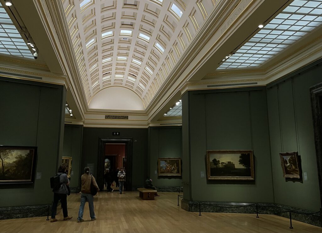
I recently went to the National Gallery and wanted to write about my visit. At first, I didn’t really know how to connect it to my master’s thesis, or even what exactly I had learned from it. This time, I simply started writing down my thoughts and by the end, I realised that it’s possible to make a connection between almost everything.
One of the first things that still amazes me is that the National Gallery like so many important museums in London is free. You can just walk in, no ticket, no obligation, and suddenly you’re standing in front of some of the most famous paintings in the world. That alone already says something about access, value, and who art is for. There’s no barrier or expectation. You’re allowed to wander, to stay five minutes or five hours.
And five hours might actually be too much.
The gallery has so many rooms that after a while all the paintings started to blur together. This feels almost wrong to admit, because these are obviously some of the most important and celebrated artworks in history. Each painting, when looked at individually, carries such rich stories, political contexts, personal tragedies and fascinating details. Knowing the story behind a painting completely changes how you see it and how much it moves you.
I noticed this especially when I was looking for The Execution of Lady Jane Grey. I already knew her story, and I had been deeply moved by it before even seeing the painting in real life. Standing in front of it felt almost like meeting a celebrity you’ve admired for a long time. In that moment, the painting didn’t feel like “just another artwork on the wall.”
But those moments became rarer the longer I stayed.
After a while, the quantity of paintings started to work against them. Room after room everything slowly flowed into everything else. I started wondering if “too much” can actually make things lose their value. Not because they aren’t valuable, but because we, as viewers, reach a limit. It reminded me of how after scrolling on TikTok for two hours, everything starts to feel the same and not because the content is identical, but because our capacity to truly engage gets exhausted. And maybe this doesn’t only happen with digital media, maybe it happens in museums too.
There was also something about the way the paintings were displayed that made this feeling stronger. The lighting, for example. This might be controversial, but I really didn’t like how Van Gogh’s Sunflowers looked. The colours felt lifeless and I hate saying that, because it’s Van Gogh. But it made me realise how much context, presentation, and atmosphere shape our experience of art. Even the most powerful work can feel distant if the conditions around it don’t support it.
Walking through the gallery, I kept thinking about attention and how fragile it is, how easily it slips away. And maybe this is where the connection to my master’s thesis begins to form. I’m becoming more interested in how meaning is created, sustained, or lost depending on scale, quantity, and context. How can we design (physical or conceptual) to allow for slower and deeper engagement?
Links:
https://www.nationalgallery.org.uk/
https://www.hrp.org.uk/tower-of-london/history-and-stories/lady-jane-grey/
https://www.nationalgallery.org.uk/visiting/virtual-tours/google-virtual-tour
Impulse #2 – Lecture: Design Future Practices @Kingston University
For this Impulse blog entry, I wanted to share my insights from my lectures at Kingston University. After my first lecture, I felt so inspired that I went straight to the library and started doing research that would eventually lead me toward my master’s thesis topic.
On our first day, we got to hear about the career path of our lecturer, Cathy. She talked about moving through different creative and political spaces, from being part of a rebel music group to convincing students to create an alternative art school as a form of protest against London’s high tuition fees. The way she told these stories was incredibly engaging. With her comedic timing and honesty, it felt much more like sitting in the audience of a stand-up show than attending a university lecture. Of course, because it was my very first lecture in London and I was already buzzing with excitement about learning new things, I was probably way more impressed than everyone else. For the other students, it was likely just another rainy Thursday morning.
What I appreciated most about this lecture and the course in general is how seriously the university prepares students for their dissertation. This entire semester is dedicated to finding and shaping a topic, and they really take the time to guide us through that process. All the research we do is meant to lead toward a final project, supported by workshops that help us along the way. We work in groups, talk openly about our ideas, and constantly reflect on where we are and where we want to go.
One piece of advice Cathy keeps repeating really stuck with me: “Start with something small, you can always go bigger.” It’s exactly what I’ve been struggling with. I have a tendency to aim straight for big, complex problems that realistically require way more power, time, or resources than I currently have. Cathy explained that it’s often much more effective to start with something small and specific, and then slowly build on it. Over time, that small idea can grow, expand, and take on more layers. That’s what I’m trying to focus on now: collecting smaller ideas, letting them develop naturally, and then gradually adding more literature, references, and sources.
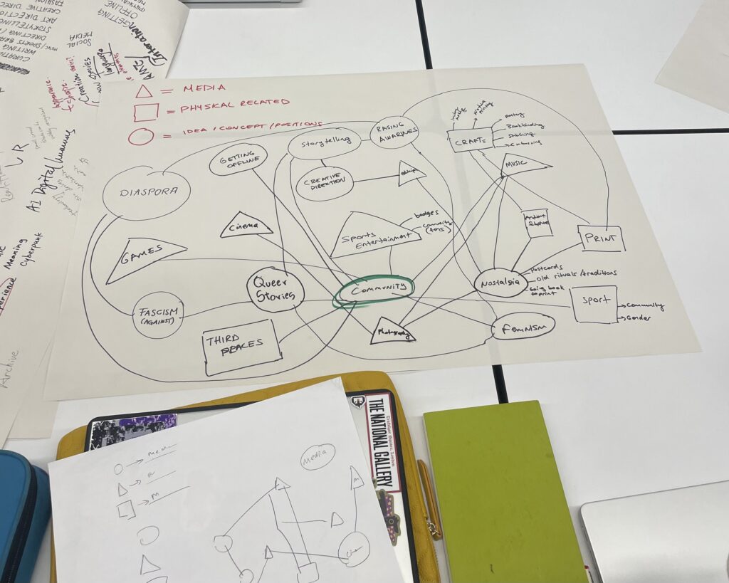
To help us through this process, Cathy divided us into three groups: Making Public, Making Situated Knowledge, and Making Meaning. Within these groups, we wrote down all of our interests and started mapping them together with the others. This simple exercise turned out to be surprisingly powerful. Seeing my thoughts laid out visually and alongside the ideas of others helped bring some structure to the chaos that had been floating around in my head. It made everything feel a little more tangible and manageable.
Links:
DE7608 intro Graphic Design – Future Practices Slides
https://docs.google.com/presentation/d/1SvQrDOy-4GwHipNV4sZ7klFm0ZUWH4DDy84T-SGMcjQ/edit?slide=id.p#slide=id.
Our Mindmaps:
https://padlet.com/qr-code/lhh5tuq2qwomtmav?source=image
Impulse #1 – Directors Roundtable
For my first Impulse blog entry, I wanted to start with something that has always been a big part of how I see and understand the world: film. Even though I study design, I’ve always felt drawn to cinema. Not just as entertainment, but as a way of thinking. Film is a combination of so many different disciplines: image, sound, timing, emotion, storytelling, and decision-making. Watching films, and especially listening to directors talk about their process, reminds me that creative direction exists everywhere, not just in design. It makes me realise how important it is to learn from other fields, because the questions are often the same. How do you create meaning? How do you guide attention? How do you stay true to an idea while navigating uncertainty?
I recently watched a Directors Roundtable with Todd Phillips, Martin Scorsese, Greta Gerwig, Noah Baumbach, Lulu Wang, Fernando Meirelles and it gave me a lot to think about. Not only about filmmaking, but about creative work in general.
One moment that stayed with me was when Martin Scorsese talked about The King of Comedy, which was called “flop of the year” when it was released. Today Scorsese is seen as one of the most important filmmakers of all time. It made me realise how success reshapes the way we look at people’s work. When someone becomes successful, we often forget the the failures and the moments where their work wasn’t understood. We see their career as something linear, even though it never was.
A story shared by the Brazilian director Fernando Meirelles stuck with me the most. When he was asked if he would consider moving to the US, he said: “I like to direct in Portuguese. I understand English, but I don’t feel English. If you say ‘mango tree’ in English, it’s just a tree. If you say ‘mangueira,’ it’s my mother, its scent, it’s so much.” This made me think about how language, context, and personal experience shape meaning. The same object can carry completely different emotional weight depending on how and where you encounter it. As someone interested in creative direction, this makes me reflect on how meaning is never fixed, it is always somehow shaped by cultural context.
Another idea that resonated with me was when they described production as an act of faith. Every day on set, you show up without knowing exactly what will happen. It might rain. Something might not work. The circumstances are rarely what you expected. You have to adapt constantly and make the best out of what is there. This feels very familiar to the creative process in general. You can prepare, research, and plan, but there will always be uncertainty. Instead of trying to control everything, you learn to respond, adjust, and trust the process.
Watching this conversation reminded me that creative direction is not about having complete control or certainty. It’s about observing closely and trusting that meaning will develop over time. It also reminded me that research is not always linear. Sometimes it starts with curiosity, with watching, listening, and collecting fragments. And only later do those fragments begin to connect.
In that sense, watching films and listening to the people who make them has become part of my research process. Not because it gives me clear answers, but because it helps me understand what it means to create something with intention.
Links:
https://www.youtube.com/watch?v=4iLtjMwkOlg&t=2471s
https://www.ebsco.com/research-starters/biography/fernando-meirelles
https://www.indiewire.com/news/general-news/martin-scorsese-audiences-hated-king-of-comedy-1234913652/
IMPULSE #8—Data Visualisation
For the next part of my research, I chose to watch the Google talk ‘Storytelling with Data’ by Cole Nussbaumer Knaflic. I picked this specifically because, while David McCandless focuses on the beauty and ‘eye candy’ of data, Cole focuses on the clutter and the psychology of how we see. Since my project is all about ‘visual overload’ and how to use it strategically, I wanted to learn from someone who is an expert in the exact opposite: cleaning up the mess to make a clear point. I wanted to understand the rules of ‘perfection’ in data storytelling so that I can know exactly how and when to break them in my own maximalist designs.
In her talk, Cole explains that we aren’t naturally good at storytelling with data because we usually just ‘show’ the data instead of ‘explaining’ it. She talks a lot about Gestalt Principles of Visual Perception—how our brains look for order and try to group things together. One of her main points is about clutter. She says that every single element you add to a design takes up ‘cognitive load’ (which connects back to what I read in Steve Krug’s book). If you add too much, the user’s brain just shuts down because it’s too much work to process. Her goal is to strip everything away until only the most important ‘aha!’ moment is left.
What I found really useful was her advice on preattentive attributes. These are things like color, size, and position that our eyes notice before we even realize we are looking at them. Cole shows how you can use a single pop of color to lead the audience’s eye exactly where you want it. This made me think about my own posters for the ‘Growth of Consumerism’ project. While I want my posters to feel crowded and ‘loud’ to represent the mess of consumerism, I still need to use Cole’s logic to make sure the key message doesn’t get lost in the noise.
My conclusion after watching this is that storytelling is just as important as the data itself. If I just throw facts at people about how much waste the fashion industry creates, they might ignore it. But if I use Cole’s ‘storytelling’ structure—starting with a problem, building tension, and ending with a call to action—I can make a much stronger impression. Her approach is very ‘clean’ and corporate, which is a great contrast to the Maximalism I am exploring.
This talk is incredibly relevant to my master’s thesis because it taught me about the ethics of visual communication. Cole warns that we can easily mislead people with how we scale our graphs or use colors. In my work, I want to use ‘Strategic Friction’ to slow people down, but I have to be careful not to use ‘Dark Patterns’ or deceptive tactics that Cole and Harry Brignull warn about. My plan is to take her rules for clarity and focus and apply them to my maximalist layouts. I want to create a design that looks like a ‘conspiracy’ or a mess at first glance, but once the user starts ‘deciphering’ it, they find a very clear, data-driven story hidden inside. It’s about finding the balance between her ‘less is more’ and my ‘more is more’ to see which one actually changes consumer behavior in Croatia.
Disclaimer: AI was used in making this blog.
Impulse #8 FAT Ice Race
In the end of last month, I attended the FAT Ice Race in Zell am See. The event combines motorsports, lifestyle, fashion, music, and brand on a snowy airfield. My focus was not only on the racing, but on the overall creative experience of the event. In addition, I produced content for my portfolio on site to document visual narratives in the event context.
IMPULSE #7 —Don’t Make Me Think
For my research, I chose to read ‘Don’t Make Me Think, Revisited’ by Steve Krug because it is the most famous ‘manual’ for how modern websites and apps are designed today. I wanted to understand the core rules that big companies use to make our digital experiences so easy and fast. Krug’s main point is his ‘First Law of Usability’: a web page should be self-explanatory so that the user doesn’t have to spend any effort wondering how to use it. He explains that people don’t actually read pages; they scan them for the first thing that looks useful—a behavior he calls ‘muddling through.’ To make this work, he suggests using clear visual hierarchies, obvious buttons, and getting rid of any unnecessary instructions.
In the book, I read about the concept of ‘cognitive load’ and the ‘reservoir of goodwill.’ Krug explains that every time a user has to think—like wondering ‘Is this a link?’ or ‘Where did the menu go?’—a little bit of their patience and energy leaks away. To prevent this, he promotes a seamless and frictionless design. The goal is to make the user’s journey so invisible and effortless that they reach their goal (like buying something) without ever having to stop and process what is happening.
My main conclusion after reading this is that while Krug’s methods are great for making things ‘usable,’ they are also the reason why impulsive shopping is so successful. If everything is designed to be frictionless, we lose the moment of reflection. This is why the book is so relevant to my thesis; it represents the ‘fast’ world I am trying to critique. While Krug says ‘don’t make them think,’ I believe that in the context of over-consumption, we actually need to make people think.
In my opinion, Krug’s laws have been used by corporations to create a culture of passive consumption. My design direction is the opposite: I want to use Strategic Friction and Maximalism to bring back that cognitive load. I want to use complex layouts and ‘slow design’ to intentionally interrupt the mindless flow that Krug’s principles have perfected. My goal is to see how I can use the opposite of his rules to create a design that isn’t just easy to use, but one that makes the user more conscious and responsible. By studying the ‘bible’ of fast UX, I’ve found a clear starting point for my own ‘slow’ and educational approach.
Disclaimer: AI used
IMPULSE #6 — Buy Now: The shopping Conspiracy
The Netflix documentary ‘Buy Now: The Shopping Conspiracy’ is a perfect addition to my research because it directly shows how big corporations trick us into buying things we don’t actually need. The film doesn’t just talk about corporate greed; it explains the entire system designed to keep us trapped in a cycle of spending. What I found most interesting were the interviews with former marketing insiders; they openly admit to the psychological tricks they used to manipulate the public.
A major theme in the film is ‘planned obsolescence.’ This is something we all experience—like when a smartphone suddenly slows down after an update or a t-shirt falls apart after three washes. The documentary shows that this isn’t an accident. It started decades ago with the ‘Phoebus Cartel,’ where lightbulb manufacturers agreed to shorten the lifespan of bulbs so people would have to buy them more often. Today, this has become an industry standard. As a designer, this is a huge realization for me because I can see how design is often used to mask the poor quality of a product.
The film also does a great job of breaking down the psychology behind branding. Marketing isn’t just selling a product; it’s selling an emotion. They use brain research to figure out which colors, fonts, or messages—like ‘limited time offer’ or ‘huge sale’—trigger a sense of urgency in us. This creates a literal addiction to shopping. I realized that ads are basically selling a perfect version of ourselves that we will supposedly ‘become’ if we buy that item. It’s pure emotional manipulation, making us feel incomplete without the latest stuff.
I was especially hit by the part about the environmental disaster. The documentary visually shows massive landfills in poorer countries where all the clothes and electronics we throw away end up. It reminded me of what I saw in the ‘Terrapija 3.0’ project and the ‘Dobra ekonomija’ series. The film also warns about ‘greenwashing’—where companies use ‘natural’ and minimalist design aesthetics to look eco-friendly while they are actually still polluting the planet.
In my opinion, this movie is a ‘must-watch’ for any designer. It helps us realize how much responsibility we have when we create visual messages. The film inspired me to explore more in my own project how design can be more honest and help people see through these marketing tricks. Instead of design just being a tool to help someone sell more products, it should be used for education and making people think. For me, this documentary was a visual alarm that confirms my thesis: we need to stop playing by the rules of this ‘shopping conspiracy’ and start designing for real needs instead of manufactured desires.
Disclaimer: AI used
https://www.imdb.com/title/tt34350086
https://www.netflix.com/title/81554996