4. IMPULS: Begegnung mit Onionlab

Das Klanglicht-Festival 2025 war für mich auch ein Raum der Begegnungen. Eine der wichtige Begegnungen fand mit dem Künstlerstudio Onionlab statt, das international für seine Arbeiten im Bereich immersiver Installationen, Lichtkunst und generativer Räume bekannt ist.

Im Rahmen der Young Masters-Ausstellung hatte ich die Möglichkeit, zwei der Künstler, die hinter dem Kollektiv Onionlab stehen, persönlich kennenzulernen.

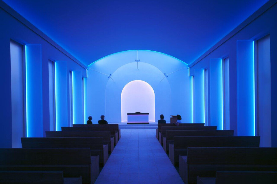
Die Installation in der Stadtpfarrkirche: Spiegel, Licht und generative Komposition

Onionlab präsentierte beim Klanglicht 2025 eine Installation, die in der Stadtpfarrkirche Graz aufgebaut war. Die Arbeit bestand aus einer Vielzahl von hängenden Spiegeln, die in unterschiedlichen Höhen und Winkeln im Kirchenschiff angeordnet waren. Diese Spiegel wurden durch ein fein abgestimmtes System aus programmierbaren Lichtquellen, rotierenden LED-Spots und gerichteten Farbakzenten angestrahlt.

Die Besonderheit lag dabei nicht nur in der technischen Präzision, sondern vor allem in der Choreografie des Lichts:

  • Das Licht bewegte sich harmonisch entlang einer vorprogrammierten Sequenz,
  • die Spiegel warfen verzerrte Fragmente, Streifen und Lichtflächen in den Raum,
  • die Reflexionen lösten die Grenzen der Architektur stellenweise auf und erzeugten schwebende Lichtkörper im Kirchenschiff,
  • begleitet wurde das Ganze von einer Komposition eines japanischen Soundkünstlers, die die Installation atmosphärisch in ein poetisch-futuristisches Licht rückte.

Onionlab gelang es, den sakralen Raum weder zu überlagern noch zu dominieren, sondern ihn durch subtile Eingriffe so zu transformieren, dass die Besucher:innen eine völlig neue Perspektive auf das Kirchenschiff erhielten.

Die Spiegel fungierten als visuelle Vermittler zwischen Architektur und Lichtquelle, und das Mapping war nicht plakativ inszeniert, sondern diente der Verfeinerung der räumlichen Wahrnehmung.

Perspektive: Masterarbeit in Kooperation mit Onionlab

Das Gespräch mit Onionlab hat in mir die Überlegung ausgelöst, meine Masterarbeit entweder in Kooperation mit dem Studio oder sogar direkt in Barcelona zu schreiben. Onionlab arbeitet in genau dem Bereich, der für meine Forschung essenziell ist:

  • Licht als architektonische Intervention,
  • generative Systeme,
  • audiovisuelle Transformation von Räumen,
  • Projektion im sakralen und urbanen Umfeld,
  • Einsatz von Spiegeln, volumetrischem Licht und immersiven Medien.

Eine Kooperation könnte folgende Vorteile haben:

  1. Professioneller Einblick in ein internationales Medienkunststudio
    – mit realen Workflows, Projektplanung, technischen Herausforderungen.
  2. Direkte Anwendung meiner Forschungsfragen
    – Lichtwirkung, Raumtransformation, sakrale Wahrnehmung, Mapping als atmosphärische Praxis.
  3. Betreuung oder mentorship durch erfahrene Künstler*innen
    – was den theoretischen und praktischen Teil meiner Masterarbeit stärken würde.
  4. Konkrete Projektmöglichkeiten
    – z. B. Teilnahme an einem Ausstellungsvorhaben, bei dem ich ein eigenes Modul beisteuern könnte.

Langfristige Perspektive nach dem Studium
– etwa ein “postgraduate internship” oder eine projektbezogene Mitarbeit.


Hinweis zur Verwendung von KI-Tools

Zur sprachlichen Optimierung und für Verbesserungsvorschläge hinsichtlich Rechtschreibung, Grammatik und Ausdruck wurde ein KI-gestütztes Schreibwerkzeug (ChatGPT, OpenAI, 2025) verwendet.

3. IMPULS: Francis Bacon

FLESH//MACHINE – A Sensorial Anatomy of Fear and Flesh

Die Begegnung mit den Werken von Francis Bacon war für mich ein prägender Moment in meiner künstlerischen Entwicklung. Bacon gilt als einer der bedeutendsten gegenständlichen Maler des 20. Jahrhunderts. Zwischen Expressionismus, Surrealismus und Kubismus zeichnen sich seine Werke durch eine radikale Darstellung des deformierten menschlichen Körpers aus. 

Ich erinnere mich noch genau an meinen Besuch im Museo Nacional del Prado in Madrid, die ich 2009 im Rahmen einer Exkursion während meines ersten Studiums in den Niederlanden besuchte. Die Darstellungen Bacons wirkten gleichzeitig verstörend und faszinierend, sie erzeugten eine Atmosphäre aus Nähe und Abstoßung, Verletzlichkeit und Gewalt. 

Diese Erfahrung gab mir den entscheidenden Impuls, als wir im Rahmen der Project Work „Gamification“ an der FH Joanneum ein Ausstellungskonzept für die Generation Z entwickeln sollten. Ziel war es, neue Wege zu finden, wie junge Besucher:innen durch spielerische und immersive Strategien an Kunst herangeführt werden können. In dieser Situation entstand die Idee einer immersiven Ausstellung zu Francis Bacon, die nicht nur seine Gemälde zeigt, sondern seine Themen – Angst, Körperlichkeit, Identität und Auflösung – sensorisch erlebbar macht. Auch wenn wir uns dann für ein anderes Thema entschieden hatten, ging mir diese Idee nicht mehr aus dem Kopf.

Konzeptidee: Flesh Machine – A Sensorial Anatomy of Fear and Flesh

Das Konzept sah vor, dass KI-gesteuerte Roboter durch den Raum wandern – bekleidet mit LED-Gewändern, die wie digitale Häute wirken. Diese Gewänder sollten aus flexiblen LED-Meshes bestehen, also netzartigen Materialien aus Glasfaser, Silikon oder Polyester, die mit Micro-LEDs bestückt sind. Durch ihre Transparenz und Biegsamkeit könnten sie Licht und Bewegung auf fast organische Weise vereinen. Die Gewänder sollten über DMX-, Art-Net- oder Video-Input-Schnittstellen ansteuerbar sein und die Malereien Bacons oder eigene, von KI generierte Körperbilder zeigen.

Der Besucher würde so in ein lebendiges, atmendes Gemälde eintreten – ein Raum zwischen Kunstwerk und künstlicher Intelligenz, zwischen Körper und Maschine. Die Roboter würden nicht als futuristische Entitäten erscheinen, sondern als fragile Wesen zwischen Fleisch und Mechanik. Dieses Setting wäre eine Anatomie der Angst: Bewegung, Präsenz, Instabilität, Identität und Entfremdung würden physisch spürbar.

Da real bewegliche Roboter mit LED-Textilien technisch und finanziell kaum umsetzbar sind, entwickelte ich die Idee weiter: Statt echter Maschinen könnten digitale Projektionen oder Displays diese Rolle übernehmen. Denkbar wären A3- bis A1-große „Digital-Poster-Screens“, auf denen animierte Figuren erscheinen, deren LED-Gewänder sich bewegen, flackern, atmen. Die Bewegung könnte durch KI-Simulationen generiert werden, die das Verhalten organischer Strukturen nachahmen. So entstünde eine metaphorische Fleischmaschine, die den Körper als Projektionsfläche für Angst, Wahrnehmung und Transformation versteht.

Verbindung zu meiner Masterarbeit

Während The Dragon’s Cave im sakral-mystischen Raum operierte, würde Flesh Machine den urban-technologischen Raum ansprechen – einen Raum, in dem das Verhältnis von Körper, Technik und Wahrnehmung erfahrbar wird.

Diese Idee könnte einen Teil meiner geplanten Dreifaltigkeit der Räume bilden:

  • der sakrale Raum (Spiritualität und Transzendenz),
  • der industrielle Raum (Technologie und Entfremdung),
  • der natürliche Raum (Vergänglichkeit und Zyklus).

Im industriellen Segment wäre Flesh Machine die konzeptionelle Umsetzung: eine audiovisuelle Reflexion über den menschlichen Körper als Projektionsfläche, über die Schnittstelle von Angst und Faszination, von Leben und Simulation.


Hinweis zur Verwendung von KI-Tools

Zur sprachlichen Optimierung und für Verbesserungsvorschläge hinsichtlich Rechtschreibung, Grammatik und Ausdruck wurde ein KI-gestütztes Schreibwerkzeug (ChatGPT, OpenAI, 2025) verwendet.

Why Films Trigger Strong Emotions: Psychological Mechanisms Behind Tears and Intensity

Many people notice that films can trigger emotions far more quickly than everyday situations. A single close-up, a shift in music or a sudden narrative turn can cause a lump in the throat or even bring tears to the eyes. To understand why this happens, it is helpful to look at the psychological mechanisms involved. These processes are well researched and explain why cinematic experiences can feel so immediate and overwhelming.

A central concept is emotional contagion. This describes the automatic tendency to absorb and mirror the emotions of others. When viewers see a character experiencing sadness or fear, they often feel traces of the same emotion. This reaction is not conscious. It is rooted in processes linked to mirror neuron activity, where observing an emotion activates similar emotional circuits in the brain. Even if the viewer logically knows the scene is fictional, the emotional system reacts as if it were real.

Another important concept is narrative transportation. This refers to the psychological state of being fully absorbed in a story. When transportation occurs, attention narrows, and the boundary between fiction and reality becomes softer. Viewers begin to think and feel within the world of the film. Research shows that during strong transportation, critical distance drops and emotional responsiveness increases. This helps explain why certain scenes feel especially intense.

Films also activate empathy-related processes. Empathy involves both understanding another person’s emotional state (cognitive empathy) and sharing an aspect of that emotion (affective empathy). Cinematic techniques, such as close-ups, slowed pacing and intimate sound design, intensify these responses. A character’s struggle or vulnerability becomes easier to identify with because film directs the viewer’s attention very precisely.

Music influences emotional reactions through affective priming. This means music prepares the emotional system for a certain mood. Slow harmonies, minor chords or subtle shifts in instrumentation can increase emotional sensitivity. Film music often works below the threshold of conscious awareness. The viewer feels the emotion before understanding why, which makes reactions stronger and faster.

Another relevant concept is safe emotional simulation. Films create a protected psychological environment in which viewers can experience intense emotions without real-life consequences. This safe distance allows people to feel deeply because they are not personally threatened. The story creates controlled exposure to emotional situations, making vulnerability easier than in real-life contexts.

In addition, the structure of film uses emotional pacing. Filmmakers craft emotional arcs deliberately: tension builds, is held and then released with precision. This controlled rhythm can create emotional peaks that rarely occur so clearly in everyday life. Because the viewer’s emotional system is guided step by step, the intensity of the final release can be very strong.

Finally, emotional reactions often connect to personal memory activation. Certain scenes can echo experiences viewers have had themselves. This may happen even if the memory is not consciously recalled. The film triggers an emotional pattern that already exists in the viewer’s internal world, creating a deeper and more personal reaction.

Together, these psychological mechanisms explain why films can touch us so immediately. They combine attention control, empathetic connection, emotional simulation and narrative immersion. When all these processes work together, the emotional effect becomes unusually strong, even overwhelming. What feels like sudden emotion is actually the result of several intertwined psychological systems designed to help humans understand the feelings of others.

Literature:

Bordwell, D., & Thompson, K. (2020). Film art: An introduction (12th ed.). McGraw Hill.

Groen, M. (2018). The psychology of emotion in film. Routledge.

Plantinga, C. (2009). Moving viewers: American film and the spectator’s experience. University of California Press.

Smith, M. (1995). Engaging characters: Fiction, emotion, and the cinema. Oxford University Press.

Tan, E. S. (1996). Emotion and the structure of narrative film: Film as an emotion machine. Lawrence Erlbaum Associates.

Understanding Stereotypes: How They Could Work in Film and Why Responsibility Matters

As we continue developing our short film, we are exploring different narrative approaches that might help guide viewers expectations and create emotional impact. One option we are considering is the use of stereotypes. To evaluate this idea properly, we first need to understand what stereotypes are, how they function in media and why responsible handling is so important.

Stereotypes are simplified ideas about groups of people. They reduce complex identities to a few general characteristics. In everyday life, they act as shortcuts people use to interpret others quickly. In film, this effect can be even more noticeable. When viewers see a character only briefly, they often rely on familiar patterns to fill in the gaps. This is why stereotypes are commonly used in media: they offer an immediate point of orientation.

Because they work so quickly, stereotypes can be an effective tool for shaping expectations. A character with certain visual or behavioral cues can lead viewers to assume they understand the situation. If we decide to use this technique, it could help guide the audience toward a particular interpretation at the beginning of the story. This would create a feeling of certainty, which could later be challenged through a shift in perspective or a narrative twist.

At the same time, we are aware that stereotypes carry risks. When used uncritically, they can reinforce harmful assumptions or reduce individuals to single traits. Media has a strong influence on how society views certain groups, and repeated stereotypical portrayals can contribute to prejudice. Because of this, any use of stereotypes requires careful thought. We need to be sure that we are not reproducing ideas that have negative effects outside the story.

In our project, we want to consider how stereotypes might be used without reinforcing them. One possibility is to guide the audience toward a familiar assumption and then reveal a more complex truth. The intention would be to highlight how quickly one can fall into stereotypical thinking. This approach could support the themes we want to explore, especially if the film addresses issues like discrimination or bias.

However, nothing is fixed yet. We are still experimenting with different methods of storytelling. Stereotypes remain only one of several tools we might use. If we choose to include them, it will be with clear intention and with the responsibility that comes with representing real people and real issues. If we decide against them, it will be because another narrative approach serves our goals more effectively.

For now, the most important step is understanding the impact of stereotypes in media. They offer narrative efficiency but also shape public perception. They can guide viewers emotionally, but they can also oversimplify. As we continue refining our ideas, we want to stay aware of both sides. Whatever choice we make, it should support the message of the film without contributing to harmful patterns.

Literature: 

Hall, S. (1997). Representation: Cultural representations and signifying practices. SAGE.

hooks, b. (1992). Black looks: Race and representation. South End Press.

Plantinga, C. (2009). Moving viewers: American film and the spectator’s experience. University of California Press.

Start into the master thesis: What Works

For the practical part of our master’s project, we set out to understand what makes a short film emotionally engaging and thought provoking. To do this, we watched several short films that are recognized for their strong emotional impact. At first, we watched them without analyzing anything. We wanted to experience them naturally, just as any viewer would. Some films touched us immediately; others did not leave a deep impression. These first reactions helped us understand which elements work intuitively.

In the next step, we examined why certain films moved us more than others. One of the clearest observations was that stories focusing on a single person are more effective in short films. With limited time, viewers connect more easily with one individual. The emotional access becomes stronger, and the message becomes clearer. Films with many characters often lose intensity because attention is divided.

Authentic dialogue also proved to be essential. The films that impressed us the most sounded natural. The conversations felt real and unpolished. They contained pauses, interruptions and spontaneous reactions that made us feel as if we were witnessing real situations. This authenticity creates emotional closeness. When dialogue feels too scripted, emotional distance grows.

Music played an important role as well. Although we expected this, studying other films made its influence more visible. Music guides the viewer’s emotional direction. It shapes atmosphere, highlights key moments and increases intensity. Many impactful short films use music only at specific points rather than constantly. This selective use strengthens emotional peaks and avoids overwhelming the audience.

Something that surprised us with its power was the unexpected twist at the end. Many short films stay memorable because they challenge the viewer’s assumptions in the final moments. A twist creates a moment of shock or rethinking, which keeps the story alive in the viewer’s mind. This effect suits our project especially well.

Our film focuses on racism. To create impact, we want to deliberately play with stereotypes. The goal is to guide viewers toward a familiar assumption. By doing so, they become part of the problem for a moment because they follow the same unconscious ideas that exist in real life. The twist at the end will break this stereotype and reveal a different truth. This moment encourages self reflection and raises the question of why one believed the stereotype in the first place.

From our analysis, we decided to concentrate on a single main character, natural dialogue, selective music and a twist that challenges perception. These insights form the foundation of our short film and help us shape a project that aims to move viewers emotionally and make them think.

Literature we can already use for out theoretical part:

Bordwell, D., & Thompson, K. (2020). Film art: An introduction (12th ed.). McGraw Hill.

Cowgill, L. A. (2005). Writing short films: Structure and content for screenwriters (2nd ed.). Watson-Guptill.

Hall, S. (1997). Representation: Cultural representations and signifying practices. SAGE.

hooks, b. (1992). Black looks: Race and representation. South End Press.

McKee, R. (1997). Story: Substance, structure, style, and the principles of screenwriting. ReganBooks.

Plantinga, C. (2009). Moving viewers: American film and the spectator’s experience. University of California Press.

Seger, L. (1990). Creating unforgettable characters. Holt Paperbacks.

The Temporal Elements of Emotional Identification with Film Characters

McCormick, S. (2020). The temporal elements of emotional identification with film characters (Master’s thesis, University of Colorado. https://mountainscholar.org/items/4619dcd4-d1e2-4f3e-4f3b-730ccf2fd93e

The thesis The Temporal Elements of Emotional Identification with Film Characters by S. McCormick looks at how our sense of time while watching a film influences how strongly we connect with characters. It is a theoretical study, meaning there is no short film or creative project attached. The thesis starts by setting up the research question, then brings in psychological theories about time perception and combines them with film theory on character emotions and immersion. Finally, the author discusses how time can shape emotional reactions in narrative cinema and why that matters for film studies. So the whole thing is more of an intellectual exploration than a practical filmmaking work.

In terms of the “artifact” part, this thesis really doesn’t have one. Everything exists on the page. That makes access easy, but it also limits what kind of evaluation we can do. There’s no practical demonstration, no production notes, nothing like that. The documentation is clear regarding the theory, but of course the connection between concept and filmmaking practice remains abstract. Honestly, you sometimes wish the author had taken one or two well known scenes and broken them down in detail, or even experimented with editing to show the point. But here, the focus stays purely academic. That’s fine if the program accepts theoretical theses, but in a film direction context it may feel a little incomplete.

The overall presentation is professional. The writing looks structured and the formatting is consistent. A few sentences get long, and sometimes the ideas take a moment to click, but that’s pretty common in theory heavy academic work. The topic choice is actually quite refreshing. Time perception and emotional engagement are usually studied separately, so putting them together brings a new angle without trying to sound “revolutionary”. It’s more like: here’s a niche idea that deserves attention. That’s a mature level of innovation.

Regarding independence, the author clearly read widely and formed their own line of reasoning. You can see original thinking in how sources are brought together. Still, since there is no empirical study or creative experiment, the independence is mainly intellectual rather than practical. It’s essentially a high-quality literature based thesis rather than a mixed method or production research project.

The structure works well. Chapters unfold logically, ideas build gradually, and the transitions between psychology and film theory are handled smoothly. Every now and then, one section could be shorter because the point was already made, but nothing major. The communication style is mostly clear, although a bit academic at times, with the typical long paragraphs people tend to write when they want to sound serious. That said, the meaning stays understandable and the argument doesn’t get lost. The scope is appropriate: the author didn’t try to cover every emotional theory ever written, which keeps the work focused and realistic.

The thesis shows attention to detail: references are done properly, terminology is introduced cleanly, and there are no distracting grammar problems. The literature selection is strong, mixing cognitive psychology, film theory, and audience studies. It’s not just surface level sources, so the foundation feels reliable. The author really did their homework.

Stepping back, the thesis makes a thoughtful contribution to how we understand emotional engagement in cinema. The key strength is that it opens up a less commonly discussed aspect of viewing: not just what we feel, but when we feel it and how our inner sense of time affects connection to characters. The main weakness is simply the lack of practical demonstration, which sometimes makes the work feel a bit theoretical and distant from actual directing practice. You don’t get that handson sense of “here’s how to use this when making a film”.

Still, as a master’s project in theoretical film analysis, it’s convincing, well researched and carefully developed. It shows critical thinking, academic discipline, and a clear interest in film psychology. With a little more concrete application, it could even be the start of bigger research or creative experimentation in emotional timing and cinematic immersion.

*To improve readability and clarity, I used GPT 5 as a language assistance tool, while all ideas, analysis, and final decisions in the text are my own

IMPULSE: Travelling to Sweden

In these impulse blog entries we are supposed to talk about a cultural experience we have had, right? And what is travelling if not a cultural experience? As to the relevance my journey to Malmö has for my master’s thesis, I did take the same trains I will be needing for my journey to Lapland, which I will be documenting. Of course I did not just travel all the way to Sweden just to be able to write another blog entry, but I will gladly take the opportunity to use my experience productively. So in this blog entry I will be analysing what observations I have made on my way to the north that might come in handy when repeating my journey in February.

My Travel Companion

Well, not only did I travel part of the same route as I will in February, I also had the same travel buddy join me: my mom. There are some valid reasons for it, both because my mom and I share some of the same passions for travelling, spontaneity, Scandinavia, and sustainability, and also because she’s my mom and I like spending time with her. However, we hadn’t travelled together just the two of us in about a decade, so in a way this trip was also a good way of figuring out whether the two of us were compatible travellers. Some observations I have made on this topic were that while we both are quite relaxed, my mom does enjoy a higher level of comfort, probably due to the fact that she is just not 24 anymore, but also that she has significantly more money at her disposal than a 24-year old (me in this case) would have. While, if I had been travelling by myself, I would have just booked a seat on the overnight train and gambled whether I could upgrade it to a mini sleeping cabin on the day of, my mom went to the register at the train station (yes, like real life people and stuff) and made the reservations for our sleeper cabins a month in advance. That being said, I was very grateful that she did (and also paid for my reservation <3) because I slept the whole night through on the train, feeling better rested than most mornings when I wake up for FH. So to summarise, I believe my mom and I complement each other quite well when on holiday, taking turns who gets to be relaxed and who stressed out, having the same priorities (i.e. looking for cute shops and taste-testing cinnamon rolls), and both being very flexible about our plans (like spending the whole day at a children’s museum when it is too rainy to do any sightseeing).

My Route

In order to get to Malmö without having to fly, we decided on taking the overnight train to Hamburg, then a 5-hour train ride to Copenhagen and another 30 minutes to Malmö. The first train ride went by in no time, because all we essentially did was fall asleep, wake up shortly before Hamburg, have breakfast delivered to bed and then we were already there. During the train ride to Copenhagen I mostly worked and we played cards, and on the ride to Malmö most of what we did was just admiring the Öresund bridge and taking pictures. So all in all, the journey was really enjoyable and didn’t feel long at all. When going to Lapland in February, however, this is of course only half of the distance we’ll be making. We will have a stopover in Copenhagen, from there we will journey on toward Stockholm and then take another overnight train, taking us all the way to Lapland.

My Luggage

While I severely overpacked for the 4 days we actually spent in Malmö, I will surely be having even more luggage the next time around. This time it went quite smoothly with having one big backpack and a small suitcase and I’m thinking for February I might just pack all of my clothes into a slightly bigger suitcase and then have a backpack for most of the camera equipment. If I find out that on our journey farther north there are some passages where pulling a suitcase is simply not an option, I might have to reconsider that choice and maybe switch to a duffel bag instead. But all in all, manoeuvring my luggage proved to be fairly easy this time around.

My Film

While mostly for my own entertainment and for the memories, I did bring a camera with me and take some photos as well as video snippets, also as sort of a “trial run”. One thing I realised though is that I felt a little disconnected from the activities if I was “the one with the camera”, documenting things. It obviously makes sense that I felt that way, but this time it did keep me from reaching for my camera quite a few times because we were actually there to visit my best friend who I hadn’t seen in months and I wanted to spend as much uninterrupted quality time with her as possible. Next time around though, the story is going to be a different one, because I will be travelling with mostly strangers (except for my mom of course, but I consider her as more of a camera assistant than film subject), thus I will more easily find into my role as observer I believe. I am quite used to that role due to working in event photography and videography a lot, where being invisible and unnoticed leads to the best results most of the time.

My Conclusion

All in all I can say that the trial run for our journey in February was a great success, also showing me what I might have to take into consideration, also what clothes to pack and which ones to leave at home, and what to expect from the train rides up north. I am thoroughly excited for February and I feel a little more confident and assured that everything might work out somewhat how I imagined it would.

Why we can see stories in shapes 

The deeper I get into motion design and abstract shapes, I come to realise that the story doesn’t only come from what I make, it also comes from how our brains react to it. And nothing shows this better than an old but also very classic animation by Fritz Heider and Marianne Simmel from 1944. It’s a short film, only a few minutes long, with two triangles and a circle moving around a box. But somehow multiple people see something different, something like a story unfolding: a bully, a victim, someone trying to help, or someone chasing and someone escaping. Even though these “characters” are only shapes. However, these are shapes that move and are associated with a deeper meaning. This simple but groundbreaking film opened up a whole field of research about how we perceive movement, intention, and emotions. Thus, it is still very relevant today when it comes to working with abstract visuals.

Heider and Simmel originally planned to understand how people make sense of events with no obvious meaning. Instead of showing real people or animals, they chose these abstract geometric shapes. And still the results were able to show so much more. “The abstract geometric figures […] are not only experienced abstractly, but are perceived and described as acting persons; their movements have causes, and the persons seem to be striving towards goals. In the perception of the events, motives and intentions are thus attributed to the persons.” (Lück, 2006). People didn’t say the big triangle moved to the left but said things like “he attacked and tried to escape.”

However, our brain does this automatically; it has a tendency to see intention, goals, and emotion in simple movement. We are built to understand behaviour even when the “behaviour” is just two triangles bumping into each other. In one of the previous blog entries I wrote about a study that had one of its results turn out that movement might not always change the aesthetic response to simple shapes. However, neuroscientist David Eagleman explains that the brain is constantly predicting and filling in meaning based on movement (Eagleman, 2015). When something is moving with a certain rhythm, speed, or direction, our brain automatically tries to guess why it’s doing this. It assigns a purpose even if there is none.

This means that even the most abstract motion becomes understandable because the brain prefers a meaningful interpretation over a neutral one. We are wired to detect motives and patterns in things that surround us, so any form that shows even a hint of intentional movement lets the brain treat it as social information. This also adds an emotional layer, meaning that a movement that looks purposeful feels alive, whereas a movement that interrupts a pattern feels threatening. For me this explains why abstraction can still feel emotional; the emotion does not need to be shown, it emerges through the way our brain processes movement.

This also explains why the animation of Heider and Simmel works so well. These are not only shapes that move, it’s how they are moving. A fast or jerky motion here feels aggressive, however a slow and more hesitant one feels shy or scared. A circle that is spinning in place might feel more playful, but a triangle that is “blocking” a doorway feels dominant. Even when shapes look the same, the way that they behave creates emotions and narrative. Another point that becomes clear when reading about the experiment is how quickly our brain starts to create reasons behind movement. Even though the shapes themselves have no inner life, people automatically describe them as if they do: “the big triangle is jealous, the small triangle tries to protect the circle” (Lück, 2006). Here it is clearly pointed out that these interpretations appear even without any contextual cuelücs. This highlights that humans are not passive observers but actively generate explanations.

What is very interesting is that the article shows that newer replications of the Heider and Simmel experiment don’t always show the exact same results as in 1944. Apparently, people today sometimes interpret the shapes more abstractly or more “animation-like.” This can be due to the use of digital media, games, and minimalist graphics. However, in almost every study a strong part of the audience does give meaning to the shapes. They don’t really stay neutral, because they turn movement into motivation. This does raise the question of how abstract something can be and still feel emotional?

Bibliography

Eagleman, D. (2015). The Brain: The Story of You (First American edition). Pantheon Books.

Lück, H. E. (2006). Die Heider-Simmel-Studie (1944) in neueren Replikationen. Gruppendynamik Und Organisationsberatung37(2), 185–196.

7 Chapels Designed by Artists

Der Artikel „7 Chapels Designed by Artists Including James Turrell, Louise Nevelson, and Mark Rothko“ von Elizabeth Fazzare (Architectural Digest, 2018) bietet einen Überblick über sieben Räume, die nicht nur sakrale Architektur neu interpretieren, sondern in vielen Fällen selbst zu künstlerischen Gesamterfahrungen werden.

Der Artikel eröffnet mit einer Beobachtung von Dr. Aaron Rosen, einem Spezialisten für Kunst und Religion: Viele künstlerisch gestaltete Kapellen entstehen als späte Werke, wenn Künstler:innen bereits etabliert sind und ihr Vermächtnis bewusst formen. Eeine Reflexion über die eigene Position im kulturellen Gedächtnis.

Kapelle im Dorotheenstädtischen Friedhof | Innenansicht
Berlin, 2015 | © James Turrell, Foto: Florian Holzherr

Es entstehen Gesamtkunstwerke, in denen Künstler:innen Architektur, Lichtführung, Ausstattung, Farbgestaltung und Skulptur genau aufeinander abstimmen. Die Kapelle bleibt ein Ort der Kontemplation, wirkt aber zugleich wie ein immersives Kunstwerk, das Besucher:innen aktiv in eine Atmosphäre hineinnimmt.

1. Mark Rothko – Die Rothko Chapel in Houston (1971)

Sie wurde 1971 eröffnet und enthält 14 großformatige Gemälde in tiefen Purpur- und Schwarztönen. Ursprünglich als christliches Kommissionswerk geplant, wurde sie später nicht-konsekriert und als interreligiöser Raum genutzt.

Für Besucher entsteht eine Art „schwarzes Heiligtum“, in dem Rothkos Gemälde zu atmosphärisch-meditativen Oberflächen werden.

Für meinen Forschungsansatz – Licht als Raumträger, Reduktion statt Überladung – ist die Rothko Chapel ein historisch bedeutendes Beispiel.

2. Louise Nevelson – Chapel of the Good Shepherd (1977)

Louise Nevelson gestaltete 1977 die Chapel of the Good Shepherd vollständig aus geschnitzten, bemalten und vergoldeten Holzelementen.

Die Intervention wirkt wie eine räumliche Skulptur: Wände, Altar und Ausstattung sind monochrom, meist weiß-gold, und schaffen eine ruhige, fast spirituelle Atmosphäre.

Materialität und Form sind hier nicht nur bildliche Inhalte, sondern können sakrale Wirkung erzeugen. 

3. Stefan Strumbel – Graffiti-Kapelle in Goldscheuer, Deutschland

Eine zeitgenössische Kirchengestaltung des deutschen Street-Art-Künstlers Stefan Strumbel.
Sein Werk umfasst:

  • Spray-Paint-Grafiken
  • LED-Beleuchtung
  • pink leuchtende Kreuzikonografie
  • großflächige Madonna-und-Kind-Darstellungen im Pop-Art-Stil.

Eine Verbindung von Popkultur und Tradition, die unterstreicht, wie offen der Kirchenraum für experimentelle Medien sein kann, wenn er dafür geöffnet wird.

4. Tobi Kahn – EMET Meditation Chapel (2002)

Der US-amerikanische Künstler Tobi Kahn gestaltete 2002 eine nicht-denominationelle Kapelle für das HealthCare Chaplaincy in New York. Sie besteht aus:

  • neun großformatigen Sky-and-Water-Gemälden
  • eigens entworfenen Möbeln
  • einer dreifachen Lichtarchitektur

Die Kombination aus sanfter Lichtführung, Horizontlandschaften und ruhiger Farbpalette zeigt, wie Licht und Raum therapeutisch wirken können.

5. James Turrell – Kapelle am Dorotheenstädtischen Friedhof, Berlin (2015)

Der US-amerikanische Lichtkünstler James Turrell, den ich im nächsten Blogpost näher studieren und untersuchen  möchte, schuf in der Kapelle des Dorotheenstädtischen Friedhofs in Berlin eine permanente Lichtinstallation, die zu Sonnenuntergang Farbverläufe erzeugt.

Die gesamte Innenarchitektur wurde auf Licht ausgerichtet: klare Linien, reduziertes Mobiliar, gezielte Lichtprogramme. Diese Arbeit zeigt, wie künstliches Licht eine sakrale Raumwahrnehmung erzeugen kann.

6. Louis Comfort Tiffany – Willard Memorial Chapel (1890er Jahre)

Die Kapelle ist die einzige vollständig erhaltene sakrale Innenarchitektur, die Louis C. Tiffany (Sohn des Juweliers & Leiter der Tiffany Glass Company) gestaltet hat.

Sie umfasst:

  • 14 opaleszente Fenster
  • eine Rosette
  • neun Glaslampen
  • Mosaikmöbel
  • goldverzierte Decken

Diese Kapelle zeigt, wie Licht durch Glas, Farbe und Ornament im sakralen Raum bereits im 19. Jahrhundert als atmosphärischer Träger eingesetzt wurde.

7. Ellsworth Kelly – Austin Chapel (2018)

Photo: Courtesy of Blanton Museum of Art, The University of Texas at Austin

Kelly entwarf die vollständige Architektur: ein kreuzförmiges Gebäude mit farbigen geometrischen Fenstern, die das Licht im Innenraum brechen.

Die Austin Chapel verbindet Minimalismus, Farbtheorie und sakrale Architektur und zeigt wiederum, wie Künstler:innen Licht bewusst als transzendente Erfahrung einsetzen.

Reflexion

Der Artikel verdeutlicht, dass:

  • Räume der Kontemplation und Wahrnehmung sind,
  • Licht als wesentliches Medium der Sakralität nutzen,
  • Architektur, Materialität und Atmosphäre als Einheit denken,
  • religiöse Räume transformieren können, ohne ihre Funktion zu verlieren.

Quellenangabe

Fazzare, Elizabeth. 2018. “7 Chapels Designed by Artists Including James Turrell, Louise Nevelson, and Mark Rothko.” Architectural Digest, May 18, 2018.

Accessed February 2025.

https://archive.is/20210709174407/https://www.architecturaldigest.com/gallery/artist-chapels


Holzherr, Florian. 2015. Kapelle im Dorotheenstädtischen Friedhof, Berlin – Innenansicht.
Fotografie. © James Turrell. Accessed February 2025.


Blanton Museum of Art. 2018. Austin Chapel – Interior View.
The University of Texas at Austin. Courtesy Photo. Accessed February 2025.


Hinweis zur Verwendung von KI-Tools

Zur sprachlichen Optimierung und für Verbesserungsvorschläge hinsichtlich Rechtschreibung, Grammatik und Ausdruck wurde ein KI-gestütztes Schreibwerkzeug (ChatGPT, OpenAI, 2025) verwendet.