The Temporal Elements of Emotional Identification with Film Characters

McCormick, S. (2020). The temporal elements of emotional identification with film characters (Master’s thesis, University of Colorado. https://mountainscholar.org/items/4619dcd4-d1e2-4f3e-4f3b-730ccf2fd93e

The thesis The Temporal Elements of Emotional Identification with Film Characters by S. McCormick looks at how our sense of time while watching a film influences how strongly we connect with characters. It is a theoretical study, meaning there is no short film or creative project attached. The thesis starts by setting up the research question, then brings in psychological theories about time perception and combines them with film theory on character emotions and immersion. Finally, the author discusses how time can shape emotional reactions in narrative cinema and why that matters for film studies. So the whole thing is more of an intellectual exploration than a practical filmmaking work.

In terms of the “artifact” part, this thesis really doesn’t have one. Everything exists on the page. That makes access easy, but it also limits what kind of evaluation we can do. There’s no practical demonstration, no production notes, nothing like that. The documentation is clear regarding the theory, but of course the connection between concept and filmmaking practice remains abstract. Honestly, you sometimes wish the author had taken one or two well known scenes and broken them down in detail, or even experimented with editing to show the point. But here, the focus stays purely academic. That’s fine if the program accepts theoretical theses, but in a film direction context it may feel a little incomplete.

The overall presentation is professional. The writing looks structured and the formatting is consistent. A few sentences get long, and sometimes the ideas take a moment to click, but that’s pretty common in theory heavy academic work. The topic choice is actually quite refreshing. Time perception and emotional engagement are usually studied separately, so putting them together brings a new angle without trying to sound “revolutionary”. It’s more like: here’s a niche idea that deserves attention. That’s a mature level of innovation.

Regarding independence, the author clearly read widely and formed their own line of reasoning. You can see original thinking in how sources are brought together. Still, since there is no empirical study or creative experiment, the independence is mainly intellectual rather than practical. It’s essentially a high-quality literature based thesis rather than a mixed method or production research project.

The structure works well. Chapters unfold logically, ideas build gradually, and the transitions between psychology and film theory are handled smoothly. Every now and then, one section could be shorter because the point was already made, but nothing major. The communication style is mostly clear, although a bit academic at times, with the typical long paragraphs people tend to write when they want to sound serious. That said, the meaning stays understandable and the argument doesn’t get lost. The scope is appropriate: the author didn’t try to cover every emotional theory ever written, which keeps the work focused and realistic.

The thesis shows attention to detail: references are done properly, terminology is introduced cleanly, and there are no distracting grammar problems. The literature selection is strong, mixing cognitive psychology, film theory, and audience studies. It’s not just surface level sources, so the foundation feels reliable. The author really did their homework.

Stepping back, the thesis makes a thoughtful contribution to how we understand emotional engagement in cinema. The key strength is that it opens up a less commonly discussed aspect of viewing: not just what we feel, but when we feel it and how our inner sense of time affects connection to characters. The main weakness is simply the lack of practical demonstration, which sometimes makes the work feel a bit theoretical and distant from actual directing practice. You don’t get that handson sense of “here’s how to use this when making a film”.

Still, as a master’s project in theoretical film analysis, it’s convincing, well researched and carefully developed. It shows critical thinking, academic discipline, and a clear interest in film psychology. With a little more concrete application, it could even be the start of bigger research or creative experimentation in emotional timing and cinematic immersion.

*To improve readability and clarity, I used GPT 5 as a language assistance tool, while all ideas, analysis, and final decisions in the text are my own
IMPULSE: Travelling to Sweden

In these impulse blog entries we are supposed to talk about a cultural experience we have had, right? And what is travelling if not a cultural experience? As to the relevance my journey to Malmö has for my master’s thesis, I did take the same trains I will be needing for my journey to Lapland, which I will be documenting. Of course I did not just travel all the way to Sweden just to be able to write another blog entry, but I will gladly take the opportunity to use my experience productively. So in this blog entry I will be analysing what observations I have made on my way to the north that might come in handy when repeating my journey in February.

My Travel Companion

Well, not only did I travel part of the same route as I will in February, I also had the same travel buddy join me: my mom. There are some valid reasons for it, both because my mom and I share some of the same passions for travelling, spontaneity, Scandinavia, and sustainability, and also because she’s my mom and I like spending time with her. However, we hadn’t travelled together just the two of us in about a decade, so in a way this trip was also a good way of figuring out whether the two of us were compatible travellers. Some observations I have made on this topic were that while we both are quite relaxed, my mom does enjoy a higher level of comfort, probably due to the fact that she is just not 24 anymore, but also that she has significantly more money at her disposal than a 24-year old (me in this case) would have. While, if I had been travelling by myself, I would have just booked a seat on the overnight train and gambled whether I could upgrade it to a mini sleeping cabin on the day of, my mom went to the register at the train station (yes, like real life people and stuff) and made the reservations for our sleeper cabins a month in advance. That being said, I was very grateful that she did (and also paid for my reservation <3) because I slept the whole night through on the train, feeling better rested than most mornings when I wake up for FH. So to summarise, I believe my mom and I complement each other quite well when on holiday, taking turns who gets to be relaxed and who stressed out, having the same priorities (i.e. looking for cute shops and taste-testing cinnamon rolls), and both being very flexible about our plans (like spending the whole day at a children’s museum when it is too rainy to do any sightseeing).

My Route

In order to get to Malmö without having to fly, we decided on taking the overnight train to Hamburg, then a 5-hour train ride to Copenhagen and another 30 minutes to Malmö. The first train ride went by in no time, because all we essentially did was fall asleep, wake up shortly before Hamburg, have breakfast delivered to bed and then we were already there. During the train ride to Copenhagen I mostly worked and we played cards, and on the ride to Malmö most of what we did was just admiring the Öresund bridge and taking pictures. So all in all, the journey was really enjoyable and didn’t feel long at all. When going to Lapland in February, however, this is of course only half of the distance we’ll be making. We will have a stopover in Copenhagen, from there we will journey on toward Stockholm and then take another overnight train, taking us all the way to Lapland.

My Luggage

While I severely overpacked for the 4 days we actually spent in Malmö, I will surely be having even more luggage the next time around. This time it went quite smoothly with having one big backpack and a small suitcase and I’m thinking for February I might just pack all of my clothes into a slightly bigger suitcase and then have a backpack for most of the camera equipment. If I find out that on our journey farther north there are some passages where pulling a suitcase is simply not an option, I might have to reconsider that choice and maybe switch to a duffel bag instead. But all in all, manoeuvring my luggage proved to be fairly easy this time around.

My Film

While mostly for my own entertainment and for the memories, I did bring a camera with me and take some photos as well as video snippets, also as sort of a “trial run”. One thing I realised though is that I felt a little disconnected from the activities if I was “the one with the camera”, documenting things. It obviously makes sense that I felt that way, but this time it did keep me from reaching for my camera quite a few times because we were actually there to visit my best friend who I hadn’t seen in months and I wanted to spend as much uninterrupted quality time with her as possible. Next time around though, the story is going to be a different one, because I will be travelling with mostly strangers (except for my mom of course, but I consider her as more of a camera assistant than film subject), thus I will more easily find into my role as observer I believe. I am quite used to that role due to working in event photography and videography a lot, where being invisible and unnoticed leads to the best results most of the time.

My Conclusion

All in all I can say that the trial run for our journey in February was a great success, also showing me what I might have to take into consideration, also what clothes to pack and which ones to leave at home, and what to expect from the train rides up north. I am thoroughly excited for February and I feel a little more confident and assured that everything might work out somewhat how I imagined it would.

Why we can see stories in shapes 

The deeper I get into motion design and abstract shapes, I come to realise that the story doesn’t only come from what I make, it also comes from how our brains react to it. And nothing shows this better than an old but also very classic animation by Fritz Heider and Marianne Simmel from 1944. It’s a short film, only a few minutes long, with two triangles and a circle moving around a box. But somehow multiple people see something different, something like a story unfolding: a bully, a victim, someone trying to help, or someone chasing and someone escaping. Even though these “characters” are only shapes. However, these are shapes that move and are associated with a deeper meaning. This simple but groundbreaking film opened up a whole field of research about how we perceive movement, intention, and emotions. Thus, it is still very relevant today when it comes to working with abstract visuals.

Heider and Simmel originally planned to understand how people make sense of events with no obvious meaning. Instead of showing real people or animals, they chose these abstract geometric shapes. And still the results were able to show so much more. “The abstract geometric figures […] are not only experienced abstractly, but are perceived and described as acting persons; their movements have causes, and the persons seem to be striving towards goals. In the perception of the events, motives and intentions are thus attributed to the persons.” (Lück, 2006). People didn’t say the big triangle moved to the left but said things like “he attacked and tried to escape.”

However, our brain does this automatically; it has a tendency to see intention, goals, and emotion in simple movement. We are built to understand behaviour even when the “behaviour” is just two triangles bumping into each other. In one of the previous blog entries I wrote about a study that had one of its results turn out that movement might not always change the aesthetic response to simple shapes. However, neuroscientist David Eagleman explains that the brain is constantly predicting and filling in meaning based on movement (Eagleman, 2015). When something is moving with a certain rhythm, speed, or direction, our brain automatically tries to guess why it’s doing this. It assigns a purpose even if there is none.

This means that even the most abstract motion becomes understandable because the brain prefers a meaningful interpretation over a neutral one. We are wired to detect motives and patterns in things that surround us, so any form that shows even a hint of intentional movement lets the brain treat it as social information. This also adds an emotional layer, meaning that a movement that looks purposeful feels alive, whereas a movement that interrupts a pattern feels threatening. For me this explains why abstraction can still feel emotional; the emotion does not need to be shown, it emerges through the way our brain processes movement.

This also explains why the animation of Heider and Simmel works so well. These are not only shapes that move, it’s how they are moving. A fast or jerky motion here feels aggressive, however a slow and more hesitant one feels shy or scared. A circle that is spinning in place might feel more playful, but a triangle that is “blocking” a doorway feels dominant. Even when shapes look the same, the way that they behave creates emotions and narrative. Another point that becomes clear when reading about the experiment is how quickly our brain starts to create reasons behind movement. Even though the shapes themselves have no inner life, people automatically describe them as if they do: “the big triangle is jealous, the small triangle tries to protect the circle” (Lück, 2006). Here it is clearly pointed out that these interpretations appear even without any contextual cuelücs. This highlights that humans are not passive observers but actively generate explanations.

What is very interesting is that the article shows that newer replications of the Heider and Simmel experiment don’t always show the exact same results as in 1944. Apparently, people today sometimes interpret the shapes more abstractly or more “animation-like.” This can be due to the use of digital media, games, and minimalist graphics. However, in almost every study a strong part of the audience does give meaning to the shapes. They don’t really stay neutral, because they turn movement into motivation. This does raise the question of how abstract something can be and still feel emotional?

Bibliography

Eagleman, D. (2015). The Brain: The Story of You (First American edition). Pantheon Books.

Lück, H. E. (2006). Die Heider-Simmel-Studie (1944) in neueren Replikationen. Gruppendynamik Und Organisationsberatung37(2), 185–196.

7 Chapels Designed by Artists

Der Artikel „7 Chapels Designed by Artists Including James Turrell, Louise Nevelson, and Mark Rothko“ von Elizabeth Fazzare (Architectural Digest, 2018) bietet einen Überblick über sieben Räume, die nicht nur sakrale Architektur neu interpretieren, sondern in vielen Fällen selbst zu künstlerischen Gesamterfahrungen werden.

Der Artikel eröffnet mit einer Beobachtung von Dr. Aaron Rosen, einem Spezialisten für Kunst und Religion: Viele künstlerisch gestaltete Kapellen entstehen als späte Werke, wenn Künstler:innen bereits etabliert sind und ihr Vermächtnis bewusst formen. Eeine Reflexion über die eigene Position im kulturellen Gedächtnis.

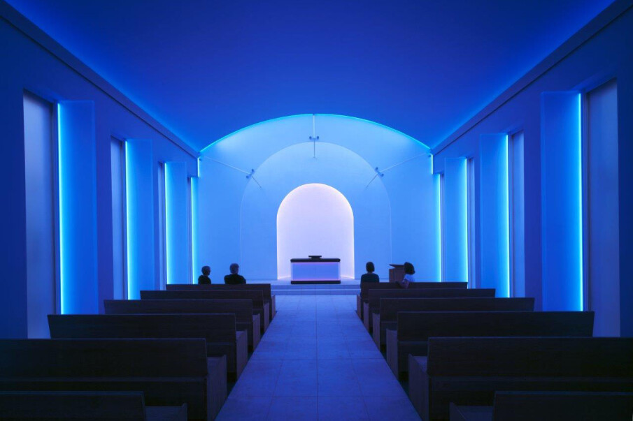
Kapelle im Dorotheenstädtischen Friedhof | Innenansicht
Berlin, 2015 | © James Turrell, Foto: Florian Holzherr

Es entstehen Gesamtkunstwerke, in denen Künstler:innen Architektur, Lichtführung, Ausstattung, Farbgestaltung und Skulptur genau aufeinander abstimmen. Die Kapelle bleibt ein Ort der Kontemplation, wirkt aber zugleich wie ein immersives Kunstwerk, das Besucher:innen aktiv in eine Atmosphäre hineinnimmt.

1. Mark Rothko – Die Rothko Chapel in Houston (1971)

Sie wurde 1971 eröffnet und enthält 14 großformatige Gemälde in tiefen Purpur- und Schwarztönen. Ursprünglich als christliches Kommissionswerk geplant, wurde sie später nicht-konsekriert und als interreligiöser Raum genutzt.

Für Besucher entsteht eine Art „schwarzes Heiligtum“, in dem Rothkos Gemälde zu atmosphärisch-meditativen Oberflächen werden.

Für meinen Forschungsansatz – Licht als Raumträger, Reduktion statt Überladung – ist die Rothko Chapel ein historisch bedeutendes Beispiel.

2. Louise Nevelson – Chapel of the Good Shepherd (1977)

Louise Nevelson gestaltete 1977 die Chapel of the Good Shepherd vollständig aus geschnitzten, bemalten und vergoldeten Holzelementen.

Die Intervention wirkt wie eine räumliche Skulptur: Wände, Altar und Ausstattung sind monochrom, meist weiß-gold, und schaffen eine ruhige, fast spirituelle Atmosphäre.

Materialität und Form sind hier nicht nur bildliche Inhalte, sondern können sakrale Wirkung erzeugen. 

3. Stefan Strumbel – Graffiti-Kapelle in Goldscheuer, Deutschland

Eine zeitgenössische Kirchengestaltung des deutschen Street-Art-Künstlers Stefan Strumbel.
Sein Werk umfasst:

  • Spray-Paint-Grafiken
  • LED-Beleuchtung
  • pink leuchtende Kreuzikonografie
  • großflächige Madonna-und-Kind-Darstellungen im Pop-Art-Stil.

Eine Verbindung von Popkultur und Tradition, die unterstreicht, wie offen der Kirchenraum für experimentelle Medien sein kann, wenn er dafür geöffnet wird.

4. Tobi Kahn – EMET Meditation Chapel (2002)

Der US-amerikanische Künstler Tobi Kahn gestaltete 2002 eine nicht-denominationelle Kapelle für das HealthCare Chaplaincy in New York. Sie besteht aus:

  • neun großformatigen Sky-and-Water-Gemälden
  • eigens entworfenen Möbeln
  • einer dreifachen Lichtarchitektur

Die Kombination aus sanfter Lichtführung, Horizontlandschaften und ruhiger Farbpalette zeigt, wie Licht und Raum therapeutisch wirken können.

5. James Turrell – Kapelle am Dorotheenstädtischen Friedhof, Berlin (2015)

Der US-amerikanische Lichtkünstler James Turrell, den ich im nächsten Blogpost näher studieren und untersuchen  möchte, schuf in der Kapelle des Dorotheenstädtischen Friedhofs in Berlin eine permanente Lichtinstallation, die zu Sonnenuntergang Farbverläufe erzeugt.

Die gesamte Innenarchitektur wurde auf Licht ausgerichtet: klare Linien, reduziertes Mobiliar, gezielte Lichtprogramme. Diese Arbeit zeigt, wie künstliches Licht eine sakrale Raumwahrnehmung erzeugen kann.

6. Louis Comfort Tiffany – Willard Memorial Chapel (1890er Jahre)

Die Kapelle ist die einzige vollständig erhaltene sakrale Innenarchitektur, die Louis C. Tiffany (Sohn des Juweliers & Leiter der Tiffany Glass Company) gestaltet hat.

Sie umfasst:

  • 14 opaleszente Fenster
  • eine Rosette
  • neun Glaslampen
  • Mosaikmöbel
  • goldverzierte Decken

Diese Kapelle zeigt, wie Licht durch Glas, Farbe und Ornament im sakralen Raum bereits im 19. Jahrhundert als atmosphärischer Träger eingesetzt wurde.

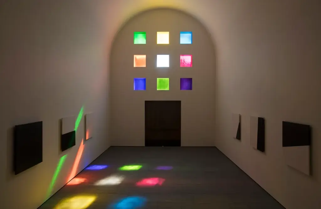
7. Ellsworth Kelly – Austin Chapel (2018)

Photo: Courtesy of Blanton Museum of Art, The University of Texas at Austin

Kelly entwarf die vollständige Architektur: ein kreuzförmiges Gebäude mit farbigen geometrischen Fenstern, die das Licht im Innenraum brechen.

Die Austin Chapel verbindet Minimalismus, Farbtheorie und sakrale Architektur und zeigt wiederum, wie Künstler:innen Licht bewusst als transzendente Erfahrung einsetzen.

Reflexion

Der Artikel verdeutlicht, dass:

  • Räume der Kontemplation und Wahrnehmung sind,
  • Licht als wesentliches Medium der Sakralität nutzen,
  • Architektur, Materialität und Atmosphäre als Einheit denken,
  • religiöse Räume transformieren können, ohne ihre Funktion zu verlieren.

Quellenangabe

Fazzare, Elizabeth. 2018. “7 Chapels Designed by Artists Including James Turrell, Louise Nevelson, and Mark Rothko.” Architectural Digest, May 18, 2018.

Accessed February 2025.

https://archive.is/20210709174407/https://www.architecturaldigest.com/gallery/artist-chapels


Holzherr, Florian. 2015. Kapelle im Dorotheenstädtischen Friedhof, Berlin – Innenansicht.
Fotografie. © James Turrell. Accessed February 2025.


Blanton Museum of Art. 2018. Austin Chapel – Interior View.
The University of Texas at Austin. Courtesy Photo. Accessed February 2025.


Hinweis zur Verwendung von KI-Tools

Zur sprachlichen Optimierung und für Verbesserungsvorschläge hinsichtlich Rechtschreibung, Grammatik und Ausdruck wurde ein KI-gestütztes Schreibwerkzeug (ChatGPT, OpenAI, 2025) verwendet.

Blogpost 2 – Thema!

Neues Semester, neuer Ansatz! (Aber dieses Mal wirklich in Richtung Masterarbeit!)

Letztes Semester durfte ich mich im Rahmen dieses Blogs mit dem Thema Motion Identity beschäftigen, was durch glückliche Zufälle dazu geführt hat, dass der finale Blogpost mehr oder weniger auf der Electric-Love-Festival-Bühne vorgeführt wurde. (AAAAAAAaaaaaah!)

Doch das ist immer noch sehr weit von dem entfernt, was Masterarbeits-Recherche sein sollte. Deshalb ist die diesjährige Mission: Rechercheansätze, Themen erkunden, „schauen, was wird“ – aber unter der Klammer eines starken Themas!

Aber: „Was willst du denn zur Masterarbeit machen?“ ist eine schreckliche Frage, weshalb ich mich zunächst mit „Was willst du auf KEINEN FALL machen?“ beschäftigt habe:
– reine 3D-Projekte
– etwas Langweiliges
– irgendeinen halbstark animierten Film (siehe Bachelorarbeit), in dem im schlimmsten Fall noch ein 2D-Rig vorkommen muss

Und während ich gedanklich weiter zwischen „Was will ich?“ und „Was will ich nicht?“ hin- und hergeschwommen bin, fand die Creative Night Graz statt!
Und irgendwie fand dieser kleine Ick* beim Thema 2D-Character seinen Weg ins Gespräch mit einem Animationsstudio (siehe Impuls-Beitrag), und auf einmal war da eine Frage: „Warum muss denn überall so ein Character rein?“

(*Ein „Ick“ ist ein plötzliches Gefühl der Abneigung oder des Ekels gegenüber einer anderen Person oder einem Ding.)

Die Frage hat ihren Ursprung wohl darin gefunden, dass sich bei fast allen Erklärfilm-Aufträgen der Vergangenheit, in jedem Pitchdeck und jedem Kund:innen­gespräch zum Thema Animation ein 2D-Character einschleicht (und wenn auch nur für eine unnötige Sequenz – Hauptsache einmal FULL BODY von links nach rechts durchs Bild) – so auch bei den Kolleg:innen aus der Branche.

Und ich habe mich gefragt:
Muss das denn so sein?
Woher kommt die Besessenheit von Kund:innen mit den kleinen Figuren? Vor allem in der Animation?
Funktioniert es tatsächlich gut, oder liegt es vielmehr am fehlenden Vorstellungsvermögen für alternative Erzählstrukturen?
Wie kann ich es schaffen, meinen zukünftigen Kund:innen dahingehend die Augen zu öffnen?
Vielleicht … mit guten Praxisbeispielen?

Und so sind wir bei folgender erster, grober Themenstellung gelandet:


Arbeitstitel:

Beyond Characters: Alternative Narrative Strategien im Motion Design

„Character – Warum Marken- und Erklärvideos neue narrative Strategien brauchen“

Forschungsfokus: Ich möchte untersuchen, warum Figuren/Maskottchen im Motion Design so dominant wurden, aber heute oft nicht mehr die wirksamste erzählerische Lösung darstellen – besonders in Branding- und Erklärvideos.

Zentrale Recherche-Blöcke:

A. Analyse: Warum Charaktere im Motion Design so populär wurden

Eventuell folgende Themen recherchieren:

  • historische Entwicklung: von TV-Maschinenfiguren über Marketing-Maskottchen bis hin zu 2D/3D-Motion-Charactern
  • psychologische Grundlagen (Identifikation, Anthropomorphismus)
  • Marketing-Mechaniken: Wiedererkennung, Emotionalisierung
  • Plattform- und Content-Trends (YouTube-Erklärvideos, Social-Media-Mascots)

B. Analyse: Warum Charaktere heute oft als oberflächlich oder redundant empfunden werden
Eventuell folgende Themen recherchieren:

  • Markenästhetik wird vereinheitlicht
  • „Character Fatigue“
  • zu generische Character-Styles (Flat, 3D-Cute, Corporate Memphis)
  • Ablenkung vom Kerninhalt statt Klarheit
  • Expertenmeinungen (Interviews)
  • Tests: gleiche Botschaft einmal mit Charakter, einmal ohne – welche wirkt klarer?

C. Neue narrative Strategien ohne Charaktere
Eventuell folgende Themen recherchieren:

  • Wie kann man Geschichten über Form, Typografie, Rhythmus, Farbe, Timing und abstrakte Bildsprache erzählen?
  • „Motion Grammar“: Bewegung als Bedeutungsträger (Siehe DesRes Motion Identity Thema)
  • Visuelle Systeme, die Marken klarer ausdrücken als Figuren (Siehe DesRes Motion Identity Thema)
  • non-character communication im Branding 

Keywords

Motion Graphics, Animation, Character Animation, non-character communication, storytelling, motion language, emotion through form, design expression, motion grammar, mascots, form-based storytelling, abstract narrative

Projektidee

A) Eine Serie experimenteller Animationen, die dieselbe Botschaft jeweils ohne Figuren kommunizieren.

Experimente z. B.:

  • nur Typografie
  • nur Formen & Komposition
  • rein über Geschwindigkeit & Rhythmus
  • minimalistische visuelle Systeme
  • abstraktes Storytelling (keine Avatare, keine Hände, keine Augen)

B) Endprojekt dass man später als Tool nutzen kann um es z.B Kund:innen vorzulegen & damit Aufklärarbeit zum Thema Animation zu machen und sie von einer „Non-character“-Erzählstruktur zu überzeugen 

—————

Soweit so gut – es ist einmal ein Anfang!

Aber Wo hackt’s noch:
– Will ich wirklich SO VIEL über Character lernen und schreiben, nur um dann zu sagen „Genau – UND JETZT OHNE!“
Lässt sich der Fokus vielleicht noch mehr auf Recherche in die Richtung „Alternativen“ drehen?

– Das Thema Literatur 🙁

Was wird das Projekt: Ist das Praxisprojekt ein Video, dass eben keine Character nutzt und super funktioniert, oder sind es sogar mehrere? Gibt es das Gegenbeispiel mit Character? Oder sollte das Projekt vielleicht sogar schon eben jene Aufarbeitung sein die ich meinen zukünftigen Kund:innen zeige/sende um zu sagen „Klar Character können wir machen… aber So geht’s auch!“

Wie geht’s weiter:

Hoffentlich mit einem Beratungsgespräch mit Roman (danke!)
Und dann muss man – Wohl oder Übel – in die Bibliothek (oder das INTERNET) um mit der tatsächlichen Recherche loszulegen!

Bis dahin GaLiGrü

London Symphony Orchestra: Abstraction and Motion in Branding

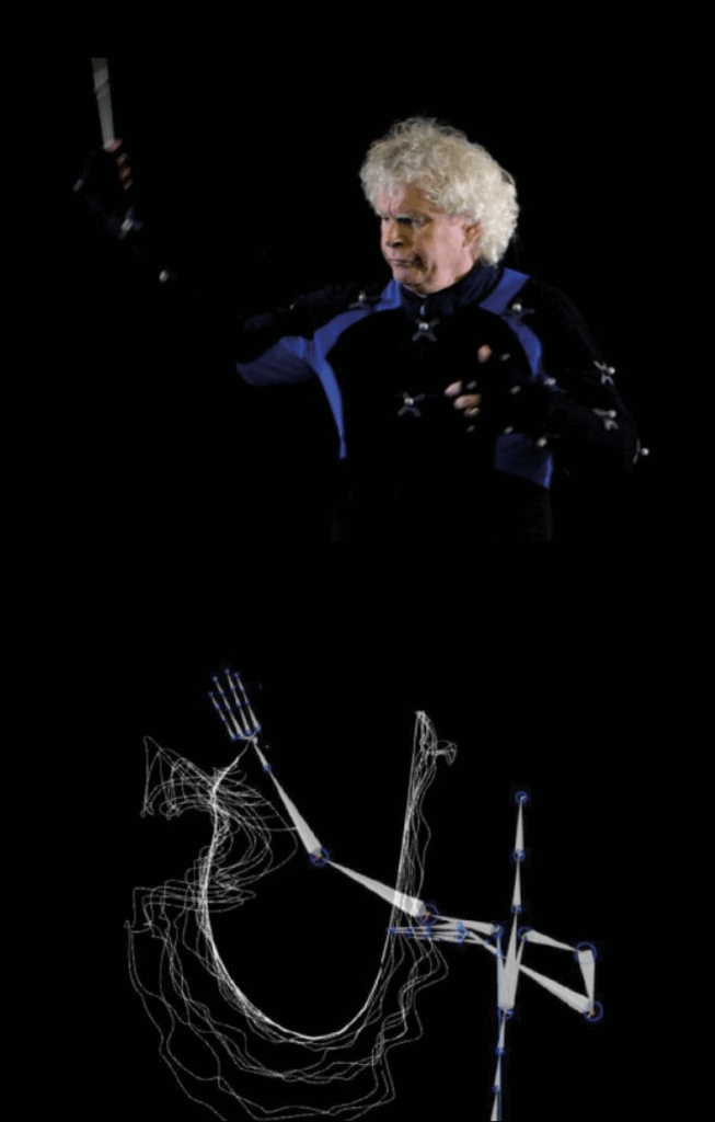
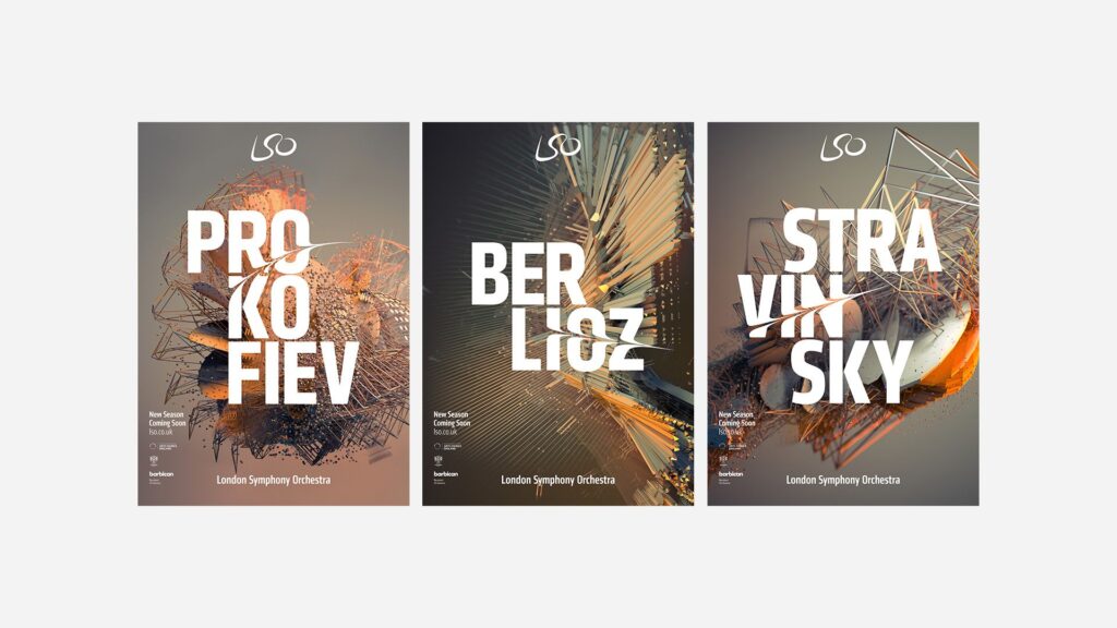
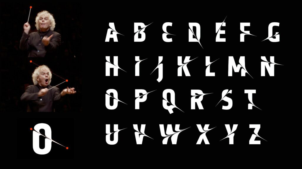
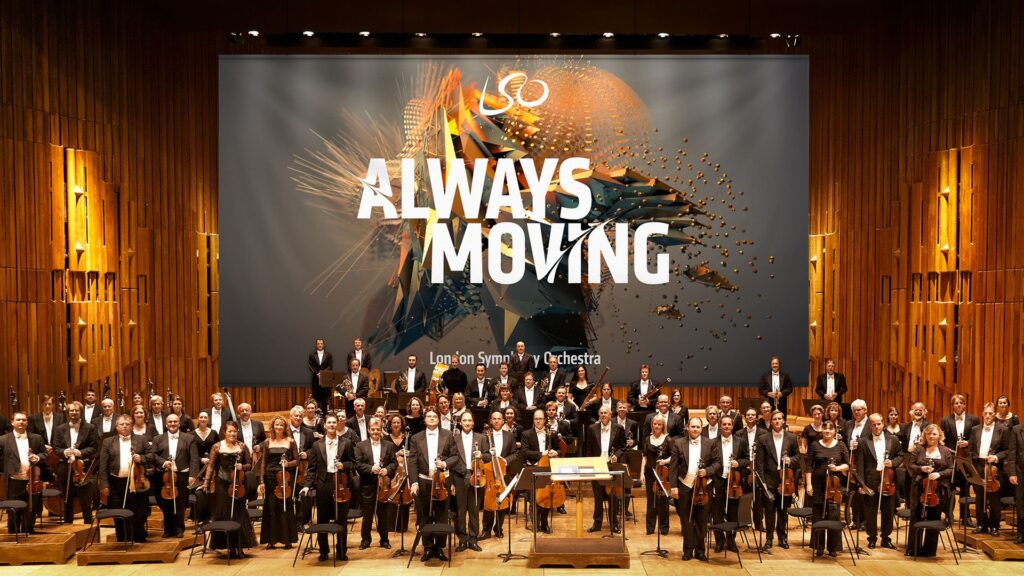
In 2017, the London Symphony Orchestra (LSO) introduced a new visual identity for its 2017/18 season. Instead of using typical images of musicians or instruments, they decided to do something much more experimental. The LSO turned to motion capture technology to create a visual language that reflects the energy, emotion, and dynamism of music itself. This collaboration, executed with the creative agency Design Bridge, used motion capture to turn music and conducting into abstract moving visuals. I found this project really interesting because it mixes classical music with digital art and motion design in. a way you don’t see very often or at least I haven’t. The whole idea was started by Sir Simon Rattle who was the LSO’s Music Director at that time. His conducting movements were recorded with twelve Vicon cameras at 120 frames per second. This helped to create a very detailed motion data that digital artist Tobias Gremmler later was able to transformed into abstract animations like abstract forms, which visually embodied the rhythm, intensity, and flow of the music. Form this data the team also created two typefaces. One of the looked more soft and flowing for a more gentle gesture approach. And the other was sharper and more angular for stronger movements. Both these typefaces worked together with the animations and the still images with this creating a full visual identity that was later on used everywhere. (The Partners Unveil Identity for LSO Formed by Tracking the Conductor’s Movement, 2017)

Abstract Forms and Motion

The abstract shapes generated from the motion capture are not random. Each shape is based on Sir Simon Rattle’s actual movements while conducting. However, the visualizations do not echo his motion. They turn his gestures into swirling vortex-like structures that suggest the textures and materials of an orchestra: wood, brass, smoke, and string. These organic, kinetic forms function as an “abstract score,” where lines, loops, and flowing wires communicate rhythm, energy, and dynamics in a visual language that parallels musical notation. Color and texture also play a big role. The animations use gradients, light flows, and semi-transparent textures to evoke elements of the orchestral soundscape. Air, vibration, resonance, and the interplay of instruments. Everything is always moving which reflects how music itself is never static. Here I really liked how the project manages to translate the feeling of music into a visual experience.

Impact and Significance

This approach positions the LSO as both a guardian of tradition and a forward-looking, innovative institution. By showing the conductors gestures in such an artistic way the visuals create a more emotional and personal connection to the music. In an industry where orchestral brands often remain conservative and predictable, the LSO’s identity stands out for its bold, kinetic abstraction. The combination of the custom typefaces and the abstract animations also helps with recognition. It shows that classical music can work with technology and contemporary design without losing its identity. 

Relevance to Motion Design

For motion design, this project is a great example of how movement can be turned into something abstract but still meaningful. It shows how motion graphics can build a whole brand identity and not just act as decoration. Because every visual element comes directly from the conductor’s movements and the music, the design feels very connected to the source. It proves that abstract shapes can still tell a story and carry emotion.

Even if the project is really strong, there are some challenges. The abstract visuals might not make sense to all viewers. People who don’t know much about design or conducting might think the shapes are just pretty graphics without understanding the idea behind them. Another issue is the budget. Motion capture is expensive and needs advanced equipment, which means smaller orchestras probably couldn’t do something similar. However I was still very fascinated by this approach and project itself and the way it was executed. 

Bibliography:

The Partners unveil identity for LSO formed by tracking the conductor’s movement. (2017, January 20). https://www.itsnicethat.com/news/the-partners-lso-identity-motion-capture-200117

Exploring my Options

I feel like, even though I have had a fairly clear overall direction for my topic from the very beginning, I always thought that the perfect idea for a more specific research question will come to me as I learn more about the topic. 

Well, that still has not happened and I’m beginning to stress out a bit. So, this blog post is my effort to sort through my own brain and figure out what I want to work on for the next 6 months. I know, this isn’t the type of scientific, perfectly cited content expected of these blogposts, but I promise, as soon as I have figured out what topic I want to write those perfectly researched texts about, I will put all my effort into it. 

I will use this blog post to create a comprehensive list of topic ideas I have had so far, a possible research question, an overview of the topic and what possible pros and cons would be.

Documentaries and Environment/Responsible Tourism

Possible Research Questions: How can documentary film function as a form of environmental communication in the context of sustainable tourism?
In what ways can documentary storytelling influence audience perceptions of responsible tourism?
To what extent can visual media foster behavioral change toward more sustainable travel?

Overview: I would explore the overall topic of environmental documentary films, how they are structured, which storytelling tools they use and how they can shape people’s views and behaviours. Maybe I could also talk about environmental communication and sustainable tourism in general and then do a deep dive on documentaries on the topic. 
With the second research question, my focus could also maybe be more on documentary storytelling in general, and then later applying it to the topic of responsible tourism.

Methods: I would first off look for literature on the topic, exploring the state of the art as well as past research and then analyse different enivronmental documentaries amongst other forms of media on how they aim to instill a desire for change in their viewers. A qualitative analysis on actual effects of these pieces of media would also be interesting, I am however not sure how I would approach this task. 

Pros: The theoretical part of my thesis would tie nicely into and prepare me for my practical project next semester, where I could apply what I learned about environmental documentaries to my own work. 

Cons: I have not yet been very successful in finding a lot of literature on the topic, which is why I am afraid I might not be able to amass enough knowledge on the topic in order to analyse and judge the pieces of media accurately. Moreover, I do not know if analysing different pieces of media alone would be enough of a scientific method for my master’s thesis.

Entschleunigung / Slow Media = Slow Travel?

Possible Research Question: How can media design interventions based on slow media principles encourage slower, more mindful, and sustainable forms of travel?

Overview: I was intrigued by the idea of connecting the slow media and the slow travel movements, exploring how travel content promoted via slow media might encourage slower and more conscious travel alongside a more conscious media consumption. 
In a world, where everything just gets faster and faster, many have recognized a need to slow down in their lives. This desire for a more conscious and more sustainable life is the most pressing on social media, where content just keeps getting faster and shorter, and in travel, where short and frequent holidays by plane, visiting every major sightseeing or insta spot are more popular than ever. 

Methods: I would again look into current research on the topic (if there is any) and explain the issues of our fast paced world, both on social media, in the fashion or food industry and in the travel sector. I would then talk about the slow media and slow travel movements and on what principles they operate, maybe finding some examples to analyse. I could also imagine creating a survey to see what the overall opinion on our fast-paced society looks like and whether the need for slower living truly exists.
In order to connect slow media to slow travel, I might be able to analyse examples or create different versions of media to compare in the survey. 

Pros: As far as I have seen, creating the connection between slow media and slow travel has not been done too often before, meaning the thesis might have some originality to it. I also feel like the documentary I want to create would tie well into the slow media idea, even if I would not be talking about documentaries specifically in my work. 

Cons: I have struggled a bit to find literature on the topic, or on slow media in general. Moreover, I am afraid that the term and the idea of “Slow Media” are not scientifically based enough to write a whole thesis on the topic. So, the whole thesis might become a bit too abstract, straying from clear-cut scientific writing too much.

Portraying Conflict in Documentaries

Possible Research Question: How do documentary filmmakers’ audiovisual and ethical decisions shape the representation of conflicting standpoints and influence viewers’ perceptions of fairness?

Overview: For this topic I would explore the topic of conflict in documentaries and how filmmakers can assure that their final work includes enough tension and conflict without harming any of the participants. Here, ethics would also come into play and would need to be talked about in depth. Portraying contrasting ideas and viewpoints is a common occurrence in documentary films and I would like to explore the different ways this task can be approached. In the case of my documentary this conflict would be between sustainable travel and the booming tourism industry, causing overtourism. Maybe conflicts could also arise between tourists and locals affected by them. 

Methods: As with the other topics, literature research would be at the start of my thesis, exploring how storytelling can work in documentaries, which role ethics play in planning and creating a documentary film and the different ways conflict can be addressed. I would also analyse different documentaries, looking at which conflicts appear and how they are treated. 

Pros: Doing a deep dive into how conflicts can be used to tell a story and dealt with in an ethical way can be good preparation for my own documentary project next semester. Also Daniel Bauer suggested this topic to me, so I feel a bit more secure about the fact that this would be an actually feasable topic people would want to read about.

Cons: Throughout the last week I have tried to find literature on the topic of conflict in documentaries and almost every search result that came up had something to do with political conflicts or war and documentaries about that, which is not really my aim for the thesis. Like with the other topics, I am kind of afraid that I won’t be able to find a lot of scientific literature on the topic. 

Conclusion

Some small part of me was hoping that, after writing all of this down and getting it out of my head and onto paper, I would see it clearly which topic is the right one. That is not quite the case, I’m still as indecisive as ever. Nonetheless, I feel like this blog post has given me some tangible bulletpoints to orient myself at and, maybe more importantly, it has shown me apects I am still unsure about with every topic, where I can ask targeted questions to my professors. So I am hopeful that by the next blog post I will have finally made a decision!

#1 How Cinematographic Techniques Shape the Emotional Experience of the Viewer

Meine Thema für die folgenden Blogposts ist das Zusammenspiel von Kameratechniken um Figuren oder Szenen im Film greifbarer und emotionaler zu gestalten.
Als erstes werfen wir einen Blich auf die Terminologie und anschließend was Kinematografie so ausmacht.

In der Filmwissenschaft treffen Praxis und Forschung oft aufeinander. Ein gutes Beispiel dafür ist die Frage, wie Kinematografie – also Lichtsetzung, Kamerabewegung, Bildkomposition und die Wahl der Optiken – unsere Wahrnehmung eines Films prägt. Viele Regeln stammen zwar aus jahrzehntelanger künstlerischer Praxis, lassen sich heute aber zunehmend durch Erkenntnisse aus Psychologie und Neurowissenschaften erklären.

Empathie: Wie Filme Gefühle auslösen

Die moderne Empathieforschung unterscheidet drei Ebenen des Mitfühlens:

  • Emotionales Mitfühlen (Embodied Simulation) – wir spüren, was Figuren fühlen.
  • Kognitives Mitfühlen (Theory of Mind) – wir verstehen ihre Perspektive.
  • Prosoziale Motivation – wir wollen ihnen helfen. (Zaki & Ochsner, 2012)

Studien zeigen, dass filmische Mittel, etwa Einstellungsgrößen, Nähe/Distanz oder Perspektivwechsel, beeinflussen, ob das Publikum eher emotional eintaucht oder intellektuell mitdenkt.

Kinematografie als Gestaltung von Raum

Ein zentrales Anliegen professioneller Kinematografie ist die Erzeugung von Tiefe und räumlicher Wahrnehmung. Denn obwohl Film eine dreidimensionale Welt auf eine zweidimensionale Fläche projiziert, entsteht im Kopf des Publikums dennoch ein überzeugendes Raumgefühl. Deshalb ist es wichtig die Dreidimensionalität zu bewahren und sogar noch zu verstärken.

Kameraleute versuchen dies seit über 100 Jahren. Gewisse Regeln werden von Generation zu Generation weitergegeben, ohne Erklärung warum diese Regeln entwicklet wurden oder warum diese existieren. Wenn man sich diese Regeln genauer ansieht, erkennt man dass diese aktiv daran beteiligt sind größere Tiefe in Bildern zu schaffen:

  • Vorder, -Mittel, Hintergrund: 3 dimensionales Bild durch Komposition
  • Chiaroscuro / Checkerboard Lighting: Hell-Dunkel-Kontraste verstärken Tiefenwirkung.
  • Gegenlicht und Konturenlicht: helfen dem Gehirn, Vorder- und Hintergrund zu trennen.
  • Pools of Light: Lichtinseln definieren unterschiedliche Raumebenen.
  • Lighting in Layers: Lichtschichten schaffen Orientierung im Bild.
  • Short Lighting / Far-Side Key: Erhöht die räumliche Präsenz.

Diese Methoden bedienen sogenannte monokulare Tiefenhinweise, also visuelle Signale, die unser Gehirn nutzt, um aus einem flachen Bild eine dreidimensionale Szene zu rekonstruieren.

Warum Tiefe so entscheidend ist

Kinematografie erzeugt nicht nur ästhetisch ansprechende Bilder – sie nutzt unbewusste Wahrnehmungsprozesse, um das Publikum im Raum einer Geschichte zu verankern. Tiefenwirkung schafft Orientierung, Glaubwürdigkeit und emotionale Bindung.

Deshalb hat sich die Erzeugung räumlicher Tiefe über Jahrzehnte hinweg fast zu einer eigenen Kunstform entwickelt und bleibt bis heute ein zentrales Werkzeug, um Zuschauer*innen in die Welt eines Films hineinzuziehen. Jetzt stellt sich die frage warum es zu einer Obsession geworden ist, Tiefe zu erzeugen?

Neuere neurowissenschaftliche Forschung weist darauf hin, dass die Wahrnehmung von Raum und die Entstehung emotionaler Empathie enger miteinander verbunden sein könnten, als bisher angenommen. Eine zentrale Rolle spielt dabei die Amygdala. Studien mit Menschen und Primaten zeigen, dass die Amygdala nicht nur emotionale Bedeutung bewertet, sondern diese Bedeutung auch mit räumlichen Informationen verknüpft. Dadurch reagiert das Gehirn schneller und intensiver auf räumlich klar verortete Reize, insbesondere wenn diese als emotional bedeutsam gelten.

Realer Raum besitzt Tiefe, und wir nehmen ihn wahr, indem wir alle verfügbaren Tiefenhinweise nutzen. Wenn Bewegtbilder diese Tiefe durch kinematografische Techniken verstärken und ein intensiviertes Gefühl von Räumlichkeit erzeugen, können sie wie ein supernormaler Stimulus wirken und die dargestellte Realität für die Zuschauerinnen und Zuschauer noch kraftvoller oder gesteigerter erscheinen lassen. (Ramachandran & Hirstein, 1999)

Literatur

Lotman, E. (2016). Exploring the ways cinematography affects viewers’ perceived empathy towards onscreen characters. Baltic Screen Media Review, 4(1). https://doi.org/10.1515/bsmr-2017-0005

Ramachandran, V. S., & Hirstein, W. (1999). The science of art: A neurological theory of aesthetic experience. Journal of Consciousness Studies, 6(6–7), 15–51.

Zaki, J., & Ochsner, K. N. (2012). The neuroscience of empathy: Progress, pitfalls and promise. Nature Neuroscience, 15(5), 675–680.

Understanding Aesthetic Variables

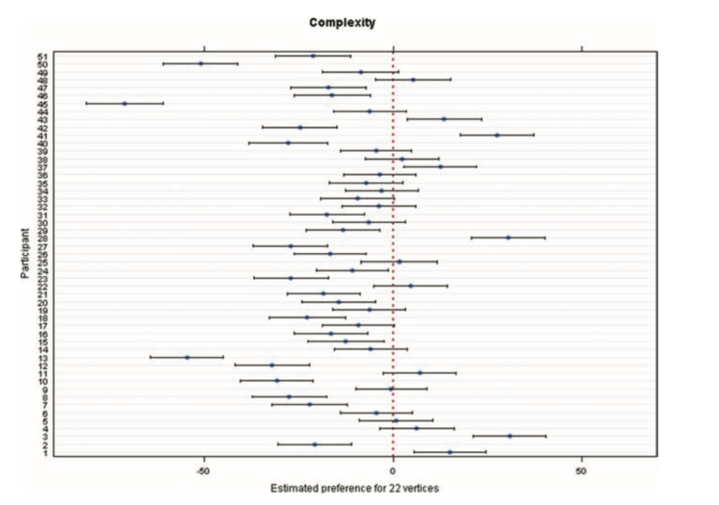
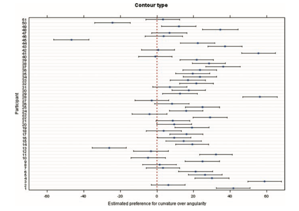
The paper “Abstract Shape Aesthetics: Contour, Complexity, Motion, and Individual Variability” (Soranzo et al., 2024) as mentioned in the previous blogpost, breaks aesthetics down into three key variables: contour, complexity, and movement. These variables help researchers understand how we respond to very simple, abstract shapes that carry no specific meaning for us. What I do like about this kind of approach is that there is a separation between aesthetics into its different parts. The focus will now lie on what these different variables mean but also how the study measured them and what these results say about the foundation of visual preference.

One of the first variables is contour. Where the shape edges, curved versus angular. In our daily life, we tend to already associate curved things with softness, smoothness, or safety, and angular things with sharpness or tension. The study confirms this pattern: participants preferred curved shapes over angular ones. This matches earlier research mentioned in the paper, which also found a strong preference for curved contours. The exact reason remains debated. Some theories suggest angular shapes trigger avoidance responses because they can signal danger. Others propose that curved shapes feel more natural to us, connecting to shapes we encounter in the environment.

The second variable, complexity, turned out to be more surprising. The study defines complexity through the number of vertices: six for simple shapes, 22 for complex ones. Complexity is already a controversial topic in aesthetic research. Some theories argue that complexity increases interest, while others suggest simplicity is more appealing because it requires less cognitive effort. In this study, participants clearly preferred simpler shapes. The authors describe this as an effect of simplicity. However, they also acknowledge that previous studies have found more mixed or even opposite patterns, depending on how complexity was defined from the beginning. This suggests complexity is not a single variable but a cluster of different visual features. For example, the paper “Visual Complexity: A Review” (Donderi, 2006) highlights that visual complexity which has been studied across many domains. It looks at how judgments of complexity relate to multiple factors such as amount of detail, predictability, symmetry, and perceptual load. One of Donderi’s key points in his work is that our perception of complexity is very tightly linked to its predictability. Images or shapes that have a more clear and regular pattern, like symmetrical shapes, often feel less complex. On the other hand, unpredictable shapes or compositions feel more complex to us because our visual system cannot easily understand or “compress” them into simple rules. This claim is also supported by the idea that our brain constantly tries to reduce incoming information into simple structures. However, when that is not possible, we perceive it as complex.

The third variable, movement, examined whether rotation or expansion would change how people rated the shapes. The interesting part is that movement did not affect aesthetic ratings. There were also no individual differences. This stands in contrast to contour and complexity, where people varied a lot. But for movement, the participants agreed that it didn’t have a special effect on them. This might mean movement simply does not influence aesthetic judgments for this type of shape. Or it might mean that the study design removed all the expressive value that movement normally carries. My main takeaway is that movement is not a universal aesthetic enhancer. When a shape is abstract and meaningless, adding rotation or expansion does not automatically make it more beautiful. Aesthetic impact depends on context and on the meaning we attach to motion.

Overall the reseach shows that aesthetic judgment are shaped by basic visual features like contour, complexity and movement. Even if movement does not play such a major role for abstract shapes. Simplicity, predictability and visual structure do have a great influence on beauty more that it might have been expected. 

Bibliography

Donderi, D. C. (2006). Visual Complexity: A Review. Psychological Bulletin132(1), 73–97.

Soranzo, A., Bertacchini, F., & Bertamini, M. (2024). Abstract Shape Aesthetics: Contour, Complexity, Motion, and Individual Variability. Art & Perception12(3), 240–263. https://doi.org/10.1163/22134913-bja10057

What Abstract Shapes Teach Us

When we talk about aesthetics, most people immediately think of art, design, or familiar objects. Things that we recognize and know. Things that carry memories and meaning. That’s why it feels almost strange to learn that an entire field of research focuses on the opposite: abstract, meaningless shapes. No symbolism and. No cultural context. 

In Abstract Shape Aesthetics: Contour, Complexity, Motion, and Individual Variability (Soranzo et al., 2024), the authors highlight why such stripped-down stimuli are so powerful. They write that studying shapes “devoid of meaning or familiarity” helps us understand how visual perception can work and how we experience art on a basic level. To me, this hints at something fundamental, that we might not need cultural knowledge to experience beauty. Some aesthetic responses might be built into how our visual system works.

Abstract Shapes as a Window Into “Raw” Perception

Abstract shapes let researches look at how we react to visuals before meaning steps in. For example, the moment we recognize a face, an animal, or a symbol, our brains automatically activate memories, emotions, and cultural knowledge. That’s also why psychologists often try to remove context, to find out what features alone can trigger an aesthetic preference.

This study took that idea and looked at it more closely. The researchers used abstract, meaningless shapes presented on a computer screen, ensuring that nothing could be interpreted as a known object. This creates a laboratory-like condition: a clean space where only visual properties matter.

And even when shapes have no meaning they can still influence us: 

  • Curves often feel soft, friendly, or organic
  • Angles can feel sharp, dynamic, or even threatening
  • Simple shapes can feel calm or elegant
  • Complex shapes can feel chaotic or energetic
  • Motion — expansion, rotation — can feel looming, playful, or mechanical

We respond emotionally to form long before meaning steps in.

A Long Tradition: Fechner and the Quest to Measure Aesthetics

What I find fascinating is this very modern study can be connected to something very old. Already in 1876, Gustav Fechner believed that aesthetics could be studied scientifically and that the best way to do this was through neutral stimuli. Here the authors explicitly link their work to Fechner’s idea that studies of beauty should start with simple, context-free shapes.

This does leave me torn. On one hand, it’s exciting to think that beauty isn’t purely subjective. On the other hand, I love the messy, emotional, culturally shaped side of aesthetics. Beauty is not only “perception”; it’s also memory, narrative, and identity.

New Insights: Individual Differences Matter

One of the most interesting results becomes visible when looking at individuals instead of a whole group of averages. The overall trends were very clear: 

  • People preferred curved over angular shapes
  • Simple over complex shapes
  • And within this experiment movement didn’t create a strong preference 

But when researches looked at each individual the results changed. Especially when contour type and complexity interacted the preferences varied a lot from person to person. This reminds us that even the most basic perceptual preferences are not universal. Even before meaning enters the picture, humans differ.

The study shows that many of our aesthetic responses may be deeply rooted in the visual system itself. Abstract shapes make these foundations visible. But for me, abstract shapes standing alone are not fully satisfying. They reveal mechanisms, not emotions. Perception, not meaning. Preference, not experience. However what I can take away form this is that abstract shapes help us understand how we process beauty, but only context explains why something truly touches us.

Bibliography:

Soranzo, A., Bertacchini, F., & Bertamini, M. (2024). Abstract Shape Aesthetics: Contour, Complexity, Motion, and Individual Variability. Art & Perception12(3), 240–263. https://doi.org/10.1163/22134913-bja10057