Hello Everybody, I hope you enjoy the video and prototype. Have a great day <3
Author: seymur.mammadov
Blog Post 5: Reality of Developing in AR and struggles
With my designs and architecture complete, I dived into Unity, eager to bring my vision to life. The first step was to implement the core QR code scanning feature. My initial research led me to Meta’s developer documentation and some promising open-source projects on GitHub, like the QuestCameraKit, which gave me a solid conceptual starting point. I found a QR scanning script that seemed perfect and began integrating it.
What followed wasn’t a straight line to success. It was a multi-week battle against a ghost in the machine—a frustrating cycle of failures that taught me a crucial lesson about AR development.
Things never work out your way
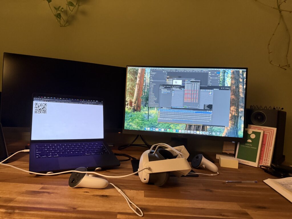
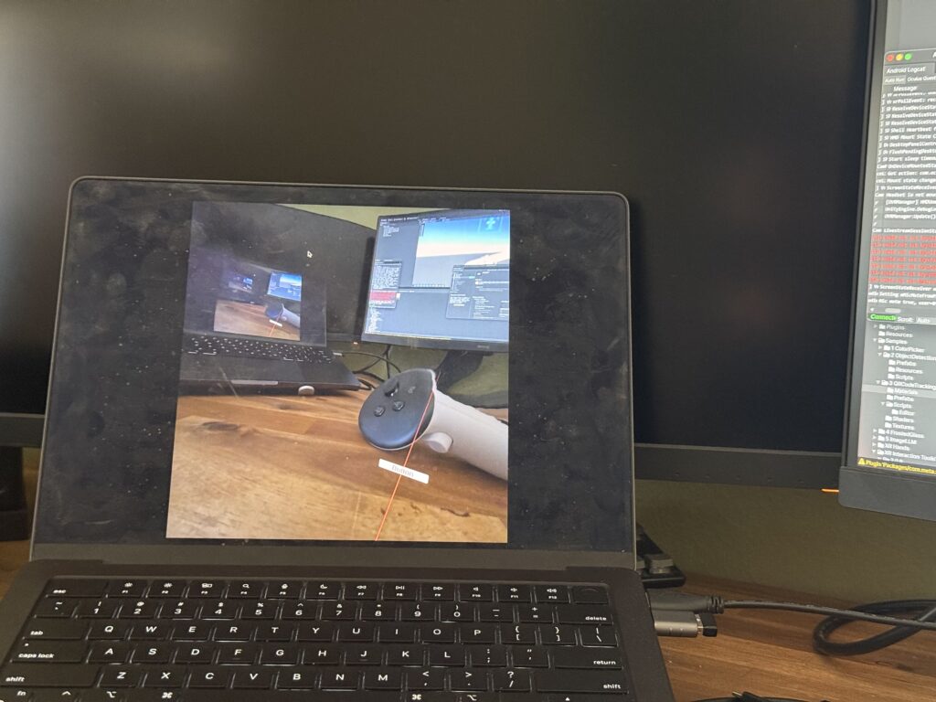
My initial prototype worked flawlessly within the Unity editor on my laptop. I could scan QR codes, trigger events—everything seemed perfect. But the moment I deployed it to the actual AR device, the Quest headset, it fell apart.
This is where I hit the wall. The symptoms were maddening: controller tracking was erratic and unpredictable, user input would get lost entirely, and the UI was completely unresponsive. After weeks of frustrating trials, debugging scripts line-by-line, and questioning my own code, I finally diagnosed the root cause. It wasn’t a simple bug; it was a foundational incompatibility.
The QR scanning asset I had chosen was built on the legacy Oculus XR Plugin. However, my project was built using the modern XR Interaction Toolkit (XRI), which is designed from the ground up to work with Unity’s new, standardized OpenXR backend. I was trying to force two different eras of XR development to communicate, and they simply refused to speak the same language.
The Turning Point: A Foundational Pivot
The “aha!” moment came with a tough realization: no amount of clever scripting or patchwork could fix a broken foundation. I had to make a difficult but necessary decision: stop trying to patch the old system and re-architect the project onto the modern standard.
This architectural pivot was the most significant step in the entire development process. It involved three major updates:
- Embracing the Modern Standard: OpenXR My first move was to completely migrate the project’s foundation from the legacy Oculus plugin to OpenXR. This involved enabling the Meta Quest Feature Group within Unity’s XR Plug-in Management settings. This single, critical step ensures all of Meta’s specific hardware features (like the Passthrough camera) are accessed through the modern, standardized API that the rest of my project was using.
- Rebuilding the Eyes: The OVRCameraRig With the OpenXR foundation in place, the old camera rig that the QR scanner depended on immediately broke. I replaced it entirely with the modern
OVRCameraRigprefab. This new rig is designed specifically for the OpenXR pipeline. It correctly handles the passthrough camera feed, and a key component of my project—the QR scanner—instantly came back to life. - Restoring the Hands: The XRI Controller Prefab Finally, to solve the erratic tracking and broken input, I replaced my manually configured controllers with the official
Controller Prefabfrom the XR Interaction Toolkit’s starter assets. This prefab is guaranteed to work with the XRI and OpenXR systems, which immediately restored precise, stable hand tracking.
The Result: A Seamless Prototype
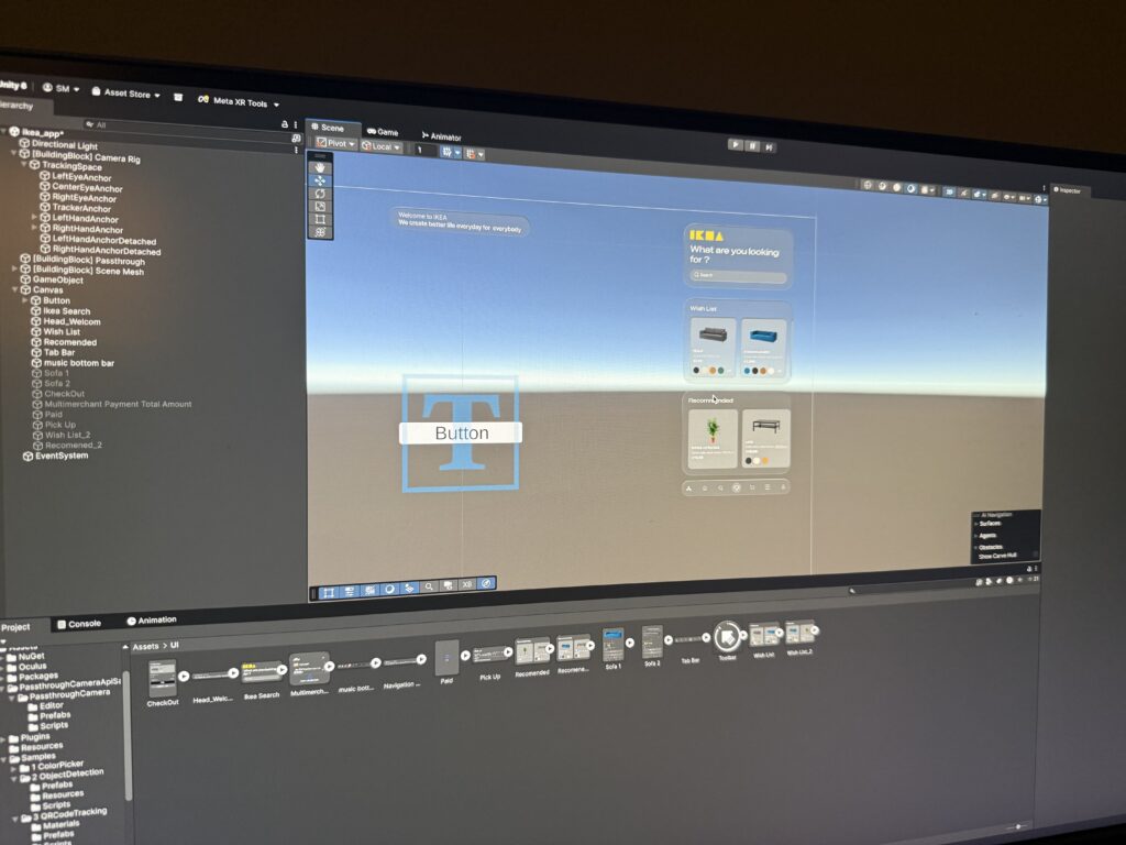
With the new foundation firmly in place, the chaos subsided. The final pieces fell into place with a central UIManager to manage the UI pages and a persistent DataManager to carry scanned information between scenes. The application was no longer a broken, unusable mess on the headset; it was stable, responsive, and worked perfectly.
This journey was a powerful reminder that in the fast-moving world of XR development, sometimes the most important skill is knowing when to stop patching a problem and instead take a brave step back to rebuild the foundation correctly. Here is few images from me trying to make it work.
This stable, working prototype is the culmination of that effort. In addition, I realize how these concepts can be complex and not make sense but I hope may be in can help someone in the future. In my final post, I’ll stop telling you about it and finally show you. Get ready for the full video demonstration.
Blog Post 4: From Blueprint to Visuals: Wireframing and Designing the UI
After defining the complex architecture and data flows in my previous posts, it was time to shift focus from the backend logic to the user’s reality. I needed to answer the most important question: What will this experience actually look and feellike for Alex, our shopper? This is where the design process begins. It’s a journey of translating abstract ideas into tangible, interactive screens. For this project, I followed a three-stage methodology, moving from low-commitment sketches to a fully realized high-fidelity vision.
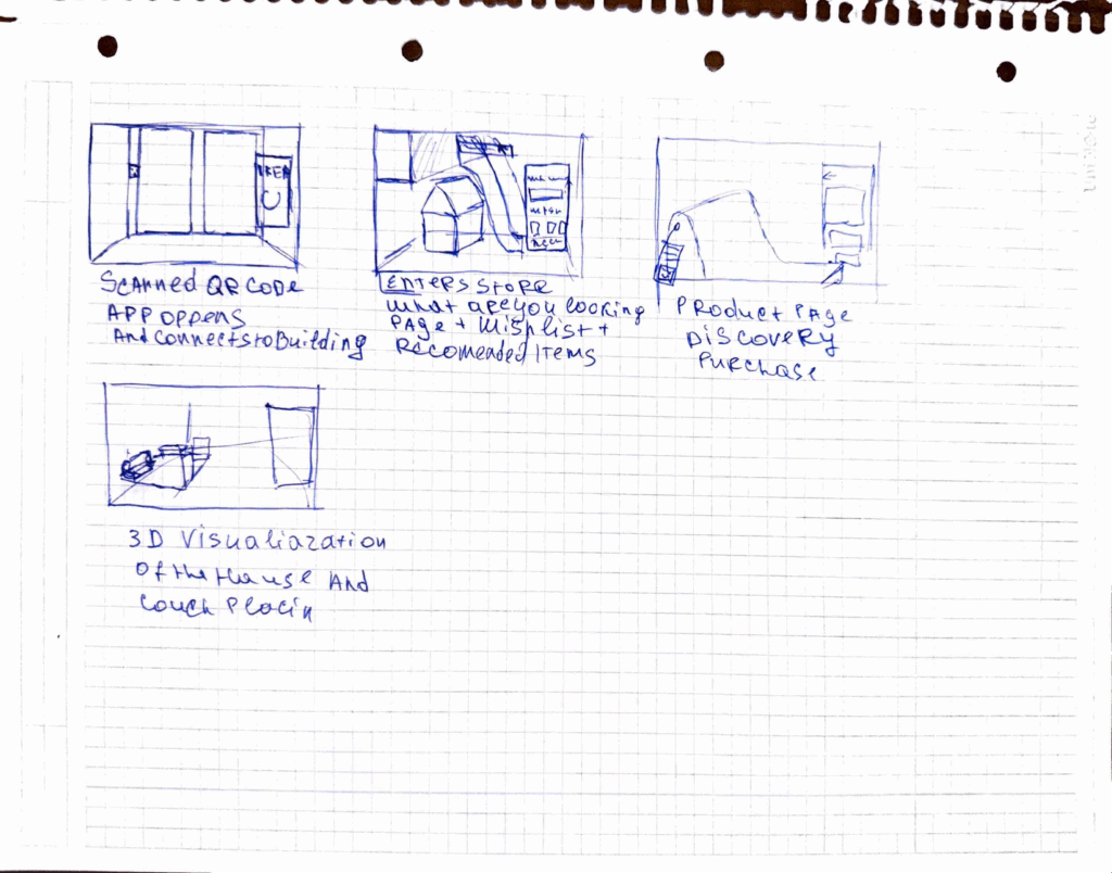
Stage 1: The Spark of an Idea – Paper Wireframes Every complex digital product begins with the simplest of tools: a pen and paper. Before getting down to pixels and software, I sketched out the core user flow. This stage is all about speed and ideation—capturing the main steps of the journey without worrying about details.As you can see from my initial drawings, I focused on the key moments: entering the store, viewing a product, and the “wow” moment of 3D visualization in the user’s own home. This raw format allowed me to establish the foundational structure of the application.
Stage 2: Building the Blueprint – Low-Fidelity (Lo-Fi) Digital Wireframes With the basic flow mapped out, the next step was to give it a more formal structure. I created low-fidelity digital wireframes. The goal here is not beauty; it’s clarity. By using simple grayscale boxes, placeholder images, and basic text, I could focus entirely on information hierarchy and layout. These Lo-Fi designs helped me answer critical questions: Where should the search bar go ? How should a product’s details be organized? What does the checkout process look like? At this stage, I focused on a mobile form factor to solidify the core components in a familiar layout before adapting them for a more complex AR view.


Stage 3: Bringing the Vision to Life – High-Fidelity (Hi-Fi) AR Mockups This is the leap from a 2D blueprint into a 3D, immersive world. Designing for Augmented Reality, especially for the main target of smart glasses, required a complete shift in thinking. The user interface can’t just be a flat screen; it needs to live within the user’s space, providing information without obstructing their view.Here are some of the key design principles I implemented in the high-fidelity mockups:
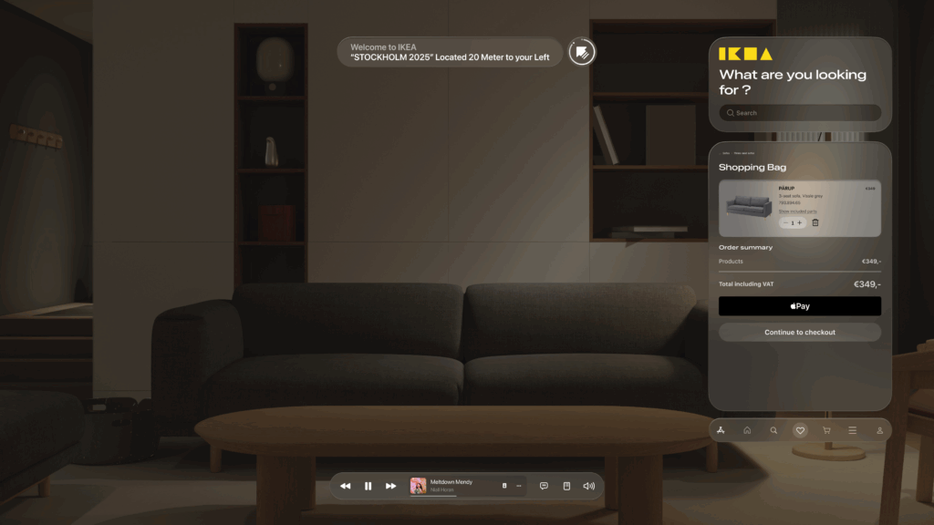
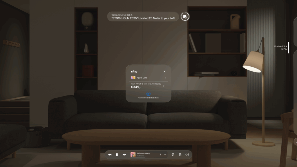
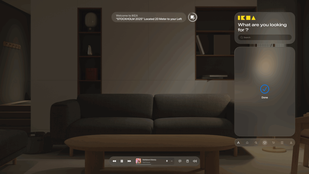
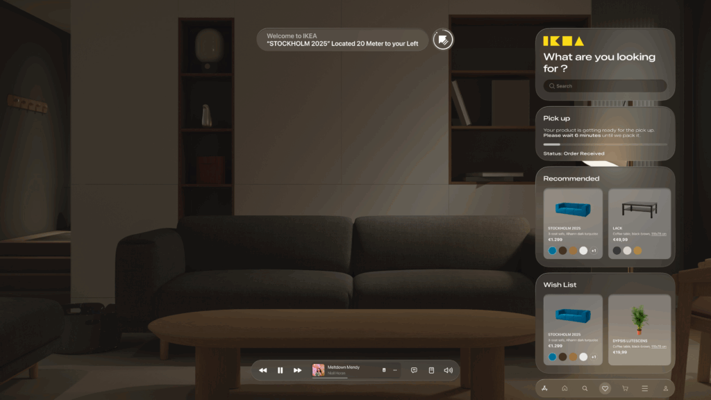
Spatial & Contextual UI: The interface appears as a series of floating panels, or “holograms.” A navigation prompt appears at the top left, while the main interactive panel is on the right, keeping the central field of view clear. This UI is also contextual—it changes based on what the user is doing, whether they are navigating, inspecting an item, or making a purchase.
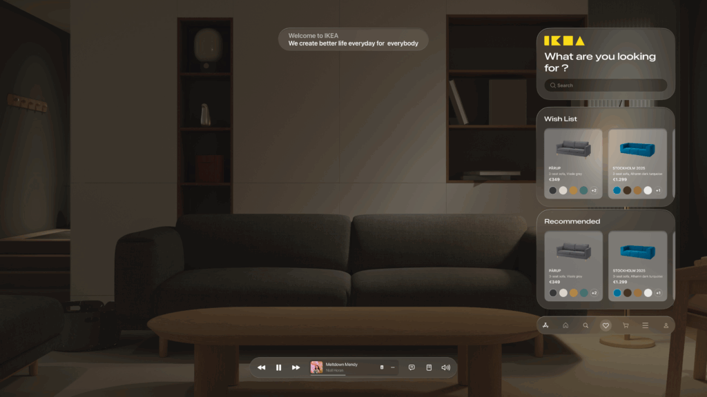
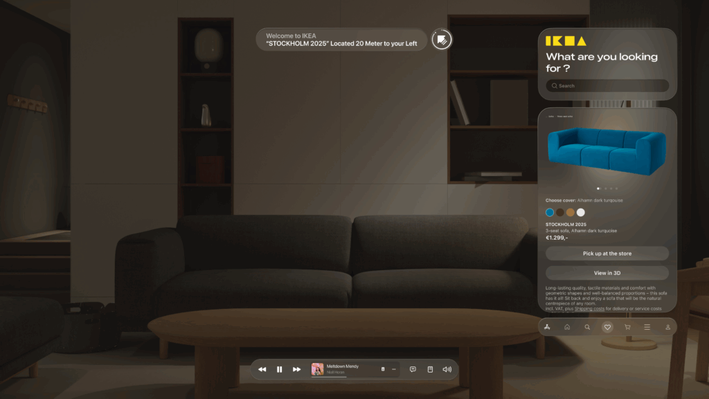
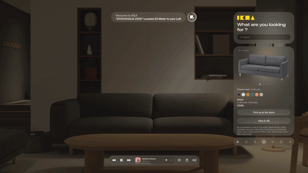
Glassmorphism: I used a translucent, blurred background effect for the UI panels. This modern aesthetic, known as glassmorphism, allows the user to maintain a sense of the environment behind the interface, making it feel integrated and less obtrusive.
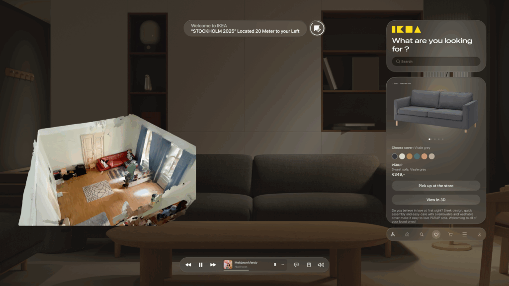
Seamless AR Integration: The core feature—visualizing furniture—is seamlessly integrated. As seen below, when Alex wants to check how a sofa looks in his apartment, the app displays the 3D scan of his room directly within the interface. This feature provides immediate, powerful value and solves a key customer pain point.
- An End-to-End Flow: From Browse the wishlist to making a secure payment with Apple Pay and seeing the order status, the entire purchase journey is designed to be fluid and intuitive, requiring minimal interaction from the user this. This actually concludes my idea of the technology us human moving from interacting with the objects by typing or other means now we have our devices to do so.
This iterative journey from a simple sketch to a polished AR interface was crucial for refining the concept and ensuring the final design is not only beautiful but also intuitive and genuinely useful.
With the architecture defined and the user interface designed, the final step is to merge them. In my next post, I’ll discuss the technical prototyping process—bringing these designs to life with code and seeing them work on a real device.
Blog Post 3: A Shopper’s Journey: Tracing the Data Flow Step-by-Step
In my last post, I unveiled the blueprint for my smart retail system—the three core pillars of the AR Application, the Cloud Platform, and the In-Store IoT Network. Today, I’m putting that blueprint into motion. I’ll follow my case study shopper, Alex, through the IKEA store and analyze the precise sequence of data “handshakes” that make his journey possible. Additionally this blog post is super technical due to my personal interest and it’s help to be able to further develop the technology
While this experience is designed to be accessible on any modern smartphone, it is primarily envisioned for the next generation of consumer Smart AR Glasses. The goal is a truly heads-up, hands-free experience where digital information is seamlessly woven into the user’s field of view.
Let’s dive into the technical specifics that happen on Alex’s chosen AR device.
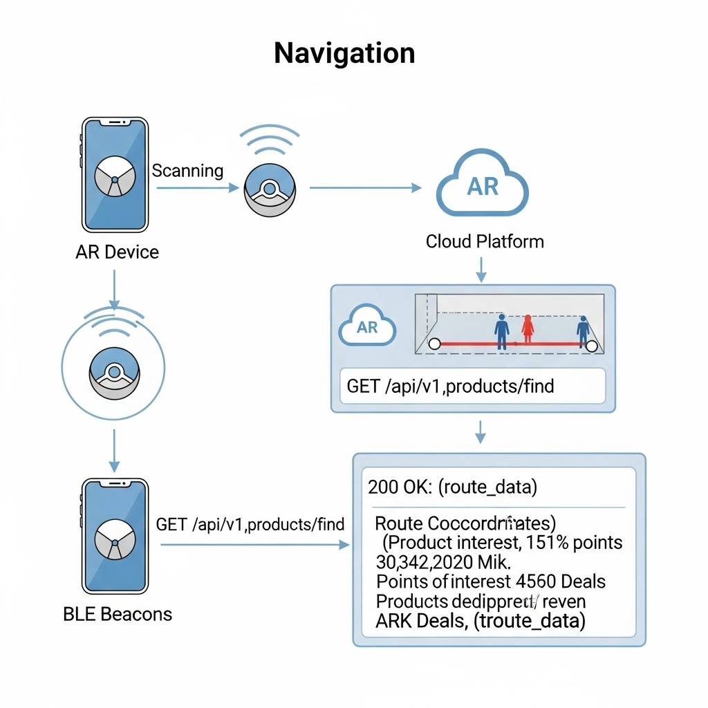
1. The Task: High-Precision In-Store Navigation
The Scenario: Alex arrives at the store, puts on his smart glasses, and wants to find the “BILLY bookshelf.” He needs a clear, stable AR path to appear in front of him.
The Data Flow: The immediate challenge is knowing Alex’s precise location, as GPS is notoriously unreliable indoors. To solve this, I’ve designed a hybrid indoor positioning system:
- Bluetooth Low Energy (BLE) Beacons: These are placed throughout the store. The AR device detects the signal strength (RSSI) from multiple beacons to triangulate a coarse position—getting Alex into the correct aisle.
- Visual Positioning System (VPS): This provides the critical high-precision lock. A pre-built 3D “feature map” of the store is hosted on my cloud platform. The software on the AR device matches what its camera sees in real-time against this map. By recognizing unique features—the corner of a shelf, a specific sign—it can determine its position and orientation with centimeter-level accuracy.
Here’s how they work together:
- The AR device uses BLE Beacons to get a general location.
- This coarse location is used to efficiently load the relevant section of the VPS feature map from the cloud.
- The device’s computer vision module then gets a high-precision coordinate from the VPS.
- Now, the application makes its
API call: aGETrequest to/api/v1/products/find. Therequest payloadincludes the high-precision VPS data, like{"productName": "BILLY", "location": {"x": 22.4, "y": 45.1, "orientation": {...}}}. - Backend calculates a route and returns a
JSON responsewith the path coordinates. - The application
parsesthis response and, using the continuous stream of data from the VPS,anchorsthe AR navigation path firmly onto the real-world floor, making it appear as a stable hologram in Alex’s field of view.
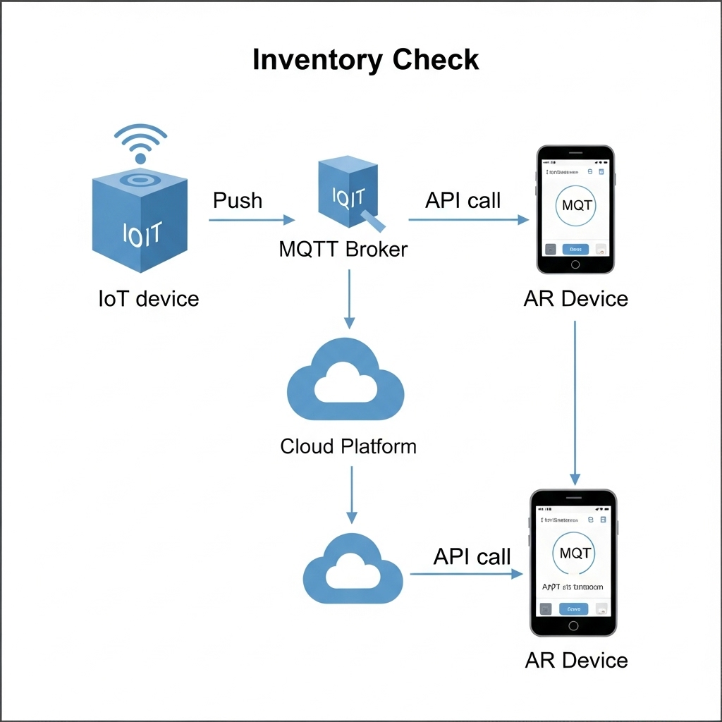
2. The Task: Real-Time Inventory Check
The Scenario: Alex arrives at the BILLY bookshelf. A subtle icon hovers over the shelf in his vision, indicating he can get more information.
The Data Flow:
- The IoT Push: A smart shelf maintains a persistent connection to my cloud’s
MQTTbroker. When stock changes, itpublishesa data packet to an MQTT topic with a payload like{"stock": 2}. - The App Pull: When Alex’s device confirms he is looking at the shelf (via VPS and object recognition), the app makes a
GETrequest to/api/v1/inventory/shelf_B3. - My Cloud backend retrieves the latest stock value from its
Redis cache. - The app receives the
JSON responseand displays “2 In Stock” as a clean, non-intrusive overlay in Alex’s glasses.
3. The Task: AR Product Visualization in Alex’s Room
The Scenario: Alex sees a POÄNG armchair he likes. With a simple gesture or voice command, he wants to see if it will fit in his living room at home.
The Data Flow:
- Alex looks at the armchair’s tag. The device recognizes the product ID and calls the
GET /api/v1/products/poang_armchairendpoint. - My Cloud Platform responds with metadata, including a URL to its 3D model hosted on a
CDN (Content Delivery Network). - The AR device asynchronously downloads the 3D model (
.glbor.usdzformat) and loads Alex’s saved 3D room scan. - Using the device’s specialized hardware, the application
rendersthe 3D armchair model as a stable, full-scale hologram in his physical space, allowing him to walk around it as if it were really there.
This intricate dance of data is what enables a truly seamless and futuristic retail experience.
In my next post, I will finally move from the backend blueprint to the user-facing design. I’ll explore the prototyping and UI/UX Design and the design process for the interface that Alex would see and interact with through his AR device.
Blog Post 2: The Blueprint: Architecting the Smart IKEA Experience
In my last post, I introduced the concept of transforming the retail journey using Augmented Reality and the Internet of Things. To move from a concept to a reality, however, we need more than just a good idea. We need a blueprint.
Remember Alex, our first-time homeowner navigating the vast IKEA maze? His journey from feeling overwhelmed to confidently furnishing his space is powered by a seamless blend of technologies. But for that “magic” to work, a robust and well-thought-out system must operate behind the scenes. Before we design a single button or write a line of code, we first have to design the architecture.
Think of it like building a house. You wouldn’t start laying bricks without a detailed blueprint. Our system architecture is exactly that: a master plan that defines all the moving parts and how they communicate with each other.
For our smart retail experience, the system is built on three core pillars:
1. The AR Application (The Guide)
This is the component Alex interacts with directly on his smartphone/Smart Glasses. It’s his window into this enhanced version of the store. It’s not just an app; it’s his personal guide, interior designer, and shopping assistant all in one.
Key Responsibilities:
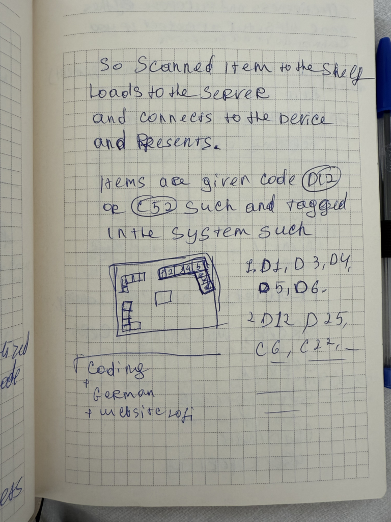
- Reading the QR code to understand the location and connect to correct server
- Rendering the AR navigation path that guides Alex through the store.
- Displaying interactive information cards for products.
- Capturing the 3D scan of Alex’s room and allowing him to virtually place furniture.
2. The Cloud Platform (The Central Brain)
If the app is the guide, the cloud is the all-knowing brain that directs it. This powerful backend system is where all the critical information is stored, processed, and managed in real-time. It’s the single source of truth that ensures the information Alex sees is always accurate and up-to-date.
Key Responsibilities:
- Storing the entire IKEA product catalog, including 3D models, dimensions, and prices.
- Managing the digital map of the store.
- Processing real-time inventory data and user account information (like Alex’s saved room scan).
3. The In-Store IoT Network (The Nervous System)
This is the network of smart devices embedded within the physical store. These devices act as the store’s nervous system, sensing the environment and sending crucial updates to the central brain. This is what connects the digital world of the app to the physical reality of the store.
Key Responsibilities:
- Using smart shelves or sensors to monitor stock levels for products like the BILLY bookshelf.
- Using beacons to help the app pinpoint Alex’s precise location for accurate navigation.
- Triggering location-based offers or suggestions.
How It All Connects
So, how do these three pillars work together? They are in constant communication, passing information back and forth to create the seamless experience Alex enjoys. This diagram shows a high-level view of our architecture:
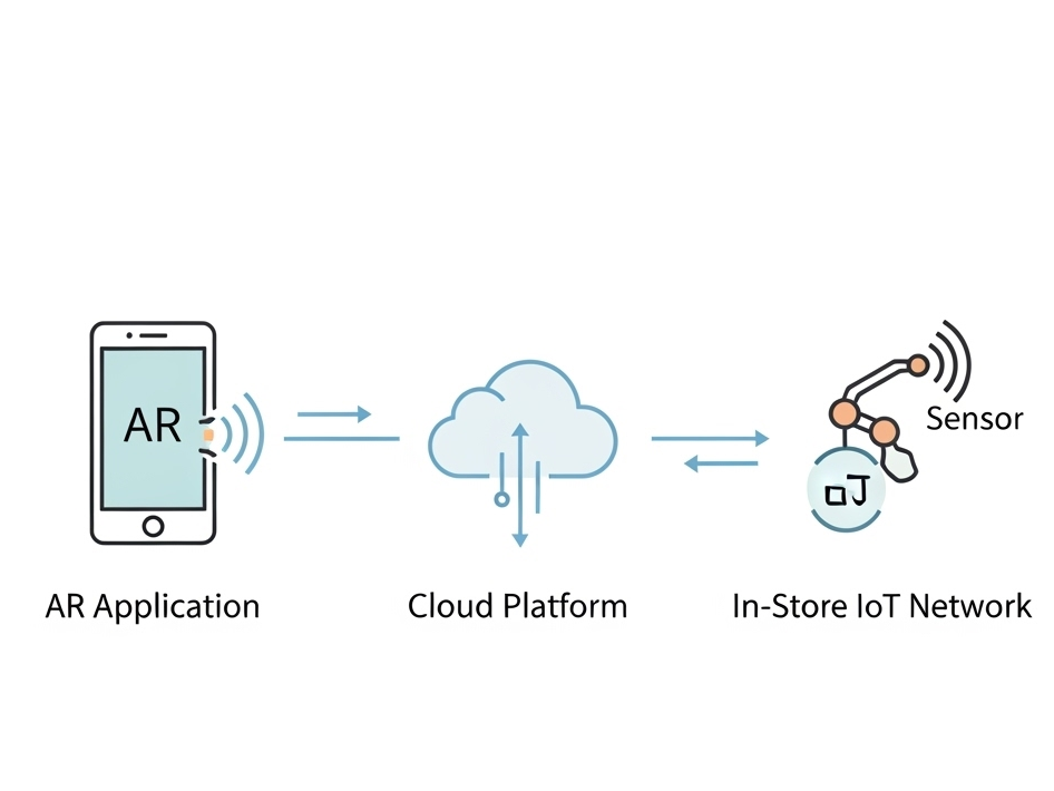
As you can see, the AR Application on Alex’s device is constantly talking to the Cloud Platform, requesting data like product locations and sending data like user requests. Simultaneously, the In-Store IoT Network is feeding live data to the Cloud, ensuring the entire system is synchronized with the real world.
With this blueprint in place, It creates a clear path forward for development.
WebExpo Conference: From badges to value: Designing meaningful gamified experiences
The speaker explained how adding simple game-like elements—things like progress bars, badges, and friendly competition—can make everyday tasks more interesting and fun. Below, I’ll walk through the key points and describe the slides they showed so you can picture how these ideas work in real life.
Why Gamification Matters
The talk began by pointing out that humans love to see progress. The first slide showed a plain horizontal bar that gradually fills in as you complete tasks. The speaker said that when you see a bar inching toward 100%, you feel motivated to keep going. Even something as simple as coloring in a bar can boost engagement—people want to finish the “game” by filling up that bar.
Common Game Elements
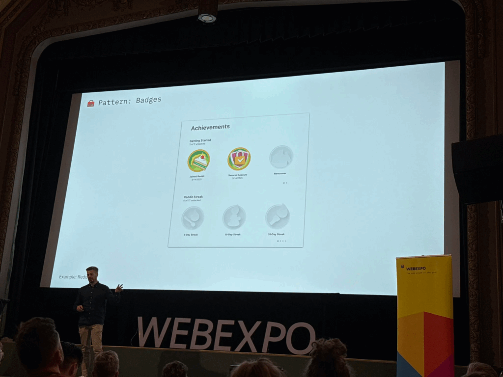
Next, the presenter gave examples we all know. For instance, Nike+ runners get badges when they hit certain mileage goals, and they can share those badges with friends. That slide showed a row of colorful badge icons, each representing a milestone like “5K Run” or “First Half-Marathon.” The speaker noted that whenever you see a badge pop up, it feels like a small victory, which encourages you to lace up your shoes and keep running.
Real Results from Research
A later slide highlighted a study from the University of Colorado. It showed two simple bars on a graph: one said “Employee Engagement +48%” and the other said “Productivity +34%.” The speaker explained that when companies added game elements to their training programs—like points for finishing modules or badges for passing quizzes—their employees became almost half again more engaged and a third more productive. Seeing those numbers side by side really drove home how powerful gamification can be.
Practical Examples in Companies
The talk moved on to how big companies use these methods. One slide displayed IBM’s badge portal, where employees earn digital badges by completing courses. The badges appeared as little icons next to each person’s name, almost like medals in an online profile. The presenter said, “When you can show off that you’ve mastered a skill, you’re more likely to keep learning and help others do the same.” It was clear that even in large organizations, a small badge system can encourage ongoing training.
Peer Recognition and Points
Another slide showed a mockup of an internal “peer-to-peer” system. In the image, you could pick a colleague’s name from a dropdown, choose “send 10 points,” and write a short note like “Great job on that report!” The speaker emphasized that giving coworkers small points for positive feedback builds a culture of recognition. Those points could be cashed in for small prizes—coffee vouchers or company swag—so people felt appreciated.
Celebrating Small Wins
Towards the end, the presenter showed an animation-style slide that said “Achievement Unlocked!” with confetti bursting out. They reminded us that when someone completes a milestone—a training module, a sales target, or even a daily habit—you should celebrate it with a pop-up or small animation. That moment of recognition makes people feel good and want to keep going.
Putting It All Together
Finally, the talk wrapped up by listing three key ingredients for gamification:
- Visual Progress: Use progress bars or charts so people can see how far they’ve come.
- Small Rewards: Give points, badges, or public praise when someone completes a task.
- Friendly Competition: Use leaderboards or let teams pick names so people feel a shared goal.
All in all, this session showed that gamification doesn’t need to be complicated. With just a few simple game pieces—like bars, badges, and leaderboards—you can turn ordinary tasks into something people want to finish.
WebExpo Conference: From GenAI to GenUI – Codify your UI on the fly
Welcome to my Day 1 Expo vlog recap. The talk I would to talk about and my favorite one is “Design Component Development for GENAI.” In simple terms, it was about how to give an AI a set of building blocks so it can put together user interfaces on its own. Here’s my basic rundown:
The speaker started by showing a simple picture of how this process works. On one side, you write down a list of interface pieces—things like buttons, cards, or headers. In the middle, there is the AI that “reads” these pieces. On the other side, the AI makes a full screen or page using those pieces. It was neat to see that you don’t have to draw every screen by hand; instead, you explain to the AI what each piece does, and it puts them together for you.
First, the speaker explained how to describe each piece in a plain text format. For example, for a button, you write down:
- The text that will appear on the button (like “Submit”).
- What happens when someone clicks it (for example, “send form”).
- How it should look (such as size and color).
For a card (which is a box that might show a photo, a title, and some text), you would write down:
- The title text.
- The description text.
- The link or image URL.
The idea is that when you ask the AI to build something—like “Make me a signup form”—it uses the pieces you described. It finds the “input field” pieces for name and email, the “button” piece for submission, and arranges them neatly.
Next, the speaker talked about how to keep those pieces organized in code. Instead of saving them only in design files (like a picture or a static mockup), you save each piece with all its details in a code library. This way, the AI can look at those code definitions and know exactly what each piece can do. For each piece, you also add simple notes like:
- How big it should be on small screens.
- What color it should use.
- Any special labels for people using screen readers.
Then, when you give the AI a request like “Create a signup form with a title, fields for name and email, and a primary button,” it goes through the code library, picks the right pieces, and instantly shows you HTML or a picture of the form. In a live demo, the speaker typed a short request, and within seconds the AI put together a complete form with the correct text sizes, colors, and spacing for both phones and computers. It felt like magic.
Because the AI can generate many pieces very quickly, the speaker emphasized the need for a review step. Designers have to look at what the AI made and say, “Yes, keep this,” “Please fix that,” or “No, don’t use this.” This makes sure the library doesn’t get cluttered with unused or messy pieces.
Finally, the speaker shared a couple of simple examples. One was a dashboard generator: users choose the numbers or stats they care about, and the AI picks the right chart pieces, tables, and filters to build a dashboard. Another example was a mobile app mockup: the AI pulled real content from a database so the design didn’t use placeholder text. It saved the team a lot of time.
Walking out of the room, I felt excited. The main message was clear: AI won’t replace designers. Instead, AI can help designers work faster by taking simple instructions and building screens automatically. All we need to do is clearly describe our design pieces and keep them organized. Today’s session on GenAI design was eye-opening.
Lo-Fi Prototyping & Speed-Dating Reflections: Leveraging AR and IoT Technologies to Revolutionize the Retail Shopping Experience
Welcome back to my blog with a new semester and new adventures. I hope you all enjoy it. I decided to continue with my research topic to further view it in this semester (I am not sure if I will continue or switch so let’s see). I will present my quick 20 min prototype. Today, I’ll also share insights from a recent prototyping exercise and a fun ‘speed dating’ session we had in class.
Prototyping
This project explores how AR and IoT technologies can reshape the physical retail shopping experience by guiding users through stores, helping them make smarter, faster decisions.
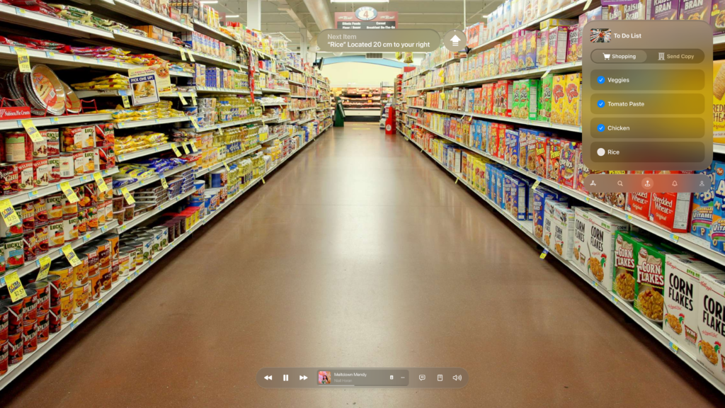
I gathered insights from my previous research and translated them into a lo-fi prototype. I focused on the core functionality: how AR glasses guide users through a store. I created wireframes depicting the user journey—from syncing their shopping list upon entering the store to guiding them to specific products like rice. The AR interface displayed essential information such as pricing, alternatives, and competitor comparisons, enhancing decision-making on the go.
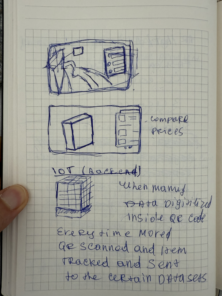
Imagine walking into your local supermarket. The moment you step in, your AR glasses detect the store’s internal network and sync with your digital shopping list. The interface opens up seamlessly, offering not just a checklist, but a smart, dynamic assistant for your entire trip.
At the top of your view, a floating navigation cue gently guides you toward the next item—say, rice—telling you it’s just 20 cm to your right. No more wandering through aisles, trying to decode vague signs or search endlessly. The glasses locate the exact position of the product for you.
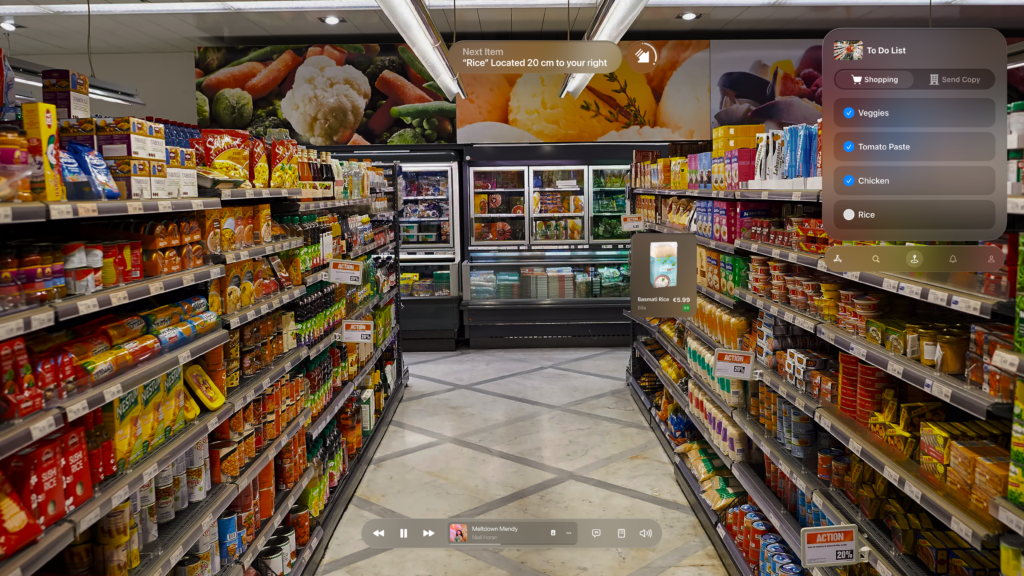
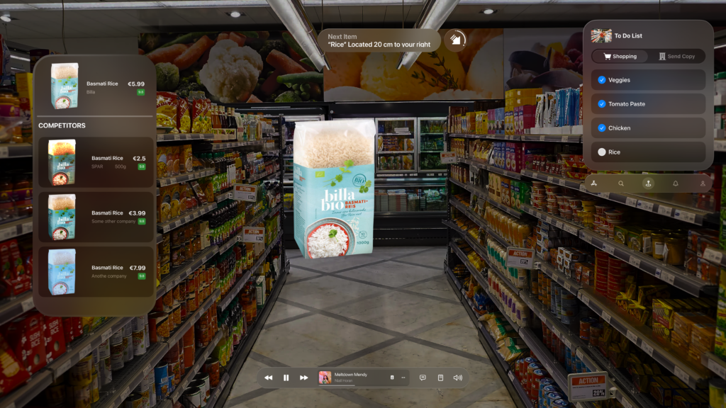
Once you’re in front of the item, a visually anchored card pops up, displaying detailed product information—brand, price, user rating, and more. But what really transforms the experience is the competitor analysis feature. It compares prices across brands and even other stores within the network. You instantly see that while Billa Bio’s Basmati Rice costs €5.99, a similar product from SPAR is just €2.50 for 500g. The AR interface gives you the context to make smarter decisions, without needing to open separate apps or websites.
The interface also adapts based on the meals you’re planning. If your recipe includes chicken, tomato paste, and certain veggies, the system clusters those items together and guides you through them logically, minimizing backtracking or unnecessary detours. Once you physically pick up an item and place it in your cart, it automatically checks off from your digital list, maintaining a smooth flow throughout your journey.
Speed Dating Exercise
To test the prototype’s usability, we participated in a ‘speed dating’ exercise where we exchanged prototypes with classmates. For three minutes, I presented my prototype, then spent three minutes exploring theirs. My peers found the AR navigation intuitive and easy to grasp, appreciating how it seamlessly integrated previous phone and AR experiences into a hands-free, guided shopping journey. The feedback was overwhelmingly positive, highlighting that the software’s ability to gently guide users through the store made the entire experience feel effortless.
NIME: Exploring the Potential of Hardware-Free Musical Interaction
My choice of the research paper would be a fascinating project called MuGeVI, which stands for Multi-Functional Gesture-Controlled Virtual Instrument. What really caught my attention is its core idea: letting you make music using just your hand gestures, captured by a standard computer webcam. No special gloves, sensors, or expensive extra hardware needed.
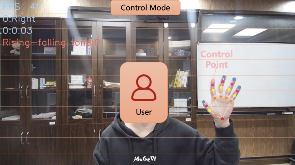
To me, this is incredibly exciting. Think about it – most of us have a computer and a webcam. This project explores using that basic setup to create a musical instrument. It feels like a big step towards making experimental music technology more accessible to everyone. Instead of needing specialized gear that can be costly or hard to find, MuGeVI uses software to watch your hands and turn those movements into music. This could be fantastic for schools, hobbyists just wanting to try gesture control, or even potentially for people with physical limitations who find traditional instruments difficult to play. Lowering the barrier to entry like this is always a good thing in my book.
Here are Gestures recognized by the software.
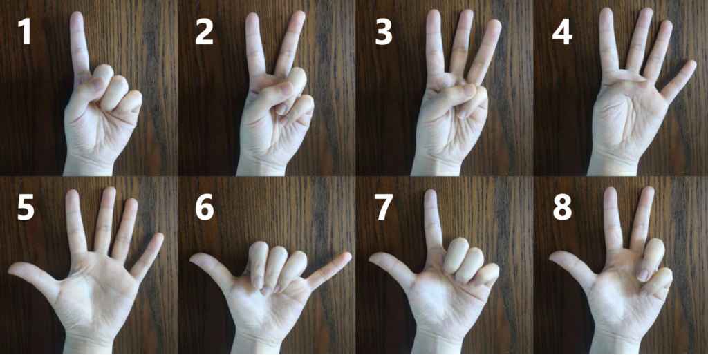
The system seems quite versatile, too. It’s not just a one-trick pony. The creators designed different modes for different musical tasks:
- You can essentially play notes in the air, like an “Air Piano,” triggering sounds based on where your hand is and a simple finger-touch gesture.
- You can use specific hand shapes to control background music, like chords and accompaniment patterns.
- You can use the position of your finger to adjust things like the pitch or volume of music already playing.
- You can even control audio effects in real-time – the example given was using your finger height to control a “wah-wah” effect on an incoming sound signal.
This variety shows a lot of thought went into making it a potentially useful tool for different kinds of musical expression.
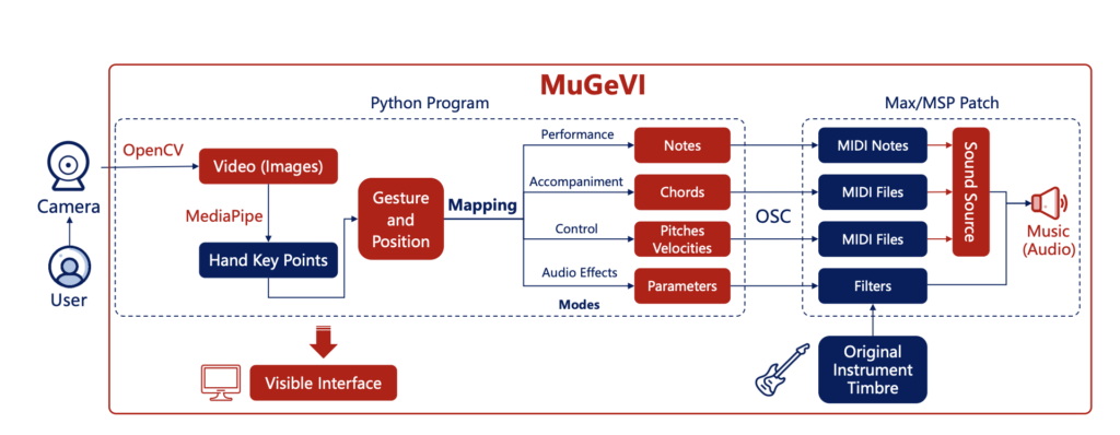
However, after analyzing the architecture of the software, as cool as the concept is, I can see some practical challenges based on the review. Relying purely on a webcam means things like lighting conditions or even just a messy background might affect how well it tracks your hands. Getting glitches or inaccurate responses would definitely be frustrating when trying to make music.
There’s also the physical side. Holding your hands up and making gestures for a long time could get tiring. And, importantly, you don’t get any physical feedback – that feeling of touch, resistance, or vibration you get from a real instrument. That lack of tactile feel might make it harder to achieve really fine control or feel truly connected to the instrument. I also noted that the mode for playing backing tracks seemed a bit rigid, locked to one speed, which might limit creativity in some situations.
Despite these potential hurdles, the creators seem aware of them and have plans to improve and expand MuGeVI, like adding more controls and making it more expressive.
Overall, my impression is really positive. MuGeVI feels like a genuinely innovative project that tackles the important issue of accessibility in music technology head-on. It shows the power of using readily available tools in creative ways. While it might still need refinement to be perfectly robust and expressive for demanding performances, the direction it’s heading in – making gesture-based music creation open to more people – is something I find truly inspiring. It’s exciting to see technology being used not just to create complex new hardware, but also to make powerful creative tools available using the tech we already have.
Blog post 9: Summary of the blog posts
Below is a direct summary of the key points covered in the previous eight blog posts. Each post delves into specific aspects of Augmented Reality (AR) and the Internet of Things (IoT) in the context of in-store retail, aiming to highlight both practical applications and design considerations.
Introduction to Augmented Reality
Discussed the fundamental concept of AR and its potential to enhance physical shopping. Covered how digital overlays can provide product information, interactive demos, or personalized promotions. Emphasized the importance of a clear, user-friendly interface that maintains focus on the real environment.
Key Point: AR can highlight products in a physical setting, offering immediate context and potentially improving the decision-making process for shoppers.
Detailed Look at the Research Process (Methods & Insights)
Described the methodology behind the prototypes and scenarios—such as user observations, case-study reviews, and early prototyping. Emphasized how learning about AR toolkits, IoT platforms, and user-centered testing informed the scenarios outlined in previous posts.
Key Point: A mix of real-world observation, theoretical exploration, and iterative testing underpins each example, helping refine solutions that genuinely address user needs.
Understanding IoT in Retail
Explained the core elements of IoT—sensors, connectivity, and real-time data processing—and how these enable features like smart shelves, automated inventory updates, and accurate stock visibility. Stressed that reliable data collection and synchronization are crucial for a seamless experience.
Key Point: IoT sensors produce instant and accurate product data, laying the groundwork for advanced retail functions such as live inventory tracking and location-based services.
Designing AR/IoT Interactions
Provided guidelines for integrating AR visuals with IoT-generated information. Highlighted the need for consistent visual design, minimal friction in user interactions, and real-time synchronization. Mentioned the importance of balancing information density so as not to overwhelm users.
Key Point: A successful AR/IoT experience demands coherence in both interface design and data flow, ensuring users receive timely, relevant details without confusion.
Security and Privacy Considerations
Identified common vulnerabilities in IoT-enabled environments, such as weak credentials and outdated firmware. Addressed data privacy challenges when integrating personal information with sensor networks. Emphasized adherence to strong encryption, user consent, and robust security practices to build trust.
Key Point: IoT systems must incorporate security measures (e.g., encrypted communication, frequent software updates) and transparent data policies to safeguard consumer privacy.
Store Experience Scenario (AR + IoT)
Presented a scenario illustrating how a shopper could use AR and IoT data in a general store environment. Showed how real-time inventory updates, guided navigation, and interactive product details improve efficiency. Suggested methods for user testing and prototyping such experiences.
Key Point: Integrating AR with accurate sensor-driven data can resolve everyday retail pain points, like item location or low-stock frustration, while enriching the overall shopping process.
Enhanced Grocery Experience with Meal Planning
Expanded on the grocery theme by showing how IoT can track stock levels for recommended meal ingredients. Displayed how an AR overlay might guide shoppers to items and confirm dietary requirements. Showed how integrated meal planning can save time and reduce waste.
Key Point: When linked with dietary preferences and smart recipe suggestions, AR and IoT solutions can transform a trip to the supermarket into an efficient, personalized, and potentially health-driven activity.
Navigating the IKEA Maze with AR Assistance
Applied similar AR/IoT concepts to a large furniture store environment. Showed how augmented overlays could guide shoppers through a complex showroom, highlight product details (dimensions, colors, materials), and link to immediate inventory checks or alternative options.
Highlight: The notoriously confusing layout of big-box stores can be tamed using AR wayfinding and precise IoT stock data, allowing quicker decisions and fewer wrong turns.