This blog post is part of my early research for the Gendered Space project. But I just finished those interviews and wanted to share some of the recurring themes and personal reflections that came up in the beginning of the semester but also now. The project itself is still evolving but these conversations already gave me a lot to think about, and they’re definitely shaping how I move forward visually and conceptually.
What stood out most were not dramatic incidents, but small, repeated behaviors and things that we often don’t even notice ourselves: stepping aside, waiting our turn, not interrupting, sitting small.
Internalized Behavior
Many people (people perceived as female) I spoke to described how their relationship to space (especially inpublic space) has been shaped since childhood. Expectations like “be polite,”“don’t talk back,” or “be nice” are still a thing in adulthood.
“I think it’s in us from the beginning. As girls, we’re told not to talk back, to be respectful. That’s just the default.”
This idea came up a lot: how deeply certain behaviors get embedded. One person even said:
“Even if I woke up as a man tomorrow, I think I’d still let people speak over me. That’s just how I’ve learned to exist.”
It made me think about the blurry line between personality and conditioning and how hard it is to unlearn something that feels like second nature.
Where It Shows Up
The situations people described were strikingly similar. Most of them weren’t “big moments” just the daily, automatic negotiations we make to keep the peace, avoid conflict, or not take up “too much” space.
Some recurring examples:
Sitting tight while the man next to you spreads his legs across half the bench.
Feeling the need to step aside on the sidewalk — even when you technically have the right of way.
Being interrupted or talked over, especially in mixed-gender groups.
Stopping mid-sentence so someone else can take over.
“It’s not even aggressive most of the time,” one participant told me. “It’s just assumed. Like, of course I’ll be the one who moves.”
Why This Matters for the Poster Series
These kinds of insights are exactly what I want to translate into the Gendered Space poster series. As I said in previous posts, the project is not about visualizing big protests or loud rebellion it’s about quiet defiance, everyday reversals.
So I’m working with scenes where women take up space deliberately: spreading out, staying still, not flinching, not moving aside.
Through limited settings and gestures, I’m trying to make this internalized choreography and reinforced genderroles visible and gently disrupt them.
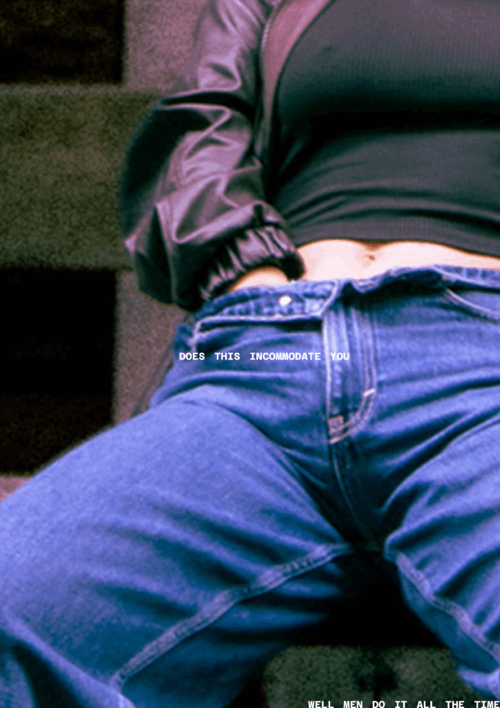
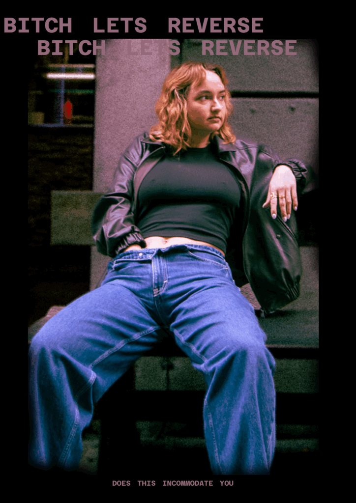
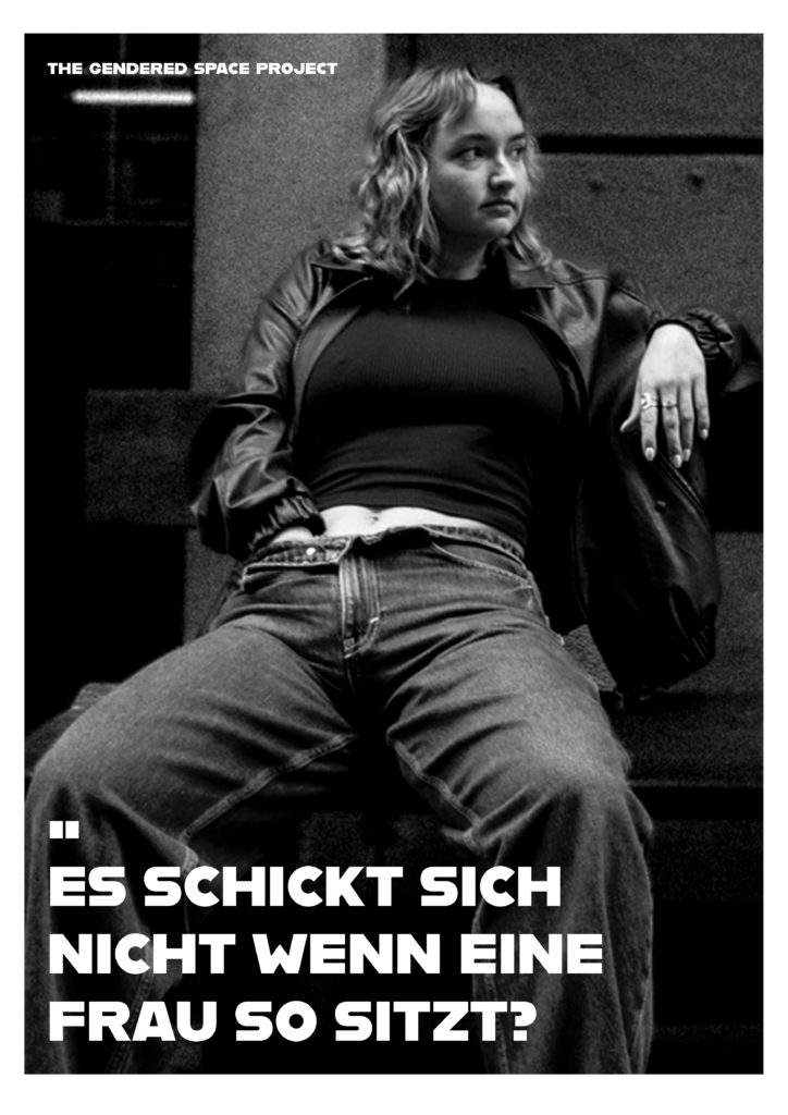
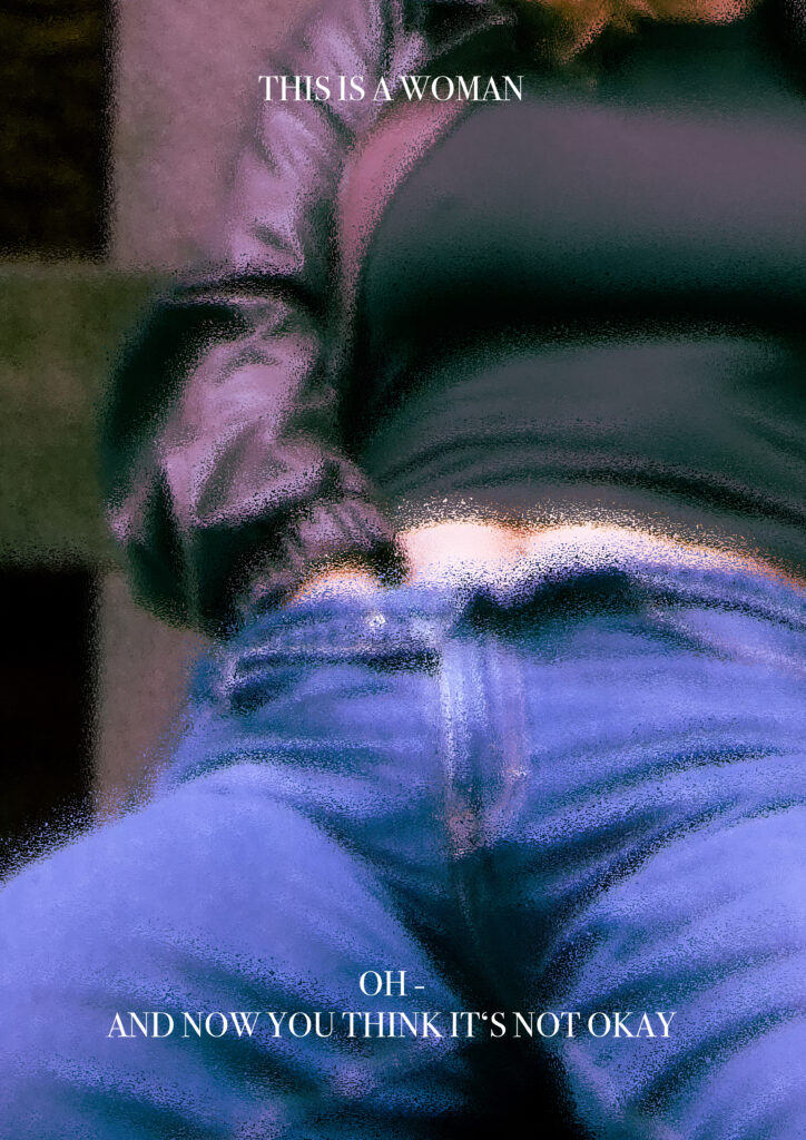
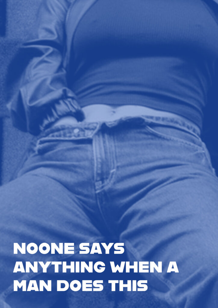
How do you design a poster that provokes in a subtle yet effective way? Rather abstract, direct, zoomed in, with bold taglines or just the photo itself?
The drafts above are a few examples of how I tried different ways of designing one of the posters. I knew that I wanted to leave the focus on the photo and mainly letting it speak for itself.
Generally, I think it’s really about balancing what you show and what you hold back, how much clarity you give and how much you leave open. There are so many ways to go about it.
You could use abstract visuals like shapes, colors, lines that hint at something without spelling it out, and therefore leaving space for people to interpret. Though, for this project I wanted to go bold and direct, with the striking photo that makes people stop and look. Zoomed-in details are super interesting too, focusing on textures, gestures, or small moments that pull you in closer.
Then there is Typography which can always make a huge difference in how posters are perceived. A strong tagline or bold text treatment can really push the vibe, adding something sharp, funny, or unexpected to the visual. Also, playing with scale, contrast, and negative space helps guide the eye and keeps things intentional, not messy. Colors matter too: muted tones can create a quiet tension, while bright contrasts make everything pop louder.
In my own work, I tried out a mix of these approaches. I also played with framing and composition, sometimes centering the subject, sometimes hiding parts, sometimes making it a bit awkward or staged on purpose.
At the end of the day, designing something provocative isn’t just about shocking people. It’s about creating a feeling, using design choices to challenge the viewer and make them react; maybe without even knowing why.
-> And I will maybe see that once I put the posters outside.
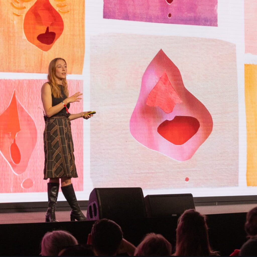
A little side excursion about a very interesting talk I heard at the OFFF Festival in Barcelona.
Anna Ginsburg – a motion/graphic designer who inspired me through her approach of innovative and artsy aesthetics combined with important topics and insightful ideas. This is what the internet says about her: Anna Ginsburg is a British director and animator known for her distinctive, hand-crafted style and her ability to combine bold visuals with powerful social messages. Her work often explores themes like gender, identity, and body image, using a mix of traditional animation, live action, and illustration. Ginsburg is especially celebrated for projects like Private Parts and Ugly, where she collaborates with other artists to create honest, thought-provoking stories that challenge stereotypes and open up conversations around complex topics.
Anna Ginsburg’s talk was really inspiring to me, especially in the context of this semester, which is all about exploring. I often struggle with starting a project from scratch as I want to explore something meaningful and also stay true to my own style. Sometimes I’m unsure whether my way of working fits with serious or important topics. I often ask myself: is this too artsy to be taken seriously? Can something that looks a certain way still carry real meaning? Anna showed that it absolutely can. She talked about how her projects often deal with themes like gender, identity, and body image. And she does it not because someone asked her to, but because these topics are genuinely important to her. That really resonated with me. It reminded me that media and communication design don’t have to be distant or purely functional to fit a wish of clients who do not know anything about design anyways; they can be emotional, personal and driven by values.
I sometimes question the meaningfulness of this field, but her work showed me that creating awareness, encouraging conversation, and making space for underrepresented topics is incredibly relevant. It also made me think about collaboration in a new way — how working with others who share your beliefs and want to make a difference through creative work can be just as meaningful as the end result itself.
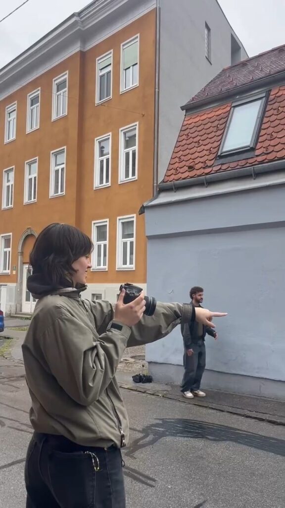
After choosing a few scenes that would portray the topic in a good way and get the message across, I lent a camera of a friend, asked Fiona and Angelo if they could model for me, and met up in the city. (Thank you !)
In this blogpost I would like to reflect on the process of taking the pictures as it is the perfect mirror of how you feel as a woman taking up the space in ways you normally don’t. For me, being the photographer it was probably not the same as being in front of the camera, but even I felt the slight discomfort of taking up this much space in public combined with the attention anxiety you get anyways when being outside with a camera.
This discomfort obviously speaks to something deeper: the internalized expectation that women should be small, quiet and unobtrusive in public spaces. Taking up space, whether physically by posing or creatively by directing a shoot, challenges that conditioning. The act of being visibly intentional in a space and claiming it without apology can feel transgressive, even when it’s something as simple as holding a camera or standing still for a portrait. It’s not just about the gaze of others but also about unlearning the instinct to minimize ourselves.
When I asked Fiona how she reflects on the photoshoot, she told me that it was definitely out of her comfort zone because the body language she had to show wasn’t usually hers, and ” it felt uncomfortable knowing people were watching. At first, I thought doing it in a public space like the main square might look cooler, but when it actually came to it, I realized how exposed and nervous I felt. We ended up doing it more hidden, and the photographer was really considerate throughout. Some poses, like in the tram, felt natural, but others like near the falafel shop or when I had to lower my pants made me feel embarrassed because it’s just not how I would normally behave in public. Overall, it really pushed me beyond what I’m usually comfortable with”.
Doing projects like this is really valuable for me and maybe others because they let us try out new ways of being seen and taking up space. It’s a chance to step outside of what feels normal or comfortable and see how that changes how we feel. I’m really curious to see what it will be like once the posters are hanging in public — how people might react, but also how I will feel seeing them there. Even now, the process has already made me think and feel differently, and I’m excited to see what happens next.
Like I already started to describe in my first blogpost, I’ve started to think more deeply and curious about the concept of space; whether it is physical, visual or social. In many ways, space is not neutral. Who gets to take up space, who is expected to shrink and be small, who is heard, and who goes unnoticed is often shaped by power structures such as gender.
Feminist theorists like Iris Marion Young have written about how women are socialized to “keep their bodies small,” like sitting with crossed legs or just avoiding taking up too much room in daily life. In her essay “Throwing Like a Girl” (1980), she discusses how even the most everyday gestures reveal how we internalize social expectations about gender. While men are encouraged to expand, to stretch, to claim their environment, women (or more precisely, those who are read as female in public) are taught the opposite: to shrink, to protect, to avoid confrontation – and to obey.
This tension between visibility and invisibility, between expansion and restriction, forms the basis for my idea generation and concept. I want to explore moments of subtle protest: Reversing these everyday dynamics that happen not through big slogans or raised fists, but through posture, looks and presence.
Here are some ideas I have thought of for possible (animated) poster scenes:
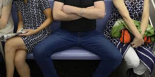
Manspreading on public transport → A woman confidently spreading out while others adapt around her // I have used this example in my blogpost before and I think it is a concept that is known too many at this point. It describes the way how men often sit or stand while taking up too much/ stealing public space from other people in their surroundings, often people perceived as female (Bertrand, 2018).
On the street, women are the ones who step aside → A Woman keeps walking straight while a man has to move // This imbalance of public norms of society where a man does not need to bother, has been known for quite a while as it was already discussed by Iris Marion Young in 1990 where she implies that Women are often physically and socially positioned in such a way that taking up space or asserting physical presence is discouraged.
In restaurants or meetings, people only speak to the men → Waiters or colleagues only address the woman, ignoring the men // This is related to the Hepeated concept where men get credit for the work women has done which has happened and shaped history since the beginning of time (Serrano, 2022). For my poster I want to show the subtle signs in daily life where people tend to rather speak with or look at the men than the women.
Men throw their arms over others’ chairs without hesitation → A woman doing the same, owning the shared space // This idea has the same origin than the manspreading idea in public transport, just with the arms.
Public spitting or peeing seen as normal for men → A woman unapologetically peeing in a public space // Men can pee anywhere and it is socially accepted (Even though many people do not like to see it, it is still okay and not called out when someone does). This is another example of how society controls women by them always having to rely on public restrooms in public spaces (Feminist Fightback, 2020).
Women covering up with a sweater to avoid being looked at → Man wearing a crop-top without discomfort or sexualization.
Men standing with hands on hips ; confident stance → Women using strong postures unapologetically.
Men taking central space at sports events, yelling and performing → A group of women in full control of the moment, loud and unapologetic // This is a reflection of how patriarchal norms encourage male visibility, entitlement, and expressive freedom in public spaces, while discouraging similar behaviors in those read as female (Rail, 2025).
Men sunbathing shirtless in parks → A topless woman reading a book casually // This regards to the – for years – ongoing discussion about top nudity and how men can be topless in public and women’s breasts get sexualized and are not allowed to be shown (Equipe Madagascar, 2020).
Mansplaining / Being stared at → A woman overexplaining to a man, or staring at him without blinking // This is another situation that focuses on the silencing of women, with specific attention to the concept that some men seemingly believe that no matter what a woman says, a man always knows better (Solnit, 2025).
Being groped in public / catcalled → a woman catcalling a group of men, flipping the power.
Next Steps
For now, this is an idea pool I can draw from for the upcoming poster. I plan to choose 4/5 scenes to start with, especially ones that feel both relatable and visually strong. My goal is not to “reverse the roles” just for the sake of it or to encourage women to be egoistic in public spaces but to reveal how strange it suddenly looks when someone perceived as female takes up space without apology (and how strange it is that it even feels strange??) and to show that space (like almost all other things) should be equally distributed.
Maybe existing loudly in a space can be a protest too.
Sources
Bertrand, D. (2018). The rapid rise of online feminism: A symptom of the surfacing of a fourth wave? Réseaux, 208209(2), 232–257. https://shs.cairn.info/journal-reseaux-2018-2-page-232?lang=en
Equipe Madagascar. (2020, December 16). Free the Nipple, a highly controversial feminist movement. Sisters Republic DE. https://sistersrepublic.eu/en/blogs/der-blog-der-sisters/free-the-nipple-eine-hochst-umstrittene-feministische-bewegung
Feminist Fightback. (2020, June). The Political Urgency of the Public Toilet | Feminist Fightback. Feminist Fightback | Anti-Capitalist Feminist Collective. https://www.feministfightback.org.uk/the-political-urgency-of-the-public-toilet/
Rail, G. (2025). Sport and Postmodern Times. Google Books. https://books.google.at/books?hl=de&lr=&id=7KI1a6Z3ouYC&oi=fnd&pg=PA301&dq=men+and+sport+events+problematic&ots=dGpZWCX__A&sig=thPKMS5g5T1Hbt1bbeQE97GexHM#v=onepage&q=men%20and%20sport%20events%20problematic&f=false
Serrano, B. (2022, May 28). Hepeating: When a man takes credit for what a woman already said. EL PAÍS English. https://english.elpais.com/society/2022-05-28/hepeating-when-a-man-takes-credit-for-what-a-woman-already-said.html
Wikipedia Contributors. (2025, April 11). Men Explain Things to Me. Wikipedia; Wikimedia Foundation.
Young, I. M. (1980). Throwing like a girl: A phenomenology of feminine body comportment motility and spatiality. Human Studies, 3(2), 137–156. https://www.jstor.org/stable/20008753
Young, I. M. (1990). The People, Place, and Space Reader. Google Books. https://books.google.at/books?hl=de&lr=&id=b9WWAwAAQBAJ&oi=fnd&pg=PA247&dq=Urban+spatial+dominance+(Iris+Marion+Young).&ots=KX_xBJptA7&sig=xHrMLb6NDsm3h250ek5BjFyeOFQ#v=onepage&q&f=false
For the last few weeks, I’ve struggled a lot with idea generation for design & research this semester. As I had already researched the history and definitions of protest and feminist design in the first semester, I couldn’t quite figure out a way to explore protest without organizing a protest itself. That’s when I started to think about subtle protest and, on the contrary, about subtle inequality that has found its way into our society and isn’t questioned too much in our day-to-day life.
An example would be: Last week, I was on a fully booked train in Germany, sitting in the bike wagon. Right in front of me was a man sitting with his legs spread out to the sides. Next to him, on the left, sat a woman with her legs crossed, visibly uncomfortable with the situation. On the other side was a free seat—in the fully booked train. But nobody wanted to sit there because a man needed to take up space: the so-called “manspreading” (Merriam-Webster).
And I think a lot of women* can relate to this situation. It happens basically daily and is a subtle sign of how our society works. Men take up space, and women have to be happy with what’s left (Alonso, 2023).
Also, in that moment when I realized it, I tried to do the same—to sit in a way that takes up more space, shows confidence, and also kind of power. And when I did, it felt weird and unnecessary, and I had the feeling that the people around me gave me slightly weird looks when I put my arm on the rest of my chair and sat more with my legs apart.
For some reason, I could not even commit fully to it and only slightly sat more confidently, as it didn’t feel “right”—a feeling that a lot of women have when they are taking up too much space in a way. For too long, women have been conditioned to believe that confidence should be quiet, success should speak for itself, and self-promotion is just another word for arrogance (Saxena, 2025).
It is an internalized concept that comes from ingrained societal beliefs about gender roles and ensures that society continues to function as it is. Therefore, women* should be encouraged to refuse to shrink, take up space, and fight for a world where every girl grows up knowing her worth (Muselmann, 2025).
The Concept: That’s when I got the idea for a small, animated poster series. The series will show little snippets or photographs of daily life situations like the one described above—but the other way around. Women taking up the space they should own. I want to explore whether it can feel natural, how people react to it, and whether it might even change how I behave in some way.
*In this blog post, I mostly refer to “women” when discussing experiences of inequality and everyday sexism. However, I want to clarify that I am specifically addressing the experiences of people who are read or perceived as female in public spaces. This includes not only cis women, but also many trans, nonbinary, and gender-nonconforming people who are treated according to societal expectations placed on femininity. These dynamics often affect individuals based on how they are externally perceived, regardless of their gender identity, and this post aims to speak to those shared experiences under patriarchal structures.
In this blog post, I want to explore the portrayal of feminism in pop culture, with a particular focus on how it is utilized within communication design and visual media. Specifically, I will look at the two major perspectives: the “Male Gaze” and the emerging concept of the “Female Gaze, which are also trending and often used in social media (twssmagazine, 2022). Is the increasing presence of feminist themes in pop culture a genuine allyship or merely an opportunistic exploitation?
Pop Culture and Feminism
Pop culture has undeniably contributed to the visibility of feminist ideals. From blockbuster films featuring strong female protagonists to high-profile ad campaigns promoting women’s empowerment, feminism seems to have become a marketable trend. For instance, movies like Wonder Woman or campaigns such as Dove’s “Real Beauty” aim to celebrate women and challenge outdated norms (Danziger Halperin & Mellon, 2020). However, this visibility often comes with strings attached. The question remains: Are these portrayals genuine efforts to support gender equality, or are they commodifying feminism for profit?
Allyship: In its best form, pop culture can amplify feminist voices, educate audiences, and foster meaningful discussions. Campaigns that challenge stereotypes or highlight intersectional struggles contribute to a broader understanding of gender equality.
Exploitation: On the flip side, the co-opting of feminist themes without substance risks reducing a complex movement to a mere aesthetic. Terms like “femvertising” describe how companies use empowerment messaging to sell products without enacting meaningful change within their organizations or society at large and therefore uphold gender binaries (Le, 2022).
Decoding the Male Gaze in Visual Media
The “Male Gaze,” a term popularized by film theorist Laura Mulvey in 1975, refers to the depiction of women in media as objects of male desire (Sassatelli, 2011). This perspective dominates much of visual media, from advertising to movies, shaping how women are portrayed and perceived. In communication design, this manifests in ways such as:
Objectification: Women are often shown as passive, decorative figures meant to appeal to heterosexual male audiences (Vanbuskirk, 2022).
Fragmentation: Advertisements frequently isolate parts of a woman’s body, such as her legs or lips, reducing her to a collection of desirable features.
Narrative Control: Stories in visual media often prioritize male perspectives, with female characters serving as supporting roles rather than autonomous agents (Jackson, 2023).
A classic example is the portrayal of women in perfume ads, where they’re often shown in submissive or hypersexualized poses, reinforcing traditional gender roles. When women, men, girls, and boys consistently see women and girls portrayed in such narrow and sexualized ways, it inevitably shapes their expectations, influences cultural norms, and affects how they understand their own identities (Vanbuskirk, 2022).
The Emergence of the Female Gaze
In contrast, the “Female Gaze” aims to reclaim agency and portray women’s experiences authentically. This perspective is not merely a reversal of the Male Gaze but rather a shift towards empathetic and nuanced storytelling. (Forster, 2019) Key characteristics of the female gaze are:
Agency: Women are depicted as active participants with complex emotions and desires, rather than objects to be consumed.
Subjectivity: The focus is on how women experience the world, showcasing their perspective rather than how they are viewed by others.
Empowerment: Visuals often challenge traditional norms and celebrate diversity in gender expression and body types.
Examples of the Female Gaze can be seen in films like Portrait of a Lady on Fire, which prioritizes female subjectivity and intimacy, or in campaigns like Aerie’s “#AerieReal,” which features unretouched images of diverse models to promote body positivity (Scateni, 2020).
Though, one could argue that #AerieReal is also part of a femvertising campaign. But how can one differentiate?
Navigating the Line within Feminism in Communication Design
For communication designers, the challenge lies in creating visuals that genuinely support feminist ideals without falling into the trap of superficiality (Cook, 2016).
Authenticity: Ensure that messaging aligns with meaningful actions. For example, if a company promotes gender equality in ads, it should also reflect that commitment internally through equal pay and diverse leadership (Alfaro-Ibáñez & Gallardo-Echenique, 2023).
Intersectionality: Feminism is not one-size-fits-all. Campaigns should consider the experiences of women across different races, classes, sexualities, and abilities (Sobande, 2019).
Avoiding Tropes: Challenge traditional stereotypes by portraying women in varied roles and narratives, moving beyond the binary of hypersexualized objects or virtuous caretakers.
Shifting the Gaze
As feminism continues to intersect with pop culture, its representation will remain a contentious issue. The concept of the Female Gaze is becoming a transformative force in challenging traditional norms. Inclusive and authentic advertising has the potential to reshape industry practices, offering a blueprint for meaningful allyship rather than superficial exploitation. While the commodification of feminist ideals is problematic, the potential to reach mass audiences and inspire change cannot be overlooked. By critically engaging with the Male Gaze and advocating for the Female Gaze, designers and creators can contribute to a more equitable and empowering media landscape (Rangles, 2023).
So, is feminism in pop culture allyship or exploitation? Maybe it’s both. The answer lies in our ability to differentiate between genuine efforts and hollow marketing—and to demand more from the media we consume and create.
Sources
Alfaro-Ibáñez, B., & Gallardo-Echenique, E. (2023). Femwashing or Femvertising? A Look at Advertising Authenticity. Atlantis Highlights in Social Sciences, Education and Humanities, 111–121. https://doi.org/10.2991/978-94-6463-254-5_12
Cook, E. (2016, April 10). 4 Femvertising Video Ads That Teach You How To Do It Right. Venture Videos; Venture. https://www.venturevideos.com/insight/femvertising
Danziger Halperin, A., & Mellon, A. W. (2020). Wonder Woman: Feminist Icon? | New-York Historical Society. Www.nyhistory.org. https://www.nyhistory.org/blogs/wonder-woman-feminist-icon
Forster, S. (2019, September 12). Yes, there’s such a thing as a “female gaze.” But it’s not what you think. Medium. https://medium.com/truly-social/yes-theres-such-a-thing-as-a-female-gaze-but-it-s-not-what-you-think-d27be6fc2fed
Jackson, L. M. (2023, July 14). The Invention of “the Male Gaze.” The New Yorker. https://www.newyorker.com/books/second-read/the-invention-of-the-male-gaze
Le, C. (2022, March 26). Femvertising: How Marketing Can Uphold the Gender Binary. The Quirky Pineapple Studio. https://thequirkypineapple.com/blog/2022/03/26/femvertising-how-marketing-can-uphold-the-gender-binary/
Mulvey, L. (1975). Visual Pleasure and Narrative Cinema. Screen, 16(3), 6–18.
Rangles, C. M. (2023). Female Gaze for Every Gaze. Google.com. https://www.google.com/url?sa=t&source=web&rct=j&opi=89978449&url=https://www.diva-portal.org/smash/get/diva2:1777975/FULLTEXT01.pdf&ved=2ahUKEwilqYfPnoeLAxVx-QIHHexuFxY4ChAWegQIExAB&usg=AOvVaw3qE4aSAfhUWI9YwqO9411f
Sassatelli, R. (2011). Interview with Laura Mulvey: Gender, Gaze and Technology in Film Culture. Theory, Culture & Society, 28(5), 123–143. https://journals.sagepub.com/doi/epdf/10.1177/0263276411398278
Scateni, R. (2020, February 26). How Portrait of a Lady on Fire celebrates the female gaze. BFI. https://www.bfi.org.uk/features/portrait-lady-fire-female-gaze
Sobande, F. (2019). Woke-washing: “intersectional” femvertising and branding “woke” bravery. European Journal of Marketing, 54(11), 2723–2745. https://doi.org/10.1108/ejm-02-2019-0134
twssmagazine. (2022, June 9). The Female Gaze: The Theory Behind the TikTok Trend. That’s What She Said. https://twssmagazine.com/2022/06/09/the-female-gaze-the-theory-behind-the-tiktok-trend/
Vanbuskirk, S. (2022, November 14). What Is the Male Gaze? Verywell Mind. https://www.verywellmind.com/what-is-the-male-gaze-5118422
After exploring feminist movements and the bold visuals of protest design in my previous posts, I began to wonder about the power of design in addressing issues that society often avoids altogether. While protest design fights for visibility and action, it also lays the groundwork for addressing the topics we shy away from: taboos. These are the subjects—like menstruation, mental health or sexuality and sex—that have been held in stigma and silence for generations (Bentley, 2022).
Design, with its unique ability to provoke thought and evoke emotion, is emerging as a powerful force to challenge these unspoken issues. Through creativity, designers are bringing these topics into the open, encouraging dialogue, and fostering a culture of understanding.
First of all, why do we even have Taboos?
Taboos exist to maintain social order and protect cultural values. They help define the boundaries of acceptable behaviour, shaping how individuals interact within a community. By setting these boundaries, societies ensure the stability of relationships, prevent harm, and preserve traditions. Taboos also reflect deeper fears, beliefs, and the need for respect in various contexts, from moral codes to personal boundaries (Jones et al., 2008).
Taboo of Menstruation
Menstruation has long been a taboo topic, shrouded in euphemisms and discomfort. For decades, advertisements depicted blue liquid instead of blood and avoided any realistic portrayal of menstruation (Germerott, 2023). But in recent years, bold design has been at the forefront of breaking these stereotypes (United Nations, 2024).
Bodyform’s “#BloodNormal” Campaign was a groundbreaking campaign in 2018 that broke away from sanitized norms by using realistic depictions of period blood in ads. By showing what menstruation actually looks like, the campaign normalized periods and encouraged open conversations about them (Campaigns of the World, 2017).
Mental Health: From Stigma to Awareness
For decades, mental health has been surrounded by silence and stigma, but design is helping break this cycle.
The Semicolon Project: A simple semicolon, representing a pause rather than an end, has become a powerful symbol of hope for those struggling with mental illness. The project was established in 2013 to raise awareness and to start talking about mental health issues like depression, addiction, self-injury and suicide (Project Semicolon, 2025). This minimalist yet emotional design has been embraced globally, often appearing in tattoos as a sign of solidarity.
Posters and Campaigns: Organizations like Time to Change use bold, brightly colored posters to encourage open discussions about depression, anxiety, and therapy (Time To Change, 2019). These designs often feature approachable typography paired with direct, compassionate messaging.
Sexuality and Gender Identity: Breaking Norms Through Visibility
Design has played a central role in fostering acceptance and inclusivity for topics like sexuality and gender identity. For Example, Gilbert Baker’s iconic rainbow flag started as a symbol of LGBTQ+ pride (Gilbert Baker Foundation, 2019). It has since evolved into numerous variations, like the Progress Pride Flag, which incorporates stripes for transgender and people of colour communities. These designs visibly represent diversity and inclusivity and has created a safe space and form of identity that has helped a lot of people to talk and learn about their sexuality as it wasn’t accepted for many years.
Also, the topic of sex education is so important for the youth but wasn’t properly talked about for so long. The design of sex education materials, including apps, websites, or even physical models, navigates the tension between education and cultural taboos and can often be done anonymously which eliminates possible shame (Buchmann, 2023).
For instance, Planned Parenthood designs user-friendly, non-judgmental interfaces for teens seeking sexual health information (Planned Parenthood, 2019).
Why Design Works
The power of design lies in its ability to bypass language and cultural barriers. A single image or symbol can convey a message instantly and provoke an emotional response (PwC, 2017). For example, a vivid poster on body positivity or a sculpture addressing domestic violence can evoke empathy and challenge ingrained biases.
Design also creates visibility for marginalized groups. When a taboo is represented visually, it gains legitimacy and enters public discourse, making it harder to ignore (Celestine, 2023).
Challenges and Criticisms
Using design to address taboos isn’t without challenges. Pushback from audiences who find the work provocative or inappropriate is common. There’s also the risk of commodification. When corporations adopt taboo-breaking designs for profit without authentic commitment to the cause, the message can feel hollow or exploitative (Najafi et al., 2024).
Lastly, Are Taboos a good thing sometimes? There are voices that state thatit is important to have taboos in some contexts and they play a crucial role in building civil society. They establish boundaries that protect collective values and prevent harmful rhetoric from destabilizing social harmony. For instance, taboos against hate speech or discriminatory language reinforce ethical standards and preserve respect (Singh, 2023).
Yet, the line between a constructive and oppressive taboo is delicate. Overuse or misuse of taboos risks silencing necessary discussions, freezing consensus, and stifling progress. When taboo topics are avoided, their underlying issues can fester in silence, leading to backlash or misunderstanding. Conversely, a thoughtful re-evaluation of taboos can lead to renegotiation of societal norms, as seen in shifts around LGBTQ+ rights or discussions of racial inequality.
In the age of the internet, where taboos are routinely challenged and reshaped, the question is not merely whether breaking a taboo is good, but whether it leads to meaningful, constructive change. Breaking certain taboos can liberate dialogue, but it also risks eroding protections that took centuries to establish. Navigating this tension thoughtfully is essential to ensure that what is unspeakable remains a safeguard for humanity, not a barrier to progress (Schwartz, 2019).
Sources
Bentley, M. (2022). A New Model of “Taboo”: Disgust, Stigmatization, and Fetishization. International Studies Review, 24(3). https://doi.org/10.1093/isr/viac028
Buchmann, M. (2023, July 24). Shedding Sexual Shame After Really Bad Sex Ed. Momotaro Apotheca. https://momotaroapotheca.com/blogs/vaginal-wellness/shedding-sexual-shame-from-poor-sex-education-in-america?srsltid=AfmBOor6Da7NbSbF4bwm5_27zJUtcJrihYD2jCCYhK0WAeUUu9WQUXuD
Campaigns of the World. (2017, October 21). Bodyform – “Periods are normal. Showing them should be too.” #BloodNormal – Best Advertising Campaigns & Marketing Strategy. Campaigns of the World. https://campaignsoftheworld.com/digital-campaigns/bodyform-blood-normal-campaign/
Celestine, A. (2023, August 22). The Power of Design to Drive Positive Social Change. Celestine’s Design Journal. https://medium.com/design-grip/the-power-of-design-to-drive-positive-social-change-e9830da28584
Germerott, I. (2023, March 2). Blut und Scham: Wie die Menstruation zum Tabuthema wurde. National Geographic. https://www.nationalgeographic.de/geschichte-und-kultur/2023/03/blut-und-scham-wie-die-menstruation-zum-tabuthema-wurde-religion-patriarchat-wissenschaft-medizin
JONES, J. P. G., ANDRIAMAROVOLOLONA, M. M., & HOCKLEY, N. (2008). The Importance of Taboos and Social Norms to Conservation in Madagascar. Conservation Biology, 22(4), 976–986. https://doi.org/10.1111/j.1523-1739.2008.00970.x
Project Semicolon. (2025). Project Semicolon – Suicide Prevention and Mental Health Awareness Organization – Your Story Isn’t Over. Project Semicolon – Your Story Isn’t Over. https://www.projectsemicolon.com/
PwC. (2017). The Power of Visual Communication.
Schwartz, A. E. (2019, March 14). Opinion | Why We Need Taboos. Moment Magazine. https://momentmag.com/opinion-why-we-need-taboos/?srsltid=AfmBOoo74N415TBzmN44zEsTbExTaJPz8NJCwg2p-gCuQOZIzByF1pDL
Singh, P. (2023, September 24). Taboos have played a significant role in shaping human societies throughout…. Medium. https://medium.com/@soamsila/taboos-have-played-a-significant-role-in-shaping-human-societies-throughout-548705671451
Time To Change. (2019). Time to Change | Let’s End Mental Health Discrimination. Time-To-Change.org.uk. https://www.time-to-change.org.uk/
United Nations. (2024). Breaking the taboos around menstrual health for gender equality. OHCHR. https://www.ohchr.org/en/stories/2024/05/breaking-taboos-around-menstrual-health-gender-equality
In my last blog post, I started thinking about how protest design works and which big movements have bold and clear designs that everyone recognizes. But what actually makes a great protest design? A design that sticks in people’s minds, inspires action, and is simple and easy to understand.
Let’s break it down:
The Design Anatomy of Protest: Typography, Icons, and More
When it comes to protests, visuals play a crucial and important role in conveying urgency, solidarity and emotion. The design elements of protest materials like typography, color, symbols, and imagery are more than only aesthetic choices. They are tools for communication, organize people around causes, and amplifying voices. Obviously, the graphic language of protest design is rarely made by professional designers but by marchers and people that want something to change, but exactly this lack of budget, urgency and motivation has created and developed its own graphic language and “rules of protest design” (Riechers, 2021).
Typography: The Voice of the Movement
Typography is the cornerstone of protest design. It transforms words into powerful visuals, ensuring that messages are loud and clear. In protests, typography often serves two main purposes: readability and emotional resonance.
Bold Fonts: Protest signs often use bold, sans-serif fonts to grab attention and convey urgency. Blocky, all-caps text screams for attention, mimicking the act of shouting. Fonts like Impact or custom hand-drawn lettering create a sense of immediacy and raw emotion.
Handwritten Text: The unpolished look of handwritten text adds authenticity to protest messages. It conveys a personal touch, making the message feel direct and heartfelt. This rawness resonates deeply with audiences and serves as a reminder of the human effort behind the cause (Schwendener, 2015).
Size and Layout: In a protest setting, readability is critical. Designers use large fonts and simple layouts to ensure messages can be understood from a distance, whether on a placard in a crowd or a digital image on social media (Gosling, 2022).
Icons and Symbols: Visual Shortcuts to Meaning
Icons and symbols are the universal language of protest design. A single image can encapsulate the essence of a movement, making it instantly recognizable across cultures and languages.
Historic Symbols: The raised fist, peace symbol, and LGBTQ+ rainbow flag are enduring icons that have transcended time. These symbols evoke solidarity, resistance, and pride without the need for words (Reason, 2024).
Abstract Images: Many protests use metaphors and abstract visuals to convey complex ideas and often the urgency of a situation. For example, the climate movement often incorporates imagery of melting ice caps, burning forests, the world, or hourglasses to symbolize the urgency of climate action (Extinction Rebellion, 2019).
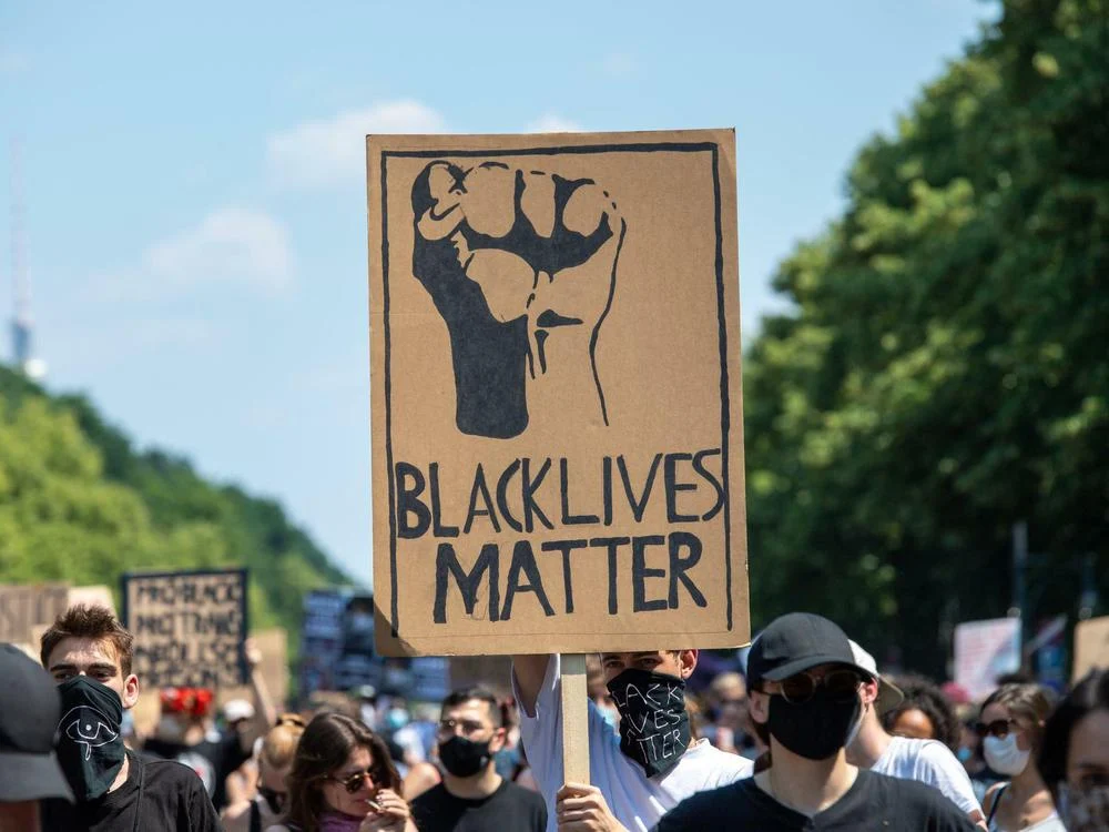
Adaptable Icons: Symbols that evolve with movements remain effective. The Black Lives Matter fist, for example, has been adapted to incorporate different skin tones, reflecting inclusivity, diversity as well as intersectionality within the cause (K.S.C., 2020).
Color: Setting the Tone of Protest
The influence of color is undeniable. Colors have the ability to shape our behavior, emotions, and mindset; they can calm us, energize us, provoke opposition, and inspire us to act. This effect is especially apparent in protests and demonstrations, where activists have realized that associating their movement with a particular color can help them gain visibility and support. There are colors that are used often as they are associated with Urgency, Anger and Protest and others that are used for certain topics (Lombardo, 2021).
Red: Often associated with passion, urgency, and anger, red is a common color in protest materials demanding immediate attention or justice. An example is the Saffron Revolution in Myanmar 2007 that arose due to the decision of the military government to remove subsidies on fuel prices, which caused a 60-100% increase of gas prices (Steinberg, 2008).
Or another known example are the Red Rebels, a street performance group that joined the activism organization Extinction Rebellion in 2015. They mainly do slow motion demonstrations in red cloaks that symbolizes the blood that almost all species on the planet have in common (Red Rebel Brigade, n.d.).
Black and White: These colors symbolize seriousness, mourning, or defiance. Black Lives Matter effectively uses black and white to emphasize strength and solidarity while keeping the message stark and unambiguous.
Yellow: Yellow is often associated with energy, optimism, and caution. It can evoke feelings of hope and happiness, but also attention, making it effective in movements that seek to raise awareness or demand urgent action, such as campaigns for mental health or social justice. In 2014, the Umbrella Movement in Hongkong made use of the color yellow by bringing yellow umbrellas to the demonstrations that were pro-democracy (Davidson, 2024).
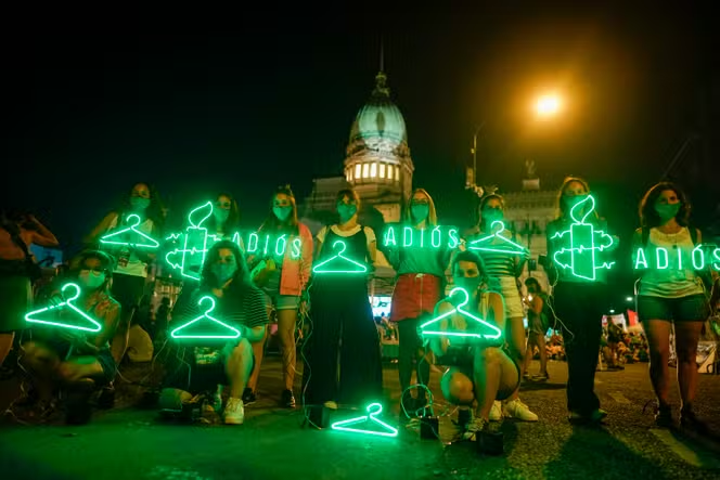
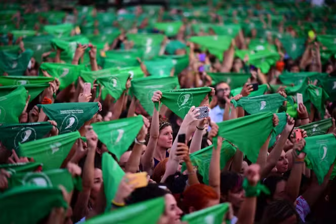
Green and Blue: Movements like Fridays for Future use greens and blues to symbolize nature and environmental care, while bright colors in general evoke optimism and hope (Fridays For Future, 2024). Also, green became the color/ symbol of resistance to anti-abortion laws (Connolly , 2022).
Purple: Violet represents dignity, justice, and the fight for equality. It has historically been linked to the women’s suffrage movement and LGBTQ+ rights, symbolizing resilience and the ongoing pursuit of social change. Also, purple has become the official color of the Women’s Day (8th March) which is celebrated every year to honor achievements and struggles of women worldwide (Mullally, 2023).
Slogans and Messaging: Clarity is Key
A great slogan is the heartbeat of protest design. It’s the soundbite that gets chanted, shared, and remembered (Van De Velde, 2022).
Conciseness: Brevity is essential. Short phrases like “No Justice, No Peace” or “My Body, My Choice” pack a punch while remaining easy to remember and replicate (Denton, 1980).
Repetition: Effective slogans often use repetition to enhance impact, such as “Black Lives Matter” or “Act Now” as they are short and can be embedded easily and repetitive in chants, posters and in the media.
First Person: Protest slogans are becoming increasingly individualized, especially in recent years and therefore reflect the growing individuality in demonstrations, Examples are ‘Je suis Charlie’, ‘Me Too’ or ‘I can’t breathe’ (Van De Velde, 2022).
Mediums and Materials: From Streets to Screens
Protest design spans a variety of mediums, each with its unique considerations (Sunmola, 2020)
Placards and Signs: Often handmade, these designs prioritize bold typography and durable materials like cardboard for practicality. Their imperfection adds a raw, human touch.
Posters and Flyers: These allow for more detailed messaging and artistic expression, combining text, imagery, and colors to inform and inspire.
Digital Design: Social media posts and digital posters amplify messages far beyond physical protests. The designs often include shareable elements like hashtags and calls to action, ensuring the message spreads globally.
Design for Accessibility
An often-overlooked aspect of protest design is accessibility. Ensuring designs can be understood by diverse audiences is key to inclusivity. Depending on the context it is important to consider and adapt the different design aspects mentioned above to achieve maximum accessibility in protest design (Vision Australia, 2025).
Readable Fonts: Big clear fonts with high contrast ensure legibility for people with visual impairments (Gosling, 2020)
Language: Including multiple languages or universally recognized symbols can make messages accessible to a broader audience. Though sometimes this and the bullet point before are hard to combine, as it is hard to put multiple languages on one placard and still expect the font to be big and bold.
Audio and Video: In digital formats, including captions, subtitles, or audio descriptions ensures accessibility for people with hearing or visual disabilities.
The Impact of Good Design
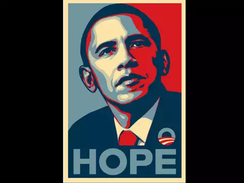
Protest design isn’t just about aesthetics—it’s about creating a visual identity for movements, fostering emotional connections, and mobilizing action, it’s a tool of empowerment and representation. Posters, stickers, and digital graphics serve as both art and argument, encouraging viewers to interact with the content in ways that dissolve the boundary between protest and education (Jasmine, 2024). When done well, it leaves an indelible mark on history. An Example could be Shepard Fairey’s “Hope” poster for Barack Obama’s 2008 campaign or the “Silence = Death” design from the AIDS activism movement. These visuals became cultural touchstones, encapsulating the spirit of their respective causes (Art Institute Chicago, 2008).
Sources
Art Institute Chicago. (2008). Barack Obama “Hope” Poster. The Art Institute of Chicago. https://www.artic.edu/artworks/229396/barack-obama-hope-poster
Connolly , A. (2022, July 6). IN PHOTOS: Here’s how green became the colour of abortion rights. Global News. https://globalnews.ca/news/8970022/green-colour-of-abortion-rights/
Davidson, H. (2024, September 28). “I was so naive”: 10 years after Umbrella protests, Hongkongers remember China’s crackdown. The Guardian; The Guardian. https://www.theguardian.com/world/2024/sep/28/i-was-so-naive-10-years-after-umbrella-protests-hongkongers-remember-chinas-crackdown
Denton, R. E. (1980). The rhetorical functions of slogans: Classifications and characteristics. Communication Quarterly, 28(2), 10–18. https://doi.org/10.1080/01463378009369362
Extinction Rebellion. (2019, April 20). The origins of the extinction symbol. Logo Design Love. https://www.logodesignlove.com/the-extinction-symbol
Gosling, E. (2020, August 11). Strongly worded letters: Typography and modern protest. Monotype. https://www.monotype.com/resources/expertise/typography-and-modern-protest
Gosling, E. (2022, July 18). Why typography still packs a punch when it comes to protest. Creative Review. https://www.creativereview.co.uk/why-typography-still-packs-a-punch-when-it-comes-to-protest/
Jasmine, M. (2024). The Role of Design in Social Justice Movements. Desireedesign.co.uk. https://www.desireedesign.co.uk/brand-insider/design-social-justice-movements
K.S.C. (2020, June 17). A brief history of protest symbols, from cockades to raised fists. The Economist. https://www.economist.com/prospero/2020/06/17/a-brief-history-of-protest-symbols-from-cockades-to-raised-fists
Lombardo, G. (2021, March 23). The Colors of Protest. DeMagSign. https://medium.com/demagsign/the-colors-of-protest-46289d141e2b
Mullally, W. (2023, March 8). Why is purple the color of International Women’s Day? Esquire Middle East – the Region’s Best Men’s Magazine. https://www.esquireme.com/news/why-is-purple-the-official-color-of-international-womens-day
Reason, P. (2024, December 4). The raised fist: a history of the symbol – People’s History Museum. People’s History Museum. https://phm-org-uk.translate.goog/blogposts/the-raised-fist-a-history-of-the-symbol/?_x_tr_sl=en&_x_tr_tl=de&_x_tr_hl=de&_x_tr_pto=rq
Red Rebel Brigade. (n.d.). Red Rebel Brigade. Red Rebel Brigade. https://redrebelbrigade.com/
Riechers, A. (2021, February 3). Type and Protest. Communication Arts. https://www.commarts.com/columns/type-and-protest
Schwendener, M. (2015, July 30). Seeing the Power of Political Posters. The New York Times. https://www.nytimes.com/2015/07/31/arts/design/seeing-the-power-of-political-posters.html
Steinberg, D. (2008). Globalization, Dissent, and Orthodoxy: Burma/Myanmar and the Saffron Revolution. Georgetown Journal of International Affairs, 9(2), 51–58. https://www.jstor.org/stable/43133778
Sunmola, Y. (2020, December 3). The visual language of Protest: How graphic design can fuel protest and change government. Medium. https://yinks0067.medium.com/the-visual-language-of-protest-how-graphic-design-can-fuel-protest-and-change-government-bcffa115a74c
Van De Velde, C. (2022). The power of slogans: using protest writings in social movement research. Social Movement Studies, 23(5), 1–20. https://doi.org/10.1080/14742837.2022.2084065
Vision Australia. (2025). Typography in Inclusive Design Part 2: Choosing typefaces and laying out text content | Vision Australia. Blindness and low vision services. Www.visionaustralia.org. https://www.visionaustralia.org/business-consulting/digital-access/blog/typography-in-inclusive-design-part-2
In this Blogpost, I would like to talk about protest design in general as it emerged as a powerful tool for resistance and social change, particularly within feminist movements but not only, thinking about BlackLivesMatter, Fridays for Future, Demonstrations against the rights, Demonstrations against war and many more.
What is Protest Design?
At its core, protest design is the use of visual elements—such as symbols, colors, typography, and graphics—to communicate a political or social message. It is a way of saying “NO!” – that you really disagree with something or someone (Tate, n.d.).
Unlike traditional design, which often focuses on aesthetics or branding, protest design aims to mobilize, inspire, and provoke thought. It’s a form of visual activism, a way to visually articulate dissent and call for change (Sunmola, 2020).
Protest design often draws from a variety of graphic design elements, using bold colors, powerful symbols, and direct messaging to ensure clarity and impact. Whether it’s a simple logo, a slogan on a banner, or an image shared on social media, protest design makes complex issues accessible and emotionally compelling. Its primary goal is to rally people around a cause, create solidarity, and make an impact both online and in the streets (Levanier, 2022).
Social Movements and Protest Design
While feminism has been a key player in protest design, other movements have also utilized visual design to amplify their messages and create change.
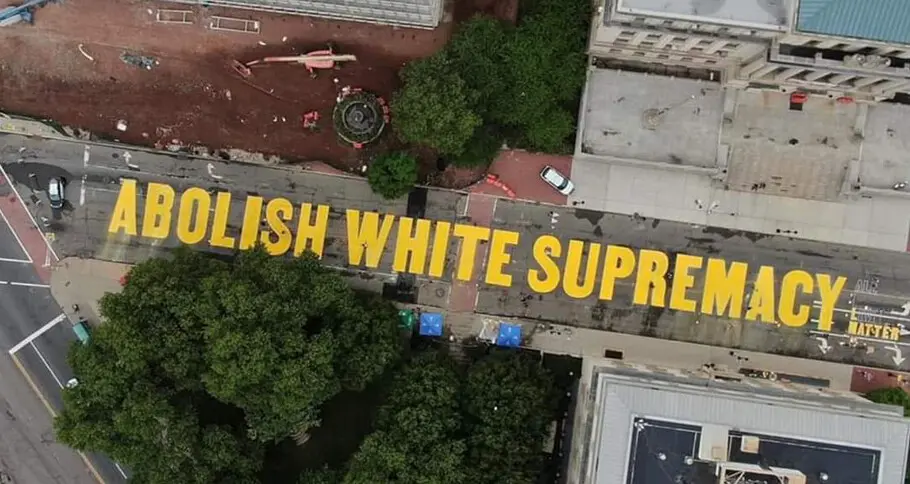
Black Lives Matter
The Black Lives Matter movement has perhaps one of the most recognizable protest designs today. The bold, black and white “Black Lives Matter” logo is instantly identifiable, carrying with it a powerful message about racial justice. The design has evolved over time, but its core message has remained the same: advocating for the value of Black lives and fighting against systemic racism with the bold image of a raised fist. In addition to the logo, countless graphics, memes, and protest posters have been created, spreading the message across social media and public demonstrations alike (Reason, 2024).
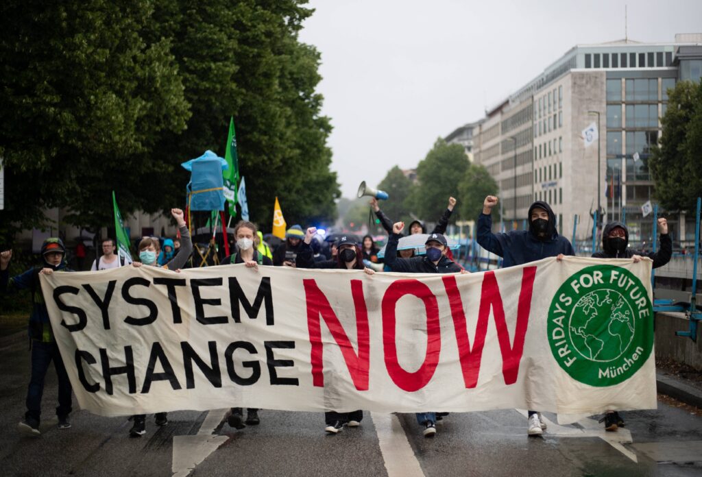
Fridays for Future
Fridays for Future Demo im Regen Am 1.7.2022 versammelten sich ca. 60 Menschen in München, um bei FFF für Klimagerechtigkeit zu demonstrieren und die Stadt Müncehn zu ernsthaften Klimaschutz zu bewegen. — On July 1st, 2022 about 60 people gathered in Munich, Germany with FFF to protest for climate justice. München Bayern Deutschland Copyright: xAlexanderxPohlx
Fridays for Future, the youth-led climate movement spearheaded by Greta Thunberg, has also embraced protest design in its efforts to raise awareness about the climate crisis. The movement’s logo—a simple, bold typography (font jost)—carries a sense of urgency, while its use of vivid, striking colors draws attention to the cause. Digital design, such as posters for climate strikes, has helped young people mobilize globally, encouraging millions of students to demand action on climate change (Anwar, 2019).
Protests Against War
Protests against war have a long history of using design to communicate their anti-war stance. From the iconic “Make Love, Not War” slogan of the 1960s to contemporary anti-war protests, design has been crucial in creating memorable, impactful messages. The peace symbol, the dove, and other visual representations of peace have been used across generations to unite people in their opposition to violence and military conflict (Rosemont et al, 2012).
Why Protest Design Matters
Protest design isn’t just about making things look visually appealing; it’s about creating a sense of urgency and solidarity. It’s about taking an issue—whether it’s climate change, racial justice, or gender equality—and making it visually accessible and emotionally powerful.
In the digital age, protest design has a far-reaching impact. Social media allows for instant sharing of images and messages, turning graphic design into a tool for viral activism. A well-designed image can spread rapidly, reaching millions of people in an instant, and sparking a global conversation (Mindful Mediator, 2023).
Moreover, protest design helps create a visual identity for movements, making them more recognizable and easier for people to rally around. A logo, a slogan, or even a specific color scheme can become synonymous with a movement, and this kind of visual recognition is essential for uniting people and building momentum.
Challenges and Criticisms
While protest design can be a powerful tool for social change, it is not without its challenges and criticisms. One major issue is the commercialization of protest imagery. As social movements gain visibility, there’s a risk that commercial entities may co-opt protest design for profit, reducing the message to a mere aesthetic trend.
Furthermore, there’s a potential danger of superficiality. If protest design becomes too focused on creating catchy visuals rather than communicating a deep political message, it risks losing its effectiveness. Design should always serve the purpose of the movement, not just its aesthetics.
Handwritten protest signs hold a unique power, offering a raw and spontaneous form of expression that contrasts with the polished and professional look of digital design. While digital tools make it easy to create flashy, shareable protest graphics for online activism, handmade signage continues to dominate physical protests, capturing the urgency and passion of the moment. These signs, often created with just markers and cardboard, reflect the immediacy of the cause and stand as deeply personal, unfiltered expressions of anger, hope, and determination.
Despite the rise of socially shareable digital visuals, the prominence of hand-drawn signs in protests highlights their enduring impact. As noted during movements like Occupy Wall Street and Black Lives Matter, these signs often become iconic symbols when photographed, with their striking, improvised lettering adding an extra layer of authenticity. Photographer David Holbrook observed that handmade signs, especially those with bold, capitalized text, convey a sense of shouting and urgency, making them highly expressive and attention-grabbing. Their imperfections and individuality demonstrate the time and effort put into crafting them, adding a human touch that resonates deeply with audiences both on the streets and through the images shared worldwide (Gosling, 2020).
Sources
Anwar, S. (2019, July 30). Grafiker über das Design von Fridays for Future – „Ich finde es wunderbar”. Deutschlandfunk Kultur. https://www.deutschlandfunkkultur.de/grafiker-ueber-das-design-von-fridays-for-future-ich-finde-100.html
Gosling, E. (2020, August 11). Strongly worded letters: Typography and modern protest. Monotype. https://www.monotype.com/resources/expertise/typography-and-modern-protest
Levanier, J. (2022, October 4). Design activism: what good can graphic design do? 99designs. https://99designs.com/blog/design-history-movements/design-activism/
Mindful Mediator. (2023, July 26). The role of social media in modern activism – Mindful Mediator – Medium. Medium. https://medium.com/%40mediation/the-role-of-social-media-in-modern-activism-20123deafacc
Reason, P. (2024, December 4). The raised fist: a history of the symbol – People’s History Museum. People’s History Museum. https://phm-org-uk.translate.goog/blogposts/the-raised-fist-a-history-of-the-symbol/?_x_tr_sl=en&_x_tr_tl=de&_x_tr_hl=de&_x_tr_pto=rq
Rosemont et al. (2012, February). History of the Make Love Not War slogan – Creative Review. Creative Review. https://www.creativereview.co.uk/make-love-not-war-slogan/
Sunmola, Y. (2020, December 3). The visual language of Protest: How graphic design can fuel protest and change government. Medium. https://yinks0067.medium.com/the-visual-language-of-protest-how-graphic-design-can-fuel-protest-and-change-government-bcffa115a74c
Tate. (n.d.). What is Protest Art? Tate Kids. https://www.tate.org.uk/kids/explore/what-is/what-is-protest-art