I recently went to the National Gallery and wanted to write about my visit. At first, I didn’t really know how to connect it to my master’s thesis, or even what exactly I had learned from it. This time, I simply started writing down my thoughts and by the end, I realised that it’s possible to make a connection between almost everything.
One of the first things that still amazes me is that the National Gallery like so many important museums in London is free. You can just walk in, no ticket, no obligation, and suddenly you’re standing in front of some of the most famous paintings in the world. That alone already says something about access, value, and who art is for. There’s no barrier or expectation. You’re allowed to wander, to stay five minutes or five hours.
And five hours might actually be too much.
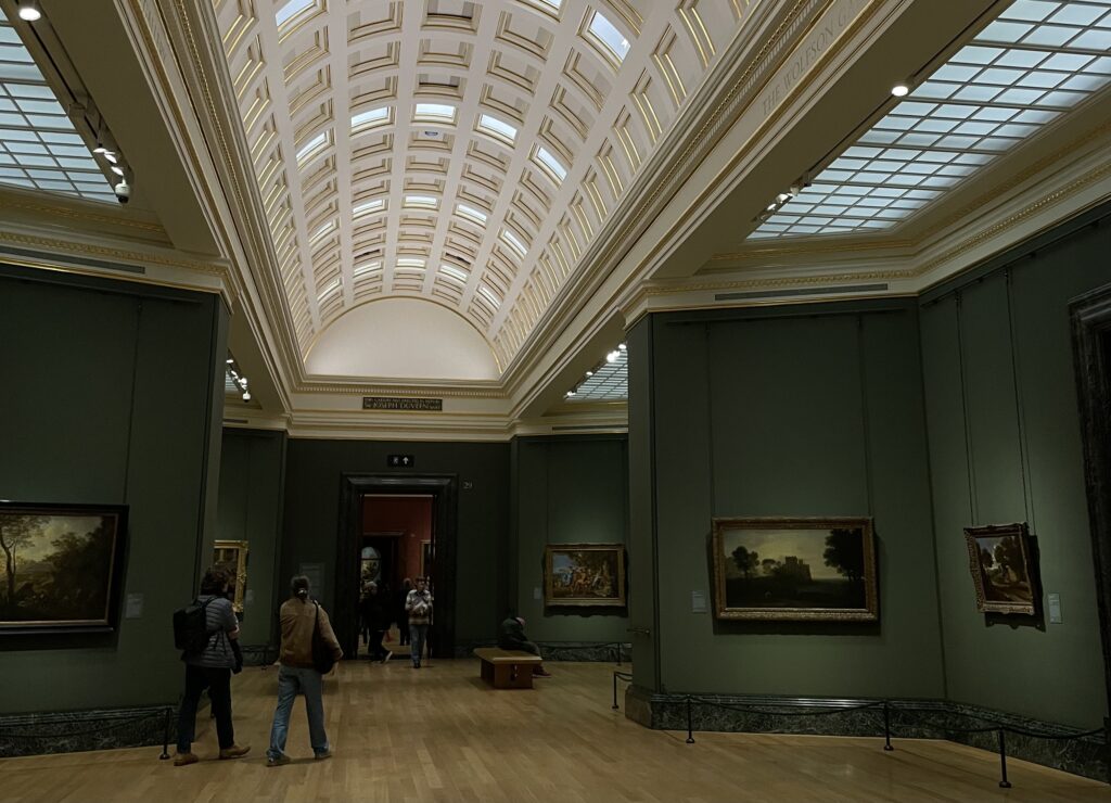
The gallery has so many rooms that after a while all the paintings started to blur together. This feels almost wrong to admit, because these are obviously some of the most important and celebrated artworks in history. Each painting, when looked at individually, carries such rich stories, political contexts, personal tragedies and fascinating details. Knowing the story behind a painting completely changes how you see it and how much it moves you.
I noticed this especially when I was looking for The Execution of Lady Jane Grey. I already knew her story, and I had been deeply moved by it before even seeing the painting in real life. Standing in front of it felt almost like meeting a celebrity you’ve admired for a long time. In that moment, the painting didn’t feel like “just another artwork on the wall.”
But those moments became rarer the longer I stayed.
After a while, the quantity of paintings started to work against them. Room after room everything slowly flowed into everything else. I started wondering if “too much” can actually make things lose their value. Not because they aren’t valuable, but because we, as viewers, reach a limit. It reminded me of how after scrolling on TikTok for two hours, everything starts to feel the same and not because the content is identical, but because our capacity to truly engage gets exhausted. And maybe this doesn’t only happen with digital media, maybe it happens in museums too.
There was also something about the way the paintings were displayed that made this feeling stronger. The lighting, for example. This might be controversial, but I really didn’t like how Van Gogh’s Sunflowers looked. The colours felt lifeless and I hate saying that, because it’s Van Gogh. But it made me realise how much context, presentation, and atmosphere shape our experience of art. Even the most powerful work can feel distant if the conditions around it don’t support it.
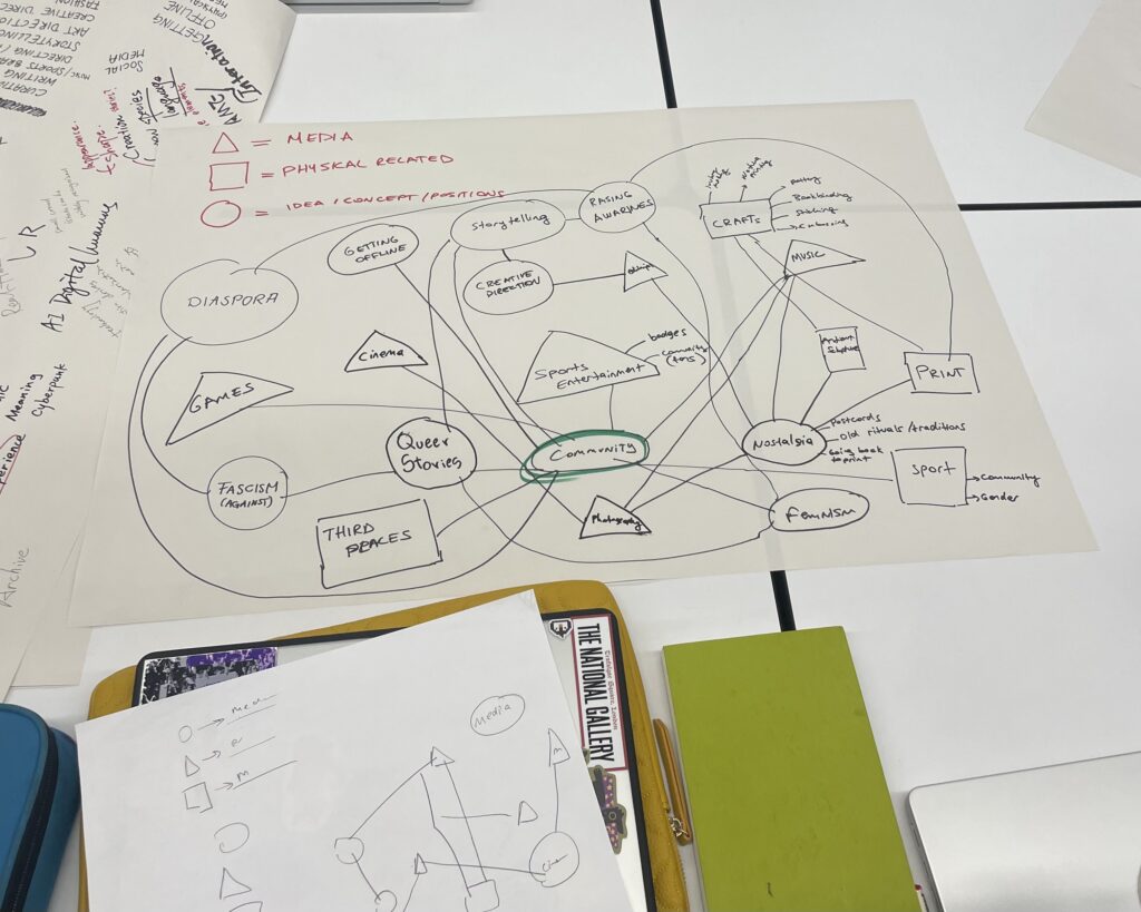
Walking through the gallery, I kept thinking about attention and how fragile it is, how easily it slips away. And maybe this is where the connection to my master’s thesis begins to form. I’m becoming more interested in how meaning is created, sustained, or lost depending on scale, quantity, and context. How can we design (physical or conceptual) to allow for slower and deeper engagement?
Links:
https://www.nationalgallery.org.uk/
https://www.hrp.org.uk/tower-of-london/history-and-stories/lady-jane-grey/
https://www.nationalgallery.org.uk/visiting/virtual-tours/google-virtual-tour