Communication of Complex Climate Data 

Climate change is one of the greatest challenges of our time, but communicating its urgency remains a significant hurdle. While data exists in abundance, the gap between understanding and action persists. This is where data visualization comes into play—transforming complex climate data into clear, engaging, and actionable insights that inspire individuals, communities, and policymakers to act. 

Why Visualizing Climate Data Matters 

Climate data is inherently complex, involving abstract concepts like carbon footprints, global temperature rise, and ocean acidification. For many, these numbers are intimidating or even incomprehensible. Studies show that visual communication can reduce disbelief by 50% and significantly enhance public engagement with climate science. By presenting data visually, we bridge the gap between abstract information and tangible understanding. 

Graphics, charts, and maps don’t just present facts—they tell stories. Design can help foster trust and build a sense of community. When people see the impact of climate change visualized in ways that resonate with them—such as rising sea levels in their region or local temperature anomalies—they are more likely to take action. 

The Role of Designers in Climate Communication 

As designers, we have the unique ability to translate data into compelling visuals that resonate emotionally and intellectually. Our role extends beyond aesthetics to encompass storytelling, empathy, and action-oriented design. A study on graphic design and climate communication emphasizes that effective visuals should promote risk perception, attract attention, and motivate action. 

However, designing for climate communication isn’t just about creating eye-catching visuals. It’s about crafting narratives that address psychological barriers like fear or denial. Positive imagery, for instance, has been shown to encourage pro-environmental behavior more effectively than fear-inducing visuals. 

Examples of Effective Climate Data Visualizations 

Two standout examples illustrate the power of effective climate communication: 

1. NASA’s Climate Time Machine 

This interactive visualization tool allows users to explore changes in key climate indicators, such as CO₂ levels, global temperatures, and Arctic sea ice, over time. By presenting both historical data and projections, the Climate Time Machine underscores the urgency of action while helping users see the long-term effects of climate change. 

2. “Show Your Stripes” Climate Graphics by Ed Hawkins 

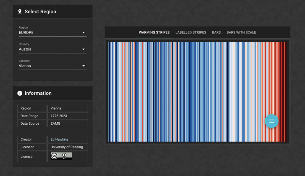
These minimalist visuals use colored stripes to represent changes in global temperature over the decades, with blue for cooler years and red for warmer years. The simplicity of the graphics makes them accessible to all audiences while visually reinforcing the undeniable warming trend. 

Challenges in Climate Data Visualization 

Despite its potential, visualizing climate data comes with challenges. Designers must navigate cognitive biases, misinformation, and the emotional burden of climate change. The abstract nature of the topic makes it harder for people to relate to or prioritize. Additionally, balancing scientific accuracy with simplicity requires careful consideration to avoid oversimplifying key messages. 

From Understanding to Action 

Visuals alone cannot solve the climate crisis, but they can catalyze action. They inspire conversations, inform decisions, and empower communities. Tools like the Ideation Booster Board, which integrates communication objectives with visual strategies, show how structured design processes can enhance the effectiveness of climate communication materials. 

Rapping it up: Data visualization is not just a tool—it’s a bridge between knowledge and action. By designing for clarity, empathy, and engagement, we can help individuals and policymakers see the urgency of climate action and take meaningful steps toward a sustainable future.


Reference

Maia, Manuela: A study with graphic in designers about climate change communication, Centro TGRAF ISEC Lisboa,14.10.2024 

https://ucrisportal.univie.ac.at/en/publications/being-simple-on-complex-issues-an-expert-view-on-visual-data-comm 23.01.2025, 07:36

https://www.restack.io/p/ai-for-climate-change-answer-best-practices-climate-data-communication-cat-ai 23.01.2025, 07:32

https://www.unsw.edu.au/newsroom/news/2021/10/graphic-design-can-build-trust-and-community-in-climate-conversa 23.01.2025, 08:21

https://www.linkedin.com/advice/1/heres-how-you-can-utilize-data-research-bolster-xst1c 23.01.2025, 07:52

https://www.researchgate.net/publication/292679121_Designing_futures_Inquiry_in_climate_change_communication 23.01.2025, 07:34

https://www.weforum.org/videos/nasa-s-climate-time-machine-shows-the-how-the-planet-is-heating-up/ 23.01.2025, 18:30 

https://www.weforum.org/videos/nasa-s-climate-time-machine-shows-the-how-the-planet-is-heating-up 23.01.2025, 18:32 

Can We Designers Change Something Against Climate Change?

Did you know that the information and communication technology sector is currently responsible for around 1.5 – 4 % of global greenhouse gas emissions? I certainly didn’t.
This statistic highlights the significant role that digital systems play in climate change, primarily due to energy-intensive networks, data centers, and end-user devices. As designers, we can no longer ignore our influence on this issue. Our choices can either contribute to or help mitigate environmental damage.

Understanding the Digital Carbon Footprint

Every digital interaction—whether it’s loading a website, streaming a video, or using a mobile app—requires energy. The classic example of the image carousel illustrates this point well. While visually engaging, carousels often consume excessive data and provide minimal usability. By eliminating such elements, we not only improve the user experience and site performance but also reduce the carbon footprint. This simple design change can lead to a substantial reduction in energy consumption, setting a precedent for more environmentally conscious design decisions.

The Philosophy of Designing for Social Good

“Designing for social good” is a concept that places human needs and ethical considerations at the forefront of design projects. This approach encourages designers to think beyond aesthetics and functionality to consider the broader social and environmental implications of their work. The aim is to create designs that benefit society, foster sustainability, and address pressing global challenges like climate change.

The Importance of Sustainable Design Practices

Sustainable design goes beyond aesthetics; it’s about creating systems that support long-term environmental health. This involves optimizing digital products to use less data, reducing unnecessary features, and prioritizing energy-efficient practices. Resources like DesignForce and Cyber-Duck provide valuable insights into how sustainable design can help combat climate change.

The Role of UX Design in Sustainability

User Experience design plays a critical role in sustainability. Poorly designed systems can increase energy consumption, leading to greater environmental impact. By focusing on efficient, user-friendly designs, we can reduce the energy needed to power digital interactions. This approach not only benefits the environment but also enhances the user experience, making it a win-win scenario.

How we Designers Can Make a Difference

Designers have a unique opportunity to lead the charge in reducing the digital carbon footprint. Here are some actionable steps to consider:

  1. Conduct a Digital Footprint Audit: Assess the energy consumption of your digital products and identify areas for improvement.
  2. Focus on Efficiency: Simplify designs to reduce data usage and improve performance.
  3. Educate Stakeholders: Raise awareness about the environmental impact of design choices and advocate for sustainable practices.
  4. Innovate Sustainably: Explore new design methods that prioritize sustainability and reduce environmental impact.

Moving Towards a Sustainable Future

As designers, our work has the power to shape the digital world and, by extension, its environmental impact. By adopting sustainable design practices, we can contribute to the global effort to combat climate change. Our designs should not only meet the needs of today but also preserve the planet for future generations.

https://razgo.medium.com/design-for-the-climate-crisis-an-updated-approach-d74f2b318c95  25.12.2024, 19:12

https://designforce.co/blog/the-fundamentals-of-social-impact-design 30.12.2024, 20:24

https://www.linkedin.com/pulse/ux-vs-climate-change-sustainableux-retrospective-james-christie 02.01.2025, 17:52

https://www.cyber-duck.co.uk/insights/how-sustainable-design-can-help-climate-change 20.01.2025, 20:53

https://medium.com/design-bootcamp/climate-change-and-its-impact-on-ux-design-a-call-for-sustainable-practices-c653cb2fec6e 20.01.2025, 19:02

https://uxdesign.cc/the-hidden-impact-of-ux-design-on-climate-change-ec5f6e758638 20.01.2025, 19:32

Mastering Design Principles: The Key to Compelling Creations 

Design principles serve as the backbone of any successful visual composition. They guide us designers in creating pieces that are not only aesthetically pleasing but also functionally effective. Whether crafting a website, designing a logo, or creating a product interface, understanding and applying these principles can elevate the work. Let’s delve into the core design principles and how they contribute to exceptional designs. 

Balance: The Foundation of Harmony 
Balance refers to the distribution of visual weight across a design. When balance is achieved, no single element feels heavier than the others, creating a sense of harmony. There are two main types of balance: 

  • Symmetrical Balance: This occurs when elements are evenly distributed on either side of an axis. Think of a butterfly’s wings – perfectly mirrored. 
  • Asymmetrical Balance: Here, balance is achieved through contrast. For instance, a small, dark object on one side of a composition can balance a large, light object on the other. 

Balance provides stability and structure, ensuring that the design feels cohesive and complete. 

Contrast: Highlighting Differences 
Contrast is all about juxtaposing elements to make them stand out. It can be achieved through differences in color, size, shape, texture, or even font style. A classic example is using a bold, dark font against a light background to emphasize text. 

Why is contrast so important? It: 

  • Draws attention to key areas. 
  • Enhances readability. 
  • Creates visual interest. 

Without contrast, designs risk feeling flat and uninspiring. 

Emphasis: Guiding the Viewer’s Eye 
Emphasis ensures that the audience knows where to look first. It’s about creating a focal point—a part of the design that grabs attention immediately. Techniques to achieve emphasis include: 

  • Using a pop of color in a monochromatic scheme. 
  • Increasing the size of a specific element. 
  • Positioning an object prominently within the composition. 

Think of emphasis as a spotlight in a theater, directing attention to the main act. 

Repetition: Building Unity and Consistency 
Repetition involves using the same elements throughout your design. This could be a recurring color palette, font, or shape. By repeating elements, you create a rhythm that ties the design together. 

Repetition is especially useful in branding. For example, consistent use of a company’s logo, colors, and typography builds familiarity and trust with audiences. It’s a subtle yet powerful tool for creating a cohesive identity. 

Proportion: Achieving Visual Balance 
Proportion relates to the size and scale of elements in relation to one another. It ensures that all parts of the design work together harmoniously. For instance, a human figure in an illustration should have arms and legs proportional to its body. 

Good proportion helps maintain visual order. When proportions are off, the design may feel awkward or jarring to the viewer. 

Movement: Creating a Visual Journey 
Movement guides the viewer’s eye through the design in a purposeful way. This principle helps create a sense of flow and narrative. Designers use lines, shapes, or strategic placement of elements to lead the audience from one point to another. 

Movement keeps viewers engaged and ensures they interact with your design as intended. 

White Space: The Power of Simplicity 

White space, also known as negative space, is the area around and between elements. Far from being “empty,” white space is a powerful tool that enhances readability, reduces clutter, and gives designs room to breathe. 

Key benefits of white space include: 

  • Highlighting key elements. 
  • Providing visual clarity. 
  • Creating an elegant, minimalist aesthetic. 

Think of white space as the silent pause in a song—essential for rhythm and impact. 

Alignment: Structuring Your Design 

Alignment ensures that elements are arranged in a visually pleasing way. Whether it’s left, right, center, or justified alignment, this principle organizes content and creates a polished look. 

Alignment is like the glue that holds a design together, giving it structure and professionalism. 

Unity: The Goal of Cohesion 

Unity is achieved when all elements in a design work together as a whole. It’s the culmination of applying other design principles effectively. A unified design feels intentional, complete, and aesthetically pleasing. 

Unity can be fostered through: 

  • Consistent use of colors, fonts, and styles. 
  • Repetition of patterns or motifs. 
  • Careful consideration of spacing and proportions. 

When unity is present, the design resonates with the viewer and communicates its message effectively. 

Conclusion 

Mastering design principles is essential for creating compositions that are both beautiful and functional. By focusing on balance, contrast, emphasis, repetition, proportion, movement, white space, alignment, and unity, you can elevate your designs to a professional level. These principles are not rigid rules but flexible guidelines that allow for creativity while ensuring that your designs remain effective. 

Whether you’re a seasoned designer or just starting out, revisiting these principles can provide valuable insights and fresh perspectives. Remember, great design isn’t just about what you add—it’s also about how you arrange, emphasize, and refine. 


Reference

https://www.linearity.io/blog/design-principles/ 18.01.25, 19:54

https://medium.com/@celestenorth/guiding-design-decisions-ecfefec92e50 19.01.25, 21:09

https://muz.li/blog/principles-driving-innovative-products/ 19.01.25, 21:15

https://jpamental.medium.com/guiding-principles-for-design-1ab90d190c11 18.01.25, 19:23

https://www.toptal.com/designers/gui/principles-of-design-infographic 19.01.25, 21:21

The Power of Data Visualization: Turning Numbers into Insight

Thinking of my project and the first meeting, the main and big problem is how data must be visualized to help people understand it. It seems so simple but most of the data gets lost in the dark because people don’t know what to do with them. Data visualization is another form of visual art that grabs our interest and keeps our eyes on the message. It’s storytelling with a purpose.

Data visualization is the graphical representation of information and data. It uses visual elements like charts, graphs, and maps to provide an accessible way to see and understand trends, outliers, and patterns in data. By presenting data visually, it transforms complex datasets into a more digestible and meaningful format, allowing stakeholders to grasp key insights quickly. 

It’s important to visualize data accurately when you’re doing market research. This is because you can visualize both numerical and categorical data, which makes the insights more impactful and reduces the risk of analysis paralysis.

What is the Goal of Data Visualization? 

The primary goal of data visualization is to communicate data clearly and efficiently. It aims to make complex data more understandable, uncover hidden insights, and facilitate better decision-making. Visualization bridges the gap between raw data and actionable intelligence, helping users to process information faster and make data-driven decisions. 

Why is Data Visualization Important? 

In the world of Big Data, it’s really important to be able to see all that data in a way that makes sense in order of being able to make data-driven decisions. The primary goal of data visualization is to communicate data clearly and efficiently. It provides an accessible way to see and understand trends, outliers, and patterns in data and a way for experts in a specific field to present data to non-technical audiences without confusion.

In today’s data-rich environment, data visualization is crucial for several reasons. It enhances understanding by making complex datasets more accessible through visual representation. This improved clarity supports better decision-making, allowing for quicker and more informed choices by highlighting key data points and trends. Additionally, data visualization aids in communication, effectively conveying information to diverse audiences, including non-technical stakeholders. Lastly, it helps identify patterns and trends that might not be immediately apparent in raw data, enabling organizations to uncover valuable insights.

What Types of Data Visualization Are There? 

There are various types of data visualizations, each suited to different kinds of data and analysis goals: 

  • Chart: Displays information in a graphical form with data along two axes. Types include graphs, diagrams, and maps.
  • Table: Presents figures in rows and columns, useful for detailed data comparison.
  • Graph: A diagram showing relationships between variables, often along two axes.
  • Geospatial: Uses maps to show data relationships with specific locations, employing shapes and colors.
  • Infographic: Combines visuals and text to represent data, often with charts or diagrams.
  • Dashboards: A collection of visualizations for comprehensive data analysis and presentation in one place.
  • Area Map: Shows values over geographical locations, such as choropleths and isopleths.
  • Bar Chart: Uses bars to represent numerical values for easy comparison.

Choosing the Right Data Visualization

Choosing the right data visualization depends on the type of data and the story you want to tell. Factors to consider include the nature of your data (quantitative vs. qualitative), the relationship between data points, and the key message or insight you want to convey. Charts, graphs, and maps serve different purposes and cater to diverse analytical needs, from showing comparisons and trends to highlighting distributions and relationships.


So the bigger purpose of Data visualization is not just about making data look good; it’s about making data more accessible and actionable. By effectively employing various visualization techniques, professionals can transform how data is interpreted and utilized across industries. 

There are a lot of tools to that can help visualization Data like: Google Charts, Tableau, Grafana, Chartist, FusionCharts, Datawrapper, Infogram, and ChartBlocks. In the course of my work with the Risklim team, I will also have to deal with such tools to see how we can work better with the available data. 

Reference

https://www.tableau.com/visualization/what-is-data-visualization#:~:text=Data%20visualization%20is%20the%20graphical,outliers%2C%20and%20patterns%20in%20data. 12.01.25, 21:37

https://www.geeksforgeeks.org/data-visualization-and-its-importance 12.01.25, 21:24

https://www.atlassian.com/data/charts/how-to-choose-data-visualization 12.01.25, 21:57

The Importance of Early Warning Systems

Early warning systems are critical tools for identifying and analyzing weather and climate-related risks. These systems aim to protect lives, livelihoods, and assets by enabling early actions in response to potential hazards. With climate change intensifying the frequency and severity of natural disasters, EWS are more necessary than ever. 

Issuing warnings within 24 hours can significantly reduce the damage caused by extreme events. (30%) Despite the growing number of disasters, only half of the world’s countries currently have access to multi-hazard early warning systems. 

Warning systems are composed of four essential elements:
– disaster risk knowledge
– detection and forecasting
– communication of warnings
-preparedness and response capabilities.

These components must work together, involving communities and organizations at risk, to effectively minimize the impacts of extreme weather and non-weather-related hazards, such as earthquakes and disease outbreaks. 

By advancing early warning systems, we can better prepare for the challenges posed by climate change, reducing harm and enhancing resilience. 

To get a better overlook which kind of early warning systems there are i started my research on that.

Swiss: WSL-Institut für Schnee-und Lawinenforschung SLF

The page on the Swiss Institute for Snow and Avalanche Research (SLF) website provides information about their research and services related to snow, avalanches, and mountain ecosystems. Visitors can find insights on current avalanche warnings, snow conditions, ongoing projects, and publications. The site also offers educational resources and tools for professionals and the public to enhance safety and understanding of mountainous environments.

The website from Swiss Institute for Snow and Avalanche Research appears updated and clean but finding the right path seems tricky sometimes.

Link: https://www.slf.ch/de/naturgefahren/lawinen/

New Zealand: NEMA 

The National Emergency Management Agency website provides comprehensive resources on disaster preparedness and management in New Zealand. Visitors can find information on emergency alerts, guidelines, like video tutorials, for responding to various natural hazards like earthquakes and tsunamis, and resources for community engagement and education. The site also details strategies for disaster resilience, emergency response planning, and legislative frameworks. Additionally, it offers insights into civil defense sector operations, public education programs, and training opportunities. 

You can search if your location is in a Tsunami evacuation zones but doesn’t provide information about current tsunami warnings.   

The design of the National Emergency Management Agency’s website is definitely not the newest one. But it is user-friendly and straightforward, focusing on easy navigation and accessibility.  

Link: https://www.civildefence.govt.nz/ 

Canada: the National Public Alerting System  

Public Safety Canada’s website provides information about the National Public Alerting System (NPAS), known as Alert Ready. It explains how the system works to deliver emergency alerts to Canadians through various channels, including TV, radio, and mobile devices, during life-threatening situations. The page also includes details on the types of emergencies covered, how the alerts are issued, and guidance on receiving them. 

Although the website of the Public Safety Canada’s National Public Alerting System is being updated regularly, the design appears somewhat outdated. It lacks modern design elements such as responsive layouts, dynamic visuals, and interactive features that are now standard in contemporary web design. The visual hierarchy is minimal, and the aesthetic could benefit from an update to improve user engagement and accessibility. While functional, the site’s design might not fully meet current user expectations for an intuitive and visually appealing experience. 

Link: https://www.publicsafety.gc.ca/index-en.aspx 

The search for warning systems turned out to be tedious. There are a few websites that offer some information but are not very exciting from a design perspective. Basically, it can be said that acoustic signals (sirens) or visual warning lights are usually used in emergency situations. In order to reach people directly, such systems rely on contact via direct messages.


Research
https://wmo.int/topics/early-warning-system#:~:text=All%20early%20warning%20systems%20aim,assets%20of%20people%20at%20risk.&text=The%20damage%20caused%20by%20a,is%20issued%20within%2024%20hours.&text=About%2030%25%20of%20the%20global,covered%20by%20early%20warning%20systems.

https://www.civildefence.govt.nz/ 

https://www.publicsafety.gc.ca/index-en.aspx 

https://www.slf.ch/de/naturgefahren/lawinen/

What is Risk Communication?

Understanding the basics of risk communication is essential for my master’s thesis because it provides the foundational knowledge necessary to explore more complex aspects. By grasping the core principles, methods, and challenges, i can delve deeper into how risk communication interacts with UX design. It’s important to identify gaps in order for me to make innovative solutions, and contribute meaningfully to the field, especially in addressing critical global issues like climate change and disaster management.

For me it’s easier to understand new subjects with short video explanations. This one took COVID-19 an example to demonstrate some dilemmas and practical issues.

So risk communication is the real-time exchange of information, advice, and opinions between experts and individuals facing threats to their well-being. Its purpose is to help people make informed decisions to mitigate the effects of hazards, such as disease outbreaks, and to adopt protective measures.

The Role of Community Engagement

Community engagement is about developing relationships and structures that involve communities as equal partners in creating emergency response solutions. It empowers communities to take an active role in planning and implementing health emergency responses. Lessons learned from past emergencies show that integrating risk communication with community engagement leads to more effective, equitable, and inclusive preparedness and response efforts. 
Risk communication and community engagement works alongside other technical areas to ensure that accurate information is delivered to communities in ways that are acceptable and workable for them. nse efforts.

The Process of Risk Communication

Risk communication involves explaining critical information in ways that enable people to make informed decisions about risks to their health, safety, and or environment. It is not merely a one-way transfer of information but a dynamic, multi-directional process involving ongoing engagement among stakeholders. This is crucial, especially when risks are uncertain or rapidly changing.

Goals and Challenges

The goals of risk communication vary. For users, it helps understand risks and benefits, while for institutions, it minimizes disputes and prevents communication breakdowns. However, firms often struggle to create communications that are both legally compliant and beneficial for users. Effective risk communication should aim to build trust, foster consensus, and support risk management decisions.

Making It Work

Effective risk communication requires identifying and understanding the audience, crafting clear messages, and selecting appropriate communication methods. While it may not guarantee consensus on risk management approaches, it enhances community involvement, raises awareness of public perceptions, and clarifies how risk assessments inform decision-making.

Conclusion

Risk communication is essential for empowering communities to make informed decisions during emergencies. By fostering trust and ongoing engagement, it contributes to more effective and inclusive risk management strategies, ultimately enhancing community resilience.

Importance of (UX-) Design in Risk communication  

Introduction 

Last September, Austria experienced a devastating flood event, highlighting the growing impact of simultaneous and systemic crises like climate change, armed conflicts, and pandemics. These events cause massive damage and disrupt lives, yet understanding and utilizing technical data to prepare for such crises often remains a significant challenge. 

To address this, the “RiskLIM” project, spearheaded by the Safety and Disaster Studies working group at Montanuniversität Leoben, aims to optimize cross-border climate services. By collaborating with organizations such as GeoSphere Austria, the German Weather Service, and the Avalanche Warning Centre, this EU-funded initiative focuses on creating actionable risk impact assessments, particularly for avalanches and snow loads. The project emphasizes bridging the gap between technical data and effective communication to better equip society for short-term hazards and long-term climate adaptation. 


Personal motivation 

As a graphic designer and content creator at the Montanuniversität Leoben, I’ve had the privilege of exploring diverse research fields, gaining valuable insights into how visual communication can simplify complex concepts. My interest in safety and disaster studies was piqued early on, particularly through discussions with the program coordinator. These conversations opened the door to integrating design into risk communication, shaping the idea of developing a master’s thesis around this critical topic. 

This intersection of research and design is incredibly compelling to me. Visual communication isn’t just about aesthetics; it’s a tool to make technical information understandable and actionable, especially in high-stress situations where clarity and usability can save lives. 


Design relevance  

Effective risk communication is more than just disseminating information; it’s about ensuring the right message reaches the right audience in a manner they can understand and act upon. Interaction design offers powerful tools to achieve this goal by simplifying interfaces, prioritizing critical information, and addressing the user’s state of mind during crises. 

For example, interactive maps can visualize real-time risk data, helping individuals and organizations make informed decisions. By employing principles of user experience (UX) design—such as clarity, accessibility, and user-centered design—these tools can transform how communities respond to emergencies. This approach aligns seamlessly with the objectives of the RiskLIM project, providing a unique opportunity to enhance risk communication through design. 


Possible Research Questions 

Since I haven’t yet gained much insight into the project and don’t know exactly in which direction it is developing, it is difficult to formulate a precise research question. That’s why I thought very generally and asked myself the following questions: 

  • How can visual design improve the accessibility and comprehension of technical data in risk communication? 
  • What role does interactive design play in facilitating community preparedness for natural hazards? 
  • How can user experience principles be adapted to meet the challenges of high-stress scenarios in risk communication? 

Expected Challenges 

Working with scientific experts: Collaboration with experts from technical fields who may not fully understand the potential of design could pose challenges. Bridging this gap will require careful communication and showcasing how design complements their expertise. Additionally, gathering feedback from diverse user groups to create universally accessible tools might demand extensive testing and iteration. 

Knowledge Gap: Gaining in-depth understanding of risk communication and technical aspects of the project may require extensive self-study. 


Next steps  

My plan to move forward: 

  1. Deepen my understanding of risk communication and its existing methodologies. 
  1. Engage with the RiskLIM project team to identify key areas where design can add value. 
  1. Develop prototypes, such as interactive maps, to demonstrate how UX design can enhance risk communication. 

Links 

The project: https://www.sds-unileoben.at/risklim-2/ 

A. Cleaveland, G. Gordon, J. Newman and S. Weber, “Designing Risk Communications,” University of California, Berkeley, Dec. 2020, doi: https://cltc.berkeley.edu/wp-content/uploads/2020/12/Designing_Risk_Communications.pdf