Impulse #7: Contemporary Art and Religious Experience

I visited the exhibition “DU SOLLST DIR EIN BILD MACHEN – Contemporary Art and the Religious Experience” at the Künstlerhaus in Vienna with a certain expectation: to encounter contemporary artistic positions that critically engage with religion without falling into pure provocation. What I found was a carefully curated exhibition that neither defends nor attacks religion outright, but instead opens up a complex space for reflection, ambiguity, humor, and critique.

The exhibition brings together works by 42 contemporary artists who approach Christian iconography from different perspectives—critical, loving, feminist, ironic, and deeply personal. Rather than aiming for scandal or shock, the exhibition focuses on dialogue: between past and present, faith and doubt, institution and individual experience. This approach resonated strongly with my own research interests, which revolve around distance, reflection, and the role of mediation in religious experience.

The exhibition is structured into seven thematic chapters—Icon, (False) Holiness, Cross, Resurrection, Divinity, Madonna, and The Last Supper—each framing how traditional religious motifs are reinterpreted today. What becomes immediately clear is that religious imagery still holds immense imaginative power, even in a largely secularized context. Art, much like religion, deals with fundamental questions of existence, meaning, and uncertainty. While religion often seeks to make the unfamiliar familiar, contemporary art does the opposite: it destabilizes what we think we know.

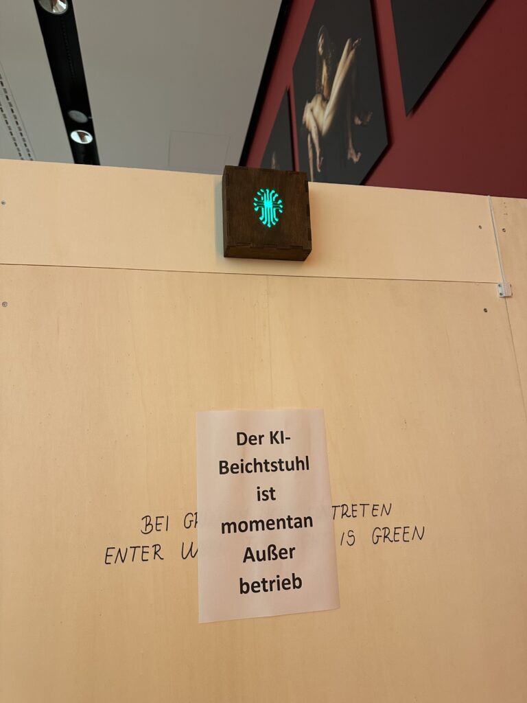
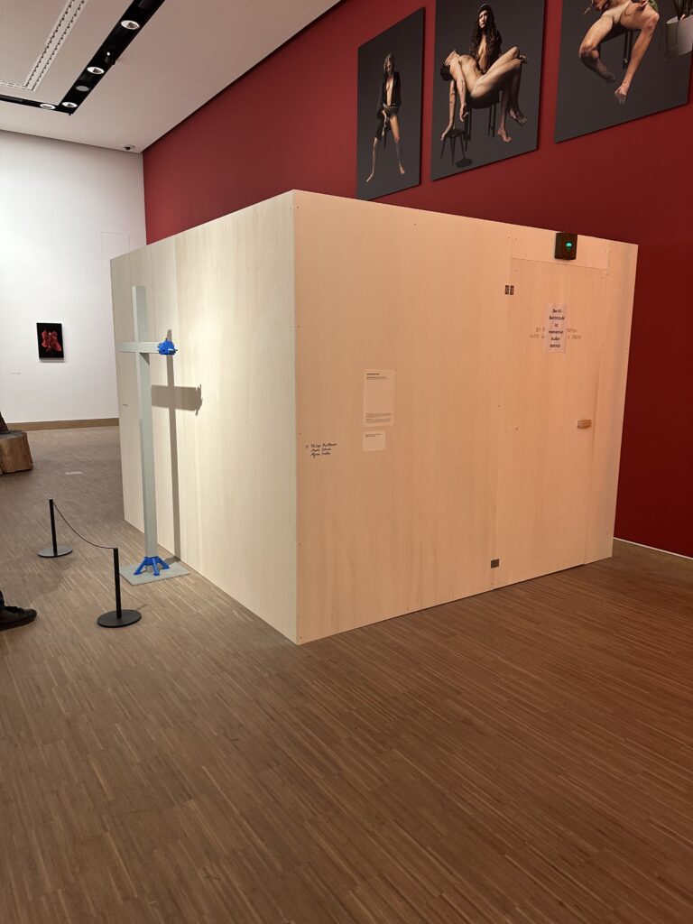
I was actually visited it on the recommendation of Martin Kaltenbrunner with whom I talked about my Master Thesis. One work I was particularly interested in seeing was Deus in Machina (2024/2025) by Philipp Haslbauer, Marco Schmid, and Aljosa Smolic—an AI-based installation that invites visitors to engage in a dialogue with a digital Jesus. Unfortunately, the installation was out of order during my visit. Still, its conceptual framing alone is highly relevant to my research. The work raises the question of whether artificial intelligence can become a spiritual interlocutor—not as a gimmick, but as a serious conversational partner. This idea sits uncomfortably between curiosity and unease, echoing many of my concerns about digital mediation of spirituality: Where does support end and simulation begin?

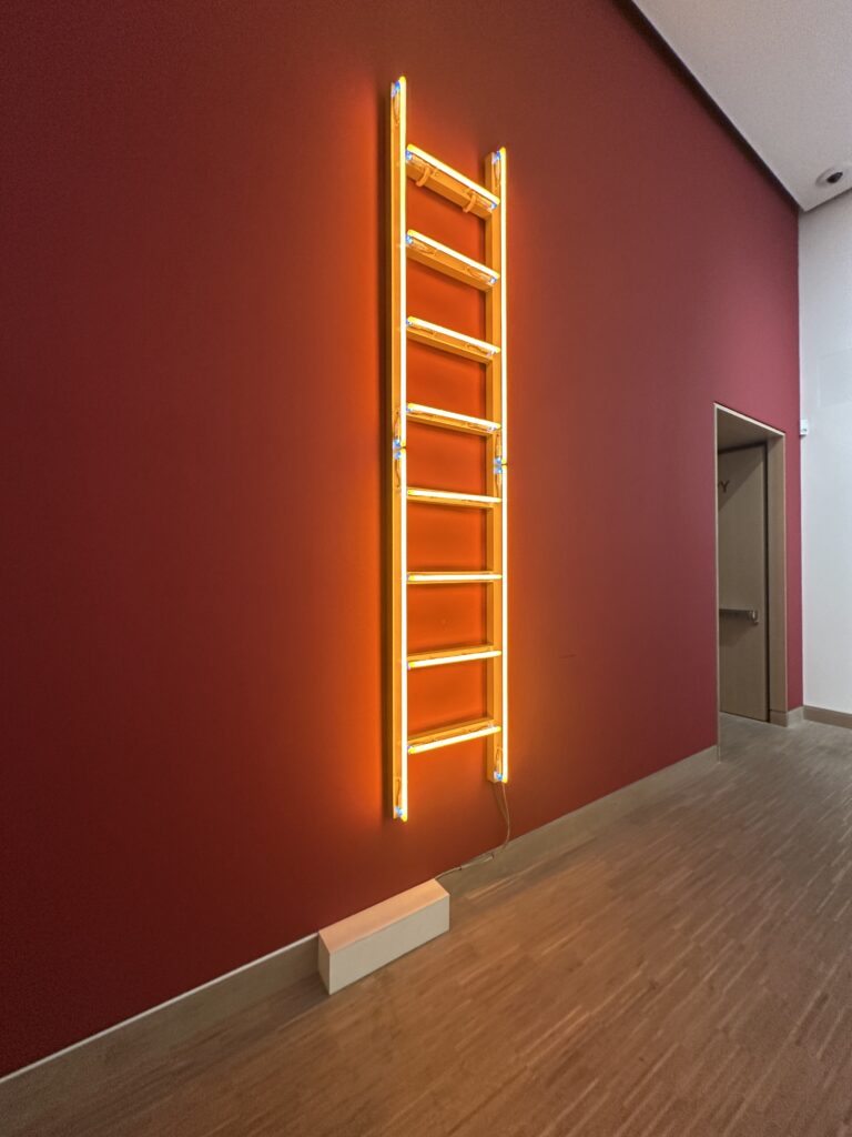
Seeing Himmelsleiter again—originally created for St. Stephen’s Cathedral—reinforced my sense of how strongly site, context, and memory shape religious experience. Removed from its original location, the work still carried symbolic weight, but its meaning shifted. This highlighted how religious and spiritual experiences are not fixed, but deeply relational and contextual.

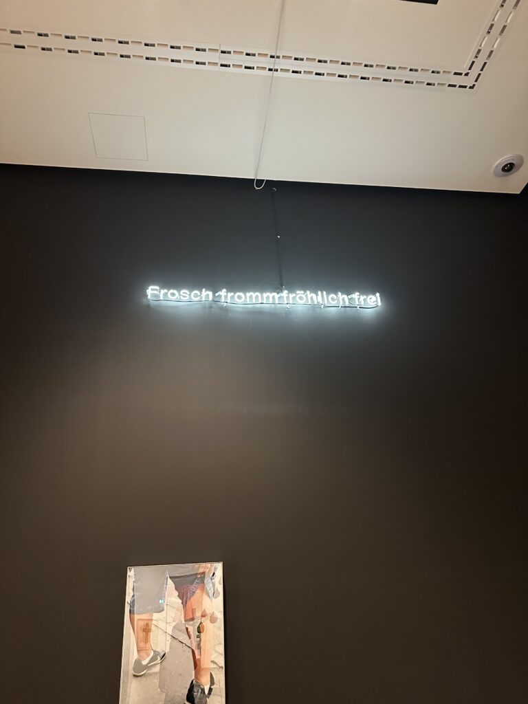
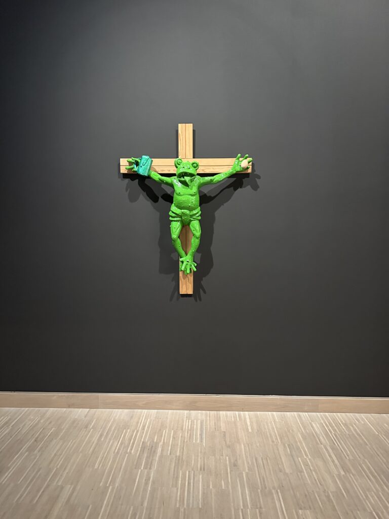
Perhaps the most striking moment of the exhibition was encountering Martin Kippenberger’s Fred the Frog Rings the Bell (1990), the infamous crucified frog. Knowing its history—the public outrage, accusations of blasphemy, political pressure, and even papal commentary—added another layer to the experience. What fascinated me was not the provocation itself, but the failure of mediation. The scandal revealed less about the artwork and more about the inability of institutions to foster dialogue. Instead of enabling theological or cultural discussion, the work was hidden, relocated, and silenced. This reaction mirrors many of the mechanisms that contribute to people distancing themselves from the Church: defensiveness, lack of dialogue, and fear of ambiguity.

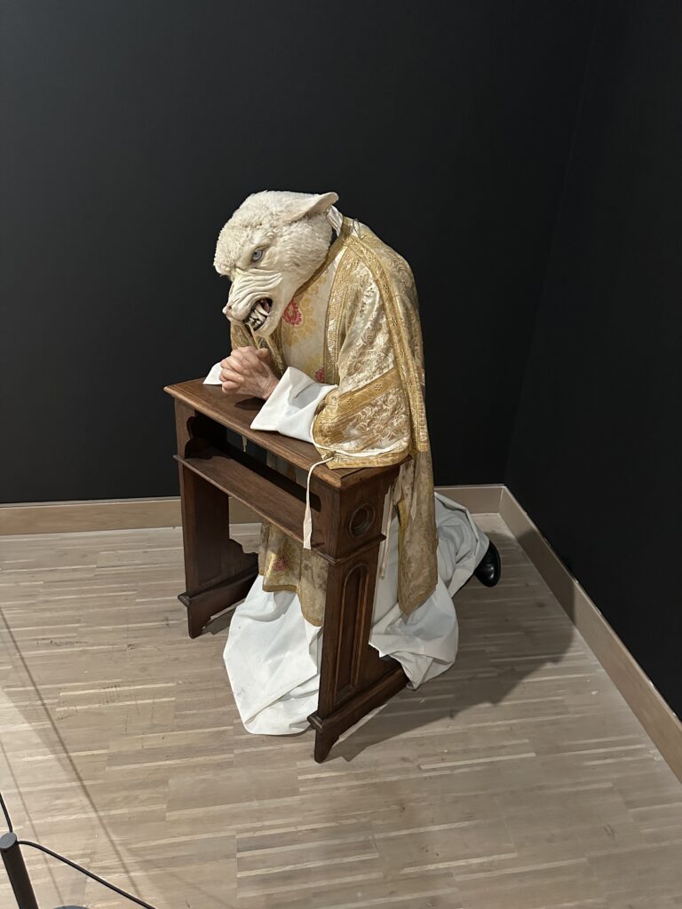
Other works, such as Deborah Sengl’s Of Sheep and Wolves, critically examine hierarchy, power, and institutional structures within the Church. These pieces do not reject faith outright but question authority and obedience—issues that are central to contemporary critiques of organized religion.

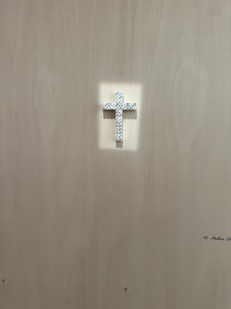
Markus Wilfling’s minimalist sculpture O.T. (God Does Not Play Dice) offered a quieter, more contemplative counterpoint. Referencing Albert Einstein, the work balances order and randomness, belief and doubt. The dice-cross simultaneously suggests structure and mystery, reminding viewers that faith is not about certainty, but about navigating the unknown.

This exhibition was a powerful impulse for my master’s research. It demonstrated how religious themes can be addressed critically without cynicism, and how distance itself can become a productive space for reflection. Most importantly, it showed that engagement with religion does not require affirmation or rejection—it can exist in between. As an interaction designer, this reinforces my interest in creating spaces that allow for ambiguity, critique, and personal interpretation, rather than clear answers or prescribed meanings.


Links:
https://www.nitsch-foundation.com/exhibition/du-sollst-dir-ein-bild-machen
https://religion.orf.at/stories/3232748

Dissclaimer: AI was used here for a better wording and structuring

3.7 IMPULSE #7

On 30/1/2026, I had another coaching session, but this time with Martin Kaltenbrunner. I shared my thesis topic again, but after my last conversation with Hort Hörstner, I had refined it a little. This time, I was asking new questions and exploring my updated path. It felt like I was slowly discovering a clearer direction for my research.

During our conversation, a term came up that really caught my attention: Soma Design, developed by Kristina Höök.

To understand it better, I watched a seminar from Stanford University (you can watch it here: https://www.youtube.com/watch?v=IwBTNAq8Qy8).

Here’s what I learned:

Soma design is a design approach that puts the felt, living body at the center of the process. It comes from somaesthetics, a philosophy that connects our sensing, moving body (soma) with the idea of paying attention to our sensory experiences (aesthetics). In design, this means focusing on how people feel, move, sense, and interact with the world, rather than only what they think or say. It’s a way of designing that listens to the body.

Höök explains that aesthetics here is not about beauty, but about a skill: the ability to notice and attend to the world through all your senses. By doing this, you can feel more pleasure, interest, and awareness in everyday life. I found this idea inspiring, and it connects closely to my topic. Social anxiety is something we experience through the body. So I started asking myself: What if design could help people become more aware of their own bodies?

She shared two examples that really made the idea clear. One was Breathing Light, a lamp that changes brightness with a person’s breathing. The other was Soma Mat, a heated mat that reacts to touch. Both are simple, but they create an immediate connection between the body and the environment.

This gave me an idea for my thesis. Instead of only showing social anxiety visually or conceptually, I could measure bodily responses, like breathing or heart rate, to help people understand how the body reacts in uneasy social situations. By letting the body “speak,” design could create experiences that help people explore, reflect, and become aware without forcing them to explain or perform.

Soma design changed the way I think about my research. It is less about controlling or representing a problem and more about creating a space where people can feel, sense, and explore. I’m excited to see how I can bring these ideas into my prototypes, letting the body guide the design and helping people connect with their own experiences in a gentle, human-centered way.

AI was used for corrections, better wording, and enhancements.

Impulse #8: Architecture of an Idea

After a few weeks of intensive learning and a complete rethink of my project direction, I realized that having a good idea is only half the battle. The real challenge lies in the execution, specifically, how to structure a complex project so it doesn’t collapse under its own weight. To get my head around this, I’ve spent the last few days diving into The System Design Primer, an open-source repository that has become an essential resource for anyone trying to build something a working system.

Thinking in Trade-offs

The most striking thing about the System Design Primer is its objectivity. It doesn’t tell you there is one right way to build a system. Instead, it teaches you that every technical decision is a trade-off. This was a very interesting perspective for me.

The documentation introduces the CAP Theorem (Consistency, Availability, and Partition Tolerance), which forces you to realize that you can’t have everything. You have to choose what matters most for your specific use case. Applying this logic to my own work has been a game-changer. It’s moved me away from trying to build a perfect project and toward building a logical one based on specific constraints.

The Power of High-Level Mapping

One of the most helpful sections of the Primer is the focus on requirement clarification. Before diving into code or hardware, the documentation insists on defining the scope:

  • User Personas: Who is this for?
  • Scale: How much data are we moving?
  • Performance: How fast does it need to be?

Mapping these out feels like a relief. It turns an abstract, overwhelming goal into a series of technical requirements. The Primer provides visual templates for high-level designs—showing how load balancers, web servers, and databases interact—which has helped me visualize my thesis as a functional architecture rather than just a collection of ideas.

From Confusion to Structure

There’s a quiet satisfaction in seeing a complex problem broken down into its component parts. The past few weeks have been fairly high-pressure, and the fog of choosing a new direction was real. But spending time with the System Design Primer has provided a much-needed sense of order. It’s one thing to have an interest in a global problem, but it’s another thing entirely to understand how to build a system that can actually address it. This documentation doesn’t just provide a technical library, it provides a way of thinking. It has taught me to look for the bottlenecks in my logic and to design my project with a focus on reliability and scalability.

I’m still refining the specifics of my research, but I feel much better equipped now. This systematic approach ensures that the final direction is not just an area of interest, but a calculated contribution to a complex, real-world environment.

Source: https://systemdesignschool.io/primer

Is Open Source entirely good? – Impulse #8

In my last post, I ended with a question: Is open source an entirely good thing? What are negative sides? It felt like a blindspot in my own thinking, which I uncovered while talking to Ursula Lagger. After doing some quick research, the answer is more complicated than I thought.

From a purely economic standpoint, open source is great. A Harvard-backed study estimated its value at a staggering $8.8 trillion. It is the critical, often invisible, infrastructure upon which modern society runs. Companies and economies depend on it.

But there is another side to that coin: the human cost. The system thrives on volunteer effort, but it’s a system that is exhausting the people who create it. While the benefits of working on open source projects are great, like accelerated skill development, best practices in code architecture, testing and collaboration, maintainer burnout is an existential risk to the ecosystem. In a recent survey, approximately 60% of open-source maintainers had considered quitting. Maintainers face a constant flood of demands from users with limited resources, insufficient (or no) compensation, and an unfortunate amount of interaction with toxic communities.

And what about us, the designers? For us this is a largely invisible opportunity. While our skills are needed, poor user experience and interface design are common barriers to open-source adoption, designers are almost entirely absent from these communities. Only about 1-3% of contributors are designers. This is likely due to structural barriers: the lack of designer-friendly tools, unfamiliar version control systems, and a developer-centric culture that often undervalues design contributions. A blindspot for the ecosystem, missing out on crucial expertise that could make open-source tools more accessible and user-friendly for everyone.

So, where does this leave me? This exploration hasn’t diminished my desire to contribute, but it has profoundly reshaped my understanding of the world I’m trying to enter. My goal to create a “Designer’s Guide to Open Source” now feels more important than ever. It’s not just about showing designers how to change a button or improve a workflow. It’s about preparing them to enter a complex ecosystem with their eyes open. It’s about encouraging contribution, but also advocating for a future where open source is as sustainable for its people as it is for the economies that depend on it.

Accompanying Links

Harvard Business School: Revealing the Economic Power of Open Source Software: https://d3.harvard.edu/revealing-value-the-economic-power-of-open-source-software/
A report on Open Source Maintainer Burnout: https://mirandaheath.website/static/oss_burnout_report_mh_25.pdf

Burnout in Open Source: A Structural Problem: https://opensourcepledge.com/blog/burnout-in-open-source-a-structural-problem-we-can-fix-together
The Internet Is Being Protected By Two Guys Named Steve (The Atlantic): https://www.theatlantic.com/technology/archive/2014/04/the-internet-is-being-protected-by-two-guys-named-steve/360766/

Ai was used to formulate this blogpost (Gemini + WisprFlow) an support with Research (Perplexity)

IMPULSE #8: Thesis Discussions

This impulse came from three separate mentoring conversations about my master’s thesis: first with Ursula Lagger, then with Horst Hörtner, and finally with Martin Kaltenbrunner. All three liked the core idea of using AR and IoT to enhance retail experiences, but each of them pushed me in a different direction. Together, these talks turned my project from a vague vision into something that needs concrete methods, business relevance and technical depth.

Focusing The Thesis With Ursula Lagger

My first conversation was with Ursula Lagger about my master’s expose. It was less about judging the idea and more about shaping it into a strong research plan. She encouraged me to keep the main concept, but to put much more emphasis on how I am going to test it with users. That meant not just saying “I will do user studies”, but being specific. Who are the participants, what scenarios will I test, which tasks will they perform, and how exactly will I collect and evaluate their feedback.

She also stressed that the written proposal should already show this depth. Instead of broad, generic goals, she wants to see clearly defined outcomes and methods. That feedback was very practical. It pushed me to rewrite sections of the proposal from high level ambition into detailed steps. For example, instead of “evaluate AR navigation in a store”, I now think in terms of concrete studies like “observe how long users take to find an item with and without AR guidance” or “measure perceived stress in crowded environments”.

Business And Social Perspective With Horst Hörtner

The conversation with Horst Hörtner brought in a different layer. He was positive about the topic and said it fits well with current technological developments, but he also pointed out that some of my scenarios are ahead of what is easily deployable today. Rather than seeing that as a problem, he framed it as a chance to think strategically.

From a business perspective, he recommended focusing on locations where the investment in AR and IoT can realistically pay off. That means contexts with higher margins or clear efficiency gains, where companies can justify installing such systems and maintaining them. Further mentioning trying to make something that will benefit not businesses but humanity. I now try to frame each concept both in terms of value for businesses and in terms of concrete benefits for humanity, not just for “tech fans”.

Technical And Methodological Depth With Martin Kaltenbrunner

With Martin Kaltenbrunner the discussion went into the technical and methodological details. He also liked the idea, but he was skeptical mentioning how trends come and go. He mentioned to look for already existing products that we might have in our phone. Additionally, his main question was: how exactly will this research play out in practice. Are there going to be physical prototypes, how will people interact with them, which tools and environments will I use.

He asked for more depth in the user research plan. Which classes or groups could participate in early tests, what kind of app or prototype will I build first, in which settings will the studies take place, and how many iterations I am planning. This made me realise that I need a clearer roadmap from first low fidelity mockups to more realistic prototypes. He also suggested concrete technical options, like building simple interactive shelves or objects with Arduino and available hardware, instead of keeping everything purely conceptual. That was encouraging, because it connected my ideas to components that are actually available in our labs.

AI Disclaimer
This blog post was polished with the assistance of AI.

IMPULSE #7: Life Story

A few days ago I had a very simple mission. Go to the store, buy a few things, get out. Instead it turned into an unplanned usability study. I needed cornstarch. That is not exactly an exotic product, so I walked to the baking section, then to the sauces, then to the international food aisle, then back to baking. I walked the same path again and again and still could not find it. At some point I just stood there in the middle of the aisle and realised that I was living inside my own thesis problem.

I knew the store had cornstarch, it is a common product and I had bought it there before, but my internal map completely failed. Shelf labels were tiny and placed at odd positions. My working memory was full of other items from my shopping list. After about twenty minutes of wandering, I finally found it at the very middle of a shelf in a place that was too easy to notice but there I am did not see it at all. That moment was the first impulse. If I had my imagined AR glasses, connected to the store’s inventory, this would have been a two second problem.

The story did not end there. When I finally picked up the cornstarch, there were two brands. The packaging looked almost identical. I could not see at a glance what the difference was, apart from a small price variation and some vague marketing text. I stood there comparing ingredients, Googling on my phone, opening product pages and reviews, trying to understand which one to choose. That felt like a second micro usability test. Finding the product is one task, choosing between options is another. Both were slower and more frustrating than they needed to be.

Later I told this story to friends and a few people immediately answered with similar experiences. They knew the store had a product, but could not locate it. Or they found something, then spent ten minutes trying to compare slightly different versions without any help. Some of them are very tech comfortable, so this is not a “user error”. It is a mix of confusing layout, poor signage and the cognitive load of doing small decisions in a crowded noisy environment.

This small field visit also changed how I think about evaluation. It is easy to say “AR will save time in the supermarket”. Now I have a real reference situation where I can ask people how long they typically search for items, how often they feel lost, and how they currently make product choices. I can imagine measuring the difference between the current experience and a guided AR version in a prototype study. The frustration I felt in front of that shelf is exactly the kind of pain point that can justify the complexity of an AR and IoT system.

In the end, this was just a normal shopping trip, but it gave me a very strong validation that my topic is grounded in everyday life. People are already hacking the system with their phones and Google. My research question is how to turn that into a seamless, spatially aware experience that lives in the environment itself instead of on a small screen.

AI Disclaimer
This blog post was polished with the assistance of AI.

IMPULSE #6: Book “Practical Augmented Reality”

The book Practical Augmented Reality: A Guide to the Technologies, Applications, and Human Factors for AR and VR, I expected to be a technical overview. Instead, it turned into a kind of design manual for my master’s thesis on leveraging AR and IoT to improve the shopping experience with context aware AR glasses. The book helped me connect big technological concepts to very concrete design decisions for my own project.

Seeing AR as “aligned, contextual and intelligent”

Early in the book, Aukstakalnis defines augmented reality as not just overlaying random graphics on the real world, but aligning information with the environment in a spatially contextual and intelligent way.
This sounds simple, but it actually shifted how I thought about my shopping glasses. It is not enough to place floating labels next to products. The system needs to understand where I am, what shelf I am looking at, and which task I am trying to complete, then lock information to those objects. This definition pushed me to think more seriously about IoT integration and precise tracking so that a price, rating, or nutrition label is always attached to the right item in space.

Designing from the human senses outward

The structure of the book also influenced how I plan my thesis. Aukstakalnis starts with the mechanics of sight, hearing and touch, and only then moves on to displays, audio systems, haptics and sensors.
That “inside out” perspective reminded me that my AR glasses concept should begin from human perception, not from whatever hardware is trendy. Reading about depth cues, eye convergence and accommodation, and how easily they can be disturbed by poorly designed displays, made me much more careful about how much information I want to show and at what distances.

For my thesis this means keeping overlays light, avoiding clutter in the central field of view, and respecting comfortable reading distances. It also supports my idea of using short, glanceable cards in the periphery instead of stacking lots of text in front of the user’s eyes.

Translating cross domain case studies into retail

The applications section of the book covers fields like architecture, education, medicine, aerospace and telerobotics.
None of them are about grocery shopping, but a common pattern appears: AR and VR are most powerful when they help people understand complex spatial information, rehearse tasks safely, or make better decisions with contextual data. I realised that retail has the same ingredients. Shelves, wayfinding and product comparisons are all spatial problems with hidden data behind them.

This insight strengthened the core vision of my thesis. My AR and IoT concept is not just about showing coupons in the air. It is about turning the store into an understandable information space, where digital layers explain what is currently invisible: where a product is, how fresh it is, how it fits personal constraints like allergies or budget, and how it compares to alternatives.

Impact on my thesis work

Overall, Practical Augmented Reality gave me three concrete things for my master’s project. First, a precise vocabulary and mental model for AR systems, which helped me write a clearer research question and background section. Second, a checklist of human factor issues that I now plan to address through prototype constraints and user testing. Third, a library of real world examples that prove similar technologies already deliver value in other domains, which I can reference when I argue why AR glasses for shopping are realistic in the near future.

Reading the book was less about copying solutions and more about understanding the hidden structure behind successful AR systems. That structure now guides how I want to combine AR, AI and IoT in an everyday retail scenario without forgetting the humans wearing the glasses.

AI Disclaimer
This blog post was polished with the assistance of AI.

IMPULSE #5: Preperation for Ph.D

This impulse is a bit unusual compared to a museum or a festival, because it did not happen in one specific room. It happened at my desk, in front of piles of PDFs. I had to start preparing my PhD proposal even before finishing my master’s thesis, mainly because of time pressure and my personal situation with the army. That pressure turned into a very intense, focused research sprint. I spent several evenings reading and analysing work on AR, AI and IoT to frame a possible PhD topic that extends my master’s project instead of repeating it.

The three main sources that shaped this impulse were the paper “IoT + AR: pervasive and augmented environments for ‘Digi-log’ shopping experience” by Dongsik Jo and Gerard Jounghyun Kim, the CHI paper “UI Mobility Control in XR: Switching UI Positionings between Static, Dynamic, and Self Entities” by Siyou Pei and colleagues, and the book “Practical Augmented Reality” by Steve Aukstakalnis. Together they created a kind of mini-course for me: one about the future of physical retail, one about interaction patterns in XR, and one about the broader technology and human factors behind all of this.

Observations: From “Cool Idea” To Structured Research Questions

Reading Jo and Kim’s “Digi-log shopping” paper was the moment where my retail ideas suddenly felt less like a personal fantasy and more like part of an actual research landscape. Their concept of blending digital overlays with the physical store confirmed that the direction of my thesis is relevant, but it also showed what has already been tried: navigation, in-store recommendations, context-aware content. While I was reading, I kept noting down where my own IKEA and grocery scenarios overlap and where they differ. That helped me see that my contribution should not just be “AR in shopping”, but more specifically about interaction patterns and how to keep users in control in these pervasive systems.

The UI mobility paper pushed me even harder in that direction. It analyses how interface elements can be anchored in XR: fixed to the world, attached to the body, or moving with the user. I realised that many of my early sketches for AR glasses assumed a single style of UI placement without questioning it. The paper gave me vocabulary and structure to ask concrete questions: when should a navigation cue be world-locked, when should it follow the head, when should it sit on the wrist. This was very useful both for tightening my master’s concept and for defining a sharper PhD angle around “interaction patterns for context-aware AR glasses”.

Main Concept: PhD Preparation As Shared Fuel For Master And Future Work

The biggest impact of this impulse is that PhD preparation stopped feeling like a separate project. The literature review I did for the proposal feeds directly back into my master’s thesis. It gave me language, references and frameworks that I can already use now: “digi-log experiences” for describing hybrid retail journeys, XR UI mobility for structuring my interaction designs, and a more precise understanding of AR hardware constraints for my scenarios.

So this impulse was not a public event, but it was a very strong push for my Design & Research. Writing the PhD proposal turned my scattered interests in AR, AI and IoT into a more coherent research trajectory. It made me read deeper, think more critically about gaps in existing work, and see my master’s thesis as the first chapter of a longer exploration instead of a one-off project.

“IoT + AR: pervasive and augmented environments for ‘Digi-log’ shopping experience” by Dongsik Jo and Gerard Jounghyun Kim – an HCI paper on blending AR and IoT in retail environments. (PDF via https://d-nb.info/1177365146/34

“UI Mobility Control in XR: Switching UI Positionings between Static, Dynamic, and Self Entities” by Siyou Pei et al. – a CHI 2024 paper on how XR interfaces move and anchor in space. (Project page: https://duruofei.com/projects/fingerswitch/

“Practical Augmented Reality: A Guide to the Technologies, Applications, and Human Factors for AR and VR” by Steve Aukstakalnis – a comprehensive AR / VR textbook. (Publisher page: https://eu.pearson.com/practical-augmented-reality-a-guide-to-the-technologies-applications-and-human-factors-for-ar-and-vr/9780134094359

AI Disclaimer
This blog post was polished with the assistance of AI.

Impulse #7: The Manual for My Hörtner-Inspired Pivot

It’s funny how things come full circle. After my transformative talk with Horst Hörtner about strategically tackling my Master’s thesis, I immediately went looking for resources to solidify that new way of thinking. Lo and behold, a book I’d previously added to my maybe later-list suddenly shot to the top: Strategic Thinking in Complex Problem Solving by Arnaud Chevallier. Diving into it now, it feels less like a new read and more like a detailed instruction manual for the approach Horst outlined.

From Vague Notion to Strategic Framework

My biggest takeaway from Horst was the concept of moving beyond just liking a topic or disliking a problem, and instead using those intuitions as strategic starting points. Chevallier’s book is essentially the blueprint for that process. It doesn’t just tell you to think strategically, it shows you how.

The core connection lies in how Chevallier tackles problem framing. Before I spoke with Horst, my approach was probably typical: identify a broad area, then try to force a research question into it. Now, with Horst’s guidance and Chevallier’s detailed steps, I’m learning to:

  1. Deconstruct: Break down the big, messy problem (like ocean plastic) into its fundamental components.
  2. Analyze: Identify the specific lever points where my current knowledge can actually make an impact.
  3. Synthesize: Reassemble these components into a clear, actionable research question.

It’s a methodical process that directly addresses the collect and form strategy Horst talked about, helping me organize those scattered thoughts into a logical attack plan.

The Power of Issue Mapping

One of the most impactful tools in Chevallier’s book for me has been Issue Mapping. This technique directly mirrors Horst’s advice to look at both what fascinates me and what I want to change. Instead of just holding these ideas in my head, Issue Mapping forces me to visually lay out:

  • The main question/problem: What exactly am I trying to solve?
  • The sub-questions: What smaller questions need to be answered to address the main one?
  • The hypotheses: What are my initial educated guesses or potential solutions?

This is exactly what I needed after those stressful weeks. It transforms the overwhelming feeling of a complex problem into a structured, navigable diagram. It’s like building a custom roadmap, where each turn represents a sub-problem, and each destination is a potential research outcome.

Aligning Knowledge with Leverage

The most practical part of Chevallier’s book is the focus on leverage. Horst challenged me to use my current knowledge. The framework helps me map my skills (like web development, prototyping, or systems design) against the sub-questions in my logic tree.

If I find a sub-question that is both a high-impact friction point and perfectly aligns with my technical portfolio, that’s the sweet spot for my thesis. It takes the guesswork out of the pivot. I’m no longer choosing a topic because it sounds cool. I’m choosing it because the logic tree proves it’s the most effective use of my skills to solve a problem I actually care about.

Impulse #6: A Conversation with Horst Hörtner

Finding a master’s thesis topic is often framed as a linear process, but in practice, it’s rarely that simple. I recently had a conversation with Horst Hörtner to discuss my current academic trajectory. I came to the meeting prepared with my previous projects and a defined topic, but I had to be direct: the current direction wasn’t working. Over the past few weeks, my interests have shifted significantly due to new input, leaving my original proposal feeling disconnected from my current goals. The talk centered on moving away from a random search for ideas and toward a strategic approach to problem-solving.

The Strategic Framework

Hörtner suggested a specific method for filtering thoughts into a viable research project. In a typical work environment, we don’t always get the chance to align our technical skills with our personal observations of the world. He proposed a dual-axis approach to bridge this gap:

  • Positive Indicators: What is currently fascinating or working well in the world?
  • Negative Indicators: What is broken, inefficient, or fundamentally frustrating?

By looking at the world through this lens, the goal is to identify a problem that isn’t just an academic exercise, but a “pain point” that requires a solution. The challenge is to use my existing knowledge base to address these frustrations in a systematic way.

Organizing the Thought Process

We used the example of ocean plastic pollution to test this logic. It’s a massive, complex issue, but the conversation focused on how to break it down. Instead of just thinking about the problem, the goal is to collect and form those thoughts into a technical solution.

This involves:

  1. Observation: Identifying the specific aspect of the problem.
  2. Analysis: Assessing if my current skill set can realistically impact that area.
  3. Synthesis: Structuring those observations into a formal research goal.

Key Takeaways

The most valuable part of the discussion was learning how to organize a high volume of new information and interests, especially after a particularly stressful few weeks of intensive learning. It wasn’t about finding an “eureka” moment, but about applying a more experienced, strategic filter to my ideas.

While I haven’t officially committed to the ocean plastic topic yet, the meeting provided a clear method for organizing my thoughts. I now have a framework to evaluate my new interests objectively and decide which one can be transformed into a solid, defensible thesis.