Voluntary Service & Open Source- Impulse #3

Continuing from the last blogposts, where I talked about what got me interested in open source as a master’s thesis topic: homelabbing. In this post, I want to talk about an intrinsic motivation, that kept me moving towards this.

Voluntary work is part of my day to day life. Since 2014, I have been part of the scouts, first as a child now as a guide. Once a week I run meet-ups for children form 7 to 10 years old, where we go out into the forest, play and teach them to be come a valuable part of society. Doing work like this takes much more time, than one would think, there is planning those 2 hour sessions, preparing before the kids come and cleaning up after they leave. There are weekend camps and a big summer camp to organise, the groups home needs to be tidy and there even is a course a scout leader must take, learning about communication and pedagogy. I give a huge part of my free time to the scout movement, and all for no pay.

In addition to big voluntary movements like the scouts, there are small communities like the “UX Graz” Community, which organise a meet up for people interested in UX design, every third Tuesday of the month. Everything is organised and run by volunteers. Every meet up is held at a different company, which provides the location, food and drinks, and there are two parts in every meet up, first there are some talks and second networking. For people attending it is completely free. Free food, free drinks, free knowledge transfer and free new contacts. (I have recently joined the organising team swell, so this is my second voluntary work.)

In my mind, there are a lot of parallels between voluntary work and open source. A small amount of people does work or creates something, that benefits a lot of others. And the work these people do is often overlooked. They act in the background often earning nothing more than respect and thanks from others. Especially in these times, it is hard t have a job, that doesn’t pay you money, next to your regular day job. Due to different reasons most people cant’t afford to work for free, still there are a bunch of people who do.

I hope to find a reason for people to work for free. In my opinion voluntary work provides a lot to society. Although sometimes I feel like the work volunteers do is under appreciated, especially youth organisations. Although to be fair, open source doesn’t mean free and open source projects aren’t always maintained by volunteers who aren’t getting paid. What drives people to give away their product for free? How can the value of voluntary work be communicated? Looking into the psychological and social aspect of people doing work just for the benefit of others, is something I would want to get into more.

Accompanying Links

A link to the UX Graz Meetup: https://www.meetup.com/uxgraz/

A link to the website of the Austrian scout movement: https://ppoe.at
Impulse no4: DIY Urbanism – 99% Invisible

Recently I listened to the 99% Invisible episode “The Help-Yourself City,” and it was much more interesting than I expected. The episode explores DIY urbanism: the little illegal-but-kind-of-understandable interventions people make in cities when official systems fail them. Things like residents painting their own crosswalks because the city won’t, placing traffic cones to reserve parking spots, building unofficial benches in their neighborhood, or taping up handmade signs to guide confused pedestrians.

An interesting point that was made was that people reshape their environments not out of rebellion (okay, sometimes out of rebellion) but mostly out of necessity. They see a problem, feel unheard, and then just decide to fix it themselves. And suddenly the city becomes this playground of small, improvised design decisions made by people who would never call themselves designers.

Listening to this made me realize how often design is treated as a top-down discipline. We create systems, UIs, layouts, streets, signs, apps — and expect users to adapt. But this episode flips the table: users constantly adapt our designs by bending them, hacking them, “misusing” them. The city becomes a reminder that “user behavior” isn’t just something to accommodate; it’s something to learn from. These tiny interventions show what people actually need, beyond what official planning claims to provide.

The creative impulse I took from this was that design should invite appropriation instead of resisting it. If people are modifying their surroundings, there’s a gap in the design. And that gap isn’t a failure — it’s a piece of insight.

For my own work I should more often ask myself: How could people misappropriate my work? How could they “co-design” it? How can I create systems that allow for bending, customizing, hacking — or at least acknowledging that this will happen anyway. The city doesn’t fight back when someone zip-ties a DIY sign to a lamppost. It just absorbs it. Maybe more digital products should behave like that, too: more porous, more flexible, more willing to be reshaped.

There’s also something philosophically beautiful about the idea that design doesn’t end when we’re done designing. The world edits it afterwards. And maybe the best designs are the ones that tolerate — or even encourage — these edits.

Impulse no3: Slow Design for Meaningful Interactions

A while ago I saw a youtube video about a survival guide to the brainrot apocalypse (https://youtu.be/6fj-OJ6RcNQ?si=RnQvDCDZ1GuJucp7) and it had an interesting section which talked about replacing doomscrolling with reading about fallacies and scientific articles. That’s how and why I came across and read this particular paper: “Slow Design for Meaningful Interactions“.

It left me thinking about a design philosophy I usually associate with niche craft projects, not mass-produced consumer products. The authors explore how the principles of Slow Design — a movement rooted in slowing down, creating awareness, and fostering more reflective, meaningful engagement — can be applied even to everyday appliances like a juicer. At first, this seems counterintuitive: mass-produced objects are designed to be efficient, convenient, and fast. But the paper argues that slowing down the right parts of an interaction can actually increase product attachment and ultimately lead to more sustainable behavior.

Slow doesn’t mean forcing the user to waste time. Instead, it means enriching the moments that are already meaningful. For a juicer, the meaningful moment isn’t the cleaning or the storing — it’s watching the fruit transform into juice and feeling connected to the process. The study reveals that people enjoy activities that slow them down when they choose them, like preparing coffee on a quiet weekend morning, paying attention to small details, or creating something with their hands. That insight became the backbone for reinterpreting the original Slow Design principles into more actionable ones: reveal, expand, reflect, engage, participate, evolve, and a new one — ritual. These were then used to redesign a juicer in a way that makes the user more involved, more aware of what’s happening inside the device, and more inclined to treat it as a long-term companion rather than something to eventually discard.

This made me rethink the moments in my own design projects where I rush to try to optimize everything. Friction is often treated as something to eliminate, but the paper reframes certain types of friction as opportunities for reflection, connection, or even emotional durability. It made me wonder where I can intentionally slow down an interaction — not to make it harder, but to make it more meaningful. A subtle animation that reveals a system’s inner workings, a gesture that requires a moment of intention, or a small ritual embedded in the interface could shift the user from passive consumption to mindful engagement.

Impulse no2: “How Designers destroyed the world” – Mike Monteiro

Der Vortrag von Mike Monteiro war für mich nichts neues aber hat mich an einen wesentlichen grundsatz erinnert den wir alle mit uns tragen sollten im Design. Während viele Design-Talks sich um neue Tools, Trends oder Best Practices drehen, geht es hier um moralische Verantwortung und darum, dass Designer*innen oft vergessen, welche Wirkung ihre Arbeit in der echten Welt hat.

Monteiro startet seinen Talk direkt recht provokant: “Designer*innen zerstören die Welt nicht, weil sie schlecht designen — sondern weil sie nicht über die Konsequenzen ihres Designs nachdenken.

„You are responsible for what you put into the world.“

Einer der stärksten Punkte im Vortrag war die Aussage, dass Design kein neutraler Akt ist. Jede Entscheidung die getroffen wird — sei es ein Button, ein Algorithmus, ein Interface oder eine komplette Plattform — hat reale Folgen:

  • Sie beeinflusst, wie Menschen handeln.
  • Sie beeinflusst, welche Informationen sichtbar werden.
  • Sie beeinflusst, wer Zugang bekommt — und wer ausgeschlossen wird.

Monteiro zeigt Beispiele von Unternehmen, die durch bewusstes Wegschauen oder blinden Gehorsam Designs entwickelt haben, die massiven Schaden angerichtet haben. Er spricht über Social Media Plattformen, die Hass und Manipulation verstärken. Über Dark Patterns, die Menschen in Abos oder Systeme drängen. Und darüber, dass all diese Systeme nicht zufällig entstanden sind sondern bewusst designed wurden.

Designer*innen haben mehr Macht, als sie glauben. Und zu oft geben sie diese Macht freiwillig ab. Monteiro kritisiert, dass viele Designer*innen „Professionalität“ als Ausrede nutzen. Sätze wie “Ich mach nur was der Kunde will” oder “Ich bin nur Designer, ich entscheide das nicht” sind nur Ausreden die es einem ermöglichen ethische Verantwortung abzugeben. Architekt*innen würden auch keine einsturzgefährdende Gebäude entwerfen nur weil der Kunde es so will.

Ein Gedanke, der wichtig ist sich immer wieder in den Kopf zu rufen ist, dass Design immer politisch ist. Monteiro sagt ganz klar: “Wenn wir etwas bauen, das Millionen an Menschen benutzen, dann gestalten wir Strukturen, Verhalten und Systeme mit.”
Und damit nehmen wir Einfluss auf unsere Gesellschaft.

Einer der wichtigsten Impulse aus dem Talk: “Designer*innen dürfen — und sollen — Nein sagen.”

  • Nicht jeder Auftrag ist moralisch vertretbar.
  • Nicht jeder Kunde hat gute Absichten.
  • Nicht jedes Produkt sollte existieren.

Monteiro ruft dazu auf, sich bewusst zu machen, für welche Art Welt man arbeiten möchte. Und sich bewusst dagegen zu entscheiden, Dinge zu bauen, die Menschen schaden, ausbeuten oder manipulieren. Er sagt auch: “Wir brauchen weniger Designerinnen, die Dienstleister sind — und mehr, die als verantwortliche Expertinnen auftreten.”

Was mir wieder klar geworden ist, ist dass ich viel öfter über die Konsequenzen meiner Arbeit nachdenken sollte. Nicht nur über das Interface, die Experience oder die Conversion Rate, sondern auch darüber welche Verhaltensweisen ich mit meinem Design fördere, welche Menschen ausgeschlossen werden und welche Probleme durch mein Design in der realen Welt entstehen könnten.

03.05.: Weitere Überlegungen zur “korrekten” Belichtung

Während ich im letzten Blog-Post schon näher darauf eingegangen bin, warum Lichtmesser, egal welcher Art, ein essenzielles Tool für professionelles Filmmaking sind, möchte ich deren Einsatzgebiete in diesem Blog-Post noch etwas ausführen. Jetzt da klar ist was Belichtungsmesser sind und wie sie eingesetzt werden, kommt ja erst die wahre Kunst ins Spiel, nämlich das Bild mit Licht zu kreieren.

Hierzu schlägt Christopher Chomyn von der ASC vor, das sogenannte “Zone System” anzuwenden. Dazu wird das Bild in verschiedene Helligkeitsbereiche, also “Zonen” eingeteilt. Jede dieser Zonen repräsentiert dabei einen Stop an Licht, hat die Kamera mit der man Arbeit also zum Beispiel 14 Stops an Dynamic Range, würde man das resultierende Bild in 14 Zonen unterteilen, wovon die unterste schwarz und die oberste weiß ist.1 Diese Herangehensweise, habe ich so noch nie gehört (zumindest als “Zonen System”), ähnelt dabei aber sehr vielen anderen Ansätzen. So ist im Grunde False Color ja auch nichts anderes, als ein Tool, das einem das Bild in genau solche Zonen unterteilt, auch wenn False Color dabei ja das IRE System verwendet und somit quasi unabhängig von der Dynamic Range des jeweiligen Sensors mit jeder Kamera funktioniert. Auch hat mich die Herangehensweise an jene vom Wandering DP erinnert, dieser spricht ja eigentlich immer nur davon, dass er in jedem Shot die maximale Anzahl von Kontrastunterschieden haben will, also wenn man das Bild von links nach rechts liest, so viele Abwechslungen zwischen hell und dunkel wie möglich. Im Grunde ist das Zonen-System hier nichts anderes, da es diese Kontrastunterschiede nur noch einmal herausstreicht.

Bleibt man bei dieser Herangehensweise, so sind für die Feststellung der Zonen natürlich vor allem Lichtmesser interessant, die das von der Szene reflektierte Licht (und damit ja quasi direkt die jeweilige Zone) ermitteln. Der Umgang mit diesen, so Chomyn, ist zwar etwas umständlich, hat man ihn aber einmal verstanden, auch irgendwo logisch. Im Grunde kann man modernen Lichtmessern die Parameter seiner Kamera einfach sagen, also jene die sich zwischen den Shots im Normalfall nie verändern, nämlich den Shutterspeed und die ISO-Empfindlichkeit. Beim Messen hält man den Lichtmesser dann in Richtung der gewünschten Stelle und dieser Spuckt einen Blendenwert aus, nämlich jenen Blendenwert, den man benutzen müsste, um diese Stelle genau als middle grey darzustellen, ganz egal ob dieser Bereich nun wirklich grau ist oder nicht. Heißt auf Deutsch: Der gemessene F-Stop muss erst interpretiert werden, um damit arbeiten zu können. Misst man etwa eine weiße Wand, und möchte, dass diese auch als weiße Wand im Film wiedergegeben wird, müsste man den gemessenen Wert um 3-4 Stops erhöhen um vom Messwert (Mittelgrau) auf den gewünschten (Weiß) zu kommen, und so weiter.2 Dies erfordert natürlich auch genaue Kenntnis über die eigene Kamera und ihre dynamic range. Hat man diese Erfahrungen jedoch gemacht und das System gemeistert, gibt es wohl kaum einen genaueren Weg um das Bild genau so zu bauen, wie es einem beliebt.

Eine weitere Überlegung bei der Belichtung ist aber auch eine gewollte Über- oder Unterbelichtung, vor allem das allseits bekannte ETTR. Zu diesem hat Chomyn aber auch interessante Überlegungen angestellt, auf die ich wohl erst durch eigene Fehler selbst gekommen wäre. Im Grunde geht es bei ETTR ja um nichts anderes, als so hell wie möglich zu belichten, ohne die Highlights zu klippen, um das gesamte Bild über den noise-floor der Kamera zu bringen und später dann in der Helligkeit anzupassen. Grundsätzlich ist das nichts schlechtes, es kann aber auch zu Problemen führen. Denn viel schlimmer als starker Noise im Bild, so Chomyn, ist verschieden starker Noise in aufeinanderfolgenden Shots. Und gerade bei ETTR könnte dies auftreten. Etwa wenn man eine Szene filmt, in der jemand zuerst in einem düsteren Raum sitzt, bis ein andere Person zum Beispiel die Rollo hinaufzieht. Im ersten, düsteren Shot, würde man extrem überbelichten, um die Schatten komplett hinaufzubekommen, weil man ja auch keine hellen Stellen im Bild hat, die potenziell klippen könnten. Behält man diese Belichtung bei, wenn die Rollo hinaufgeht, würde aber natürlich alles sofort ausbrennen, daher müsste man für den zweiten Shot die Belichtung dahingehend anpassen, dass auch die neue Lichtquelle von draußen nicht clipped. Das würde natürlich eine viel dunklere Belichtung für den Innenraum, und daher viel mehr Noise bedeuten. Vermutlich sogar einen so großen Unterschied, dass es völlig amateurhaft aussieht. Chomyn empfiehlt daher ETTR in ausgewählten Sequenzen einzusetzen, in denen es möglich ist, aber nicht immer anzuwenden.3

  1. Vgl. Chomyn, Christopher: Measuring Light. In: Mullen, Merritt David (Hrsg.) und Hummel, Rob (Hrsg.): American Cinematographer Manual. Eleventh Edition. Los Angeles: The ASC Press 2023. S. 89-91. ↩︎
  2. Vgl. Ebda. S. 96-98. ↩︎
  3. Vgl. Ebda. S. 100-102. ↩︎

Impulse No1: Take-away: WUC Vortrag zu „Political Design“

Der Talk über „Political Design“ beim World Usability Congress war für mich ein sehr spannender, weil er etwas angesprochen hat, das im UX/UI und Design Business immer zu beachten ist und zwar, dass Design nie in einem luftleeren Raum, sondern immer in einem Netz aus Unternehmenskultur, Menschen, Egos und politischen Dynamiken entsteht. Obwohl man immer versucht sich im Studium oder in Projekten auf „best practices“ und Designprinzipien zu konzentrieren, merkt man irgendwann unumgänglich, dass die Realität viel komplexer ist.

Im Vortrag wurde Political Design als ein Prozess beschrieben, in dem UX Professionals nicht nur Interfaces gestalten, sondern auch lernen müssen, mit organisationalen Spannungen umzugehen. Nicht, weil sie wollen, sondern weil sie müssen!! Die Grundidee befasst sich damit, dass Design immer mit Neugier, Spieltrieb und Leidenschaft beginnt. Aber je weiter wir in echten Projekten vorstoßen, desto mehr stoßen wir an Grenzen, die nichts mehr mit Figma oder heuristischen Evaluationen zu tun haben, sondern mit Menschen, Macht und Kommunikation.

Ein Satz, der besonders betont wurde ist:

„No tension. No extension.“

Ohne Reibung und Konflikt keine Weiterentwicklung. Ohne Konflikte keine Innovation. Das klingt im ersten Moment sehr intuitiv und sinnvoll für mich und das ist es im Endeffekt auch. Viele der spannendsten Projekte, wurde erzählt, entstehen genau da, wo unterschiedliche Perspektiven aufeinanderprallen. Marketing will X, Engineering will Y, das Management will alles gleichzeitig und Nutzer*innen wollen etwas ganz anderes. In dieser Spannung entsteht oft der Raum für kreative Lösungen.

Was ich besonders gut fand war, dass der Vortrag klar gemacht hat, dass Political Design nicht bedeutet, sich „politisch”, im Sinne von manipulativ oder strategisch zu verhalten. Vielmehr geht es um Soft Skills wie: klar zu kommunizieren, zuzuhören und das Gefühl zu geben gehört zu werden. Es geht darum zu verstehen wie und warum die Menschen um uns herum ihre Entscheidugnen treffen.

Im Grunde wurde betont, dass UX nicht nur ein sehr technischer, sondern ein zutiefst zwischenmenschlicher Beruf ist. Wir designen nicht nur für Menschen, sondern auch mit Menschen und diese Menschen haben ihre eigenen Prioritäten, Ängste, Ziele und Blind Spots. Ein Design Prozess der das mitbedenkt ist weitaus effektiver und liefert bessere Ergebnisse.

Als Impuls nehme ich für mich mit, dass ich in meiner eigenen Arbeit noch stärker darauf achten möchte WIE ich kommuniziere und woran Ideen wirklich scheitern. Political Design nehme ich für mich weniger als ein Framework, sondern mehr als eine Haltung auf. Eine die neugierig auf Menschen zugeht und sich nicht nur auf das perfekte Interface beschränkt.

IMPULSE.04 // Designing for Safety in Healthcare

In this talk Dr. Avi Mehra an IBM associate partner shared valuable insights on the critical intersection of design and clinical safety in digital health. Avi and his college Flora, a design director at IBM discuss how to create safer healthcare solutions through thoughtful collaboration and user-centered design principles.

The presentation begins with a personal story from the speaker’s early days in an intensive care unit, highlighting a serious patient safety incident caused by miscommunication and outdated information. This story set the stage for the central theme: safety must always be at the forefront of healthcare design. The speakers emphasized that digital health technologies hold immense potential to improve patient experiences but can also introduce significant risks if not carefully managed.

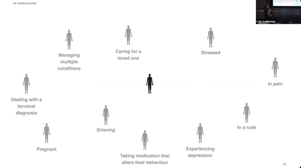
Flora then introduced four key principles for designing with safety in mind:

  1. Design for the edges of the population: Focus on users with complex needs, not just the average user.
  2. Recognize the risks: Understand the serious consequences of missteps in healthcare delivery.
  3. Account for various care settings: Design for the entire patient journey, including home care and telemedicine.
  4. Support adoption from the start: Ensure that new solutions seamlessly integrate into existing workflows and do not overwhelm users.
Screenshot from the presentation

I really appreciate Flora’s perspective on designing for the edges of the population. She highlights that individuals often face multiple challenges simultaneously, rather than just one. This is something I was not considering yet and is something I want to keep in mind as I develop my personas.

Link to video: https://www.youtube.com/watch?v=g9ku7Xane6w

AI was used to rephrase my thoughts.

IMPULSE №4

AI and coding

If I got one euro every time someone said AI in the last two years, I could probably pay my rent for a year. Jokes aside, AI really did change everything. It gives regular people access to tools that used to require a full team. For designers, this is huge. We can finally bring weird ideas to life without begging a developer to “just help a tiny bit.”

I’ve worked with developers for years and always admired how they manage to build complicated systems from scratch. Now we can do a chunk of that work ourselves. You still need to know basic logic, but the heavy lifting can be handled by AI. So why not experiment a little, build something fun, and keep the creative spark alive?

For the last months I’ve been watching designers and devs use different AI coding tools. I’m inspired, but also a bit lost, because these tools aren’t perfect yet. You have to juggle between them. So I wrote down simple notes based on talks, videos, and tests. Here’s the short version.

1. v0 by Vercel – the most capable, but very generic.

Pros
• Builds complex logic fast.
• Follows instructions well.
• Code and previews load quickly.

Cons
• First drafts look chaotic with strange animations.
• Designs often feel bland when you ask for something subtle.
• Struggles with basic layout alignment.
• Preview wasn’t mirrored like a real camera app.

2. Lovable – the best visuals and overall experience, but misses logic sometimes.

Pros
• Cleanest and most modern UI.
• Shows a plan before coding, which feels reassuring.
• Adds creative touches on its own.
• Sound effects were nice once fixed.

Cons
• Ignored some specific instructions at first.
• Needed reminders to add live filter previews.

3. Bolt.new -friendly interface, but broke completely in the test.

Pros
• Shows every step it’s doing.
• Chat feels natural and clear.

Cons
• Tried to use the phone camera, which caused flashing screens and overheating.
• Couldn’t fix the bug through prompts. Prototype failed.

4. Google AI Studio (Gemini) – the weakest tool in both design and function.

Pros
• Eventually used a clean grid.
• Basic photo strip feature worked after a full restart.

Cons
• Ugly old-school Material Design look.
• First attempt failed with an error.
• Interface feels overwhelming.
• Didn’t generate real filters, only simple color changes.

5. Figma Make Designs (Beta)– the most creative, but still too buggy.

Pros
• Fun and expressive design style.
• Added extra features like frames and cute filters.
• Sounds worked immediately.

Cons
• Images didn’t load at first.
• Camera only worked after “publishing.”
• Buttons were placed randomly.
• No preview of filters until asked

AI still isn’t perfect for coding, but it’s already strong enough to help designers build real prototypes with logic, visuals, and sound. It feels like a new creative playground. I’ll definitely try to vibe-code some mini project in the next months

IMPULSE №3

As an international student, and someone who’s constantly watching friends juggle life across countries, I keep coming back to one question: Why is it so hard to stay connected?

There isn’t just one reason. We’re all busy: classes, work, deadlines, life. It’s normal that it gets harder to keep up. Most families can still talk over dinner and stay in sync.
But what about people who live thousands of kilometers apart?
That’s where it gets complicated. Schedules rarely match, time zones pull people even further apart, and honestly, it’s no surprise that so many long-distance relationships fade after a few months.

Trying to understand this better, I went back to the basics: What actually makes a human connection strong?
Maybe if I answered that, the “how do we keep it?” part would make more sense.

While wandering through YouTube, I found a talk called “The hidden truth about human connection” by Dan Foxx. He basically put into words something most of us already feel deep down but rarely say out loud.

His main message was that we struggle to connect because our ego gets in the way.
We’re stuck in our own perspective instead of actually caring about the other person. Real connection comes when we shift from “What do I get out of this?” to “How can I care for this person?” That’s when relationships deepen.

Listening to him helped me see why connection feels harder today, especially across distance:

1. We treat connection like something we can postpone.
When life gets intense, it’s easy to think, “We’ll catch up later.” But relationships don’t maintain themselves. Without intention, they slowly fade.

2. Technology simulates connection but doesn’t fully deliver it.
Sending reels, emojis, or brief texts feels like staying in touch, but it doesn’t provide the presence or emotional depth we actually crave. Digital contact is convenient… but often shallow.

So how do we preserve connection even from far away?

1.Lead with empathy.
Ask real questions. Listen with care. Make space for someone else’s feelings, not just your own.

2. Be consistent, even in small ways.
Things like a voice message, a short video call, a thoughtful note matter when done with full attention. Presence beats frequency.

3. Choose depth over constant chatter.
One meaningful conversation will strengthen a connection more than a month of random memes and “how was your day?” messages.

Takeaways
Human connection is essential. It’s one of the things that makes life feel meaningful. Dan Foxx’s talk reminded me that distance isn’t the real enemy, disconnection is. And disconnection happens when we stop showing up with honesty, empathy, and intention. This talk felt like the starting point of a bigger exploration for me. I’ll might go deeper into the topic of human connection in my next posts.

I used ChatGPT to check the spelling and grammar of this text

LS Impulse #3 Demokratie, heast!

By now, we have all been to this exhibition probably, but I wanted to mention it for my research as well since I went there a couple of times already and I think the exhibition is presented in a really nice way on different levels: It is visually appealing, interactive and has a good size to not be overflowed with information or feeling like there is something missing.

The exhibition focuses on one central question: How do we want to shape our society in the future? It highlights that democracy sometimes feels very static and abstract, but  it is something we practice every day, in big political institutions like the townhall, but also in very immediate contexts: workplaces, schools, families, and communities. The exhibition combines historical material about democratisation in Graz with current debates around participation, civil rights, social responsibility, and the fragility of democratic systems. What I found particularly meaningful is the idea that democracy is in constant movement. It requires reflection, dialogue, and sometimes the willingness to question our own assumptions.

The exhibition uses varied media to create this sense of movement and participation. The spaces are visually designed to invite curiosity rather than lecture the visitor. Instead of overwhelming explanations, each room opens a small question, theme, or personal story. The interactivity is also woven into the exhibition in a subtle but effective way through sticky dots, opinion walls, small surveys, and participatory prompts. Visitors are encouraged to position themselves, literally and metaphorically, and to see how diverse or fragmented collective opinions can be. It becomes clear that democracy is not only about “being loud” but also about observing and understanding how different perspectives coexist.

From a communication design perspective, this was one of the strongest aspects. The way the exhibition was structured felt democratic in itself: open, accessible, and balanced between information and personal engagement. The visual design was friendly and non-intimidating, with a tone that felt approachable but not superficial. This made it possible to deal with political content without creating emotional overload or polarization, something that is difficult to achieve in contemporary political communication, which tends to be highly charged or simplified. Also, when I spoke to the curator she also mentioned that they got criticized for putting in their own political views even though they tried to be as neutral as possible. This also reminded me that anything (regarding design in this case) can be unpolitical and I will always send some kind of message.

The exhibition also made me think about how communication design can contribute to democratic processes. Visual tools, spatial cues, and interactive elements can help people express opinions, reflect on their biases, or understand complex issues. The use of stickers, participatory questions, and tangible interaction points reminded me how design can facilitate dialogue rather than merely transmit information. In my own work regarding activism, protest, or subtle feminist interventions these ideas feel very relevant. Designing spaces for conversation rather than statements might be the wording and also a direction worth exploring.

How is this an impulse for my potential master’s topic?

This exhibition made me reflect again on the relationship between design and participation. A possible direction for my future research could involve exploring how communication design can create environments for democratic engagement in public space,  activist contexts, or through gamified interaction. It also connects to some of my earlier ideas around subtle protest and spatial behaviour: how can design help people understand power structures through experience rather than explanation?

Alternatively, this impulse could be relevant for my interest in globalisation and the communication of complex systems. Democracies depend on clarity, accessibility, and inclusivity; and design plays a huge role in how accessible political knowledge or decision-making feels.

In the context of my developing research identity, Demokratie, heast! serves as a reminder that design is never neutral. It mediates understanding, shapes participation, and creates frameworks for dialogue. Maybe my master project can explore how communication design can act as a facilitator of reflection and collective thinking through visuals, spatial, interactive and emotional design.

Links:

https://www.grazmuseum.at/ausstellung/demokratie-heast/