A mobile dashboard may not offer the full functionality of its desktop counterpart, but it can still provide users with a scannable view of top-line data and statistics to let them make informed decisions. It can also give managers and executives the necessary tooling to quickly approve orders, contracts, and procedure and policy documents.
I drew from experience and other proficient UX Designers some of the best practices and key aspects that designers can use to design better mobile dashboards:
Smooth Navigation
Let’s start with navigation as this is how users will get acquainted with your dashboard and find the information they’re looking for. If the navigation for your mobile dashboard is clumsy or disjointed, or your search bar or navigation menu isn’t well suited to touch-based interactions, you are likely to turn off users.
Visual prioritization is key. Responsive mobile dashboards should communicate information quickly and prioritize it in a clear visual hierarchy. Another dashboard design best practice is using the principle of progressive disclosure to reveal information only when the user needs it.

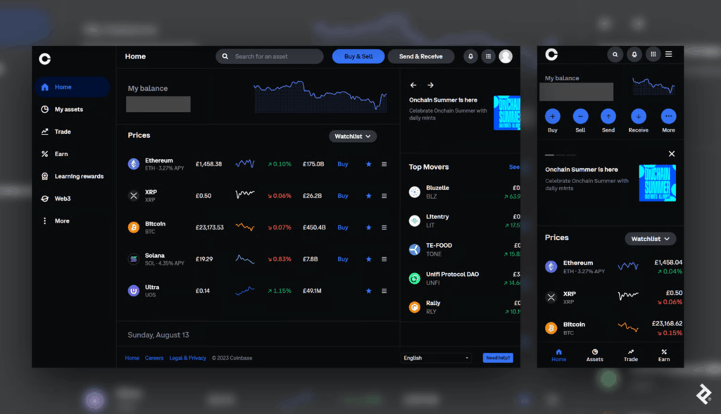
This mobile dashboard effectively uses space to prioritize the most essential options. Crucial buttons from the left-hand panel on desktop become the bottom navigation bar on mobile, a standard for mobile menus as the position falls into the “Z” page scanning pattern where users’ attention tends to land.
Responsive Tables and Charts
Designing responsive mobile tables and charts can be a challenge, but in my experience, the customer satisfaction it provides is worth it.
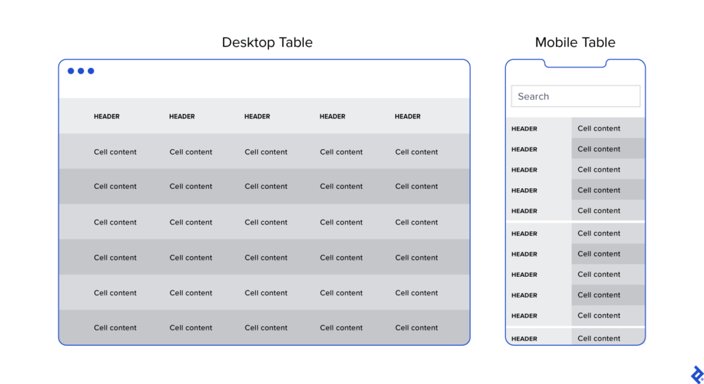
Generally, I advocate for responsive web designs that send a single code set to all devices but use fluid grids and media queries to change the appearance of elements based on a device’s size and orientation. This common and effective method is used in mobile dashboards to collapse table row headers into column headers in a set of stacked, standalone cards that can be scrolled through vertically. The approach offers an elegant mobile presentation that avoids squishing cells, while allowing the user to quickly peruse large amounts of data.

Button Design
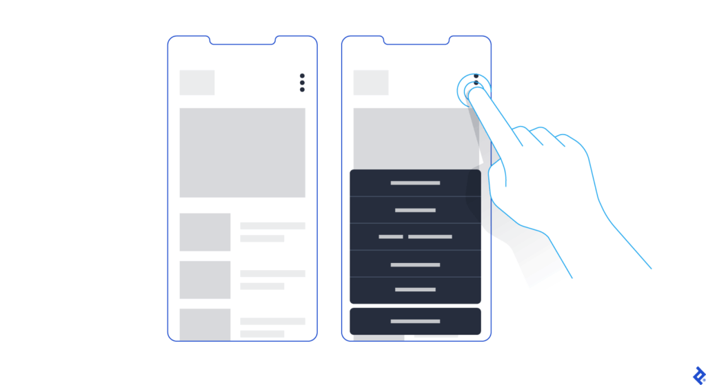
Arguably, one of the biggest challenges in creating a responsive mobile dashboard is sizing and arranging buttons. Why? Because, unlike on desktop, you touch them, rather than select them with a cursor or keyboard command. They need to be big enough and spaced out enough to be tapped comfortably, and, due to the limited screen space, some will have to be collapsed into sub-menus or even hidden.

Standard button design principles should apply to your mobile designs. I tend to divide button design into two main principles: You should present buttons in a range of styles (sizes, colors, and shapes) that denote their relative importance through visual cues; and the text label or icon associated with a button should connote its semantic meaning and intended function—for instance, whether the button affirms an action, selects a tool, navigates to a new page, or cancels an action.
But you may have important buttons that can’t be hidden. As an alternative to the kebab menu, you could simply increase the button size to meet the mobile guidelines and then stack them vertically. Another alternative would be to leave the most crucial buttons at full size and make secondary buttons smaller by replacing the text label with an icon. When considering which technique to use, decide which buttons are most essential on each page.
Conclusion
When the project scope and budget allow, it’s most efficient to consider how a responsive mobile dashboard will look and function as you’re building out the desktop version. This will save time and development costs later in the product life cycle, and it will also help ensure brand consistency across devices. It’s also paramount to recruit a skilled developer to assess the feasibility of various design approaches, and, where needed, define CSS rules for reconfiguring tables and charts. Above all, try to faithfully recreate as much of the desktop experience as you can: You may have to eliminate some features and functionality, but it’s important not to dumb down the design and to follow the UX design process.
Mobile dashboard UI shouldn’t be an afterthought. If designed with care and foresight, mobile dashboards can provide significant value to users.