How Art Found Its Place in the Digital Space 

There was a time when the art world was confined to physical walls—museums, galleries, studios. Access was limited, gatekeepers held the keys, and artists needed a foot in the door before they could be heard, seen, or celebrated. But with the rise of the internet, all of that changed.

The digital space—the vast, decentralized network that makes up our online lives—has become more than just a tool. It has become a canvas, a stage, a studio, and even a marketplace. Over the last few decades, art has carved out its own corner of the web, evolving from early digital experiments to fully immersive experiences, reshaping how we create, consume, and interact with creative expression.

The Origins: Pixels and Possibilities 

The seeds of digital art were planted long before social media or online galleries. As early as the 1960s, artists began experimenting with computers, using algorithms and programming languages to generate shapes and forms. But it wasn’t until the internet became accessible in the 1990s that things truly started to shift.

Artists discovered that they could not only make work using digital tools, but also share it instantly, globally. Platforms like DeviantArt, Tumblr, and early web forums gave rise to new communities—DIY spaces where creators supported each other, collaborated across continents, and rejected traditional hierarchies.

From Niche to Movement

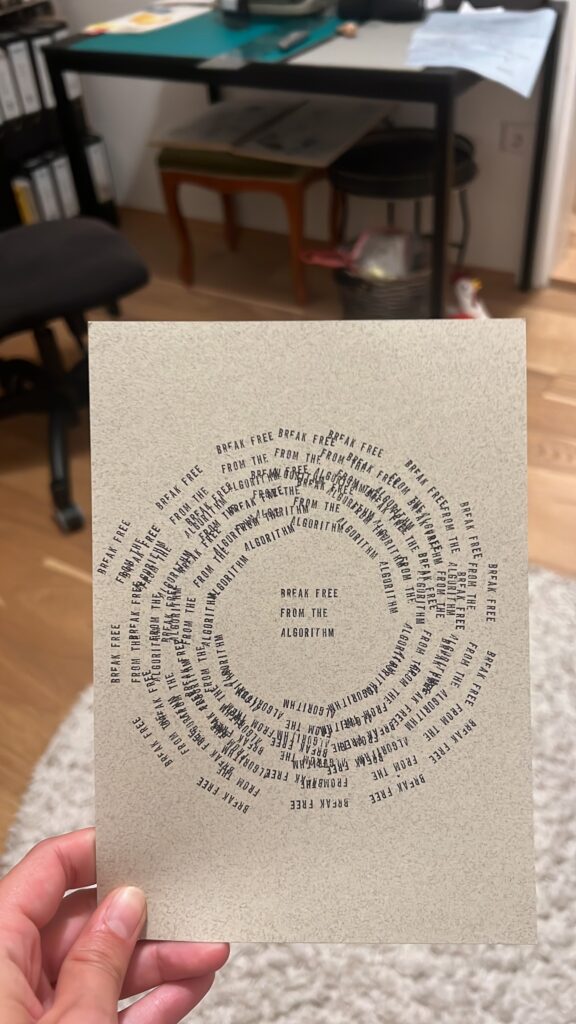
As the web matured, so did the digital art scene. New aesthetics emerged—glitch art, net art, and later, generative art driven by code. Artists began to question what it meant to “own” or “exhibit” a piece of work in a space where everything is infinitely reproducible. Some embraced the ephemeral nature of the internet; others used it to archive and immortalize their creations.

By the 2010s, platforms like Instagram turned art into scrollable experiences. Suddenly, visibility wasn’t dependent on geography or institutional support—it was algorithmic, viral, and sometimes wildly democratic. Meanwhile, digital tools evolved. With the rise of software like Processing, TouchDesigner, and later AI-powered platforms, artists found new ways to collaborate with technology itself. 

Claiming Space: Art in the Web3 Era

Fast-forward to today, and digital art is not just a fringe movement—it’s a legitimate, disruptive force. The emergence of NFTs and blockchain technology added a layer of value and ownership to digital files, shaking the foundations of the traditional art market. Virtual galleries, online auctions, and decentralized platforms now offer artists unprecedented control over their work and how it’s distributed.

But even beyond commerce, the internet has allowed art to exist in dialogue with its audience in real-time. It’s more interactive, more accessible, and often more experimental than ever before. The web is no longer just where art is posted—it’s where it’s born.

What’s Next?

In this series, we’ll explore the many faces of art in the digital age—from the rise of generative art and algorithmic aesthetics to the communities that shaped the early web’s creative underground. We’ll look at how artists are using new technologies, navigating online spaces, and redefining what it means to be a creator in a world where the gallery is the screen, and the studio is everywhere.

Welcome to the age of cloud-native creativity. Art isn’t just on the internet anymore—it is the internet.

#9 EXPERIMENT: Transparent Paper x Storytelling

Concept Statement:

Transparent paper is not just a surface—it’s a metaphor. It can reveal, distort, conceal, or overlay. This experiment uses transparency to interrogate truth and illusion, age and memory, appearance and internal life, and how these concepts interact when layered both physically and conceptually.

Collecting ideas for meaningful messages matching the material:

  • Transparent Poster
  • Old vs. young age in layers
  • Masking
  • Facebook spying van (OFFF)
  • Look Inside a Body
  • Hidden brain structures
  • Naked vs. Dressed

After this brainstorming I went online to collect inspiration and create a moodboard.

Objective

To explore how messages change in meaning depending on what is revealed, what is hidden, and what is layered—using transparent paper as a tool for storytelling.

Choice of Material

As I already collected bad experiences before with trying to print on transparent paper with a digital printer I was looking more into analogue techniques to process the material in an artistic way.

Here is a Typewriter design I created with transparent paper:

Final Format:

  • Assemble into a zine, scroll, lightbox installation, or hanging mobile, just something that allows interaction with transparency.
  • The piece could evolve as viewers shift, flip, or rearrange the transparent sheets to emphasizing the changeable, nonlinear nature of thought, identity, and perception.

Reflection:

The transparent paper doesn’t just support your content, it is the content. It forces you to rethink legibility, presence, and absence. This experiment shows how fragile, overlapping realities create depth, much like the inner life of a human being.

#8 EXPERIMENT: Laser x Lino printing

Digitalizing the illustration and cleaning it up in Photoshop:

Screenshot, color selection tool, to select the background and delete it.

As a next step I was creating a vector in Illustrator with the image tracer tool and turning it into a negative to send it to the laser and cut out the lino and stamp plate. To make the process faster I added a close red outline, so less lino had to be earased which saves a lot of time and energy.

Printing results at DRUCKZEUG with dark red ink on differently colored paper:

Further development would be to create gift wrapping paper instead of plain cards, to make the design more buyable. Here is an inspo that I came across on Tiktok:

I also tried creating a branding for my own business by making a stamp design out of lino and the laser. Here is how it turned out. Reflecting on the result, I would prefer a smaller logo and a less “solid design” for a finer print surface. Anyways I can now use this for branded packaging and signage which is helpful for setting up a future studio.

#7 EXPERIMENT: Stamping Art x Creative Process

A serial stamping experiment using a customizable stamp featuring the evolving text patterns.

Objective:

To externalize and ritualize the creative process through repetition, chaos, and eventual clarity by using stamping as a method of expression and transformation.

Materials:

  • A custom rubber stamp with the text.
  • Black ink pads
  • 10+ sheets of thick paper (>150g)
  • A timer

Phase 1: Chaos

  • Stamp the text frenetically, without alignment, orientation, or consideration for spacing.
  • Overlap the words. Smear ink. Use too much or too little.
  • Let impulse lead the way.
  • Spend exactly 10 minutes doing this without pause.

First there was chaos.

Phase 2: Intention

  • Clean the stamp. Reset the workspace.
  • Begin stamping slowly, mindfully, in a straight line, evenly spaced.
  • Each repetition of the phrase becomes a quiet act of re-centering.
  • Do this until the page feels “complete” (self-defined).

Then there was intention:

Phase 3: Wild Experimentation

  • Introducing other variables: multiple ink colors, torn paper, unconventional surfaces (fabric, cardboard, experimentation with different papers…)
  • Layer stamps over painted or drawn marks
  • Tryed stamping on curved or moving surfaces
  • Let unpredictability enter again, but this time with playful purpose

Phase 4: Direction

  • Curate best selections from all phases.
  • Choose compositions that feel balanced and resolved.
  • Frame these as final pieces.
  • Display them in a linear narrative: from chaos to clarity.

My Interpretation

The stamp is typically a symbol of officialdom, approval, and uniformity, but here it becomes a metaphor for the repeated internal voice of the artist. Through misuse, experimentation, and eventual mastery, the process reflects the psychological arc of making: first the storm, then the structure.

This process shows that I need to get my mess out of my head first, in order to create something intentional after.

2.5 OFFF case study – experience/ discovery

After weeks of research and building up high expectations, my visit to OFFF Barcelona turned out quite differently than imagined—especially from a design perspective.

After my arrival in the city, I was surprised to discover that many locals didn’t even know what OFFF was. Taxi drivers, hotel staff, and even people near the venue hadn’t heard of the festival, let alone knew where it was taking place. There were no posters, billboards, or any kind of out-of-home advertising in public spaces or transit stations. Even at newspaper stands, no sign of the event — no coverage, no ads, nothing.

When we reached the venue the day before, I expected to see a strong, immersive visual identity, already promoting tomorrow’s event— but it just wasn’t there. There was no banner at the entrance, no large-format visuals, no color-coded areas, no vibrant signage like I had anticipated from their online presence. Just a few arrows here and there to guide people, and even those lacked any kind of pictogram or branding. No icons. No system.

And also with the start of the event, the only branded element that stood out were the OFFF tote bags given to visitors — perhaps the one visible touchpoint that tied back to the festival’s identity, cause you could always spot a “fellow designer” when you went for a stroll through the city. A few small logos could be spotted if you paid close attention, but overall, the visual consistency and presence were minimal.

Maybe what what I remember most: just 10 meters outside the venue, you were back in “normal” Barcelona. If you didn’t already know about OFFF, you never would have guessed that a major design event was happening just around the corner — even with some big design and art universities just around the corner(!).

For a festival that positions itself at the heart of contemporary creativity, the lack of physical branding and atmosphere was … kind of underwhelming. As a designer that was very keen on seeing how consistent design is realized on such a big stage, this difference between the strong online identity and the nearly invisible physical presence was not only unexpected. It was also an important lesson. A strong event identity doesn’t just live online — it has to be experienced.
And maybe (just maybe) the OFF organizers should think about hiring one of the guys talking about how awesome their designs are at their festival, to make their appearance just nearly as good, as the designs shown there.

Evidence for (not) presence of the visual identity around the event

Prototyping VIII: Image Extender – Image sonification tool for immersive perception of sounds from images and new creation possibilities

Sound-Image Matching via Semantic Tag Comparison

Continuing development on the Image Extender project, I’ve been exploring how to improve the connection between recognized visual elements and the sounds selected to represent them. A key question in this phase has been: How do we determine if a sound actually fits an image, not just technically but meaningfully?

Testing the Possibilities

I initially looked into using large language models to evaluate the fit between sound descriptions and the visual content of an image. Various API-based models showed potential in theory, particularly for generating a numerical score representing how well a sound matched the image content. However, many of these options required paid access or more complex setup than suited this early prototyping phase. I also explored frameworks like LangChain to help with integration, but these too proved a bit unstable for the lightweight, quick feedback loops I was aiming for.

A More Practical Approach: Semantic Comparison

To keep things moving forward, I’ve shifted toward a simpler method using semantic comparison between the image content and the sound description. In this system, the objects recognized in an image are merged into a combined tag string, which is then compared against the sound’s description using a classifier that evaluates their semantic relatedness.

Rather than returning a simple yes or no, this method provides a score that reflects how well the description aligns with the image’s content. If the score falls below a certain threshold, the sound is skipped — keeping the results focused and relevant without needing manual curation.

Why It Works (for Now)

This tag-based comparison system is easy to implement, doesn’t rely on external APIs, and integrates cleanly into the current audio selection pipeline. It allows for quick iteration, which is key during the early design and testing stages. While it doesn’t offer the nuanced understanding of a full-scale LLM, it provides a surprisingly effective filter to catch mismatches between sounds and images.

In the future, I may revisit the idea of using larger models once a more stable or affordable setup is in place. But for this phase, the focus is on building a clear and functional base — and semantic tag matching gives just enough structure to support that.

Getting inspiration in Barcelona

Barcelona came at the perfect time, we hopped on a plane to go look at design somewhere else and at some point things felt less blurry (at least for a little bit).

One of my highlights: our visit to the studio LoSiento. Before we went there I looked at their portfolio and admired their work, but seeing the whole analogue and experimental process behind it really shifted something in me. They approach design not just as something that lives on a screen or in a PDF, but as something physical. Printed, folded, cut, built, poured, glued, photographed. Everything they do starts with their hands. It reminded me that good ideas don’t have to start in Illustrator. They can start with scissors, weird materials, or just curiosity. That mindset of playful experimentation is something I want to bring more into my own process this semester. I sometimes get caught up in refining too early, but LoSiento made me want to loosen up and trust the process, quite literally.

The next days at the OFFF Festival, the keynote that stuck with me the most came from DixonBaxi, the studio behind the rebranding of Formula 1 which launched this year. I’d seen the work before but hearing them explain their thinking hit differently. They spoke about how they wanted to design something that felt faster, more open, more future-oriented. It wasn’t about redesigning a logo, it was rather about reshaping a whole experience around the sport. As someone exploring motorsport through a design lens, that talk gave me a kind of permission to not treat some things as untouchable, and to think about what stories visuals are really telling. They mentioned “designing for emotion, not decoration” and I’ve been repeating that line in my head ever since. There was also a keynote from Lauren Heartstone about the redesign of sports graphics, again focussing on their work for the new Formula 1 Race Graphics. I also loved the approach of this new era in sports design.

So all in all I actually got quite some inspiration in Barcelona, which also leads me to want to further experiment with analogue printing whilst also looking more into (motor)sports design and a way to combine those things for my master project.

Designing Reality: How Adobe Aero is Changing AR for Creatives.

Designing Reality: How Adobe Aero is Changing AR for Creatives.

In this world where digital encounters draw ever closer to the tangible, augmented reality (AR) is not a futureistic idea any more. And it’s interactive, immersive, and extremely creative. Amid the multitude of platforms emerging to the occasion, Adobe Aero is a game changer, a piece of software that gives designers, artists and storytellers the ability to bring to life their visions literally in the 3D space.

But what’s that makes Adobe Aero so special? What are designers so excited about it? Let’s examine what Aero is, why it is that important, and how it is changing our creative process.

What is Adobe Aero?

Adobe Aero is a strong app for AR authoring and viewing by Adobe as a member of its Creative Cloud suit. It enables creators to design and share interactive augmented reality experiences without having to write any code at all. That’s right. No unity, no unreal engine, no need of developer background. Simply creativity and iPad (or iPhone) and Aero. Users are also able to import 3D models, animations, and assets from Adobe tools such as Photoshop, Illustrator or Substance 3D, and layer them into real world environments using the mobile camera. Whether you want animated characters to walk on your kitchen table or build immersive product demonstrations or interactive stories responding to touch & movement. You can do all this in augmented space with Aero.

Key Features That Make It Shine

1.Intuitive Drag-and-Drop Interface

Adobe aero is user friendly. I used it for my personal business logo and it worked perfectly. Its interface lives up to the feel of many other creative tools from Adobe, making it easy for long-term users. You just drag 3D assets from our library into your scene, adjust their position, size and apply inbuilt behaviors such as bounce, rotate or fade to animate them.

2.Interactivity Without Coding

The ability to create interactive experiences, thanks to simple triggers and actions, is one of Aero’s best features. For instance, if one taps on a digital object it can cause it to spin, tumble, or produce a sound. This degree of interactivity brings AR to life and becomes attractive without necessitating technical know-how.

3.Cross-Tool Integration

Aero works with other Adobe tools without glitches. How about using layered PSD file for digital pop-up book? Done. Want an original 3D logo to create in Illustrator or Substance? Just import it. Aero is a creature of a creative ecosystem. you can do animation as well such as spin, move and all.

4.Real-Time Preview and Sharing

Content creators are able to view their experiences in real time on mobile via links or QR codes. This is extremely important for client presentations, education and using in social networks.

Empowering a New Era of Creativity.

Traditionally, the creation of AR experiences entailed an intricate process of development environments, use of coding languages or collaboration with engineers. Adobe Aero manages to turn that model on its head by allowing designers to be able to independently prototype, build, and share augmented experiences.

This democratization of AR design is important because it moves creative power into a lot more hands, artists, creatives, educators, marketers even students can now create in AR without having to wait on a dev team, or a big budget.

Picture yourself, as a fashion designer, presenting a virtual runway anywhere on the street or a curator at a museum making tales of the gallery walls into an animated story that reacts to the movement of visitors. Aero is making that sort of magic possible.

Use Cases: From Art to Commerce

Adobe Aero is already used in many industries:

  • Art & Exhibitions: Digital artists are utilizing Aero to place animated artwork over real world environments. This is in particular strong for public installations, street art or immersive galleries.
  • Marketing & Retail: Brands can develop product demos where customers can imagine furniture in their homes, or play with 3D packaging prior to purchase.
  • Education: Teachers and students are also applying Aero to interactive learning – picture an AR history lesson in which the ruins of Rome appear under your desk or science project that uses 3D models of molecules.
  • Storytelling & Publishing: Authors and content producers are creating AR-enhanced books and zines; transforming pages from a single sense into multisensory adventures.

AR as a Creative Standard

AR is no gimmick or trend. It’s becoming a new norm for digital communication and design. Given the increasing popularity of headsets such as Apple Vision Pro and the Meta Quest, high quality AR content will be in much higher demand. Adobe Aero is contributing to preparing creatives for that future by making available to them tools that they can import immediately. The way we learn also matters for those who aim to stay ahead of the curve learning Aero isn’t just a fun experiment, it’s a smart investment in future ready skills.

Final Thoughts

Adobe Aero is proof that AR does not have to be complex to be powerful. Thanks to a bit of imagination and a smart device, author-savants are now in a position to design immersive and interactive worlds that immerse and excite. Whether a designer bursting at the seams to enrich your toolbox, a marketer yearning for fresh paths to your audience or an artist keenly watching the frontiers of digital representation, Aero is the starting point for your next big idea in Augmented Reality.

References

Adobe, 2023. Adobe Aero: Create interactive augmented reality experiences without coding. [online] Available at: https://www.adobe.com/products/aero.html [Accessed 9 May 2025].

Adobe Creative Cloud, 2023. Adobe Aero: Getting Started with AR. YouTube. Available at: https://www.youtube.com/watch?v=Fg2kjUlSsu0 [Accessed 9 May 2025].

Billinghurst, M., Clark, A. and Lee, G., 2015. A survey of augmented reality. Foundations and Trends in Human–Computer Interaction, 8(2–3), pp.73–272.

Craig, A.B., 2013. Understanding augmented reality: Concepts and applications. Waltham: Morgan Kaufmann.

Ha, A., 2022. Adobe Aero adds desktop support and new features for creators. TechCrunch. Available at: https://techcrunch.com/2022/10/18/adobe-aero-desktop-update/ [Accessed 9 May 2025].

Parsons, T., 2023. Augmented reality for designers: How Adobe Aero is changing the creative landscape. Creative Bloq. Available at: https://www.creativebloq.com/features/adobe-aero-ar [Accessed 9 May 2025].

The Futur, 2023. Augmented Reality Design with Adobe Aero – What You Need to Know. YouTube. Available at: https://www.youtube.com/watch?v=czdMwCnxRRA [Accessed 9 May 2025].


Grammar and structure were refined with the help of ChatGPT.

Beyond the Lens: The Next Frontier of Augmented Reality in Marketing

Since people are tired of the usual online ads, an essential shift is happening. AR is now used for more than fun effects, as it supports marketing that relies on presence, relevance and people’s connection. The future of AR marketing is focused on changing the way brands interact with the physical world instead of only adding digital elements to it.

Here, I discuss the next important things happening in AR marketing such as ambient AR and campaigns affected by emotions, as well as real-time personalization.

1. Background Marketing: Ambient AR consists of Interactive Elements

Ambient AR refers to information or objects that appear in the physical environment around someone, depending on their location, the time or even the mood they display. With ambient AR, you can receive information or experiences without having to aim your device at anything or use the camera.

Just think that as you walk into a store, your AR glasses will highlight items that mean most to you based on your past and present interests. Perhaps it’s a public sculpture that tells a relevant story from the brand as you walk by. Marr (2019) stated that the next important shift in marketing will be hidden tools that make it more convenient for people without demanding attention.

They believe that these campaigns will be integrated into our lives, helping us rather than causing disruptions.

2. Emotionally Responsive AR: Marketing That Feels

With today’s technology, marketers have more ways to sense when customers are not happy or satisfied and can respond.

Marketing is being transformed by the way AR blends with affective computing which is able to gauge feeling from a person’s face or other signs. When AR is used, brands are able to react instantly to what a user is feeling.

A fashion retailer can use AR mirrors to determine if a customer is upset or happy and react appropriately. If a person seems tense, a skincare brand may guide them through visualisations to help relax. Since the brand responds so quickly, marketing shifts from promotion to sympathy.

Kotler, Kartajaya and Setiawan (2021) state in their book that the upcoming trend in marketing calls for machines and humans to work together. Emotion-aware AR prepares to do just that.

3. AR Spaces That Last: Digital Twins Are Increasing

Businesses are beginning to design AR spaces that mirror actual places and keep updating with the real world. Thanks to Niantic and Snap’s platforms, companies are able to set up multi-user AR areas where clients interact with various things such as products, over a period of time.

Envisage a sneaker brand where you could use AR to access its virtual flagship store, join drop events, meet others in real time and share your brand avatar. They shouldn’t be mistaken for simple campaigns; they’re meant to last.

Craig mentioned before that with AR, we will experience more lasting environments that matter for a period of time.

4. Hyper-Personalisation Through AI and Spatial Data

AI allows brands to examine AR data to personalise their offerings for every individual. Based on someone’s interactions and tastes, a tourism company could develop an AR walk in real time. A fitness company could advise you on appropriate exercises based on your schedule when you enter a gym. ( which is already can used as an app)

Pires and Stanton (2015) explain that real-time flexibility is crucial in today’s marketing which incremental AR provides with accuracy.

5. Storytelling for the Sustainable Use of the Environment

Many consumers hope that brands can be more transparent and environmentally friendly. AR lets you present eco-information by visualising the process behind a product on its packaging or in stores.

For example, Rothy’s has introduced AR experiences that explain how used plastic bottles are made into shoes. When customers perform a scan, the sustainability statements are immediately visible.

Deloitte highlights that AR creates transparency, turning regular CSR efforts into experiences that engage consumers.

6. WebAR and 5G are helping to get rid of the barriers.

Over the past few years, using AR in marketing was restricted due to the requirement for users to download an app and the lack of enough bandwidth. However, WebAR enables AR to be accessed via web browsers and with the introduction of 5G, these problems are no more.

Nowadays, brands can design interactive campaigns using a link or QR code. Because it takes little effort to log in, the platform will attract more users, encourage them to spend more time there and reach a wider audience. When Starbucks switched to WebAR for their seasonal offers, they reported a 62% increase in the way customers engaged with the campaigns.

In Conclusion: From Something New to Something Essential

The best part about AR in marketing now is its potential, rather than what it is today. Today, AR is more than a clever tool or a trend; it is expected to be the main form of brand communication. There will be a shift in AR marketing from advertising to offering experiences so realistic that people barely notice it.

It is evident that the brands that succeed in being less visible, yet present, will guide the future market.

Reference List (Harvard Style)

Craig, A.B. (2013) Understanding Augmented Reality: Concepts and Applications. Waltham, MA: Morgan Kaufmann.

Deloitte. (2024) Augmented Reality: The new front line of digital marketing. Available at: https://www2.deloitte.com

Kotler, P., Kartajaya, H. and Setiawan, I. (2021) Marketing 5.0: Technology for Humanity. Hoboken, NJ: Wiley.

Marr, B. (2019) Tech Trends in Practice: The 25 Technologies That Are Driving the 4th Industrial Revolution. Hoboken, NJ: Wiley.

Pires, G.D. and Stanton, J. (2015) Interactive and Dynamic Marketing. London: Routledge.

Scholz, J. and Smith, A.N. (2022) Immersive Marketing: How Technology is Shaping the Future of Customer Experience. London: Routledge.

Starbucks. (2024) Seasonal AR campaigns: A case study. Available at: https://stories.starbucks.com


Grammar and formatting support provided by ChatGPT.

#2 The Art of Noticing

Lately, I’ve realized that I’m always collecting. Not with intention or purpose, but with a quiet pull toward the things no one else seems to care about. My camera roll is full of crumpled posters, broken signs, strange textures on walls or spilled paint. I never really questioned it. I just took the pictures.
But now, as I think about my semester of experimentation, I’m starting to see it as a tool to be more present and maybe even as my own way of creating designs that don’t follow.

We live in a culture of overstimulation, where everything is trying to grab our attention like ads, feeds, headlines, polished portfolios. But there’s a different kind of awareness that lives in the cracks. It’s quieter. Slower. More personal.

This week, I’ve been thinking about how noticing could be a form of resistance. A refusal to only look at what’s designed to be looked at. A refusal to be impressed only by what’s been curated, filtered, finished. Noticing is not about finding beauty. It’s about being present enough to see what’s already there. And that’s something design often forgets. We’re trained to create impact. To control the narrative. To arrange every element with intention. But what happens when we just observe? When we gather fragments, traces, leftovers and let them lead us somewhere? I’ve started going on walks with no destination during covid and it kind of became my version of therapy. Just me, my headphones, and an openness to what I might find.

A bent fence, casting a perfect accidental grid on the pavement. A half-painted wall where the tape lines remain like scars. A sticker with only one letter left. Things no one made, but that somehow say something. I’m thinking of this as a kind of visual journal. Not even a moodboard or inspiration source yet. Just proof that the world is already designing without us.

These images might become the texture of a future poster. Or a layout experiment. Or maybe nothing at all. But the act of noticing itself feels valuable. It’s a practice in being present. It’s also a way to challenge the perfectionism I keep wrestling with. Because when I notice things that are broken or unfinished or random and still feel drawn to them, it reminds me that I don’t always have to fix or perfect everything I create.

This project might be about randomness but at the moment, it’s really about paying attention.
Noticing things that don’t scream for it. Stuff that exists on the edges. Messy details. Accidents. Layered posters. Things that feel like they have a story even if I don’t know what it is yet.

I like that I’m not trying to make anything final right now. There’s no pressure to solve anything. I’m just observing. Letting things unfold a bit. Saving images, making notes, trying to figure out what all this could turn into.