Introducing Beside You: the Augmented Managment software that will later be introduced as a SaaS (Software as a Service).
Initially, working on this project has been a ride since the beginning, being the sole product designer at a company that specializes in customer experience and business management along with a team of full stack devs and data scientists meant that we either we will get things done or we will get things done.
One of the early challenges was to convert a data driven platform to an intuitive and cohesive interface that offers the ease of analysis and ultimately efficient decision making.

One of the early challenges was to convert a data driven platform to intuitive and cohesive interface that offers the ease of analysis and ultimately efficient decision making.
Sketching consisted of building a skeleton that will overaly the first foundation that will eventually convey the design language that the software will adopt and in the meantime everything has to be succintly explained to the stakeholders in order for them to grasp the design system and for me to extract more insights from them since they will be the first users of the software.

Moving on to a low fidelity wireframe with the intention of giving more meaning and structure to the interface meant that progress is happening and things are starting to evolve in terms of results from the ideation and the user interviews. Also, the latter gave me the playground to begin building the design system from the layout, color palette, and typography to the spacing and the accessibilty.
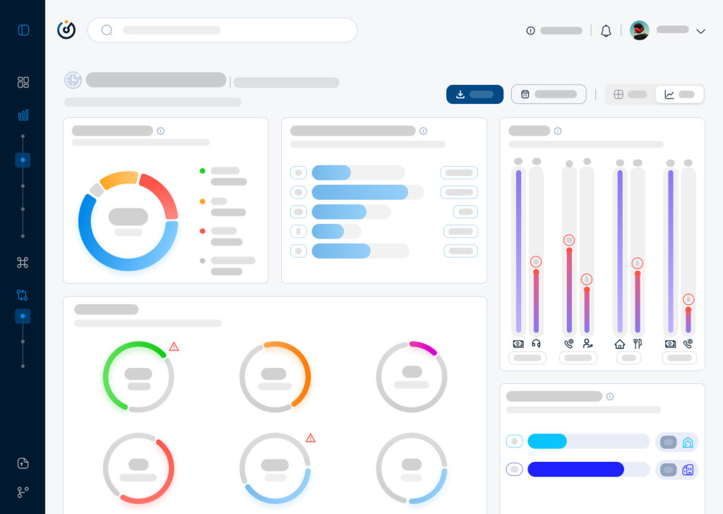
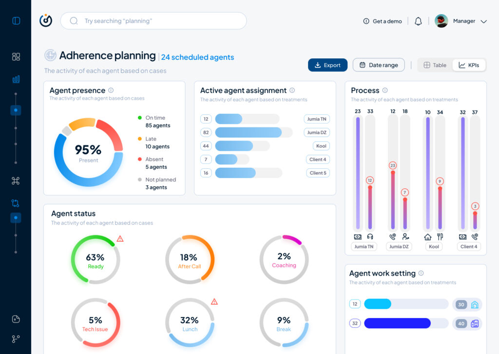
Moving on to a highfidelity wireframe that paved the way to add real data to the interface that allowed us as a team to get a realistic first look on how the software will behave in terms of data visualisation and user navigation and from there began our first user test which will give us a direction to make the right adjustments and iterations.
To conclude, this article is a condensed version of what actually happened and the process behind creating a data driven product from the ground up, otherwise I will have to write a journal that won’t serve nobody but nonetheless it is always beneficial to write about a design process that was complicated and challenging at times, the benefits are a documentation and a clarity that will even pave the way to iterate better on the next stages of the product life cycle.