Impulse #4: The Role of Playtesting in Game Development

Understanding Users before Building a Game

Game development today involves more than programming and visual design. The process has expanded to prioritize player experience, usability, and comfort. As a result, user research and structured game testing have become established parts of development rather than optional additions. Developers collect information about potential players’ expectations, preferred interaction styles, and prior gaming experience. These findings help define the core direction of the project, informing mechanics, interface design, and accessibility considerations.

The Role of Continuous Playtesting

Playtesting follows throughout production. During testing, participants play the game while developers evaluate how easy it is to understand controls, complete objectives, and maintain engagement. Feedback may take the form of performance metrics, interviews, or surveys. Insights gathered from testing lead to adjustments in difficulty, interface structure, pacing, and overall design. By repeating this cycle of testing and refinement, developers aim to reduce friction and improve player satisfaction prior to release.

VR as a Special Design Challenge

Virtual reality development highlights the importance of this approach. In VR environments, issues such as motion sickness, spatial confusion, and physical fatigue can occur if design choices are not aligned with human perception and comfort. Prototypes are therefore tested early, often using basic shapes or limited interaction, to observe how players move, react, and navigate. These observations allow developers to refine interactions before expanding the experience. The overall purpose of these processes is to ensure that the final product functions as intended when experienced by diverse players. Testing with real users helps identify challenges that may not be visible to designers or engineers working closely with the system.

Source: https://www.interaction-design.org/literature/article/how-to-understand-user-needs-in-virtual-reality?srsltid=AfmBOopOKeH_8sjLighvBVX2mjNCNtP7S0dj0D1mwOKBO1bDZp9lVcOC

UX Quality in Video Games

As I learned more about UX design and testing, I began to view video games very differently. Instead of only enjoying them as a player, I now pay close attention to how mechanics are introduced, how controls feel, and how smoothly the experience guides me from one action to the next. I’ve noticed how a well-designed game teaches its systems without overwhelming the player, while a poorly designed one creates confusion or frustration through unclear feedback or awkward navigation. My own play experiences have become a source of learning — I can sense when a game’s UX supports my immersion, and equally when it breaks it. Understanding the development behind these decisions has made me appreciate how much careful thought goes into balancing challenge, flow, and usability. Games have essentially become case studies, helping me recognize what makes an interaction feel right, and inspiring ideas for how those same UX principles can be applied in design work beyond gaming.

Source: https://uxplanet.org/how-video-games-can-develop-your-ux-design-skills-e209368330ac
Impulse #3: Nadieh Bremer, WebExpo 2025

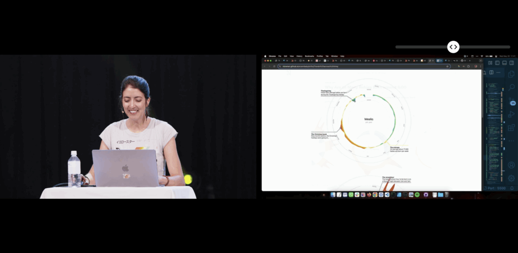
This blogpost will be a reflection inspired by Nadieh Bremers’ WebExpo 2025 talk Creating an effective & beautiful data visualisation from scratch with d3.js. Bremer demonstrates how visual interfaces can be designed to convey information clearly and emotionally. She outlines a design process that begins with understanding the data’s story and ends with polishing details such as visual hierarchy, color, and interaction. Her approach emphasizes that visuals should not only communicate facts but also evoke engagement and a sense of discovery. I rewatched the digital documentation of her talk to recap the content of her presentation.

Bremer presents visualization as a communication medium, where design choices directly impact user comprehension and emotional experience. Clarity reduces frustration, while appealing design increases motivation to explore. This perspective positions data visualization as a critical component of user experience, not merely a decorative or aesthetic layer.

Learning about new technologies for data visualization

When I encountered Nadieh Bremers work, I was already familiar with data visualization, but mostly through print media and a little experience with Processing. Designing layouts for magazines or static posters taught me how much data visuals can influence perception and guide a narrative. Around that time we went to WebExpo, I got into JS coding but wasn’t aware of the posibilities to use it for data visualization. Her projects demonstrated what I had been missing in print -> interactivity and adaptivity.

Why adaptive data visualization matters for a good user experience

During my deeper dive into adaptive data visualization literature, I explored a research paper focusing on real-time decision support in complex systems. It argues that static dashboards are no longer enough to support organizations facing rapidly changing data environments. Instead, visualizations must adapt to:

  • Incoming data streams
  • User interactions
  • Context shifts
  • Multivariate complexity

Adaptive systems combine machine learning, real-time processing, and flexible visualization layers to support faster and more informed decision-making. This means that the visualization is not just displaying data, it is interpreting and reacting to it. The paper specifically highlights D3.js as one of the technologies capable of creating these highly flexible and dynamic interfaces. Unlike pre-built dashboards, D3 allows developers to adapt interactions, transitions, and representations directly to user needs and situational changes.

In my earlier blog posts I wrote about affective computing. Combining the gained knowled I came to a conclusion: If a system can visually adapt based not only on the dataset, but also on the emotional state of the user, could generate a better user experience?

Sources:

https://slideslive.com/39043157/creating-an-effective-beautiful-data-visualisation-from-scratch

https://www.researchgate.net/publication/387471439_ADAPTIVE_DATA_VISUALIZATION_TECHNIQUES_FOR_REAL-TIME_DECISION_SUPPORT_IN_COMPLEX_SYSTEMS

WebExpo Conference 2025, Day 01

Digital Accessibility Meets Physical Accessibility

As a master’s student of Interaction Design at FH JOANNEUM in Graz and a passionate aspiring UX designer, attending the WebExpo Conference 2025 was both inspiring and eye-opening. On the first day, the talk that resonated with me the most was “Digital Accessibility Meets Physical Accessibility” presented by Erik Gustafsson Spagnoli, Nathalie Pentler & Daniel Göransson. A session that confronted a crucial, yet often overlooked topic: the intersection of digital and physical barriers in user experience design.

The UX of ICT

One of the examples that stood out was the real-world usability of ICT (Information and Communication Technology) kiosks, especially pickup touchscreens in public spaces. These screens are often placed too high for wheelchair users or children to reach, and they typically lack audio support or voice-guided interactions. It might sound like a small detail, but from an accessibility standpoint, it can determine whether someone can independently use a service or not. This example made me reflect on how vital it is to go beyond screens and look at the entire context in which a product or service is used.

When “Old School” Is More Inclusive

The talk also raised an interesting reflection for me: while digitalization brings many advantages, there are situations where physical, tactile elements, like a good old-fashioned button, might be the better solution. For someone with visual impairments or limited dexterity, navigating a touchscreen can be frustrating, confusing, or simply impossible. A clearly labeled, tactile, physical button can offer a much more intuitive and accessible alternative. It’s a valuable reminder that digital innovation should never come at the cost of inclusivity.

As designers, we shouldn’t blindly chase modern interfaces just because they’re sleek or trendy. Sometimes, the most user-friendly design choice is the one that feels familiar, tangible, and grounded in human ergonomics.

Inclusive Interaction Design

What fascinated me the most was the proposed solution involving a voice guide that activates when the user presses the screen longer. This tiny interaction design change, a prolonged touch to trigger audio feedback, is a smart, simple fix that can drastically improve the inclusivity of the interface. As someone pursuing a career in UX design, these kinds of insights are gold. They underline that good design is not only about aesthetics or digital flow, but about enabling access for everyone, regardless of ability or environment.

Designing for the Margins

A key takeaway for me was the principle of designing for the margins. By designing for users who experience the most significant barriers, like those with physical disabilities, we often end up creating better products for all users. This aligns perfectly with what I’ve been learning in my studies and during my internships: that UX is about solving real problems, and accessibility should never be an afterthought.

Conclusion

This talk also made me reflect on the importance of field research – going out, observing, talking to users, and understanding their journeys in context. A wheelchair user trying to use a touchscreen in a crowded city center might face a vastly different experience than someone using it at home. Empathy in design starts with understanding these differences.

Product differentiation and innovation with UI UX Design

According to Forester, every dollar invested in UX brings 100 dollars in return which means a whopping 9,9% ROI. Unfortunately, only 55% of companies currently attempt to invest in UI and UX design, costing businesses a loss of an estimated $2 billion every year owing to bad user experience.

What is product innovation?

Product innovation involves creating new or improved products that meet customers’ changing needs and expectations. It consists in identifying new market opportunities, developing new product ideas, and bringing those concepts to market through research, development, testing, and marketing.

Product innovation can be driven by various factors, including changing customer preferences, technological advances, and increased competition. Companies that continuously innovate their products are able to stay ahead of the curve, meet the evolving needs of their customers, and achieve a competitive advantage.

What is product differentiation?

Product differentiation is a marketing strategy that aims to make a product different and better, and stand out from similar products offered by competitors.

It involves creating a unique value proposition for a product and setting it apart from others in terms of design, features, benefits, quality, and other factors important to customers.

By differentiating a product, companies increase their market share, attract new customers, retain existing ones, and outperform their competitors. It also increases brand recognition, customer loyalty, and higher profits.

Product differentiation vs. product innovation

Product differentiation and innovation are aspects of product strategy that strive to create a solution to the user’s problem and distinguish it from similar solutions. Product innovation deals with creating and introducing new products or improving existing outcomes. In contrast, product differentiation focuses on spotlighting these innovations to users and letting them understand why they should pick this product over the competitors. As a result, the two work hand in hand, creating a solid solution and keeping the prospects aware of the features.

Importance of UI and UX to product innovation

UI and UX designs are critical components of the software development process, as they play a significant role in determining the success of a product. They boost product adoption, increase customer satisfaction, and drive growth.

How UI and UX design drive digital product innovation

UI and UX design is designing and improving a user’s overall experience with a product or service. It involves understanding the needs and expectations of the users, as well as researching and testing various design solutions to create a functional and enjoyable product. Killer UX design considers a user’s entire experience with a product, including usability, accessibility, and overall satisfaction with the product.

In the next posts, I will discuss in detail how exactly UI and UX design drive digital product innovation.

Conclusion

In today’s competitive business environment, UI and UX design are crucial in building product differentiation and innovation, both for startups and well-established brands. By creating great products with an exceptional user experience, businesses can stand out from the competition and build a loyal consumer base. Companies such as Google, Apple, Slack, and Discord are great examples of how UI and UX can drive product differentiation and innovation. They prioritize the user experience in their product development process and continually use research to improve their products. In doing so, they have been able to create products that are both functional and enjoyable to use. As businesses prioritize UI and UX in their product development, we can expect continued innovation and differentiation in the marketplace.

References

Designing for Product Strategy by O’Reilly Media, Inc.

Essential UX Statistics — Everything You Need to Know by Julija A.

Robbio Alex, User Experience Is Now Your Business Strategy, Forbes 2019

Shatny Alex, Top UX KPIs and UX Metrics to Measure the Success of Your Design, Softteco.com 2022

01 The influence of cognitive biases on UX Work

Before reading this please answer this question (even if you don’t read the blog):

Results in next post ;D

Background

One of the reasons, who I got into UX Design in the first place is behause it connects three of my fields of interest: Design, Psychology and working with people. I want to find out more about what makes people click and what drives their perception of a design. Considering unconcious factors that influence how a user percieves a product is an important step to make a product truely userfriendly and human centered. Being aware of these factors and biases can really help to correctly approach a UX problem. Is this a „real“ finding or is this problem due to a bias?

What is a Bias?

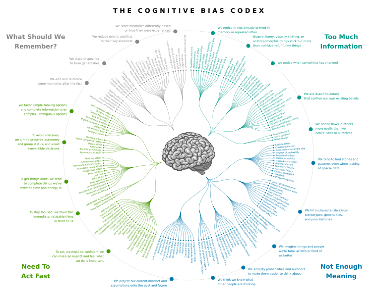
First things first: “[A] cognitive bias is the tendency to think certain ways, often resulting in a deviation from rational, logical decision-making.” (CXL) The occurs in all areas of life, there is a bias for almost every area of life, they impact how we buy, sell, interact with friends, think, feel, etc. Feeling guiltier about a certain situation than you should, according to friends and family, you could be experiencing the egocentric bias. (cf. CXL) It’s important to remember that biases can occur on both sides during user research, both the user and the researcher can be subject to predetermined believes, affecting the outcome of the research. Some are already well known like the confirmation bias. (cf. Smashing Magazine)

Source

Impact on UX Design

In UX design, a bias can emerge at any stage, from topic selection to data interpretation, due to influences from researchers, participants, or other external factors. This is particularly concerning since designers and researchers may not be aware of them, potentially leading to skewed results or exclusionary designs. (cf. Clara Purdy) Take a look at the picture below, the cognitive bias codex, the list of biases designers make come across is nearly endless. Everyone can be subject to any of those biases, whether you come across it and recognize it or it effects yourself.

Source

Research Goals

Right now I can’t really tell where this research journey is going to take me, for now I will focus on biases and their effects of UX work. BUT during the researcher for this post, I realized how deep the rabbit hole around UX design and psychology goes. (Study guide for the rabbit hole ;D)

For now, a desirable outcome would be, to create a collection of biases and other effects, that influence people. Since one would have to become sensitive to these topics before they can conquer them. In addition to just generating awareness, there should also be info on why this matters and how to adjust to these effects. In the end there should be a lexicon about common effects, to be aware of and how to combat them. A deeper understanding of perceptual psychology will greatly impact how a designer approaches upcoming problems, to deepen the understanding for actions different users take.

Thanks for reading through my blog!
Leave a comment, if you are interested in this topic and tell me what you want to read about next! ;P