SURFBOARD PROTOTYPE CONSTRUCTION

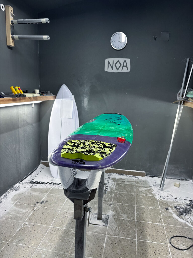
The base model and final prototype selected for this project is built on top of my own personal shortboard. It is measuring 5 feet 9 inches in length and is made for faster maneuvers like the cutback because of its short length and small volume. Considering these factors the board was selected due to its size and shape, which offer a wider range of motion and faster changes of speed and rotation in comparison to a longboard. Also, the dynamical movement and the internal board vibrations will be different than the one of a longboard or a board with a higher volume. Before the construction, a planning session was conducted with the Noa team to identify the ideal locations for sensor placement, cable routing, mounting of the housing, and material usage considering the exposure to saltwater.

Noa surfboards is a small factory for shaping mostly shortboards and riverboards. With their own shaping studio, they represent one of the few professional shapers in the region of Austria and Germany. This studio was chosen for the professional knowledge and experience of shaping to develop a well-functioning and safe protype.  

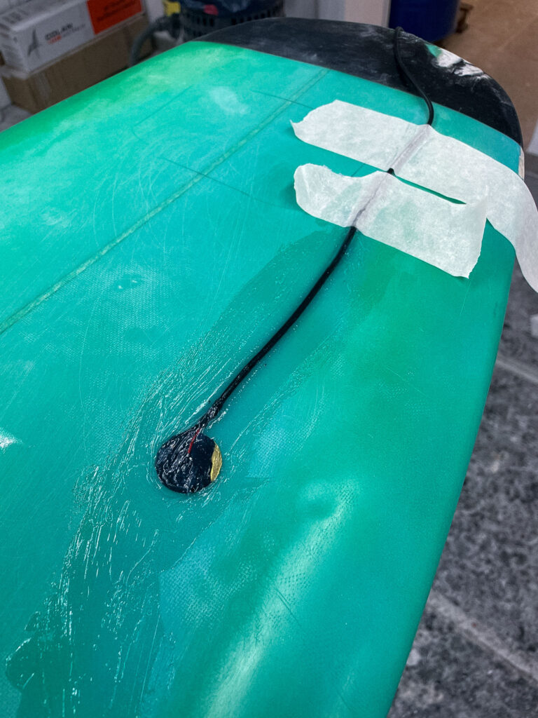
Looking at the building phase of the protype, Noa Surfboards proposed embedding the piezo disc underneath the front-foot zone of the deck. This area is perfect to capture the movement of the surfer, while not being under strong impact of the bodyweight of the surfer. In order to integrate the microphone in the body of the board a rectangular section of the fiberglass top layer was carefully removed. In the next step the piezo disc was mounted directly to the raw material. To protect the microphone from external impacts and the saltwater multiple layers of fiberglass cloth were laid over the sensor and encapsulate the mic completely. 

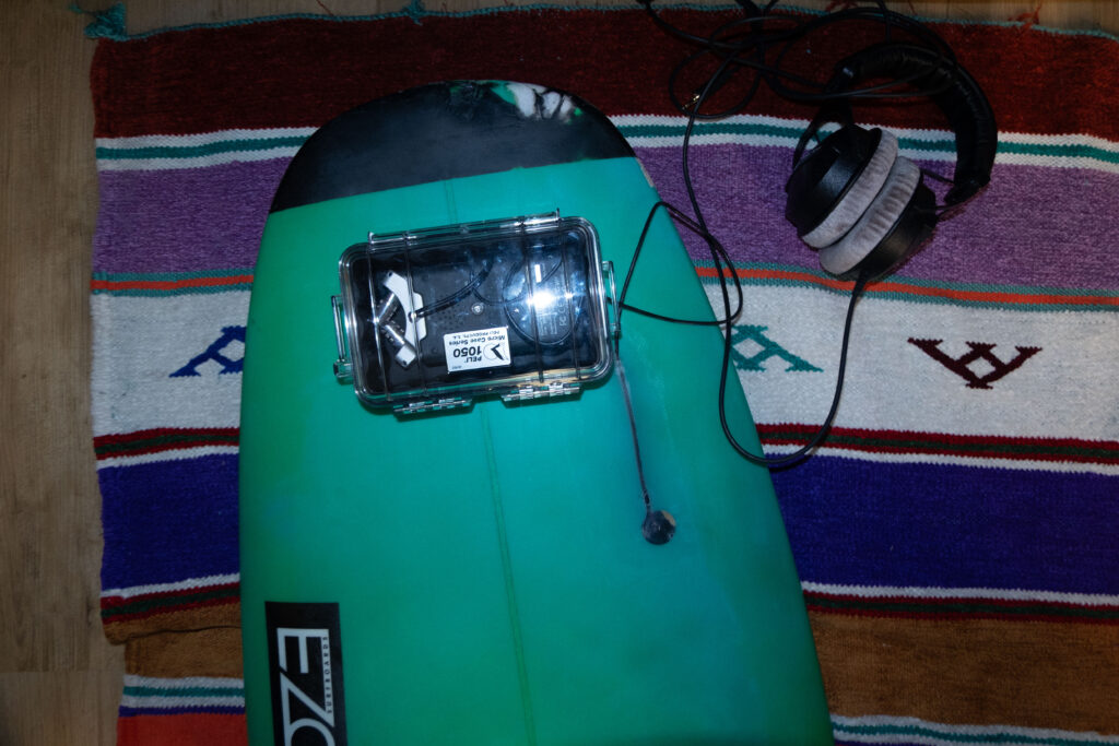
Another critical technical step was to route the cable from the embedded mic to the waterproof electronics box. Therefore, a narrow channel was drilled on the side of the box for the cable to enter. 

Inside the case, the Zoom H4n recorder and x-IMU3 sensor were suspended in a foam block designed to isolate the electronics from board vibrations and strong impacts. 

  1. Evaluation of the prototype

#6 Final Prototype and Video

Have fun with this Video to find out what my actual Prototype is.

Reflection

This project began with a vague idea to visualize CO₂ emissions — and slowly took shape through cables, sensors, and a healthy amount of trial and error. Using a potentiometer and a proximity sensor, I built a simple system to scroll through time and trigger animated data based on presence. The inspiration came from NFC tags and a wizard VR game (yes, really), both built on the idea of placing something physical to trigger something digital. That concept stuck with me and led to this interactive desk setup. I refined the visuals, made the particles feel more alive. I really want to point out how important it is to ideate and keep testing your ideas, because there will always be changes in your plans or something won’t work etc. Let’s go on summer vacation now 😎

Blogpost #5 – Prototype

In my previous blog post (#3), I explored the value of tangible interfaces and embodied interaction, especially when applied to scientific concepts. I took a look at constructivist and kinesthetic learning theories and discussed how meaningful, hands-on engagement can help people and especially children understand and retain information more effectively than traditional textbook-based approaches. Building on this I tinkered around with a lo-fi tangible prototype: an interactive chemistry simulation that allows users (kids) to explore real chemical reactions in a safe, accessible, and playful way.

One of the challenges in kinesthetic learning (or hands-on learning in general), especially in the context of science education, are the physical restrictions: there is messiness, the danger of working with certain substances, and the financial or spatial limitations of traditional labs. The prototypes approach is to offer a digital-physical hybrid that provides the sensory and experiential engagement of a real experiment without the need for actual chemicals or laboratory space. Of course this is really stripped down to the most basic parts, but the bigger idea is to use technology to make knowledge tangible and engaging and not just shift everything from a textbook to a screen – because where’s the fun in that?

Making the prototype

I started by developing the concept of my prototype. I knew I wanted it to deal with some kind of scientific topic and while reading the paper about kinesthetic learning I figured that making experiments with chemicals more accessible could be an interesting starting point, since that is something that I always found most interesting in chemistry class and would have wanted to do more. The idea is to simulate the feeling of experimenting through look, sound and haptics. I chose a simple experiment where different substances react with water and started by creating my digital setup for which I created some simple visuals in processing. I initially wanted to trigger the sounds with Max9. This worked great, however I ran into the problem, that I couldn’t simultaneously trigger the MaxPatch and the Processing sketch. So I decided to add the sound directly into processing with a sound library, which worked really nicely. I then did some more experimenting with the visuals and sounds and added some information text for each chemical reaction for more context as to what is happening (it is still about education after all, even if the shapes and colors are a lot of fun to look at). I then hooked the whole thing up to a MakeyMakey and crafted really simple physical representations out of paper for the chemical substances I was simulating. To make them conductive I used tinfoil and after a bit of experimenting I was able to make my own little Natrium-Explosion in my room without dying – how cool!

Conclusion

It was really interesting diving into prototyping with a vague idea at this point in the project, as this is not an approach I am used to. I liked that it pushed me to just start, try things and experiment. This really helped me get rid of high standards for this early stage. While I think I do enjoy the topic, I might have to still dabble in my other two ideas just to figure out where I see the most potential and have the most fun. I think I will need a lot more experimenting to see what I want to do, but this is definitely a good start.

#15 Building a pocket sized tactile flood map

Three cups of coffee, an A4 sheet of foam board, and a stack of scavenged textures later, I finally have a first physical model of flood risk in the Tulln area. It is rough, flimsy in places, and already shedding, but it’s also the most concrete (and tactile!) expression of my idea so far.


Choosing “A4” over “A-Lot”

I promised myself to work small this time. An ~A4 footprint forces ruthless simplification:

  • Only the Danube’s immediate floodplain.
  • No elevation gain because there is almost none in that area.
  • 2 flood scenario (HQ 30 & HQ 100).

That constraint kept the materials list tight and the cutting tolerable with a hobby knife.


Thirty-Minute Build

  1. Print → Trace → Cheat Printer died, so I traced the WISA map contours right off my screen onto scrap paper, then onto materials—eyeballing when necessary.
  2. Knife workQuick, approximate cuts of cardboard, cork, felt, and foam.
  3. Base & WaterCraft-foam ribbon for the Danube; its cool, slick surface instantly stands out.
  4. Land UsesFelt for green, cork for sealed areas. Simple rectangles keep the skyline abstract.
  5. Flood OverlaysRough side of each sponge = HQ 30; soft cellulose side = HQ 100. Cut to match the WISA outlines and glued as over-lays.

Total build time: ~30 minutes.


First Blind Pass

With eyes closed I traced from river outward:

  • Foam river – instantly identifiable.
  • Rough sponge – HQ 30; its grit jolts the fingertip.
  • Soft sponge – HQ 100; squishy, cooler, clearly distinct.
  • Felt – forgiving, farmland vibe.
  • Cork – rigid and grainy; screams “built-up.”
  • Cardboard steps – subtle, but enough curb-height to prove the land does rise.

What I Learned

  • At A4 scale every millimetre matters. Flood zones have to be chunky enough to feel but not so thick they dwarf the elevation logic.
  • Textures communicate hierarchy if the height difference is consistent. Soft-but-low worked only when the sponge sat at the same level as the surrounding terrain.
  • Material memory is powerful. Sandpaper felt “urban” without explanation, reaffirming research on intuitive texture cues.

Further thoughts

  1. Movable Sponge OverlaysCut each HQ zone as a separate, magnet-backed piece. Users can lift, align, or stack them to see extent differences.
  2. Sliding FilmPrint HQ 30 and HQ 100 outlines on transparent acetate (raised ink or puff-paint). Slide the film over the base map; tactile bumps show where water spreads further.
  3. Stackable “Risk Chips”Punch small, uniform discs out of sponge: light-touch discs for HQ 100, rough discs for HQ 30. Drop them into a recessed Danube channel to build a tactile bar-chart of depth along chosen transects.
  4. Add a braille / raised-symbol legend to the bottom edge.
  5. Run a short thinking-aloud test with at least three users, including one low-vision participant.

#2.05 Refined Prototype & Some more thoughts

I’ve proceeded to improve the lamp’s physical design and technical implementation after creating the initial proof of concept to test the fundamental interaction loop. The objective at this point is to make the prototype more like the final experience, which I envision to be soft, ambient, emotionally soothing, and user-friendly.

Shifting from ZigSim to Arduino + Sensor

In this step of the prototype, I moved away from using ZigSim with the mobile sensor, to using an Arduino board with a proximity sensor. The sensor detects when the phone is placed in the dock and sends this data to Max/MSP, which then triggers visual feedback in Resolume Arena. This allowed for a more modular and scalable system: the phone becomes a passive actor in the setup, while the lamp actively reflects the user’s engagement or disengagement with it.

Redesigning the Dock

Since the first prototype of the dock was too big and bulky, I shifted toward a rectangular, low-profile dock that takes up less space and fits more naturally into the physical environment of a desk. When I built the second prototype, I realized that it wasn’t high enough, because you almost couldn’t put the phone in it. When I built the third prototype, I made it a bit higher so that you could put the smartphone in easily.

The lamp

In the first prototype, I experimented briefly with using transparent paper to diffuse the LED strips, and I decided to take that idea further. For this version I put a LED hexagon into a see-through sphere. To avoid hard and direct light, I lined the inside of the sphere with transparent paper, softening the light and creating a much more ambient, almost lantern-like glow. This resulted in a less like “technology” and more like calming object. The light is still the primary feedback. When the phone is placed on the dock, the LED hexagon glows with a gentle, diffused light, signaling the beginning of a focus session. Is the phone removed the color of the light changes – not to shame the user, but to offer a reflective signal. This fits the principles of Calm Technology: feedback is present but not dominant. The lamp becomes a kind of behavioral mirror – always gentle, never forceful.

Some more thoughts – Creative Prompts

In the last session Birgit suggested an interesting shift in perspective – what if distraction wasn’t always something negative, but could actually hold meaning? That idea really stuck with me. I haven’t implemented it into the prototype yet, but I’ve been thinking a lot about it, especially because I know how common it is, especially in creative fields, to feel guilty when we’re not being “productive” or working on something for school. That guilt is exactly what I don’t want people to feel when they use the Focus Lamp.

As someone who works creatively, I’ve often noticed how much time I can end up spending on my phone, especially on social media. And after a while, I started to feel like I was losing a bit of my spark and creativity. That feeling is part of what inspired this project in the first place. So now I’m considering integrating an app after all, not as the main feature, but as a gentle companion to the lamp.

The idea is that if someone is in focus mode and still picks up their phone, instead of being punished or shamed, they’re offered a creative prompt. Something light and inspiring to nudge them in a different direction during that moment. For example: “Draw what’s around you for 10 minutes,” “Read 10 pages of something,” or “Stretch for a few minutes.”

It’s not about blocking the phone or enforcing discipline. It’s about helping people reconnect – with their creativity, their bodies, their curiosity – especially in those moments when they’re about to drift into passive scrolling. It should just be a small nudge, maybe in the right direction.

#14 Preparing to build a prototype

After outlining a national-level idea for a tactile map of Austria in my last post, I quickly realized: starting small is smarter. Not only because of time and material constraints, but because detail matters and working at a regional scale allows me to dive deeper into how elevation, infrastructure, and flood risk actually intersect.

So for my next prototype, I’m focusing on the region around Tulln, and potentially Vienna if time allows. This area offers a compelling intersection of topography, hydrology, and urban development all wrapped around the Danube, Austria’s largest and most flood-prone river.


Why Tulln?

  • It’s a mid-sized town with both urban and rural textures, making it ideal for mixed-surface representation.
  • It lies directly along the Danube, with several documented flood events in recent years.
  • Its relatively flat terrain offers subtle elevation changes—challenging but manageable for tactile representation.
  • Data is available: flood risk mapsland use info, and elevation contours are easier to source at this scale.

Plus: I have a personal reference point for it living close by, which helps in imagining scale and interpretation.


What the Data Says: A Quick WISA Deep-Dive

I spent an evening inside the WISA (WasserInformationsSystem Austria) portal, specifically the second-cycle hazard and risk maps:

https://maps.wisa.bmluk.gv.at/gefahren-und-risikokarten-zweiter-zyklus

Key takeaways:

  1. Three flood scenarios dominate planning: HQ30, HQ100, HQ300 (30-, 100-, 300-year events).
  2. Each scenario maps expected water depth and flow velocity—crucial for picking tactile textures.
  3. In the Tulln/Vienna stretch, HQ100 zones hug both banks, widening dramatically at meander bends.

Material Scouting (aka “Foam Feel-Up” Day)

I’ve been to a few shop looking at different materials to see what would work best.

Prototype Blueprint (Version 0.1)

LayerData SourceTactile Encoding
Elevation (4 bands)data.gv.atcardboard (stacked)
HQ100 flood zoneWISA hazard mapScrub Sponge (Reinigungsschwamm)
Sealed landdata.gv.atcompressed cork board
Green spacedata.gv.atfelt fabric
Danube + major tributariesWISA hazard mapsmooth craft foam

The aesthetic goal isn’t prettiness; it’s readability by hand. Every texture must scream its meaning in under two seconds of fingertip contact.

Scope Check

  • Board size: A4 fits on a lap, lowers material costs, easy for the first prototype
  • Layers: 3–4 elevation steps + 1 sponge overlay = max 5 tactile heights.
  • Geography: Tulln centre + ~5 km buffer on each side; Vienna only if the first build behaves.

Next Up: Cutting, Gluing, (Re-)Cursing

In my next Blog Post I’ll document the messy middle:

  1. Printing and tracing simplified contours.
  2. Foam-board surgery (scalpel + podcasts).
  3. Flood-sponge wrestling: how do you glue something that’s meant to feel like water?
  4. First blindfold test: can a friend locate “safe ground” by touch alone?

Fingers crossed (and hopefully uncut).

Blog Post 6: Designing wireframes for the prototype and Video of the prototype

This post focuses on the wireframing process for the Device App prototype, developed as part of my ongoing research into the role of Digital Memories in technology and interaction design. The goal of the wireframes was to translate research insights and conceptual direction into tangible, testable user flows. These wireframes represent the core flows of the prototype.

Starting With Sketches

I began the design process with rough sketches on paper to explore layout ideas quickly and think through user flows without constraints. This sketching phase allowed me to focus purely on functionality, flow logic, and visual hierarchy without getting distracted by UI details.

In the sketches, I explored the two key flows of the app:

  1. Adding Photos from a Connected Device
    • Users can connect a device via cable.
    • Choose to create a new folder or add to an existing one.
    • Photos are selected, reviewed, and saved into the desired folder.

  1. Viewing Photos as a Slideshow
    • Users can open any folder and launch a fullscreen slideshow.
    • A horizontal strip allows navigation between photos while viewing.

This paper-first approach helped me solidify the app’s structure before moving to Figma for the digital wireframes.

Building the Wireframes

Once the core flow was mapped out, I built detailed wireframes in Figma. The two main flows in the prototype are:

1. Add Photos Flow

Users connect a device, choose a folder (or create one), select photos, and upload them. The wireframes guide them step-by-step through this process with clear UI feedback like folder creation confirmation and selection indicators.

2. Slideshow Viewing Flow

Folders can be opened to view photos as a slideshow. This mode is minimal and immersive, offering a fullscreen photo experience with a navigation strip below.

Navigation and consistency were key considerations throughout. I maintained common buttons, tabs (like Add Photos / Saved Folders / Watch), and bottom navigation across screens to reduce friction and support intuitive exploration.

HOMESCREEN – Wireframe

ADD PHOTOS

CREATING NEW FOLDER FROM A DEVICE

Design Decisions

Some key choices I made:

  • Simplicity & Clarity: Especially important for intergenerational use.
  • Folder-Based Memory Organization: To give emotional context to digital memories.
  • Clear Action Paths: With visual hierarchy and button grouping to support user confidence.

FINAL LOW FIDELITY PROTOTYPE VIDEO

I was also describing the prototype so I reccomend to play the video in faster speed 1.5x. Thanks 🙂

14 Adding encryption to Morse Arduino

After getting the Arduino to encode Morse messages and send them to a connected Max patch (see the last blogpost), I took the next step. So far, I built a way to create messages, and a way to transmit them, but not everyone was able to simply read and understand morse code, so the next step was obvious: build a way the messages could be read in clear text. The idea was simple: after every message got “sent”, the Arduino would take the Morse code string and convert it into readable text.

My first attempt was a long list of if statements, which worked, but I had hoped for an easier way to add and administrate different dot & dash combinations. Next I thought of using a switch statement to iterate through the combinations, but Arduino doesn’t support those, so I had to come up with a new idea. After searching on the internet, I came across a different solution, using arrays. So I rewrote it using arrays that mapped Morse code strings to letters. That gave me something that felt like a switch statement. It was now much cleaner, and easier to add custom combinations later.

Before:

After:

The decoding worked like this: one array was filled with all the Morse code symbols, and one with the matching letters. The code then iterated through the Morse message character by character, building a temporary substring that represented a single Morse symbol (like “.-” or “–“). Whenever it hit a slash (/), the program knew it had reached the end of one symbol. It then compared the collected substring to all entries in the Morse array. When it found a match, it took the corresponding index in the letter array to find the translation. That translated letter got added to the final decoded message string.

To figure out how many slashes were pressed, the code counted how many consecutive / characters appeared in the string. Each time it found a slash, it increased a counter. When a non-slash character came next (or the message ended), it used the number of counted slashes to determine the type of break:

  • One slash (/) meant a new letter started.
  • Two slashes (//) meant a new word started.
  • Three slashes (///) meant the start of a new sentence.
  • Four slashes (////) marked the end of the message. 

This system worked surprisingly well and gave me more control over formatting the final message. By using these simple separators, I could organise the output clearly and logically. Here is how the full print would look like with the translation.

The result? A very basic but fully functional Morse communication device: input, output, transmission, and now decoding. Currently it is just displaying the message in the serial monitor, but I plan to make the message be displayed on the LED Matrix, on the Arduino, that way the message is readable to the user immediately. I also read online, that an Arduino can be connected to a web server, so I will probably test that out, since this way I could create smart devices for my room on my own.

Instructions

If you wanted to try it out yourself, here was what you needed:

  • An Arduino (compatible with Modulinos)
  • The three button Modulino
  • The latest sketch with decoding logic (I could share this if you were interested)

Not a lot to do, except plugging in the three button Modulino and uploading this sketch:

#12 DataVis Workshop

The workshop WS#6 Eva-Maria Heinrich / Bringing the Abstract to Life – Beyond Data Visualisation at the International Design Week was all about pushing my prototype beyond pixels and printouts. Instead of presenting Austria’s daily land consumption as another chart, I set out to build a physical prototype – a 1.13 m² “slice” of ground that stands in for every hectare consumed in a single day. Here’s a rundown of my process, why a hands-on prototype matters, and the production hurdles I encountered along the way.


Why Prototype Matters in Multi-Sensory Data Visualization

Many of my previous posts have explored the theory behind multi-sensory data visualization – how tactile textures, sounds, or spatial arrangements can make numbers resonate more deeply. This time, I wanted to prototype those ideas in a tangible form. By crafting a small landscape that viewers can actually touch, I could test whether the physicality adds insight that a static infographic simply can’t. In other words, this wasn’t a polished art piece – it was a work-in-progress prototype intended to reveal both the strengths and limitations of turning data into material.


Concept: A 1.13 m² “Plot” of Daily Land Use

At a scale of 1:10 000, 1 cm² on my board represents 1 hectare in the real world. To capture Austria’s daily land conversion, the board measures 1.13 m² total, divided into:

  • 52 % concrete (fully sealed surfaces like roads and buildings)
  • 12 % gravel (partially sealed areas such as construction zones)
  • 36 % grass (green spaces cut off from natural ecosystems)

When laid out side by side, these materials form a unified plane that still reveals stark textural differences up close. Walking viewers through each zone gets them thinking: “That gray slab isn’t just a shape – it’s every driveway and parking lot paved over today.”


From Sketch to First Prototype

Mapping Out the Layout

I began by sketching on paper, dividing a 1 m × 1.13 m rectangle into proportional zones. Once I had rough percentages, I exported the grid to Illustrator to generate precise outlines. Printing a full-scale template and taping it to plywood helped me trace clean boundaries for concrete, gravel, and grass sections.

Gathering & Testing Materials

  • Concrete mix: I bought a small bag of ready-to-mix putty. My first batch was too smooth, so I added extra pebbles I got on the street to add some texture.
  • Gravel: I grabbed some gravel from a construction site. Putting it basically one by one on the surface, I glued them down with normal glue.
  • Grass: I had a few ideas for grass but because of time constraint I settled on a doormat I found at the hardware store, knowing I could swap in live grass later.

Building the First Iteration

  1. Base Preparation: I glued two sheets of thin carton together (hoping for the best).
  2. Concrete Section: Mixing putty and gravel, I poured it cup by cup each time mixing it again and again.
  3. Gravel Section: I sprinkled gravel by hand, and gently pressed it in place.
  4. Grass Section: Cutting the doormat to form was very easy and I just glued it down.

What I learned in the process

Prototyping isn’t a linear path, and my first iteration had plenty of hiccups.

Mainly finding the right material and then finding good substitutes because of the time frame. Then of course finding the right mix for the putty and putting it on the surface.

By the end of the week, the prototype still had a few chips of gravel out of place and some cracks and color difference in the putty, but those imperfections felt authentic – almost like the real world, where land-use boundaries aren’t always neat and tidy.


Why This Prototype Matters

  • Tactile Immersion: Viewers can kneel down and feel the roughness of gravel next to the coldness of the putty. That sensorial contrast sparks a more intuitive understanding of how land is consumed.
  • Immediate Comparisons: Instead of reading “52 %” on a slide, people see the massive concrete patch in context – ranking it against gravel and grass sizes without needing numbers to guide their eyes.
  • Hands-On Research: As a prototype, it’s a learning tool more than a final exhibit. The bumps in production taught me about material properties – knowledge I’ll carry into my next prototype. Each mis-cut or adhesive spill revealed potential adjustments for future iterations.

Final Thoughts

Prototyping this 1.13 m² piece of ground forced me to embrace trial and error. Every spilled drop of glue and cracked chunk of putty helped me understand how to translate data into material form. The end result isn’t a museum-ready installation – it’s a functional prototype that still has rough edges. But those imperfections are part of its story: they remind me (and future viewers) that real-world data isn’t always clean, and neither is the crafting process that brings it to life. Already, this initial version has sparked new ideas for my thesis – especially around combining tactile and auditory layers.