Introducing Beside You: the Augmented Managment software that will later be introduced as a SaaS (Software as a Service).
Initially, working on this project has been a ride since the beginning, being the sole product designer at a company that specializes in customer experience and business management along with a team of full stack devs and data scientists meant that we either we will get things done or we will get things done.
One of the early challenges was to convert a data driven platform to an intuitive and cohesive interface that offers the ease of analysis and ultimately efficient decision making.
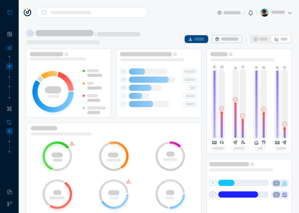
One of the ‘Pre Design Sprint’ Data Interface that I found when I came onboard.
One of the early challenges was to convert a data driven platform to intuitive and cohesive interface that offers the ease of analysis and ultimately efficient decision making.
Sketching consisted of building a skeleton that will overaly the first foundation that will eventually convey the design language that the software will adopt and in the meantime everything has to be succintly explained to the stakeholders in order for them to grasp the design system and for me to extract more insights from them since they will be the first users of the software.
Moving on to a low fidelity wireframe with the intention of giving more meaning and structure to the interface meant that progress is happening and things are starting to evolve in terms of results from the ideation and the user interviews. Also, the latter gave me the playground to begin building the design system from the layout, color palette, and typography to the spacing and the accessibilty.
First draft of the dashboard’s lo-fi wireframe
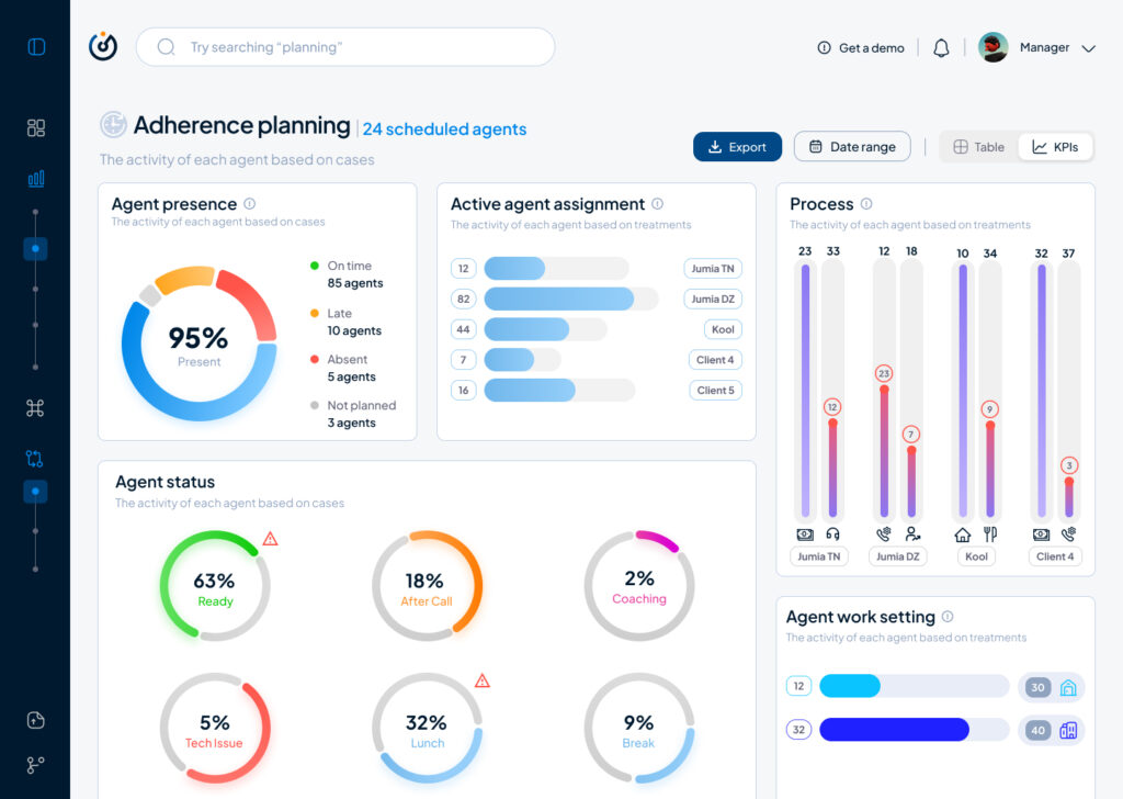
Moving on to a highfidelity wireframe that paved the way to add real data to the interface that allowed us as a team to get a realistic first look on how the software will behave in terms of data visualisation and user navigation and from there began our first user test which will give us a direction to make the right adjustments and iterations.
First iteration of the dashboard’s hi-fi wireframe
To conclude, this article is a condensed version of what actually happened and the process behind creating a data driven product from the ground up, otherwise I will have to write a journal that won’t serve nobody but nonetheless it is always beneficial to write about a design process that was complicated and challenging at times, the benefits are a documentation and a clarity that will even pave the way to iterate better on the next stages of the product life cycle.
In this second part of the IDW25 recap I want to talk about the prototype I created of my CO2 project. The goal for me was to build an installation to interact with the data visualisation. For this I chose makey makey and built a control mechanism with aluminium foil and a pressure plate. To send the data from processing to the projector I used Arena Resolume. My concept was based on the CO2 footprint. So you activated the animation with steping on the pressure plate. Here are first sketches of my idea.
I thought about making an interactive map where you step on different countries and realease fog in a glas container. But that was too much to create in one week so I reduced the concept to projecting the boundary I showed in my last blog post. I kept it simple and connected the makey makey to aluminum foil to control the time line with a finger tap. The processing output is being projected on the wall.
Conclusion
It was interesting to get to know the possibilities of the used technology to visualise data and therefore I had a lot of fun during production. I will definitly keep working on this project to see where it can go. Also expand the data set to compare more countries. In the first part of the blog post I mentioned that there are probably better programs to make more visually appealing animations for such a topic. But for a rough protoype this was completly fine.
The International Design Week 2025 is over and this first part of the blog will be a recap of my process. I joined the workshop #6—Beyond Data Visualisation with Eva-Maria Heinrich. The goal was to present a self chosen data set on a socio-political topic. I chose a data set on the Co2 emission worldwide per country (https://ourworldindata.org/co2-emissions). The process started with evaluating the data span I want to show and the method of visualisation. Because the task of the workshop was to present data in an abstract way and to step back from the conventional methods, to make the experience more memorable.
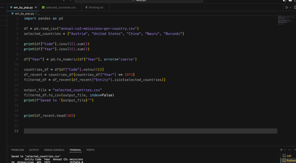
Cutting the Data with Python
So to get a specific range of data to make a prototype i used python to cut the csv file to my liking. I used the pandas tool for python to manipulate the file. At first I wanted to compare three countries, but later in the process I realized that this goal was a bit too much for the given time, since I haven’t used python like this before. It was a nice way to get to know the first steps of data analysis with coding.
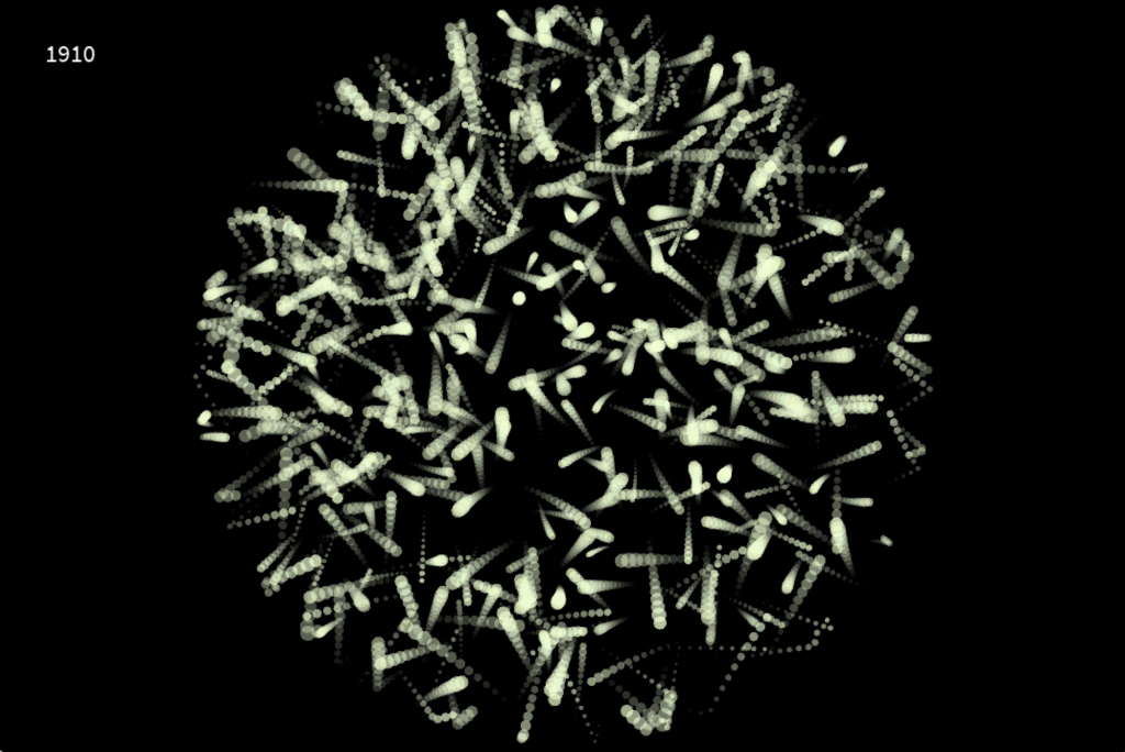
I created a new csv file with a selected country, in this case it was Austria in a time span from 1900—2023. Now it was time to visualise it.
Let’s get creative!
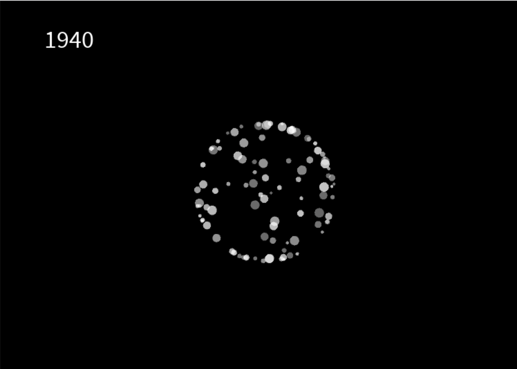
In my research on how CO2 was being visualised before I looked up some videos of NASA showing how the emission covers the world. I got inspired by this video.
I chose processing to create my own interpretation of visualising emission. In hindsight, there are probably better tools to do that, but it was interesting to work with processing and code some visuals relative to a data set. I created a radial boundary which is invisible. Inside this shape, i let a particle system flow around which is relative to the CO2 emission in the specific year, shown in the top left corner. This visualisation works like a timeline. You can use your LEFT and RIGHT arrow keys to go back and forth in 10 years steps. The boundary expands or be reduced, which depends if the emission of that year is higher or less. The particle system also draws more or less circles, depending on the amount of CO2.
After the workshop was done I tried out other methods to make the particle system flow more and create a feeling of gas and air.
Conclusion
The whole week was a nice experience. I got to try out new techniques and tools and create something i never done have before. A problem I encountered was the time. It’s hard to estimate what you can do, if you try out something completly new. The presentation day at the end was really inspiring and emotional to see what the all the other students have created and talking about their process and results.
As digital interfaces evolve, ambient displays are becoming a critical tool for integrating multisensory data into everyday environments. Unlike traditional visualisations that demand direct attention, ambient displays operate at the periphery of perception, using light, sound, temperature, or movement to subtly communicate information. However, as these displays evolve, so does the need to understand their relationship with data and the context in which they exist.
Beyond Peripheral Awareness: Understanding Context in Ambient Displays
Historically, ambient displays have been discussed in terms of peripheral awareness—providing information in a non-intrusive manner. However, research by Vande Moere & Offenhuber (Beyond Ambient Display) suggests that ambient displays should not only be classified based on how they present data but also on the context in which they exist. Their model proposes three categories:
Visualisation as Translation – Data is presented in an abstract form, independent of its environment (an ambient color-changing orb that visualises air quality).
Visualisation as Augmentation – The display integrates into an existing object, enhancing its natural affordances (a lamp that glows brighter based on energy consumption).
Visualisation as Embodiment – The display itself is the context, shaping meaning through its physical presence (large-scale urban installations that respond to public data).
By categorising displays in this way, designers can better align the modality, environment, and function of ambient displays to create more intuitive and meaningful interactions.
Designing for Subtlety and Context
The effectiveness of ambient displays lies in their ability to convey meaning without overwhelming users.
Selecting the Right Modality – Light, sound, or haptics should be chosen based on how users engage with their environment. A museum exhibit might use soft pulses of sound to indicate visitor density, while a wearable device could use gentle temperature shifts.
Context Sensitivity – Displays should align with their physical and social context. A public installationvisualising air pollution might use smoke-like visuals, reinforcing an intuitive connection between representation and data.
Balancing Functionality and Presence – An ambient display should enhance awareness without becoming the focal point. If too dominant, it shifts from being “ambient” to demanding attention, which can disrupt the user experience.
The Future of Ambient Displays in Multisensory Data Design
By rethinking ambient displays as context-sensitive interfaces rather than just passive visualisations, designers can integrate seamless, non-disruptive data experiences into everyday life. Whether through urban-scale data sculptures, responsive architectural spaces, or adaptive environmental displays, the next wave of ambient visualisation will focus on how context shapes perception—blurring the line between information and environment.
Reference
D. Offenhuber, “Beyond Ambient Display,” International Journal of Ambient Computing and Intelligence, 2009.
Designing and Evaluating Ambient Information Systems: Workshop at Pervasive 2007, The 5th International Conference on Pervasive Computing, Toronto, ON, Canada, May 13, 2007.
How do different combinations of visual, auditory, and tactile cues influence users’ ability to detect and interpret complex pattern in data?
Human Senses and Beyond
When we talk about the human senses, the classic list of sight, sound, smell, touch, and taste usually comes to mind. However, there is growing evidence that humans perceive the world through far more than these five fundamental channels. In addition to balance, proprioception (awareness of body position), and temperature sensation, researchers continue to uncover other nuanced ways in which we sense and interpret our surroundings. https://aeon.co/videos/aristotle-was-wrong-and-so-are-we-there-are-far-more-than-five-senses
For the scope of this research, I will concentrate on sight, sound, and touch—particularly regarding how data can be represented and experienced through these modalities.
Accessibility in Design
In modern design practice, accessibility is a fundamental principle rather than an afterthought. Whether creating websites, data visualizations, or interactive installations, designers should integrate accessibility guidelines from the start. These guidelines typically include:
Color Contrast and Shape Differentiation Ensuring legibility and clarity for individuals with various visual abilities, including color blindness.
Alternative Text and Descriptions Providing alt text for images and clear labeling for data charts to support screen readers.
Flexible Interaction Methods Offering keyboard or alternate navigation modes for users who cannot interact with a mouse or touch interfaces.
Definition and Rationale Sonification involves mapping numerical data or other abstract information to audible properties such as pitch, volume, rhythm, or timbre. Its fundamental goal is to leverage the human auditory system’s sensitivity to changes in frequency and amplitude. This can be particularly useful when data contains temporal patterns or fluctuations that might be more readily perceived through sound than sight.
Time-Based Patterns: For datasets that evolve rapidly, detecting a small uptick or sudden dip is sometimes easier when it’s rendered as a change in pitch or tempo.
Parallel Processing: The brain processes auditory and visual stimuli along different pathways, so combining both channels can help distribute cognitive load.
Inclusive Experiences: Individuals with visual impairments or color-vision deficiencies can gain richer insights by “listening” to data, reducing reliance on purely visual cues.
Design Considerations
Data-to-Sound Mapping: Deciding which data variables map to pitch, volume, or rhythmic patterns is crucial. Overly complex mappings can overwhelm users, while oversimplified mappings might convey only superficial insights.
Contextual Meaning: Providing brief textual or spoken labels can clarify what changes in pitch or tempo signify, helping users build intuitive mental models.
Avoiding Auditory Overload: Continuous, intense auditory cues can be fatiguing. Subtle sound cues or situational “alerts” (playing a specific note only when a threshold is crossed) often strike a better balance.
Definition and Applications Tactile interfaces, often called haptic interfaces, communicate information through the sense of touch—vibrations, pressure, temperature changes, or textural shifts. This approach is notably valuable for individuals with visual or auditory impairments, but it also holds potential for creating richer, more immersive data experiences for all users.
Vibrotactile Feedback: Short pulses or vibration patterns can indicate specific data thresholds or events, such as crossing a predefined limit or detecting an anomaly.
Physical or 3D Representations: Tactile data displays can take the form of raised surfaces, 3D-printed graphs, or shape-changing interfaces. Users can literally feel the peaks, troughs, or relationships in data.
Thermal or Pressure Feedback: Emerging technologies allow for subtle temperature changes or pneumatic feedback. For instance, temperature gradients might mirror climate data, enabling users to “feel” environmental shifts over time.
Design Considerations
Integration with Other Senses: Tactile interfaces often work best with visual or auditory cues. Each modality can reinforce or clarify the other, fostering a more complete understanding of the data.
Tactile Resolution: Human touch has limits in distinguishing small differences in vibration frequency or texture. Designers must tailor the granularity of feedback to what users can reliably perceive.
Attention and Comfort: Continuous or intense haptic signals can lead to sensory fatigue. Designers should consider using event-based or gentle transitions to avoid discomfort.
Connecting Sensory Design and Accessibility
The overarching theme linking these ideas is that designing for accessibility often creates a more inclusive, engaging experience for everyone. This approach demands thoughtful consideration of how data is conveyed: beyond color and labels, it involves weaving together sight, sound, and touch. Whether in assistive technologies, artistic installations, or everyday data dashboards, a multisensory perspective can expand what is possible in data communication.