Moving Beyond Dry Audio to Spatially Intelligent Soundscapes
My primary objective for this update was to bridge a critical perceptual gap in the system: while the previous iterations successfully mapped visual information to sonic elements with precise panning and temporal placement, the resulting audio mix remained perceptually “dry” and disconnected from the image’s implied acoustic environment. This update introduces adaptive reverberation, not as a cosmetic effect, but as a semantically grounded spatialization layer that transforms discrete sound objects into a coherent, immersive acoustic scene.
System Architecture
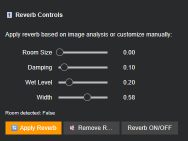
The existing interactive DAW interface, with its per-track volume controls, sound replacement engine, and user feedback mechanisms, was extended with a comprehensive spatial audio processing module. This module interprets the reverb parameters derived from image analysis (room detection, size estimation, material damping, and spatial width) and provides interactive control over their application.
Global Parameter State & Data Flow Integration
A crucial architectural challenge was maintaining separation between the raw audio mix (user-adjustable volume levels) and the reverb-processed version. I implemented a dual-state system with:
current_mix_raw: The continuously updated sum of all audio tracks with current volume slider adjustments.current_mix_with_reverb: A cached, processed version with reverberation applied, recalculated only when reverb parameters change or volume sliders are adjusted with reverb enabled.
This separation preserves processing efficiency while maintaining real-time responsiveness. The system automatically pulls reverb parameters (room_size, damping, wet_level, width) from the image analysis block when available, providing image-informed defaults while allowing full manual override.
Pedalboard-Based Reverb Engine
I integrated the pedalboard audio processing library to implement professional-grade reverberation. The engine operates through a transparent conversion chain:
- Format Conversion:
AudioSegmentobjects (from pydub) are converted to NumPy arrays normalized to the [-1, 1] range - Pedalboard Processing: A
Reverbeffect instance applies parameters with real-time adjustable controls - Format Restoration: Processed audio is converted back to
AudioSegmentwhile preserving sample rate and channel configuration
The implementation supports both mono and stereo processing chains, maintaining compatibility with the existing panning system.
Interactive Reverb Control Interface
A dedicated control panel was added to the DAW interface, featuring:
- Parameter Sliders: Four continuous controls for room size, damping, wet/dry mix, and stereo width, pre-populated with image-derived values when available
- Toggle System: Three distinct interaction modes:
- “🔄 Apply Reverb”: Manual application with current settings
- “🔇 Remove Reverb”: Return to dry mix
- “Reverb ON/OFF Toggle”: Single-click switching between states
- Contextual Feedback: Display of image-based room detection status (indoor/outdoor)
Seamless Playback Integration
The playback system was redesigned to dynamically switch between dry and wet mixes:
- Intelligent Routing: The
play_mix()function automatically selectscurrent_mix_with_reverborcurrent_mix_rawbased on thereverb_enabledflag - State-Aware Processing: When volume sliders are adjusted with reverb enabled, the system automatically reapplies reverberation to the updated mix, maintaining perceptual consistency
- Export Differentiation: Final mixes are exported with
_with_reverbor_rawsuffixes, providing clear version control
Design Philosophy: Transparency Over Automation
This phase reinforced a critical design principle: spatial effects should enhance rather than obscure the user’s creative decisions. Several automation approaches were considered and rejected:
- Automatic Reverb Application: While the system could automatically apply image-derived reverb, I preserved manual activation to maintain user agency
- Dynamic Parameter Adjustment: Real-time modification of reverb parameters during playback was technically feasible but introduced perceptual confusion
- Per-Track Reverb: Individual reverberation for each sound object would create acoustic chaos rather than coherent space
The decision was made to implement reverb as a master bus effect, applied consistently to the entire mix after individual track processing. This approach creates a unified acoustic space that respects the visual scene’s implied environment while preserving the clarity of individual sound elements.
Technical Challenges & Solutions
State Synchronization
The most significant challenge was maintaining synchronization between the constantly updating volume-adjusted mix and the computationally expensive reverb processing. The solution was a conditional caching system: reverb is only recalculated when parameters change or when volume adjustments occur with reverb active.
Format Compatibility
Bridging the pydub-based mixing system with pedalboard‘s NumPy-based processing required careful attention to sample format conversion, channel configuration, and normalization. The implementation maintains bit-perfect round-trip conversion.