My Review of “Designing for Slow Reflection” by Gkounta & Wijayantha (2025)

The master thesis “Designing for Slow Reflection: Using a Physical Artifact to Reflect on Screen Exposure” was written by Dimitra Gkounta and Hasini Wijayantha, from the Master’s Programme in Human Computer Interaction and User Experience at the Umeå University in 2025. It explores how design can encourage people to think more deeply about their screen habits before going to sleep. In the current world, where most echnologies are designed to be fast and efficient, the authors experiment with slow technology; a design approach that promotes patience, reflection, and awareness instead of instant gratification.

Their research question is clear:

How can slow technology design qualities be implemented in an artifact to foster reflection on screen exposure before sleep?

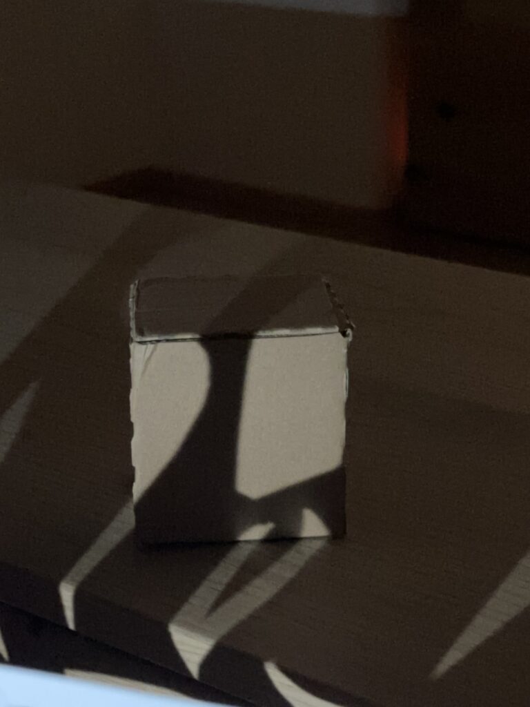
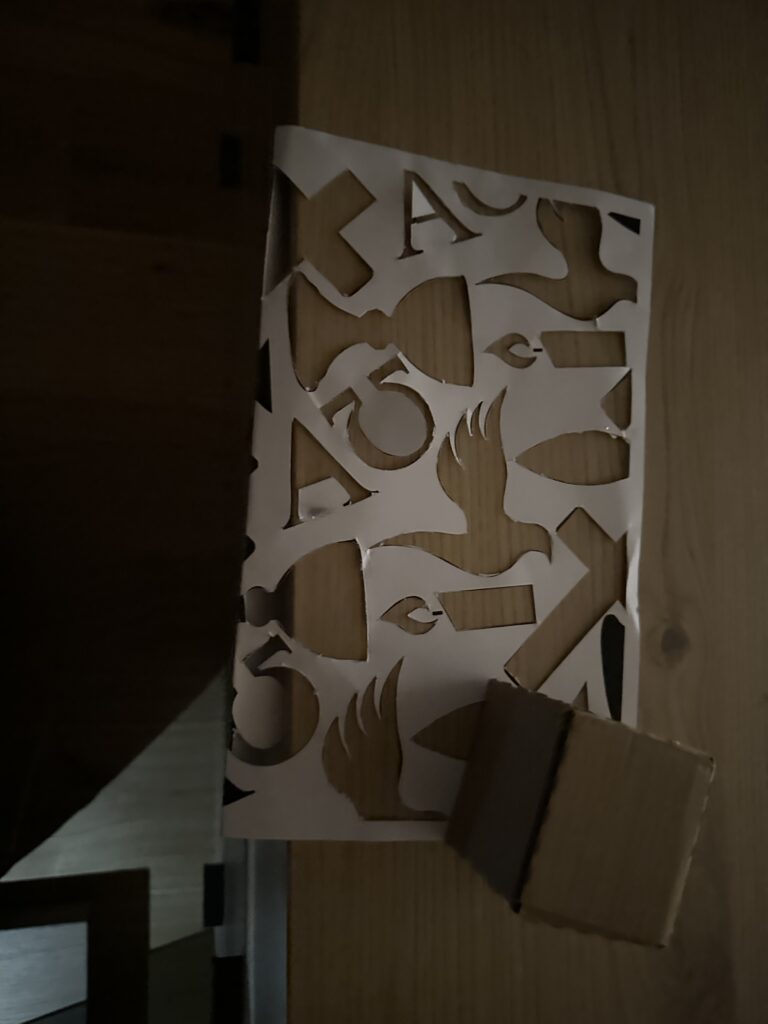
To explore this, they used a Research through Design approach and created a low-fidelity prototype figurine that changed it’s appearance based on participants self reported screen time and sleep quality over the span of three days. The figurine represented the users behaviour visually through torn clothes or dirt (representing poor sleep or excessive screen time) or a neat appearance (representing healthier habits).

Pre-Evaluation

The figurine is well documented in this thesis. The authors describe its material, design choices, and the reasoning behind each visual change, such as torn clothing or posture adjustments. Photos and diagrams show the figurine in different stages of transformation thus painting a clear picture of the development process. It is also explained why the figurine was kept low-fidelity, giving a very well documented impression overall.

Though it is not publicly accessible the detailed explanation of the process would allow an interested party to recreate a similar setup.

The theoretical arguments and the practical implementation align convincingly which can be seen by a clear representation of three slow technology qualities (explicit slowness, ongoingness, and pre-interaction). There is a deliberate delay between data reporting and visual change (explicit slowness), the figurines gradual deterioration (ongoingness), and the morning audio journaling (pre-interaction). Though some participants reacted poorly to the delayed feedback, that just confirmed the expected challenge of introducing slowness into an environment that is accustomed to fast-technology.

Overall the documentation is clear and comprehensible. Each methodological step is described in detail, easy to follow and participant quotes give quick insight into how the figurine was perceived.

In my opinion, the quality of this thesis fully meets the standards expected of a master’s thesis and could be used as a shining example. It demonstrates a strong link between theory and design, creative experimentation, and careful reflection.

Main Evaluation

Overall Presentation Quality
The thesis is professionally presented and well structured. There is a clear line leading from theory to practice and both the term slow technology and the design process of the figurine are explained well. The thesis reads very easily without loosing its scientific tone which was a pleasant surprise.

Degree of Innovation
I think this work is highly original, at least I haven’t seen anything similar before. It combines slow technology with self tracking through data which is very interesting. The delayed feedback approach was very new to me since most technologies focus on near instant feedback and quick responses. The figurine also introduced a certain ambiguity to the data which is a refreshing idea, hopefully leading to more meaningful engagement. Overall the thesis provided a fresh perspective by focussing on designing for reflection rather than efficiency.

Independence
The authors show strong independence and creativity. They designed and created the figurine themselves, developed the study setup, and critically reflected on their own design choices. And though it was not without its challenges (e.g. participant misinterpretation), they adjusted their method accordingly.

Organization and structure
This thesis is organized very logically. Each section builds upon the previous one and has a clear focus. The transitition from theory to practice is clear and the documentation of both design and analysis is easy to follow. Photos of the figurine add to an easily digestable reading experience.

Communication
The writing style is professional yet clear and easy to understand. Concepts like explicit slowness, ongoingness, and pre-interaction are well explained. In my opinion the authors successfully combined technical language with narrative elements such as participant quotes which made the whole thesis engaging to read.

Scope
The scope fits the level of a master thesis. The project focuses on a specific, manageable question and a small user group of six participants. My only critique would be that the study frame was very short (three days) and could’ve been expanded.

Accuracy and Attention to Detail
The study reads very careful and precise. The theoretical foundation seems solid and the design and analysis are documented in such detail, that it makes it easy to understand how the figurines transformations came about.

Literature
This thesis makes great use of literature by connecting classical theories of reflection (Schön, 1987) with more recent studies on slow design and personal informatics. The authors also situate their project in a broader research context by showing how their study fills a gap in applying slow technology in self-tracking before sleep.

Overall Assessment

This thesis was super interesting to read, gave plenty of new perspective, food for thought, and was overall a thoughtful piece of research. It had a strong theoretical foundation, a creative new concept and a more than sufficiently reflective analysis. I think the application of slow technology principles, through a physical figurine into personal informatics is innovative and refreshing and made for an engaging read. A minor weakness is the short duration of the study, which limits insight into long-term behavioral change and could question the validity of the study outcome. Still, this thesis offers some inspiration for designers/researchers who want to rethink the role of slowness and reflection in todays fast paced environment. Slowing down could actually help us see ourselves more clearly.

IMPULS #1: Kerstin Röse (WUC)

Take-away: Vortrag von Kerstin Röse – „Digital Exclusion“

Der Vortrag von Kerstin Röse beim World Usability Congress war für mich ganz spannend, weil er ein Thema behandelt hat, das man im UX/UI-Design oft vergisst: ältere Menschen als Zielgruppe. Wir designen meistens neue Interfaces, informieren uns über die neusten KI Modelle oder das Internet of Things, dabei gibt es gleichzeitig eine ganze Generation, die sich von dieser „digitalen Welt“ ausgeschlossen fühlt oder gar keinen Zugang hat. Eigentlich ein Thema, dass uns in Betracht unserer Großeltern auch bewusst ist, aber es war trotzdem interessant, noch ein paar empirischere Daten und noch mehr sensibilisierung zu dem Thema zu bekommen. Jedenfalls ging es im Vortrag um digitale Exklusion, speziell bei Menschen ab 65 Jahren, und was wir als Designer*innen dagegen tun können.

Röse hat in ihrem Talk den Satz gesagt: „Every generation will get their silverliners.“ – also, jede Generation bekommt irgendwann ihre „Silberrücken“, ihre älteren Menschen, die mit den technologischen Entwicklungen Schritt halten müssen. Sie hat auch schön gezeigt, wie sich die digitale Interaktion über die Jahrzehnte verändert hat – von Kommandozeilen über grafische Interfaces bis hin zu KI Inputs meist über Sprache. Ich hab mich gefragt, welche technische Neuerung wohl kommen wird, wenn ich ein silverliner bin und mit der Weiterentwicklung kämpfe.

Ein zentrales Thema war, dass digitale Transformation nur dann erfolgreich ist, wenn sie alle einschließt. Damit hat sie deutlich gemacht, dass digitale Teilhabe nicht nur ein soziales, sondern auch ein wirtschaftliches Thema ist. Anscheinend gewinnt man nämlich nur so Konzerne dazu, Inklusion zu betreiben: Wenn ältere (oder anderwertig beeinträchtigte) Menschen ausgeschlossen bleiben, verlieren sowohl sie als auch Unternehmen wichtige Potenziale. Und schließlich geht es immer um den Umsatz.

Ein weiterer wichtiger Punkt war die Studie „D21 Digital-Index 2020/21“, die sie zitiert hat. Darin wurde untersucht, was sogenannte „Offliner“ – also Menschen, die das Internet nicht nutzen – motivieren würde, doch digital aktiv zu werden. Die Ergebnisse waren so:

  • 23 % würden sich mehr trauen, wenn ihnen jemand zeigt, wie es funktioniert.
  • 20 % wünschen sich einfachere Bedienung.
  • 19 % würden sich überzeugen lassen, wenn sie einen klaren persönlichen Nutzen sehen.

Diese Zahlen zeigen ziemlich deutlich, dass es beim Thema „Digital Inclusion“ nicht nur um Technik geht, sondern um Verständnis, Empathie und gute Kommunikation. Als Designer*innen sollten wir besondern bei der “einfachen Bedienung” einwirken können – indem wir Produkte schaffen, die intuitiver sind, Vertrauen aufbauen und Menschen Schritt für Schritt begleiten. Den letzten Punkt mit “persönlichen Nutzen” verstehe ich nicht ganz. Wenn sie eh keinen Zweck für an einem digitalen Gerät sehen, weil sie ihr Leben ev. mithilfe von Verwandten oder offline Medien regeln können, dann seh ich auch keinen anderen Nutzen, außer kommerz, den Offlinern unbedingt das Internet aufzubürden.

Was ich aus dem Vortrag wiedermal mitgenommen habe, ist vor allem: Design hat Verantwortung. In meiner Masterarbeit wird es wahrscheinlich nicht um ältere Menschen oder Barrierefreiheit im Web gehen, aber ev. um die Benachteiligung von Frauen in Kunst und Wissenschaft, und der Grundtenor “Exklusion” bleibt auch hier derselbe.


Hier der Link zu der Studie:

https://initiatived21.de/uploads/03_Studien-Publikationen/D21-Digital-Index/2020-21/d21digitalindex-2020_2021.pdf

Es kommen bei dem Digitalisierungsindex jährlich Zahlen raus, in wie weit die Digitalisierung in Deutschland fortgeschritten ist.

IMPULSE #1: 7 Minutes of Writing

Yesterday in class, we did a simple, yet for me, annoying exercise: write continuously for seven minutes, starting with the phrase “I am writing my master’s thesis about…” No stopping, no editing, no thinking too much … just writing. 

What began as a stream of random thoughts quickly turned into something more revealing. I switched from English to German almost instantly, because it felt more natural — and maybe also because the topic touches something personal. I found myself writing about how religion, especially Catholicism, still influences me, and how my relationship with it has changed over time. 

I realized that my thesis isn’t just about “religion and millennials” in an abstract sense. It’s about the tension between belief and institution, between faith and church. I wrote about how many of my friends have turned away from religion, how the Church has lost credibility, and yet how my personal faith still gives me strength. That contradiction — being supported by something that many reject — feels like the heart of what I want to explore. 

During those seven minutes, I also wrote about my uncertainty: How can I make this topic interactive? How can I visualize something as internal and emotional as belief? I imagined a projection inside St. Stephen’s Cathedral, a space that already carries so much symbolic weight. But what would I actually project? What is the question behind the light? 

By the end of the exercise, I was exhausted and a little frustrated. Seven minutes can feel endless when you’re forced to confront your own thoughts without a filter.  The writing helped me see that I don’t need to have all the answers yet.  

This small exercise reminded me that creative research isn’t only about collecting data or designing interfaces. It’s also about listening to yourself, about noticing what questions keep returning, even when I tried to avoid them. Question like: Can faith exist without the institution of the Church? But my topic includes the topic of distance as well. Maybe something i should focus more on and something i can work with in my interactive part. 

Dissclaimer: AI was used here for a better wording 

IMPULSE: Doku Fernweh und Flugscham

Als ersten Impuls und erste Inspiration für mein Masterarbeit-Thema habe ich recherchiert, welche anderen Dokumentationen zum Thema Overtourism, nachhaltiges Reisen und die Zukunft des Tourismus bereits produziert wurden und bin dabei auf die Dokumentation “Fernweh und Flugscham – Wie wollen wir in Zukunft reisen?” von Antje Christ auf der ARTE Mediathek gestoßen.

Die Dokumentation behandelt allgemein die Probleme die mit der immer weiter steigenden Menge an Touristen einhergehen. Im speziellen wird auf einzelne Hotspots eingegangen wie zum Beispiel Barcelona, Venedig und Dubrovnik.

Palau wird als Positivbeispiel herangezogen, da hier großer Wert darauf gelegt wird, die Einreisenden Tourist:Innen darauf hinzuweisen, respektvoll mit dem Land umzugehen. Hierfür wurde ein eigenes Video produziert (siehe: https://www.youtube.com/watch?v=UKhmZbY3FYY), welches jeder einreisenden Person gezeigt wird, sowie ein spezieller Passstempel, mit dem man sich bei Einreise zumindest symbolisch dazu verpflichtet, sich dem Land gegenüber respektvoll zu verhalten.

Während solche Maßnahmen durchaus das Bewusstsein und das Verantwortungsgefühl der Reisenden stärken können, werden sie alleine nicht die Lösung gegen Overtourism sein.

Die Doku beschreibt, dass das große Problem im heutigen Tourismus die schiere Menge und Konzentration von Tourist:Innen an bestimmten Orten darstellt. Und obwohl Tourismus durchaus auch neue Jobs und Möglichkeiten für Anwohner dieser Hotspots schafft, sind dies meist sehr schlecht bezahlte und unsichere Berufe. Eine der notwendigen Maßnahmen, welche in der Doku beschrieben wird ist daher die Dezentralisierung von Touristenströmen, um Hotspots zu entlasten. In Barcelona werden beispielsweise immer mehr Attraktionen in der direkten Umgebung der Stadt beworben um die Touristenmassen im Stadtkern auszudünnen und Touristenströme bewusst zu lenken und zu verteilen.

Auch in Venedig ist die schiere Konzentration neben den Kreuzfahrtschiffen das größte Problem. Die Touristenmassen konzentrieren sich auf einige wenige Attraktionen, während Kreuzfahrtschiffe die Luftqualität drastisch verschlechtern und ihre Passagiere kaum Geld in der Stadt lassen. Hier gibt es Überlegungen, in Zukunft digitale Systeme wie beispielsweise Überwachungskameras, Smartphone Tracking, sowie Big Data einzusetzen um die Bewegungsmuster von Touristenmassen zu verfolgen und dementsprechend zu reagieren und sie zu steuern. Hier wurde in der Dokumentation auch darauf eingegangen, dass Tourist:Innen auch heute schon nicht nur durch bewusst wahrgenommene Eindrücke, beispielsweise auf Social Media oder im Fernsehen, sondern auch durch die darunterliegenden Algorithmen stark unterbewusst beeinflusst werden.

Die Dokumentation zeigt aber auch mögliche Zukunfts-Szenarien auf, wie Tourismus nachhaltiger gelebt werden kann. Beispielsweise wird von “Resonanztourismus” gesprochen, bei dem das Ziel sein soll, dass sich Besucher:Innen kaum noch von Einheimischen unterscheiden lassen, sondern mit den lokalen Gegebenheiten quasi verschmelzen. Außerdem soll “Slow Travel” in Zukunft als Kontrast zur alltäglichen Gehetztheit stehen und damit auch authentischere Erlebnisse für Reisende ermöglichen.
Im Film wird erklärt, dass Tourismus nur dann zukunftsfähig sein kann, wenn immer weniger große Konzerne involviert sind, man selten aber dafür länger verreist und man so gut es geht versucht auf umweltschädliche Reisen zu verzichten.

Die Doku beschreibt noch viele andere wichtige Punkte und Probleme, die von mir aufgezählten waren jedoch die, die bei mir am meisten Eindruck hinterlassen haben und mir den größten Denkanstoß gegeben haben. Allgemein hat die Doku in mir die Frage geweckt, ob möglicherweise unsere grundlegende Art in der heutigen Zeit Konsum zu betreiben auch das ist, was aus Tourismus ein Problem macht und ob vielleicht ein allgemeines Umdenken notwendig ist.
Warum sollte man aber nicht genau im Tourismus mit diesem Umdenken starten?

Für alle, die Interesse an der Dokumentation haben, hier noch der Link: (disclaimer – sie ist leider nur in Deutschland oder mit deutschem VPN verfügbar)
https://www.arte.tv/de/videos/100296-000-A/fernweh-und-flugscham/

Proseminar Master’s Thesis – Benjamin Pohler

Sprachverständlichkeit im Broadcast:
Masterarbeit von Elias Thomas Weißenrieder (HdM Stuttgart, 2024)

Arbeit (https://curdt.home.hdm-stuttgart.de/PDF/Weissenrieder.pdf)

Theoretische Ausarbeitung eines Programmtools zur Sprachverständlichkeitsanalyse von Sprachsignal-Audiodateien aus dem Broadcastumfeld
Elias Thomas Weißenrieder, Master of Engineering, Hochschule der Medien Stuttgart, Studiengang: Audiovisuelle Medien.

Warum für mich interessant

Sprachverständlichkeit ist im TV-Broadcast eines der wichtigsten Forschungsfelder überhaupt. Die Arbeit entwickelt theoretisch, aber praxisnah ein Programmkonzept zur automatisierten Verständlichkeitsanalyse und prüft dafür etablierte Verfahren gegeneinander. Fokus: Was taugt im echten Broadcast-Use Case? Dazu gehören ein Versuch mit Hörtest und die Ableitung einer GUI/Workflow-Skizze für ein späteres Tool.

Abbildung: GUI Skizze

Abbildung: GUI Skizze vom entwickelten Tool

Werkstück/Dokumentation

Es gibt kein ausgeliefertes Tool, aber klar dokumentierte Bausteine: Auswahl und Implementierungswege (Python Code) für akustische Metriken der Sprachverständlichkeitsmessung STOI, PESQ und NISQA, ein Hörversuch zur Validierung, Skizzen der Oberfläche, Blockschaltbilder zweier Varianten (intrusiv mit Referenz vs. non-intrusiv), plus Nutzerinterview mit einem Broadcast-Toningenieur (13 Jahre Praxis).
Die Versuchsdaten sind typisch Broadcast: Kommentar Beyerdynamic DT797 PV über RIEDEL CCP-1116, Atmo mit SCHOEPS ORTF-3D (8 Kanäle). Aufzeichnung u. a. mit Reaper und RME MADIface USB, Routing „Direct Out“ aus LAWO; spätere Bearbeitung/Export u. a. in Nuendo 12, Loudness auf −23 LUFS normiert. Das “Werkstück” ist somit eine simulierte Stadionatmosphäre “in the Box” nachgestellt.

Abbildung: Aufbau eines ORTF 3D


1. Gestaltungshöhe

Die gestalterische Leistung liegt hier im Design eines belastbaren Mess-Workflows statt in Klangkunst. Sound Design Aspekte fanden hier dennoch seinen Platz für die Simulation für den Hörversuch. Positiv hervorzuheben ist: sauberer Use Case (Live-Kommentar im Stadion), realistische Testsignale, und eine Oberfläche, die Durchschnitts- und Worst-Block-Werte ausweist (für den schnellen Check und den gezielten Drill-down). Das ist genau der Blick, den man in der Sendezentrale braucht. Ein ästhetisches Sound-Narrativ schlüssig.

2. Innovationsgrad, Neuigkeitswert und Beitrag

Nicht neu ist, dass man die Metriken STOI/PESQ/NISQA kennt, neu ist die konsequente Einbettung in Broadcast-Praxis inkl. Hörtest-Abgleich und GUI-Konsequenzen für die Programmierung (Blockgrößen, Sortierung, Ergebnisdarstellung). Das ist ein relevanter, kleiner Schritt Richtung operationalisierbares Tool. In der Zukunft wäre eine offene Referenz-Datenbank (Audio + Ground Truth) nötig, aber für eine Masterarbeit ist der gewählte Umfang und Scope realistisch und umfangreich genug.

3. Selbstständigkeit und Eigenleistung

Die Arbeit zeigt eigenständige Entscheidungen: Versuchsdesign (auch wenn es hier Kritikpunkte von mir gibt, da ein ITU-genormtes Design nicht einghalten wurde), Auswahl und Implementierungspfade der Algorithmen, Norm-Lautheit, Testsignal-Kuratorik (z. B. keine Eigennamen, um Bias zu vermeiden). Auch das Nutzerinterview ist selbst erhoben und floss in die GUI-Anforderungen ein (z. B. einfache Tabellen-View, blockweise Detailansicht).

4. Gliederung und Struktur, Logik und Nachvollziehbarkeit

Wießenrieder hält sich klar: Grundlagen, Vergleich, Versuch, Tool-Konzept, Hypothesen-Check und alles mündet in einem Fazit mit Implementierungsvorschlag. Es kann schnell herausgefunden werden, was wo begründet ist. Für meinen Geschmack könnte der Methoden-Teil teils kompakter sein, dafür glänzen die Blockschaltbilder und die GUI-Skizzen als Orientierungsanker.

5. Kommunikationsgrad, Verständlichkeit, Ausdruck und Darstellungsweise

Die Sprache ist sachlich, gut lesbar. Wichtig für mich war Einordnung und Konsequenz, dies wird durchgezogen (z. B. MOS-Skala für Hörtest, Mapping der Verfahren). Was ich mir als Leser wünschen würde: Audio-Beispiele/QR-Links und 1-2 Plots (z. B. Block-STOI über Zeit), um die Argumente des Autors der Masterarbeit hör- und sichtbar zu machen.

6. Umfang und Angemessenheit

Umfang passt zum Ziel einer theoretische Ausarbeitung und Validierung auf einen Datensatz. Der Hörtest ist okay skaliert (MOS-Skala definiert aber abgewandelt, Setup beschrieben), Hörversuch hat zu wenig Teilnehmer, ist okay für eine Masterarbeit, limitiert aber die Generalisierbarkeit bzw. kann sich negativ auf die statistische Auswertung auswirken.

7. Orthographie, Sorgfalt & Genauigkeit, Formale Präzision

Formal sauber, konsistente Terminologie, klare Verweise. Die Lautheits-Normierung (-23dB LUFS), die Samplerate-Grenzen (PESQ-Limit bei 16 kHz) und der Export-Workflow sind präzise dokumentiert. Pluspunkt für Reproduzierbarkeit. Ein vollständiger Tech-Appendix (Kanal-Matrizen, Skript-Versionen, REAPER Session) wären vorteilhaft gewesen.

8. Literatur, Qualität, Relevanz, Vollständigkeit

Die Kernverfahren (STOI, PESQ, POLQA, NISQA, STI/SII, etc.) sind eingeführt und sinnvoll verortet. Für ein produktives Tool bräuchte es perspektivisch mehr Breite bei Non-Intrusive Methoden und Domain-Spezifika (z. B. codec-spezifische Fehlerbilder im TV-Chain). Für die gewählte Fragestellung reicht diese Auswahl aber mehr als genug aus. Alle die schonmal mit der Messung solcher akustischen Metriken arbeiteten wissen, wie aufwändig dies ist auszuwerten und zu einem Hörversuch zusammenzuschüren.

Ergebnisdiskussion und Kernresultate

Im direkten Abgleich mit dem Hörtest schneidet STOI am besten ab. PESQ liegt spürbar dahinter, NISQA weicht am stärksten ab. Unter anderem weil das Modell in diesem Setup sogar das Referenzsignal zu schlecht bewertet und dadurch die Skalierung kippt. Für Live-Kommentar und Stadion-Atmo ist STOI daher die naheliegende Wahl: Das Maß reagiert robust auf maskierende Umgebungsgeräusche; PESQ misst eher allgemeine Qualität als Verständlichkeit.

Für die Bedienung würde ich für meinen Geschmack und für die Übersichtlichkeit so aufziehen: Balkendiagramm für den schnellen Vergleich mehrerer Dateien, dazu eine Tabelle mit Gesamtwert und dem schwächsten Zeitfenster inkl. Position, für die Detailprüfung eine zeitliche Fensterung mit Wellenform. Das ist im Sendebetrieb schnell lesbar und spart Zeit.

Das Test-Setup spiegelt reale TV-Bedingungen (Headset, ORTF-3D-Atmo, -23dB LUFS, LAWO-Kette). Die Ergebnisse sind damit gut auf ähnliche Livesituationen übertragbar. Grenzen sehe ich bei anderen Störprofilen und immersiven Ausspielungen. Nächste Schritte wären für mich: nicht-intrusive Modelle gezielt mit Broadcast-Daten nachtrainieren und kanal/stem-getrennte Auswertungen prüfen, um Maskierung in komplexeren Mischungen besser zu sehen.


Stärken/Schwächen der Masterarbeit

Die Stärke von Weißenrieders Masterarbeit liegt in der praktischen Umsetzung: getestet wird mit echten Broadcast-Signalen (Kommentar gegen Stadion-Atmo), nicht mit Labor-Pink-Noise. Der Weg von Versuch zu Entscheidung ist stringent: Hörtest und Algorithmusvergleich führen nachvollziehbar zu STOI als Leitgröße, daraus folgen klare UI-/Prozess-Konsequenzen (Schnellübersicht, schwächstes Zeitfenster mit Positionsangabe, einfache Sortierung). Der Nutzerfokus wirkt echt und sendetauglich.

Schwachstellen gibt es trotzdem: Die Hörtest-Stichprobe ist offenbar klein, und das dominierende Szenario (Fußball + Kommentar) lässt offen, wie stabil die Befunde in ruhigeren Formaten wären. Die ITU Norm für den MOS Hörversuch wurde modifiziert, was die Auswertbarkeit so nicht schlüssig macht. Hörbeispiele oder Zeitverlaufs-Plots hätten die Argumente zusätzlich tragfähig gemacht.

Für meine Praxis nehme ich mit: STOI als Default, aber blockweise auswerten (nicht nur Mittelwerte). Ablauf zuerst denken: Tabelle mit Gesamt- und Minimumwert, Balkenvergleich über Files, dazu eine einfache Timeline mit Wellenform. Und Daten wie on-air kuratieren (-23dB LUFS, Headsets, reale Atmo). Perspektivisch lohnt sich der Blick auf Immersive/Stem-basierte Auswertung.
Fazit: eine fokussierte, praxistaugliche Arbeit mit echtem Mehrwert für den Sendebetrieb.

Critical Review: “Sound response to physicality – Artistic expressions of movement sonification” by Aleksandra Joanna Słyż (Royal College of Music, 2022)

by Verena Schneider, CMS24 Sound Design Master 

The master thesis “Sound Response to Physicality: Artistic Expressions of Movement Sonification” was written by Aleksandra Joanna Słyż in 2022 at the Royal College of Music in Stockholm (Kungliga Musikhögskolan; Stockholm, Sweden).

Introduction

I chose Aleksandra Słyż’s master thesis because her topic immediately resonated with my own research interests. In my master project I am working with the x-IMU3 motion sensor to track surf movements and transform them into sound for a surf documentary.
During my research process, the question of how to sonify movement data became central, and Słyż’s work gave me valuable insights into which parameters can be used and how the translation from sensor to sound can be conceptually designed.

Her thesis, Sound response to physicality, focuses on the artistic and perceptual dimensions of movement sonification. Through her work Hypercycle, she explores how body motion can control and generate sound in real time, using IMU sensors and multichannel sound design. I found many of her references—such as John McCarthy and Peter Wright’s Technology as Experience—highly relevant for my own thesis.

Gestaltungshöhe – Artistic Quality and Level of Presentation

Słyż’s thesis presents a high level of artistic and conceptual quality. The final piece, Hypercycle, is a technically complex and interdisciplinary installation that connects sound, body, and space. The artistic idea of turning the body into a musical instrument is powerful, and she reflects deeply on the relation between motion, perception, and emotion.

Visually, the documentation of her work is clear and professional, though I personally wished for a more detailed sonic description. The sound material she used is mainly synthesized tones—technically functional, but artistically minimal. As a sound designer, I would have enjoyed a stronger exploration of timbre and spatial movement as expressive parameters.

Innovationsgrad – Innovation and Contribution to the Field

Using motion sensors for artistic sonification is not entirely new, yet her combination of IMU data, embodied interaction, and multichannel audio gives the project a strong contemporary relevance. What I found innovative was how she conceptualized direct and indirect interaction—how spectators experience interactivity even when they don’t control the sound themselves.

However, from a technical point of view, the work could have been more transparent. I was missing a detailed explanation of how exactly she mapped sensor data to sound parameters. This part felt underdeveloped, and I see potential for future work to document such artistic systems more precisely.

Selbstständigkeit – Independence and Original Contribution

Her thesis clearly shows independence and artistic maturity. She worked across disciplines—combining psychology, music technology, and perception studies—and reflected on her process critically. I especially appreciated that she didn’t limit herself to the technical side but also integrated a psychological and experiential perspective.

As someone also working with sensor-based sound, I can see how much self-direction and experimentation this project required. The depth of reflection makes the work feel authentic and personal.

Gliederung und Struktur – Structure and Coherence

The structure of the thesis is logical and easy to follow. Each chapter begins with a quote that opens the topic in a poetic way, which I found very effective. She starts by explaining the theoretical background, then moves toward the technical discussion of IMU sensors, and finally connects everything to her artistic practice.

Her explanations are written in clear English, and she carefully defines all important terms such as sonificationproprioception, and biofeedback. Even readers with only basic sound design knowledge can follow her reasoning.

Kommunikationsgrad – Communication and Expression

The communication of her ideas is well-balanced between academic precision and personal reflection. I like that she uses a human-centered language, often describing how the performer or spectator might feel within the interactive system.

Still, the technical documentation of the sonification process could be more concrete. She briefly shows a Max/MSP patch, but I would have loved to understand more precisely how the data flow—from IMU to sound—was built. For future readers and practitioners, such details would be extremely valuable.

Umfang – Scope and Depth

The length of the thesis (around 50 pages) feels appropriate for the topic. She covers a wide range of areas: from sensor technology and perception theory to exhibition practice and performance philosophy.
At the same time, I had the impression that she decided to keep the technical parts lighter, focusing more on conceptual reflection. For me, this makes the thesis stronger as an artistic reflection, but weaker as a sound design manual.

Orthography, Accuracy, and Formal Care

The thesis is very carefully written and proofread. References are consistent, and the terminology is accurate. She integrates both scientific and artistic citations, which gives the text a professional academic tone.
The layout is clear, and the visual elements (diagrams, performance photos) are well placed.

Literature – Quality and Relevance

The literature selection is one of the strongest aspects of this work. She cites both technical and philosophical sources—from G. Kramer’s Sonification Report to McCarthy & Wright’s Technology as Experience and Tanaka & Donnarumma’s The Body as Musical Instrument.
For me personally, her bibliography became a guide for my own research. I found new readings that I will also include in my master thesis.

Final Assessment – Strengths, Weaknesses, and Personal Reflection

Overall, Sound response to physicality is a well-balanced, thoughtful, and inspiring thesis that connects technology, perception, and art.
Her biggest strength lies in how she translates complex sensor-based interactions into human experience and emotional resonance. The way she conceptualizes embodied interaction and indirect interactivity is meaningful and poetic.

The main weakness, in my opinion, is the lack of detailed technical documentation—especially regarding how the IMU data was mapped to sound and multichannel output. As someone building my own sonification system with the x-IMU3 and contact microphones, I would have loved to see the exact data chain from sensor to audio.

Despite that, her work inspired me profoundly. It reminded me that the psychological and experiential dimensions of sound are just as important as the data itself. In my own project, where I sonify the movement of a surfboard and the feeling of the ocean, I will carry this understanding forward: that sonification is not only about data translation but about shaping human experience through sound.

Final Prototype: An Interactive Projection Experience

I’m thrilled to share that I’ve completed my final prototype! The journey wasn’t without its challenges, especially when connecting my laptop to the projector, but I managed to get everything up and running in the end.

For this prototype, I utilized Zig Sim, Max and Resolume Arena to create an interactive layer. The key feature is that the projection changes color based on the movement of the projector. When you move the projector, the image shifts from full color to black and white, emphasizing the theme of perspective.

My aim was to not only enhances the visual experience but also invites viewers to interact with the projection in a unique way.

I won’t lie, I wasn’t sure if I could implement what I had created in my head. However I’m even more excited to see how this concept evolves.

Exploring Projection

I finally got a mini beamer and tested it for the first time. Until now, I had been working mainly with candlelight and flashlights to project my cut-out patterns, but having a proper projector opened up an entirely new range of possibilities.

The test went surprisingly well. The beamer worked smoothly, and I was able to project both my digital Illustrator pattern and the physical stencils I had created. What struck me immediately was how powerful the combination of the two approaches can be. The crispness of the digital projection layered with the soft, imperfect shadows from the cut-out patterns created a unique visual depth. At times the two aligned to reinforce one another, while in other moments they clashed, resulting in distortions and unexpected visual tensions.

Seeing the religious symbols I had cropped, resized, and transformed behave in this hybrid space was fascinating. Some appeared monumental when enlarged across the cube’s surface, while others dissolved almost completely into abstraction. This play between clarity and fragmentation ties directly back to my concept of questioning authority and representation in the visual language of the Church.

Overall, this first experiment confirmed that working with both analog and digital projection is a promising direction. The interaction of light, shadow, and symbol not only adds complexity but also reinforces the idea that meaning is never fixed—it shifts depending on context, scale, and perspective.

My next step will be to bring in ZIG SIM to explore the interactive dimension. By integrating sensor-based input, I want to see how projection can dynamically respond to movement or touch. The goal is to eventually merge all three elements—the beamer, the stencil projections, and interactivity—into one cohesive experiment.

Exploring Symbols: From Research to Projection

In my latest step, I started to look more closely at the symbols I associate with the Church and Christianity. I didn’t want to only rely on my personal impressions, so I also did some research on Christian iconography. Very quickly, I came across recurring motifs: the cross, a particular style of fish representation, the Alpha and Omega, the dove, and, of course, the candle. These are all powerful, recognizable elements that carry centuries of meaning and interpretation.

I decided to collect these symbols and transform them into a pattern in Illustrator. Instead of keeping them whole and perfectly visible, I chose to crop them in different ways. This meant that some parts of the pattern are cut off, others are enlarged, and some are reduced to fragments. My idea behind this was to create a visual language where not everything is always visible in its entirety. Sometimes the symbols appear distorted, sometimes they seem larger or smaller than expected. This connects to my concept of questioning clarity and authority in religious representation—how symbols are never neutral, but always shaped by context and perception.

While working with the pattern, I also experimented with its size. At first, the motifs were too large, which limited the effect I was aiming for. By reducing them, I was able to create a denser composition that worked better both visually and conceptually.

After finishing the pattern, I cut it out and began experimenting by projecting it onto my cardboard cube. I was curious to see how the cropped symbols would behave on a three-dimensional surface, and what kinds of distortions or new combinations would emerge as the light wrapped around the edges of the cube. Already, the results were interesting: the fragments became more abstract, sometimes unrecognizable, and at other times they gained a new intensity by being enlarged or stretched.

The next step will be to introduce another layer to this experiment. I decided to get a mini-beamer in order to project not just with candlelight or flashlight, but also digitally. This way, I can explore the combination of analog cut-out patterns with digital projections. For example, I could project the Illustrator pattern directly, or use an image, and layer that with the shadows created by the physical stencil. I am especially curious to see how the two techniques interact—whether they will reinforce each other or create unexpected contradictions.

Creating an effective & beautiful data visualisation from scratch

It is amazing to me personally that this talk was almost entirely about introducing one of the most underrated coding language in data viz, D3.js, which is a lang that should be a staple in every team that wants to create bespoke charts and design beautiful yet functional dashboards from scratch and proudly enough my master’s thesis main topic is about a SaaS that has a dashboard that was created entirely by the unpopular D3.js.
I was involved in designing all the components needed for the dashboard which is called “Steering” and also in the appropriate research to find out how to develop those components on a web app level which is was done later by a fellow full stack developer.