Im ersten Schritt meiner Recherche zu KI und KI-gestützten Video-Tools habe ich mir einen umfassenden Überblick über die gängigen Anbieter verschafft und die verschiedenen Tools einem ersten Test unterzogen.
Nachfolgend findest du eine detaillierte Auflistung der wichtigsten Funktionen, Preisstrukturen sowie meiner persönlichen Erfahrungen mit den jeweiligen Tools. Abschließend ziehe ich ein Fazit, welches meine bisherigen Erkenntnisse zusammenfasst und eine erste Einschätzung zu den besten Anwendungen für unterschiedliche Anforderungen gibt.
Adobe Firefly Video Model
Adobe Firefly Video Model richtet sich primär an professionelle Anwender aus der Film- und Medienbranche, die hochwertige KI-generierte Clips benötigen. Die Integration in Adobe Premiere Pro macht es besonders attraktiv für bestehende Adobe-Nutzer. In der Anwendung überzeugt Firefly mit einer hohen Qualität der generierten 5-Sekunden-Clips, jedoch sind die aktuellen Funktionen im Vergleich zu anderen KI-Video-Tools noch recht limitiert.
Hauptfunktionen:
Generierung von 5-Sekunden-Clips in 1080p
Integration in Adobe Premiere Pro
Fokus auf Qualität und realistische Darstellung
Preismodell:
Gratis/in der Creative Cloud enthalten: 1.000 Generative Credits für Bild- und Vektorgrafik-Standardfunktionen wie „Text zu Bild“ und „Generatives Füllen“+ 2 KI-Videos
Basis: 11,08€ pro Monat für 20 Clips à 5 Sekunden
Erweitert: 33,26€ pro Monat für 70 Clips à 5 Sekunden
Premium: Preis auf Anfrage für Studios und hohe Volumen
Fazit:
+ Funktioniert an sich sehr gut, einfaches und logisches Interface, generierte Videos sehr gut (mehr dazu im 2. Blogpost „erste Anwendung“),
+ unter Bewegungen hat man eine Auswahl an den gängigsten Kamerabewegungen wie (Zoom in/out, Schwenk links/rechts/oben/unten, statisch oder Handheld)
– leider nur 2 Probevideos möglich, auf 5 Sekunden begrenzt
–> werde für das Projekt eventuell für 1-2 Monate Adobe Firefly Standard kaufen (je nach Intensivität der Nutzung und Länge des Endprodukts vllt sogar die Erweiterte Version)
RunwayML ist eine vielseitige KI-Plattform, die sich auf die Erstellung und Bearbeitung von Videos spezialisiert hat. Mit einer benutzerfreundlichen Oberfläche ermöglicht sie es, Videos aus Texten, Bildern oder Videoclips zu generieren. Besonders hervorzuheben ist die Text-zu-Video-Funktion, die es ermöglicht, aus einfachen Texteingaben realistische Videosequenzen zu erstellen. Zudem bietet RunwayML die Möglichkeit, erstellte Videos direkt zu exportieren, was den Workflow erheblich erleichtert.
Preismodelle:
Basic: Kostenlos, 125 einmalige Credits, bis zu 3 Videoprojekte, 5 GB Speicher.
Aber auch die Möglichkeit „Runway for Educators“. Kann man sich anmelden, werde ich definitiv versuchen (man bekommt einmal 5.000 Credits)
Side note: Runway is incorporated into the design and filmmaking curriculums at UCLA, NYU, RISD, Harvard and countless other universities around the world. Request discounted resources to support your students.
Fazit: sieht an sich sehr vielversprechend aus, werde ich defintiv noch genauer testen,
werde eine Anfrage für Runway for Educators stellen
–> ebenfalls eine Überlegung wert ein Abo abzuschließen für den Zeitraum des Projekts, wird aber je nach Anwendung und nach Ergebnissen noch entschieden
Midjourney ist ein KI-gestützter Bildgenerator, der durch die Eingabe von Textbeschreibungen hochwertige und künstlerische Bilder erzeugt. Die Plattform ist bekannt für ihre Fähigkeit, lebendige und detaillierte Bilder zu erstellen, die den Nutzervorgaben entsprechen. Allerdings liegt der Fokus von Midjourney hauptsächlich auf der Bildgenerierung, und es bietet keine dediziertenText-zu-Video-Funktionen.
Preismodelle:
Basis: $10 pro Monat, begrenzte Nutzung.
Standard: $30 pro Monat, erweiterte Nutzung.
Pro: $60 pro Monat, unbegrenzte Nutzung.
Fazit:
Kann allerdings gut mit den anderen beiden KI-Tools kombiniert werden, z.B. Bilderstellung mit Midjourney und „Animation/Bewegung“ in den anderen Programmen
+ an sich ein tolles KI-Tool, vor allem das feature, dass 4 Bilder generiert werden und man sich mit den Verweisen auf die Bilder beziehen kann, liefert tolle Ergebnisse
– an sich „komplizierter“ als andere KI-Tools dadurch, dass eine „gewisse Sprache“ bei den Prompts verwendet werden muss, macht aber sobald man es einmal verstanden hat keine großen Unterschied
Sora ist ein von OpenAI entwickeltes KI-Modell, das es ermöglicht, realistische Videos basierend auf Texteingaben zu erstellen.
– Text-zu-Video-Generierung: Sora kann kurze Videoclips von bis zu 20 Sekunden Länge in verschiedenen Seitenverhältnissen (Querformat, Hochformat, quadratisch) erstellen. Nutzer können durch Texteingaben Szenen beschreiben, die dann von der KI in bewegte Bilder umgesetzt werden. OpenAI
– Remix: Mit dieser Funktion können Elemente in bestehenden Videos ersetzt, entfernt oder neu interpretiert werden, um kreative Anpassungen vorzunehmen.
– Re-Cut: Sora ermöglicht es, Videos neu zu schneiden und zu arrangieren, um alternative Versionen oder verbesserte Sequenzen zu erstellen.
Preismodell:
– Plus: 20$/Monat includes the ability to explore your creativity through video Up to 50 videos (1.000 credits) Limited relaxed videos Up to 720p resolution and 10s duration videos
– Pro: 200$/Monat includes unlimited generations and the highest resolution for high volume workflows Up to 500 videos (10.000 credits) Unlimited relaxed videos Up to 1080p resolution and 20s duration videos
Fazit:
+ tolles Tool, intuitiveres Interface, vor allem sehr attraktiv, da ich bereits ein ChatGPT Plus Abo haben und im Vergleich zu Adobe kein zusätzliches Abo für die Grundfunktionen notwendig ist
+ ebenfalls inspirierend ist die Startseite, auf der viel Inspo und andere Videos zu sehen sind. Keines der anderes Tools war so aufgebaut und förderte so stark und schnell die Kreativität, vor allem sehr gut, da die Prompts immer angeben sind und einen Einblick geben, wie Prompts formuliert werden müssen um gute Ergebnisse zu erhalten
+ ebenfalls sehr gut gelöst, ist die Tutorial Section
Für meinen weiteren Forschungs- und Projektprozess werde ich die verschiedenen KI-gestützten Videotools weiterhin intensiv testen und ausgiebige Experimente durchführen.
Besonders positiv überrascht hat mich bisher Sora, da der Einstieg dank meines ChatGPT Plus-Abos äußerst unkompliziert war. Bei den anderen KI-Tools prüfe ich derzeit noch, welche Anbieter für meine Anforderungen am besten geeignet sind und ob sich ein Abonnement lohnt. Adobe und Runway stehen dabei aktuell ganz oben auf meiner Liste. Besonders bei Runway hoffe ich, ein Educator-Abo erhalten zu können, um das Tool im vollen Umfang nutzen zu können.
A Short Blogpost on why Colorists should use their own Luts and should create them, themselves. In modern film and video production, Look-Up Tables (LUTs) play a crucial role in the workflows of cinematographers, editors, and especially colorists. LUTs enable consistent color transformations and help efficiently communicate creative looks. However, pre-made LUTs are often inadequate as they fail to meet the specific requirements of a project or reflect a colorist’s, DP’s or Director’s creative vision. Therefore, it is essential for every professional colorist to create their own LUTs to merge technical precision with artistic control. Almost every DP (Director of Photography) has their own LUT that they use on their Job. Even Roger Deakins, one of the best DPs, always uses the same LUT for his films on set. He might let the colorist alter contrast or saturation to fit the mood of the film.
1. The Function and Importance of LUTs
LUTs serve as predefined color transformations that convert an image into a desired color representation. Their primary functions include:
Technical Color Transformation: Converting raw camera material (Log or RAW) into a displayable color spectrum, such as Rec. 709 for standard monitors.
Creative Color Styling: Applying specific color moods or looks to achieve an aesthetic vision.
Consistency in Workflow: Ensuring uniform representation of footage from production through final color grading.
Since each camera has its own color science and different projects have unique requirements, standard LUTs are often insufficient or introduce unwanted color shifts.
2. The Limitations of Standard LUTs
Many filmmakers and colorists rely on pre-existing LUTs, but these have significant drawbacks:
Limited Adaptability: They are not optimized for specific lighting conditions, light sources, or individual camera settings.
Lack of Individuality: Standard LUTs often create generic looks that do not reflect a film’s creative vision.
Lack of Control Over Transformation: A LUT stores a predefined color transformation and cannot perform selective corrections or mask-based adjustments.
For these reasons, professional colorists must create their own LUTs to perfectly balance their creative signature and technical requirements.
3. Types of LUTs: Technical, Creative, and Hybrid
Before a colorist creates their own LUTs, it is important to understand the different types and their applications:
Technical LUTs: These transform the color spectrum and gamma curve of a camera sensor into a standardized color profile (e.g., ARRI LogC to Rec. 709). They are based on pure color science without artistic modifications.
Creative LUTs: These focus solely on aesthetic adjustments. They alter color tones, contrast, and saturation without performing a color space transformation.
Hybrid LUTs: A combination of technical and creative LUTs that incorporates both a color transformation and a specific artistic look. These LUTs are commonly provided by camera manufacturers like ARRI or RED.
4. The Advantages of Custom LUTs for Colorists
Creating custom LUTs offers numerous benefits:
Customization for Individual Projects: Every project requires a specific color mood. Custom LUTs allow colorists to tailor the colors precisely.
Consistency Across Productions: A colorist can maintain their unique visual identity by using similar color palettes for different productions.
Optimization for Specific Camera Systems: Different camera sensors have different color characteristics. A custom LUT ensures that footage is optimally interpreted.
Increased Efficiency in Workflow: Well-designed LUTs provide a strong starting point for color grading, saving time in post-production.
5. Creating Custom LUTs in DaVinci Resolve
Modern color grading software like DaVinci Resolve or nuke provides powerful tools for creating custom LUTs. The process involves several steps:
Setting Up a Proper Test Environment: Selecting reference footage that matches the final shooting material.
Applying a Technical Color Transformation: Performing a neutral color correction to convert the footage from Log or RAW into a usable color spectrum.
Applying Creative Adjustments: Modifying hue, contrast, and saturation to achieve the desired aesthetic.
Exporting the LUT: Saving the color transformation as a .cube file for use in various projects.
Testing & Refining: The LUT should be tested with different shots and lighting conditions and adjusted as needed.
6. Conclusion
A professional colorist should not rely solely on pre-made LUTs but should develop their own to ensure maximum creative control and technical precision. Custom LUTs allow for efficient implementation of desired aesthetics and optimize the workflow. Modern tools like DaVinci Resolve or Nuke offer powerful options for creating and refining LUTs, enabling every colorist to shape and preserve their unique color identity.
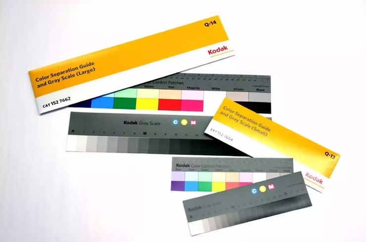
The process of creating scene-referred negative emulations requires a meticulous approach, combining traditional film stocks, digital cinematography, precise lighting conditions, and advanced post-processing techniques. This post outlines the essential tools, film stocks, and preparation steps necessary for accurate film profiling, which serves as the foundation for creating high-quality emulations. The aim is to develop LUTs (Look-Up Tables) that emulate the characteristics of film negatives, preserving their unique response to color and light.
1. Film Stocks
To establish a reliable baseline for negative emulations, it is essential to test and profile various film stocks. Luckily a few people already did all the Preparation Parts. I will use scanned film from Nico Fink, an Austrian colourist. He uses the following film stocks for profiling:
Kodak 200T (5213) 35mm Motion Picture Film
Kodak 500T (5219) 35mm Motion Picture Film
Kodak Porta 400 35mm Photo Film
Fuji Superia X-Tra 400
Silbersalz35 Kodak 50D, 250D, 500T & 200T Motion Picture Film (respooled for stills)
Silbersalz35 Fujifilm Vivid 500T Motion Picture Film (respooled for stills)
Rollei VarioChrome (Special Edition)
Agfa (expired 1979)
Some additional Stocks are tested as well, including Kodak 250D (5203), Kodak 50D (5207), Cinestill 800T, Fuji Provia 100, Fuji Velvia 100, Kodak Ektachrome E100, and Kodak Gold 200.
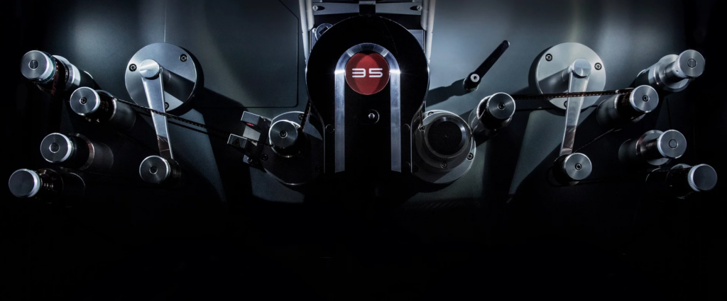
2. Digital Cameras for Profiling
He achieved comprehensive digital profiling, through a selection of high-end cinema cameras. These cameras are chosen based on their sensor characteristics, color science, and dynamic range:
ARRI Alexa Mini
RED Helium (initial test camera)
SONY FX9
Blackmagic Design Pocket 4K or 6K
Additional cameras, such as the RED Komodo, SONY VENICE, and Blackmagic Design URSAmini 4.6K G2, are also included depending on the project requirements.
3. Test Charts
Accurate scene-referred profiling requires precise test charts. These where used to calibrate color response and exposure latitude.
To achieve accurate film emulation, a combination of software tools was used for color matching and LUT generation:
Blackmagic Design DaVinci Resolve (primary color grading and LUT application)
The Foundry Nuke (for precise curve creation and LUT extraction)
Adobe Camera RAW (for stills conversion)
7. Workflow Overview
The workflow for scene-referred negative emulation consists of multiple controlled steps:
Conclusion
Capture test charts under controlled lighting conditions at 5600K and 3200K with a digital camera, exposing from -5 to +5 EV in 1-stop increments.
Expose the same test charts under identical conditions using film stocks.
Develop and scan negatives, ensuring high consistency in digital files.
Align digital and scanned film images in Nuke, adjusting for white balance and exposure.
Create a 1D LUT using grayscale steps for R, G, and B channels.
Use Resolve for color matching, refining the LUT with its built-in tools.
Alternative: Implement Tetrahedral 3D Interpolation via Blink Script for improved color accuracy.
Apply additional filmic effects, such as halation, grain, and gate weave, to enhance realism.
These Are the steps one one would have to make, to get an accurate result. It is very expensive and time consuming and there are so many complicated steps that can alter the result in a good and bad way. Luckily Nico Fink provides his scans for little price on his website. This saves a lot of time and the preparations are done by a professional. Now the digital Part starts. Embark with me on a technical journey on how to profile filmstock. We will try and Profile the EastmanEXR100T and 200T Filmstock.
Nachdem im ersten Blogpost nur grob der Themenbereich genannt wurde, hier noch einmal offiziell: Ich werde mich in diesem Semester mit dem Thema Motion Identity beschäftigen und im Zuge dessen natürlich auch eine entwickeln. Davor gibt es aber noch einiges zu Recherchieren und zu Analysieren! Zuerst schauen wir uns den groben Prozess der Erstellung einer Motion Identity an und finden raus, was da denn alles dazu gehört!
Anders als klassisches Motion Design, das eher projektbasiert, ästhetisch/funktional gestaltet wird, geht es bei der Motion Identity um ein tieferes, systemisches Verständnis für die „Bewegungs-DNA“ einer Brand. Die Entwicklung einer professionellen Motion Identity hat verschiedene Stufen im Designprozess, der Strategie aber auch kreatives Experimentieren und technisches Know-how. In großen Braning-Agenturen wird Motion-Design und die Motion Identity schon zu Beginn des Designprozesses mit-konzipiert und beeinflusst die Brandgestaltung maßgeblich, ähnlich wie Typografie, Farben und Komposition.
In diesem Blogpost möchte ich den Workflow dokumentieren, den ich mir für dieses Projekt zurechtgelegt habe, um eine Motion Identity zu entwerfen. Wir betrachten – weil ich noch unsicher bin worauf es schlussendlich hinaus läuft – zwei zentrale Szenarien: 1. Den Aufbau einer neuen Brand + Motion Identity von Grund auf 2. Die Integration einer Motion Identity in eine bestehende Markenwelt
Bevor es los geht schauen wir uns ein paar Beispiele an, um uns ein Bild davon zu machen, was uns am Ende dieser Reise erwartet:
Zu genaueren Analysen verschiedener Motion Identities kommen wir dann wahrscheinlich später im Prozess!
Also, wie komme ich von Zero zu einer gelungenen Motion Identity:
Herangehensweise 1: Aufbau einer Brand + Motion Identity von Grund auf
Vgl. Koto 2025; Vgl. Gleave Dawncreative 2024
1. Phase: Briefing und Strategie — Das Fundament der Motion Identity
Die erste Phase bei der Erstellung einer Motion Identity besteht aus Recherche zur Marke und Positionierung. Man beginnt hoffentlich auch damit, ein detailliertes Briefing einzuholen, in dem die Stakeholder den Umfang, die Ziele, den Zeitrahmen und das Budget des Projekts definieren (Vgl. Never Sit Still o.D.).
Inhalte des Briefings:
Wer ist die Marke?
Was sind Vision, Mission und Werte?
Wer ist die Zielgruppe?
Was sind zentrale Touchpoints (Website, App, Social Media, Videos, etc.)?
Welche emotionale Tonalität soll die Marke vermitteln? (z. B. verspielt, ernst, exklusiv, technologisch)
Welche Stilistik verfolgt das statische Corporate Design bereits?
Gibt es bestehende audiovisuelle Markenassets?
Ziel ist es, die Positionierung und den emotionalen Markenkern zu erfassen. „Motion reinforces a brand’s personality. To do that, you have to be very clear on just what that personality is“ (Vgl. Gleave Dawncreative 2024).
Diese Grundlage bestimmt später, welche Persönlichkeit ind den Formen oder auch Bewegungsmustern (z. B. verspielt, ruhig, präzise) entwickelt werden. Ein hilfreiches Werkzeug wenn es um Motion geht, sind z.B. Positionierungsskalen (Vgl. Gleave Dawncreative 2024), um visuelle und motion-relevante Attribute festzulegen. Zb.
Einfach ↔ Komplex >> Klarheit vs. Vielschichtigkeit
Zugänglich ↔ Exklusiv >> Breitenansprache vs. Premium
Traditionell ↔ Modern >> Klassisch vs. Zukunftsgewandt
Verspielt ↔ Ernst >> Locker vs. Seriös
Diese Skalen beeinflussen nicht nur Farbwahl und Typografie – sondern es lassen sich auch die späteren Bewegungsverhalten (z. B. dynamisch vs. ruhig) ableiten.
Schritt 2: Entwicklung der visuellen Identität
Auf Basis der strategischen Positionierung entsteht das visuelle Designsystem (darauf wird hier nicht genauer eingegangen):
Logo(s)
Typografie
Farbwelt
Iconografie
Raster- und Layoutsystem
Grafische Elemente (z. B. Linien, Muster, Illustrationen)
Dabei ist wichtig: Schon beim statischen Design an Bewegung denken! Wie wird sich das Logo bewegen? Wie harmoniert das Layout mit Motion Transitions?
Schritt 3: Erste Motion Exploration
Diese Phase konzentriert sich auf Forschung und Entwicklung der Bewegung. In diesem explorativen Stadium werden experimentelle Bewegungsstudien durchgeführt, um zu entdecken, wie sich bestehende Markenelemente bewegen und interagieren. Wie Never Sit Still betont, ist dieser Schritt entscheidend für die Entwicklung von Motion Principles, die die Grundlage eines Motion-Systems bilden (Vgl. Never Sit Still o.D.).
Die Entwicklung einer klaren Botschaft für dein Motion Design wird den Großteil der Entscheidungen bestimmen.
– Welche Geschichte soll die Bewegung erzählen? Kann sie die Markenwerte und die Persönlichkeit bzw. das Produkt oder die Dienstleistung erklären?
– Soll die Bewegung in den Produkten selbst vorkommen oder nur in der Kommunikation und im Marketing verwendet werden?
– Welche Emotionen sollen geweckt werden? Soll die Bewegung nur eine funktionale Unterstützung sein, oder soll sie ausdrucksstark sein?
– Was wollen wir an der Marke hervorheben? Ist sie mit einer bestimmten Kultur, einem Stil oder einem Genre verbunden?
Zu den wichtigsten Aktivitäten in dieser Phase gehören:
Bewegungsstudien für Logo-Dynamiken, Typografie-Verhalten und illustrative Elemente. (Wie kann das Logo auftreten/verlassen?)
Erstellung von Bewegungsprototypen mit verschiedenen Tools wie After Effects, oder Figma.
Vergleichende Analyse mithilfe von Skalen zur Definition des Bewegungsstils: billig vs. teuer, verspielt vs. ernst, traditionell vs. modern (Vgl. Gleave Dawncreative 2024).
Emotionale Mapping: Welche Art von Bewegung erzeugt das gewünschte Gefühl? Welche Art von Energie soll die Marke vermitteln? (Welche Bewegungsstile spiegeln die Marke? Verspielt = bounce, unvorhersehbare Bewegungen; Premium = langsam, subtil, minimal; Technologisch = präzise, linear, geometrisch)
Schritt 4: Entwicklung der Motion Principles
Dieser Schritt überführt das Experimentieren in ein kohärentes System. Motion Principles definieren wie Bewegung das Verhalten und den Tonfall der Marke unterstützt, während Motion Mechanics spezifische Animationsstile und -verhalten beschreiben (Vgl. KOTO 2025).
Motion Principles definieren typischerweise:
– Geschwindigkeit und Rhythmus (langsam, schnell, elastisch)
– Richtung und Bewegungsachse
– Energiedynamik (hüpfend, fließend, scharf)
Motion Mechanics umfassen:
– Spezifische Techniken wie Slide-Ins, Bounce-Ins, Fade-Outs, Zooms
Diese Definitionen gewährleisten Konsistenz über alle Formate und Ausgaben hinweg. Dieser Grundbauplan für das spätere System ist vergleichbar mit einem Styleguide für visuelle Gestaltung. (Vgl. Never Sit Still o.D.; Vgl. IBM Design Language 2023)
Schritt 5: Aufbau eines Motion Systems
Sobald die grundlegenden Prinzipien festgelegt sind, ist eine Verfeinerung erforderlich, um Skalierbarkeit und Praktikabilität sicherzustellen. Basierend auf den Prinzipien entsteht also das Motion System: Ein systemischer Baukasten, der genau definiert, wie sich welche Elemente bewegen.
Beispielhafte Module:
Logoanimation
Typo-Ein- und Ausblenden
Übergänge zwischen Content-Blöcken
Lower Thirds
UI-Elemente: Buttons, Toggles, Formfelder
Auch die Easing-Kurven werden standardisiert: (z. B. ease-in-out für organische Übergänge, bounce für dynamischen Effekt)
Tipp: Entwickle „Motion Mechanics“ – wiedererkennbare Bewegungsmuster mit Alleinstellungsmerkmal.
Zu dieser Phase gehört:
– Testen über verschiedene Plattformen hinweg (Web, Mobile, Video, Print) – Anpassung der Bewegungsparameter basierend auf Nutzerfeedback und Zugänglichkeitsstandards – Festlegung von Bewegungs-Hierarchien (z. B. primäre Bewegungen für große Übergänge, Mikro-Interaktionen für UI/UX) (Vgl. Never Sit Still o.D.).
Es gibt eine große Bandbreite an Motion, die in unterschiedlichen Kontexten und mit unterschiedlichen Absichten eingesetzt werden kann.
Bei der Entwicklung eines Motion-Systems oder der Guidelines ist es hilfreich, eine Vorstellung davon zu haben, wie Marken typischerweise mit Bewegung umgehen. Hier also ein kleiner Cheat-Sheet von KOTO (https://offbrandkoto.substack.com/p/reel-talk-the-power-of-branded-motion), der die typischsten Anwendungsfälle für Motion in einer Brand festhalten.
Motion Guidelines als PDF mit detaillierten Bewegungsprinzipien, -mechaniken und Anwendungsbeispielen (inkl. Timing-Tabelle, Easing-Library)
Komponentenbibliothek
ev ein Präsentationsdecks für interne und externe Stakeholder (Vgl. Never Sit Still o.D.)
Dadurch wird die Anwendung im Team vereinfacht – von Design bis Video Editing. Dieses Toolkit ist entscheidend für die Markenkonsistenz, insbesondere wenn mehrere Teams oder Agenturen an der Inhaltsproduktion beteiligt sind.
Schritt 7: Anwendung & Testing
Nun erfolgt der Rollout in allen Medienformen. Die Anwendung des Motion-Identity-Systems in realen Szenarien ist der ultimative Test für seine Wirksamkeit. Dazu gehören:
Website und App-Interaktionen (Hover-Zustände, Button-Klicks, Seitenübergänge)
Social Media Content (Intro/Outro-Karten, kinetische Typografie, animierte Infografiken)
Videoproduktion (Intros, Outros, Transitions)
Broadcast- und Präsentationsvideos, Pitchdecks (Logo-Animationen, Erklärvideos, Lower Thirds)
Schritt 8: Pflege & Weiterentwicklung
Motion Identities sind kein statisches Projekt – sie leben mit der Marke mit. Marken entwickeln sich weiter, und das sollte auch ihre Bewegungssprache tun. Bewegungssysteme solltenmodular und erweiterbar sein, um sich an zukünftige Markenerweiterungen und neue technologische Medien anzupassen (Vgl. KOTO 2025).
Regelmäßige Audits und Feedback-Zyklen können helfen:
– Veraltete Bewegungs-Assets zu identifizieren
– Die Zugänglichkeit und das Nutzererlebnis zu verbessern
– Sich an sich ändernde Markenstrategien anzupassen
Tipp: Auch Accessibility-Kriterien (z. B. „reduce motion“ Systemoptionen) sollten regelmäßig geprüft und angepasst werden.
Herangehensweise 2: Integration einer Motion Identity in eine bestehende Marke
Vgl. Gleave Dawncreative 2024; Vgl. Never Sit Still o.D.
Schritt 1: Analyse der bestehenden Marke
Zunächst muss klar sein:
Was ist die aktuelle Markenpersönlichkeit?
Welche Emotionen vermittelt das Design?
Welche Positionierung liegt vor?
Positionierungsskalen helfen auch hier zur Einordnung: „Wenn die Marke ernst, minimal und technologisch wirkt – wie muss dann Bewegung gestaltet sein?“ (Siehe oben)
Schritt 2: Motion Audit
Gibt es bereits Bewegungen?
Videos?
Microinteractions im Interface?
Transitions?
Oft zeigt sich: Es gibt Inkonsequenz, die durch ein konsistentes Motion System gelöst werden kann.
Schritt 3: Motion-Ziele definieren
Welche Funktion soll Motion erfüllen?
Storytelling?
UX-Optimierung?
Brand Recognition?
Welche Emotion soll transportiert werden?
Wo soll Bewegung auftreten – wo nicht?
Schritt 4: Motion Prinzipien festlegen
Basierend auf der bestehenden Brand:
Easing-Typen
Timings
Energielevel
Animationscharakter
Wichtig: Bewegung muss das ergänzen, was die visuelle Marke vorgibt. [Details siehe Prozess oben]
Schritt 5: Animation der zentralen Brand-Elemente
[Details siehe Prozess oben] Alle weiteren Schritte wie oben
Und “few common mistakes to avoid” als Liste von KOTO (Vgl. KOTO 2025):
Don’t overdo it: Too much or overly flashy motion can be distracting. Treat motion like any other design element—focused and intentional. Always return to your strategy to create meaningful movement instead of digital clutter.
Don’t neglect the bigger picture: Every piece of motion should align with your overall strategy and strengthen your brand identity. Ignoring this can weaken your brand’s impact.
Don’t underestimate quality: If you don’t have the resources for high-quality motion design, stick with polished static designs. A professional-looking static asset is always better than poorly executed motion.
Accessibility is key: Motion design should include everyone. Add audio captions where needed and use Harding-FPA tests to ensure flash-heavy videos are safe for those with epilepsy.
Zirka so würde ich im Prozess dann auch vorgehen… hoffe ich! Wir werden sehen! Weiter geht es damit, Inspiration zu sammeln und eine Brand zu (er-)finden, mit der ich arbeiten möchte!
Quellen:
KOTO 2025 KOTO (18.02.2025): Reel talk: the power of branded motion design. In: offbrandkoto, https://offbrandkoto.substack.com/p/reel-talk-the-power-of-branded-motion (zuletzt aufgerufen am 16.03.2025)
Never Sit Still o.D. Never Sit Still (o.D.): Motion Branding. In: Never Sit Still, https://neversitstill.com/motion-branding(zuletzt aufgerufen am 16.03.2025)
*Zuhilfenahme von ChatGPT: Die KI wurde zur Übersetzung, Korrektur und Formulierungshilfe von Texten verwendet. Alle Inhalte wurden anschließend eigenständig ausgewertet, überarbeitet und in den hier präsentierten Beitrag integriert.
Wir leben in einer zunehmend visuell überladenen, lauten und digitalen Welt. Sei es Social Media, Web oder täglich benutzte Apps und „In a world where watching big screen while holding little screen is a relatable feeling, motion is essential, not optional.“ (Vgl. KOTO 2025).
Deshalb wird auch von Brands und Marken erwartet, dass sie auf dynamische, einprägsame und emotional ansprechende Weise mit ihrem Publikum kommunizieren. Viele Marken tendieren immer noch dazu, erst an ihre Motion-Language zu denken, wenn sie plötzlich einzelne bewegte Elemente brauchen, weshalb es oft keine oder wenig Guidelines dafür gibt. Brands starten deshalb jedes mal aufs neue von Null, wenn es um die Konzeption bewegter Elemente geht, was den Prozess ineffizient macht und in einer „moving-image-first“-Welt durchaus für Schwierigkeiten sorgt. Hier kommt die Motion Identity (auch bekannt als Motion Branding oder Motion Design Systems) ins Spiel.
Was ist Motion Identity?
Die Motion Identity ist ein Teil der Visual Identity eines Unternehmens und bezieht sich auf die gezielte und strategische Anwendung von Motion Design auf verschiedene Markenelemente.
Bewegung wird so als wichtiger Kern-Bestandteil der Markenidentität (Corporate und Visual Identity) betrachtet. Während klassische Markenidentitäten primär visuelle Komponenten wie Logo, Typografie, Farben oder Bildsprache definieren, erweitert eine Motion Identity diese Elemente um eine bewegte und dynamische Dimension: Sie beschreibt, wie sich eine Marke bewegt – also, wie sich Logos, Typo, Icons, Layouts und visuelle Elemente im digitalen Raum verhalten (Vgl. KOTO 2025).
Diese Bewegungsmuster sind nicht nur Deko, sondern kommunizieren die Werte, den Charakter und die Haltung einer Marke auf eine subtile und emotionale Art. Die Bewegungen sind wiedererkennbar, präzise definiert und konsistent über alle Kanäle/Touchpoints hinweg. Man nennt es auch eine „Motion Language“ – ein Set aus Bewegungsprinzipien, das über alle Kanäle hinweg Anwendung findet.
Ein solches System entsteht nicht zufällig, sondern durch exploratives Design und präzise Definition in Form von Motion Guidelines, Toolkits und definierter Animationstechniken. (Vgl. Never Sit Still o.D.)
Warum ist eine Motion Identity wichtig?
Wir leben in einer „motion-first world“: Marken werden heutzutage überwiegend in digitalen und bewegten Kontexten wahrgenommen, sei es in Apps, auf Websites, durch Reels, TikToks, Instastories, Showcases, Onboarding Screens oder Werbevideos. Die Ära der rein statischen Corporate Identity naht dem Ende und was früher als eine Ergänzung der Markenidentität galt, ist heute einer der erste Kontaktpunkte: Motion. (Vgl. KOTO 2025) Bewegung wird immer mehr zu einem der primären Informationsträger. Im Gegensatz zu statischen Branding-Elementen fangen Bewegungselemente die Aufmerksamkeit der Betrachter:innen viel schneller ein, vermitteln Emotionen mit zusätzlichen Nuancen und schaffen immersive Markenerlebnisse. (Vgl. Gleave Dawncreative 2024)
Motion Identity spielt eine entscheidende Rolle bei der Steigerung der Markenwahrnehmung. Wenn sie effektiv umgesetzt wird, fördert sie die Wiedererkennung, verstärkt zentrale Markenbotschaften und verbessert das Nutzererlebnis. (Vgl. KOTO 2025).
Motion Identity überbrückt auch die Lücke zwischen Storytelling und Branding, denn Motion Design und Bewegung ist wie dafür geschaffen, Geschichten zu erzählen. Storytelling kann den Wert eines Produktes um bis zu 2706% steigern (https://www.go-globe.com/storytelling-statistics-trends-infographic/#:~:text=Furthermore%2C%20research%20indicates%20that%20stories%20have%20the%20potential%20to%20boost%20product%20perception%20by%202%2C706%25), und schon minimale Transitions (zB im Logo) können eine eben solche Geschichte erzählen! (Vgl. KOTO 2025)
Ein starkes Motion-System bietet einen Rhythmus und Stil, der emotional mit den Nutzern resoniert und den Charakter der Marke symbolisiert. An einem heruntergebrochenen Beispiel erklärt, könnte eine Premium-Marke langsame, sanfte und bewusste Bewegungen und Übergänge verwenden, um Eleganz und Raffinesse zu vermitteln, während ein Tech-Startup schnellere, modularere Bewegungsverhalten einsetzen könnte, um Agilität und Innovation zu signalisieren (Vgl. Gleave Dawncreative 2024).
Vorteile von Motion Identity:
Emotionale Wirkung: Motion ruft sofort eine emotionale Resonanz hervor und transportiert Tonalität und Markenwerte genauso schnell und sogar schneller als Text oder Farbe.
Erhöhte Wiedererkennbarkeit: Logoanimationen, gut eingesetzte Bewegungsmuster oder Transitions erhöhen den Wiedererkennungswert, besonders auf Social Media oder im UX-Kontext.
Informationsvermittlung: Animation unterstützt die kognitive Verarbeitung, denn sie können Hierarchien deutlich aufzeigen, Abläufe erklären und Nutzer:innen durch komplexe Inhalte führen.
Differenzierung: In einem überladenen digitalen Umfeld ist Bewegung ein starker Differenzierungsfaktor und eine eigene Motion Identity hilft womöglich dabei, sich von der Konkurrenz abzuheben.
Anpassen ist einfach: Motion-Systeme können in allen Formaten flexibel angewendet werden – von Microanimation bis Showreel
Consistency in UX: Bewegungsmuster können Navigation, Feedbackmechaniken und Benutzerführung standardisieren und verbessern, was besonders in Apps und auf Websites wichtig ist.
Motion ist also mehr als nur ein Stilmittel – Es ist ein strategisches Werkzeug im Branding (der Markenbildung). „Motion reinforces a brand’s personality“ – das bedeutet, dass die Art der Bewegung genau auf die Markenwerte abgestimmt sein muss: verspielt, klar, ruhig oder dynamisch. Eine einfache Slide-in-Animation kann professionell oder verspielt wirken – je nach Kurvengeschwindigkeit, Timing, Form oder Typo. (Vgl. Gleave Dawncreative 2024)
How much motion does a brand need?
Nicht jede Marke braucht spektakuläre Animationen. Die Menge an Animation hängt von der Persönlichkeit der Marke und vom Anwendungskontext ab:
Low-Motion – Animierte Brand-Assets: Schon ganz dezente Bewegungen können die Werte einer Brand vermitteln, z. B. durch typografische Transitions oder reduzierte Logoanimationen. Startet man mit den Basics und dem Motto „Keep it simple“ reicht es schon, sich mit dem Logo, Symbolen und ev. Überschriften zu beschäftigten
Mid-Level Motion – Motion Systems: Man empfiehlt immer zumindest das basis-level an Motion in einem Branding zu beachten, ultimativ lassen sich aber schnelle und praktische Sets und Systeme für Motion erstellen. Diese sogenannten Motion Systems machen es einfacher, die Bewegungen „up-zu-scalen“, ohne dauerhaft Dinge neu erfinden zu müssen. Durch ein Set an Assets rund um das Thema Motion, kann so vieles abgeleitet werden.
High-Motion Brands — Guidelines und Toolkits: Marken mit vielen digitalen Kontaktpunkten (wie Tech-, Media- und Lifestyle-Unternehmen) brauchen oft eine sehr ausgeprägte Motion Identity und ein gut anwendbares Motion System. Es bietet sich an „accessible and straightforward“ Guidelines zu entwickeln, die dem Team und allen Beteiligten erklärt, wie sich die Brand bewegt. Das stärkt nicht nur das Brand-System, es ermglicht auch ein flexibles Anpassen und Erweitern. Sogenannte Motion Toolkits werden für „motion-heavy industries“, wie Live-TV verwendet. Hier werden editierbare, automatisch anpassbare oder sich ständig updatende Dateien erstellt, die schnell (oder sogar in Echtzeit) mit Daten und Eingaben arbeiten.
Die Regel lautet wie so oft „As much motion as necessary – not as much as possible.“, denn zu viel Animation wirkt überladen und kann ie Nutzer:innen wie auch die Technik überfordern. Ziel ist es, genau so viel Bewegung einzusetzen, wie es der Markenbotschaft, der Plattform und dem Publikum entspricht.
Motion Design vs. Motion Identity vs. Motion System
Das hier ist auch der richtige Moment um die Begriffe ein wenig voneinander zu differenzieren:
Motion Design, ist die Gestaltung einzelner bewegter Inhalte – z. B. Videos, Transitions oder Animationen. Hier liegt der Fokus auf der Kreativität und visueller Umsetzung. Motion Identity, ist die strategisch definierte Bewegungssprache einer Marke – Sie ist systematisch, konsistent und auf Markenwerte abgestimmt und damit ein Teil der Markenidentität. Motion Systems sind technisch-kreative Frameworks die aus Prinzipien, Guidelines, Tools und Templates bestehen. Sie definieren, wie und wo Bewegung markenkonform eingesetzt werden können. (Vgl. Dickinson 2024)
Schlüsselelemente eines Motion-Identity-Systems
– Motion Principles: Grundlegende Regeln, die die Verwendung von Bewegung über verschiedene Markenelemente hinweg steuern. Sie definieren Timing, Geschwindigkeit, Richtung und Easing-Kurven.
– Motion Mechanics: Spezifische Techniken wie Slide-Ins, Fade-Outs, Bounce-Effekte, Skalierung und Rotation, die ein visuelles Vokabular für Bewegung bieten.
Motion Behavior: Die kinetische Signaturpersönlichkeit einer Marke – ihr Rhythmus, Tempo und ihre Elastizität.
Anwendungsrichtlinien: Diese gewährleisten die Konsistenz bei der Anwendung von Bewegung über digitale, gedruckte und umgebungsbezogene Touchpoints hinweg (Vgl. KOTO 2025; Vgl. Never Sit Still o.D.).
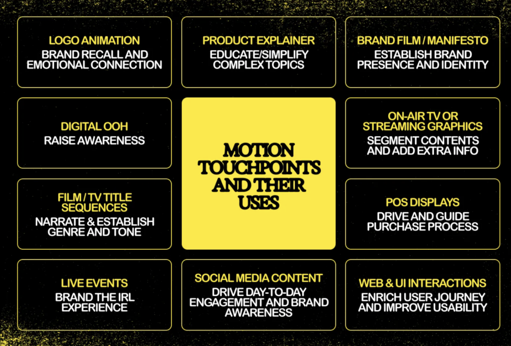
Abschließend ein Bild mit ein paar der wichtigsten Touchpoints der Motion Identity:
Motion Identity nicht mehr nur eine oberflächliche, ästhetische Verbesserung, sondern viel mehr ein zentraler Bestandteil moderner Markensysteme! Sie verleiht einer Marke eine Stimme und verbessert sowohl die visuelle Kommunikation als auch die Nutzerinteraktion. Da sich die digitalen Medien immer weiter entwickeln, wird auch die Motion Identity eine immer wichtigere Rolle in der Bereitstellung konsistenter, emotional ansprechender und user-centered Marken spielen.
KOTO 2025 KOTO (18.02.2025): Reel talk: the power of branded motion design. In: offbrandkoto, https://offbrandkoto.substack.com/p/reel-talk-the-power-of-branded-motion (zuletzt aufgerufen am 16.03.2025)
Never Sit Still o.D. Never Sit Still (o.D.): Motion Branding. In: Never Sit Still, https://neversitstill.com/motion-branding(zuletzt aufgerufen am 16.03.2025)
*Zuhilfenahme von ChatGPT: Die KI wurde zur Übersetzung, Korrektur und Formulierungshilfe von Texten verwendet. Alle Inhalte wurden anschließend eigenständig ausgewertet, überarbeitet und in den hier präsentierten Beitrag integriert.
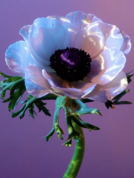
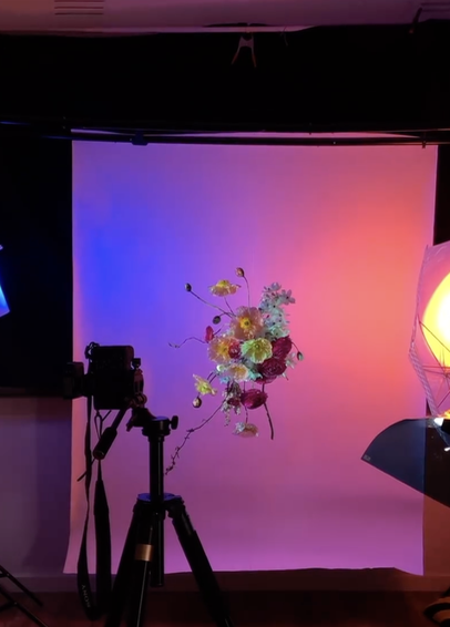
I’ve been interested in projection mapping for a while now, but I never got around to trying it so far. It always seemed like one of those things that required a lot of technical knowledge, and I wasn’t sure where to start. This semester, I finally decided to change that and use it as my practical project. My plan is to document the whole process—from figuring out the basics to creating a finished projection. Since I have no experience with projection mapping or the software involved, I will be starting completely from the start.
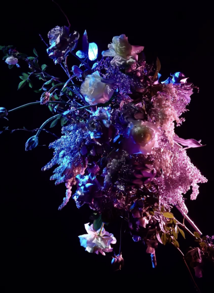
The idea would be to project onto different kinds of flower bouquets hereby working with a different more organic shape to project onto That makes things a bit more difficult because flowers aren’t flat, so I’ll need to be more precise to make it work and maybe do a bit of trial and error to achieve the visuals I want. But before I even get to that part of the project, I need to figure out which software I will be learning to use for this project.
Right now, I don’t have a clear concept yet, just a rough idea of the direction I want to go in. I know I want to create something immersive and simply learn more about projection mapping. I like the contrast between nature and digital projections, and flowers seem like an interesting choice because they’re delicate and always changing. That also makes them a challenge, since most projection mapping is done on flat, static surfaces. I have no idea how well this will work, but that’s part of the reason I want to give it a try.
When researching projection mapping, I quickly realized that there are a lot of ways to approach this but also a lot of different softwares to learn and use. Three of the most commonly used programs that spoke to me are MadMapper, Resolume, and After Effects. Each of them has a different focus, so choosing the right one depends on the specific needs that it can be used for.
Choosing the Right Software
MadMapper for example is one of the most well-known tools for projection mapping. It’s designed specifically for this purpose, making it a strong candidate. It allows users to easily map visuals onto different surfaces, and from what I’ve seen so far, it seems relatively intuitive when starting to learn it.
Resolume is often used by VJs and performers who need real-time video editing and projection. It has strong capabilities for live performances, which makes it different from MadMapper. However, I’m not sure if it’s the best option for a pre-planned, artistic projection onto flowers and it also seems a bit more complex to get into as a beginner.
After Effects is an industry-standard tool for animation and motion design. While it’s not a projection mapping software per se, it allows for highly detailed animations. The downside is that it doesn’t work in real-time, meaning I’d need to pre-render all visuals before projecting them onto the surfaces I plan on using. This could be fine in general however when using different flowers I would constantly have to go back and forth.
My next step will be to test them out and see how they function in practice. I expect that hands-on experimentation will give me a clearer idea of which tool fits best.
First Practical Steps
To get started with the practical part, I plan to do some small projection tests. Rather than jumping straight to mapping onto flowers, I will begin with a flat surface as they are easier to start with. This will help me understand the basic workflow of the software I choose and allow me to focus on the technical side before adding any more complexity to the whole project.
When starting to test simple projections, I will create a basic shape or animation and project it onto a blank wall or another flat surface to understand how the software works. Following that, I want to experiment with 3D surfaces. Once I am more comfortable with flat surfaces, I will move on to objects with different textures and shapes to see how projection mapping handles uneven surfaces. Another option would be to try different software, where I could compare MadMapper, Resolume, and After Effects to see which one feels most intuitive and produces the best results. However, I might already decided what platform I want to use based on the previous research I did for each of them. After deciding on the software, I will begin designing the visuals for my projection that will be later used for the flowers. Following that will be a lot of trying out and testing, supported by learning from different tutorials and research.
Challenges and Considerations
One of the biggest challenges I think I will encounter is getting into the platform I will choose as well as working with organic shapes later on in the project. Unlike traditional projection surfaces like buildings or screens, flowers are delicate and constantly shifting in shape when using different ones. This means I need to find a way to adapt the projections dynamically or carefully plan around their natural form.
Another technical challenge will be aligning the projections accurately. Since flowers are small and three-dimensional, any misalignment will be much more noticeable than on a larger, flat surface. I may need to experiment with different positioning techniques or adjust the projection settings frequently.
From a creative perspective, I also need to consider what kind of visuals will work best on such an unusual surface. The question is do I want to focus on abstract patterns, realistic imagery, or something completely different? This will be part of my exploration in the coming weeks.
Next Steps
As I move forward, I’ll keep documenting both my research and practical progress. My next steps will focus more on refining the concept and understanding the technical side of projection mapping.
Continue researching projection mapping on organic objects, especially how light interacts with different textures like flowers, fruits, and fabric
Compare software options: After Effects and MadMapper seem the most relevant, but I want to understand their limitations before committing to one
Develop a clearer creative direction, looking at how textures and colors can enhance natural forms
Start thinking about technical challenges, like how to align projections correctly on uneven surfaces and how different materials react to light
For this semester’s practical part of the course I decided to plan, film and edit a first, very short documentary-like video in preparation for my documentary project at the end of the Master’s. I want to analyse which steps have to be taken beforehand, how filming something like this might look like and what to keep in mind during the editing. Moreover, I wanted to streamline and optimise my filming setup as much as possible during this first “trial run”, given that I don’t know, how big of a crew I will have to support me for my final project. This means, seeing how much of the work I can do by myself and how to organise help for parts where I need it. When trying to come up with a topic for the short documentary, I knew I wanted to focus on a group or organisation in Graz that inspires and interests me. This was when I remembered having been to 2 events in the past where people could come together, enjoy drinks and music, generally have a good time, and raise awareness of an important issue at the same time while listening to interesting speeches.
The Topic
Both of these events were held under the name “Auto:Frei:Tag”, which is exactly what the name suggests; an event on a Friday where one or multiple roads get blocked for car traffic and taken over by a small street-celebration. The organisation behind it supports individuals, shops or clubs wanting to organise their own car-free Fridays by providing posters, music, tables, chairs and much more. The idea of it all is to raise awareness to what our inner cities could potentially look like if they were not designed with mainly cars in mind. There is so much space in Graz’s inner city which could be used differently and organising events where this space is taken back, if just for one afternoon, shows how big the problem currently is and what a greener future might look like.
The First Steps
What I have done so far is reach out to the organisation, seeing if they would even be willing to collaborate with me for this project. I have also had a first meeting with some of the members, asking and answering questions about my plans and creating a rough framework as to what the final product might look like. I decided to keep the length of the video under 10min and to focus mostly on presenting what “Auto:Frei:Tag” even is and what they do, without going into too much detail on the issues behind it or trying to convince anyone to completely change their ways, as that would take up too much time in the video. This means that for my target group I have decided to focus mostly on young adults which already have a certain interest and awareness of sustainability topics and are open and willing to learn about new ways they can support certain causes and focus their energy and motivation.
Next Steps
During our meeting, I also got a lot of helpful input on possible sources for information on the topic and experts who might be interested in participating in my documentary. So for my next steps, I want to do some research on the topic of traffic politics in Graz as well as on some of the mentioned experts, as well as reach out to a few of them, asking whether they would be willing to give interviews on the topic. I want to include interviews with one expert as well as one member of the organisation as well as interviews with visitors and participants of the Auto:Frei:Tag. Moreover, I want to film at one of the car-free Fridays. Due to the very loose organisational structure, these events are sometimes planned quite spontaneously and there is not one planned yet for this year. This means that for filming at an actual event I will still have to wait until I hear from them, but I can plan my shots beforehand as well as do research on the topic and plan and film interviews beforehand. For my next blogposts I want to focus on researching the actual production process of a documentary film as well as do some research into the topic of my video in order to be able to ask the right questions.
In diesem Artikel sollen folgende Fragen untersucht werden:
Was ist eine audioreaktive Animation?
Welche Funktionen bieten Blender und Cinema 4D?
Welche Vorteile bietet diese Technik für ein Videomapping gegenüber einer herkömmlichen Animation?
Was ist eine audioreaktive Animation?
Eine audioreaktive Animation beschreibt den Prozess, bei dem ein Audiosignal von der Animationssoftware erkannt und als Information weiterverarbeitet wird, um bestimmte Parameter eines Objekts zu verändern. Ein einfaches Beispiel: Wird eine Kickdrum im 4/4-Takt mit 90 BPM (Beats Per Minute) erkannt, kann der entsprechende Frequenzbereich ausgewählt werden, um beispielsweise die Größe einer Kugel zu steuern. Die Skalierung der Kugel würde sich dann synchron zum Beat der Kickdrum verändern.
Die Herausforderung besteht darin, gezielt Einfluss auf die gewünschten Parameter wie Skalierung, Position oder Farbe zu nehmen und gleichzeitig dynamische Anschlags- und Ausklangszeiten zu definieren, um eine flüssige, ansprechende Animation zu erzeugen, die harmonisch mit der Musik interagiert.
Blender und Cinema 4D bieten hierfür unterschiedliche Ansätze und Werkzeuge, um audioreaktive Animationen umzusetzen.
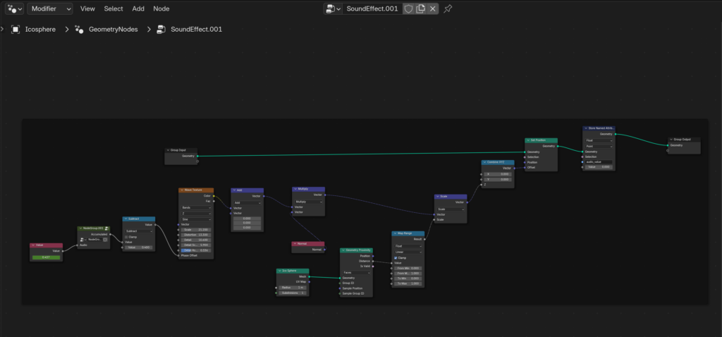
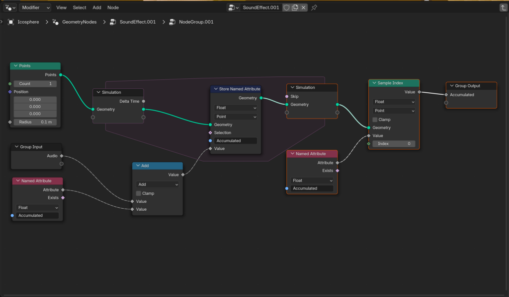
Audioreaktive Animation in Blender mit Geometry und Simulation Nodes
In Blender ermöglichenGeometry Nodes, 3D-Objekte prozedural zu erstellen, zu verändern und zu animieren, indem visuelle Knoten (Nodes) miteinander verbunden werden.
Ein häufiger Ansatz ist es, einen Keyframe auf einen Value Node zu setzen und diesen mit einer Audiodatei zu verknüpfen. Je nach ausgewähltem Frequenzbereich wird der Wert des Nodes dynamisch beeinflusst. So lassen sich die Eigenschaften eines geometrischen Objekts, wie Skalierung, Position oder Rotation, direkt durch das Audiosignal steuern.
Besonders interessant sind die Simulation Nodes, die es ermöglichen, komplexe Bewegungen und Interaktionen zu generieren. Dies umfasst Loop-basierte Simulationen, die über mehrere Frames hinweg berechnet und präzise gesteuert werden können. Dadurch lassen sich flüssige Bewegungen und dynamische Ease-In- und Ease-Out-Animationen erzeugen, die nahtlos auf Audiosignale reagieren.
Audioreaktive Animation in Cinema 4D mit Soundfields und Mograph
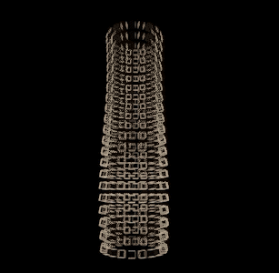
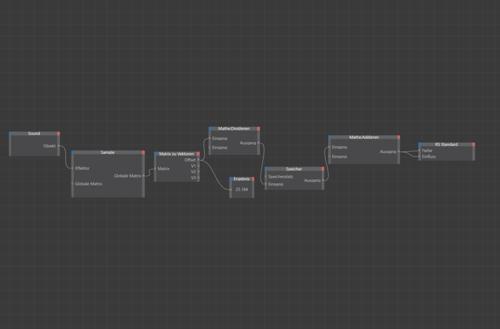
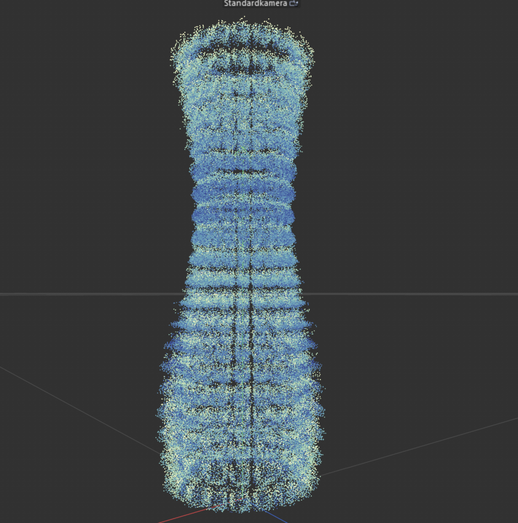
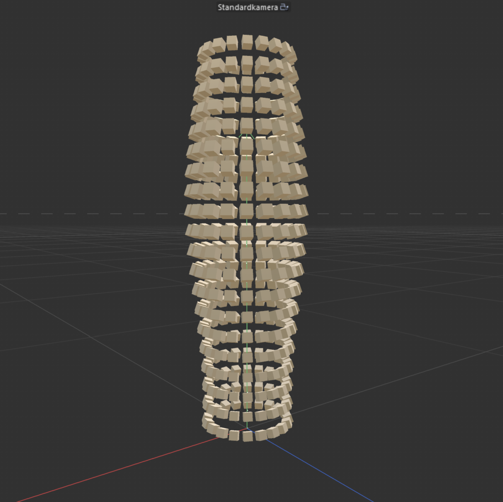
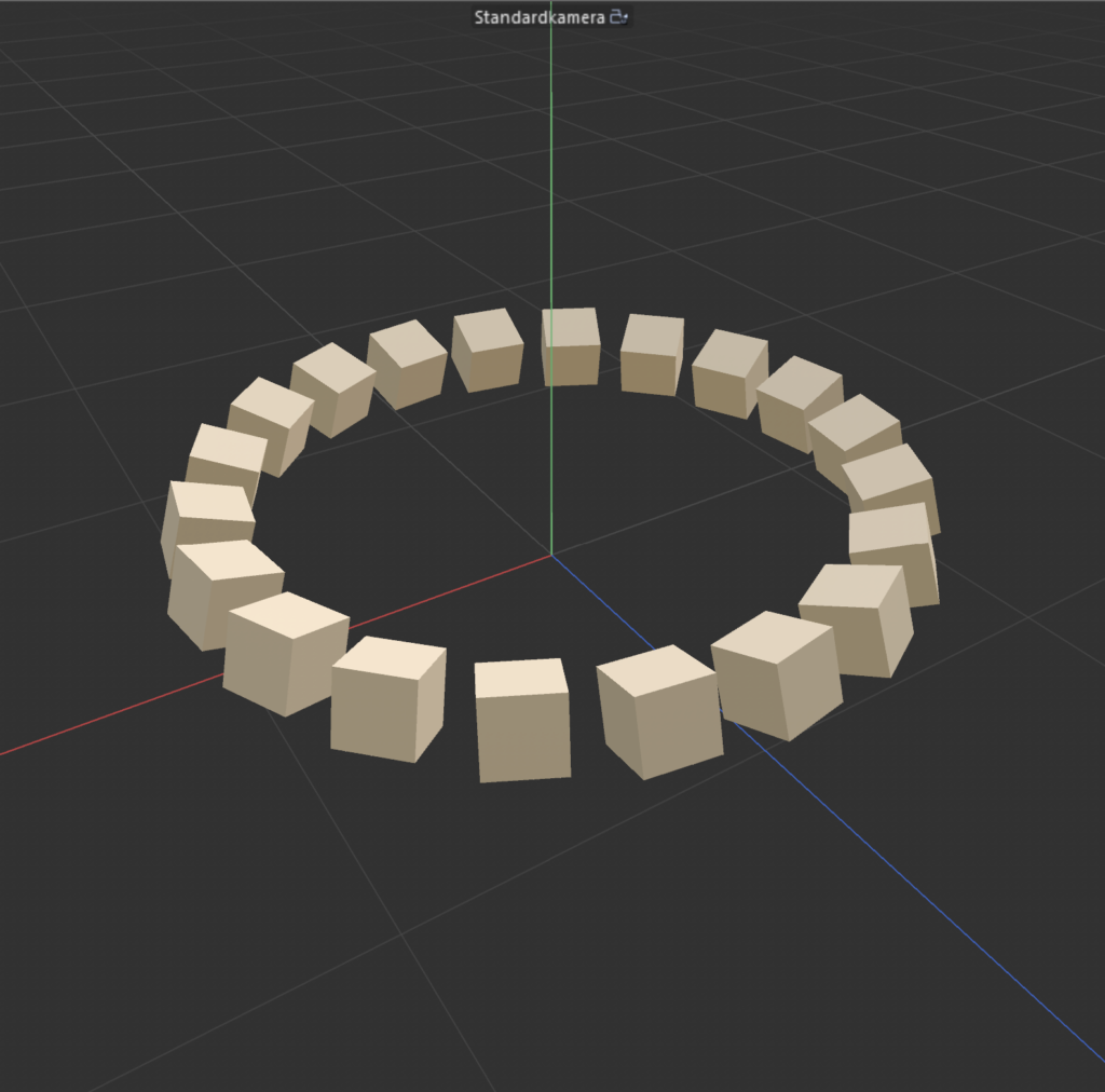
Cinema 4D bietet mit seinen Soundfields und Mograph-Tools eine benutzerfreundliche Möglichkeit, audioreaktive Animationen zu erstellen.
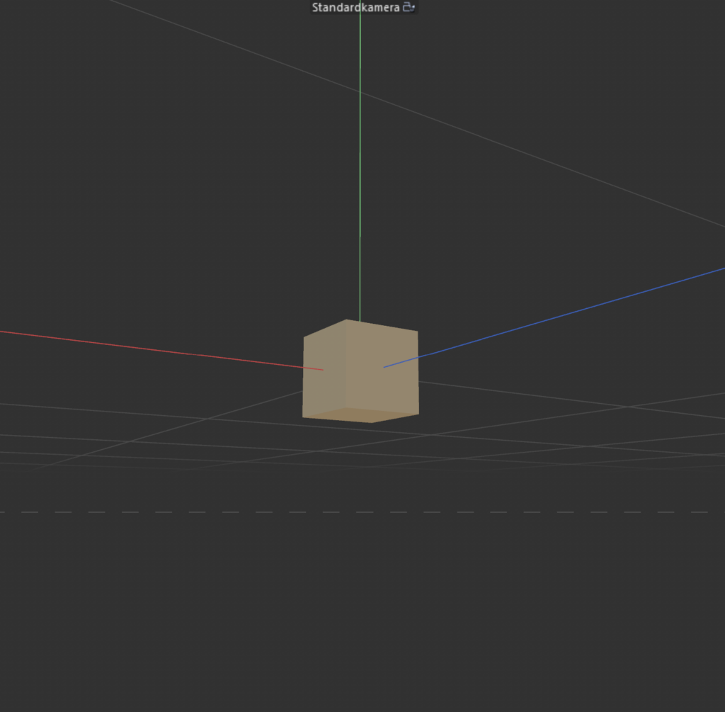
In meinem Beispiel wird ein Cube mehrfach geklont und über einen Schritt- und Formeleffektor, die beide ein Soundfield enthalten, animiert. Die Klone werden dann als Simulationsobjekte definiert, um eine Partikel-Replikation des ursprünglichen Turms zu erzeugen.
Das Soundfield ermöglicht es, Audiosignale direkt auf Parameter wie Position, Skalierung oder Rotation zu übertragen, was besonders für rhythmische oder abstrakte Animationen nützlich ist.
Vorteile für ein Videomapping gegenüber herkömmlichen Animationen
Im Kontext des Videomappings bieten audioreaktive Animationen erhebliche Vorteile, insbesondere bei der Gestaltung von längeren Visualisierungen, da sie zum Großteil ohne Keyframes auskommen und die Musik den Rhythmus vorgibt.
Ein besonderer Vorteil zeigt sich, wenn das Sounddesign selbst entwickelt wird. In diesem Fall entsteht eine einzigartige Symbiose zwischen Bild und Ton. Durch gezieltes Komponieren und das Einsetzen bestimmter Sounds und Frequenzen übernimmt der Sounddesigner gewissermaßen auch die Rolle des Animators.
Warum diese Technik besonders für Videomapping geeignet ist:
Echtzeit-Reaktion: Visuelle Effekte können live auf Musik reagieren.
Effizienz: Keine manuelle Anpassung von Keyframes erforderlich, die Animation passt sich dynamisch an.
Kohärentes Erlebnis: Durch die direkte Verbindung von Ton und Bild entsteht ein intensiveres visuelles Erlebnis.
Flexibilität: Änderungen im Audiosignal erfordern keine zeitaufwendige Anpassung der Animation.
Blender featuring C4D – Ein möglicher hybrider Workflow für die Zukunft?
Eine vielversprechende Methode, die Stärken beider Programme zu kombinieren, wäre der Einsatz von FBX, OBJ oder Alembic-Dateien, um Meshes und Animationen, die in Blender mit Simulation Nodes erstellt wurden, in den Workflow von Cinema 4D zu integrieren, um dort weiterverarbeitet zu werden.
So lassen sich die prozeduralen und simulationsbasierten Möglichkeiten von Blender mit den intuitiven Tools und der Benutzerfreundlichkeit von Cinema 4D verbinden, um ein noch leistungsfähigeres Setup für audioreaktive Animationen zu schaffen.
🤖🧠Disclaimer zur Nutzung von Künstlicher Intelligenz (KI):
Dieser Blogbeitrag wurde unter Zuhilfenahme von Künstlicher Intelligenz (ChatGPT) erstellt. Die KI wurde zur Recherche, zur Korrektur von Texten, zur Inspiration und zur Einholung von Verbesserungsvorschlägen verwendet. Alle Inhalte wurden anschließend eigenständig ausgewertet, überarbeitet und in den hier präsentierten Beitrag integriert.
Das Ziel des zweiten Design & Research Projekts im Masterstudiengang CMS24 besteht darin, einen Prototypen zu entwickeln, der im weiteren Verlauf auch für die Masterarbeit von Bedeutung sein wird. Dieser Prototyp dient als experimentelles Werkzeug zur Untersuchung der Rolle von Videomapping als künstlerische Technik zur Veränderung der architektonischen Wahrnehmung durch Licht und Bewegung.
Anpassung der Forschungsfrage
Zunächst möchte ich die zentrale Forschungsfrage anpassen, bzw. um einen neuen Gedankenimpuls erweitern. Anstatt nur den kulturellen Kontext des Gebäudes zu berücksichtigen, soll auch die Auswirkung der Projektion auf die Architektur untersucht werden: „Wie kann Videomapping als künstlerische Technik die Wahrnehmung von Architektur durch Licht und Bewegung verändern?“
Folgende Themenbereiche dienen als theoretische Grundlage:
Geschichte des Lichtdesigns in der Architektur
Wahrnehmungspsychologie von Lichtprojektionen
Interaktion von Licht, Farbe und Materialität
Prototypenentwicklung
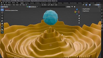
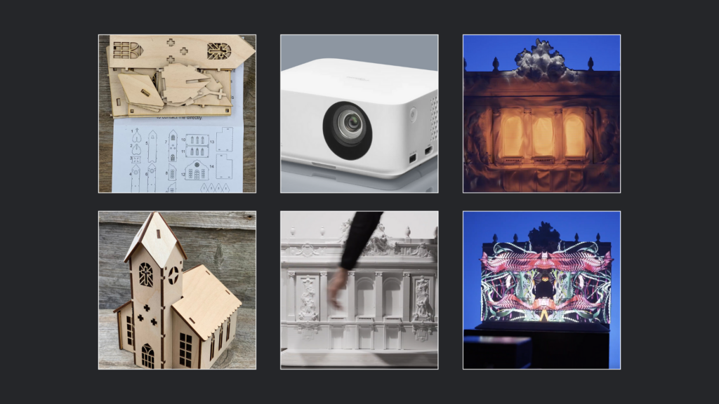
In meinem Projekt plane ich, ein Modell – voraussichtlich eine Miniaturkirche – entweder als fertigen Bausatz aus dem Internet zu bestellen und zusammenzubauen oder es als Laser-Cutter-Vorlage mit dem Lasercutter der Fachhochschule auszuschneiden.
Projektion & Videomapping
Nach der Fertigstellung des Modells soll dieses mithilfe eines Beamers projiziert und durch Videomapping visuell bespielt werden. Hierfür ist der Einsatz eines Kurzdistanzprojektors oder eines kleinen mobilen Beamers vorgesehen, um maximale Flexibilität bei der Aufstellung und Projektion zu gewährleisten. Ziel dieser Projektionen ist es, verschiedene Techniken, Farben, Texturen, Animationen und Visualisierungen auf die Miniaturkirche anzuwenden, um deren Wirkung auf die Oberflächenstruktur und die architektonische Gestaltung zu untersuchen. Besonders relevant ist hierbei die Frage, wie Licht auf Architektur wirkt und inwieweit Projektionen als erweiterte Gestaltungsebene dienen können.
Prototypenvarianten und Herausforderungen
Um ein möglichst authentisches 3D-Mapping zu erzielen, plane ich, die Miniaturkirche auch als digitales 3D-Modell zu erstellen. Dies würde die Flexibilität erhöhen und eventuell auch die Möglichkeit bieten, virtuelle Prototypen in VR oder AR zu testen. Ein potenzielles Problem bei der Projektion auf physische Modelle ist deren geringe Größe von etwa 20 bis 30 cm sowie die eingeschränkte Auflösung des Beamers. Es bleibt fraglich, ob feine Konturen und Linien des Modells präzise genug dargestellt werden können, um eine ästhetisch ansprechende und wirksame Projektion zu ermöglichen.
Software & Technik
Das Videomapping soll audio-reaktiv gestaltet werden, wobei ich derzeit überlege, ob ich dafür Cinema4D oder Blender verwenden soll. Optimalerweise würde ich eine Kombination der besten Features beider Programme nutzen. Blender bietet aufgrund seiner leistungsstarken Geometrie- und Simulations-Nodes deutlich mehr Optionen zur Erstellung sanfter, dynamischer Animationen, während Cinema4D in diesem Bereich bisher limitiert ist – jedoch in anderen audio-reaktiven Anwendungsbereichen deutlich intuitiver ist. Weitere Untersuchungen und Experimente dazu werden im nächsten Blogpost (BlogPost #2) dokumentiert.
Der Medientheoretiker Marshall McLuhan stellte einst fest: „Das Medium ist die Botschaft.“ Diese Aussage hat in unserer von digitalen Technologien geprägten Zeit eine besondere Relevanz und dient als Leitsatz für die Entwicklung dieses Prototyps.
🤖🧠Disclaimer zur Nutzung von Künstlicher Intelligenz (KI):
Dieser Blogbeitrag wurde unter Zuhilfenahme von Künstlicher Intelligenz (ChatGPT) erstellt. Die KI wurde zur Recherche, zur Korrektur von Texten, zur Inspiration und zur Einholung von Verbesserungsvorschlägen verwendet. Alle Inhalte wurden anschließend eigenständig ausgewertet, überarbeitet und in den hier präsentierten Beitrag integriert.
The panel discussion that took place at Vienna Pixel had professionals of the animation field discuss the topic of diversity and representation in animation.
The discussion starts off with the guests discussing their favorite childhood characters, pointing out the fact that these characters heavily influence people, following them into their adult lives even.
The question is posed as to how character design can made good when following „classic“ character design approaches, that have lots of rules and principles, have the potential to reinforce bad stereotypes.
One issue that needs to be addressed is the fact that the reinforcement of such types happens already in art school, for example in live drawing sessions, where the models are often white, think and straight, not sufficiently integrating other body types into the education of art students. The professionals then recommend to go outside, to sit on the bus, for instance, and look art people, to look at their body shapes and outfits and whatever else, as there is so much diversity in that. They point out that when it comes to character design, artists tend to see a lot online or in the production of big studios that they compare their own work to and then find ones line, narrowing down their way of finding inspiration elsewhere because they feel comfortable in that line of work and don’t have to take too many risks.
Another challenge for artists is their own subconscious prejudices, which means that it is important for people to talk to the groups they want to represent in order to do it correctly. Some studios even have diversity teams that ensure the representation of the characters is suitable as sometimes, even if there are no bad intentions, people can get it wrong if they don’t talk to the ones it actually concerns.
The classic school of animation works quite well in communicating intention, action and characteristics but sometimes they tend to be overdrawn, one of the artists mentions. They talk about how they discovered that representing someone through their actions rather than the look of the character can be very interesting, as you can’t tell from their look whether they are good or bad.
Larger productions have seen a lot of progress however there is still a long way to go. The professionals then move on to describing some experiences they have made concerning the topic of representation themselves.
One example that is named is about one artist working on a project that featured trans-persons and there was a lot of discussion within the team as to how to show the respective sequences. However, the team consisted of CIS people only, so they called in some friends to talk with and get feedback from them to make sure the representation was authentic. Another example was a game with a story about a disabled person, where the team reached out to an agency for accessibility and a disabled basketball player, who even supported the work on the game design for the apartment to realistically depict how the character interacts with the world.
Representation requires thorough, self-critical research from the creators and it is really a responsibility that they share through all kinds of diversity, be it gender, disability, or race. They also stress that intersectional research is important, explaining how just talking to a person of color, for instance, isn’t enough to represent all of one entity. Social backgrounds, living circumstances, dreams and personal definition need to be considered.
Often, higher positions in the industry are predominantly led by men, whereas women, queer people, or marginalized groups might have trouble to reach these positions. Still, the panel guests convey that it is an organic process and that being sensitive and open to listen and give people opportunities is important, so that spaces that, for example, support a persons specific requirements can be set up. Listening is one of the issues in the industry, and good leaders should take in the people around them. But, on a positive note, they also mention that they feel a big shift in awareness in the next generation coming on.
One thing that is still noticeable in many areas of the industry is even present in the education at universities and art schools – male-identifying students have shown up to collect feedback more than non-male identifying people, with more confidence/certainty, showing just how much it is still engraved in women’s minds how much more they have to prove themselves and that they are harder on themselves, often questioning their abilities. Therefore, mutual support and opening up towards each other is of great importance.
The panel concludes the talk with some questions from the audience, debating over topics like cultural consulting and as to why it is not a priority at big studios, for example. The answer to this comes out pretty clearly states that after all, a company’s goal is still to make money and that in the end, the value of the content comes from and with the value of the people/end-consumer of the contents because this translates back into the company. Therefore, it can be hard to find initiatives or to get them right. Also, there is still a lot that is not known to many people, so some disabilities, for instance, might not be represented because too little people actually know about them.
The panel guest suggests to do anti-bias training, to really inform themselves and to do so actively in order to tell appropriate stories.
They then move on to other questions, and one important topic mentioned is the issue of constantly feeling not educated enough even if they do research, talk to and bring in people to tell their stories – and yet, mistakes happen. Still, it is important to think about the intention behind that, and maybe being able to separate certain treats of a character from others. In the example, the representation of an asexual person who is a mean character is mentioned, as it left the community disappointed due to their portrayal, as asexual people are not often seeing representation in the media. But it is about the intention behind it – would the creators portray all asexuals as mean and manipulative or is this just a character that happens to be both of these things?
Overall, it matters how and why we create characters audiences can identify with, and there should be a way of creating them that connects to their story and on how they solve problems – and to then go from there, in order to discover their form and shape based on the character rather than its look.
Also, characters should not be reduced to one identity in terms of what they can portray, such as in having an immigrant always tell their „immigrant story“ and taking away the rest of their identity.
Also, all of us have stereotypes inside of us and we also live clichés, and creating content that is expected is just less interesting, because people often expect what’s coming etc.
To sum up: being aware and open-minded, talking to people, listening and educating oneself is a major part in the creating and portraying of character. There is much work yet to be done, but there also is a noticeable shift in the industry, sparking hope for the future!