Visual Perception and Memory (for Designers) (Blogpost 7)

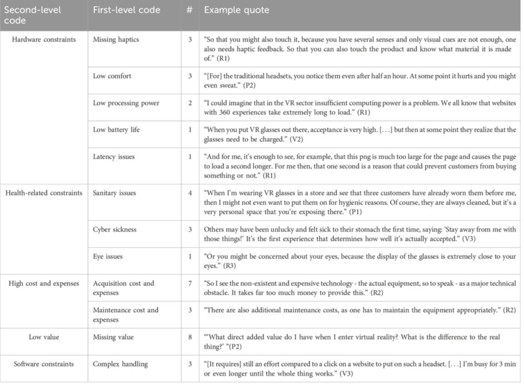
Warum ist das wichtig für meine Design-Masterarbeit?

Unser Gehirn ist biologisch sehr stark auf unsere visuelle Wahrnehmung ausgerichtet – Bilder ziehen unsere Aufmerksamkeit fast automatisch an. Sehen ist unser zentraler Sinn für die Informationsaufnahme und vor allem visuelle Reize werden extrem schnell verarbeitet. Wir besitzen ein bemerkenswert leistungsfähiges Bildgedächtnis und können uns so an tausende Bilder mit ziemlich hoher Genauigkeit erinnern. (Vgl. Malamed, 2015, chap. Introduction)
Unser Gehirn ist darum bemüht Sinn aus all den Reizen zu machen und der Prozess des Verstehens heißt so viel wie „unsere Erinnerungen nach Assoziationen, Emotionen und Verbindungen zu durchsuchen“ (Vgl. Malamed, 2015, chap. Introduction)

Ein grundlegendes Verständnis der menschlichen visuellen und kognitiven Fähigkeiten hilft Designer:innen dabei, verschiedene Botschaften gezielt und wirkungsvoll zu gestalten.Wenn man weiß wie Menschen Informationen wahrnehmen, verarbeiten und speichern kann Gestaltung präziser eingesetzt werden. Beispielsweise lassen sich Prozesse klarer visualisieren oder emotionale Reaktionen können bewusster auslösen werden. Design ist damit dann nicht mehr nur ästhetisch, sondern funktional wirksam, weil es sich an den tatsächlichen Grenzen und Möglichkeiten menschlicher Wahrnehmung orientiert. (Vgl. Malamed, 2015, chap. Introduction)

Visual Processing bzw. „Visuelle Verarbeitung“

Wahrnehmung ist ein Prozess, in dem wir sensorische Reize aufnehmen (z.B. über unsere Sinne), diese Informationen dann verstehen und ihnen schlussendlich Bedeutung geben. Wir sehen etwas und müssen dann das Gesehene kognitiv verarbeiten, um daraus „Sinn“ abzuleiten. Unser Gehirn sucht dabei ständig nach Mustern, um schnell Entscheidungen treffen zu können. Unser Gehirn sucht in der visuellen Umgebung nach bedeutungsvollen Mustern, um Entscheidungen darüber zu treffen, wie wir handeln und reagieren sollen. (Vgl. Malamed, 2015, chap. Section One Getting Graphic.)

Menschen verarbeiten diese Reize während sie weiter mit ihrer Umwelt interagieren und es werden verschiedene Hirnregionen gleichzeitig aktiviert. Dieses parallele Verarbeiten ermöglicht es, visuelle Informationen so schnell und effizient zu erfassen und erklärt, warum Gestaltung ebenfalls schnell und wirkungsvoll kommunizieren kann! (Vgl. Malamed, 2015, chap. Introduction)

Visuelle Wahrnehmung ist ein wechselseitiger Prozess: Einerseits nehmen wir einzelne Details wahr und setzen sie zu einem Gesamtbild zusammen. Andererseits bringen wir eigenes Wissen sowie konkrete Ziele in die Wahrnehmung ein, die bestimmen, wohin wir blicken und wie wir sensorische Informationen interpretieren.

Wie wir Dinge wahrnehmen, entsteht aus dem Zusammenspiel von „Bottom-Up“ und „Top-Down“-Prozessen. (Vgl. Malamed, 2015, chap. Section One Getting Graphic.)

Bottom-Up-Verarbeitung

Die menschliche Fovea (im Auge) kann jeweils nur einen sehr kleinen Bereich scharf erfassen, weshalb wir unsere Umgebung nicht kontinuierlich, sondern in schnellen Sprüngen (Sakkaden) erfassen. Wir fixieren kurz einen Punkt, springen dann zum nächsten und nehmen bei jeder Fixation nur einen kleinen Teil der visuellen Information auf. Erst durch dieses Muster aus Sakkaden entsteht unser Gesamtbild der Umgebung. (Vgl. Malamed, 2015, chap. Section One Getting Graphic.)

Dieser Prozess läuft extrem schnell und früh in der visuellen Verarbeitung ab ohne bewusste Aufmerksamkeit. Bereits auf den ersten Blick erkennen wir unbewusst:
– Bewegung
– Kanten von Formen
– Farbe
– Konturen
– Kontraste
All diese Eigenschaften können genutzt werden, um Aufmerksamkeit im Design gezielt zu lenken! (Vgl. Malamed, 2015, chap. Section One Getting Graphic.)

Währenddessen übernimmt das Gehirn gleichzeitig weitere Aufgaben:
Es unterscheidet Figur-Grund-Beziehungen, gruppiert visuelle Elemente, organisiert Texturen zu grundlegenden Formen. (Hier kommen die Gestaltprinzipien ins Spiel, aber darauf gehe ich in diesem Kapitel nicht näher ein.) (Vgl. Malamed, 2015, chap. Section One Getting Graphic.)

Diese Prozesse laufen sehr schnell ab und lassen uns Dinge erkennen. Die gewonnenen Informationen werden unmittelbar an andere Hirnregionen weitergeleitet und beeinflussen, worauf wir als Nächstes unsere Aufmerksamkeit richten. (Vgl. Malamed, 2015, chap. Section One Getting Graphic.)

Top-Down-Verarbeitung

Die Top-Down-Verarbeitung wird durch Vorwissen, Erwartungen und aktuelle Ziele gesteuert. Was wir sehen, hängt also stark davon ab, wonach wir gerade suchen. Unser Gehirn blendet Informationen aus, die im Moment nicht relevant erscheinen, und hebt das hervor, was zu unserer aktuellen Aufgabe/Ziel passt. Verändert sich das Ziel, verändert sich auch die Wahrnehmung: Wir sehen mehr von dem, worauf wir fokussiert sind, und weniger vom Rest. Wahrnehmung ist daher kein rein visueller Vorgang, sondern wird maßgeblich durch Denken, Erwartungen und Absichten beeinflusst. (Vgl. Malamed, 2015, chap. Section One Getting Graphic.)

All die visuelle Eindrücke werden zunächst nur für Millisekunden im sensorischen Gedächtnis gespeichert und erst später im Arbeitsgedächtnis wird die Information bewusst analysiert, verglichen und interpretiert. Dort treffen neue Reize auf vorhandenes Wissen – Bottom-Up- und Top-Down-Prozesse treffen quasi aufeinander.
Da Inhalte im Arbeitsgedächtnis schnell verblassen, müssen sie weiterverarbeitet werden, um behalten zu werden. Die Leistungsfähigkeit unseres Arbeitsgedächtnisses hängt unter anderem von Verarbeitungsgeschwindigkeit, Ablenkung, Alter und Expertise ab. (Vgl. Malamed, 2015, chap. Section One Getting Graphic.)

Die Belastung des Arbeitsgedächtnisses wird als cognitive load bezeichnet. Je höher sie ist, desto schlechter können wir Informationen verarbeiten. Für Design bedeutet das: Inhalte sollten so gestaltet werden, dass sie das Arbeitsgedächtnis nicht überanspruchen. (Vgl. Malamed, 2015, chap. Section One Getting Graphic. Cognitive Load: Demand on Working Memory) Wird Information dann im Arbeitsgedächtnis weiterverarbeitet und mit vorhandenem Wissen verknüpft, kann sie ins Langzeitgedächtnis übergehen. Das Langzeitgedächtnis speichert Fakten und Konzepte (semantisch), persönliche Erlebnisse und Emotionen (episodisch) sowie erlernte Abläufe und Fähigkeiten (prozedural). (Vgl. Malamed, 2015, chap. Section One Getting Graphic. Long-Term Memory: Permanent Storage)

Unser Arbeitsgedächtnis ist begrenzt. Design muss Informationen daher klar strukturieren, reduzieren und priorisieren, damit sie überhaupt verarbeitet werden können. Je klarer, reduzierter und bedeutungsvoller Informationen gestaltet sind, desto eher bleiben sie im Gedächtnis.

Neue Informationen werden immer in vorhandenes Wissen eingeordnet. Dafür nutzt unser Gehirn sogenannte Schemata. Schemata sind mentale Strukturen, die dabei helfen, verschiedene Eindrücke schnell zu interpretieren und einzuordnen. Diese Schemata verändern sich laufend durch neue Erfahrungen. Abruf aus dem Gedächtnis geschieht über Reize wie Bilder, Emotionen oder Begriffe. (Vgl. Malamed, 2015, chap. Section One Getting Graphic. Schemas: Mental Representations)

Darüber hinaus nützt das Gehirn „mental Models“, also Vorstellungen davon, wie Dinge funktionieren (z.B. Navigation in Interfaces). Sie ermöglichen schnelle Orientierung, weil wir bekannte Muster auf neue Situationen übertragen. (Vgl. Malamed, 2015, chap. Section One Getting Graphic. Mental Models)

Für Designer:innen kann man daraus ableiten. Visuelle Elemente aktivieren automatisch bestehende Schemata und mental Models. Formen, Farben und Strukturen erzeugen immer auch Erwartungen und Bedeutungen. Gestaltung sollte daher an den kognitiven Voraussetzungen der Zielgruppe ausgerichtet sein und an deren Vorwissen, kulturellem Kontext, visueller Kompetenz, Motivation und Ablenkbarkeit. (Vgl. Bradley, 2011)

Design funktioniert dann am besten, wenn es an vorhandene Denkstrukturen anschließt und Bedeutung klar vermittelt – nicht nur ästhetisch wirkt. 

Designer sollen sich vor Beginn also die Frage stellen: Was soll hier eigentlich kommuniziert werden? Dann kann man die Gestaltung gezielt auf unterschiedliche kognitive Prozesse ausgerichtet werden.
– Geht es um Wiedererkennung, müssen Elemente durch Kontrast, Größe oder visuelle Dominanz hervorgehoben werden. (Vgl. Bradley, 2011)
– Geht es um Verständnis und Erkenntnis, braucht es klare Strukturen, Anknüpfung an bestehende mentale Modelle und visuelle Systeme, die leicht interpretierbar sind. (Vgl. Bradley, 2011)

Ein erfolgreiches Design berücksichtigt sowohl das Gesamtbild als auch alle einzelnen Elemente – etwa. Man soll bei allen Entscheidungen die kognitiven Aufgaben der Nutzer:innen mitzudenken und sich fragen: Welche Informationen sollen sie aufnehmen? Welche visuellen Fragen soll das Design beantworten? Wenn man diese Mechanismen versteht, kann man Gestaltung gezielt einsetzen, um Blickführung zu steuern, Bedeutung zu erzeugen und Inhalte nachhaltiger im Gedächtnis zu verankern. (Vgl. Bradley, 2011)

Quelle:

Malamed, C. (2015). Visual language for designers (E-book ed.). Rockport.

Bradley, S. (2011, March 7). About Vanseo Design. Vanseo Design. https://vanseodesign.com/about/

Bemerkung für Masterarbeit: Noch andere Quellen/Infos reinbringen und Verknüpfungen finden; Derzeit eher “Nacherzählung aus der Quelle”

Das beschleunigte Medium Social Media – Recherche-Ansatz 1(Blogpost 6)

Zitat:
Social Media sind digitale Medien und Technologien, die es Nutzerinnen/Nutzern  ermöglichen, über digitale Kanäle zu kommunizeren, sich zu vernetzen und auszutauschen sowie mediale Inhalte einzeln, in einer definierten Gruppe oder offen zu erstellen und weiterzugeben. Social-Media-Technologien können z.B. in folgende Bereiche unterteilt werden:

  • Kommunikation – dazu zählen etwa Blogs, Webinare, Mikroblogging, Soziale Netzwerke etc. (z.B. Facebook, X (Twitter), Linkedin, Xing)
  • Multimedia – dazu zählen Video-Sharing, Foto-Sharing, Livecasting, Vlogs, Podcasts etc. (z.B. Tik-Tok, Instagram, YouTube, Flickr)
  • Zusammenarbeit und Wissensmanagement – dazu zählen Wikis (z.B. Wikipedia), Social Bookmarks, Bewertungs- und Auskunftsportale etc.
  • Unterhaltung – dazu zählen Virtuelle Welten, Online-Spiele etc. (z.B. Second Life), Mobile Apps

(Österreich.gv.at-Redaktion, 2025)

Social Media im zeitgenössischen Marketing

Socialmedia ermöglicht Brands und Marken erstmals eine direkte, zweispurige Kommuniktion mit den Nutzer:innen und potenziellen Kund:innen! Man kann Feedback in Echtzeit aufnehmen, Inhalte personalisieren, Produkte bewerten und Gespräche anstoßen. Dadurch entstehen Beziehungen, in denen die User:innen aktiv  mit den Marken interagieren und eine emotionale Bindung aufbauen, anstatt nur passive Empfänger:innen zu sein (Vgl. Qiao, 2025).

Natürlich beeinflussen die Plattformen neben unserer Aufmerksamkeit auch unser Konsumverhalten. Die Kaufentscheidungen der Menschen werden durch Werbung, soziale Einflüssen und eben diesen Markeninteraktionen beeinflusst. Aufgrund der kontinuierlichen Markenpräsenz auf Social Media wird auch eine Art „Markenidentität“ auf seiten der User:innen aufgebaut und sie beginnen beispielsweise sich über Marken zu definieren oder sich mit ihnen zu identifizieren. (Vgl. Qiao, 2025)

Um die Verbindung zum Thema Aufmerksamkeit zu machen: Problematisch ist die Reizdichte in den Sozialen Netzwerken. Übermäßige Markeninhalte können das Nutzungserlebnis stören, lenken ab und es wird schwer die Aufmerksamkeit der User:innen zu bekommen. (Vgl. Qiao, 2025)

Diese Reizüberflutung ist – wie in vorhergehenden Blogposts beschrieben – kein rein plattformspezifisches Phänomen, sondern Teil einer allgemeinen, gesellschaftlichen Beschleunigung. Hartmut Rosa schreibt, dass sich Handlungen und Wahrnehmungsprozesse durch Zeitknappheit zunehmend verdichten und Inhalte immer schneller verarbeitet werden müssen, wodurch Aufmerksamkeit permanent neu verteilt werden muss (Rosa, 2005, p. 199–204). Gleichzeitig wächst mit der technischen Beschleunigung auch die Kommunikationsfrequenz – Kommunikation wird nicht nur schneller, sondern dichter und häufiger (Rosa, 2005, p. 252–253). All wird nach Qiao Beobachtungen auch auf Social Media sichtbar. (Vgl. Qiao, 2025)

In einer so „informationsgesättigten Umgebungen“ wie Social Media entsteht also ein Wettbewerb um Aufmerksamkeit, da Aufmerksamkeit eben jene „begrenzte Ressource“ ist, die zwischen immer mehr Reizen „effizient verteilt“ werden muss (Davenport & Beck, 2001, p. 2–3; Davenport & Beck, 2001, p. 3).

Will man dem Problem allerdings zumindest ein bisschen entgehen und nutzt die Möglichkeit, Inhalte für die User:innen  „vorzuselektieren“ und nur „für die jeweilige Person relevantes auszuspielen“ – man nennt es Datenbasierte Personalisierungen – so kommen Fragen zum Datenschutz und der Transparenz auf. (Vgl. Qiao, 2025)

Es wird daher zur Aufgabe der Marken, zwischen effektiver, datengetriebener Kommunikation und dem Schutz der Privatsphäre zu balancieren! (Vgl. Qiao, 2025) 

3. Einfluss von Social Media auf Markenwahrnehmung

Wie Markenwahrnehmung entsteht

Markenwahrnehmung beschreibt nach Qiao die Gesamtheit aus Eindrücken, Emotionen und Erwartungen, die Konsument:innen gegenüber einer Marke entwickeln. Sie entsteht über viele Kanäle gleichzeitig: visuelle Identität (Logo, Name, Design), Werbung, persönliche Produkterfahrung, Empfehlungen anderer Nutzer:innen, Markenstories sowie Social-Media-Inhalte (Qiao, 2025).

Social Media verstärkt diesen Prozess, weil Brands und Marken dort ständig präsent sein können. Nutzer:innen haben Einfluss auf die Markenwahrnehmung und formen diese mit, indem sie zB Kommentare, Likes oder Reviews hinterlassen. Wichtig ist zu bemerken, dass Nutzer:innen den Bewertungen anderer Nutzer:innen oft viel stärker vertrauen als klassischer Werbung – das macht Social Media zu einem noch wichtigeren Tool im Entscheidungsprozess. (Vgl. Qiao, 2025)

Vertrauen bildet die Grundlage für (Brand-)Loyalität. Diese Loyalität entsteht durch positive emotionale Erfahrungen mit der Marke und führen zu einer langfristigen Markenbindung. Dieses Vertrauen wird durch positive Nutzer:innen-Erfahrungen gestärkt (Vgl. Qiao, 2025)

Nach Qiao erhöht Social Media die Markenwahrnehmung vor allem durch:

  • massive Sichtbarkeit
  • virale Verbreitung von Inhalten
  • gezielte, datenbasierte Ansprache bestimmter Zielgruppen
  • Und die permanente Interaktion zwischen Marke und Nutzer:innen

(Qiao, 2025)

Durch Likes, Kommentare und dem Teilen von Inhalten werden Konsument:innen aktiv in die Kommunikation der Marke eingebunden und diese Partizipation lässt die Brands eben nahbarer und glaubwürdiger erscheinen, als klassische Einwegwerbung (Vgl. Qiao, 2025).

5. Challenges and Risks of Social Media Marketing

Qiao schreibt, dass Social Media für Marken zwar eine enorme Reichweite bietet, gleichzeitig können aber viele Probleme dabei erzeigt werden Durch die permanente Informationsflut, wie auch Hartmut Rosa und Davenport & Beck beschreiben, fühlen sich viele Nutzer:innen überfordert, was zu Reizüberflutung, Desinteresse und sinkender Aufmerksamkeit gegenüber all den Marketinginhalten führen kann. Besonders zu häufige oder zu aufdringliche Inhalte wirken kontraproduktiv und können negative Einstellungen gegenüber den Marken erzeigen. Zu häufige oder aufdringliche Werbung wirkt kontraproduktiv und kann negative Einstellungen gegenüber (Vgl. Qiao, 2025).

Außerdem ist es wichtig im Hinterkopf zu behalten, wie schnell Marken auf Social Media auch die Kontrolle verlieren können, indem sie negative Kommentare bekommen, oder weil Shitstorms oder Fehlinterpretationen das Image der Marke beschädigen. (Vgl. Qiao, 2025).

Das heißt, die Marken bewegen sich in einem sehr dynamischen, manchmal schwer steuerbaren Umfeld in dem es wenig Fehlertoleranz gibt und Aufmerksamkeit sehr flüchtig ist. Visuelle

Diese Flüchtigkeit lässt sich auch empirisch belegen, denn Eye-Tracking-Daten zeigen, dass bereits nach etwa 2,5 Sekunden 62,5 % der Betrachter:innen den visuellen Kontakt zu Werbestimuli abbrechen (eye square, 2020, p. 2). Aufmerksamkeit operiert damit vorallem in extrem kurzen Zeiteinheiten, in denen Inhalte entweder unmittelbar verarbeitet werden – oder verloren gehen (eye square, 2020, p. 4–5).Diese Mikro-Zeitfenster verstärken den von Davenport und Beck beschriebenen „Wettbewerb um Aufmerksamkeit“, in dem Organisationen und Marken gezwungen sind, aus einer Überfülle an Informationsquellen selektiv wahrgenommen zu werden (Davenport & Beck, 2001, p. 3).

Kommunikation wird sofort selektiert und bewertet. Eine Markenpersönlichkeit, also Brand Identity, wird heute also in beschleunigten, bewegten, interaktiven Kontexten konstruiert — nicht mehr primär über statische Identitätssysteme.

Social Media ist unausweichlich und ein zentraler Faktor in der Markenidentität. Diese Plattformen beeinflussen nicht nur unsere allgemeine Wahrnehmung, wie man information aufnimmt  und „beschleunigen“ unsere Welt weiter, sie beeinflussen auch wie Nutzer.innen Marken bewerten und wie sie ihre Kaufentscheidungen treffen. Durch Interaktion, Personalisierung und emotionale Ansprache entstehen neue Formen der Markenbindung, gleichzeitig aber auch neue Anforderungen an Glaubwürdigkeit und Transparenz (zB beim Thema Datenschutz) (Vgl.Qiao, 2025).

Durch Social Media ist Informationsvermittlung zwischen Marke und Nutzer:in nicht mehr einseitig

Und es wird ein kontinuierlicher Austauschprozess, in dem die Nutzer:innen eben sogar aktiv die Bedeutung der Marke mit-formen. Marken müssen deshalb nicht nur sichtbar auf Social Media sein, sondern vorallem konsistent, responsiv und vertrauenswürdig auftreten, um langfristige Beziehungen aufzubauen (Vgl. Qiao, 2025).

Quellen:

Qiao, C. (2025). The impact of social media on brand perception and consumer behavior. Highlights in Business, Economics and Management, 52.

Davenport, T. H., & Beck, J. C. (2001). The attention economy: Understanding the new currency of business. Harvard Business School Press.

Rosa, H. (2005). Beschleunigung: Die Veränderung der Zeitstrukturen in der Moderne. Suhrkamp.

Österreich.gv.at-Redaktion. (2025, May 19). Social Media. oesterreich.gv.at. https://www.oesterreich.gv.at/de/lexicon/S/Seite.991502

——

Notiz für Masterarbeit: Das ist jetzt alles sehr auf einen Artikel bezogen, unbedingt noch andere Quellen nutzen und das Kapitel ausführlicher bzw. besser und sinnvoller strukturieren. Man wiederholt viel aus den Kapiteln zur Aufmerksamkeit. Sinnhaftigkeit davon ist fraglich.
Nach Recherche zu Visual perception und vorallem zu Branding/Motion usw. kann man hier ev noch mehr Design-Perspektive reinbringen.

Aufmerksamkeit als knappe Ressource und erste Verbindungen zum Design (Blogpost 5)

“In an information-rich world, the wealth of information means a dearth of something else: a scarcity of whatever it is that information consumes. What information consumes is rather obvious: it consumes the attention of its recipients. Hence a wealth of information creates a poverty of attention and a need to allocate that attention efficiently among the overabundance of information sources that might consume it.” ― Herbert A. Simon (1971 in seiner Rede”Designing Organizations for an Information-Rich World”)

Wir leben in einer Welt bzw. Wirtschaft in der Information, Wissen, Arbeit, Kapitel etc. im Überfluss vorhanden ist. Wirtschaftlich betrachtet ist es einfach ein Unternehmen zu gründen, Dinge online zu teilen, Kund:innen und Märkte zu erreichen , Werbung anzuzeigen usw. Was jedoch wirklich KNAPP ist, ist Aufmerksamkeit! (Vgl. Davenport, T. H., & Beck, J. C. (2001). The attention economy: Understanding the new currency of business. Harvard Business School Press.)

Warum beschäftigen wir uns im Rahmen dieser Recherche jetzt so sehr mit dem Fehlen der Aufmerksamkeit? Dafür möchte ich Davenport und Beck zitieren:
DEFICIT PRINCIPLE: Before you can manage attention, you need to understand just how

depleted this resource is for organizations and individuals. (Vgl. Davenport & Beck, 2001, p. 3)

Dieses Defizit kann auf der Ebene der Organisation betrachtet werden, wenn zb intern in der Kommunikation oder durch den dauerhaften Informationsfluss dei Aufmerksamkeit schwindet, oder aber auch auf individueller Ebene, dann geht es um eine kognitive Überforderung durch eben diese ständige Erreichbarkeit und das Multitasking.

In einer Umgebung mit sehr viel Information, entsteht automatisch ein Mangel an etwas anderem. Dieses „andere“ ist Aufmerksamkeit. Information braucht immer jemanden der sie wahrnimmt und je mehr Informationen es gibt, desto schwerer wird es für Menschen diese wahrzunehmen. Heißt kurz gesagt: Information ist theoretisch unbegrenzt. Die menschliche Aufmerksamkeit ist aber sehr wohl  biologisch begrenzt. (Vgl. Davenport & Beck, 2001, p. 2-3)

Deshalb entsteht ein sogenannter „Wettbewerb um die Aufmerksamkeit“, denn es besteht der Zwang zu Selektieren und die Notwendigkeit seine Aufmerksamkeit „effizient zu verteilen“ (Vgl.Davenport & Beck, 2001, p. 3)

Das heißt auf meine Masterarbeit bezogen:
Marken konkurrieren garnicht nur oder primär mit anderen Marken.
Vielmehr konkurrieren sie mit ALLEN Inhalten im Feed, mit den Nachrichten, Messages, Videos, Benachrichtigungen und allen weiteren Reizen unserer Wahrnehmung!

Aufmerksamkeit ist KNAPP und SELEKTIV, man muss also um sie kämpfen! (Vgl. Davenport & Beck, 2001, p. 3-8) Gerade deshalb ist es umso wichtiger die Anwendungsszenarien und Kontaktpunkte der Zielgruppe mit der Marke unter die Lupe zu nehmen, um auf die richtige Art und Weise Aufmerksamkeit zu erregen.

Wenn Aufmerksamkeit so knapp ist, muss unsere Gestaltung umso strategischer sein, denn die Signale müssen schnell funktionieren und die Bedeutung muss schnell klar sein. Vielleicht kann eine gute Motion Identity eben dieser Aktivierungsmechanismus sein?

Wie kommt man nun an Aufmerksamkeit? Was lenkt sie und wie funktioniert sie?

THE EYES DON’T LIE

Nach Davenport und Beck beschäftigt sich ein großer Teil der Forschung im Bereich Aufmerksamkeit mit der „visuellen Aufmerksamkeit“, also damit, wie schnell unser Auge etwas erkennt und worauf es sich fokussiert. Das Kernmotto „the eyes don’t lie“ soll aussagen, dass man kann ziemlich genau messen kann, was Menschen tatsächlich wahrnehmen, auch wenn sie später vielleicht etwas anderes behaupten.  (Vgl. Davenport & Beck, 2001, p.19)

Aufmerksamkeit entsteht nicht automatisch, sondern durch permanentes filtern unseres Gehirns. Es wählt aus einer Vielzahl an Reizen einzelne aus und blendet den Rest der Eindrücke aus. Man kann also sagen dass Aufmerksamkeit immer ein Selektionsprozess ist.

Aus den Experimenten die in diesem Rahmen gemacht wurden  (Vgl. Davenport & Beck, 2001, p.19) lassen sich drei Prinzipien ableiten. Ich möchte diese Prinzipien auch immer gleich unter dem Designaspekt betrachten.

1.Pop-out-Effekt: Aufmerksamkeit entsteht durch Unterschiedlichkeit

Wohl wenig überraschend:
Wir nehmen Dinge schneller wahr, wenn sie sich klar von ihrer Umgebung unterscheiden. Unser Gehirn erkennt Abweichungen leichter als Normalität. Deshalb fällt etwas Ungewöhnliches in einem vertrauten Umfeld schneller auf als etwas Gewöhnliches in einem ungewohnten Umfeld. (Vgl. Davenport & Beck, 2001, p.19) 

Nach Bradley spielt auch eine Erwartungshaltung eine Rolle dabei, was einem ins Auge fällt. So kann auch etwas „optisch weniger Auffälliges“ sofort hervorstechen, wenn wir mit eben dieser Erwartung in die Situation hineingehen. Der Wahrnehmungsfokus kann sich also bewusst und unbewusst verschieben. (Vgl. Bradley, 2011)

Unser beschleunigtes Lebenstempo führt dazu, dass wir die Zeit für unsere Wahrnehmung kürzen, ebenso wie die unserer Handlungen. Inhalte müssen in einer Flut von immer neuen Reizen viel schneller verstanden werden (Vgl. Rosa, 2005, p. 199–204.) Je schneller etwas hervorsticht, desto höher die Chance sich zwischen all den Reizen hervorzuheben.

Für Design heißt das:
– Was Aufmerksamkeit erzeugen soll, braucht visuelle Eigenständigkeit.
– Gleichförmigkeit macht unsichtbar.

2. Dauerhafte Neuheit funktioniert nicht

Alles ständig neu oder anders oder besonders zu machen funktioniert wiederum auch nicht, denn Neuheit verliert ihren Effekt. Das nennen Davenport und Beck den Boy-who-cried-wolf-Effekt: Wer permanent auffallen will, fällt irgendwann gar nicht mehr auf. (Vgl. Davenport & Beck, 2001, p.19)

Bradley bestätigt dieses Phänomen in seinem Text, dass unser Gehirn alles heraus filtert, was im Moment nicht relevant erscheint. Das bedeutet: Wenn ständig alles neu, laut oder anders ist, verliert „anders“ seine Bedeutung. Dein Wahrnehmungssystem gewöhnt sich daran und Neuheit wird Normalität. (Vgl. Bradley, 2011)

Auf die Markenkommunikation umgelegt kann man ableiten:
– Wenn Marken ständig visuell experimentieren oder ständig neue Reize setzen, stumpft die Wahrnehmung ab.
– Aufmerksamkeit braucht Wiedererkennbarkeit genauso wie Variation!
– Ohne ein stabiles Erwartungsmuster wird nichts priorisiert und alles wird zu „Hintergrundrauschen“(Vgl. Bradley, 2011)

3. Aufmerksamkeit entsteht erst im Vergleich

Interessanterweise funktioniert gezielte Aufmerksamkeit, laut Davenport und Beck, nur dann gut, wenn es andere konkurrierende Reize gibt. Wenn nur ein Stimulus vorhanden ist, bringt „Fokussierung“ kaum Vorteile. Erst durch Ablenkung entsteht echte Aufmerksamkeit. (Vgl. Davenport & Beck, 2001, p.19)

Was wir wahrnehmen, hängt davon ab, was sonst noch da ist UND welches Ziel wir gerade verfolgen. Am Beispiel von Bradley: Ein rotes Wort zwischen vielen weißen Wörtern fällt auf weil es konkurrierende Reize gibt mit denen es verglichen werden kann. Ohne Vergleich, keine Aufmerksamkeit.(Vgl. Bradley, 2011)

Das bedeutet:
– Menschen nehmen Inhalte stärker wahr, wenn sie diese im Kontext anderer Inhalte erleben.

Zusammenfassend kann man sagen:

  • Aufmerksamkeit ist immer kontextabhängig, zielabhängig und vergleichsbasiert.
  • Aufmerksamkeit entsteht durch visuelle Differenz
  • Sie nutzt sich bei Überreizung ab
  • sie existiert nur im Wettbewerb mit anderen Reizen

Gestaltung von Aufmerksamkeit findet immer in Konkurrenz statt und Marken müssen sich visuell behaupten – nicht nur „gut aussehen“, aber dabei Konsistenz bewahren. Der Kern einer guten Markenidentität.

QUELLEN:

Davenport, T. H., & Beck, J. C. (2001). The attention economy: Understanding the new currency of business. Harvard Business School Press.

Rosa, H. (2005). Beschleunigung: Die Veränderung der Zeitstrukturen in der Moderne. Suhrkamp.

Bradley, S. (2011, March 7). About Vanseo Design. Vanseo Design. https://vanseodesign.com/about/

#8 Experiencing Installation Art

Over the past decades, contemporary art has shifted away from purely object-based works towards more spatial and experiential forms. Installation art plays a key role in this development. Instead of presenting an artwork as an isolated object, installation art places the viewer directly within the work (Bishop, 2005). The viewer is no longer a distant observer, but an active and physically present part of the artwork. This shift changes how meaning is created. Experience is no longer limited to visual perception, but includes space, movement, and time. Walking through an installation, staying within it, or changing position all influence how the work is perceived by the visitor. Meaning therefore comes through presence and duration rather than through visual observation alone (Lennon, 2025). 

The main difference between traditional object-based art and installation art lies in how the viewer is addressed and how physical space is used. Classical artworks such as paintings or sculptures function as closed objects that are observed from a distance. The viewer remains outside the work and engages with it mainly through vision. Sculptures often emphasize control over material such as marble, bronze, or wood. They are usually placed on pedestals, which separate them from the everyday space of the viewer and maintain a clear distance between artwork and audience (Bishop, 2005). In installation art, space itself becomes an active part of the work. A room filled with colored light is no longer just a container for art, but the artwork itself. The work exists as a unified whole in which objects, spatial proportions, light, and sound are closely connected. This shift from object-based aesthetics to situational experience fundamentally changes perception. The viewer is no longer a detached observer, but a physically present subject whose senses are engaged beyond sight, including sound, touch, and spatial awareness (Kadari Art Gallery, n.d.).

In her critical history of installation art, Claire Bishop describes four main modes of experience. Each of them shows a different understanding of the viewer and their role within the artwork.

Phenomenological experience

This mode is based on the philosophy of Maurice Merleau-Ponty and focuses on the lived body as the main site of perception. The viewer is not an analytical observer, but an active participant who experiences the work through movement, presence, and bodily awareness. The boundary between subject and object becomes less clear (Mildred Lane Kemper Art Museum, n.d.).

Psychological experience

Drawing on psychoanalytic ideas by Sigmund Freud, some installations aim to disturb the viewer’s sense of stability or address deeper psychological layers. Concepts such as the uncanny or unconscious impulses are used to create emotional tension or discomfort (Bishop, 2005). 

Political activation

In this mode, audience participation is understood as a tool for social and political engagement. The active involvement of the viewer is seen as an alternative to the passive consumption encouraged by mass media such as television or film.

Decentering of the subject

This approach challenges the idea of a single, fixed viewpoint. The viewer is confronted with multiple perspectives, which undermines hierarchical models of vision, such as those established by Renaissance perspective (Bishop, 2005).

Among these modes, the phenomenological perspective is especially important. It focuses on the awareness of one’s own body, movement, and position in space. This bodily awareness plays a key role in how installation art is experienced. Studies show that when viewers are physically involved and aware of their presence, the emotional impact of the artwork becomes much stronger.

The development of installation art is closely linked to a critique of the traditional exhibition space known as the “White Cube.” This model, described by Brian O’Doherty, refers to modern gallery spaces with white walls, neutral lighting, and little reference to the outside world (Zhihan Ren, 2025). The goal of the White Cube is to present artworks as timeless and objective, as if they exist outside of history, place, or social context. In this setting, architecture is not a neutral background. It functions as an invisible frame that shapes how viewers engage with the artwork. Installation art challenges this framework. Instead of being confined to a single object, the work extends into the surrounding space. Walls, floors, and the viewer’s position become part of the artwork itself. As a result, viewers are forced to constantly question where to stand and how to move within the space.

In contrast, the “Black Box” offers a highly controlled environment that originates from theatre and cinema. Here, darkness, light, sound, and movement are carefully directed to guide attention and emotion. In contemporary practice, these two models increasingly overlap and form what is often described as a “Grey Zone.” This hybrid space appears when performative works enter museum contexts or when media installations combine the openness of the White Cube with the controlled atmosphere of the Black Box.

Within this Grey Zone, the viewer often becomes an incidental performer. Their movement through the space is no longer random, but part of the overall structure of the work. The experience emerges through presence, movement, and interaction with the spatial setting.

To conclude installation art fundamentally changes the relationship between artwork, space, and viewer. Instead of observing from a distance, the viewer becomes an active part of the work through movement, presence, and sensory engagement. By involving the body and multiple senses, installation art shifts perception from visual observation to spatial and embodied experience. Overall, installation art positions the viewer not as a passive observer, but as a participant whose presence is essential to the work itself.

Bibliography: 

Bishop, C. (2005). Installation Art. Tate Publishing. https://www.scribd.com/document/463827422/Installation-Art-Claire-Bishop-pdf

Kadari Art Gallery. (n.d.). Exploring the Boundaries: Installation Art vs Traditional Sculpture. Retrieved https://kadariartgallery.com/blogs/news/exploring-the-boundaries-installation-art-vs-traditional-sculpture

Lennon, B. (2025). How contemporary installation art uses space, site and scale to create a phenomenological experience for viewers [Master’s thesis, Institute of Art, Design + Technology]. https://hdl.handle.net/10779/iadt.30601340.v1

Mildred Lane Kemper Art Museum. (n.d.). Olafur Eliasson: Your Imploded View (2001). Retrieved https://www.kemperartmuseum.wustl.edu/learn/learning-resources/eliasson-olafur-your-imploded-view-2001/type/essays

Zhihan Ren. (2025). When the Black Box Meets the White Cube: Spatial Shifts and Postdramatic Aesthetics in Performance Art. ResearchGate. https://www.researchgate.net/publication/392611552_When_the_black_box_meets_the_white_cube_spatial_shifts_and_postdramatic_aesthetics_in_performance_art

Beschleunigte Kommunikationskontexte (Blogpost 4)

Ich möchte diesen Blogpost (und wahrscheinlich auch den nächsten) meiner Recherche zum Thema „Beschleunigte Kommunikationskontexte/Aufmerksamkeit“ widmen.

———

Im Rahmen dieser Arbeit möchte ich die das Thema der „Veränderung der Wahrnehmung durch beschleunigte Kommunikationskontexte“ bearbeiten.

Zuerst gilt es also zu definieren, was „Beschleunigte Kommunikationkontexte“ sind!

Beschleunigung bezieht sich im Kontext dieser Arbeit auf eine gesellschaftliche Veränderung, wie sie der Soziologe Hartmut Rosa (2005) in seiner Arbeit Beschleunigung: Die Veränderung der Zeitstrukturen in der Moderne (Frankfurt am Main: Suhrkamp, 2005) definiert hat. Ich möchte eben Hartmut Rosas Theorie zur sozialer Beschleunigung als Ausgangspunkt für meine Definition nutzen.

Hartmut Rosa beschreibt Beschleunigung als strukturelle Grundlogik in unserer modernen Gesellschaft, denn diese definiert sich zunehmend über Geschwindigkeit und Wachstum.

Dabei definiert er folgende drei Arten der Beschleunigung: technische Beschleunigung, Beschleunigung sozialen Wandels und die Beschleunigung des Lebenstempos. Diese Beschleunigungen treten gleichzeitig auf und die Menge an Informationen, Handlungen und Erfahrungen um uns herum wachsen viel schneller, als unsere Fähigkeit eben diese zu verarbeiten.(Vgl. Rosa, H. (2005). Beschleunigung: Die Veränderung der Zeitstrukturen in der Moderne. Suhrkamp. 71–88.)

Hartmut Rosa unterscheidet eben drei miteinander verflochtene „Dimensionen sozialer Beschleunigung“: (Vgl. Rosa, 2005, p. 124–138.)


– Technische Beschleunigung: Also jene Beschleunigung die durch verbesserteTechnologien und Innovationen auftreten, z.B. in Bereichen wie Kommunikation, Transport (Flug statt Schiff etc.) oder der Produktion (Fast-Food Restaurants, Fabriken, etc.) (Vgl.Rosa, 2005, p.124–129.)

– Beschleunigung sozialen Wandels: Betrifft die Veränderung sozialer Normen, Verhaltensweisen oder Lebensformen, erkenntlich z.B So war es beispielsweise früher üblich, dass der Sohn denselben Beruf wie der Vater, sein Leben lang, ausgeübt hat. Heutzutage hat sich diese Tradition fast aufgelöst.  (Vgl.Rosa, Rosa, 2005, p.129–135.)

– Beschleunigung des Lebenstempos: Diese Beschleunigung betrifft die Menge an Handlungen und Erfahrungen die in einem Moment, also einer Zeiteinheit – um es messbar zu machen – passieren. z.B. durch die Digitalisierung kann man hunderte Nachrichten auf einmal bekommen; oder wir hören Sprachnachrichten, lesen und schreiben Nachrichten gleichzeitig; Das macht unsere Zeit immer knapper! (Vgl.Rosa, 2005, p.135–138.)

Diese drei Dimensionen sind nach Hartmut Rosa zwar logisch voneinander unterscheidbar, wirken aber empirisch gemeinsam und verstärken sich auch gegenseitig. (Vgl.Rosa, 2005, p.124–138.)

Technische Beschleunigung erhöht den sozialen Wandel, dieser beschleunigt wiederum die Zeitknappheit und eben diese Zeitknappheit steigert das Lebenstempo, was Wiederrum den Wunsch nach mehr technischer Beschleunigung verstärkt.
Wir befinden uns also in einem sich selbst immer weiter verstärkendem Kreislauf der Beschleunigung, und diese lässt sich eben auch in unserer Mediennutzung und Medienlandschaft allgemein erkennen! (Vgl. Rosa, 2005, p. 243–255.)

Beschleunigung im Kommunikationskontext

Aus Rosas Theorie lassen sich zentrale Charakteristika der Heutigern Kommunikationsräume, z.B. Social Media, ableiten. 

Permanente Steigerung der Kommunikationsfrequenz

Obwohl technischer Fortschritt Zeitersparnis mit sich bringt, ist das Ergebnis davon nicht gleich freie Zeit, da mit der Zeitersparnis auch unsere Handlungsmöglichkeiten und Reaktionsgeschwindigkeiten wachsen! Hartmut Rosa erklärt das beispielsweise anhand von  E-Mails: E-Mails sind schneller als Briefe, bekommen aber auch schneller eine Antwort, was Wiederrum eine noch schnellere Rückantwort bedarf. Ein Brief wurde gesendet und man bekam frühestens ein paar Tage danach eine Antwort, mit der man sich bis dahin nicht auseinander setzen musste – anders bei E-Mails die schon binnen Minuten wieder beantwortet im Postfach landen können) Kommunikation wird also schneller, aber auch dichter und häufiger! (Vgl. Rosa, 2005, p. 252–253.)

Verdichtung von Reizen und Verkürzung von Rezeptionszeit

Durch die Zeitknappheit verdichten sich unsere Handlungen und Erfahrungen und wir müssen mehr Inhalte in kürzerer Zeit verarbeiten. Dadurch wird unsere Wahrnehmung beeinflusst und unsere Aufmerksamkeit muss permanent neue verteilt werden. (Vgl. Rosa, 2005, p.199–204.)
Unser beschleunigtes Lebenstempo führt dazu, dass wir die Zeit für unsere Wahrnehmung kürzen, ebenso wie die unserer Handlungen. Inhalte müssen in einer Flut von immer neuen Reizen viel schneller verstanden werden (Vgl. Rosa, 2005, p. 199–204.)  Es gibt weniger bis keine Pause und mehr Multitasking, was zu einem Gefühl der permanenten Zeitknappheit führen kann. (Vgl. Rosa, 2005, p. 199–201.) Das schreiben auch Davenport und Beck in ihrem Buch „Attention Economy“  (Vgl. Davenport & Beck, 2001, p.6-8) – sie nennen es „info stress“, und beschäftigen sich weiterführend mit der Auswirkung dieses Stresses auf die Einzelperson wie auch die Unternehmen. 

Gleichzeitigkeit vieler Kanäle

Eben dieses Multitasking wird als Strategie im Umgang mit der Zeitknappheit betrachtet, denn mehrere Aktivitäten parallel heißt, mehr Handlungen Zeiteinheit! (Vgl.Rosa, 2005, p.199–204.) Diese Logik spiegelt sich heute in paralleler Mediennutzung und plattformübergreifender Kommunikation wieder – so wird parallel Musik gehört und gescrolled oder getextet .

Beobachtungen zur Aufmerksamkeitsspanne

„The Sunday New York Times contains more factual information in one edition than in all the written material available to a reader in the fifteenth century.“ (Vgl.Davenport & Beck, 2001, p. 4)

Wie Davenport und Beck in ihrem Buch über Aufmerksamkeit schreiben: Wir sind umgeben von einer nie dagewesene Menge an Information, zu jeder Zeit und dauerhaft (jetzt vermutlich noch mehr als zum Zeitpunkt von Davenport und Beck vor 25 Jahren) – und das hat sich eben mit der Entwicklung der Technik und Medien beschleunigt, wie Hartmut Rosa schreibt. Dabie handelt es sich bei Information, und Reizen, wie Hartmut Rosa schreibt, nicht nur um Wörter und Bilder, wie in Zeitschriften, TVs oder Mails, sondern jedes Produkt und jedes Business-Angebot möchte deine Aufmerksamkeit für „ihre Information“.(Vgl. Davenport & Beck, 2001, p. 5)

Hartmut Rosa bringt die Beschleunigung auch ganz konkret mit der Nutzung von Medien und den medialen Wahrnehmungsprozessen in Verbindung. Er beschreibt, dass die Inhalte – beispielsweise im Fernsehen – immer kürzer werden, beispielsweise Werbespots waren etwa mal 30 Sekunden lang und waren zum Zeitpunkt seiner Beobachtung oft nur noch wenigen Sekunden lang. Außerdem wechselten die Zuschauer:innen ihr Programm zusätzlich dazu noch im Sekundentakt und auch die Schnittfrequenz ist deutlich höher! (Vgl. Rosa, 2005, p.202–204.) 

All das deutet schon hin auf den weiteren Verlauf dieser Beschleunigung, wie er heute auf Social Media zu beobachten ist. Eye-Tracking-Daten aus dem Jahr 2020 (Vgl.eye square GmbH. (2020). Die magischen 2,5 Sekunden: Media attention benchmark. p1-7.) zeigen anhand einer Meta-Analyse von 320 In-Context-Studien mit über 340.000 Proband:innen, dass die durchschnittliche visuelle Verweildauer auf Werbe-Stimuli beispielsweise nur wenige Sekunden beträgt und bereits nach 2,5 Sekunden haben 62,5 % der Betrachter:innen den visuellen Kontakt wieder abgebrochen.  (Vgl. eye square, 2020, p. 2)Aufmerksamkeit operiert primär in extrem kurzen Episoden, in denen Inhalte entweder sofort verarbeitet werden – oder verloren gehen. (Vgl. eye square, 2020, p. 4-5.)

Für unsere Wahrnehmung bedeutet das folgendes: Wir werden in immer kürzeren Abständen mit neuen visuellen Eindrücken konfrontiert. Unsere Wahrnehmung wird in kleine Häppchen zerteilt, also fragmentierter und wir müssen viele verschiedene Inhalte immer schneller verstehen! 

Währenddessen schrumpft das Fenster unserer Aufmerksamkeit, denn immer mehr Ereignisse werden in immer kleinere Zeiträume gepresst und müssen verarbeitet werden. In diesem Rahmen erwähnt Rosa auch „Multitasking“, als Strategie gegen eben diese Zeitknappheit, was aber dazu führt dass wir mental ständig zwischen zwei oder mehr Kontexten hin und her springen müssen. Aufmerksamkeit wird dadurch systematisch verknappt – während gleichzeitig die Menge an Reizen weiter zunimmt. (Vgl. Rosa, 2005, p.202–204.)

Deshalb entsteht für all jene, die unsere Aufmerksamkeit erregen wollen ein sogenannter „Wettbewerb um die Aufmerksamkeit“, denn es besteht der Zwang zu Selektieren und die Notwendigkeit seine Aufmerksamkeit „effizient zu verteilen“ (Vgl.Davenport & Beck, 2001, p. 3)

Fazit

Beschleunigung ist – hingegen einer zum Zeitpunkt des Schreibens oft beiläufig getätigten Annahme – nicht nur eine Begleiterscheinung von Social Media, sondern ein gesellschaftliches Phänomen dass auf vielen Ebenen spürbar ist und auch schon immer spürbar war. Die Beschleunigung hat nach Rosa direkte Auswirkung auf unsere Wahrnehmung, Identität und Kommunikation und auch auf alle zeitbasierten Kommunikationsformen und Medien wie auch auf die Inhalte, die auf diesen Kanälen funktionieren sollen.

Quellen

Rosa, H. (2005). Beschleunigung: Die Veränderung der Zeitstrukturen in der Moderne. Suhrkamp.

Davenport, T. H., & Beck, J. C. (2001). The attention economy: Understanding the new currency of business. Harvard Business School Press.

eye square GmbH. (2020). Die magischen 2,5 Sekunden: Media attention benchmark.
(Link für später: https://marktforschungsanbieter.de/ & https://marktforschungsanbieter.de/files/profiles/249/1238735351562530.pdf? )

IMPULSE: Semester End Talks

As our semester neared its end, there were several different talks scheduled to help us get a clearer perspectives of our master’s thesis, future work perspectives and maybe life in general. And even though all of these topics tend to drive my pulse up, the talks were really helpful, reassuring and inspiring. So I want to reflect on the thoughts and ideas that came up during those last couple of days and how I might implement them into my plans.

First off, we had a talk with Hansjürgen Schmölzer, who was supposed to help us get an idea of what kind of career we might want to pursue after our Master’s and what possibilities we even have. While we only talked briefly about the kind of work I might want to do and my values and wishes, we quickly got into the topic of my master’s thesis, more specifically my practical workpiece. Now, I found out 5 minutes before our talk that Hansjürgen is an incredibly successful Austrian documentary filmmaker and, coincidentally, my practical workpiece IS a documentary. So, naturally he gave me lots of helpful tips, insights and hard truths once I had told him about my plans. I was able to get some feedback about some of the ideas I had and was still unsure about and he gave me some great creative input. However, he also kept me down to Earth and clearly told me if some of my visions were simply not feasible within the time limitations I have set for myself.

My second talk was with Roman, where we talked more about the topic of my thesis and I feel like every time I meet with him, my topic somehow changes a little but also becomes a lot clearer and I leave with newfound motivation to get started. (thank you Romaaaan!) We also talked about my workpiece and my plans for it, and while Hansjürgen Schmölzer seemed to think that 30 minutes were simply not enough time to establish the story in the way that I had planned, Roman was rather sceptical if I really wanted to make the film this long.

So in conclusion, getting feedback and help from people that know more than you and have more experience is incredibly helpful and eye-opening, but can also be rather confusing at times and lead to more of a mess to untangle at first. But I believe that it is worth it to take the time to sit down and go through all of the feedback you have received from different sources, also consider why people might think that way and then categorise it in a way that is helpful to you and your process. Also always stay true to your own opinions and values.

The last talk we had scheduled was with Ursula Lagger, where we talked more so about the written part of the thesis. In this talk I kind of surprised myself with how much I could already say about my topic and my plans and how much thought I have actually already put into it. With the exhibition and everything else that stressed me out lately, the thesis kind of slipped to the back of my mind where it stayed, lurking in the dark and whispering ominous warnings at times, but didn’t concern me enough to actually act on it. So, when it was finally time to face that sleeping dragon, I was pretty stressed, but it turns out that past me had actually already put some effort into taming it and maybe the distance even helped me see the bigger picture now.

So, sometimes we need a scheduled stressor to help us see that what we had been avoiding this whole time wasn’t as bad as we thought, anyway. However, the talk with Ursula Lagger was not only good for stressing me out, but it was also really helpful in clearing a lot of things up where my own thoughts and plans had been rather blurry so far.

To conclude, feedback talks really stress me out beforehand but always prove to be really helpful after the fact, so I am very glad that FH provides an environment where I am forced into them.

IMPULSE: How to leverage AR in the new retail revolution

Reflections Inspired by a Zappar Talk

The YouTube video about “How to leverage AR in the new retail revolution” is zoom call based presentation about how augmented reality (AR) can be used in modern retail environments — how it can be applied in stores and customer experiences to influence shopping behavior and engagement. 

applications of AR in retail and how companies can use AR as a tool in the retail revolution.

One example discussed was a retail AR experience developed for Motorola. In this case, AR was used to explain product features and functionality through animated visual content. By scanning the product or its packaging with a smartphone, users could access AR explanations that went beyond static text or printed manuals.

What made this example particularly interesting to me is that the AR experience was not limited to the store. Customers could take the product home and still access the AR content later. This shifts AR from a one-time in-store interaction to a take-home support tool, allowing users to explore information at their own pace, without pressure.

Another point emphasized in the talk was the use of animation as a way to explain information. Instead of relying on long descriptions, AR animations visually demonstrate how a product works. In some cases, these animations are inspired by the brand’s logo or visual identity, which makes the experience feel familiar and playful rather than technical or overwhelming.

This combination of animation, branding, and explanation shows that AR can be both informative and enjoyable, helping users understand products while keeping the experience light.

Smartphone-first AR and everyday usability

All examples presented in the talk were based on smartphone AR, not headsets. This choice felt intentional and realistic. Smartphones are already part of everyday shopping behavior, and using them for AR does not require special preparation, waiting time, or staff assistance.

This reinforced my growing understanding that AR in retail does not need to be deeply immersive to be effective. Instead, it needs to be easy to access, easy to stop, and socially acceptable. In this sense, AR works best when it blends into the shopping process rather than standing out as a spectacle.

Why this talk motivated further research

What motivated me most about this talk is how rare this perspective still is. Despite the growing interest in AR, there are surprisingly few talks and examples that focus on practical AR in retail, explained through real use cases rather than marketing promises.

Seeing examples like the Motorola case made me realize how much potential AR still has as a quiet design intervention—one that reduces uncertainty, supports understanding, and lowers cognitive and emotional load during shopping.

This talk gave me a strong impulse to continue researching AR in retail from a user experience and emotional comfort perspective, especially because there is still limited accessible material that critically reflects on AR as a supportive, human-centered tool rather than a novelty.

Hands-on exploration: testing Zappar’s tools myself

After watching the talk, I decided to explore Zappar’s platform myself to better understand how their approach translates into practice. I visited their website and explored the examples and tools they provide, which led me to an actual working AR build environment. I tested several of their live AR experiences directly on my phone, and the overall performance was noticeably smooth and stable in use.

To gain deeper insight, I also tested the platform more extensively through a paid plan. The professional membership is relatively affordable (around 11 EUR per month), which made it accessible for experimentation and research purposes. I deliberately focused on some of the more challenging AR interactions for this type of tool, particularly face recognition–based try-on experiences and text-based AR interactions.

I tested several variations of these features, and the results were surprisingly reliable. Face tracking worked accurately, the try-on interaction felt responsive, and the text interactions were clear and easy to control. What impressed me most was not only the technical performance, but also the quality of the interface. The design felt intuitive, well-structured, and approachable, even when testing more complex AR actions.

This hands-on testing strengthened my impression that Zappar’s tools are not only conceptually interesting, but also practically usable for rapid prototyping and user experience research. Experiencing the platform directly helped me better understand how AR can be implemented in a way that feels smooth, accessible, and user-friendly—qualities that are essential for meaningful AR use in retail contexts.

It instantly generates a QR code, and you can test it on your phone quickly and easily. It works perfectly.

Reflection for my thesis

The Zappar examples strengthened my conviction that meaningful AR in retail does not require complex hardware or fully immersive environments. Instead, it requires thoughtful design, clear purpose, and respect for the user’s time, attention, and emotional state.

This impulse directly feeds into my Master’s thesis, where I explore how AR can support more comfortable and inclusive retail experiences—particularly for users who experience shopping as stressful or overwhelming. The talk confirmed that AR’s real value in retail lies not in replacing reality, but in quietly supporting it.

Leveraging Augmented Reality in Retail – Zappar Talk
https://www.youtube.com/watch?v=grnDgOHY9Tc

In the development of this blogpost, AI (ChatGPT) was used as a supportive writing and structuring tool. I provided the conceptual content, research direction, theoretical preferences, and methodological decisions, while the AI assisted in translating it to English, refining the wording, organising the material and generating coherent academic formulations based on my input. The AI did not produce research or arguments but helped transform my ideas into a clear and well-structured text draft.

Using Blippar Builder for AR Prototyping

One of the platforms I tested is Blippar, specifically Blippar Builder, which is promoted as a no-code AR creation tool.

This blogpost clarifies what Blippar Builder can actually do, what it cannot do, and how it fits into my overall prototyping workflow.

What is Blippar Builder?

Blippar Builder is a web-based AR authoring platform that allows users to create AR experiences without programming. Content such as 3D models, images, videos, and text can be placed into an AR scene and triggered through QR codes or image recognition. The experience then runs on smartphones, either via WebAR or the Blippar app.

Official platform information:
https://www.blippar.com/builder

The tool is mainly designed for marketing and branded AR experiences, but it can also be used in design research contexts.

What Blippar Builder is good at

Blippar Builder works well for early-stage AR prototyping. It allows me to quickly visualize ideas and test how AR content appears in real physical environments. This includes checking scale, placement, readability, and overall visual clarity.

For my thesis, this distinction is actually helpful. Blippar Builder can function as an early-stage tool to test visual comfort, scale, clarity, and first emotional reactions to AR content. These are key aspects of my research, which focuses on reducing sensory overload and improving emotional comfort in retail settings.

Because the tool requires no coding, it keeps the focus on design decisions rather than technical implementation.

What Blippar Builder cannot do

Blippar Builder has clear limitations when it comes to interaction depth. It does not support complex user flows, adaptive behavior, or logic that changes based on user state. Interaction options are mostly predefined and linear.

Blippar offers both a visual Builder and a Unity plug-in, but they are used in different ways. Projects made in the Builder cannot be moved into Unity. The Unity plug-in is for building AR experiences directly in Unity, while the Builder is mainly for quick visual prototypes and testing ideas.

Blippar Builder vs Unity: how they connect

Blippar Builder and Unity serve different roles in the design process.

Blippar Builder → early visual / comfort / perception testing

Unity + Blippar SDK → advanced AR development (if needed)

Unity without Blippar SDK → alternative AR pipeline

When a company like Blippar offers an AR SDK, it means: developers can build AR experiences inside their own app or in Unity

SDK- A Software Development Kit (SDK) is a collection of tools and code libraries that allows developers to build and customize applications by directly programming functionality, such as AR tracking or interaction logic.

Why this tool choice makes sense for my thesis

Using Blippar Builder at an early stage allows me to:

  • test visual comfort and clarity quickly
  • observe first user reactions
  • refine design direction before technical development
  • free for the first steps

Later, moving to Unity (with more experience and money) allows for more complex experimentation with interaction, pacing, and user behavior. This separation demonstrates a structured and methodologically sound design process, rather than a limitation.

Scope and Limitations of the Prototype Testing

The prototype was not designed to evaluate long-term usage patterns, complex interaction flows, or adaptive and personalized system behavior. These aspects were intentionally excluded from the testing process. The focus of the research lies on first impressions, visual clarity, sensory comfort, and initial emotional responses to AR-supported retail interactions, rather than on system performance, prolonged engagement, or behavioral optimization over time.

My feedback on the User-experience aspect of it while trying it out a bit.

One issue I noticed early on is that the instant readiness of the tool can be misleading. The previews and renderings inside the Builder often give a more polished impression than the final AR experience after publishing. In practice, this means that what looks good during setup does not always translate exactly the same way in the live AR environment.

As a result, publishing can sometimes lead to disappointment, especially when expectations are set too high by the in-editor preview. This made it clear that multiple rounds of testing, proofreading, and correction are necessary to achieve the desired quality. In that sense, the tool encourages fast creation, but still requires careful refinement to avoid false assumptions about the final outcome.

I also encountered some features that were not immediately intuitive and were harder to understand or apply within my project context. Certain functions require trial and error before their behavior becomes clear, which can slow down the workflow at times.

That said, aside from these limitations, my first interaction with Blippar Builder was mostly smooth. The platform allowed me to create the type of AR content I had in mind without needing coding knowledge, which is a significant advantage. This accessibility is a key reason why such tools attract attention at trade shows and events and can contribute to increased engagement and sales. By lowering the technical barrier, Blippar Builder opens up AR creation to a wider audience and enables brands to differentiate themselves through interactive marketing experiences.

Conclusion

Blippar Builder is capable of producing AR prototypes, but primarily at a conceptual and visual level. It is best suited for early-stage design exploration and communication of ideas. For more complex interaction and behavioral research, it needs to be combined with more flexible development tools such as Unity.

In my thesis workflow, Blippar Builder therefore functions as a valuable early-stage prototyping tool, supporting design exploration before moving into deeper technical development.


Source links you can include in your blogpost:


In the development of this blogpost, AI (ChatGPT) was used as a supportive writing and structuring tool. I provided the conceptual content, research direction, theoretical preferences, and methodological decisions, while the AI assisted in translating it to English, refining the wording, organising the material and generating coherent academic formulations based on my input. The AI did not produce research or arguments but helped transform my ideas into a clear and well-structured text draft

Meta Quest Headsets vs Smartphones in Retail AR:

When comparing AR on smartphones with VR headsets such as Meta Quest, the discussion should not only focus on immersion, but also on practical use in real retail environments.

Defining the technologies briefly

  • Smartphone-based AR (Augmented Reality) means digital elements are added to the real world through a phone screen. The user stays fully aware of their surroundings.
  • VR (Virtual Reality) uses head-mounted displays that fully replace the real environment with a virtual one.

While VR offers stronger immersion, this strength also creates operational challenges in retail.

Hardware management and constant care in stores

One major difference between smartphones and VR headsets is device ownership and responsibility.

Smartphones are personal devices. Customers bring their own phones, meaning:

  • no shared hardware
  • no setup by staff
  • no maintenance by the store
  • no hygiene management

VR headsets, on the other hand, are shared devices in retail settings. This means they require:

  • staff supervision
  • setup assistance
  • regular cleaning and sanitization
  • technical troubleshooting

Retail research on VR adoption highlights operational complexity and maintenance effort as key barriers to implementing VR experiences in stores. Studies reviewing VR use in retail environments point out that head-mounted displays require additional resources and management, which makes them harder to integrate into everyday shopping situations.
(Source: Frontiers in Virtual Reality, 2025 – VR adoption barriers)
 https://www.frontiersin.org/journals/virtual-reality/articles/10.3389/frvir.2025.1721321/full

Throughput and waiting time: one user vs many users

Another critical issue is throughput, meaning how many people can use a system at the same time.

  • Smartphone AR allows many users simultaneously, because everyone uses their own device.
  • VR headsets allow only one user at a time per headset.

In busy retail environments, this creates waiting times, which research in consumer behavior shows can reduce satisfaction and willingness to engage. Even highly engaging experiences lose value if customers have to wait, ask for assistance, or interrupt their shopping flow.

low-effort, fast-access solutions are more likely to be adopted than complex systems that slow down the shopping process.

Security and loss prevention as a realistic concern

Another practical issue is security.

VR headsets are:

  • expensive
  • portable
  • visually attractive

In open retail environments, this means they often need:

  • constant supervision
  • fixed stations
  • anti-theft measures

This adds another layer of operational effort. Smartphones avoid this issue entirely because the store does not provide the hardware. From a retail management perspective, this significantly lowers risk and responsibility.

Why smartphones fit everyday retail better

Research on mobile AR in retail shows that smartphones work well because they:

  • integrate into existing shopping behavior
  • require no additional learning or equipment
  • allow users to start and stop instantly
  • support short, spontaneous interactions

 ease of use and familiarity strongly influence acceptance and engagement in retail contexts.

Conclusion: immersion vs reality

VR headsets like Meta Quest are powerful tools for guided experiences, events, or brand storytelling. However, in everyday retail environments, they introduce challenges related to:

  • hardware care
  • waiting times
  • staff involvement
  • security and maintenance

Smartphone-based AR avoids these issues by using devices people already own. This makes it more scalable, safer, and better aligned with real shopping behavior.

For these reasons, smartphone AR currently represents a more realistic and responsible solution for retail experiences focused on comfort, accessibility, and smooth user flow.

In public store environments, VR users must often remain in fixed positions for safety, while wearing highly visible head-mounted displays. Studies show that this increases self-consciousness and feelings of being observed or judged by others, making VR less suitable for casual, everyday shopping experiences. As a result, VR is often better suited to private or controlled environments than open retail spaces.

I particularly appreciate the approach taken by Schwind et al. (2018), as the authors do not only theorize about social acceptance, but empirically investigate how people actually feel when using VR glasses in public spaces—and how the surrounding public reacts to this use. By testing VR glasses in different everyday contexts, the study shows that while VR use is more accepted in private or socially isolated situations (such as at home or on a train), acceptance decreases significantly in public environments where social interaction is expected. This finding is especially relevant for retail contexts, as the high level of immersion provided by VR glasses also makes the user more visible and socially exposed, which can increase self-consciousness and discomfort.

Virtual Reality on the Go? A Study on Social Acceptance of VR Glasseshttps://www.researchgate.net/publication/327256690_Virtual_reality_on_the_go_a_study_on_social_acceptance_of_VR_glasses

(In the development of this blogpost, AI (ChatGPT) was used as a supportive writing and structuring tool. I provided the conceptual content, research direction, theoretical preferences, and methodological decisions, while the AI assisted in translating it to English, refining the wording, organising the material and generating coherent academic formulations based on my input. The AI did not produce research or arguments but helped transform my ideas into a clear and well-structured text draft.)

Interviewing an AKH Psychiatrist for My Master’s Thesis:

The interview was conducted on January 17, 2026

Medical Perspectives on Sensory Overload, AR, and Emotional Comfort in Retail

My focus in this case lies particularly on people who experience shopping as stressful or overwhelming, such as introverted individuals, people with social anxiety, and users on the autism spectrum.

To support my design research with a medical perspective, I conducted a qualitative expert interview with Dr. Sofia Kuhn, a psychiatrist working in the clinical context of AKH Wien.

About her:

Dr. Sofia Kuhn is a medical doctor working in the field of psychiatry, with clinical experience in the context of child and adolescent mental health. She is affiliated with AKH Wien, one of Austria’s largest university hospitals, which is closely connected to the Medical University of Vienna.

Her professional work focuses on the diagnosis and treatment of psychiatric and developmental conditions, including autism spectrum conditions, anxiety-related disorders, and social difficulties in children and adolescents. Through her clinical practice, she works closely with patients and families who face challenges related to sensory sensitivity, emotional regulation, and social interaction.

Due to her medical background and daily clinical experience, Dr. Kuhn brings a psychiatric and therapeutic perspective to questions of environmental stress, sensory overload, and behavioral responses. This makes her expertise particularly relevant for research at the intersection of mental health, user experience, and design, especially when exploring how digital or immersive tools may influence comfort, stress, and participation in everyday environments.

The aim of this interview was to gain insight into how sensory environments are experienced from a psychiatric point of view—and how design decisions may support, but also potentially challenge, mental wellbeing.

Reaching the interview: more complex than expected

Arranging this interview was already part of the research process. I initially contacted AKH Vienna via email, explaining my academic background and research topic. Due to institutional structures, several emails were required before an appropriate specialist could be assigned. I also went there personally to support the process.

After Dr. Kuhn was assigned, I sent a short written presentation of my thesis topic together with several versions of interview questions. She asked to see the questions in advance and selected the ones she felt were most relevant and realistic to answer within the given time. I agreed to this approach, as it respects both clinical workload and qualitative research ethics.

Interview setting, consent, and technical limitations

The interview was conducted via Zoom and recorded as audio and screen video, with explicit consent given at the beginning of the conversation. I clearly stated that the interview was being documented for academic purposes.

Originally, the interview was planned for 10 minutes only. Despite this strict limitation, we managed to slightly extend the conversation beyond the original 10-minute limit, especially toward the end, when the discussion became more reflective.

For transcription, I used AmberScript. Due to the limitations of the free version, only 10 minutes of audio could be transcribed. The transcript therefore contains minor grammatical inaccuracies and repetitions. However, for qualitative thematic analysis, this is acceptable, as the focus lies on meaning and content rather than linguistic perfection. I asked for permission to record it and use it in the future.


Selected interview questions (original wording)

Dr. Kuhn selected and answered the following questions during the interview. The wording below is documented in its original form, as prepared and shared with the interviewee in advance:

  1. Before we start, could you briefly tell us about your medical background and your current position?
  2. It is well known that visual sensitivity is common in children on the autism spectrum. In your opinion, can autistic children benefit from predictable and visually simple screen interfaces rather than complex or highly animated ones?
  3. In your experience, can controlling brightness, color intensity, and visual clutter on screens help reduce stress or anxiety in autistic children?
  4. What aspects of shopping environments—such as visual stimuli, unpredictability, mirrors, or fitting rooms—you think can be especially overwhelming for autistic, introverted and people with social anxiety?
  5. Could screen-based AR guidance, such as step-by-step instructions or visual navigation, help people feel more in control during shopping experiences?
  6. Does this mean that digital or AR-based try-ons on phones or tablets could reduce sensory overload compared to physical try-ons in stores?
  7. From a psychiatric perspective, what visual design principles should designers consider when developing screen-based tools or AR applications for autistic children?
  8. What main problems or challenges do you see with this concept in practice and how accessible do you think this concept is for different groups of people?
  9. In Austria, do you see a growing need for sensory-friendly digital solutions in everyday environments such as retail, public services, or education?

These questions structured the entire conversation

key moments from the interview (quoted)

One of the most valuable outcomes of this interview was the unexpected depth of medical reflection, especially given the strict 10-minute time limit. Several statements by Dr. Sofia Kuhn stood out.

1. Shopping environments as cumulative sensory stressors

When asked which aspects of shopping environments can be overwhelming, Dr. Kuhn clearly described shopping as a multi-layered sensory challenge, especially for autistic children and their families:

“Shopping can be particularly difficult for autistic children and their parents. Retail environments are often overwhelming and tiring, as children are required to process multiple sensory stimuli at the same time, including bright lights, loud sounds, crowded spaces, and visually intense product displays.” 

She further emphasized that overload is not limited to one space, but builds up through constant transitions:

“Frequent transitions, for example moving from one store to another, being exposed to street noise and entering new environments, can further heighten sensory overload and make the experience especially challenging.”…

Why this is important:
This confirms that sensory overload in retail is cumulative, not isolated. From a design perspective, this means AR should aim to reduce overall mental effort, not just improve one single interaction.


2. AR guidance as a tool for stress reduction and focus

When discussing screen-based AR guidance, Dr. Kuhn highlighted its potential to improve concentration and reduce stress—if designed carefully:

“I think it could be helpful by reducing stress and increasing concentration. Such tools may help children focus better on their actions.” 

She directly linked this to visual design choices:

“The use of soft colors and gentle animations could make the experience more comfortable and enjoyable for such children.” 

Why this is important:
This statement validates key design principles for my AR prototype from a psychiatric perspective, not just a UX one.


3. Simplicity and visual restraint in design

When asked which visual design principles should guide AR tools for autistic children, Dr. Kuhn gave a very clear answer:

“Visual design should remain uncluttered and include only the elements and symbols that are essential for the given context. Color should be selected very thoughtfully and kept at a moderate intensity.” 

She also stressed the importance of motion control:

“Animations, if used, should be subtle and smooth, avoiding sharp or sudden movements. Overall, the design should be intuitive and easy for children to understand.” 

When I asked directly whether simpler design is better, her response was unambiguous:

“Yes. Of course.” 

Why this is important:
This supports the idea that “less is better” is not a stylistic trend, but a mental health requirement for certain user groups.


4. Digital try-ons as a way to avoid stressful physical experiences

Regarding AR-based try-ons, Dr. Kuhn confirmed their potential benefit:

“Yes, they certainly could. Digital trials may help avoid some of the stressful sensory experiences associated with physical fitting rooms.” 

Why this is important:
This quote directly supports the relevance of AR try-ons as a stress-reducing alternative, not merely as a technological novelty.

5. The most critical insight: when innovation can become harmful

The most unexpected and influential part of the interview emerged when discussing limitations and risks. Dr. Kuhn emphasized that innovation is never universally positive:

“Every innovation has both positive and negative aspects. Not everyone will benefit from such innovations.” 

She explained that for certain psychiatric conditions, reduced interaction can conflict with therapeutic goals:

“For a person with social phobia, Asperger’s syndrome, depression, or other disorders, avoiding social interactions is part of the condition. Such innovative technologies may even reduce direct contact with anxiety, which is especially necessary in exposure-based psychotherapy.”

She stated this very clearly:

“This is not the goal of therapy. The goal is for the person to be able to communicate.” inteview 10 min at end verion t…

Why this is important:
This insight fundamentally changed my thinking. It introduced an ethical boundary for AR design: reducing stress must not mean reinforcing avoidance.


6. AR as encouragement, not replacement

Toward the end of the interview, Dr. Kuhn clarified how such technologies can still be useful when applied responsibly:

“An easier form of communication may help people decide to go to a shop, knowing that they will only need minimal interaction. This can be beneficial at a certain stage, as a form of encouragement.” 

However, she immediately added a clear limitation:

“This is beneficial only up to a certain stage. At later stages, we would expect a stronger therapeutic effect.” 

She concluded with a statement that strongly frames my design responsibility:

“It’s essential that such innovative approaches are introduced with great care. These advancements should not reduce real-world communication or lead to social isolation. Sensory-friendly technology should support interaction with the outside world, not replace it.” inteview 10 min at end verion t…

Summary: Key insights from the interview

Understand AR not as a tool to remove social interaction, but as a supportive layer that reduces stress while still allowing real-world engagement.

From a psychiatric perspective, shopping environments were described as highly demanding sensory spaces, especially for autistic and sensitive individuals. Sensory overload results from the combination of bright lights, noise, crowds, visual clutter, and frequent transitions between environments, making shopping exhausting rather than neutral.

Dr. Kuhn emphasized that predictable, visually simple, and uncluttered interfaces—using moderate colors and gentle animations—can help reduce stress and improve concentration. This confirms that visual simplicity is a psychological necessity, not just an aesthetic choice.

She also confirmed that digital or AR-based try-ons can reduce sensory overload compared to physical fitting rooms by avoiding confined spaces, mirrors, and time pressure.

At the same time, the interview highlighted a critical limitation: for certain psychiatric conditions, reducing social interaction too much can reinforce avoidance behavior. Therefore, sensory-friendly technologies should support gradual participation, not eliminate communication entirely.

Overall, the interview strengthened the medical and ethical foundation of my thesis and directly informed the design principles of my AR prototype, reinforcing the idea that AR should support interaction with the outside world rather than replace it.

(In the development of this blogpost, AI (ChatGPT) was used as a supportive writing and structuring tool. I provided the conceptual content, research direction, theoretical preferences, and methodological decisions, while the AI assisted in translating it to English, refining the wording, organising the material and generating coherent academic formulations based on my input. The AI did not produce research or arguments but helped transform my ideas into a clear and well-structured text draft.)