Impulse #4 – Wreck this journal

Early this week I found myself procrastinating again and I stumbled upon a book I got for Christmas some years ago: Wreck this Journal by Keri Smith. The author stated in her acknowledgment that this book is dedicated to perfectionists all over the world; and I totally understand why. I would say I am a perfectionist myself and to be honest the idea of “destroying” a totally new book made me feel a bit unwell, but I guess that’s where real creativity and inspiration start, outside of your comfort and what you know.

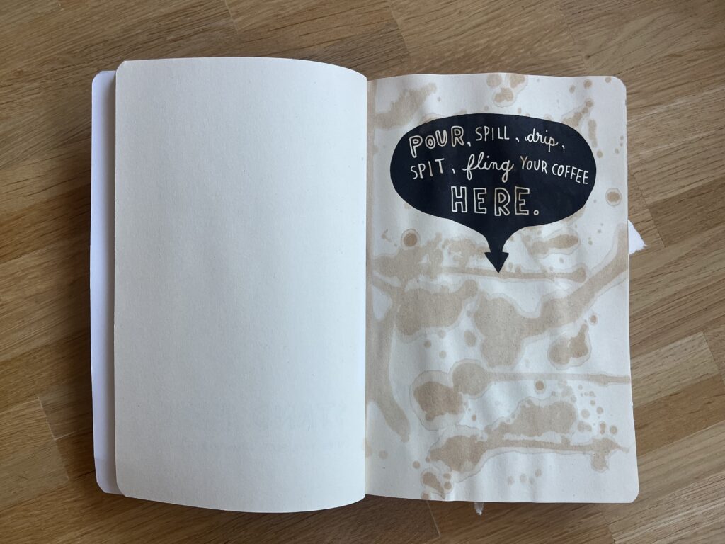
This book has around 220 pages, where each page is a creative prompt, an invitation to mess around, destroy, let loose and have fun, it feels like a permission to play. I journaled a lot in my teenage years and I wanted everything to be perfect especially the first few pages. One of the first prompts was to “spill coffee on this page”. It took me some time to really bring myself to do it, knowing that the coffee will not just spill on this page, but also the rest of the book. I was stressed to be honest. But while doing it, felt quite freeing and fun. I mean there are still some pages, where I am having a hard time doing them, but I guess this is just a process. I am so used to try to make everything perfect and shiny. Every project needs to be efficient and optimized and there is no room for mistakes or failure. So maybe with every page I give myself the permission to just have fun.

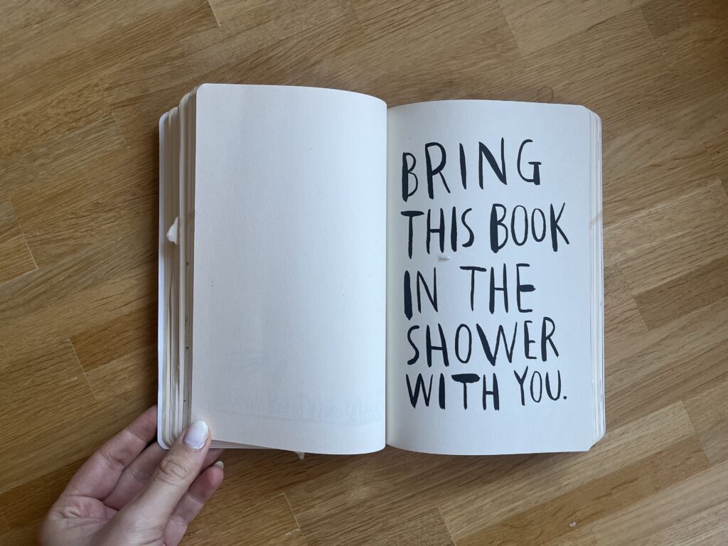
I think this book is in a strong relation with the “Do First, Think Later” idea I wrote about in my last blog. The prompts are weird and illogical, like taking the journal to the shower, but it helps to start creating on an impulse without planning it too much. It’s all about just start doing it, get messy and see where the chaos leads. This book forces you to start with your gut instead of overthinking it with your head.

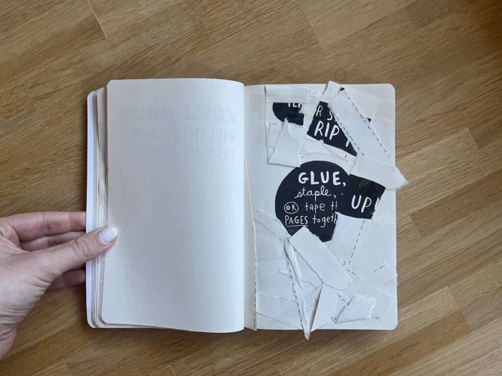
There are also a lot of pages where you need to destroy the page like it ripping it apart, crumbling it up or cutting into several pages. The good thing about having to destroy things is that you basically can’t fail. This removes all the pressure, self-judgement and need for perfectionisms. It’s all about the activity itself rather than the outcome. It’s all about fun and having a good time, embracing the imperfection.

Another important aspect of the book is, that they work with creative constraints like draw the page with glue. Instead of having infinite choices of a blank canvas you can get a silly prompt that forces you to get creative within a given limit or constraint. I think having a clear prompt can prevent the paralysis of endless choices that sometimes block the creativity.

Even though this is an analog book, which gives more ideas to get chaotic, messy and imperfect than a website, but I think the core ideas can be translated into the digital creative playground, and I think this webspace should exactly be a place for creatives to just let go, get chaotic, mess around. It should be a place where not everything needs to be perfect, it should be a place to just have fun and be creative.

AI was used to check spelling and grammar and better clarity.

Impulse #3 – Die Kreativmaschine

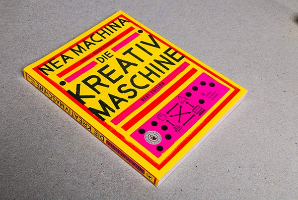
Two weeks ago, we had a class with Konrad Baumann where he brought some of his books. This big yellow book caught called “Nea Machina. Die Kreativmaschine” caught my attention. At this time, the idea for my Master’s Thesis slowly starting to grow, focusing on creativity. So, I was very curious about what the “Kreativmaschine” could be.

source: https://www.poschauko.de/neamachina/

The book is a work of Thomas and Martin Poschauko, two multidisciplinary creative professionals whose work goes from fine art, design, creativity research and academic teaching. It is based on an experiment they did: They wanted to see how many different art pieces they could create within four months. The core constraint or template was that each art piece had to be a portrait with the title “Nea Machina”. In those four months they created 1000 different variants. The book showcases the results of the experiment. However, while working on the variations they started to analyze their work and also the process, which led them to their own creative methodology: Die Kreativmaschine. Therefore, the book not only displays their work, but also gives an insight into the theoretical essence and principles.

The core idea of the Kreativmaschine

The Kreativmaschine consists of four components: head, gut, hand and computer. Those four elements are further separated into two different levels:

  • Idea Level: Head and Gut
  • Tool Level: Hand and Computer
source: https://www.poschauko.de/neamachina/

The idea level represents the origin of an idea, which is essential for any creative work. It addresses the question: “From which inner drive does design emerge?”
* The head refers to a planned, conceptual approach that relies on clear structures of thought. Logic plays an important role here.
* The gut, by contrast, is emotional and non-rational. It involves intuitive action and is associated with playful, unsystematic, and not immediately logical approaches.

The tool level describes the technical realization of an idea.
* The hand stands for all manual techniques, such as painting or constructing installations – anything that involves real, physical materials.
* The computer, on the other hand, represents digital design carried out on the computer using graphic software.

The authors shared their observation: they realized that every time they created a variation on the computer, their next inspiring idea involved creating something by hand. They stated that the rotation of the four elements in both levels is what kept them going and gave them inspiration for the next variation that kept the whole experiment running.

While the Kreativmaschine is the central concept of the book, they also cover several other core topics:
* Independence from the computer
* Letting go of control leads to higher quality
* Escape the everyday
* Do first – think later
* The good feeling as a creative force
* Artist or designer
* The special tool “hand”
* Free perception

This book, and specially the concept of the Kreativmaschine provide a good theoretical framework for my Master’s Thesis on encouraging playful, low-pressure creativity as counter to productivity culture.

One thing that stuck with me was the core topic “Do first – think later”, because I feel like we are so used to the opposite. We think before we do, we want to plan everything before we start to be as efficient as possible when working on the project. I think it is generally a good approach in life, but maybe not always the best approach for creative projects. The authors said that sometimes the good ideas come from just starting and seeing where it leads you. So, starting with your gut instead of with your head. The book shows that spontaneous, non-rational and imperfection can be the key to breaking creative blocks and foster real inspiration.

Link to their website:
https://www.poschauko.de/neamachina

AI was used to check spelling and grammar and better clarity.

Impulse #2 – Finding Inspiration and Ideas

Yesterday I had a big block trying to find an idea for my next assignment. Honestly, I felt quite lost. I was sitting at my desk, just staring at my laptop and got more frustrated every minute. My brain felt completely blank and I was starting to get angry at myself, because I felt I was wasting so much time especially since I had plans to meet a friend later. I could feel how the pressure of “I need to get an idea now” totally blocked all my creativity.

I almost canceled on my friend, but then I thought maybe it is a good idea to step back from the project for a while, since I was already frustrated anyway. I am happy I did it. At my friends’ place I told her about the struggles, and she asked me a bunch of questions about what project and what I need to do. This already helped me to start getting some initial ideas.

At some point of the conversation, she stood up and grabbed a graphic design book. I was a bit confused at the beginning because the book was mostly filled with posters and logos from throughout the years and this was not really my assignment topic. But she told me whenever she feels stuck with a project, she looks into the book to get some fresh inspiration.

She gave me a little challenge:

  1. Pick a random page for the aesthetic.
  2. Pick a random page for the theme/topic.
  3. Pick a random page for the character or the main element.


It was really fun flipping through the book and finding inspiration in things where I wouldn’t normally look. I arrived at her place with zero ideas and two hours later I left with a brain filed with new ideas and inspiration. Just by talking to her and flipping through that book.

What I take away from this evening

It showed me once again, that when I want to work on a creative project, I can’t just sit in front of my laptop and wait for the perfect idea to just pop into my head. It just doesn’t work for me to force creativity on the spot especially while being in the same environment all the time.

In addition, I realized that I sometimes rely too much on inspiration from digital tools like Pinterest, but it only shows you things based on what you like, so honestly there is no new input that challenges your thinking.

Two reminders for my future creative blocks:

* Inspiration can be everywhere and sometimes it is better to close the laptop and to look for inspiration in the real world. Looking at a random book, observing the surroundings or just talking to someone who might give me a random starting point I need to get moving.

* Taking a break, especially if I am already frustrated, can be very helpful. Even if it’s just for an hour. It can help to get some new and fresh ideas.

So, don’t get stuck in front of the laptop. Change the environment and start with a random input to see where it leads you.

And shoutout to Stefi <3

AI was used to check spelling and grammar and better clarity.

Impulse #1 – CoSA

Last week I visited CoSA – Center of Science Activites in Graz. CoSA offers twelve different areas, where visitors can explore technical and scientific relations and phenomena in a hands-on way. Instead of a strict and typical ‘do not touch’ they follow the rule of ‘please touch’, encouraging a playful discovery. I visited three of the areas: The Experimentarium, The MedLab and Technology.

The Experimentarium is a playful, curiosity-driven space full of scientific phenomena and hands-on surprises. Introductions and exhibits were hidden, and you needed to find the tiny drawers and covered elements spread throughout the room. The space felt like a playground and as a visitor you got invited to poke around, test things, explore and discover at your own pace.

In the MedLab you could discover the world of medical research. You could slip into the shoe of a medical professional, either as a doctor or a lab technician. There were three patients that needed to be examined, and you could even take a blood sample with real liquid in the syringe. The blood sample needed to be analyzed in the lab to find out the correct diagnosis, which made the experiment surprisingly realistic.

In the Technology Area focused engineering and mobility. You could build your own vehicle by selecting the different components needed for a car. For each component there were even different options to use, like a diesel engine, gasoline engine or electric motor. Once the car was assembled, you can test it in a racing simulation and fine-tune it based on the performance. It was a fun and very interactive way to learn about something complex as a vehicle.

I completely lost track of time during my visit and felt totally immersed in the exhibition. I was genuinely fun. When I reflected on why I enjoyed the exhibition so much, I realized it gives visitor a place to experiment, explore, and play. I felt a bit like a curious kid again.

And that feeling connects to what I want to research about in my master thesis: how interaction design can foster playful, imperfect and low-pressure creativity. We live in a world which pushes us towards productivity, efficiency and optimization and I think we all forgot how it feels to simply just mess around and play without expecting a result. As children playing was our way of learning, discovering new things and processing our environment and I think unfortunately we lost that as adults.

And maybe that is what we should bring that back in our lives. Play more, experiment more and just try things, without judgment and without pressure. This is where the idea for my project is coming from: I want to create an interactive web playground for creatives. A digital space where the goal is not to produce something ‘useful’, but to create something without pressure, where we can set our perfectionism aside and simply create something for the joy of creating.

So, I think this is a reminder for myself, that play isn’t a distraction of creative work, maybe it is a form of creative work; and the kind that brings back energy, curiosity, and inspiration.

AI was used to check spelling and grammar and better clarity.

Proseminar TASK III – Evaluation of master’s thesis

Tiel: Zufall und Design
Autor: Martin Naumann
Veröffentlichung: 2023
Universität: Hochschule Anhalt
Studiengang: Intermediales Design

Die Masterarbeit “Zufall und Design” untersucht das Phänomen des Zufalls und seine Bedeutung für Design. Im theoretischen Teil setzt sich der Autor mit wissenschaftlichen Bereichen auseinander in denen Zufall ein Teil der Forschung ist. Für das Werkstück arbeitet der Autor mit Zufallsgeneratoren, generativer Software sowie künstlicher Intelligenz. Die daraus entstandenen Werke werden in einer Ausstellung gezeigt. Die Werke umfassen interaktive Installationen, literarische Werke sowie Produkt-Prototypen. Ziel der Arbeit ist es, ein besseres Verständnis für Zufall zu entwickeln und wie es im Design eingesetzt werden kann.

Gesamtqualität der Präsentation
Die Arbeit ist sehr umfangreich, detailliert und sorgfältig gestaltet. Die klare Gliederung ermöglicht eine gute Orientierung. Das Thema Zufall wurde auch direkt in dem Design der Arbeit aufgegriffen, was natürlich einerseits die Arbeit unterstreicht, aber an manchen Stellen zu Schwierigkeiten der Lesbarkeit führt.

Grad der Innovation
Die Arbeit zeichnet sich durch einen hohen Grad an Originalität aus, insbesondere durch die Untersuchung von Zufall aus naturwissenschaftlichen, psychologischen und philosophischen Kontexten und deren Verbindung mit kreativen Designprozessen. Die Ausstellung umfasst außerdem diverse Exponate, bei denen mit verschiedenen Medien gearbeitet wurde, um das Thema Zufall hier nochmal aus verschiedenen Perspektiven zu betrachten.

Selbstständigkeit
Die Arbeit zeigt eine hohe Selbstständigkeit. Die umfangreiche Literaturrecherche zu Beginn verbindet verschiedene Disziplinen und werden eigenständig interpretiert. Die praktische Umsetzung zeigt eigenständige konzeptionelle Entscheidungen und Ideen. Die eigene Vorgehensweise wird mit Grafiken und Reflektionen gut dokumentiert.

Organisation und Struktur
Die Gliederung ist logisch und nachvollziehbar: Einleitung, theoretische Grundlagen, Erkenntnisse, Methoden, Designprozess, Designlösung und Reflexion. Man kann als Leser einen klaren roten Faden verfolgen es wird klar dargestellt, wie die theoretische Grundlage im praktischen Teil angewendet wird.

Kommunikation
Der Text ist klar formuliert mit einem wissenschaftlichen, aber gut zugänglichen Stil. Fachbegriffe werden verständlich erklärt, und komplexe Inhalte mit klaren und einfachen Grafiken dargestellt.

Umfang
Die Arbeit ist sehr umfangreich. Es wird sowohl theoretisch als auch praktisch tiefgehend auf das Thema Zufall eingegangen.

Genauigkeit und Aufmerksamkeit zum Detail
Sprachlich und formell ist der Arbeit sehr sorgfältig verfasst. Der Autor verwendet in der Arbeit Fußnoten, aber die Kurzbelege auf den jeweiligen Seiten fehlen. Er verweist lediglich im Literaturverzeichnis auf die verwendete Quelle.

Literatur
Grundsätzlich ist es gut, dass Quellen aus verschiedenen Disziplinen wie Wissenschaft, Philosophie und Design verwendet wurden, jedoch sind eine hohe Anzahl an Quellen Wikipedia, was im wissenschaftlichen Arbeiten eher umstritten ist.

Das Werkstück

Das Werkstück ist sehr umfassend in den Kapiteln Methoden, Design Prozess und Design Lösung dokumentiert. Das Kapitel Methoden beinhaltet die Umfrage, die Organisation mit Mindmaps und dem Zeitplan, sowie die Experimente mit Zufall. Er arbeitete dabei mit Zufallsgeneratoren, generativer Software z.B. Touchdesigner und Blender und Künstlicher Intelligenz. Er zeigt in diesem Kapitel auch immer den Prozess mittels Screenshots. Im Design Prozess schreibt er über die fünf Konzepte der Exponate. Die Design Lösung umfasst einen detaillierten Entstehungsprozess der Exponate sowie die Entwicklung der Ausstellung. Die Arbeit umfasst eine umfassende und klare Dokumentation der Exponate, diese existieren jedoch auch als physische Prototypen.

Die praktische Umsetzung ist eng mit der theoretischen Grundlage verknüpft. Jedes der Exponate beschäftigt sich mit einer Problemstellung, welche sich aus der theoretischen Auseinandersetzung ergeben haben. Das umfassende Werkstück zeigt eine professionelle Qualität und gestalterisches Können, da das Thema Zufall mit unterschiedlichen Medien aufgearbeitet wurde.

Allgemeine Bewertung

Insgesamt handelt es sich um eine sehr gut gelungene und innovative Masterarbeit, die das Thema Zufall sowohl aus wissenschaftlicher als auch kreativer Perspektive beleuchtet und innovative Gestaltungslösungen vorstellt. Der Schwachpunkt der Arbeit ist die fehlerhafte Zitierung sowie die eher wenig wissenschaftliche Literatur.

#2.06 Final Video

In this final post, I’m sharing a short video documenting the process behind the first prototype of the Focus Lamp. I started with a quick proof of concept to explore the core interaction: placing the phone in a dock to trigger a shift in light and attention. From there, I moved on to a more refined version, improving both the physical design and the technical setup.

This is still just the beginning. The prototype is far from finished, but it marks an important step in translating abstract ideas, about distraction, focus, and calm technology, into something tangible. There’s a long way to go, but I’m excited to continue exploring how physical objects can gently support more mindful and intentional use of technology.

#2.05 Refined Prototype & Some more thoughts

I’ve proceeded to improve the lamp’s physical design and technical implementation after creating the initial proof of concept to test the fundamental interaction loop. The objective at this point is to make the prototype more like the final experience, which I envision to be soft, ambient, emotionally soothing, and user-friendly.

Shifting from ZigSim to Arduino + Sensor

In this step of the prototype, I moved away from using ZigSim with the mobile sensor, to using an Arduino board with a proximity sensor. The sensor detects when the phone is placed in the dock and sends this data to Max/MSP, which then triggers visual feedback in Resolume Arena. This allowed for a more modular and scalable system: the phone becomes a passive actor in the setup, while the lamp actively reflects the user’s engagement or disengagement with it.

Redesigning the Dock

Since the first prototype of the dock was too big and bulky, I shifted toward a rectangular, low-profile dock that takes up less space and fits more naturally into the physical environment of a desk. When I built the second prototype, I realized that it wasn’t high enough, because you almost couldn’t put the phone in it. When I built the third prototype, I made it a bit higher so that you could put the smartphone in easily.

The lamp

In the first prototype, I experimented briefly with using transparent paper to diffuse the LED strips, and I decided to take that idea further. For this version I put a LED hexagon into a see-through sphere. To avoid hard and direct light, I lined the inside of the sphere with transparent paper, softening the light and creating a much more ambient, almost lantern-like glow. This resulted in a less like “technology” and more like calming object. The light is still the primary feedback. When the phone is placed on the dock, the LED hexagon glows with a gentle, diffused light, signaling the beginning of a focus session. Is the phone removed the color of the light changes – not to shame the user, but to offer a reflective signal. This fits the principles of Calm Technology: feedback is present but not dominant. The lamp becomes a kind of behavioral mirror – always gentle, never forceful.

Some more thoughts – Creative Prompts

In the last session Birgit suggested an interesting shift in perspective – what if distraction wasn’t always something negative, but could actually hold meaning? That idea really stuck with me. I haven’t implemented it into the prototype yet, but I’ve been thinking a lot about it, especially because I know how common it is, especially in creative fields, to feel guilty when we’re not being “productive” or working on something for school. That guilt is exactly what I don’t want people to feel when they use the Focus Lamp.

As someone who works creatively, I’ve often noticed how much time I can end up spending on my phone, especially on social media. And after a while, I started to feel like I was losing a bit of my spark and creativity. That feeling is part of what inspired this project in the first place. So now I’m considering integrating an app after all, not as the main feature, but as a gentle companion to the lamp.

The idea is that if someone is in focus mode and still picks up their phone, instead of being punished or shamed, they’re offered a creative prompt. Something light and inspiring to nudge them in a different direction during that moment. For example: “Draw what’s around you for 10 minutes,” “Read 10 pages of something,” or “Stretch for a few minutes.”

It’s not about blocking the phone or enforcing discipline. It’s about helping people reconnect – with their creativity, their bodies, their curiosity – especially in those moments when they’re about to drift into passive scrolling. It should just be a small nudge, maybe in the right direction.

#2.04 Sketches & First Quick Prototype

Sketches

I also began sketching out ideas for how the lamp could look like. I think I decided to go into round and soft forms quick, since they intuitively feel more calming and emotionally inviting than angular or rigid shapes. I feel I was guided more by the emotional tone of the object – a gentle presence on the desk – than by the function for now.

Some initial inspirations:

  • Lava lamps: their fluid, continuous motion has a calming and almost hypnotic effect, which aligns perfectly with the idea of supporting focus without creating stress.
  • Organic shapes: neutral, timeless. These shapes don’t scream “technology,” which is important for creating a non-intrusive and emotionally grounding experience.
  • Japanese lanterns and soft-diffuse paper lights: I love the ambient softness and the quiet presence they have in a room.

I didn’t only sketch the shape of the lamp itself but also how the dock, where you put the phone, could look like. The first try was a square shape which fits the phone – but then as soon as I cut the cardboard, I realized the whole lamp + dock is probably too big, because it would take up a lot of space on the desk.

First Quick and Dirty Prototype

To move from the abstract idea and the theories and frameworks in the background to a tangible experience, I built a quick proof-of-concept prototype using ZigSim, Max/MSP, Resolume Arena and a basic lightning setup with some led-strips for the quick testing for now. This is actually less about the design of the lamp but more about the technology in the background and the core interaction loop:

  • Phone placed on dock > soft, calming light is triggered
  • Phone removed from dock > light changes

I also experimented with using transparent paper as a diffuser to soften the LED light, aiming to create a more ambient and less direct glow.

This was just a quick prototype as a proof of concept for the interaction loop.

Next steps

  • Prototyping with Arduino
  • Integrate a proximity sensor to detect whether the phone is in the dock or not.
  • Redesign the dock and where to put the phone + sensor
  • Use a different source of light which is smaller than the LED strips
  • build a prototype of the lamp itself
  • Experiment with softer shapes and better light diffusion to create a calming, ambient presence that supports focus

#2.03 Theoretical Frameworks

In this blogpost I want to explore the ideas, theories and frameworks which shape the concept behind my prototype. I am diving into psychology behind focused work, the design of calm interfaces, and how we might nudge behavior without enforcing strict rules.

The Flow State – The foundation of deep creative work

One of the central concepts driving this project is Flow, a term coined by psychologist Mihaly Csikszentmihalyi, who describes it as “a state in which people are so involved in an activity that nothing else seems to matter” [1] It’s the sweet spot where challenge meets skill, and our attention becomes fully aligned with the task at hand.

Csikszentmihalyi outlines eight components that typically make up these experiences:

  1. The task is something we believe we can complete
  2. We can fully concentrate on the task
  3. The task has a clear goal
  4. It provides immediate feedback
  5. There is a deep, but effortless involvement that blocks everyday worries and frustrations
  6. We feel in control of our actions
  7. Self-consciousness disappears, but paradoxically we feel more ourselves afterward
  8. Our sense of time shifts: hours feel like minutes and the other way round [2]

The interplay of these elements creates a type of enjoyment so fulfilling that people are willing to invest significant effort just to experience it. [2] However, the modern digital environment, especially smartphones, disrupt the conditions needed for flow. Every notification, every swipe, every quick scroll breaks our attention and concentration and makes it harder to return to a state of deep immersion. In his book, Csikszentmihalyi writes: “[…] attention is our most important tool in the task of improving the quality of experience.” [3]

This project is about protecting that attention, not by eliminating distractions entirely (which isn’t realistic), but about creating the right conditions for focus and flow to happen more easily.

Calm Technology – Supporting, Not Distracting

Another concept that influences the project is Calm Technology, which was introduced by Mark Weiser and John Seely Brown (1995) in their paper “Designing Calm Technology”.

It is a design philosophy focused on integrating technology more seamlessly into daily life by using peripheral awareness rather than demanding our full attention all the time.

Today, most digital tools overwhelm us by constantly competing for our focus and attention, creating a sense of stress and distraction. Calm Technology on the other hand is about designing for both our center and periphery of attention, allowing us to shift our focus naturally when needed.

The periphery are things we are aware of without actively focusing on them. For example, when driving, we might not actively think about the engine sound, but we notice if it suddenly changes. Calm technology uses this same principle: subtle, non-intrusive cues that live in the background and only surface when needed. This allows us to stay aware without feeling overwhelmed.

Eventually, they argue that designing for calmness is essential in a world of constant digital noise and distraction. It’s not about removing information but about designing it to fit better with how people naturally divide their attention. [4]

Persuasive Design – Nudging, Not Controlling

My approach is informed by persuasive design, which incorporates principles from psychology, like motivations and cognitive biases, and turns them into practical strategies for designing products.

“Persuasive design can help:

  • Users in decision making
  • Designers communicate more clearly
  • Nudge users in the right direction
  • Help users to develop skills
  • Drive users end or begin new habits” [5]

A key framework here is BJ Fogg’s Behavior Model (FBM) that helps designers and researchers understand how to change human behavior through technology. He sees three factors that need to be there at the same time for the behavior to happen:

Motivation + Ability + Triggers = Behavior

Fogg points out that the goal of persuasive design is not to manipulate or shame users into behaving a certain way. Instead, it’s about gently guiding behavior, ideally in line with what the user already wants to do, like staying focused or being more intentional with their time. [6]

Literature

[1] Mihaly Csikszentmihalyi, Flow: The Psychology of Optimal Experience (Harpercollins, 1990), 4.

[2] Mihaly Csikszentmihalyi, Flow: The Psychology of Optimal Experience (Harpercollins, 1990), 49.

[3] Mihaly Csikszentmihalyi, Flow: The Psychology of Optimal Experience (Harpercollins, 1990), 33.

[4] Mark Weiser, John Seely Brown und Xerox PARC, „Designing Calm technology“, 21. Dezember 1995, https://people.csail.mit.edu/rudolph/Teaching/weiser.pdf.

[5] Eddie Kim, “Persuasive Design: Nudging Users in the Right Direction,” Medium, December 6, 2021, https://uxdesign.cc/persuasive-design-nudging-users-in-the-right-direction-5af4a6f8c06f.

[6] B. J. Fogg, “A Behavior Model for Persuasive Design,” in Proceedings of the 4th International Conference on Persuasive Technology, (April 2009): 1–7.

#2.02 Designing for Focus in an Age of Distraction

When I sit down to do work, I often only find myself deep in a rabbit hole of Reels or TikToks or reorganizing my phone, only after 30 minutes into the task. And to be honest even while working on this blog post I got distracted several times by my phone. This is why I decided to explore the topic of distraction in a digital life but I think it is also broadly relevant, since I feel like a lot of people struggle with getting distracted easily these days.

Are we living in an attention crisis?

There is a rising discourse around attention crisis, brain rot and digital burnout, since our days are increasingly fragmented by notifications, being constantly online and temptation of endless scrolls. In his book Stolen Focus, Johann Hari, talks about the effects of this crisis such as reduced productivity, heightened stress levels and even a weakening of our capacity to build deep and meaningful relationships. [1] A study from Microsoft says that our attention span shrank from 12 seconds in 2000 to 8 seconds nowadays, leading to humans having a shorter attention span than a goldfish. [2]

On average, people spend 4.5 hours a day on their phones [3], with 2.5 of those hours dedicated to social media. [4] Big tech companies like Meta and Google generate revenue by maximizing user engagement, turning out attention into a profitable business model. As a result, we get bombarded with dopamine-driven feedback loops that make it extremely hard to put the phone away to concentrate on a single task. [5]

Spending so much time on social media and doom scrolling for hours also affects people. In October 2024 “Brain Rot” was chosen for the Oxford Word of the Year. Brain Rot refers to the cognitive decline and mental exhaustion experienced by individuals, particularly adolescents and young adults, due to excessive exposure to low-quality online materials, especially on social media.“ [6]

Brain rot is an emerging concern among adolescents and young adults navigating today’s tech-saturated word. Marked by symptoms such as brain fog and reduced concentration, this condition seems to worsen with excessive screen time and constant exposure to trivial online content, ultimately contributing to a decline in cognitive function. [6]

Creative professionals like designers, writers, artists, musicians need uninterrupted time to enter a state of flow, where ideas can surface and evolve without constant context-switching. But even with productivity tools, focus apps, and “Do Not Disturb” settings, our smartphones still act like behavioral magnets. They promise us connection, innovation, and escape and they’re designed to be hard to ignore. Notifications, dopamine loops, and habit-forming UX patterns pull us away from the present moment, often without us realizing it.

So, the central question guiding my prototype this semester is:
How might a tangible interface reduce smartphone-related distractions for creative professionals?

The Concept: A Lamp That Helps You Focus

Rather than building yet another app to solve the problem, I want to explore a physical, ambient object that supports intention and presence in a gentle, non-coercive way. My prototype will be a lamp/phone dock – a small, aesthetically calming object that lives on your desk and invites you to temporarily “put the phone away” without demanding rigid rules or screen-time shaming.

The lamp will produce a gentle, ambient light when the phone is in the dock; it may change color gradually to show how much time was spent in focused mode. The lamp may respond softly by changing its color temperature, dimming slightly, or providing a quite auditory cue if the phone is taken out too often. These feedback loops are intended to raise awareness, encourage behavior, and support the user’s initial goal of remaining focused on their job rather than to punish.

Why a Tangible Interface?

I’m interested in how tangible interaction, physically placing the phone somewhere, seeing a change in your environment, can help ritualize focus in a way that’s more embodied and emotionally resonant than tapping a digital button.

What’s next?

In my next blogpost I want to look at some theories and frameworks such as:

  • Theory of Flow
  • Calm Technology
  • Persuasive Design

After getting into those theories and frameworks I am going to start with the first simple prototype.


My goal isn’t to eliminate distractions entirely, that’s unrealistic and probably undesirable. Instead, I’m curious about how design can create moments of pause. How can we introduce friction in a respectful, aesthetic, and emotionally intelligent way? How might we design tools that gently invite reflection, rather than enforce rules?

Literature

[1] Johann Hari, Stolen Focus: Why You Can’t Pay Attention – and How to Think Deeply Again (New York: Crown Publishing, 2022)

[2] Microsoft Canada Consumer Insights Team. Attention Spans: Consumer Insights. Spring 2015. Toronto: Microsoft Canada.

[3] Fabio Duarte, “Time Spent Using Smartphones (2025 Statistics),” Exploding Topics (blog), June 5, 2025, https://explodingtopics.com/blog/smartphone-usage-stats.

[4] Josh Howarth, “Worldwide Daily Social Media Usage (New 2025 Data),” Exploding Topics (blog), June 5, 2025, https://explodingtopics.com/blog/social-media-usage.

[5] Shehzad Batliwala Do Mgm, “The Attention Crisis: A Visionary’s Perspective on the Stolen Focus Epidemic,” Medium, September 10, 2023, https://medium.com/@visionarydoc/the-attention-crisis-a-visionarys-perspective-on-the-stolen-focus-epidemic-eff6692abbf9.

[6] Ahmed Mohamed Fahmy Yousef et al., “Demystifying the New Dilemma of Brain Rot in the Digital Era: A Review,” Brain Sciences 15, no. 3 (March 7, 2025): 283, https://doi.org/10.3390/brainsci15030283.