Translating Visual Narrative into Album Package Design

What makes K-Pop packaging so unique is how it turns a music release into a collectible experience. Albums are not just containers for songs, they’re extensions of the group’s concept, often acting as physical embodiments of their visual and gender narrative.

Through my genre experiments, I began to notice just how tightly album design is tied to the styling and gender presentation of a comeback. In an Electronic concept, the packaging might feature glitch aesthetics, holographic materials, and minimal typography. In a Classical-inspired release, one might expect textured paper, serif fonts, gold foil, and portrait-style photography. These choices reinforce the persona and mood the group is performing.

K-Pop packaging uses everything, photobooks, postcards, posters, even the way the CD is tucked into the case to tell a visual story. And because styling plays such a central role in constructing gender identities, those same visual codes carry over into the packaging: softness versus structure, vulnerability versus power, natural versus artificial.

In essence, album packaging becomes an archive of a concept, preserving not just the sound but the gendered visual world that accompanied it. It’s branding, storytelling, and identity-making, all in one object.

Communicating Gender Through Styling

In K-Pop, fashion and makeup are key tools for constructing gender narratives. These aren’t just surface-level aesthetics, they actively shape how idols are perceived, interpreted, and emotionally engaged with.

Throughout my research, I observed that K-Pop boy groups constantly move between traditionally “masculine” and “feminine” styling cues. One comeback might feature structured military jackets and leather, another soft pastels, lace, or glossy skin. Makeup plays a crucial role here, highlighting certain features (eyes, lips, jawlines) to either sharpen or soften a member’s look, depending on the concept.

This flexibility doesn’t dilute identity, it expands it. It invites fans to see masculinity as multi-faceted, emotional, and performative. In many ways, K-Pop creates space for gender as performance, much like drag or theatre, but within a mainstream pop format. Importantly, this kind of gender play is made digestible and aspirational through the high production quality of styling, visuals, and controlled group dynamics.

Each visual concept becomes a new lens through which to explore and project identity, not as fixed, but as curated and expressive. And fans engage deeply with this process, decoding meanings, reading emotions, and connecting with idols based on how their image evolves over time.

Going back to K-Pop

After experimenting with Electronic, Lofi, and Classical music genres, returning to K-Pop feels like coming back to a language I know, but now with a deeper understanding of what makes it so special. The genre-blending journey allowed me to momentarily remove K-Pop from its typical aesthetic environment and ask: what remains when we strip away the gloss and recontextualize it?

What stood out most is how visually versatile yet identity-focused K-Pop is. Unlike Lofi or Classical, where the aesthetic can overshadow the individual, K-Pop insists on keeping the idol at the center. This centrality enables gender identity to be fluid, stylized, and emotionally legible, especially through fashion and makeup.

Fashion in K-Pop is not just styling, it’s character-building. Masculinity can mean smoky eyeliner, cropped knits, or harnesses, femininity can exist within a boy group’s soft gaze, sheer fabrics, or flower-strewn visuals. The genre doesn’t collapse gender, it performs and stretches it, borrowing freely from both sides while always pushing aesthetic boundaries.

These experiments made me realize that K-Pop’s success lies in its hyper-design and intentional ambiguity. It allows for brief detours, like classical elegance or digital abstraction, but always returns to the idol as a canvas for complex identity-making.

Experiment 3 – Classical Music

Branding in Classical Music

In the classical genre, branding is steeped in tradition, prestige, and formality. It draws heavily from historical visual codes, ornate serif fonts, monochromatic palettes, formalwear, and references to Western art history or architecture. Classical branding emphasizes discipline, skill, and cultural authority.

Evaluation 

The Classical genre experiment was by far the hardest to work with. Unlike the previous genres, which either aligned naturally with K-Pop’s visual playfulness or offered space for reinterpretation, Classical music belongs to a completely different aesthetic system. Translating that into a K-Pop context, where identity is bold, emotionally expressive, and fast-moving, was a challenge.

However, there was an unexpected point of cultural resonance: the fact that Korean pop culture is also deeply rooted in a society that is more conservative and hierarchical compared to many Western music industries. In that sense, Classical aesthetics, with their emphasis on discipline and tradition, felt slightly more at home than expected. There’s a cultural familiarity in the values it conveys: respect for elegance, and controlled emotion. This overlap added an interesting, if subtle, layer of fit.

Another difficulty was in the design language of classical music posters and album covers. They tend to be text-heavy, with a focus on composer names, titles, venues, and dates, rather than on visual branding or performer identity. This made it particularly hard to adapt the format to a K-Pop setting, where visuals usually speak louder than copy. Improvising around this structure was tricky, I had to either simplify the layout significantly or risk losing the clarity and energy expected of a K-Pop concept.

This experiment highlighted just how powerful cultural codes are in shaping genre identity, and how challenging it can be to bridge aesthetics built on fundamentally different assumptions.

Choosing genre 3 – Classic

For my third genre experiment, I’m turning to a world far removed from the digital softness of Lofi or the neon modernity of Electronic: Classical music. With its deep roots in tradition, formality, and historical prestige, Classical offers a completely different aesthetic and cultural frame through which to reimagine the visual storytelling of K-Pop.

Why Classic?

Classical music carries with it an air of refinement, structure, and cultural gravitas. It conjures visuals of orchestras, velvet-draped theaters, marble columns, tailored tuxedos, and gilded instruments. The aesthetic is steeped in a historical Eurocentric idea of “high culture,” and with that, comes a set of visual norms that are both highly gendered and heavily codified: men in suits or waistcoats, women in flowing gowns, all within a restrained palette of blacks, whites, and muted golds.

Introducing a K-Pop boy group into this visual world invites a fascinating tension. K-Pop thrives on the new, the now, the visually explosive. Classical is about heritage, structure, and restraint. What does it mean to place a contemporary idol into this visual lineage?

This genre is about elegance, legacy, and form. It will be fascinating to see how K-Pop’s emotional expressiveness and stylized gender play navigate these older aesthetic structures.

I’ll begin working on this classical transformation, developing visual motifs and styling cues that channel classical beauty through the K-Pop view.

Experiment 2 – Lofi

Branding in Lofi

Lofi branding centers on emotional intimacy and authenticity. Often associated with lo-fi beats “to study/relax to,” its visual identity is nostalgic, cozy, and DIY-leaning, built around soft color palettes, analog textures, and handmade or illustrated elements. Branding in this genre prioritizes mood over spectacle, creating a sense of comfort and emotional presence. The visuals are often embedded in soft clothing, unfiltered moments, and solitary, reflective settings.

Evalution

The Lofi genre experiment was both intriguing and challenging, and while it worked out better than I expected, it also showed some key limitations in translating this aesthetic to a K-Pop world.

Lofi’s visual language is inherently quiet, nostalgic, and non-specific. It thrives on mood over identity, often relying on soft colors, hand-drawn illustrations, and ambient, faceless environments. This creates a calming, intimate atmosphere, but it also makes it difficult to embed strong, recognizable personalities into the visual branding. In trying to reimagine a K-Pop group within this framework, I found it hard to represent the individual members in a way that felt distinctive or character-driven. They risked blending into the aesthetic rather than shaping it.

There’s potential here, especially for a special album concept or side project, where the goal might be to evoke a specific feeling or moment rather than highlight the group’s full image. A cartoonish or illustrated approach could work well in that case, perhaps offering a stylized version of the members that fits within Lofi’s softness without erasing their identities entirely. But as a main concept or long-term branding strategy, Lofi feels too generalized. The aesthetic tends to overpower the artists themselves, making it hard to maintain the strong visual-personality connection that’s central to K-Pop.

That said, I was surprised by how well the emotional tone and mood alignment worked. K-Pop often explores vulnerability and intimacy through ballads or softer concepts, and the Lofi styling did manage to evoke a similar atmosphere. It’s not that it failed, it simply doesn’t allow for the kind of individual expression that fans expect from a K-Pop group.

In the end, this experiment highlighted the importance of balance: how much can an aesthetic speak before it silences the artist? And how do you design within a genre that’s more about feeling than face?

Next, I’ll make a 180 twist, and going to experiment with the Classical genre.

Choosing Genre 2 – Lofi

Choosing Genre 2 – Lofi Music

After exploring the futuristic and hyper-stylized aesthetics of Electronic music, I’m taking a step in the opposite direction for my second genre experiment: Lofi. Known for its understated, nostalgic, and often deeply personal mood, Lofi presents an intriguing visual world that contrasts sharply with both K-Pop and the techno-futurism of Electronic.

Why Lofi?

Lofi music, short for “low fidelity”, originated from imperfections in sound recording, but over time, it has become synonymous with digital calm, emotional introspection, and a sense of soft detachment. Visually, Lofi has developed a recognizable aesthetic online: warm color palettes, grainy textures, analog-style overlays, animated or illustrated characters (thinking of the “lofi girl”), and settings that feel deeply personal, such as bedrooms, city windows at night, study desks.

This genre’s appeal lies in its intimacy and quietude. It’s not about spectacle or perfection, but rather about mood and tone. That makes it an exciting space to explore K-Pop through, especially given how heavily K-Pop relies on visual stimulation, dramatic styling, and polished image construction.

Lofi offers a space for gentleness, vulnerability, and emotional resonance. It will be interesting to see how this shifts not only the appearance of a K-Pop concept, but the emotional tone it performs.

Next: I’ll try my best on a Lofi Cover Poster.

Experiment 1 – Electronic

Branding in Electronic Music

Branding in Electronic music is often rooted in anonymity, abstraction, and futurism. Many artists use visual motifs like glitch effects, cyberpunk aesthetics, minimalistic typography, and digital distortions to cultivate a persona that feels more like a concept than a person. Branding here is immersive and often experience-based, tied to rave culture, light shows, and high-tech visuals. Gender identity is frequently blurred or stylized beyond recognition, allowing for fluid, alien, or post-human representations that challenge traditional norms.

Evaluation

The Electronic genre experiment was a surprisingly seamless fit for K-Pop branding. While this was initially intended as a contrast experiment, I quickly realized that many elements of Electronic aesthetics already work with the bold, experimental spirit often found in K-Pop.

Electronic branding thrives on creativity, abstraction, and sensory stimulation. It embraces bold and funky color palettes, unconventional silhouettes, and a sense of visual freedom that doesn’t shy away from theatricality. These are qualities that also define many K-Pop concepts, especially those leaning into high-fashion or futuristic themes. Because of this overlap, the process of reimagining a K-Pop boy group within this genre felt less like a reinvention and more like an amplification of existing traits.

What made the experiment successful was the mutual alignment in expressive freedom. Both genres celebrate visual impact and emotional intensity through styling, Electronic through distortion, glow, and digital abstraction; K-Pop through high-contrast fashion, sharp choreography, and makeup that dramatizes the face. Gender expression in this context remained fluid and performative, with Electronic aesthetics allowing for an androgynous or post-human look.

Ultimately, the Electronic genre didn’t drastically challenge K-Pop’s identity, it enhanced it. It offered a natural extension of the idol’s persona into a more digital, deconstructed world. This makes me wonder whether K-Pop, already a hybrid genre, is uniquely positioned to absorb and reinterpret global aesthetics, especially those rooted in subculture or technological futurism.

Next up: I’ll step into a softer, more introspective space with the Lofi experiment, an aesthetic that might push K-Pop further from its comfort zone.

Choosing Genre 1 – Electronic

As I begin my first genre experiment, I’ve chosen to rebrand K-Pop through the visualities of Electronic music. This genre offers a rich landscape of aesthetic codes that are at once futuristic, synthetic, and deeply tied to the body, through dance, rhythm, and often, nightlife. It feels like a natural starting point, not only because of its stark contrast with K-Pop, but also because of the potential overlap in theatricality and visual experimentation.

Why Electronic?

Electronic music, particularly in its subgenres like techno, house, and synth-pop, has always been visually forward-thinking. Think neon lighting, metallics, cyberpunk references, holographic materials, and modular or asymmetrical silhouettes. The scene’s roots in underground club culture also open up gender expression in fluid and often transgressive ways, queer aesthetics have long found a home in this space. In that sense, the Electronic genre shares some DNA with K-Pop’s own flirtation with androgyny and boundary-pushing styling, but it amplifies these traits within a more abstract, sometimes even dehumanized framework.

K-Pop, by contrast, often uses styling to emphasize emotion, narrative, or intimacy. Its idols are both idealized and made accessible through fashion that speaks to fans’ desires, aspirations, or fantasies. So what happens when those same idols are placed in the cold, digital, deconstructed aesthetics of Electronic music?

This experiment is ultimately about asking: what kinds visualities are possible within the visual vocabulary of Electronic music, and how might a K-Pop idol inhabit those possibilities?

Next up: I’ll begin creating and documenting the actual visual experimentation.

Rebranding K-Pop – other music genres explorations

During my explorative phase, I’d like to take a closer look at the intersection of genre aesthetics and gender identity expression in the visual presentation of K-Pop groups. Using an experimental, practice-based design approach, the project seeks to reimagine K-Pop through the stylistic lenses of other musical genres to investigate how genre conventions shape visual narratives, particularly in relation to fashion, makeup styling, and album package design. The ultimate aim is to unpack the flexibility of gender representation in K-Pop and to question how these expressions might shift when situated within different cultural and sonic contexts.

Introduction: Genre as Aesthetic and Cultural Code

Musical genres are not only categorizations of sound, they are cultural ecosystems. Each genre develops its own set of visual codes, aesthetic expectations, and symbolic associations that extend far beyond music, influencing everything from stage design to fashion and album packaging. These visual languages help audiences identify, interpret, and emotionally connect with artists. They also carry implicit and explicit ideas about identity, gender roles, authenticity, and performance.

While genres like rock or hip-hop might emphasize rebellion, masculinity, or street credibility, others like classical or ambient might evoke refinement, calm, or intellectualism. These aesthetics shift with time, geography, and audience. Yet, genre conventions still provide a powerful structure for how artists are visually framed and understood.

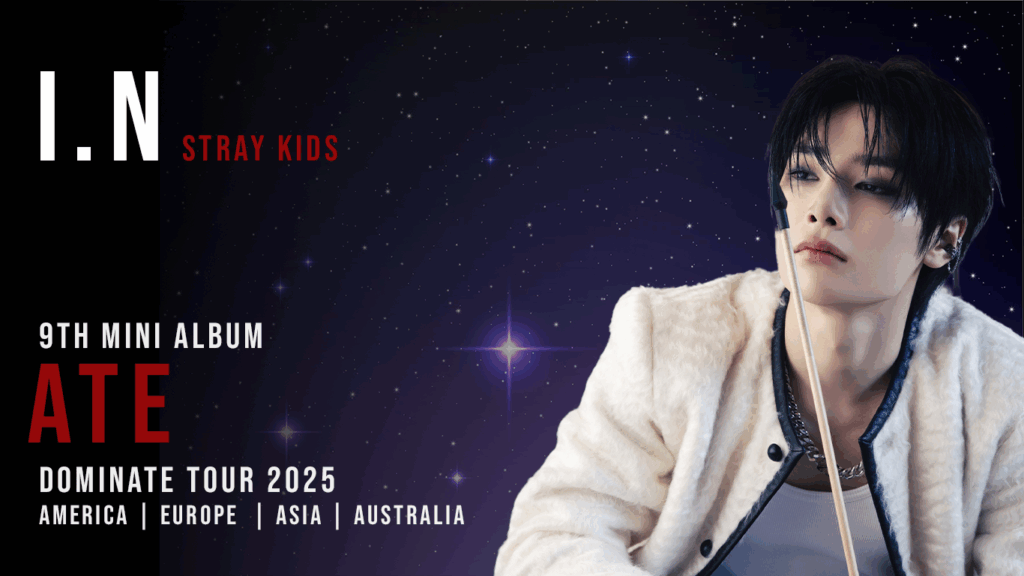
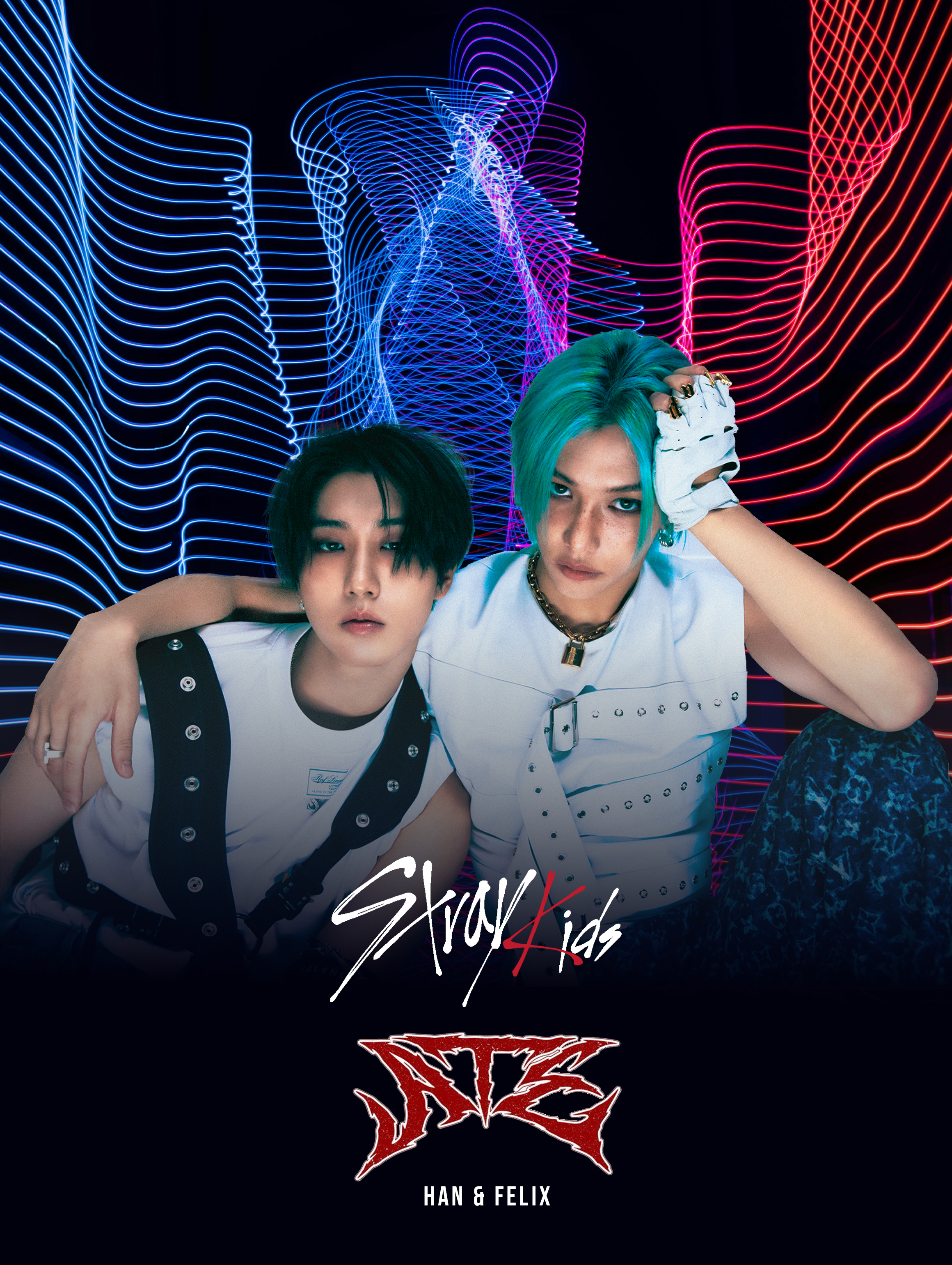
In this context, K-Pop stands out as a highly stylized, precisely curated genre that frequently plays with and challenges gender norms, particularly through the fashion and makeup styling of male idols. K-Pop visuals are often hyper-modern, experimental, and emotionally expressive, leveraging androgyny and fluidity in ways that resist or complicate Western norms of masculinity.

Experimental Approach

By adopting the visual and conceptual frameworks of selected genres, I aim to analyze how gender expressions might shift or be reinterpreted across aesthetic contexts.

This involves three core steps for each genre:

  1. Genre Selection and Analysis – Understanding the visual codes and cultural associations of the chosen genre.
  2. Styling Experimentation – Rebranding a K-Pop group within that genre.
  3. Evaluation – Reflecting on how gender identity is expressed differently through this rebranded aesthetic, and what this reveals about the role of genre in gender performance.

Chosen Genres for Exploration

For this phase of the research, I have selected three musically and visually distinct genres:

1. Electronic

Electronic music is associated with futurism, nightlife, and technology. Visually, it leans toward bold colors, metallics, synthetic textures, and high-contrast lighting. Gender expressions in this genre often embrace the avant-garde, with space for both hypermasculine and androgynous stylings. I will explore how these aesthetics can reshape the image of a K-Pop group, how futurism and abstraction might emphasize or erase gendered styling.
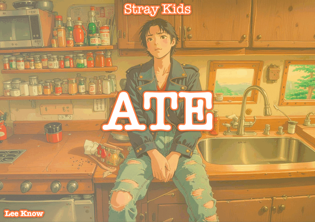
2. Lofi

Lofi hip-hop, often linked to digital nostalgia and internet aesthetics, evokes a sense of intimacy and introspection. Its visual language includes soft tones, vintage textures, hand-drawn elements, and domestic or solitary settings. In this context, I will investigate how understated, “authentic” visuals interact with the typically high-gloss image of K-Pop, and whether subtle, emotionally grounded styling can still communicate complex gender narratives.

3. Classical

The classical genre draws on centuries of cultural tradition, evoking elegance, discipline, and refinement. Visual aesthetics may include formal wear, muted color palettes, and references to art history or architecture. This genre offers a contrasting lens to the youth-centric energy of K-Pop and presents an opportunity to explore how traditional ideas of masculinity and femininity are preserved or challenged in this visual context.

Next Steps

In the upcoming weeks, I will document each stage of this process, beginning with the Electronic genre.

This phase of experimentation is not intended to reach final conclusions but to serve as a tool for critical reflection and creative inquiry. Through recontextualizing K-Pop visuals across diverse genre aesthetics, I hope to uncover new insights into how gendered identities are visually constructed, destabilized, or reimagined.