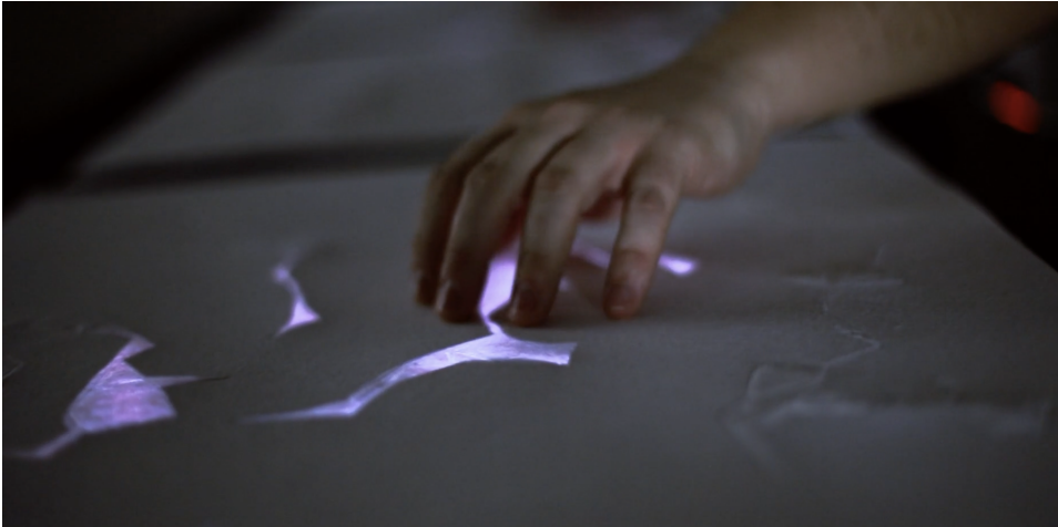
The International Design Week 2025 is over and this first part of the blog will be a recap of my process. I joined the workshop #6—Beyond Data Visualisation with Eva-Maria Heinrich. The goal was to present a self chosen data set on a socio-political topic. I chose a data set on the Co2 emission worldwide per country (https://ourworldindata.org/co2-emissions). The process started with evaluating the data span I want to show and the method of visualisation. Because the task of the workshop was to present data in an abstract way and to step back from the conventional methods, to make the experience more memorable.
Cutting the Data with Python
So to get a specific range of data to make a prototype i used python to cut the csv file to my liking. I used the pandas tool for python to manipulate the file. At first I wanted to compare three countries, but later in the process I realized that this goal was a bit too much for the given time, since I haven’t used python like this before. It was a nice way to get to know the first steps of data analysis with coding.
I created a new csv file with a selected country, in this case it was Austria in a time span from 1900—2023. Now it was time to visualise it.
Let’s get creative!
In my research on how CO2 was being visualised before I looked up some videos of NASA showing how the emission covers the world. I got inspired by this video.
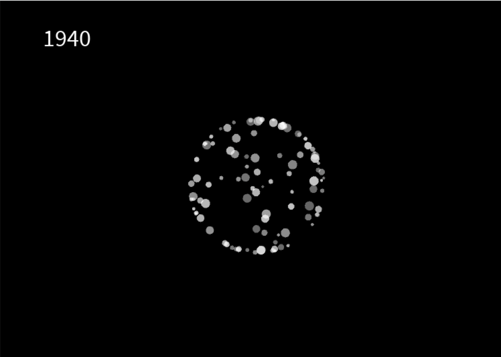
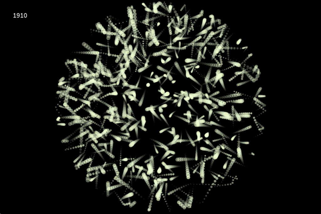
I chose processing to create my own interpretation of visualising emission. In hindsight, there are probably better tools to do that, but it was interesting to work with processing and code some visuals relative to a data set. I created a radial boundary which is invisible. Inside this shape, i let a particle system flow around which is relative to the CO2 emission in the specific year, shown in the top left corner. This visualisation works like a timeline. You can use your LEFT and RIGHT arrow keys to go back and forth in 10 years steps. The boundary expands or be reduced, which depends if the emission of that year is higher or less. The particle system also draws more or less circles, depending on the amount of CO2.
After the workshop was done I tried out other methods to make the particle system flow more and create a feeling of gas and air.
Conclusion
The whole week was a nice experience. I got to try out new techniques and tools and create something i never done have before. A problem I encountered was the time. It’s hard to estimate what you can do, if you try out something completly new. The presentation day at the end was really inspiring and emotional to see what the all the other students have created and talking about their process and results.