How Motion created meaning 

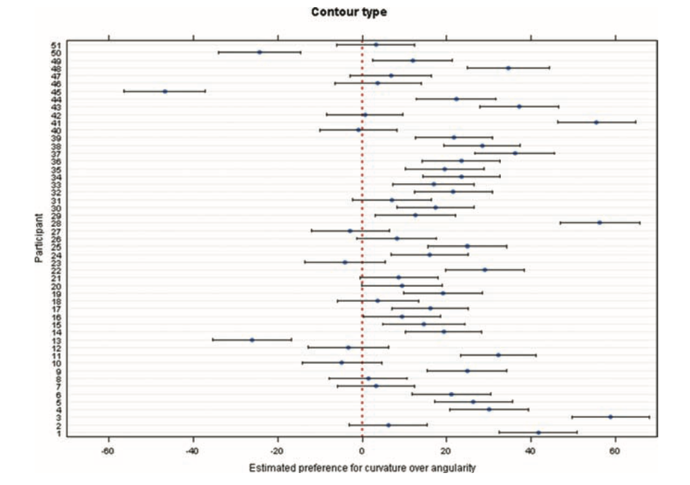
A square slowly growing or a rectangle slipping across the screen seemed too minimal to create anything emotional. But the more I read about the effect moving shapes have on our preception the more I realise that motion itself can carry a kind of langueage. It doesn’t need details. It needs rhythm, timing and space. The viewers then fill the rest. I noticed this most clearly when I wanted Rhytmus 21. Nothing dramatic really happens in the film however the black and white shapes feel strangely confident in how they move (Richter, 1921). A shape that is growing feels like pressure and a shape shrinking feels like realse in a sort of way. Its not a narrative but it can create a flow that is easy to follow. It shows that timing has a purpose as it creats structure in the whole experience. 

Around the same time I was reading a psychology paper that explored how people react to abstract motion. This study shoes that viewers look for strucutre even when visuals are extremly simple (Bloom & Veres, 1999). There is no need for faces or objexts or any sort of representational content. As soon as movement has rhythm or direction, our brain starts to organise it. This helped me to understand why Richters film feels so intentional even though nothing is “doing” anything. The viewers mind gives the motion sense just because the timing fits together. Here I also learned that direction of motion matters. Forward motion feels way more natural. Reversed motion feels off and it breaks the sense of progression. That alone showed me how sensitive we are to timing and order, even in minimal animations. This also might explain why a loop can feel smooth in one version and confusing in another even fi the shapes are identical. 

I came across another study which then again changed my understanding of moving shapes. The study here focused on how small, more abstract motions can create emotional impressions without them needing any kind of character (Bartram & Nakatani, 2010). Here it surprised me that even very little motion has a big effect and can feel very expressive. A soft drift can feel more calm whereas a quick movment or jitter can make it feel more tense. In a way it makes a lot of sense but these are still just objects moving around randomly. Even movements that are barely visible can change how we read an animation. This outcomes also connects very well back to Richer’s film as the shapes there are extremely simple, yet they already carry athomsphere and feeling just through how they move. Reading this also made me think differently about how to animate. I sometimes do assume that there is a ceratin need for details however here the opposite seems to be true. Even small changes in acceleration or smoothness can change how the viewer expereinces the whole piece. 

Following that I also looked into other design research papers that examined how physical structures influence the movement of shapes. Here the study focused more on mechanical models, but the findings can still apply well to abstract animations (Harrison et al., 2015). Here the authors explained that motion depends on the relationships between parts. Some changes in the structure can change the experience completely. Motion worked only when the relationships between the shapes stayed in balance. If one angle or distance changed too much, the flow of the movement broke and suddenly looked irregular or unstable. This shows that abstract motion follows a kind of internal logic. When timing and spacing support that logic, the movement feels smooth and coherent. When they don’t, the viewer notices it immediately, even if the shapes themselves remain simple. It highlights how sensitive motion is to structural consistency, and how much the quality of a movement depends on the conditions that allow it to unfold naturally.

All of this showed again that motion can have a big impact on the shapes’ perception. The shapes themselves are simple, but their relationships, timing, and rhythm create structure, flow, and atmosphere. Motion can communicate emotions even when nothing represents anything.

Bibliography:

Bartram, L., & Nakatani, A. (2010). What makes motion meaningful? Affective properties of abstract motion. 2010 Fourth Pacific-Rim Symposium on Image and Video Technology, 468–474. https://doi.org/10.1109/PSIVT.2010.85

Bloom, P., & Veres, C. (1999). The perceived intentionality of groups. Cognition71(1), B1–B9.

Harrison, L., Earl, C., & Eckert, C. (2015). Exploratory making: Shape, structure and motion. Design Studies.41, 51–78.

Richter, H. (Director). (1921). Rhythmus 21 [Video]. https://www.youtube.com/watch?v=R_kceafWtbE&list=RDR_kceafWtbE&start_radio=1

Why we can see stories in shapes 

The deeper I get into motion design and abstract shapes, I come to realise that the story doesn’t only come from what I make, it also comes from how our brains react to it. And nothing shows this better than an old but also very classic animation by Fritz Heider and Marianne Simmel from 1944. It’s a short film, only a few minutes long, with two triangles and a circle moving around a box. But somehow multiple people see something different, something like a story unfolding: a bully, a victim, someone trying to help, or someone chasing and someone escaping. Even though these “characters” are only shapes. However, these are shapes that move and are associated with a deeper meaning. This simple but groundbreaking film opened up a whole field of research about how we perceive movement, intention, and emotions. Thus, it is still very relevant today when it comes to working with abstract visuals.

Heider and Simmel originally planned to understand how people make sense of events with no obvious meaning. Instead of showing real people or animals, they chose these abstract geometric shapes. And still the results were able to show so much more. “The abstract geometric figures […] are not only experienced abstractly, but are perceived and described as acting persons; their movements have causes, and the persons seem to be striving towards goals. In the perception of the events, motives and intentions are thus attributed to the persons.” (Lück, 2006). People didn’t say the big triangle moved to the left but said things like “he attacked and tried to escape.”

However, our brain does this automatically; it has a tendency to see intention, goals, and emotion in simple movement. We are built to understand behaviour even when the “behaviour” is just two triangles bumping into each other. In one of the previous blog entries I wrote about a study that had one of its results turn out that movement might not always change the aesthetic response to simple shapes. However, neuroscientist David Eagleman explains that the brain is constantly predicting and filling in meaning based on movement (Eagleman, 2015). When something is moving with a certain rhythm, speed, or direction, our brain automatically tries to guess why it’s doing this. It assigns a purpose even if there is none.

This means that even the most abstract motion becomes understandable because the brain prefers a meaningful interpretation over a neutral one. We are wired to detect motives and patterns in things that surround us, so any form that shows even a hint of intentional movement lets the brain treat it as social information. This also adds an emotional layer, meaning that a movement that looks purposeful feels alive, whereas a movement that interrupts a pattern feels threatening. For me this explains why abstraction can still feel emotional; the emotion does not need to be shown, it emerges through the way our brain processes movement.

This also explains why the animation of Heider and Simmel works so well. These are not only shapes that move, it’s how they are moving. A fast or jerky motion here feels aggressive, however a slow and more hesitant one feels shy or scared. A circle that is spinning in place might feel more playful, but a triangle that is “blocking” a doorway feels dominant. Even when shapes look the same, the way that they behave creates emotions and narrative. Another point that becomes clear when reading about the experiment is how quickly our brain starts to create reasons behind movement. Even though the shapes themselves have no inner life, people automatically describe them as if they do: “the big triangle is jealous, the small triangle tries to protect the circle” (Lück, 2006). Here it is clearly pointed out that these interpretations appear even without any contextual cuelücs. This highlights that humans are not passive observers but actively generate explanations.

What is very interesting is that the article shows that newer replications of the Heider and Simmel experiment don’t always show the exact same results as in 1944. Apparently, people today sometimes interpret the shapes more abstractly or more “animation-like.” This can be due to the use of digital media, games, and minimalist graphics. However, in almost every study a strong part of the audience does give meaning to the shapes. They don’t really stay neutral, because they turn movement into motivation. This does raise the question of how abstract something can be and still feel emotional?

Bibliography

Eagleman, D. (2015). The Brain: The Story of You (First American edition). Pantheon Books.

Lück, H. E. (2006). Die Heider-Simmel-Studie (1944) in neueren Replikationen. Gruppendynamik Und Organisationsberatung37(2), 185–196.

London Symphony Orchestra: Abstraction and Motion in Branding

In 2017, the London Symphony Orchestra (LSO) introduced a new visual identity for its 2017/18 season. Instead of using typical images of musicians or instruments, they decided to do something much more experimental. The LSO turned to motion capture technology to create a visual language that reflects the energy, emotion, and dynamism of music itself. This collaboration, executed with the creative agency Design Bridge, used motion capture to turn music and conducting into abstract moving visuals. I found this project really interesting because it mixes classical music with digital art and motion design in. a way you don’t see very often or at least I haven’t. The whole idea was started by Sir Simon Rattle who was the LSO’s Music Director at that time. His conducting movements were recorded with twelve Vicon cameras at 120 frames per second. This helped to create a very detailed motion data that digital artist Tobias Gremmler later was able to transformed into abstract animations like abstract forms, which visually embodied the rhythm, intensity, and flow of the music. Form this data the team also created two typefaces. One of the looked more soft and flowing for a more gentle gesture approach. And the other was sharper and more angular for stronger movements. Both these typefaces worked together with the animations and the still images with this creating a full visual identity that was later on used everywhere. (The Partners Unveil Identity for LSO Formed by Tracking the Conductor’s Movement, 2017)

Abstract Forms and Motion

The abstract shapes generated from the motion capture are not random. Each shape is based on Sir Simon Rattle’s actual movements while conducting. However, the visualizations do not echo his motion. They turn his gestures into swirling vortex-like structures that suggest the textures and materials of an orchestra: wood, brass, smoke, and string. These organic, kinetic forms function as an “abstract score,” where lines, loops, and flowing wires communicate rhythm, energy, and dynamics in a visual language that parallels musical notation. Color and texture also play a big role. The animations use gradients, light flows, and semi-transparent textures to evoke elements of the orchestral soundscape. Air, vibration, resonance, and the interplay of instruments. Everything is always moving which reflects how music itself is never static. Here I really liked how the project manages to translate the feeling of music into a visual experience.

Impact and Significance

This approach positions the LSO as both a guardian of tradition and a forward-looking, innovative institution. By showing the conductors gestures in such an artistic way the visuals create a more emotional and personal connection to the music. In an industry where orchestral brands often remain conservative and predictable, the LSO’s identity stands out for its bold, kinetic abstraction. The combination of the custom typefaces and the abstract animations also helps with recognition. It shows that classical music can work with technology and contemporary design without losing its identity. 

Relevance to Motion Design

For motion design, this project is a great example of how movement can be turned into something abstract but still meaningful. It shows how motion graphics can build a whole brand identity and not just act as decoration. Because every visual element comes directly from the conductor’s movements and the music, the design feels very connected to the source. It proves that abstract shapes can still tell a story and carry emotion.

Even if the project is really strong, there are some challenges. The abstract visuals might not make sense to all viewers. People who don’t know much about design or conducting might think the shapes are just pretty graphics without understanding the idea behind them. Another issue is the budget. Motion capture is expensive and needs advanced equipment, which means smaller orchestras probably couldn’t do something similar. However I was still very fascinated by this approach and project itself and the way it was executed. 

Bibliography:

The Partners unveil identity for LSO formed by tracking the conductor’s movement. (2017, January 20). https://www.itsnicethat.com/news/the-partners-lso-identity-motion-capture-200117

Understanding Aesthetic Variables

The paper “Abstract Shape Aesthetics: Contour, Complexity, Motion, and Individual Variability” (Soranzo et al., 2024) as mentioned in the previous blogpost, breaks aesthetics down into three key variables: contour, complexity, and movement. These variables help researchers understand how we respond to very simple, abstract shapes that carry no specific meaning for us. What I do like about this kind of approach is that there is a separation between aesthetics into its different parts. The focus will now lie on what these different variables mean but also how the study measured them and what these results say about the foundation of visual preference.

One of the first variables is contour. Where the shape edges, curved versus angular. In our daily life, we tend to already associate curved things with softness, smoothness, or safety, and angular things with sharpness or tension. The study confirms this pattern: participants preferred curved shapes over angular ones. This matches earlier research mentioned in the paper, which also found a strong preference for curved contours. The exact reason remains debated. Some theories suggest angular shapes trigger avoidance responses because they can signal danger. Others propose that curved shapes feel more natural to us, connecting to shapes we encounter in the environment.

The second variable, complexity, turned out to be more surprising. The study defines complexity through the number of vertices: six for simple shapes, 22 for complex ones. Complexity is already a controversial topic in aesthetic research. Some theories argue that complexity increases interest, while others suggest simplicity is more appealing because it requires less cognitive effort. In this study, participants clearly preferred simpler shapes. The authors describe this as an effect of simplicity. However, they also acknowledge that previous studies have found more mixed or even opposite patterns, depending on how complexity was defined from the beginning. This suggests complexity is not a single variable but a cluster of different visual features. For example, the paper “Visual Complexity: A Review” (Donderi, 2006) highlights that visual complexity which has been studied across many domains. It looks at how judgments of complexity relate to multiple factors such as amount of detail, predictability, symmetry, and perceptual load. One of Donderi’s key points in his work is that our perception of complexity is very tightly linked to its predictability. Images or shapes that have a more clear and regular pattern, like symmetrical shapes, often feel less complex. On the other hand, unpredictable shapes or compositions feel more complex to us because our visual system cannot easily understand or “compress” them into simple rules. This claim is also supported by the idea that our brain constantly tries to reduce incoming information into simple structures. However, when that is not possible, we perceive it as complex.

The third variable, movement, examined whether rotation or expansion would change how people rated the shapes. The interesting part is that movement did not affect aesthetic ratings. There were also no individual differences. This stands in contrast to contour and complexity, where people varied a lot. But for movement, the participants agreed that it didn’t have a special effect on them. This might mean movement simply does not influence aesthetic judgments for this type of shape. Or it might mean that the study design removed all the expressive value that movement normally carries. My main takeaway is that movement is not a universal aesthetic enhancer. When a shape is abstract and meaningless, adding rotation or expansion does not automatically make it more beautiful. Aesthetic impact depends on context and on the meaning we attach to motion.

Overall the reseach shows that aesthetic judgment are shaped by basic visual features like contour, complexity and movement. Even if movement does not play such a major role for abstract shapes. Simplicity, predictability and visual structure do have a great influence on beauty more that it might have been expected. 

Bibliography

Donderi, D. C. (2006). Visual Complexity: A Review. Psychological Bulletin132(1), 73–97.

Soranzo, A., Bertacchini, F., & Bertamini, M. (2024). Abstract Shape Aesthetics: Contour, Complexity, Motion, and Individual Variability. Art & Perception12(3), 240–263. https://doi.org/10.1163/22134913-bja10057

What Abstract Shapes Teach Us

When we talk about aesthetics, most people immediately think of art, design, or familiar objects. Things that we recognize and know. Things that carry memories and meaning. That’s why it feels almost strange to learn that an entire field of research focuses on the opposite: abstract, meaningless shapes. No symbolism and. No cultural context. 

In Abstract Shape Aesthetics: Contour, Complexity, Motion, and Individual Variability (Soranzo et al., 2024), the authors highlight why such stripped-down stimuli are so powerful. They write that studying shapes “devoid of meaning or familiarity” helps us understand how visual perception can work and how we experience art on a basic level. To me, this hints at something fundamental, that we might not need cultural knowledge to experience beauty. Some aesthetic responses might be built into how our visual system works.

Abstract Shapes as a Window Into “Raw” Perception

Abstract shapes let researches look at how we react to visuals before meaning steps in. For example, the moment we recognize a face, an animal, or a symbol, our brains automatically activate memories, emotions, and cultural knowledge. That’s also why psychologists often try to remove context, to find out what features alone can trigger an aesthetic preference.

This study took that idea and looked at it more closely. The researchers used abstract, meaningless shapes presented on a computer screen, ensuring that nothing could be interpreted as a known object. This creates a laboratory-like condition: a clean space where only visual properties matter.

And even when shapes have no meaning they can still influence us: 

  • Curves often feel soft, friendly, or organic
  • Angles can feel sharp, dynamic, or even threatening
  • Simple shapes can feel calm or elegant
  • Complex shapes can feel chaotic or energetic
  • Motion — expansion, rotation — can feel looming, playful, or mechanical

We respond emotionally to form long before meaning steps in.

A Long Tradition: Fechner and the Quest to Measure Aesthetics

What I find fascinating is this very modern study can be connected to something very old. Already in 1876, Gustav Fechner believed that aesthetics could be studied scientifically and that the best way to do this was through neutral stimuli. Here the authors explicitly link their work to Fechner’s idea that studies of beauty should start with simple, context-free shapes.

This does leave me torn. On one hand, it’s exciting to think that beauty isn’t purely subjective. On the other hand, I love the messy, emotional, culturally shaped side of aesthetics. Beauty is not only “perception”; it’s also memory, narrative, and identity.

New Insights: Individual Differences Matter

One of the most interesting results becomes visible when looking at individuals instead of a whole group of averages. The overall trends were very clear: 

  • People preferred curved over angular shapes
  • Simple over complex shapes
  • And within this experiment movement didn’t create a strong preference 

But when researches looked at each individual the results changed. Especially when contour type and complexity interacted the preferences varied a lot from person to person. This reminds us that even the most basic perceptual preferences are not universal. Even before meaning enters the picture, humans differ.

The study shows that many of our aesthetic responses may be deeply rooted in the visual system itself. Abstract shapes make these foundations visible. But for me, abstract shapes standing alone are not fully satisfying. They reveal mechanisms, not emotions. Perception, not meaning. Preference, not experience. However what I can take away form this is that abstract shapes help us understand how we process beauty, but only context explains why something truly touches us.

Bibliography:

Soranzo, A., Bertacchini, F., & Bertamini, M. (2024). Abstract Shape Aesthetics: Contour, Complexity, Motion, and Individual Variability. Art & Perception12(3), 240–263. https://doi.org/10.1163/22134913-bja10057

IMPULS 01 – Arkestra of Light – Lifted

Bei dem besuch des diesjährigen Klanglichts ist mir vorallem die Installation  „Arkestra of Light – Lifted“ ins Auge gefallen da diese thematisch sehr gut zu meinem möglichen master thema passen könnte. Die Installation war eine großformatige Licht- und Klangprojektion des Kollektivs OchoReSotto. Sie wurde direkt auf die Fassade der Dreifaltigkeitskirche am Karmeliterplatz projiziert, die gewählte location hat viel angeboten mit ihren Säulen, Rundungen und der geschwungenen oberen Form.  Was mir als Erstes aufgefallen ist, war die kräftige Farbwahl. Die Farben waren intensiv, aber trotzdem angenehm, und die Formen dazu eher simpel gehalten, was das Ganze nicht überladen hat, dies hat sich aber auch im verlaufe der animation verändert und angepasst. Ich fand besonders spannend, wie diese Formen zueinander animiert wurden, manchmal schnell, energetisch, dann wieder ruhiger, fast rhythmisch, so als würde die Fassade kurz durchatmen. Auch die Mischung aus 2D- und 3D-Elementen war schön subtil eingesetzt und hat der Projektion eine gewisse Tiefe gegeben, ohne dass es zu technisch wirkt.

Etwas was mich überrascht hat, war, dass die Architektur der Kirche selbst für meinen Geschmack nur teilweise genutzt wurde. Ich hatte das Gefühl, dass besonders die Säulen ein bisschen einbezogen wurden, aber die Türen, die Rundungen oben oder die spezifische Form der Fassade hätten viel mehr Potenzial geboten. Es wirkte eher so, als diene die Kirche als Fläche – aber nicht wirklich als Teil der Erzählung. Das fand ich etwas schade, weil genau das Zusammenspiel zwischen Animation und Raum oft das Spannendste an Projektionen ist. Trotzdem hat die Installation für mich gut funktioniert, weil die Animationen selbst sehr stimmig waren. 

Die wechselnden Bewegungen und Farben erzeugten ein Gefühl, das ständig in Veränderung war, teils mehr  Input auf einmal, fast ein bisschen überwältigend, dann wieder Momente, in denen sich die Formen zusammenziehen und eine gewisse Ruhe reinbringen. Dieses Wechselspiel hat mich irgendwie reingezogen, ohne dass ich die ganze Zeit analysiert habe, was da passiert. Für meine eigene inspiration werde ich hiervon definitiv den Umgang mit simplen aber auch teils eher Abstrakten Formen mitnehmen. Klare, einfache Elemente, die durch die Animation an Ausdruck gewinnen. Dazu die Farbwahl, die stark, aber nicht überladen ist, und der Mix aus 2D und 3D, der dem Ganzen Tiefe gibt. Auch wenn ich mir gewünscht hätte, dass die Architektur der Dreifaltigkeitskirche noch stärker in die visuelle Story eingebunden wird, war „Arkestra of Light – Lifted“ für mich ein schönes Beispiel dafür, wie Licht, Klang und Rhythmus ein Gefühl erzeugen können, das nicht unbedingt logisch ist, aber emotional wirkt.

Task 3 – Evaluation Masters Thesis

Title: Angry?#METOO – An epistemological approach to harnessing the power of female rage

Author: Sigrid Wallaert

Ghent University

Studyprogramm: Master of Arts in Philosophy

Year: 2018 – 2019

General overview

This master’s thesis in the fields of feminist philosophy and epistemology offers a theoretical analysis of female anger in the context of feminism and the #MeToo movement. The work, which entails approximately 37,000 words and is purely theoretical and contains no artistic elements in itself.

Design quality

The overall design of this master’s thesis focuses on its linguistic and argumentative structure; hereby the visual design is not the main focus of this work. There is a uniform layout, but it is not a work of art itself. The work is therefore strong in its structure but is not focusing on its visual appeal.

Degree of innovation

The topic of ‘female rage’, which is related to the #MeToo movement, is still very relevant even though it was written in 2018/2019. It has combined feminist philosophy and pop culture and is very original when it comes to its attempt to understand anger as an epistemic tool, while still being heavily literature-based.

Independence

The author of this thesis demonstrates a high level of independence in both the topic selection and the overall structure of the thesis. She analyses critically well-known theorists such as Nussbaum and Ahmed, while still being able to connect to the contemporary feminist movement. Additionally, she also is able to reflect on her own position as a white woman.

Structure and Organization

The work itself has a clear structure and can be followed easily. Each chapter ends with a brief summary and conclusion that sums up the overall arguments that were stated. Some sections might benefit from a more visual approach or the inclusion of visual elements.

Communication

The writing style is very clear and precise and still maintains an academic tone that can be understood easily. The intended audience might be those who are interested in feminism or philosophers.

Scope

As the work has around 37,000 words, it has an appropriate length for a master thesis. It goes in depth with its chosen topic and has its main focus on literature analysis rather than empirical examples.

Accuracy and attention to detail

The citation style is consistent throughout the work and the sources are mentioned correctly. Some arguments are being repeated; however, the overall style is written in a sophisticated and fluid way.

Literature

The bibliography is very extensive and almost includes around 90 sources. It has a good combination of academic texts that include feminist works but also other theoretical works.

Overall, the work discusses a still very relevant topic with a clear argumentative structure. The writing is strong and understandable; however, the perspective is mostly from a Western side and shows little intersectional diversity. However, I did enjoy reading this thesis as the topic is very interesting for my upcoming master idea.

10_Final Reflections

After weeks of experimenting with MadMapper, testing different objects, and creating animations, I finally wrapped up my projection mapping project. For this last post, I want to keep it short and mostly show the video. It’s a mix of different surfaces that I used to project onto, from flat walls and analog photos to plants like monstera and lavender. Throughout the process, I tried out different animation styles to see what works best with each shape. For example, bold, linear animations worked really well on the big monstera leaves, while more delicate moving lines looked better on smaller flowers like lavender. I also experimented with masking techniques to highlight only specific parts of images or objects, which added a more dynamic effect.

One thing I learned is that projection mapping doesn’t have to be super complex to be effective. Sometimes, simple animations combined with an interesting surface create the strongest impression. It’s also really satisfying to see how digital visuals can bring analog objects to life.

08_Working with Masks in MadMapper

MadMapper offers many creative possibilities when it comes to shaping projections, but one function that changed a lot about the visual control is the use of masks. Until now, my process was more about experimenting with shapes and textures, projecting videos onto surfaces, and adjusting effects to see how they behave. Masks, however, introduced a new level of focus and intention. They let me decide exactly where the light should appear, and where it should disappear. A mask in MadMapper allows you to isolate certain parts of your projection. Instead of applying movement or animation to the whole area, you can restrict it to a small detail, a corner, a line, or even a floating shape.

To better understand how the masking system works, I followed a very clear and practical tutorial by Thomas Grogan on YouTube. The video introduced not only the basic tools but also demonstrated how to use masks in a structured and creative way. What helped me most was the clear, hands-on approach that didn’t overcomplicate things. It was a reminder that even simple setups can be powerful if they’re used with intention.

A few things stood out to me in the tutorial:

  • Masks are added directly to surfaces and don’t require complicated preparation.
  • They can be inverted easily, which is perfect for situations where you want to hide everything except one specific part.
  • Feathering options let you control the softness of the edges, which helps when working with organic materials or creating dreamlike transitions.
  • The mask shape itself can be animated or moved in space, which adds another layer of rhythm to the projection.

Instead of focusing on abstract technical explanations, the tutorial showed how to apply these techniques in a small, realistic setup — and that inspired me to try the same with my own material. I didn’t need a huge concept; just isolating a piece of an image or a shape was enough to change the whole feel of the projection.

I started with simple test cases, animating only a section of an image while keeping the rest completely still. It created a calm, almost surreal atmosphere. As I got more comfortable with the tools, I began to experiment with overlapping masks, animating their shapes, and adjusting transparency. Instead of turning everything on at once, I could now reveal one layer at a time. This change also had a big effect on how I worked with different materials. I went back to some previous test setups and applied masks to see how they behaved differently. One of them was my photo wall with analog images. I had used it before, but now I could focus on just one part of a photo and bring only that fragment to life. To better understand and reflect on these moments, I documented the process more carefully this time. I recorded short video clips and took still photos from different angles. The most valuable insight from this experiment was that limiting the projection area made the overall visual stronger. 

09_ Projection Mapping as Political Expression

Over the past few weeks, I’ve mostly focused on the technical and aesthetic aspects of projection mapping here experimenting with shapes, surfaces, and how light interacts with plants. But while working on these visual experiments, I still had in my mind what power projection holds beyond just the artisctic side. Especially in the context of recent protests and political action, I started to see projection as a tool that could be used for visibility. One article that stayed with me was from PBS NewsHour, which explored how artists use projection mapping as a form of protest (Projection Artists Bring Light to Social Issues With Attention-grabbing Protests, 2017). They project powerful messages onto public buildings to challenge political systems, spark conversations, and support marginalized voices. What makes projection so effective in this context is its temporality, it doesn’t leave a permanent mark, but for a moment, it transforms a public space into something charged and meaningful. That transience also mirrors the urgency behind many of the messages. 

A recent example that made a strong impression on me was an action in New York where protestors occupied the Museum of Modern Art (MoMA) and projected artwork by Palestinian artist Maisara Baroud onto the building. His home in Gaza had been destroyed, and he continues to create and share his work while displaced, living under extreme conditions. The projection of his art onto MoMA was not only a critique of the institution’s silence, but a way of amplifying his voice. The caption of the post summed it up perfectly: “MoMA, we kicked it off for you by showing work from Maisara Baroud.” It’s a direct invitation to reflect on which stories are being told and which are being excluded in institutional spaces.

This idea reminded me of other examples where light has been used to resist, comment, or reclaim space. One that came to mind was the collective “The Illuminator,” which has been projecting political messages around New York City for years, often using iconic buildings like the Empire State Building or the New York Public Library as a canvas. They once projected “We are the 99%” during the Occupy Wall Street movement, turning architecture into activism (The Illuminator, n.d.). Reading some passages from Speculative Everything by Anthony Dunne and Fiona Raby also helped me to see things a little differently. They argue that design does not necessarily have to solve problems, but can also raise questions. Their concept of ‘speculative design’ encourages us to create alternative future scenarios and challenge existing norms through visual fiction. This is very similar to what projection mapping can achieve. Especially when it’s not about perfection or entertainment, but about evoking emotions or reflections. I don’t want to overcomplicate things, especially since I’m still learning and experimenting. But this change in mindset helps me approach the next steps of my project with a different attitude. Instead of just focusing on how cool or aesthetic a projection looks, I start thinking about what it can say.

This got me thinking even though my project started with flowers and abstract visuals, what if there projections could also be used as a form of political storytelling? There’s something symbolic about projecting onto plants.

Sources:

Projection artists bring light to social issues with attention-grabbing protests. (2017, September 17). PBS News. https://www.pbs.org/newshour/arts/projection-light-artists-protest

The Illuminator. (n.d.). https://theilluminator.org/