How do you design a poster that provokes in a subtle yet effective way? Rather abstract, direct, zoomed in, with bold taglines or just the photo itself?
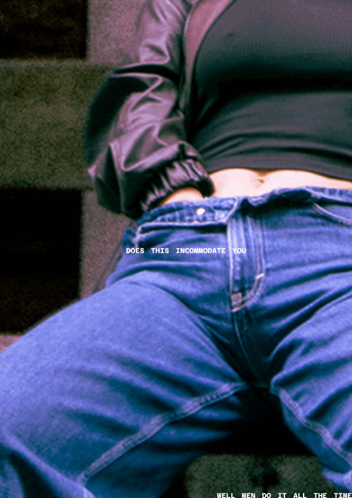
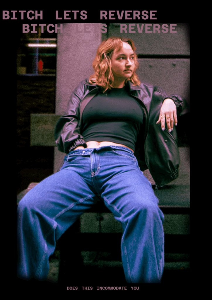
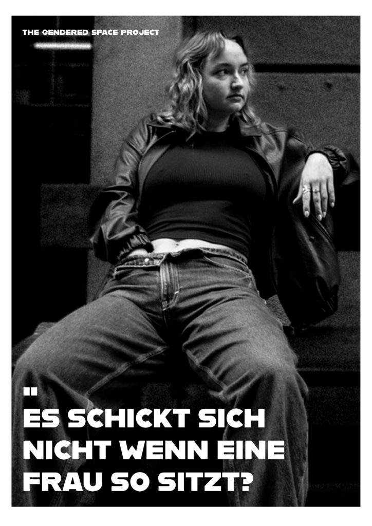
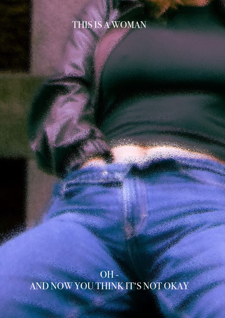
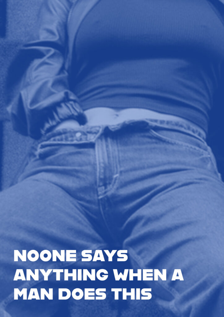
The drafts above are a few examples of how I tried different ways of designing one of the posters. I knew that I wanted to leave the focus on the photo and mainly letting it speak for itself.
Generally, I think it’s really about balancing what you show and what you hold back, how much clarity you give and how much you leave open. There are so many ways to go about it.
You could use abstract visuals like shapes, colors, lines that hint at something without spelling it out, and therefore leaving space for people to interpret. Though, for this project I wanted to go bold and direct, with the striking photo that makes people stop and look. Zoomed-in details are super interesting too, focusing on textures, gestures, or small moments that pull you in closer.
Then there is Typography which can always make a huge difference in how posters are perceived. A strong tagline or bold text treatment can really push the vibe, adding something sharp, funny, or unexpected to the visual. Also, playing with scale, contrast, and negative space helps guide the eye and keeps things intentional, not messy. Colors matter too: muted tones can create a quiet tension, while bright contrasts make everything pop louder.
In my own work, I tried out a mix of these approaches. I also played with framing and composition, sometimes centering the subject, sometimes hiding parts, sometimes making it a bit awkward or staged on purpose.
At the end of the day, designing something provocative isn’t just about shocking people. It’s about creating a feeling, using design choices to challenge the viewer and make them react; maybe without even knowing why.
-> And I will maybe see that once I put the posters outside.