After writing my previous article about illustration and typography, I came across some incredible examples of illustrated typography, and I wanted to dive deeper into the topic. I’ve tried illustrating letters myself a few times, and it can be so much fun, but also a bit frustrating.
Illustrated typography is exactly that mix of challenge and play. It’s where type stops being just text and becomes part of an image, a visual expression, or even a little scene on its own. I wanted to explore why it works, how it’s used today, and how illustrators and designers can experiment with it.
What Is Illustrated Typography?
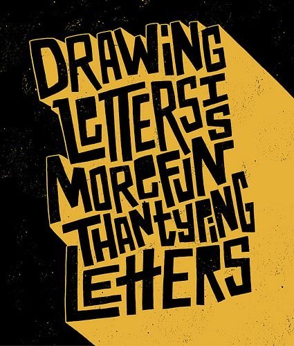
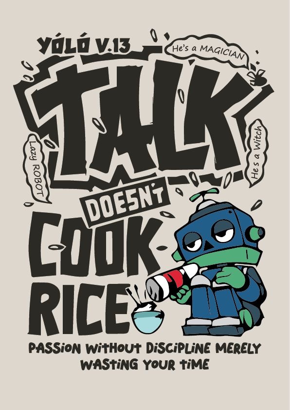
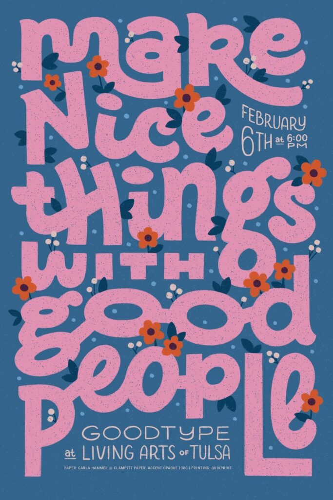
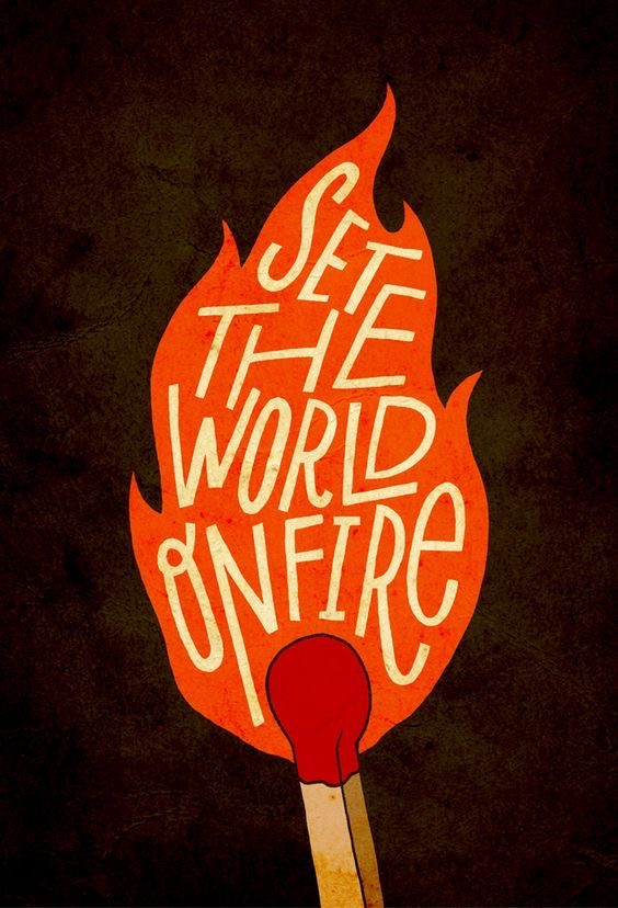
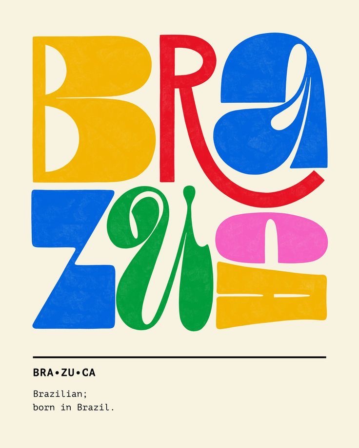
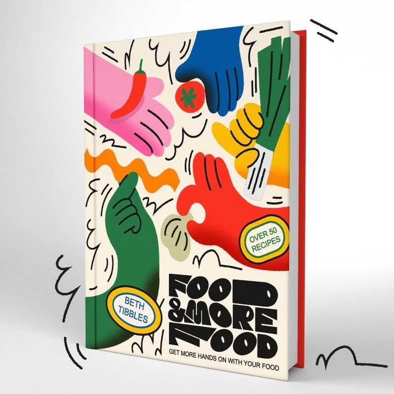
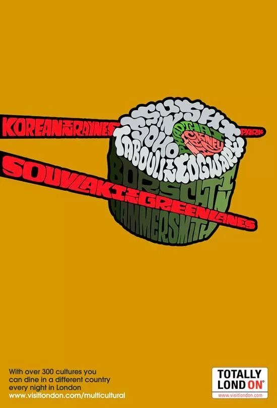
Illustrated typography is any lettering that’s been decorated, drawn, or visually enhanced. It’s not just choosing a cool font, it’s making each letter part of an image. This can be hand-drawn, digitally illustrated, painted, or even animated.
Illustrated typography comes in many forms:
- Hand-lettering, like carefully drawn quotes or posters.
- Fonts with illustration elements, where each letter has a small decoration or design.
- Mixed media, combining watercolor, collage, or 3D textures.
- Motion typography, where letters move, change, or transform on screen.
In all of these, the key is that the letters themselves are part of the visual story, not just a container for words.
Why It Works
Illustrated typography does something regular text can’t.
- Gives personality: A font might feel serious or playful, but illustrated letters feel alive
- Draws attention: On a poster, cover, or social media post, it instantly stands out.
- Adds emotion: Letters can look happy, dramatic, soft, or chaotic, and it’s all felt before the reader finishes the sentence.
- Blends text and image: In some designs, letters become part of a bigger illustration, turning a word into a small scene.
Basically, it makes words feel like art, not just information.
Examples and Inspiration
There are tons of places where illustrated typography is used and make sense:
- Magazines and Editorial
- Advertising and Posters
- Social Media (check out @goodtype )
- Motion Design
Trends and the Future
Illustrated typography is having a bit of a renaissance. People are moving away from purely digital fonts that feel cold and uniform. Hand-made letters, texture, and playful designs are back in style. Social media encourages it too the more visual, the more shareable. And with animation tools, letters can now move, giving illustration and typography a new, lively life online. It’s a trend that works in branding, editorial design, posters, and online content. And it’s fun because it combines two things designers and illustrators love: words and pictures.
Tips for Trying It By Myself
If you want to play with illustrated typography, here are some simple tips I wrote down for myself:
- Think about balance: Letters should complement your illustration, not compete with it.
- Keep it readable: Even if it’s decorative, people still need to understand the words.
- Experiment with texture and color: Small details, shadows, or watercolor effects make letters feel alive.
- Start small: Try a quote, a social media post, or a poster (don’t feel like you need a book cover right away.)
- Mix hand and digital: Scan sketches and refine them digitally, or add digital textures to hand-lettering.
Final Thoughts
Illustrated typography shows that letters don’t have to be boring. They can tell a story, set a mood, or just make you pause and smile. From my own experience trying it, it can be frustrating at times, but that’s part of the fun and part of why it’s so rewarding. Whether you’re an illustrator, a designer, or someone who loves creative visuals, experimenting with letters as art is a playful way to mix illustration and design. I’m a fan.
Sources
https://www.rmcad.edu/blog/illustrative-typography-merging-text-and-image/
https://bluelavaart.com/art-education/illustrative-typography
https://www.rmcad.edu/blog/typography-meets-illustration-integrating-lettering-into-visual-art/
https://beckyhtaylor.wordpress.com/2012/11/18/illustrative-typography/