As part of my SaaS project, one of the user interfaces that had to be done is the Steering dashboard but it required a lot of back and fourth of feedback, iterations and meetings to finally come to a great enough version in terms of functionality and business but as a product designer and using Lean UX as a methodolgy , at some stage I had to do an iteration test.
Macro and Steering are the fundamentals of what consists this interface, they serve the business internally as much as they serve it externally with clients and prospects.
Macro: refers to the holistic overview of an insights dashboard and its part of the macro-micro dynamic that I’m using as a system thinking for the whole project.
Steering: provides a real-time view of every KPI needed to make better decisions and steer the business towards a better course.
This testing/iteration process shows the first level of a user interface that required little user interview, user feedback and zero iteration but it served as a good foundation and a stepping stone to a later version that will pave the way to the “final” iteration.
The first version was even called ‘Adherence Planning’ which was an innacurate term of what we are trying to achieve and also because it defined only one aspect of the whole dashboard.
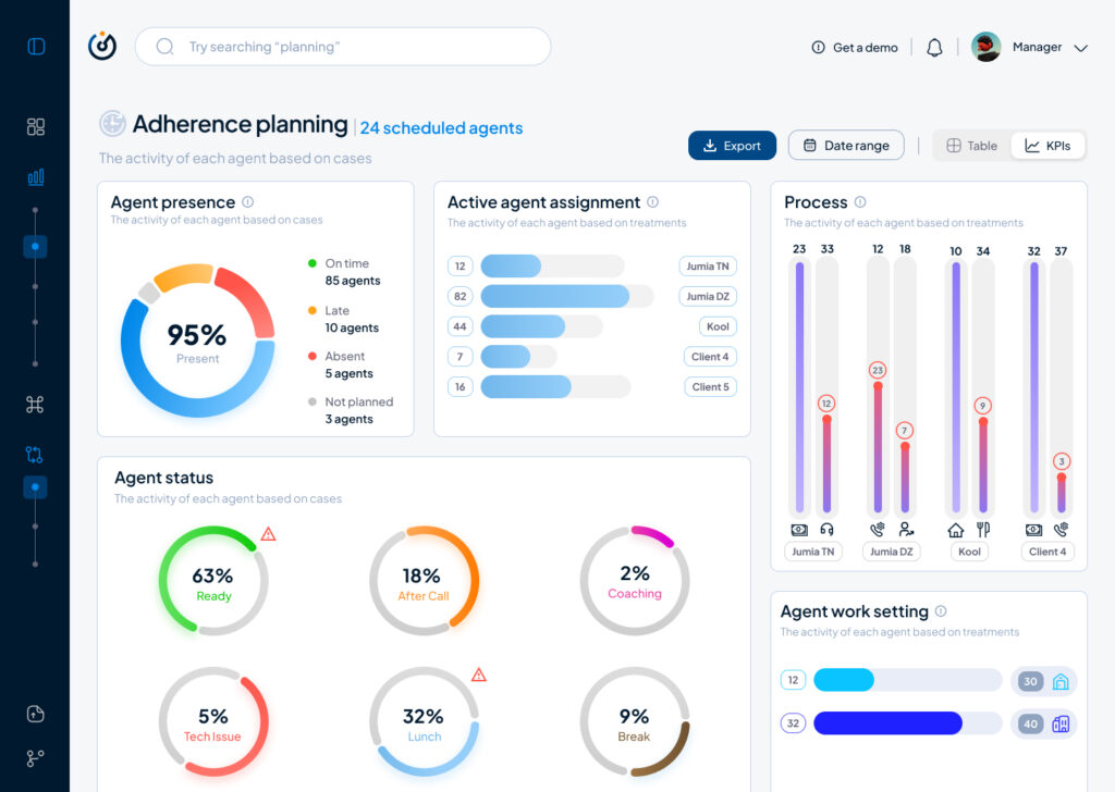
It had the basic insights that we want to show without much output but it was limited, inefficient and not value driven on a business level.
So after much stakeholder’s feedback we iterated that version to a much effective version that visualised the data in a much more functional manner and I did that through designing the work force performance gauge chart, rearranging the cards to suit the data monitoring priority, tweaked the charts and their colors on a UI level for more effective anomaly identification, streamlied the data visualisation with proper alerts identification and finally made the 3 dots ‘kebab’ compartment the drawer where every additional setting is hidden, and here is where I arrived:

The Steering Dashboard is now much more structured and serves the decision making business goal on a decent level, every KPI can be checked and monitored in real time along with checking the business performance in terms of profit and loss through the “Work force performance” gauge.
What I learned
A disruptive data vizualisation product can never be done, but through proper UI UX design, testing, iterating and coming up with the optimal solutions, it can reach a certain level of efficient structure that will propel it to achieve some of the business goals that were far further in the roadmap of the product experience and all of the above can only be done through collaboration and proper communication within a team.
All and all, I’m just getting started and i’m thrilled to work more on the refinement of both my skills and everything that I get involved in