Once I felt like the Home tab had a solid direction, I shifted my focus to the Activity tab. This is the part of the app that lets users look back and understand what the tool has found over time. If the Home tab is about quick action, the Activity tab is about reflection and detail. It’s where things get a bit more layered.
I started by asking a few questions. After a scan is done, what would someone want to do next? What would they expect to see if they tapped into their past results? The obvious answer was, they’d want to understand where their data showed up, how serious it is, and what actions they can take. So that became my starting point for the user flow.
The journey into the Activity tab begins with a list of past scans. Each entry shows the date, how many exposures were found, and a quick status, like “3 removals in progress” or “Last checked 4 days ago.” This lets the user get a feel for their privacy over time. From there, tapping into any scan opens a detailed breakdown.
Inside that scan detail view, I imagined a set of cards or sections for each exposure. Each card would show where the data was found, maybe on a marketing site, a data broker list, or a forum. It would also show what kind of data was found, like a phone number or full name, and whether the app could help remove it. There would be a clear action button like “Request Removal” or “Ignore for Now,” giving the user simple choices without pressure.
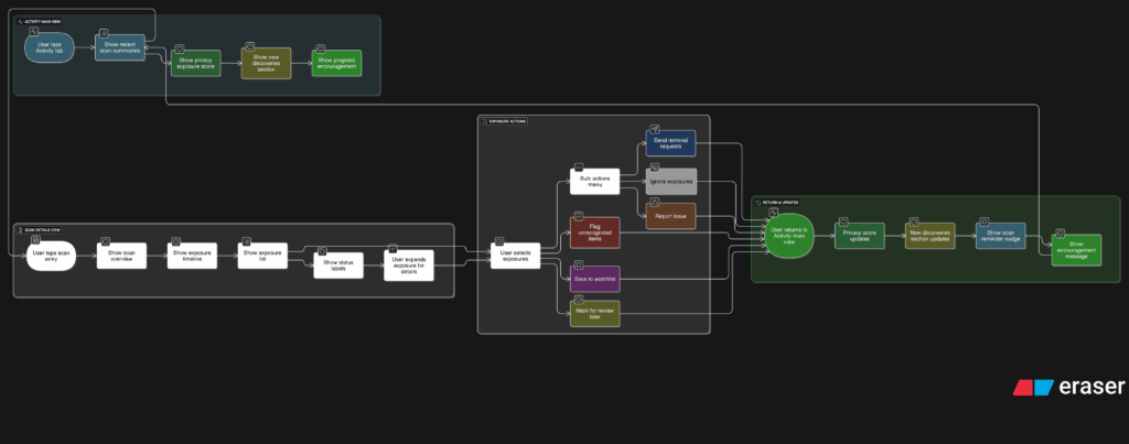
Another part I thought about was how to show overall progress. Maybe there’s a visual indicator on the main Activity screen that shows how your privacy is improving over time. Something like a simple line graph or a color-coded “privacy score” that updates as you take action. I don’t want it to feel gamified, but it should feel encouraging. Like you’re making progress, not just looking at problems.
One small but important touch I sketched out was what happens when there are new exposures. Maybe we highlight them with a subtle label like “New since last scan” or bump them to the top of the list. This way the user’s attention naturally goes to the most important updates.
This part of the app is where people go to feel more in control. It’s not just a log of past activity. I wanted it to feel full of helpful options without overwhelming anyone.