When information flows so smoothly that your brain barely breaks a sweat, that’s the magic of cognitive ease. You can think of cognitive ease as your brain’s comfort zone. When information is easy to process, you’re more likely to engage with it, trust it, and stick around. On the other hand, when things are complicated or confusing, your brain throws up a big red flag and says, “Nope, not today, I’m out.”
So, how do we keep our users lounging in the comfort of cognitive ease? Here comes A/B testing into play, a very helpful tool of user experience design, I would like to further explore in the next few months. A/B testing is like a popularity contest for website elements. You create two versions (A and B) of a webpage or feature, show them to different user groups, and see which one performs better. My goal with this is pretty simple, first I want to test the previous established commandments and their actual functionality. Do they work on target groups? Is there an actual significant difference between the “conservative” (A) way of designing a website or does the “neuro” (B) way actually work better when it comes to our cognitive comprehension. By comparing variations of various design elements, I want to identify which versions make information processing a breeze. After researching a little further I came up with the following schedule of testing:
Hypothesis Formation: Guess which design tweaks might enhance cognitive ease. Maybe simplifying navigation or tweaking color schemes could do the trick.
Version Creation: Develop two versions of the webpage—Version A (the conservative design) and Version B (the new design with said proposed changes).
User Exposure: Randomly present these versions to users, ensuring each group experiences only one version. Also switching between several target groups.
Data Collection: Gather data on user interactions—click-through rates, time spent on the page, conversion rates, eye-tracking, you name it.
Analysis: Crunching the numbers to see which version led to smoother user experiences and better engagement.
A common issue many users face is getting lost or overwhelmed by a website’s menu. Imagine your website is a maze with too many twists and turns, and users are just looking for the exit. Simplifying the navigation bar is one way to prevent users from hitting that “Back” button out of frustration. In an A/B test, you could create a streamlined version of the navigation with fewer categories and clearer labels, and compare it with your existing complex menu. If users find what they’re looking for faster in the new version, congratulations—you’ve just made their experience more cognitively pleasing.
Let’s talk about optimizing content layout. No one likes staring at a wall of text—it’s a one-way ticket to mental exhaustion. A solution? Breaking up the content with bullet points, subheadings, and images, making sure to introduce any sort of hierarchy for the brain and eyes. To put this to the test, creating a version that’s broken up with more digestible chunks of information and visuals, and compare it to the original text-heavy layout. If the users engage more with your new format, you’ve made their cognitive load lighter. This ties into Information Processing Theory, developed by George A. Miller, which explains how our brains process and store information. The theory suggests that our minds work similarly to computers, where information is received, processed, and stored in stages. A key concept is “chunking,” where we group information into manageable units, allowing short-term memory to handle more. Additionally, the TOTE model—Test, Operate, Test, Exit—shows that behavior involves ongoing processes of testing and revising until a goal is reached. In the context of content layout, applying these principles means organizing information in a way that reduces cognitive load, making it easier for users to process and retain the material, ultimately increasing engagement.
Reggelin, Jonas. (2023). Neurowebdesign: Shaping the Future of Web Experiences with Neuroscience.
Miller, G. A. (1956). The magical number seven, plus or minus two: Some limits on our capacity for processing information. Psychological Review, 63(2), 81–97. https://doi.org/10.1037/h0043158
Chronologisches Storytelling auf Web-Plattformen bedeutet, dass eine Geschichte oder Ereignisse auf einer Webseite in der Reihenfolge erzählt werden, in der sie tatsächlich passiert sind. Digitale Werkzeuge wie Bilder, Videos oder interaktive Elemente machen die Inhalte dabei lebendiger und spannender. Ein bekanntes Beispiel ist „Scrollytelling“. Hier wird der Inhalt so präsentiert, dass sich die Geschichte beim Scrollen nach und nach entfaltet. Das ist besonders bei längeren Artikeln oder Reportagen beliebt, weil es die Leser*innen stärker einbindet und den Text weniger statisch wirken lässt. Quelle: https://www.vev.design/blog/scrollytelling-tools/
Zweck
In meiner Arbeit soll es um die Repräsentation von Minderheiten in der Kunst gehen. Darum wurde auch Chronologisches Storytelling gewählt, um mit einer öffentlich zugänglichen Methode auf kreative Weise einen emotionalen Zugang zu schaffen.
Ein gutes Buch zu diesem Thema ist „Digital Storytelling: Form and Content“, das erklärt, wie digitale Plattformen genutzt werden können, um spannende Geschichten zu erzählen. Quelle: https://link.springer.com/book/10.1057/978-1-137-59152-4
Fallbeispiele
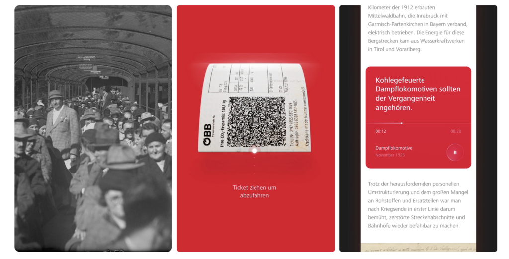
ÖBB History
Als erstes fällt mir bei dem Thema direkt die ÖBB History page von der Agentur wild in Wien ein.
Die Website bietet eine interaktive Zeitreise durch die Geschichte und Zukunft der Österreichischen Bundesbahnen. Im Fokus stehen die wichtigsten Ereignisse der letzten 100 Jahre, bedeutende Errungenschaften sowie die weniger bekannten, dunkleren Kapitel ihrer Geschichte.
Interaktion erhält man zum Beispiel durch Scrolling in einer Timeline, es gibt aber noch zusätzlich unkonventionellere Aktionen wie z.B. ein Ticket ziehen oder Datepicker betätigen um in der Zeit zu springen und verschiedene Arten von Slider.
Es wurde aus meiner Sicht nicht zuuu viel an Effekten hinzugefügt, was die Website auch überladen kann, aber einzelne, sehr ausgeklügelte Animationen die super abgestimmt sind auf den Anwendungsfall gewählt. Meiner Meinung nacht ist das schon eine der coolsten kommerziellen Webseiten, die ich bisher gesehen habe.
Leider ist sie aktuell nicht mehr online: https://oebb-history.at/en. Aus dem Grund hab ich dem Entwickler Team geschrieben, ob es die wieder geben wird oder ob ich anderwertig nochmal darauf zugreifen kann. Da ich schon einmal Kontakt mir der Agentur hatte, kann ich gegebenenfalls auch technisch Nachfragen, wie die Umsetzung genau gelaufen ist und wo es vielleicht Challenges bzw. Tipps für mich gab/gibt.
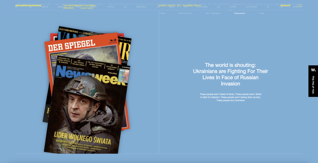
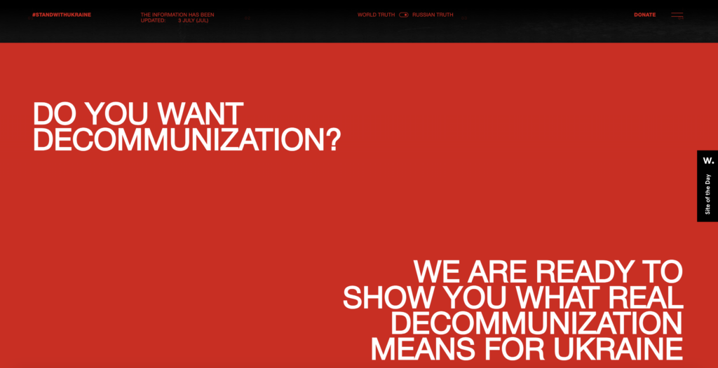
Ukrain War Non Profit
Diese Website ist ein non profit Projekt von “The First The Last” Agentur in USA. Sie macht das geschehen in der Ukraine auf eine weise erlebbar und sorgt somit auf eine emotionale Weise für Support durch User, die am Ende zur Hilfe aufgerufen werden.
Fachlich gesehen wird auch hier über verschiedene Interaktionsmöglichkeiten ein immersives Erlebnis geschaffen.
Besonders spannende Idee: über einen switch button kann man zwischen “World truth” und “russian truth” die Ansichten wechseln.
Mein take-away davon: Ich finde es besonders spannend, wenn Webseiten sich komplett in ihrer art der Interaktion und im Design auf den erlebbaren Content fokussieren. Auf diese Weise bekommt eine Webseite, mit deren Funktionen so vieles möglich gemacht werden kann, eine viel tiefere Bedeutung.
You are driving in your car (old brain is moving muscles, scanning the road, new brain is processing visual data and talking to the old brain so that you stay between the lines), and you are thinking about an argument you had with your brother over the weekend (new brain is remembering the argument, mid brain is reliving the argument emotionally). You are, after the fact, thinking about the things you should have said, but didn’t. You feel upset that you didn’t defend yourself (mid brain feeling upset, new brain thinking about things to say, old brain still driving the car). Suddenly, a car in front of you brakes (old brain notices that something has changed that needs attention, old brain floods system with hormones to heighten your ability to fight or flee, old brain has you slam on brakes, mid brain feels scared that you almost had an accident and relieved that you didn’t, new brain analyzes situation and thinks about what you might have done differently). While you drive the rest of the way home, you relive the near miss (new brain plays the memory over and over, mid brain feels the emotions again).You decide not to be angry with your brother any more, life is too short (mid brain feels forgiving and happy, new brain makes decision to call brother on phone, but decides to wait until you get home since talking on a cell phone while driving may not be a good idea right now, old brain is still driving the car).
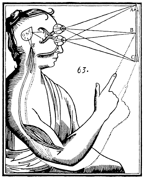
Our physical bodies and the parts of the brain that govern them are inextricably linked with the parts of our brain that regulate emotions and the parts of the brain that deal with conscious thought and reasoning. These are separate systems in the brain, but they all work together. Our feelings and our reasoning are affected by our physical movement. It is our old brain that is regulating digestion and sleep, but there are controls in the mid brain that govern our emotions and feelings and can then affect our digestion and sleep. And what we think of as our “mind” (the new brain) has an effect on emotions, feelings, and digestion and sleep, too. Although we have three different brain systems, they are all connected and interrelated. We’ve inherited a mindset that tells us that the mind and body are separate, but the research and data show us they are not. Antonio Damasio (1994) calls this separation of mind and body “Descartes’ Error.”
Illustration of the “flawed” mind and body dualism by René Descartes.
But since the new brain is the only part of brain functioning that we are conscious of, we think it is the most important player. Our mid brain (emotions) and old brain (auto-matic functioning) processing are, for the most part, unconscious, but here’s the interesting thing: our behavior and our decision-making is just as affected, actually, even more affected by our old brain and our mid brain than it is by our new brain.
What does this mean? It means that we think we make decisions about how to act and what to do consciously, but actually most of our decision-making and behavior is governed by unconscious processing. We can’t really separate what we do consciously from the unconscious aspects.
HAVE YOU HAD A BRILLIANT UNCONSCIOUS THOUGHT LATELY?
The new frontier of thought is actually the unconscious. The latest idea is that we are processing information and “thinking” unconsciously all the time.This is why when we are trying to solve a problem and we stop working on it and go to lunch, the solution will suddenly appear as we are munching on our sandwich or driving in the car back to work. Your unconscious was working on the problem, but you weren’t aware of it.
Wilson (2002) defines the unconscious as “mental processes that are inaccessible to the conscious mind, but influence judgments, feelings or behavior… shortcuts that size up our environment, interpret and initiate behavior quickly.”
Imagine a day without the unconscious. We wouldn’t be able to get through five minutes. The estimate from neuroscientists is that our five senses are taking in 11 million pieces of information every second. And now many of those are we processing consciously? A mere 40! So we need the unconscious to deal with the other 10,999,960 pieces of information each second, or we would be overwhelmed in a matter of seconds. Our unconscious mind lets us process all the incoming data from our environment, and it instantly decides whether it is good or bad, something to avoid and run away from, or something to run toward. Our unconscious is a huge efficient shortcut tool, showing us what to pay attention to consciously.
“Automatic cognitive processes are internal automatons that help us navigate a multifaceted and complex environment by slicing it into easily digestible bites. They…can thus free our very limited-capacity consciousness from many burdens.”
Ran R. Hassin (Hassin, 2005)
You’re sitting in front of a computer screen that is divided into four quadrants. The experimenter tells you to watch for an X that is going to appear in one of the quadrants and to press one of the four buttons in front of you to indicate which quadrant the X is in. This experiment was performed by Lewicki in 1988.
The participants didn’t know it, but there was a complex rule about where the X would appear. For example, the X never appeared in the same square two times in a row; the location of the third X was dependent upon the location of the second. The location of the fourth X was dependent upon the location of the set of Xs for the previous two trials. Lastly, an X never appeared in a spot unless it had appeared in at least two of the other squares.
The rules were complicated, but participants learned them. That was evident since as they continued, their performance steadily improved, they got faster and faster at pressing the correct buttons. But not one of the participants could articulate what the rules were. Nor were they aware they were learning rules. Yet their performance improved. Their unconscious mind was learning the rules for them and guiding their behavior about which button to press. Just when participants were starting to perform well, the rules suddenly changed. The participants then started making mistakes, and their response times increased. They noticed that they weren’t doing well, but they didn’t know why. They had no awareness that there were rules that no longer worked. Interestingly, they consciously looked for reasons as to why their performance had deteriorated. They said things like they had “lost the rhythm” or that the experimenters were flashing subliminal pictures on the screen to distract them (which wasn’t true).
We often don’t know why we do the things we do. But we are quick to make up a reason that we actually believe, even though it’s not true. Psychologists call this confabulation. Our unconscious minds are very smart. But we don’t control them.
WHAT MAKES US CLICK?
Most Website-Owners have their Websites for a reason. There are target behaviors that they want us to engage in-quite often, even several target behaviors. An e-commerce site wants us to choose products and buy them. A non-profit site wants us to loan money to help small business owners in different parts of the world. A Fortune 1000 company wants us to be impressed with what they do and buy more stock in the company. A site based on ad revenue wants us to come to the site and then click on an ad. A site that is trying to get acquired wants us to come to the site and register to be a member so that the company can say they have x million registered members. Almost all Websites have target behaviors. How do they get us to engage in the target behavior? How do they get us to buy, register, donate, and click? What makes us click?
To get us to click, they have to persuade us. But don’t make the mistake of thinking that the best way to persuade us is to make a logical presentation. As we learned most behavior and decision-making isn’t conscious. That means that they will have to engage the mid brain and the old brain, in addition to the new brain. We want to think that we are making logical decisions, even though we aren’t. The most effective Websites are Websites that talk to all three brains. When the Web site engages all three brains, then we click.
Old Brain:
Since the old brain focuses on survival instincts and basic needs like safety and comfort, to appeal to this part, websites should ensure clear navigation, fast loading times, and predictable patterns to minimize cognitive load and frustration (Nielsen Norman Group, 2006). For instance, using contrasting colors for call-to-action buttons makes actions immediately visible and instinctive, reducing effort in decision-making.
Lymbic System:
Visual elements, such as appealing imagery, engaging videos, and emotion-driven copy, can elicit positive feelings and a sense of trust (Petersen et al., 2009). For example, e-commerce websites often use customer testimonials or happy lifestyle images to create emotional resonance, increasing users’ trust and engagement.
Neocortex:
The new brain handles higher-order reasoning and decision-making. Websites must provide informative, structured content and logical layouts to engage the new brain. For instance, product comparison tables in tech retail sites (e.g., Apple or Amazon) help users make rational, informed decisions by clearly presenting features and benefits.
By addressing all three brain systems, a website can create a seamless, intuitive, and emotionally engaging user experience, improving overall satisfaction and usability.
Sources:
Damasio, A. (1994). Descartes’ Error: Emotion, Reason, and the Human Brain. New York: G.P. Putnam’s Sons.
Descartes, R. (1641). Meditations on First Philosophy. (J. Cottingham, Trans.). Cambridge: Cambridge University Press. (Original work published 1641).
MacLean, P.D. (1970). The triune brain in evolution: Role in paleocerebral functions. Springer Science & Business Media.
Panksepp, J. (1998). Affective Neuroscience: The Foundations of Human and Animal Emotions. Oxford: Oxford University Press. (For emotional processing in the brain and its impact on physical and mental states).
Craig, A.D. (2002). How do you feel? Interoception: The sense of the physiological condition of the body. Nature Reviews Neuroscience, 3(8), 655-666. (For the interconnection between brain systems and bodily states).