#13 Combining Elevation, Floods, and Touch

After experimenting with spaghetti mountains and 1:10,000 land-consumption patches, I’ve found myself drawn toward a new direction – one that combines topography, climate data, and tactile experience into a single, tangible system. This post is about bringing those earlier experiments together under a more urgent, nationally relevant theme: flood risk in Austria.


Where I’m Coming From

So far, my prototypes have had one foot in playful material exploration and the other in physical data storytelling:

  • The Spaghetti Schlossberg turned abstract elevation data into a tactile mountain – wobbly and imperfect, but rich with potential.
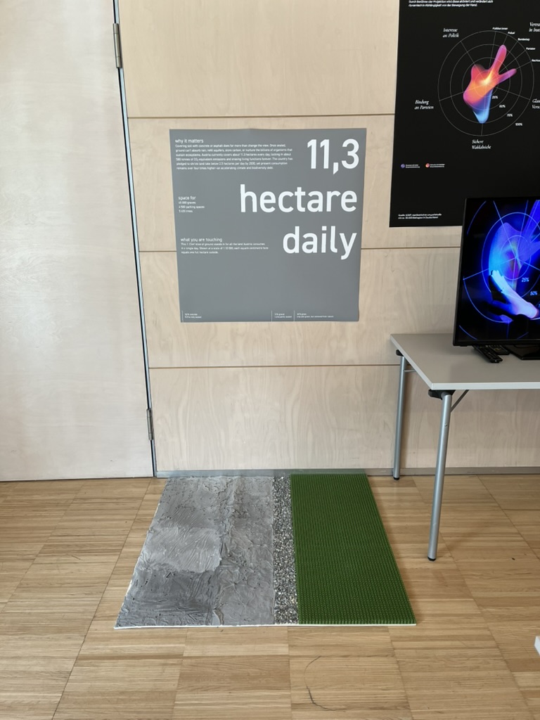
  • The Land Use Patch made daily land consumption physically touchable, swapping colors for textures to communicate proportion, pressure, and permanence.

While they felt like separate ideas at first, both were really about the same thing: using touch to interpret spatial data in a more embodied way.


A Shift in Focus: Austria, Climate, and Tactile Maps

After researching climate impacts in Austria, especially the floods in 2024 in Vienna and Lower Austria, I began asking a new question:

What would it feel like to touch the places most vulnerable to climate risk?

This led me to the idea of creating a tactile flood risk map of Austria, combining elevation and flood zones into one cohesive, touchable landscape. The concept builds directly on what I’ve done so far: layering materials, mapping by hand, and treating texture as information.


Inspiration: Harrison Cole and Tactile Environmental Mapping

A major turning point came when I watched Harrison Cole’s video on tactile maps. His research for his phd shows how important carefully designed tactile maps are and how they can communicate both geographic and thematic information – not just where things are, but how they relate, change, and affect us.

Especially relevant were:

These examples helped me see that tactile design isn’t just about accessibility, but also about expanding the way everyone can perceive environmental risk – with their hands, not just their eyes.


What I’m Building Next

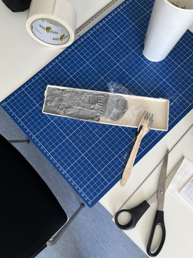
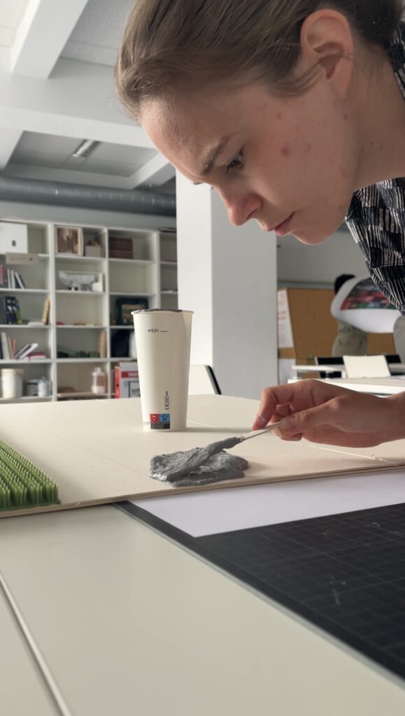
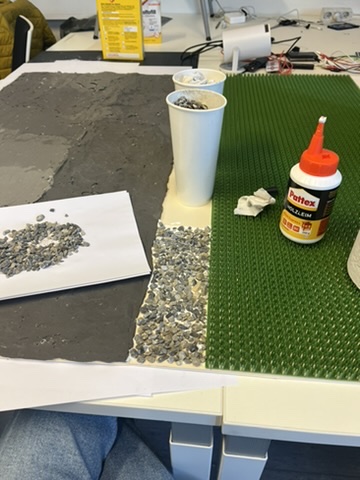
For my next prototype, I’m sketching out a physical map of Austria that shows both elevation and flood-prone areas. Here’s the plan:

  • Stacked cardboard or foam to build elevation in simplified contour layers.
  • Flood zones represented using sponge, felt, or soft rubber – anything that feels “wet” or absorbent.
  • Possibly include overlays from my land-use prototype (gravel, concrete, grass) to link impermeable surfaces to higher flood risk.

By combining these, I hope to answer:

  • Can we physically feel the risk tied to elevation and development?
  • How does texture communicate urgency or vulnerability better than visuals alone?
  • Could this be used in climate education or planning contexts?

Why Flood Risk?

Austria isn’t immune to climate impacts. The floods in Vienna and along the Danube aren’t isolated events. They’re part of a broader pattern of intensifying risks tied to both urban development and changing weather patterns.

A tactile map could:

  • Make climate data more accessible to visually impaired users.
  • Create a more memorable experience for general users.
  • Encourage reflection and conversation around geography, infrastructure, and preparedness.

Final Thoughts

What began as two strange lo-fi experiments have merged into something more purposeful. This third prototype will be a test of that synthesis: Can elevation, land use, and flood vulnerability live on the same board? Can they tell a story not just visually, but viscerally?


References & Links

#12 DataVis Workshop

The workshop WS#6 Eva-Maria Heinrich / Bringing the Abstract to Life – Beyond Data Visualisation at the International Design Week was all about pushing my prototype beyond pixels and printouts. Instead of presenting Austria’s daily land consumption as another chart, I set out to build a physical prototype – a 1.13 m² “slice” of ground that stands in for every hectare consumed in a single day. Here’s a rundown of my process, why a hands-on prototype matters, and the production hurdles I encountered along the way.


Why Prototype Matters in Multi-Sensory Data Visualization

Many of my previous posts have explored the theory behind multi-sensory data visualization – how tactile textures, sounds, or spatial arrangements can make numbers resonate more deeply. This time, I wanted to prototype those ideas in a tangible form. By crafting a small landscape that viewers can actually touch, I could test whether the physicality adds insight that a static infographic simply can’t. In other words, this wasn’t a polished art piece – it was a work-in-progress prototype intended to reveal both the strengths and limitations of turning data into material.


Concept: A 1.13 m² “Plot” of Daily Land Use

At a scale of 1:10 000, 1 cm² on my board represents 1 hectare in the real world. To capture Austria’s daily land conversion, the board measures 1.13 m² total, divided into:

  • 52 % concrete (fully sealed surfaces like roads and buildings)
  • 12 % gravel (partially sealed areas such as construction zones)
  • 36 % grass (green spaces cut off from natural ecosystems)

When laid out side by side, these materials form a unified plane that still reveals stark textural differences up close. Walking viewers through each zone gets them thinking: “That gray slab isn’t just a shape – it’s every driveway and parking lot paved over today.”


From Sketch to First Prototype

Mapping Out the Layout

I began by sketching on paper, dividing a 1 m × 1.13 m rectangle into proportional zones. Once I had rough percentages, I exported the grid to Illustrator to generate precise outlines. Printing a full-scale template and taping it to plywood helped me trace clean boundaries for concrete, gravel, and grass sections.

Gathering & Testing Materials

  • Concrete mix: I bought a small bag of ready-to-mix putty. My first batch was too smooth, so I added extra pebbles I got on the street to add some texture.
  • Gravel: I grabbed some gravel from a construction site. Putting it basically one by one on the surface, I glued them down with normal glue.
  • Grass: I had a few ideas for grass but because of time constraint I settled on a doormat I found at the hardware store, knowing I could swap in live grass later.

Building the First Iteration

  1. Base Preparation: I glued two sheets of thin carton together (hoping for the best).
  2. Concrete Section: Mixing putty and gravel, I poured it cup by cup each time mixing it again and again.
  3. Gravel Section: I sprinkled gravel by hand, and gently pressed it in place.
  4. Grass Section: Cutting the doormat to form was very easy and I just glued it down.

What I learned in the process

Prototyping isn’t a linear path, and my first iteration had plenty of hiccups.

Mainly finding the right material and then finding good substitutes because of the time frame. Then of course finding the right mix for the putty and putting it on the surface.

By the end of the week, the prototype still had a few chips of gravel out of place and some cracks and color difference in the putty, but those imperfections felt authentic – almost like the real world, where land-use boundaries aren’t always neat and tidy.


Why This Prototype Matters

  • Tactile Immersion: Viewers can kneel down and feel the roughness of gravel next to the coldness of the putty. That sensorial contrast sparks a more intuitive understanding of how land is consumed.
  • Immediate Comparisons: Instead of reading “52 %” on a slide, people see the massive concrete patch in context – ranking it against gravel and grass sizes without needing numbers to guide their eyes.
  • Hands-On Research: As a prototype, it’s a learning tool more than a final exhibit. The bumps in production taught me about material properties – knowledge I’ll carry into my next prototype. Each mis-cut or adhesive spill revealed potential adjustments for future iterations.

Final Thoughts

Prototyping this 1.13 m² piece of ground forced me to embrace trial and error. Every spilled drop of glue and cracked chunk of putty helped me understand how to translate data into material form. The end result isn’t a museum-ready installation – it’s a functional prototype that still has rough edges. But those imperfections are part of its story: they remind me (and future viewers) that real-world data isn’t always clean, and neither is the crafting process that brings it to life. Already, this initial version has sparked new ideas for my thesis – especially around combining tactile and auditory layers.