Last semester, my research focused on how UX/UI design can make mental health apps more calming and accessible, and how AI can provide personalized, empathetic support. I explored micro-interactions, color psychology, and AI-driven emotional intelligence to understand what makes digital mental health tools effective.
This time, I wanted to explore physical, tangible interactions for well-being—something that doesn’t require a screen or notifications but still guides users toward emotional regulation.
The Three Prototypes
For this exercise, I created three lo-fi prototypes:
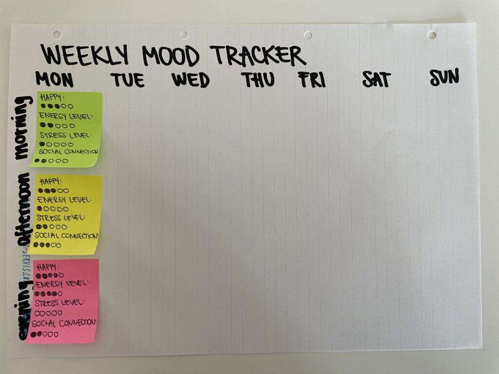
Weekly Mood Tracker: A simple, analog way to log emotions over the week using color-coded entries for easy reflection.
Self-Reflection Cards: A deck of prompts designed to encourage mindful self-exploration and emotional processing.
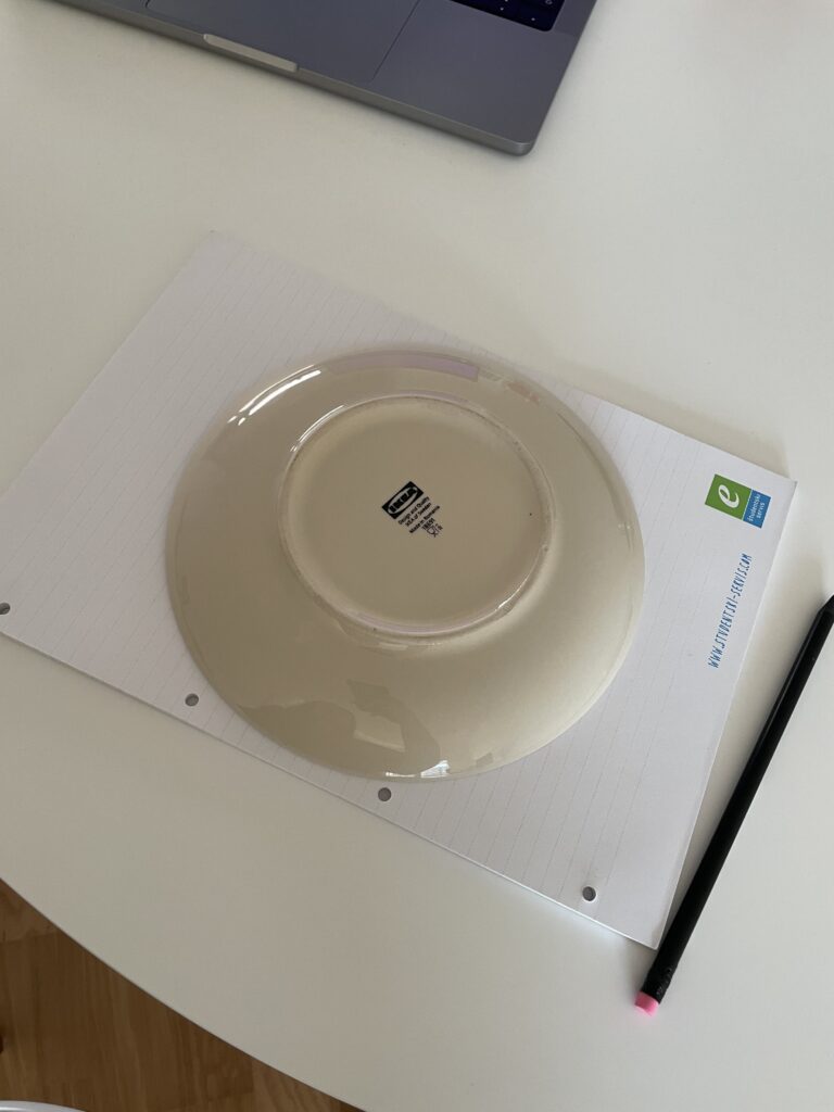
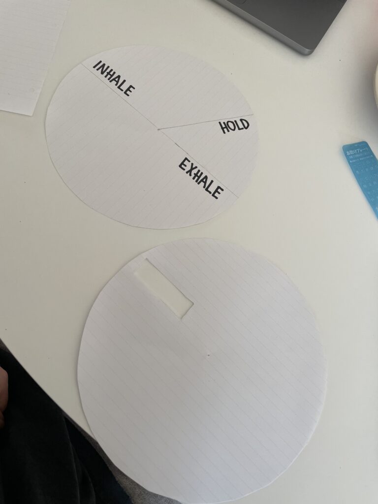
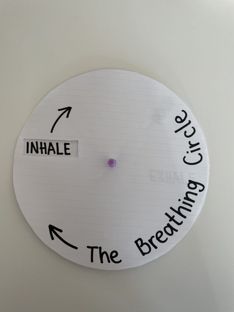
Breathing Circle: A guided breathing tool made of paper, where users rotate a circular element to synchronize their breath with a visual cue.
Choosing the Breathing Circle
While all three prototypes engage users in self-awareness and well-being, I chose to bring the breathing circle to class because it best embodies my research goal: designing interfaces that guide users toward calmness in a simple, intuitive way. Unlike mood trackers or reflection tools, the breathing circle introduces a hands-on, meditative experience that requires minimal effort—ideal for moments of stress.
Speed-Dating My Prototype
In class, we shared our prototypes in a Speed-Dating/Sharing session, presenting them to different classmates in quick succession. This was an exciting way to gather feedback and refine ideas. Some of the key insights from my classmates included:
- Great for children in schools – One student noted that the breathing circle could be useful in classrooms, similar to a fidget gadget, helping children focus while also providing a calming mechanism.
- Ideal for bedtime – Another student said they would love to use it before bed to relax, which sparked the idea of making the prototype more tactile with textures and even usable in the dark.
- A minimalist, portable tool – Someone pointed out that, since it’s thin and can be small, it’s perfect for carrying on public transport or while traveling. Its minimalistic design keeps the focus solely on breathing, without distractions.
- A sensory experience – A classmate suggested adding resistance to the movement (like a soft fabric hinge) to make turning it feel more grounding.
What is My Prototype Trying to Address?
The breathing circle is designed to address a key challenge in mental health support: how to create intuitive, low-effort tools for emotional regulation. Unlike mood-tracking apps or chat-based AI support, this tool is immediate and physical—it doesn’t require users to think, analyze, or type, just breathe. This prototype is particularly suited for:
- Commuters and travelers – Its thin, compact design makes it easy to use on the go, whether on public transport, at an airport, or in a waiting room.
- Children and adults needing focus – It can function as a calming fidget tool, helping with concentration in schools, workplaces, or even at home.
- People looking for a screen-free relaxation method – No notifications, no distractions—just a simple, intuitive breathing guide.
Potential Features & Future Iterations
Based on the feedback, I’d love to explore:
- Tactile Elements – Soft materials, textured surfaces, or raised patterns to enhance sensory engagement.
- Glow-in-the-Dark or Low-Light Adaptation – So it can be used before bed without needing external light.
- Personalization – Adjustable speed settings, so users can customize their breathing pace.
- Elastic Resistance – Adding a slight resistance to the movement to make it more grounding and engaging.
If My Prototype Had a Dating Profile …
“Looking for a mindful moment? I’m a simple, no-fuss tool that helps you slow down and just breathe. I work best in quiet moments, whether you’re feeling stressed, anxious, or just need to unwind. Small, discreet, and always ready to help—swipe right for relaxation!”
Final Thoughts
This session reinforced how valuable it is to test even the simplest ideas. The breathing circle started as a basic paper prototype, but through conversation and iteration, it could evolve into something more immersive and widely useful. The feedback also reminded me that not all mental health tools need to be digital—sometimes, the most powerful solutions are the simplest, most tangible ones.