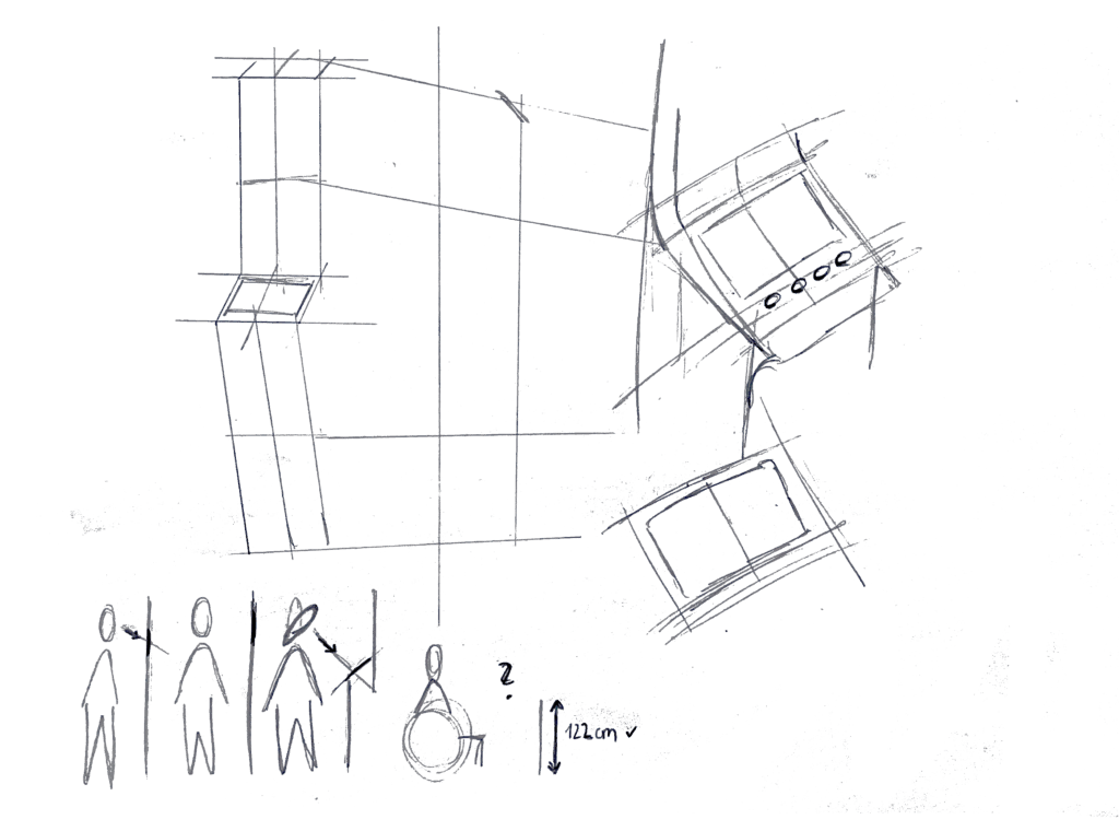
#2.04 Sketches & First Quick Prototype

Sketches

I also began sketching out ideas for how the lamp could look like. I think I decided to go into round and soft forms quick, since they intuitively feel more calming and emotionally inviting than angular or rigid shapes. I feel I was guided more by the emotional tone of the object – a gentle presence on the desk – than by the function for now.

Some initial inspirations:

  • Lava lamps: their fluid, continuous motion has a calming and almost hypnotic effect, which aligns perfectly with the idea of supporting focus without creating stress.
  • Organic shapes: neutral, timeless. These shapes don’t scream “technology,” which is important for creating a non-intrusive and emotionally grounding experience.
  • Japanese lanterns and soft-diffuse paper lights: I love the ambient softness and the quiet presence they have in a room.

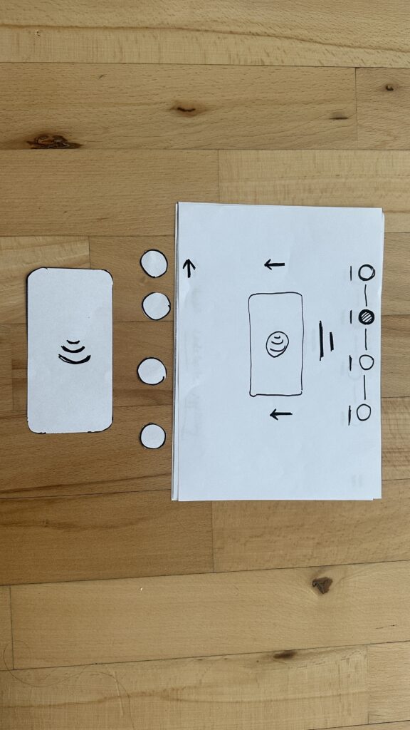
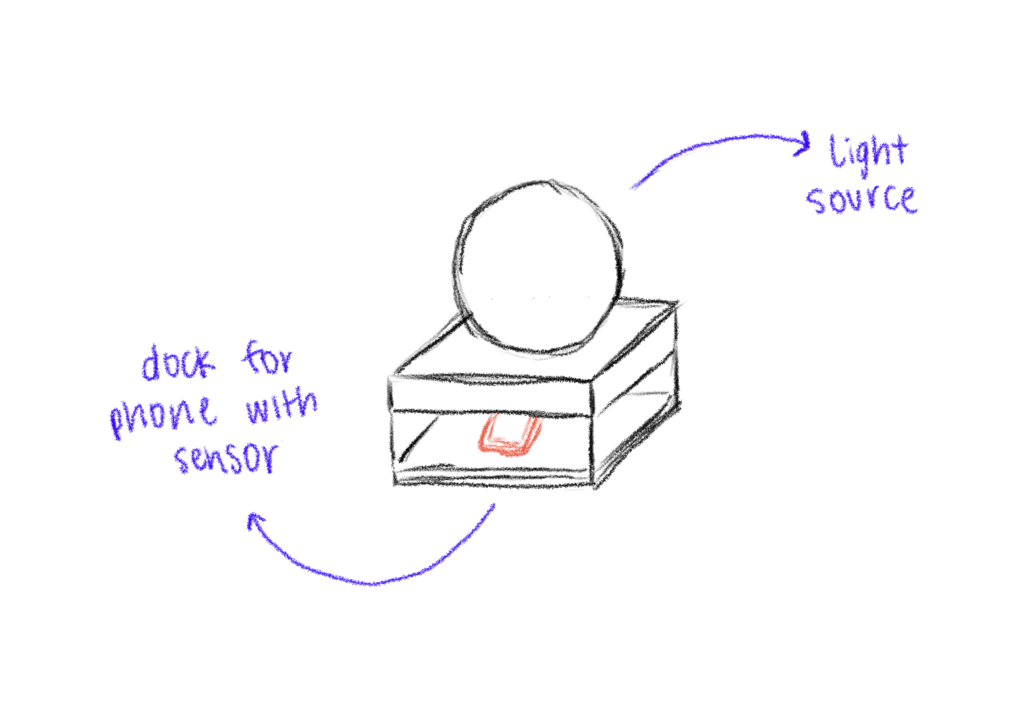
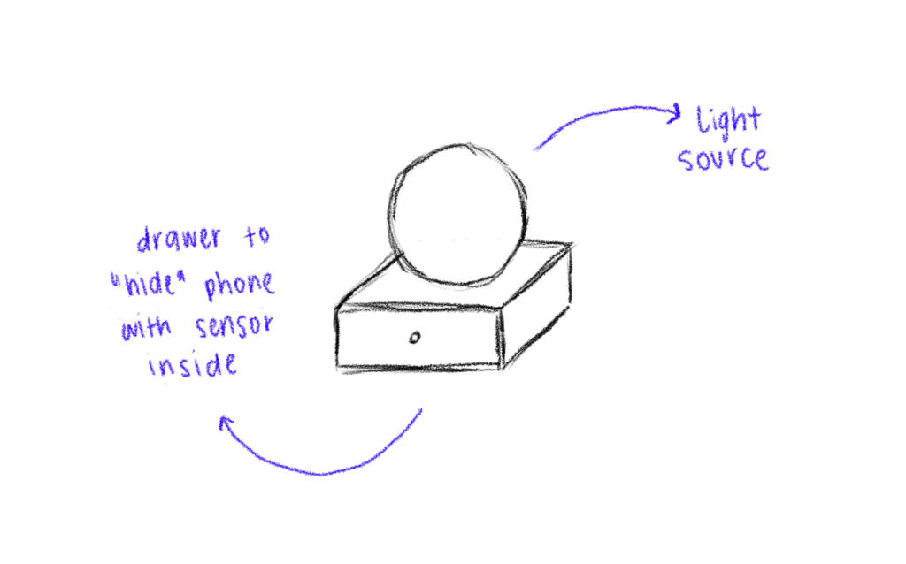
I didn’t only sketch the shape of the lamp itself but also how the dock, where you put the phone, could look like. The first try was a square shape which fits the phone – but then as soon as I cut the cardboard, I realized the whole lamp + dock is probably too big, because it would take up a lot of space on the desk.

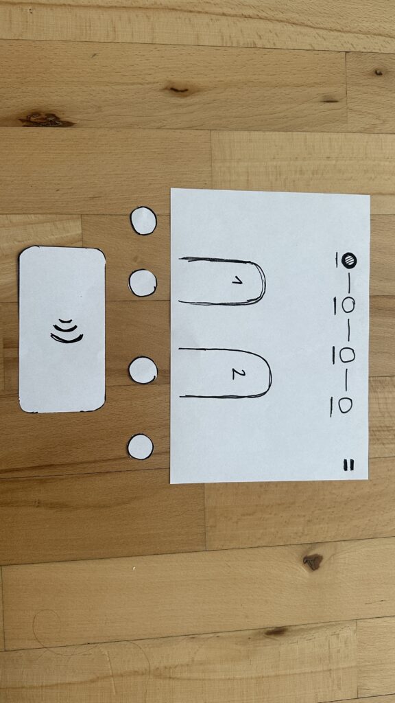
First Quick and Dirty Prototype

To move from the abstract idea and the theories and frameworks in the background to a tangible experience, I built a quick proof-of-concept prototype using ZigSim, Max/MSP, Resolume Arena and a basic lightning setup with some led-strips for the quick testing for now. This is actually less about the design of the lamp but more about the technology in the background and the core interaction loop:

  • Phone placed on dock > soft, calming light is triggered
  • Phone removed from dock > light changes

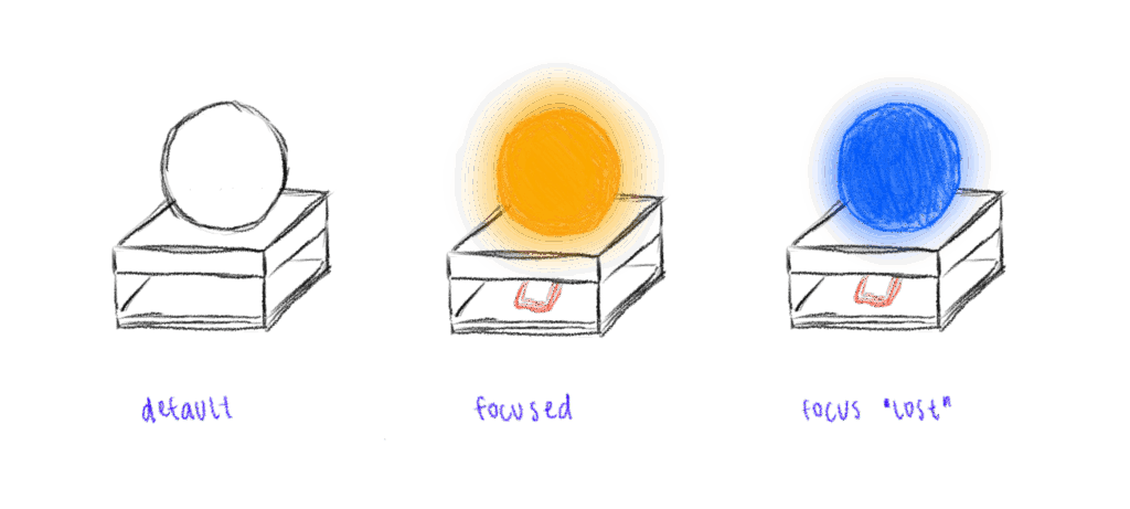
I also experimented with using transparent paper as a diffuser to soften the LED light, aiming to create a more ambient and less direct glow.

This was just a quick prototype as a proof of concept for the interaction loop.

Next steps

  • Prototyping with Arduino
  • Integrate a proximity sensor to detect whether the phone is in the dock or not.
  • Redesign the dock and where to put the phone + sensor
  • Use a different source of light which is smaller than the LED strips
  • build a prototype of the lamp itself
  • Experiment with softer shapes and better light diffusion to create a calming, ambient presence that supports focus

Blog Post 6: Designing wireframes for the prototype and Video of the prototype

This post focuses on the wireframing process for the Device App prototype, developed as part of my ongoing research into the role of Digital Memories in technology and interaction design. The goal of the wireframes was to translate research insights and conceptual direction into tangible, testable user flows. These wireframes represent the core flows of the prototype.

Starting With Sketches

I began the design process with rough sketches on paper to explore layout ideas quickly and think through user flows without constraints. This sketching phase allowed me to focus purely on functionality, flow logic, and visual hierarchy without getting distracted by UI details.

In the sketches, I explored the two key flows of the app:

  1. Adding Photos from a Connected Device
    • Users can connect a device via cable.
    • Choose to create a new folder or add to an existing one.
    • Photos are selected, reviewed, and saved into the desired folder.

  1. Viewing Photos as a Slideshow
    • Users can open any folder and launch a fullscreen slideshow.
    • A horizontal strip allows navigation between photos while viewing.

This paper-first approach helped me solidify the app’s structure before moving to Figma for the digital wireframes.

Building the Wireframes

Once the core flow was mapped out, I built detailed wireframes in Figma. The two main flows in the prototype are:

1. Add Photos Flow

Users connect a device, choose a folder (or create one), select photos, and upload them. The wireframes guide them step-by-step through this process with clear UI feedback like folder creation confirmation and selection indicators.

2. Slideshow Viewing Flow

Folders can be opened to view photos as a slideshow. This mode is minimal and immersive, offering a fullscreen photo experience with a navigation strip below.

Navigation and consistency were key considerations throughout. I maintained common buttons, tabs (like Add Photos / Saved Folders / Watch), and bottom navigation across screens to reduce friction and support intuitive exploration.

HOMESCREEN – Wireframe

ADD PHOTOS

CREATING NEW FOLDER FROM A DEVICE

Design Decisions

Some key choices I made:

  • Simplicity & Clarity: Especially important for intergenerational use.
  • Folder-Based Memory Organization: To give emotional context to digital memories.
  • Clear Action Paths: With visual hierarchy and button grouping to support user confidence.

FINAL LOW FIDELITY PROTOTYPE VIDEO

I was also describing the prototype so I reccomend to play the video in faster speed 1.5x. Thanks 🙂

Blog Post 6: Sketching an Inclusive EV Charger

Over the past week I dove into sketching my very first EV charging station interface, on paper, low-fi style. My goal? A clean, intuitive flow that anyone, whether standing or in a wheelchair, can use without a hitch.

1. First Sketches: Facing the Screen

I started by thinking about how the display sits in real life. Based on some research I’d gathered (https://www.sciencedirect.com/science/article/abs/pii/S0169814197000875), I initially tilted the screen at about 45° for comfortable reach and visibility. Drawing a single-column station with that slanted display felt natural…until I grabbed a ruler and realized wheelchair users would struggle to see or reach it. Back to the sketchbook.

2. Measuring for Everyone

Next, I looked up anthropometric data: average standing height (around 1.63 m for women) and wheelchair eye level (about 1.30 m). That research told me the top of the screen should sit at roughly 1.60 m, with the row of buttons falling around 1.20 m. Everyone’s arm and line-of-sight reach now fall squarely within easy range.

3. Second Sketches: Flat & Accessible

Armed with those new dimensions, I redrew the station. This time the screen is perfectly vertical, no tilt, so a seated user can see the full interface. On each side: charging cables loop neatly above the column. From past frustration I know that having the cable hang above the car inlet gives you full freedom of movement, if it came from below, you’d scrape against bumpers or crouch awkwardly. The cable’s plug snaps in and out with minimal force and a clear click, avoiding any wrestling match.

4. Interaction Storyboard

  1. Welcome Screen (140 cm high): A crisp display text and 4 sturdy physical buttons. Underneath, the payment pad glows green when it’s your turn to tap.
  2. Scan Step: Three payment methods—bank card tap, RFID charge card, or QR code scan. A left-arrow “Back” button stays red until you choose.
  3. Plug Step: You pull the cable from its cradle, align it to your car’s port, and push in. A simple animated diagram on screen guides you.
  4. Confirmation Lights: With each successful step—scan, plug, start—an LED ring pulses green. If something’s off, it flashes yellow for “check connection.”
  5. Charging Dashboard: Once juice is flowing, you see real-time kWh delivered, state-of-charge %, and an estimated “Time Remaining.” A big “End Session” button waits for you.


5. Beyond the Screen: Real-World Accessibility

A few extra thoughts, courtesy of accessibility best practices:

  • Pathway Design: The route from parking spot to station needs a gentle ramp or smooth, level surface (no hidden curbs)
  • Color & Contrast: Color-blind or low-vision users need high-contrast icons and optional haptic or audio cues. Long-press “Touch to Speech” could read aloud on-screen labels.
  • Height Considerations: Remember: 130 cm eye height for wheelchair users vs. 163 cm average standing height. Buttons and screens must accommodate both.
  • Future-Proofing: As self-driving cars roll in, drivers that are visually impaired should also be able to interact with the Charging Station

What’s next? I will turn my sketches from the last post into more mid-to-heigh-fidelity wireframes, then run two rounds of user tests. I’ll watch them scan, tap, and plug in. Their real-time reactions will guide the next iteration: adjusting button sizes, tweaking the cable loop, or even adding voice prompts.

Every scribble, every measurement, and every user test brings me closer to a charging experience that’s not just functional, but truly inclusive, so that plugging in your EV feels as natural as unlocking your phone. Stay tuned for my prototype reveal in the video and my reflection and learnings of this project.

Blog 4: Sketching an Intuitive EV Charging Interface

After my first wild prototype about a 1,000‑floor elevator, I realized I really want to stick with mobility. EV charging stations are such a timely, real‑world challenge plus, I’ve experienced the pain myself! My girlfriend’s dad owns an EV, and I’ve helped him charge it only to run into confusing screens and awkward cables. Others I chatted with have plenty of frustrating stories, too. So I decided: let’s start by sketching a super‑simple, button‑based interface and see how two real users feel about it. (User Testing Informationen available in the next Post)

Four Clear Steps

On paper, I drew these low‑fidelity screens, focusing on clarity over bells and whistles:

  1. Choose Your Charger
    • A simple map shows two plugs at a station.
    • Green plug: available. Red plug: occupied.
    • A progress bar at the top displays “Step 1 of 4”, so you always know where you are.
    • Why? Users often fumble for which port is free. Clear colors and a step indicator keep anxiety low.
  2. Verify Payment
    • Three big buttons let you pick Credit Card, RFID Charge‑Card, or App‑QR Code.
    • A Back button (which lights red if you tap it) lets you switch methods at any time.
    • Once you choose, a screen prompts you to hold your card or show the QR code.
    • Why? Real stations offer multiple payment options. Lumping them into three buttons matches user expectations and avoids tiny menu lists.
  3. Plug In Cable
  • An animated cable slides out of the station.
  • A simple diagram shows “Cable → Car Port.”
  • If it clicks in correctly, the station glows green. If it fails, it glows red. A gentle blue pulse means “charging.”
  • Why? Physical actions need instant feedback. Color and motion reassure the user that they plugged in correctly.

    4. Charging Overview
  • Time Remaining: Counts down so you know when you’re done.
  • Battery Icon + Bar: State‑of‑charge advances in real time.
  • Power Delivered (kW): Shows exactly how fast you’re charging.
  • Big buttons: “End Session,” “Help,” “Info,” and “Language.”
  • Why? These are the four most‑asked questions: How long? How full? How fast? And what if I need help or another language?

Design Choices & Future Accessibility

  • Physical Buttons vs. Full Touchscreen: Early users can look, press, and go (no searching menus)
  • Progress Bar: Keeps people calm by showing exactly where they are in the flow.
  • Language Toggle: Always visible in case you need English, German, or any other option.
  • Text‑to‑Speech Future: With a long press on a touchscreen button, an image‑to‑speech API could read the label aloud for visually impaired users.

I’ll soon interview blind or wheelchair‑using drivers to see what adaptations they need. In a world of self‑driving cars, everyone should be able to charge their own vehicle of course.

Next: Real‑World User Tests

As a next step, I’ll ask some volunteers to walk through these sketches:

  • Where do they pause?
  • Which buttons feel unclear?
  • Do they spot the back arrow or language switch easily?
  • How do they react to red/green/blue feedback?

I’ll refine the flow based on their comments, then build clickable wireframes or maybe a cardboard prototype with LEGO. Iteration will tell me what works best.

Early References & Inspiration

  • Intuitive UI example: technagon.de/intuitive-user-interface-laden-kann-so-einfach-sein/
  • EV station UX tips: altia.com/2023/08/16/enhancing-ev-charging-station-ux-and-why-it-matters/
  • Payment variety today: ekoenergetyka.com/blog/how-do-ev-charging-stations-work/
  • Kempower design guide: kempower.com/user-experience-ev-charger-design/

These resources helped me understand real pain points and best practices. I’ll keep updating this blog as I refine the design and test with real users because the journey from sketch to screen is just beginning.