Critical Review: “Sound response to physicality – Artistic expressions of movement sonification” by Aleksandra Joanna Słyż (Royal College of Music, 2022)

by Verena Schneider, CMS24 Sound Design Master 

The master thesis “Sound Response to Physicality: Artistic Expressions of Movement Sonification” was written by Aleksandra Joanna Słyż in 2022 at the Royal College of Music in Stockholm (Kungliga Musikhögskolan; Stockholm, Sweden).

Introduction

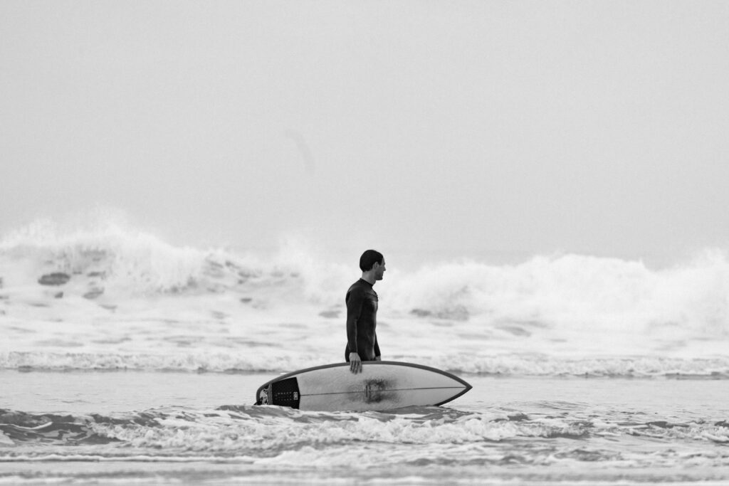
I chose Aleksandra Słyż’s master thesis because her topic immediately resonated with my own research interests. In my master project I am working with the x-IMU3 motion sensor to track surf movements and transform them into sound for a surf documentary.
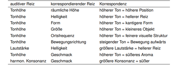
During my research process, the question of how to sonify movement data became central, and Słyż’s work gave me valuable insights into which parameters can be used and how the translation from sensor to sound can be conceptually designed.

Her thesis, Sound response to physicality, focuses on the artistic and perceptual dimensions of movement sonification. Through her work Hypercycle, she explores how body motion can control and generate sound in real time, using IMU sensors and multichannel sound design. I found many of her references—such as John McCarthy and Peter Wright’s Technology as Experience—highly relevant for my own thesis.

Gestaltungshöhe – Artistic Quality and Level of Presentation

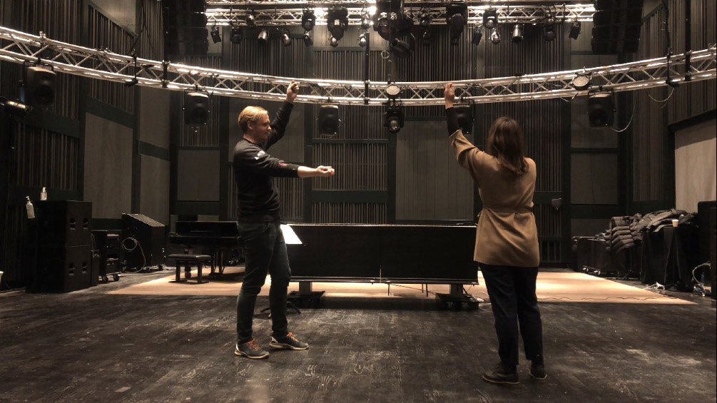
Słyż’s thesis presents a high level of artistic and conceptual quality. The final piece, Hypercycle, is a technically complex and interdisciplinary installation that connects sound, body, and space. The artistic idea of turning the body into a musical instrument is powerful, and she reflects deeply on the relation between motion, perception, and emotion.

Visually, the documentation of her work is clear and professional, though I personally wished for a more detailed sonic description. The sound material she used is mainly synthesized tones—technically functional, but artistically minimal. As a sound designer, I would have enjoyed a stronger exploration of timbre and spatial movement as expressive parameters.

Innovationsgrad – Innovation and Contribution to the Field

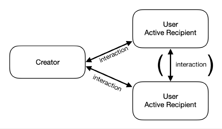
Using motion sensors for artistic sonification is not entirely new, yet her combination of IMU data, embodied interaction, and multichannel audio gives the project a strong contemporary relevance. What I found innovative was how she conceptualized direct and indirect interaction—how spectators experience interactivity even when they don’t control the sound themselves.

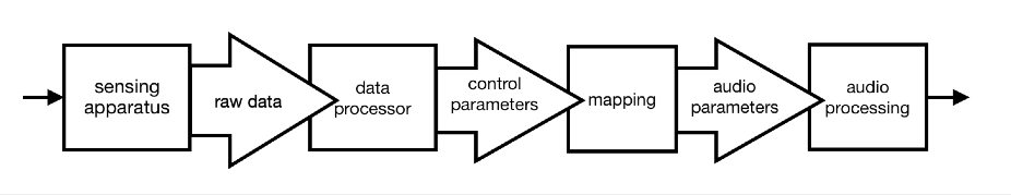
However, from a technical point of view, the work could have been more transparent. I was missing a detailed explanation of how exactly she mapped sensor data to sound parameters. This part felt underdeveloped, and I see potential for future work to document such artistic systems more precisely.

Selbstständigkeit – Independence and Original Contribution

Her thesis clearly shows independence and artistic maturity. She worked across disciplines—combining psychology, music technology, and perception studies—and reflected on her process critically. I especially appreciated that she didn’t limit herself to the technical side but also integrated a psychological and experiential perspective.

As someone also working with sensor-based sound, I can see how much self-direction and experimentation this project required. The depth of reflection makes the work feel authentic and personal.

Gliederung und Struktur – Structure and Coherence

The structure of the thesis is logical and easy to follow. Each chapter begins with a quote that opens the topic in a poetic way, which I found very effective. She starts by explaining the theoretical background, then moves toward the technical discussion of IMU sensors, and finally connects everything to her artistic practice.

Her explanations are written in clear English, and she carefully defines all important terms such as sonificationproprioception, and biofeedback. Even readers with only basic sound design knowledge can follow her reasoning.

Kommunikationsgrad – Communication and Expression

The communication of her ideas is well-balanced between academic precision and personal reflection. I like that she uses a human-centered language, often describing how the performer or spectator might feel within the interactive system.

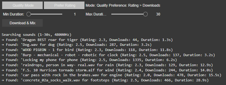
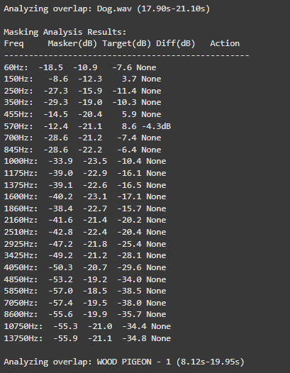
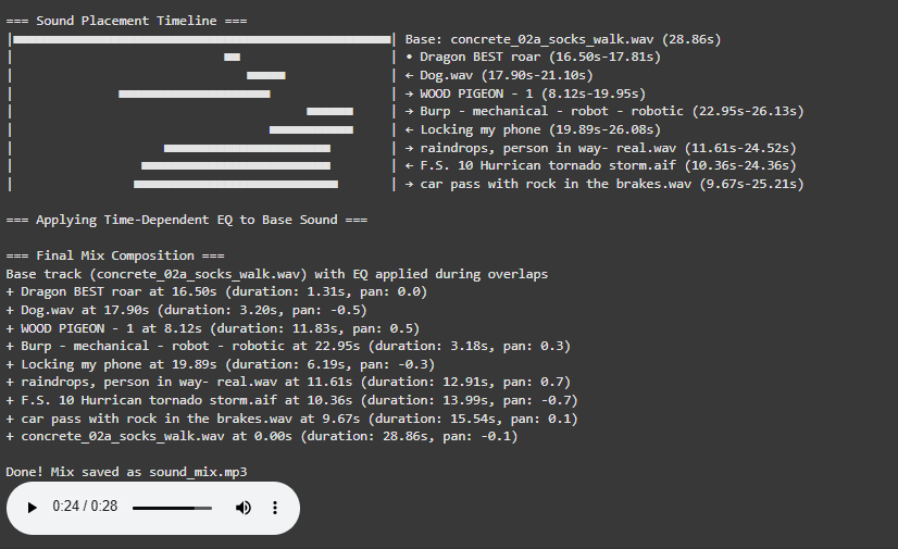
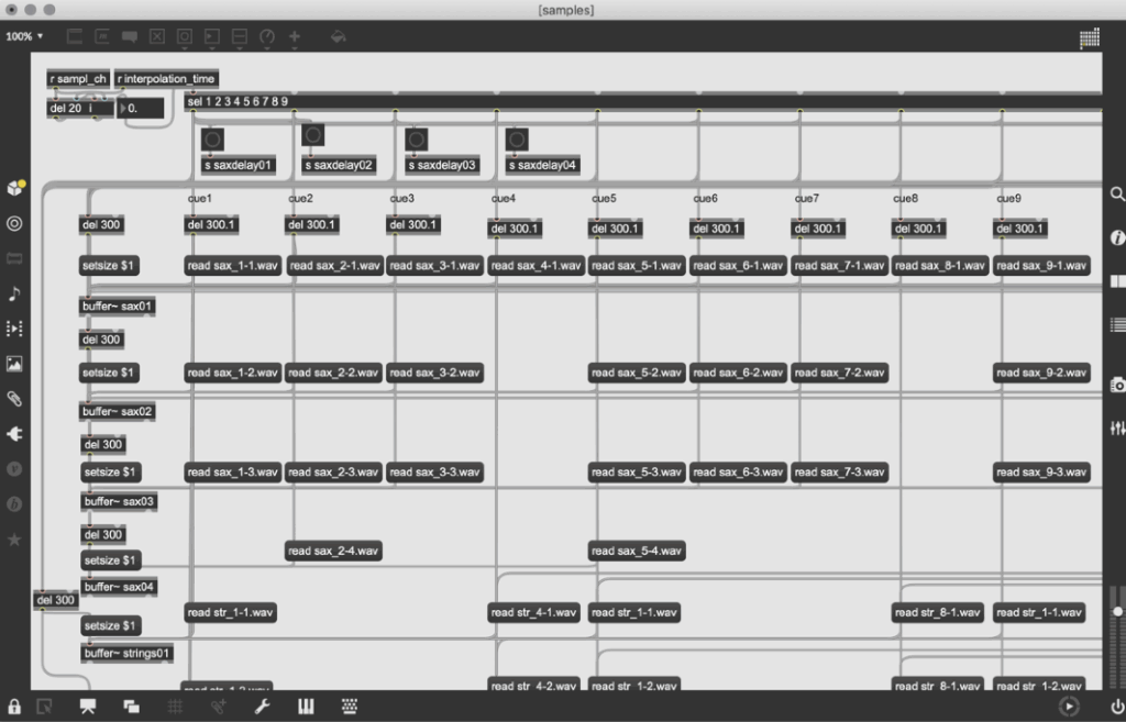
Still, the technical documentation of the sonification process could be more concrete. She briefly shows a Max/MSP patch, but I would have loved to understand more precisely how the data flow—from IMU to sound—was built. For future readers and practitioners, such details would be extremely valuable.

Umfang – Scope and Depth

The length of the thesis (around 50 pages) feels appropriate for the topic. She covers a wide range of areas: from sensor technology and perception theory to exhibition practice and performance philosophy.
At the same time, I had the impression that she decided to keep the technical parts lighter, focusing more on conceptual reflection. For me, this makes the thesis stronger as an artistic reflection, but weaker as a sound design manual.

Orthography, Accuracy, and Formal Care

The thesis is very carefully written and proofread. References are consistent, and the terminology is accurate. She integrates both scientific and artistic citations, which gives the text a professional academic tone.
The layout is clear, and the visual elements (diagrams, performance photos) are well placed.

Literature – Quality and Relevance

The literature selection is one of the strongest aspects of this work. She cites both technical and philosophical sources—from G. Kramer’s Sonification Report to McCarthy & Wright’s Technology as Experience and Tanaka & Donnarumma’s The Body as Musical Instrument.
For me personally, her bibliography became a guide for my own research. I found new readings that I will also include in my master thesis.

Final Assessment – Strengths, Weaknesses, and Personal Reflection

Overall, Sound response to physicality is a well-balanced, thoughtful, and inspiring thesis that connects technology, perception, and art.
Her biggest strength lies in how she translates complex sensor-based interactions into human experience and emotional resonance. The way she conceptualizes embodied interaction and indirect interactivity is meaningful and poetic.

The main weakness, in my opinion, is the lack of detailed technical documentation—especially regarding how the IMU data was mapped to sound and multichannel output. As someone building my own sonification system with the x-IMU3 and contact microphones, I would have loved to see the exact data chain from sensor to audio.

Despite that, her work inspired me profoundly. It reminded me that the psychological and experiential dimensions of sound are just as important as the data itself. In my own project, where I sonify the movement of a surfboard and the feeling of the ocean, I will carry this understanding forward: that sonification is not only about data translation but about shaping human experience through sound.

Post 1: Listening to the Ocean

– The Emotional Vision Behind Surfboard Sonification

Surfing is more than just a sport. For many surfers, it is a ritual, a form of meditation, and an experience of deep emotional release. There is a unique silence that exists out on the water. It is not the absence of sound but the presence of something else: a sense of connection, stillness, and immersion. This is where the idea for “Surfboard Sonification” was born. It began not with technology, but with a feeling. A moment on the water when the world quiets, and the only thing left is motion and sensation.

The project started with a simple question: how can one translate the feeling of surfing into sound? What if we could make that feeling audible? What if we could tell the story of a wave, not through pictures or words, but through vibrations, resonance, and sonic movement?

My inspiration came from both my personal experiences as a surfer and from sound art and acoustic ecology. I was particularly drawn to the work of marine biologist Wallace J. Nichols and his theory of the “Blue Mind.” According to Nichols, being in or near water has a scientifically measurable impact on our mental state. It relaxes us, improves focus, and connects us to something larger than ourselves. It made me wonder: can we create soundscapes that replicate or amplify that feeling?

In addition to Nichols’ research, I studied the sound design approaches of artists like Chris Watson and Jana Winderen, who work with natural sound recordings to create immersive environments. I also looked at data-driven artists such as Ryoji Ikeda, who transform abstract numerical inputs into rich, minimalist sonic works.

The goal of Surfboard Sonification was to merge these worlds. I wanted to use real sensor data and field recordings to tell a story. I did not want to rely on synthesizers or artificial sound effects. I wanted to use the board itself as an instrument. Every crackle, vibration, and movement would be captured and turned into music—not just any music, but one that feels like surfing.

The emotional journey of a surf session is dynamic. You begin on the beach, often overstimulated by the environment. There is tension, anticipation, the chaos of wind, people, and crashing waves. Then, as you paddle out, things change. The noise recedes. You become attuned to your body and the water. You wait, breathe, and listen. When the wave comes and you stand up, everything disappears. It’s just you and the ocean. And then it’s over, and a sense of calm returns.

This narrative arc became the structure of the sonic composition I set out to create. Beginning in noise and ending in stillness. Moving from overstimulation to focus. From red mind to blue mind.

To achieve this, I knew I needed to design a system that could collect as much authentic data as possible. This meant embedding sensors into a real surfboard without affecting its function. It meant using microphones that could capture the real vibrations of the board. It meant synchronizing video, sound, and movement into one coherent timeline.

This was not just an artistic experiment. It was also a technical challenge, an engineering project, and a sound design exploration. Each part of the system had to be carefully selected and tested. The hardware had to survive saltwater, sun, and impact. The software had to process large amounts of motion data and translate it into sound in real time or through post-processing.

And at the heart of all this was one simple but powerful principle, spoken to me once by a surf teacher in Sri Lanka:

“You are only a good surfer if you catch a wave with your eyes closed.”

That phrase stayed with me. It encapsulates the essence of surfing. Surfing is not about seeing; it’s about sensing. Feeling. Listening. This project was my way of honoring that philosophy—by creating a system that lets us catch a wave with our ears.

This blog series will walk through every step of that journey. From emotional concept to hardware integration, from dry-land simulation to ocean deployment. You will learn how motion data becomes music. How a surfboard becomes a speaker. And how the ocean becomes an orchestra.

In the next post, I will dive into the technical setup: the sensors, microphones, recorders, and housing that make it all possible. I will describe the engineering process behind building a waterproof, surfable, sound-recording device—and what it took to embed that into a real surfboard without compromising performance.

But for now, I invite you to close your eyes. Imagine paddling out past the break. The sound of your breath, the splash of water, the silence between waves. This is the world of Surfboard Sonification. And this is just the beginning.

References

Nichols, W. J. (2014). Blue Mind. Little, Brown Spark.

Watson, C. (n.d.). Field recording artist.

Winderen, J. (n.d.). Jana Winderen: Artist profile. https://www.janawinderen.com

Ikeda, R. (n.d.). Official site. https://www.ryojiikeda.com

Truax, B. (2001). Acoustic Communication. Ablex Publishing.

Puckette, M. S. (2007). The Theory and Technique of Electronic Music. World Scientific Publishing Company.

Prototyping XI: Image Extender – Image sonification tool for immersive perception of sounds from images and new creation possibilities

Smart Sound Selection: Modes and Filters

1. Modes: Random vs. Best Result

  • Best Result Mode (Quality-Focused)
    The system prioritizes sounds with the highest ratings and download counts, ensuring professional-grade audio quality. It progressively relaxes standards (e.g., from 4.0+ to 2.5+ ratings) if no perfect match is found, guaranteeing a usable sound for every tag.
  • Random Mode (Diverse Selection)
    In this mode, the tool ignores quality filters, returning the first valid sound for each tag. This is ideal for quick experiments or when unpredictability is desired or to be sure to achieve different results.

2. Filters: Rating vs. Downloads

Users can further refine searches with two filter preferences:

  • Rating > Downloads
    Favors sounds with the highest user ratings, even if they have fewer downloads. This prioritizes subjective quality (e.g., clean recordings, well-edited clips).
    Example: A rare, pristine “tiger growl” with a 4.8/5 rating might be chosen over a popular but noisy alternative.
  • Downloads > Rating
    Prioritizes widely downloaded sounds, which often indicate reliability or broad appeal. This is useful for finding “standard” effects (e.g., a typical phone ring).
    Example: A generic “clock tick” with 10,000 downloads might be selected over a niche, high-rated vintage clock sound.

If there would be no matching sound for the rating or download approach the system gets to the fallback and uses the hierarchy table privided to change for example maple into tree.

Intelligent Frequency Management

The audio engine now implements Bark Scale Filtering, which represents a significant improvement over the previous FFT peaks approach. By dividing the frequency spectrum into 25 critical bands spanning 20Hz to 20kHz, the system now precisely mirrors human hearing sensitivity. This psychoacoustic alignment enables more natural spectral adjustments that maintain perceptual balance while processing audio content.

For dynamic equalization, the system features adaptive EQ Activation that intelligently engages only during actual sound clashes. For instance, when two sounds compete at 570Hz, the EQ applies a precise -4.7dB reduction exclusively during the overlapping period.

o preserve audio quality, the system employs Conservative Processing principles. Frequency band reductions are strictly limited to a maximum of -6dB, preventing artificial-sounding results. Additionally, the use of wide Q values (1.0) ensures that EQ adjustments maintain the natural timbral characteristics of each sound source while effectively resolving masking issues.

These core upgrades collectively transform Image Extender’s mixing capabilities, enabling professional-grade audio results while maintaining the system’s generative and adaptive nature. The improvements are particularly noticeable in complex soundscapes containing multiple overlapping elements with competing frequency content.

Visualization for a better overview

The newly implemented Timeline Visualization provides unprecedented insight into the mixing process through an intuitive graphical representation.

Explore I: Image Extender – Image sonification tool for immersive perception of sounds from images and new creation possiblities

The project would be a program that uses either AI-content recognition or a specific sonification algorithm by using equivalent of the perception of sight (cross-model metaphors).

examples of cross modal metaphors (Görne, 2017, S.53)

This approach could serve two main audiences:

1. Visually Impaired Individuals:
The tool would provide an alternative to traditional audio descriptions, aiming instead to deliver a sonic experience that evokes the ambiance, spatial depth, or mood of an image. Instead of giving direct descriptive feedback, it would use non-verbal soundscapes to create an “impression” of the scene, engaging the listener’s perception intuitively. Therefore, the aspect of a strict sonification language might be a good approach. Maybe even better than just displaying the sounds of the images. Or maybe a mixture of both.

2. Artists and Designers:
The tool could generate unique audio samples for creative applications, such as sound design for interactive installations, brand audio identities, or cinematic soundscapes. By enabling the synthesis of sound based on visual data, the tool could become a versatile instrument for experimental media artists.

Purpose

The core purpose would be the mixture of both purposes before, a tool that supports and helps creating in the same suite.

The dual purpose of accessibility and creativity is central to the project’s design philosophy, but balancing these objectives poses a challenge. While the tool should serve as a robust aid for visually impaired users, it also needs to function as a practical and flexible sound design instrument.

The final product can then be used by people who benefit from the added perception they get of images and screens and for artists or designers as a tool.

Primary Goal

A primary goal is to establish a sonification language that is intuitive, consistent, and adaptable to a variety of images and scenes. This “language” would ideally be flexible enough for creative expression yet structured enough to provide clarity for visually impaired users. Using a dynamic, adaptable set of rules tied to image data, the tool would be able to translate colors, textures, shapes, and contrasts into specific sounds.

To make the tool accessible and enjoyable, careful attention needs to be paid to the balance of sound complexity. Testing with visually impaired individuals will be essential for calibrating the audio to avoid overwhelming or confusing sensory experiences. Adjustable parameters could allow users to tailor sound intensity, frequency, and spatialization, giving them control while preserving the underlying sonification framework. It’s important to focus on realistic an achievable goal first.

  • planning on the methods (structure)
  • research and data collection
  • simple prototyping of key concept
  • testing phases
  • implementation in an standalone application
  • ui design and mobile optimization

The prototype will evolve in stages, with usability testing playing a key role in refining functionality. Early feedback from visually impaired testers will be invaluable in shaping how soundscapes are structured and controlled. Incorporating adjustable settings will likely be necessary to allow users to customize their experience and avoid potential overstimulation. However, this customization could complicate the design if the aim is to develop a consistent sonification language. Testing will help to balance these needs

Initial development will target desktop environments, with plans to expand to smartphones. A mobile-friendly interface would allow users to access sonification on the go, making it easier to engage with images and scenes from any device.

In general, it could lead to a different perception of sound in connection with images or visuals.

Needed components

Technological Basis:

Programming Language & IDE:
The primary development of the image recognition could be done in Python, which offers strong libraries for image processing, machine learning, and integration with sound engines. Also wekinator could be a good start for the communication via OSC for example.

Sonification Tools:
Pure Data or Max/MSP are ideal choices for creating the audio processing and synthesis framework, as they enable fine-tuned audio manipulation. These platforms can map visual data inputs (like color or shape) to sound parameters (such as pitch, timbre, or rhythm).

Testing Resources:
A set of test images and videos will be required to refine the tool’s translations across various visual scenarios.

Existing Inspirations and References:

– Melobytes: Software that converts images to music, highlighting the potential for creative auditory representations of visuals.

– VOSIS: A synthesizer that filters visual data based on grayscale values, demonstrating how sound synthesis can be based on visual texture.

– image-sonification.vercel.app: A platform that creates audio loops from RGB values, showing how color data can be translated into sound.

– BeMyEyes: An app that provides auditory descriptions for visually impaired users, emphasizing the importance of accessibility in technology design.

Academic Foundations:

Literature on sonification, psychoacoustics, and synthesis will support the development of the program. These fields will help inform how sound can effectively communicate complex information without overwhelming the listener.

References / Source

Görne, Tobias. Sound Design. Munich: Hanser, 2017.

10 Bias Recap

After one semester of bias research, I want to do a short recap, on everything I came across. So here is a condensed version, of all things, I found out:

What is a Bias?

Bias refers to a tendency to favor or oppose something based on personal opinions rather than objective reasoning. While biases can be explicit (conscious and intentional) or implicit (unconscious and automatic), they often stem from cognitive shortcuts known as heuristics. These shortcuts help our brains process information efficiently but can also lead to misinterpretations and irrational decisions. Cognitive biases, in particular, shape how we perceive reality, causing individuals to interpret the same facts differently. They develop early in life through personal experiences, societal influences, and media exposure, reinforcing both positive and negative associations.

Bias subtly affects decision-making in various aspects of life, from personal interactions to professional settings. Research shows that even trained professionals, such as scientists and hiring managers, exhibit unconscious biases, leading to disparities in employment opportunities. Implicit biases influence perceptions of competence, trustworthiness, and fairness, often without individuals realizing it. Acknowledging these biases is essential for reducing their impact and fostering more objective and equitable decision-making.

The Cognitive Bias Codex

The Cognitive Bias Codex by Buster Benson provides a comprehensive overview of over 200 cognitive biases, grouped into four categories to help us understand how our brains process information. One bias worth highlighting is the Bias Blind Spot, which refers to our tendency to think we’re less biased than others. This is especially relevant for UX design, where designers might overlook their own biases and assume their design decisions are universally valid. Other biases like Confirmation Bias, which makes us favor information that supports our existing beliefs, and Availability Heuristic, which makes us judge the likelihood of events based on what comes to mind most easily, can also influence how users engage with design elements.

In addition to these, biases such as the Mere-Exposure Effect, where familiarity breeds preference, and Anchoring, where initial information anchors subsequent judgments, can significantly shape how users make decisions. These mental shortcuts help us navigate the world more efficiently, but they can also distort our thinking. By understanding these biases, we can better design user experiences that acknowledge these cognitive filters, creating interfaces that allow for more informed, balanced decision-making. Ultimately, the Codex is a reminder that recognizing our biases is the first step towards making better choices—both in design and in life.

Common Biases in (UX) Design

Biases in UX design can subtly influence how designers create, research, and test products. Common biases include Confirmation Bias (seeking data that aligns with assumptions), False-Consensus Effect (assuming users think like designers), and Recency Bias (overweighting recent feedback). Anchoring Bias occurs when initial information overly influences decisions, while Social Desirability Bias can distort user research, and Sunk Cost Fallacy keeps designers committed to failing ideas.

To spot biases, review your assumptions and ensure decisions are based on data, not personal opinion. Involve diverse perspectives and conduct usability tests with varied users to uncover blind spots. Documenting your reasoning can also help identify biases. By recognizing and addressing these biases, designers can create more inclusive, user-centered designs.

Advantages of Biases

Biases are often seen as negative, but they serve important cognitive functions. They help us make quick decisions by filtering information efficiently, improving focus, and enhancing productivity in work and learning. Biases also support social connections by fostering trust and teamwork, aid in pattern recognition for faster learning, and boost motivation by reinforcing commitment to long-term goals. Additionally, they play a key role in survival, helping individuals assess risks and stay cautious in uncertain situations.

While biases can lead to errors, they also provide valuable benefits. By enabling efficient decision-making, strengthening social bonds, enhancing learning, and ensuring safety, they function as essential mental shortcuts. Recognizing their advantages allows for a more balanced perspective on their role in daily life.

Bias in Ai

AI is transforming industries, including UX design, by automating processes, analyzing user data, and enhancing efficiency. However, AI is only as unbiased as the data it learns from. If datasets contain historical biases, AI models can perpetuate them, influencing critical decisions in areas such as healthcare, hiring, and search engine results. For example, algorithms have been found to favor certain demographics in medical treatment recommendations, reinforce gender stereotypes in search results, and discriminate against female job applicants. These biases stem from underrepresentation in training data, flawed problem framing, and algorithmic design choices that prioritize overall accuracy over subgroup fairness.

Addressing AI bias requires proactive governance, ethical oversight, and diverse, representative training data. Organizations must implement fairness-focused frameworks, employ transparency practices, and incorporate human oversight to refine AI-generated outputs. Ethical considerations should also be integrated into science and technology education, ensuring interdisciplinary collaboration and regulatory measures to promote accountability. While technical solutions can mitigate bias, broader societal discussions are necessary to address the ethical implications of AI-driven decision-making.

Examples of Bias in Design

“Life can only be understood backwards, but it must be lived forwards.” ~ Soren Kierkegaard. This applies to biases in design—often, they’re only recognized after decisions are made. Here are a few examples:

  1. Spotify Shuffle Button: A Reddit user pointed out that the shuffle button was hard for colorblind users to distinguish. About 8% of men have red-green color blindness, and a simple design tweak could improve accessibility.
  2. Cars and Seat Belts: In the 1960s, crash tests used male-bodied dummies, neglecting the safety of women and children. This is sampling bias, where the sample didn’t represent the full population.
  3. Facebook’s “Year in Review”: Facebook’s 2014 feature, which showcased popular posts, sometimes included painful memories for users, due to optimism bias—assuming all top moments are joyful.

These examples show how majority bias—focusing on the majority and neglecting minorities—can shape designs that overlook important user needs.

How to combat Bias

The first step in addressing unconscious bias is recognizing it exists. Tools like the Designing for Worldview Framework by Emi Kolawole or Harvard’s Project Implicit tests can help identify biases. Understanding your biases is key to overcoming them and making design more inclusive. Once biases are spotted, the next step is to take action. Consciously designing with diverse users in mind and using tools like Perspective Cards can guide you to consider various experiences. Listening to clients and users, while letting go of assumptions, is essential to create designs that truly meet everyone’s needs.

Building diverse teams is critical to fostering inclusive design. Teams with varied backgrounds bring fresh perspectives, which are essential in a profession that thrives on challenging existing ideas. Overcoming bias is a lifelong commitment, so keep learning and remain open to feedback. Reflect on who might be left out and seek ways to make your designs more inclusive. Additionally, don’t just focus on the “happy path” in design; consider unhappy paths to address potential issues early on. Finally, when creating personas, challenge assumptions by focusing on real user experiences rather than demographic stereotypes. Designing for a global audience requires understanding diverse cultural insights, ensuring that inclusion is integrated into every step of the design process.

09 Advantages of Biases

This may seem counterintuitive, since biases always have a negative reputation, but they can have some advantages as well. Before I end this line of blogposts, with a short recap, I want to go another way, to highlight some positive sides of biases.

Biases also have many benefits. Our brains use biases to make decisions quickly, focus on important information, and even stay safe. Let’s explore some of the advantages of biases and how they help us in daily life.

01 Biases Help Us Make Quick Decisions

In a world full of information, our brains cannot process everything at once. Biases help us filter information so we can focus on what matters. For example, the brain ranks and prioritizes information to help us act fast. This ability is essential when making quick decisions in everyday life, such as crossing a busy street or choosing what to eat. Without biases, decision-making would be slow and overwhelming (LinkedIn).

02 They Improve Our Focus and Efficiency

Biases allow us to focus on relevant details while ignoring distractions. This is especially useful in work and learning environments. For example, when searching for an object in a cluttered room, our brains use bias to guide our attention toward what is most likely to help us. Similarly, biases help professionals make better decisions by focusing on key information instead of getting lost in unnecessary details (Airswift).

03 Biases Support Social Connection

Humans naturally form groups based on shared interests, beliefs, or backgrounds. This is known as ingroup bias. While this can sometimes lead to discrimination, it also has benefits. Ingroup bias helps build trust and cooperation within communities. It fosters teamwork, strengthens social bonds, and encourages people to support one another. These social connections are essential for emotional well-being and personal growth (Harvard Business School).

04 They Enhance Learning and Adaptability

Biases help us learn new things by making patterns easier to recognize. For instance, our brains naturally categorize information to make sense of the world. This ability helps us identify risks, recognize familiar faces, and understand new concepts more quickly. Even in education, biases help students focus on the most relevant material and remember information more effectively (LinkedIn).

05 Biases Can Increase Motivation

Some biases, like confirmation bias, can motivate people to pursue their goals. Confirmation bias makes us focus on information that supports our beliefs. While this can sometimes lead to mistakes, it also helps people stay committed to long-term goals. For example, entrepreneurs often rely on positive feedback to keep going, even when facing challenges. This kind of bias can drive innovation, persistence, and personal success (Airswift).

06 They Enhance Survival and Safety

From an evolutionary perspective, biases have helped humans survive by guiding quick and instinctive reactions. For example, people are naturally more alert to potential dangers because of negativity bias, which makes us pay more attention to risks. This bias helps us stay cautious and avoid harm. Similarly, biases like familiarity bias encourage people to stick with what they know, which can be useful in uncertain situations (Harvard Business School).

Conclusion

While biases can sometimes lead to errors, they also provide many benefits. They help us make fast decisions, focus on important details, connect with others, learn efficiently, stay motivated, and protect ourselves. Understanding the positive side of biases can help us use them wisely while being aware of their limitations. Rather than seeing biases as flaws, we should recognize them as essential tools for navigating the world more effectively.

08 Most common Biases in (UX) Design

After talking a lot about biases in general, I want to put focus on biases, that affect the design discipline in particular. I wanted to find out, which biases are very common amongst designers and how they can be spotted.

Biases can creep into UX design in subtle ways, shaping how designers create and evaluate their work. These mental shortcuts or preconceived notions can distort user research, design decisions, and testing outcomes.

Common UX Biases

  1. Confirmation Bias:
    Designers often seek out data or feedback that aligns with their assumptions or expectations. For example, if you’re convinced users will love a feature, you might unconsciously focus on positive comments while ignoring criticism. This skews the final product toward the designer’s preferences rather than the users’ needs (cf. UX Team).
  2. False-Consensus Effect:
    This bias happens when designers assume users think like they do. For instance, just because a designer finds an interface intuitive doesn’t mean the average user will feel the same way. This misalignment often results in designs that alienate diverse user groups (cf. Toptal).
  3. Recency Bias:
    This occurs when designers give undue weight to the most recent feedback or user data they’ve encountered. While recent input can be important, over-relying on it can overlook broader patterns or trends that are crucial to creating balanced designs (cf. PALO IT).
  4. Anchoring Bias:
    Designers may fixate on the first piece of information they receive, such as initial user feedback or early test results, and let it heavily influence future decisions. This can lead to disregarding new, potentially more accurate insights that arise later in the process (cf. UX Team).
  5. Social Desirability Bias:
    During user research, participants might provide answers they think the researcher wants to hear instead of their genuine thoughts. This can lead to misleading data and decisions that don’t address real user needs (cf. Toptal).
  6. Sunk Cost Fallacy:
    Designers sometimes stick with a feature or concept they’ve invested a lot of time and effort into, even when it’s clear it’s not working. This bias prevents teams from pivoting to better alternatives (cf. PALO IT).

Spotting Biases

To identify biases in your work, start by reviewing your assumptions. Are you basing design decisions on data or personal opinions? Regularly involve diverse perspectives in your design process to uncover blind spots. For example, conducting usability tests with a variety of users can highlight mismatches between the design and user expectations (UX Team).

Another tip is to document your decision-making process. Writing down why you chose a certain layout or feature can make biases easier to spot. If your reasoning is based on personal preference or limited data, you’ll know to re-evaluate that choice (Toptal).

Biases in UX design can hinder the creation of user-friendly and inclusive products. By recognizing common biases like confirmation bias, false-consensus effect, recency bias, and others, you can take proactive steps to create designs that truly meet users’ needs. Regularly challenging assumptions and involving diverse perspectives ensures a more balanced and effective design process.

07 How to combat Bias

I have talked a lot about what bias is and where it can occur, but not about how it can be mitigated. You will find some ideas on how to deal with bias in this blog post.

1. Spotting Unconscious Bias

The first step to overcoming unconscious bias is recognizing that it exists. For teams, tools like the Designing for Worldview Framework by Emi Kolawole or AIGA’s Gender Equity Toolkit, can help. If you want to find out, how biased you are towards a certain group of people, check out Harvard’s Project Implicit tests . Knowing your biases is the first step toward fixing them. (cf. UX Booth)

Source

2. Taking Action

Once you’ve spotted your biases, it’s time to do something about them. A great way to start is by consciously designing with different users in mind. Tools like Perspective Cards can help you imagine how your designs might feel to people with different experiences. When working with clients or users, take time to truly listen and understand their perspectives. Let go of your own assumptions—it’s the best way to gain new insights and create designs that work for everyone. (cf. UX Booth)

3. Build Diverse Teams

Diverse design teams are key to creating inclusive experiences. Diversity matters especially in design, a profession that requires professionals to think new thoughts and challenge existing ideas all the time. Different people think a different way, brining them together can result in a pool of new ideas, incorporating different (cf. UX Booth)

4. Keep Learning

Overcoming bias isn’t a one-time thing, it’s a lifelong process. Stay curious and open to feedback. Always think about who you might be leaving out and how you can make your designs more inclusive. By committing to continuous learning and embracing new perspectives, you’ll create better, more universal designs that truly work for everyone. (cf. Medium)

5. Explore the “unhappy paths”

When designing, don’t just focus on the “happy path” — consider the unhappy paths too. These are real-life situations where things break, go wrong, or are misused, and they shouldn’t be ignored as edge cases to fix later. Ask tough questions like, “How could people game the system?” or “Who could use it to harm others?” Addressing these issues early creates more robust and humane products that work for diverse users. While exploring unhappy paths may slow you down initially, it saves time in the long run by preventing costly reworks and ensuring you’re headed in the right direction from the start. (cf. Medium)

6. Make personas challenge assumptions

Personas are a hot topic, with debates on whether they’re necessary or useful, but when done right, they can be a powerful tool to challenge assumptions about users. Start by removing demographic details like age, gender, or income, which can introduce bias. Instead of generic stock photos, use real images of users who defy stereotypes, helping teams confront their unconscious expectations. If real user photos aren’t available, consider inclusive stock photo alternatives like tonl.co. You can also use names from underrepresented groups to further broaden perspectives. Remember, this isn’t about ticking a diversity box — it’s about reflecting real insights and challenging narrow views to design for a wider audience.
(cf. Medium)

7. Designing for a diverse global audience

t R/GA, we design for global audiences by leveraging diverse teams and cultural insights from the start. Our “Human, Simple, Powerful” design model ensures diversity and inclusion are baked into the process. The “Human” element focuses on addressing problems through a human lens, considering cultures, customs, and the context of users’ lives. We validate prototypes through user testing with a diverse audience that mirrors the anticipated end users. By mapping touchpoints and breakpoints across different backgrounds and conducting experience mapping globally and locally, we gain a well-rounded view of our users. This approach helps us create focused, inclusive solutions that eliminate ambiguity and meet the needs of diverse audiences. (cf. Medium)

Source

Although completely overcoming bias is probably impossible, you can try to minimize their impact on your work by utilizing some of the methods, I wrote about in this blog post.

06 How Bias effects (UX) Design

“Life can only be understood backwards, but it must be lived forwards” ~ Soren Kierkegaard
A quote that is also very fitting, when talking about bias in design. Most of the time you can only understand, that a decision could have been made due to a bias, after the changes have already been deployed. Looking a bit deeper into the topic of biases and how they affect (UX) design, here are some interesting stories, how products turned out biased towards or against parts of their user groups.

1 – Spotify Shuffle Button

In a reddit form, a user requested, that the shuffle button in the Spotify app would have a circle around it, since they are color blind and have a hard time seeing the difference between the active and inactive shuffle button. (see picture below) (cf. Reddit) Put simply, this might have happened due to a blind spot affecting Spotifys design team. Not all people perceive colors the same way, some have a hard time, especially seeing red and green. Approximately 8% of men and 0.5% of women are affected by this type of color blindness. (cf. the Guardian) This simple change could be a big difference for certain subsets of users.

Approximation of how a colorblind user with protanopia color blindness may see the Shuffle button in Spotify. Source

2 – Cars and Seat Belts 

Here is a fun one, in the 1960s, most crash test for cars were done with crash test dummy, modeled after an average male physique (height, weight & stature). Therefore safety design decisions were mostly tailored to men, neglecting woman, children, smaller or bigger individuals. Although crash test have been conducted with “female” crash test dummies, but they were only placed in the passenger seat. (cf. User interviews) When talking about safety, one hopes, that all possible users have been considered.

This happened very likely due to the “sampling bias”: “Sampling bias occurs when a sample does not accurately represent the population being studied. This can happen when there are systematic errors in the sampling process, leading to over-representation or under-representation of certain groups within the sample.” (Simply Psychology)

3 – Facebooks “Year in Review” 

In 2014 Facebook introduced the “year in review” feature, which showed the user their best performing posts of the past year. The algorithm would identify the “best” posts/moments depending on the amount of likes. Now this is all fun and games, until you see a lost loved one in your year review. While the algorithm might work for most users, some will have a different, less satisfying experience. (cf. Forbes)

Who ever had the idea for this feature, handed their bias over to the algorithm who automatically creates these reviews. Due to the optimism bias people to believe that they are less likely to experience negative events and more likely to experience positive ones. This bias can lead to overly optimistic expectations about the future, underestimating risks, or failing to prepare for potential challenges. Designers assumed that users’ most engaged photos and moments would always be joyful, leading to a feature that unintentionally surfaced painful memories for some users.(cf. The Decision Lab)

Source

These are just three examples of how biases can affect design and there are many more, this was just the beginning. Although I have noticed, that a lot of bias related “fails” happened, because the designers or researchers focused on one part of their users. There is another bias, that might be the basis for all of this: The majority bias, cognitive bias where people focus on the larger or more visible part of a group, often overlooking minority perspectives. This bias assumes the majority is representative or correct, leading to the neglect of smaller groups or less common viewpoints. Which could lead to neglect of a bunch of smaller groups, which all together would form the majority. (cf Nature)

1.10 AI Companions vs. Traditional Therapy

Can Technology Replace Human Connection?

The rise of AI companions has sparked a significant debate: can technology truly replace human therapists in addressing mental health issues? AI-driven systems like Woebot and Wysa offer cognitive-behavioral therapy (CBT) techniques, providing instant support to users. However, while these AI companions are effective in alleviating feelings of loneliness and offering immediate assistance, they still fall short in replicating the depth of human connection provided by traditional therapy.

Image Source: Vice

AI as a Complementary Tool

AI companions offer several advantages, such as accessibility, 24/7 availability, and anonymity, making them valuable tools for individuals who may not have immediate access to human therapists. For instance, 48% of people in the U.S. reported experiencing some form of mental health issue, and AI solutions could help bridge the gap where human therapists are unavailable or overwhelmed by demand. However, they lack the nuanced empathy and relational depth that human therapists bring to therapeutic conversations. Research indicates that while AI companions can provide immediate relief, they do not guarantee substantial long-term improvements in mental health.

The Future of Mental Health Care

Rather than replacing human therapists, AI companions could become part of a hybrid model. AI can handle initial assessments and offer support between therapy sessions, while human therapists provide ongoing treatment for deeper emotional and psychological issues. This collaborative approach can provide a more comprehensive mental health support system, blending the best of both worlds. For example, AI companions have been shown to reduce loneliness among seniors, enhancing their overall well-being.

Effectiveness of AI in Addressing Mental Health Issues

AI companions have demonstrated effectiveness in managing certain mental health conditions:

Anxiety and Depression: AI-driven applications can provide immediate support and coping strategies for individuals experiencing anxiety and depression. They offer tools like mood tracking, mindfulness exercises, and cognitive-behavioral techniques to help users manage symptoms.

Stress Management: AI companions can assist in stress reduction by guiding users through relaxation techniques, meditation, and providing real-time feedback on stress levels.

However, AI companions are less effective in addressing:

Severe Mental Health Disorders: Conditions such as schizophrenia, bipolar disorder, and severe personality disorders require comprehensive treatment plans that include medication management and intensive psychotherapy, areas where AI companions currently fall short.

Crisis Situations: In cases of acute mental health crises, such as suicidal ideation or severe self-harm, immediate human intervention is crucial. AI companions are not equipped to handle such emergencies and may not provide the necessary support.

Sources

  1. “AI In Mental Health: Opportunities And Challenges In Developing Intelligent Digital Therapies.” Forbes. Accessed: Jan. 25, 2024. [Online.] Available: https://www.forbes.com/sites/bernardmarr/2023/07/06/ai-in-mental-health-opportunities-and-challenges-in-developing-intelligent-digital-therapies/
  2. “AI Therapists vs. Human Therapists: Complementary Roles in Mental Health.” mindpeace.ai. Accessed: Jan. 25, 2024. [Online.] Available: https://mindpeace.ai/blog/ai-therapists-vs-human-therapists
  3. “Artificial intelligence in mental health care.” American Psychological Association. Accessed: Jan. 25, 2024. [Online.] Available: https://www.apa.org/practice/artificial-intelligence-mental-health-care
  4. “Exploring the Pros and Cons of AI in Mental Health Care.” Active Minds. Accessed: Jan. 25, 2024. [Online.] Available: https://www.activeminds.org/blog/exploring-the-pros-and-cons-of-ai-in-mental-health-care/
  5. “Can AI Companions Help Heal Loneliness? | Eugenia Kuyda | TED.” YouTube. Accessed: Jan. 25, 2024. [Online.] Available: https://www.youtube.com/watch?v=-w4JrIxFZRA
  6. Lee, E. E., Torous, J., De Choudhury, M., Depp, C. A., Graham, S. A., Kim, H. C., Paulus, M. P., Krystal, J. H., & Jeste, D. V. (2021). Artificial Intelligence for Mental Health Care: Clinical Applications, Barriers, Facilitators, and Artificial Wisdom. Biological Psychiatry: Cognitive Neuroscience and Neuroimaging, 6(9), 856-864. https://doi.org/10.1016/j.bpsc.2021.02.001
  7. “Mental Health Apps and the Role of AI in Emotional Wellbeing.” Mya Care. Accessed: Jan. 25, 2024. [Online.] Available: https://myacare.com/blog/mental-health-apps-and-the-role-of-ai-in-emotional-wellbeing
  8. Thakkar, A., Gupta, A., & De Sousa, A. (2024). Artificial Intelligence in Positive Mental Health: A Narrative Review. Frontiers in Digital Health, 6, 1280235. https://doi.org/10.3389/fdgth.2024.1280235
  9. ” ‘They thought they were doing good but it made people worse’: why mental health apps are under scrutiny.” The Guardian. Accessed: Jan. 25, 2024. [Online.] Available: https://www.theguardian.com/society/2024/feb/04/they-thought-they-were-doing-good-but-it-made-people-worse-why-mental-health-apps-are-under-scrutiny
  10. “Why Some Mental Health Apps Aren’t Helpful?” Greater Good Magazine. Accessed: Jan. 25, 2024. [Online.] Available: https://greatergood.berkeley.edu/article/item/why_some_mental_health_apps_arent_helpful