16 – Pulling It All Together

After spending time designing each part of the app on its own, I knew the next step was to figure out how it all fits together. It’s one thing to have a solid Home tab, a clear Activity tab, and a flexible Settings area. But the real challenge is making the tool feel like one connected experience instead of just three separate features sitting side by side.

So I started mapping the full user journey, from the moment someone opens the app for the first time to the moment they take their first action. The goal was to make sure every screen, every tap, and every option felt like part of a bigger flow.

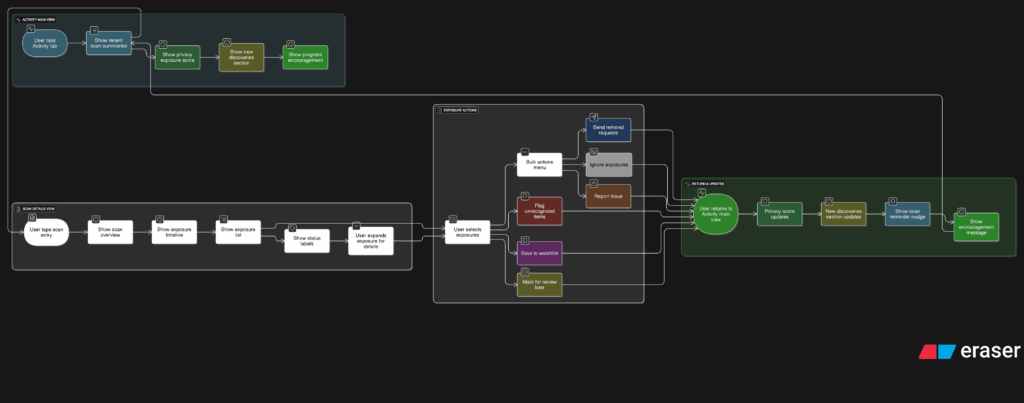
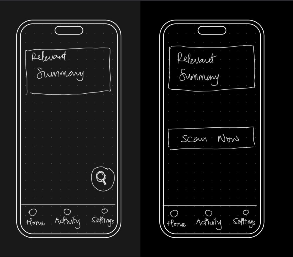
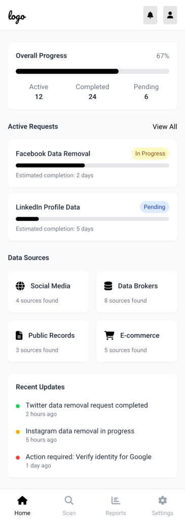
It starts with Home. This is where the user gets a quick update on their privacy status and can tap one button to begin scanning. Once the scan is done, they’re either shown a clean summary that says everything looks good, or they’re nudged to go check out their results in the Activity tab.

That handoff between Home and Activity became really important. It needed to feel natural, not like you’re being dropped into another part of the app. So I kept asking myself questions like, “What happens after a scan?” and “What does the user want to do next?” The answer is usually some version of “check what was found” or “see if anything needs action.”

Once they land in Activity, the results are organized clearly. Old scans are listed with summaries, and new findings are labeled in a way that stands out without being too loud. From there, users can open a scan, review the exposed data, and decide what to do. They might request a removal, ignore it, or save it for later.

Then there’s Settings, which sits quietly in the background but plays a big role in shaping how the app works. Before a user ever hits “Scan Now,” the tool has already been set up to know what data to look for and where to search. That part happens quietly but meaningfully. And at any point, the user can return to the Settings tab to update what they’re tracking or change how often they want to scan.

Full App Flow

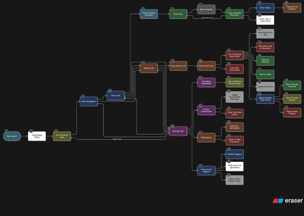
The more I worked on this flow, the more I realized how important rhythm is. The app should never feel like it’s asking too much at once. It should guide, not demand. There’s a gentle back-and-forth between checking your privacy, understanding your exposure, and deciding what to do about it. That rhythm is what makes the whole thing feel usable.

At this point, the main structure is starting to come together. There are still things to work out, like onboarding, empty states, and what the app says when no data is found. But now that the core journey is mapped, I feel more confident about shaping the rest of the experience.

14 – What the Activity Tab Unlocks

Once I felt like the Home tab had a solid direction, I shifted my focus to the Activity tab. This is the part of the app that lets users look back and understand what the tool has found over time. If the Home tab is about quick action, the Activity tab is about reflection and detail. It’s where things get a bit more layered.

I started by asking a few questions. After a scan is done, what would someone want to do next? What would they expect to see if they tapped into their past results? The obvious answer was, they’d want to understand where their data showed up, how serious it is, and what actions they can take. So that became my starting point for the user flow.

The journey into the Activity tab begins with a list of past scans. Each entry shows the date, how many exposures were found, and a quick status, like “3 removals in progress” or “Last checked 4 days ago.” This lets the user get a feel for their privacy over time. From there, tapping into any scan opens a detailed breakdown.

Inside that scan detail view, I imagined a set of cards or sections for each exposure. Each card would show where the data was found, maybe on a marketing site, a data broker list, or a forum. It would also show what kind of data was found, like a phone number or full name, and whether the app could help remove it. There would be a clear action button like “Request Removal” or “Ignore for Now,” giving the user simple choices without pressure.

User flow of the activity tab

Another part I thought about was how to show overall progress. Maybe there’s a visual indicator on the main Activity screen that shows how your privacy is improving over time. Something like a simple line graph or a color-coded “privacy score” that updates as you take action. I don’t want it to feel gamified, but it should feel encouraging. Like you’re making progress, not just looking at problems.

One small but important touch I sketched out was what happens when there are new exposures. Maybe we highlight them with a subtle label like “New since last scan” or bump them to the top of the list. This way the user’s attention naturally goes to the most important updates.

This part of the app is where people go to feel more in control. It’s not just a log of past activity. I wanted it to feel full of helpful options without overwhelming anyone.

12- Finding Structure

I’ve been reflecting a lot since the speed dating session. The feedback was clear: people grasped the purpose of the prototype almost instantly, which was uber-good. I didn’t have to over-explain, and that felt like a win, though I knew it needed more structure. The project was described as having a “careful” personality, which I really appreciated. It aligns perfectly with the tone I’m aiming for: clear, intentional, and respectful of people’s data.

So I took a step back to think more about how the privacy scrubbing tool should actually work as a whole. Since I’m building this as a mobile app or possibly a mobile-first web app, I needed to start mapping out how the experience would feel from the first moment someone opens it. Rather than focusing only on how the home screen looks, I started thinking about how all the different parts of the app connect and what role each one plays.

The idea was to shape a full user journey, not just a set of screens. I wanted the app to feel like it had a clear rhythm, starting on the Home tab where you get a quick view of your privacy status and can run a scan right away. That screen would offer a calm summary, like “We found this much of your data online,” along with a clear suggestion for what to do next. The one-tap scan button would live here too, ready when needed. From there, I thought about how the app should guide the user. Should the tabs always be visible? How do we help users understand where they are and what to do next? How do we balance helpful information with simplicity?

The big realization was that the entire experience could be organized around three core areas: the Home, Activity, and Settings tabs. Each one would represent a different phase of the user’s interaction with the app — starting, reviewing, and customizing. It seems simple now, but this framing helped everything start to click into place.

So I began from scratch, just trying to map out what each section really needed to do.

  • Home would be where everything starts. It’s where the user gets a quick status update and triggers a scan.
  • Activity would give access to deeper insights about past scans and new discoveries.
  • Settings would let the user control everything else, especially what the tool is scanning for in the first place.

This new framing gave me something solid to work with. I was no longer thinking screen by screen or feature by feature. I was thinking system-wide. What kind of flow did I want someone to experience? What should feel immediate? What should feel controllable? What should feel private? I started writing down questions like:

  • What’s the first thing someone wants to know when they open a tool like this?
  • What’s the minimum information they need to feel informed, but not overwhelmed?
  • How do I make it feel helpful, but not invasive?

The answers pointed toward simplicity and calm. Not a flashy dashboard. Not a scary privacy alert system. Just a clear, steady interface that makes you feel like someone’s helping you take care of something that’s long overdue.

05 Designing Privacy-Centric User Experiences: Case Studies and Practical Insights

Introduction

Creating platforms that respect user privacy isn’t just a moral obligation; it’s a necessity in today’s data-driven world. In this post, I focus on designing privacy-centric user experiences, showcasing real-world case studies and exploring actionable design strategies. These insights will directly inform my thesis goals of developing a framework for companies and prototyping a simple privacy tool to empower users to manage their digital footprints more effectively.

What Makes a Privacy-Centric User Experience?

A privacy-centric experience ensures that users are informed, in control, and confident about their data. It prioritizes transparency, simplicity, and respect for user consent while avoiding deceptive practices. This means:

  1. Clarity: Clear communication about what data is collected and why.
  2. Control: Tools that allow users to customize their privacy preferences easily.
  3. Trust: Ethical practices that build long-term confidence.

Example: Apple’s App Tracking Transparency feature asks users if they want to allow tracking, giving them a clear choice with simple language.

Case Studies of Privacy-Centric Platforms

  1. Signal (Messaging App): Signal prioritizes privacy by offering end-to-end encryption and collecting minimal metadata. Users trust Signal because it’s transparent about its data collection policies—essentially none—and offers simple privacy controls.
  2. DuckDuckGo (Search Engine): Unlike Google, DuckDuckGo doesn’t track users or store personal information. Its clean interface and privacy-first branding make it a favorite for those seeking anonymity.
  3. Joindeleteme.com (Data Removal Tool): This tool simplifies the process of removing personal data from online platforms, offering a user-friendly experience with automated data removal requests.
image source: IndianExpress
Image source: iDrop

How Do These Examples Inform Design Practices?

These platforms succeed by embedding privacy into the user experience, demonstrating best practices for designers:

  1. Default Privacy: Assume users want to opt out of tracking. Signal doesn’t track by default, removing the burden of choice.
  2. Simplified Consent: Make choices clear and accessible. DuckDuckGo eliminates tracking entirely, so users don’t need to worry about settings.
  3. Automation: Joindeleteme.com automates repetitive tasks, minimizing user effort while maintaining control.

How can design principles from successful privacy-centric platforms be adapted into frameworks or tools for broader use?

  • What features of these platforms are most effective at fostering user trust?
  • How can automation and default settings simplify privacy management for users?

Designing a Framework for Companies

To guide companies in creating privacy-centric platforms, a framework should include:

  1. Transparency Guidelines: Require clear communication about data collection. Example: Dashboards showing what data is collected in real time.
  2. User Empowerment: Include tools that allow users to opt out of tracking with a single click. Example: Privacy toggles for ads, location tracking, and analytics.
  3. Ethical Compliance Checks: Provide a checklist for meeting GDPR and other privacy laws. Example: Assessing whether consent dialogs meet “informed consent” criteria.
Possible permissions users can control if companies implement Privacy Transparency Guidelines

Designing a Prototype Privacy Tool

Inspired by joindeleteme.com, the proposed tool could:

  1. Identify Data Sources: Help users find where their personal information exists online.
  2. Simplify Requests: Automate data deletion requests based on privacy laws like GDPR.
  3. Track Progress: Provide real-time updates on data removal processes for transparency.
Mockup of a possible view of the tool

Challenges in Execution

  1. Data Mapping Complexity: Identifying all the platforms where a user’s data exists is a significant technical hurdle.
  2. User Trust: Convincing users to trust the tool with sensitive data requires a flawless UX and a proven ethical stance.
  3. Corporate Pushback: Companies reliant on data monetization may resist the widespread adoption of privacy frameworks.

My Personal Motivation

The more I explore privacy-first platforms, the more I realize how empowering ethical design can be. I’m motivated to create solutions that reduce friction for users while making privacy the norm rather than the exception.

03 – A History of Data Privacy and Designing for Informed Consent: Clarity in Privacy Choices

Introduction

Data privacy has become a hot topic in recent years, but concerns about personal information are far from new. The evolution of data privacy highlights how the digital landscape has shifted from respecting personal boundaries to monetizing user data. In this post, we’ll explore key moments in the history of data privacy, landmark cases that shaped it, and why ethical consent mechanisms are more critical than ever. We’ll also discuss the groundbreaking work of organizations like noyb.eu (None of Your Business) and how design can ensure users truly understand what they’re agreeing to.

The History of Data Privacy

Data privacy debates date back decades. In 1973, the U.S. Fair Information Practices principles laid a foundation for protecting personal data, emphasizing transparency and consent. Later, Europe’s Data Protection Directive (1995) and General Data Protection Regulation (GDPR, 2018) set global benchmarks for user privacy rights. GDPR established a crucial requirement for “explicit consent,” sparking significant changes in how companies request and handle user data.

Image source: Recast

Case Example: The Cambridge Analytica scandal (2018) exposed how personal data harvested via Facebook was used for political profiling without user knowledge, sparking global outcry and reinforcing the need for ethical consent practices.

image source: CloudHQ


Why Consent Still Fails

Despite legal advancements, informed consent is still far from universal. Many companies use dark patterns—design tricks that nudge users into agreeing to data collection they might not fully understand. Ambiguous language, pre-checked boxes, and overly complex privacy policies make it hard for users to make informed decisions.

Example: A cookie consent popup that makes “Accept All” the easiest option while burying granular controls under multiple layers of navigation.

image source: CookieYes

noyb.eu: Leading the Charge Against Privacy Violations

Founded by privacy activist Max Schrems, noyb.eu challenges companies that violate GDPR regulations. The organization has filed complaints against major corporations for failing to obtain valid user consent, often citing the use of manipulative interfaces. noyb.eu emphasizes transparency and user empowerment, aligning closely with the principles of ethical design.

Example: In 2021, noyb filed hundreds of complaints about deceptive cookie banners, pushing companies to adopt clearer, more compliant designs.

Image source: EDRi

How can design simplify and improve informed consent for users in light of historical and ongoing privacy challenges?

  • What lessons can be learned from past privacy violations to improve future consent mechanisms?
  • How can organizations like noyb inspire better design practices?

Design Approaches to Solve the Issue

  1. Simplify Language: Use clear, jargon-free language to explain consent choices. Example: Replace “We use cookies to improve your experience” with “We track your activity to show ads. You can opt out.”
  2. Visual Aids: Use graphics or icons to represent data usage (e.g., icons for tracking, ads, or personalization). Example: A pie chart showing how your data is used.
  3. Granular Controls: Allow users to toggle specific permissions rather than forcing all-or-nothing decisions. Example: Separate toggles for tracking, personalized ads, and email subscriptions.
  4. Actionable Transparency: Show real-time examples of how data will be used. Example: “We will use your email to send weekly updates—no spam.

Why This Matters for Design

Informed consent isn’t just about compliance—it’s a design challenge that affects user trust and brand reputation. Ethical consent mechanisms can be a competitive advantage, making users feel respected and empowered. Designers have a responsibility to move beyond dark patterns and craft experiences that genuinely prioritize user choice.

Challenges and Personal Motivation

Crafting effective consent mechanisms is tricky. Balancing simplicity with compliance often conflicts with corporate interests in data collection. However, I’m deeply motivated by the idea that design can bridge the gap between user needs and ethical practices, turning complex legal requirements into intuitive experiences for everyone.