After conceptualizing the panner interface as a core feature of my spatial sound toolkit, the next phase of the project shifted into technical territory. This stage involved developing both the XY panner behavior and a trigger system built directly on top of object positions. In this post, I’ll walk through how I translated the idea into code; using MAX/MSP, Max for Live andJavaScript, creating a mix of visual and hidden logic.
Starting with a simple XY Pad
My starting point was a simple XY pad. At first glance, this seemed like a straightforward way to navigate sound across a room and interact with virtual objects. But I quickly found that in its raw form, it lacked the nuance I needed; it was too binary, too linear. There was no sense of proximity, weight, or sonic gravity between the user and the objects.
So I introduced some kind of attractors.
Introducing Attractors
The new implementation allows each object in the panner to become an attractor within a customizable radius. Here’s how it works:
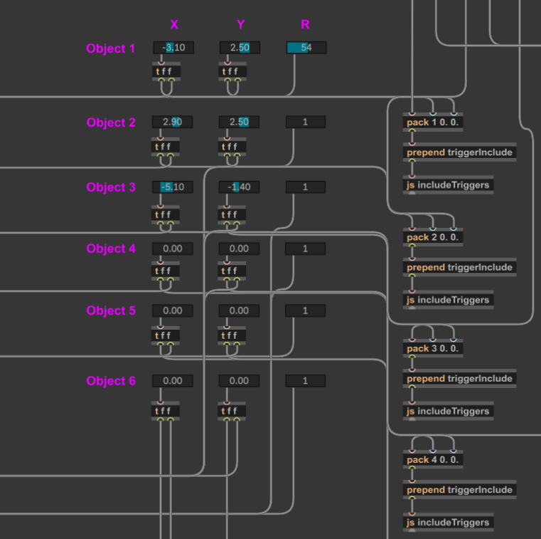
- Each object is placed at a fixed position on the grid; The user can set the position within the interface.
- A radius value (default: 0.5; range: 0.5–4 [coordinates]) defines how close the user’s XY slider needs to be in order to activate the attractor. This gets checked via a classic condition.
- If the user’s XY position falls within that radius, it triggers the
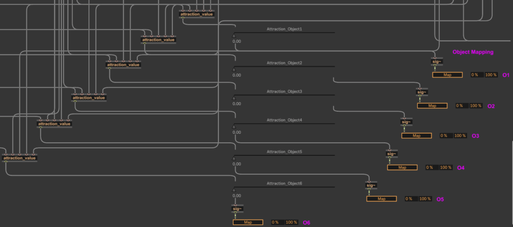
attraction_valueabstraction; - This abstraction calculates the distance between the user position and the object using the classic formula:
d = √([x₂ - x₁]²+[y₂ - y₁]²) - This distance is then normalized between 0 and 1 based on the radius and used to control mapping parameters; in this case, faders that modulate each object’s sound layer.
This system gives users a gradient-based interaction model, where getting closer to an object increases its influence, allowing for more natural and exploratory listening behaviors. To give the creators further possibilities to influence the responsiveness, there is an additional smoothing fader, that allows control over how long panning movements need to take action (100-4000ms).
Trigger System
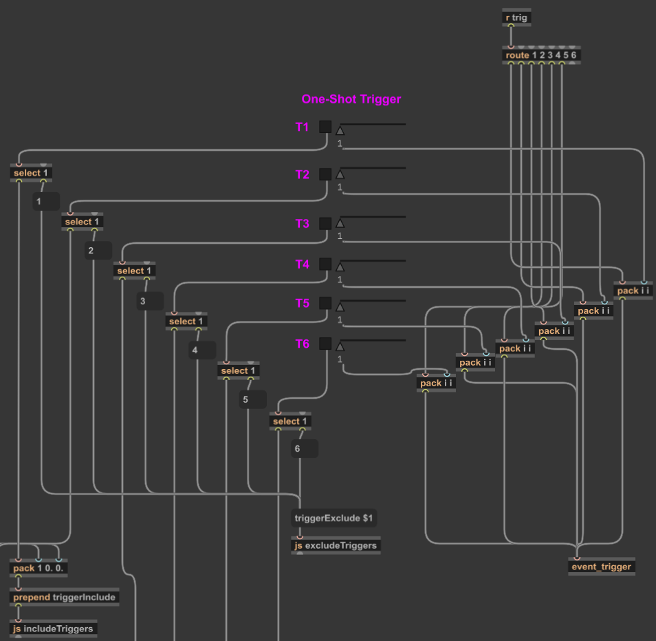
To complement the panner, I also implemented the trigger system that sits directly on top of the mapped objects.
To keep the patch clean and user-friendly, I wrote a custom JavaScript file;includeTriggers.js
Using JavaScript in Max/MSP provided me with several advantages:
First of all it allows controlled patch editing without the user needing to dive into patch internals.
Further I could implement accurate placement of the trigger buttons in both the patcher and the presentation mode (which further on equals the UI of the Max for Live-Device).
I could also establish invisible connections to the send object that routes interaction to my event_trigger abstraction.
This script is activated via a simple toggle switch in the user interface. When toggled on, it triggers the following actions:
- Finds the correct trigger button templates;
- Positions them on top of the corresponding object locations;
- Connects them invisibly to the back-end.
When toggled off, a sister script, excludeTriggers.js, removes them from presentation mode, disabling interaction safely without deleting anything.
Using the Max for Live API
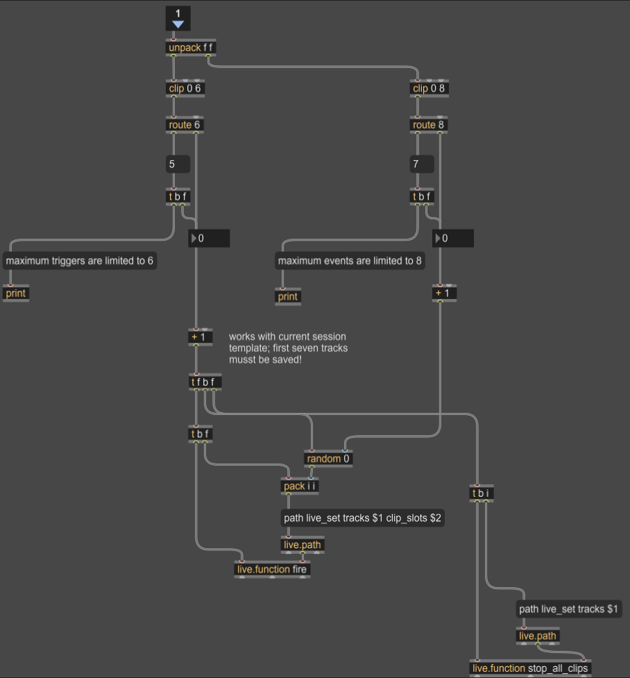
When a user activates one of the visible triggers, the event_trigger abstraction takes action. It uses the Max for Live API to launch a clip from Ableton Live’s Session View; playing a sound event specifically assigned to that object.
Each object can hold multiple events, which are randomly triggered using a round-robin system. As pointed out in the previous blog entry, this ensures variation and prevents repetition.
Learning Through the Implementation
This implementation phase was not only functional but also very much educational. Working with Max for Live’s UI elements and the API gave me a much better understanding of the platform’s architecture.
In particular, experimenting with JavaScript within Max/MSP allowed me to see and manipulate the underlying hierarchy of patch elements; something normally hidden from view. It definitely was a somewhat tedious process, that forced me to rely a lot on trial and error, due to a bad documentation. But this experiments resulted in a handful of reusable scripts like e.g. createTriggers.js and deleteTriggers.js, which I may refine further for future iterations. Same thing counts for working with Max for Live. Even though I might not use every approach I have some patches now, that I can easily adapt for other UIs.
Since I already mention, that it’s quite a new challenge for me to work with the idea of a broader usability in mind, some feedback would be really nice: So if you’re working with spatial sound, Max for Live, or experimental interaction systems and would like to test this prototype or collaborate; feel free to reach out.