Building the Panner: Creating an interface for Sound, Space, and Interaction

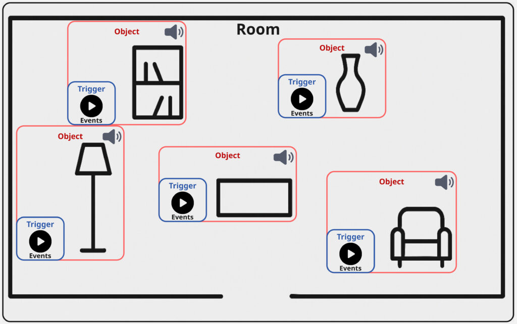
After thinking about the concept for my sound toolkit, the next step in my development focused on the implementation of a central feature: the panner interface. This module allows both creators and audiences to explore and interact with sound in space, directly connecting objects within a room to specific sonic materials.

Mapped Space and Sculpted Sound

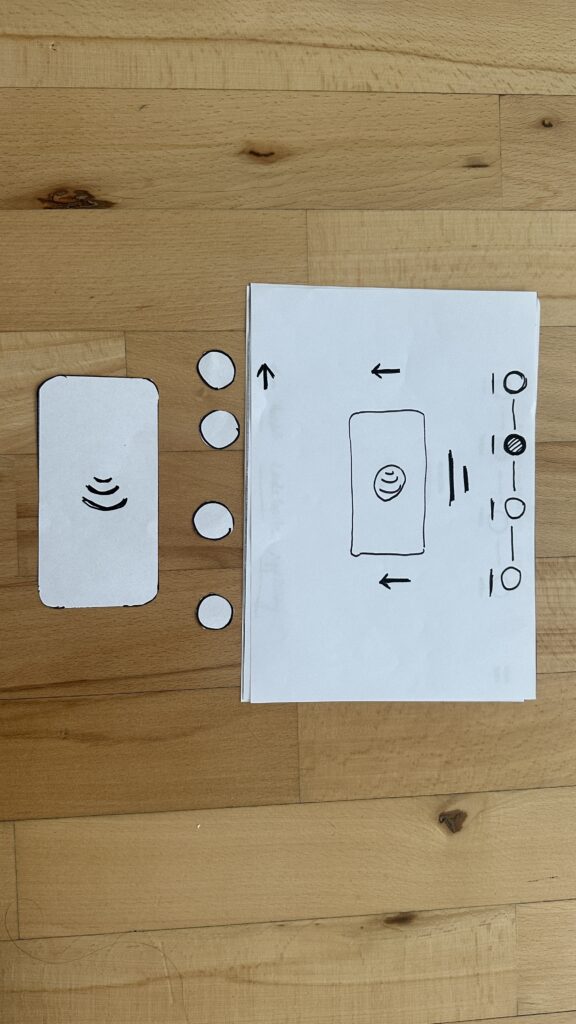
The basic functionality of the panner is simple in concept but provides an intuitive experience: it lets users navigate a mapped room and “find” interesting objects through their sonic feature. These objects are linked to compositional materials; for instance, looping ambient pads that are distributed over all of the objects. As you move across the interface, you transition between these materials, and with that inherently between the acoustic properties of each object, they begin to transform what you hear.

This movement isn’t just technical; it’s compositional. Further the potential is there, that the listener becomes part of the performance, shaping the sonic outcome through their interaction with the panning-position; references for similar ideas and use-cases can be found in spatial audio, game sound, and interactive installation art.

Introducing Triggers

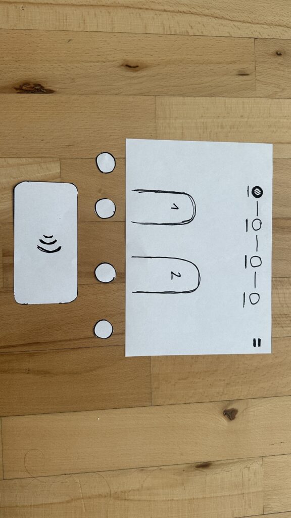
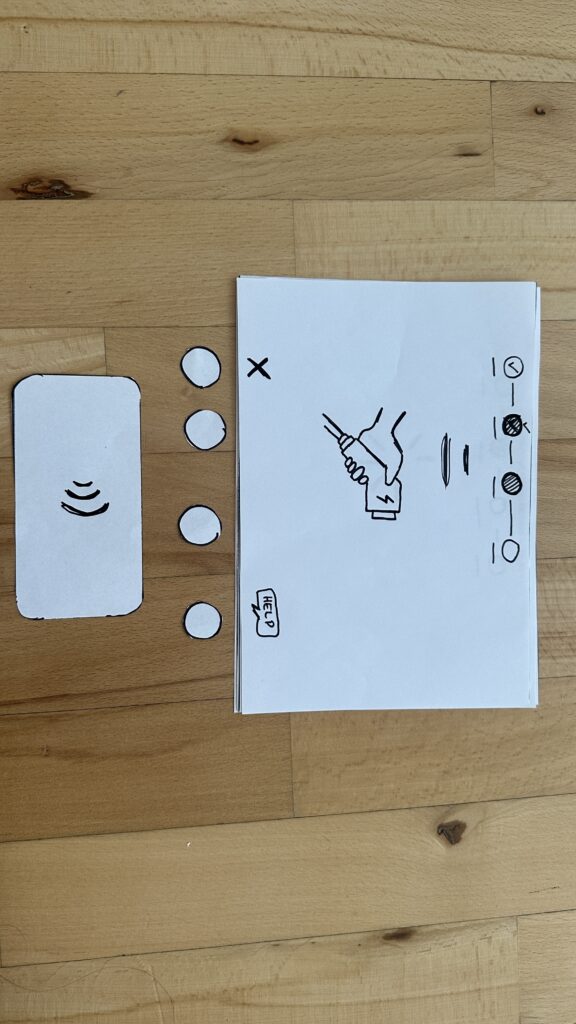
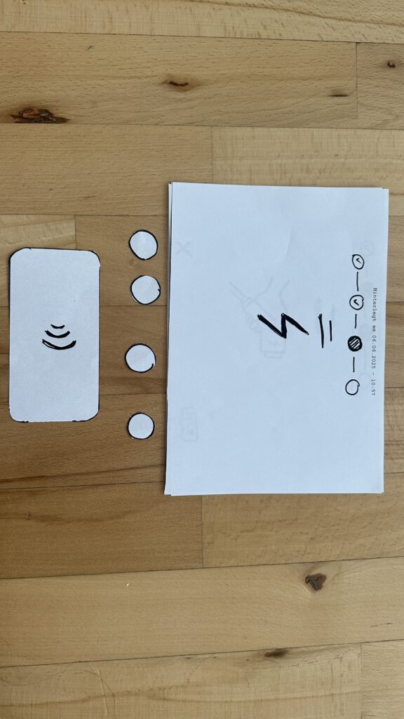
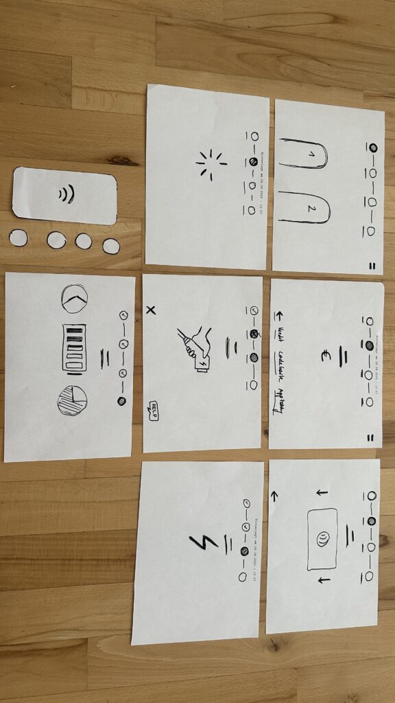
To deepen the interaction, I added another layer to the interface: object-based triggers. These can be placed on top of objects in the room and are activated through user interaction. Each trigger is connected to a collection of sound events; sonic gestures that may be specific to certain objects.

What makes these events interesting is that they can be tailored to the object’s qualities. A metallic object, for instance, might trigger sharp industrial sounds, while a soft, fabric-covered object could respond with warm filtered tones. But of course the creative potential is broad. So for example the compositional logic could be based also on affordances; a concept introduced by psychologist James J. Gibson.

Affordance refers to the perceived and actual properties of an object that determine how it could be used. In this context, a desk might afford work or stress, and thus be linked to fast-paced or “busy” sounds.
(Source: Gibson, James J. “The Theory of Affordances” The Ecological Approach to Visual Perception. Boston: Houghton Mifflin, 1979)


Triggers play back events using randomized selection, similar to round-robin techniques used in video games. This ensures variation and prevents the experience from becoming predictable or repetitive; especially useful in exhibition settings, where visitors move at their own pace and may stay for different durations. With just six triggers each holding eight events, you already have 48 sonic elements that can be recombined into an evolving aleatoric composition.

Between Creator Tool and Public Interface

Importantly, this panner isn’t only meant for audiences; it’s also built to serve creators as a composition tool. Implemented as a Max for Live plug-in, I further provide an Ableton Live session template that simplifies the setup, which now consists of the following steps:

  • Load a map of the room.
  • Place objects using the provided visual grid.
  • Begin composing within the sessions structure without worrying about the technical backend.

The final panning interface itself can also serve as a user interface for an audience. The most simple solution for this would be the use of Max/MSP’s presentation mode, which of course already works. This dual-purpose design supports both easy prototyping for composers and a potential for more public oriented contexts like e.g. exhibitions, offering flexibility to musicians, designers, and curators alike.

What’s Next: Integration and Testing

The next planned development steps for this specific elemnt of my toolbox include:

  • Adding OSC integration, so creators can use external XY controller apps (e.g., on smartphones or tablets) to interact with the panner in real-time.
  • User testing with other creators, to gain feedback on interface design, usability, and creative workflows.

As someone used to designing tools mainly for my own use, this phase marks an important shift. Building something for others has pushed me to rethink how I structure code, name parameters, and guide the user. This process has also begun to improve my own workflow, making it easier for me to revisit and repurpose tools in the future.

Closing Thoughts

This latest phase of development has brought together many of the themes I’ve been exploring; from spatial sound and interaction to composition, psychology, and usability. The panner is not just a technical feature; it’s a conceptual lens for thinking about how space, sound, and interface design come together to shape musical experience and my workflow as musician.

15 Creating a Web Interface for Arduino

Like I have teased in the last blog post, I came across a YouTube video, that showed, how to create a web interface for an Arduino. This has a number of use cases, live sensor monitoring, remote control, live system feedback or interactive installations. This makes it possible to control how the user can interact with an Arduino, using a platform, that they already know.

When the Arduino connects to a WiFi network, it gets an IP address and starts a tiny web server that can talk to web browsers. When you open that IP address in your browser, the browser sends a request to the Arduino. The Arduino responds with a simple web page, in my case a form in which you can write morse code. If you type something and click “Submit,” the browser sends the text back to the Arduino. The Arduino reads and understands the send information and can react accordingly. This way, the Arduino works like a tiny website, letting you interact with it through any browser.

I once again started with an example, I found in the WiFiS3 library of Arduino, “SimpleWebServerWiFi”. This code generated a very simple website with which you could turn on and off an LED on the Arduino. Using this as my starting point, I first wanted to expand the web interface, which took a little longer than it would usually take to build, since I had to upload the code multiple times and change it so it finally looked “good enough” for this prototype. But doing the interface it self was just the easy part.

Before
After

Next I wanted to give my simple interface some functionality, there for the form I created on the Arduino needed to send the data input by the user back to the Arduino, so it could understand and for now translate it. And I have to be honest, I really tried to understand the code but just couldn’t figure out, how it worked, so I asked ChatGPT to help me out. Using its infinite wisdom it created a short piece of code, that converted the users input into a string, that could be understood by the code, I had written before.

The next step was easy, I added the code for decoding the message, I created last week and explained in the last blog post. Now I just needed the Arduino to display the message, after it received one, which was easy enough by just adding an “if” statement, that would only add extra content to the website, if a message had been received before. And like that, I finished the next version of my chaotic morse code prototype.

Now that I’ve built this basic version, I’ve been thinking about how this kind of setup could be used in different contexts. For example, it could be adapted for interactive museum exhibits, where visitors can type a message into a browser on their phone and trigger lights, sounds, or physical movements in an installation. It could also be used for DIY home automation, like controlling lights. Or it might become a learning tool for kids, where they can experiment with inputs and immediately see results, helping them understand communication systems like Morse code in a playful, hands-on way.

Instructions

If you wanted to try it out yourself, here was what you needed:

  • An Arduino
  • a Laptop or any other device that can use a Browser ;D

This time it is even simpler, plugin the Arduino, change the SSID & Password to fit your home WiFi network and upload the sketch. In the Serial Monitor you will then see the Arduinos IP address, now open a browser and type in the shown IP address. Now you should see the simple interface I created, the only thing to do now is to write some morse code and let the Arduino decode it.

Blog 4: Sketching an Intuitive EV Charging Interface

After my first wild prototype about a 1,000‑floor elevator, I realized I really want to stick with mobility. EV charging stations are such a timely, real‑world challenge plus, I’ve experienced the pain myself! My girlfriend’s dad owns an EV, and I’ve helped him charge it only to run into confusing screens and awkward cables. Others I chatted with have plenty of frustrating stories, too. So I decided: let’s start by sketching a super‑simple, button‑based interface and see how two real users feel about it. (User Testing Informationen available in the next Post)

Four Clear Steps

On paper, I drew these low‑fidelity screens, focusing on clarity over bells and whistles:

  1. Choose Your Charger
    • A simple map shows two plugs at a station.
    • Green plug: available. Red plug: occupied.
    • A progress bar at the top displays “Step 1 of 4”, so you always know where you are.
    • Why? Users often fumble for which port is free. Clear colors and a step indicator keep anxiety low.
  2. Verify Payment
    • Three big buttons let you pick Credit Card, RFID Charge‑Card, or App‑QR Code.
    • A Back button (which lights red if you tap it) lets you switch methods at any time.
    • Once you choose, a screen prompts you to hold your card or show the QR code.
    • Why? Real stations offer multiple payment options. Lumping them into three buttons matches user expectations and avoids tiny menu lists.
  3. Plug In Cable
  • An animated cable slides out of the station.
  • A simple diagram shows “Cable → Car Port.”
  • If it clicks in correctly, the station glows green. If it fails, it glows red. A gentle blue pulse means “charging.”
  • Why? Physical actions need instant feedback. Color and motion reassure the user that they plugged in correctly.

    4. Charging Overview
  • Time Remaining: Counts down so you know when you’re done.
  • Battery Icon + Bar: State‑of‑charge advances in real time.
  • Power Delivered (kW): Shows exactly how fast you’re charging.
  • Big buttons: “End Session,” “Help,” “Info,” and “Language.”
  • Why? These are the four most‑asked questions: How long? How full? How fast? And what if I need help or another language?

Design Choices & Future Accessibility

  • Physical Buttons vs. Full Touchscreen: Early users can look, press, and go (no searching menus)
  • Progress Bar: Keeps people calm by showing exactly where they are in the flow.
  • Language Toggle: Always visible in case you need English, German, or any other option.
  • Text‑to‑Speech Future: With a long press on a touchscreen button, an image‑to‑speech API could read the label aloud for visually impaired users.

I’ll soon interview blind or wheelchair‑using drivers to see what adaptations they need. In a world of self‑driving cars, everyone should be able to charge their own vehicle of course.

Next: Real‑World User Tests

As a next step, I’ll ask some volunteers to walk through these sketches:

  • Where do they pause?
  • Which buttons feel unclear?
  • Do they spot the back arrow or language switch easily?
  • How do they react to red/green/blue feedback?

I’ll refine the flow based on their comments, then build clickable wireframes or maybe a cardboard prototype with LEGO. Iteration will tell me what works best.

Early References & Inspiration

  • Intuitive UI example: technagon.de/intuitive-user-interface-laden-kann-so-einfach-sein/
  • EV station UX tips: altia.com/2023/08/16/enhancing-ev-charging-station-ux-and-why-it-matters/
  • Payment variety today: ekoenergetyka.com/blog/how-do-ev-charging-stations-work/
  • Kempower design guide: kempower.com/user-experience-ev-charger-design/

These resources helped me understand real pain points and best practices. I’ll keep updating this blog as I refine the design and test with real users because the journey from sketch to screen is just beginning.