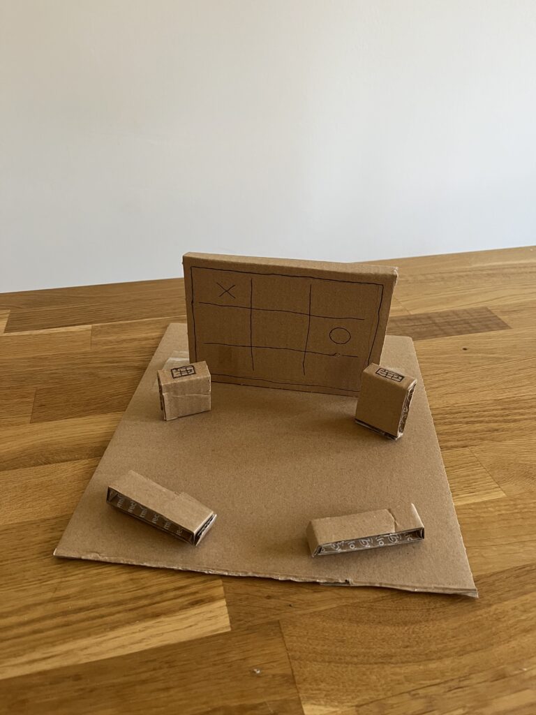
After a few weeks of intensive learning and a complete rethink of my project direction, I realized that having a good idea is only half the battle. The real challenge lies in the execution, specifically, how to structure a complex project so it doesn’t collapse under its own weight. To get my head around this, I’ve spent the last few days diving into The System Design Primer, an open-source repository that has become an essential resource for anyone trying to build something a working system.
Thinking in Trade-offs
The most striking thing about the System Design Primer is its objectivity. It doesn’t tell you there is one right way to build a system. Instead, it teaches you that every technical decision is a trade-off. This was a very interesting perspective for me.
The documentation introduces the CAP Theorem (Consistency, Availability, and Partition Tolerance), which forces you to realize that you can’t have everything. You have to choose what matters most for your specific use case. Applying this logic to my own work has been a game-changer. It’s moved me away from trying to build a perfect project and toward building a logical one based on specific constraints.
The Power of High-Level Mapping
One of the most helpful sections of the Primer is the focus on requirement clarification. Before diving into code or hardware, the documentation insists on defining the scope:
- User Personas: Who is this for?
- Scale: How much data are we moving?
- Performance: How fast does it need to be?
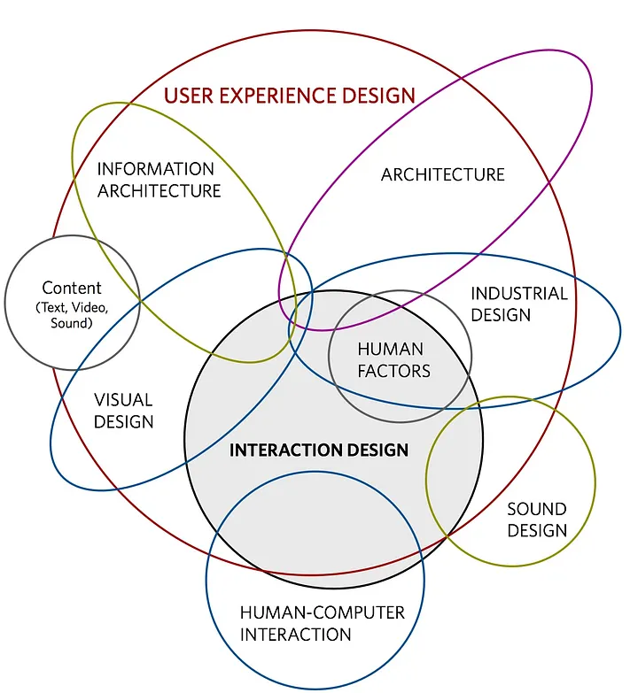
Mapping these out feels like a relief. It turns an abstract, overwhelming goal into a series of technical requirements. The Primer provides visual templates for high-level designs—showing how load balancers, web servers, and databases interact—which has helped me visualize my thesis as a functional architecture rather than just a collection of ideas.
From Confusion to Structure
There’s a quiet satisfaction in seeing a complex problem broken down into its component parts. The past few weeks have been fairly high-pressure, and the fog of choosing a new direction was real. But spending time with the System Design Primer has provided a much-needed sense of order. It’s one thing to have an interest in a global problem, but it’s another thing entirely to understand how to build a system that can actually address it. This documentation doesn’t just provide a technical library, it provides a way of thinking. It has taught me to look for the bottlenecks in my logic and to design my project with a focus on reliability and scalability.
I’m still refining the specifics of my research, but I feel much better equipped now. This systematic approach ensures that the final direction is not just an area of interest, but a calculated contribution to a complex, real-world environment.