Design is more than aesthetics, it’s about creating experiences that align with how the human brain processes information. As designers, understanding how attention works and how visual and cognitive mechanisms interact is crucial to crafting meaningful interfaces. In this Blog I want to explore how the brain, working memory, and the eye’s unique structure, including the fovea and peripheral vision, influence how users perceive and engage with design.
The Brain and Attention: A Limited Resource
Human attention is a finite resource, closely tied to our working memory. Working memory acts as a mental workspace, holding information temporarily while we focus on tasks. However, its capacity is limited to around 5–7 unrelated concepts at a time.
While the brain processes an astounding 11 million bits of sensory data per second, it can only consciously handle about 50 bits. This bottleneck forces the brain to prioritize information, directing attention based on personal goals and relevance. This selective focus explains why, in moments of distraction – such as when interrupted mid-task – information in working memory is often lost.
In interface design, this limitation underscores the need for clarity and prioritization. Overloading users with information can lead to cognitive fatigue and poor retention. Simplicity is key to holding attention and enhancing usability.
Vision: The Fovea and Peripheral Guidance
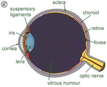
The human eye is a gateway to the brain, but it doesn’t work uniformly. A tiny part of the retina, the fovea, plays a disproportionately large role in how we perceive detail. The fovea, only about 1.5 mm wide, provides high-resolution vision and transmits data directly to the brain without compression. Although it makes up just 1% of the retina, the brain dedicates nearly 50% of its visual processing resources to it.
This narrow field of focus contrasts sharply with our peripheral vision, which is low in resolution but highly sensitive to motion. Peripheral vision serves as a guide, directing the fovea to areas of interest. While peripheral vision fills in missing details based on memory and expectations, it can also deceive us, creating the illusion of seeing everything clearly.
For designers, this means users don’t view interfaces as a whole but scan them, focusing on points of contrast or motion. Ensuring key information is compact, visually distinct, and aligned with user goals is essential.
Design Principles Inspired by Attention and Vision
To optimize user experiences, design should account for the brain’s and eye’s processing limits. Here are a few key strategies:
- Proximity and Grouping:
Leverage the Gestalt principle of proximity to group related elements. For example, error messages should appear near input fields to prevent users from missing them during task-focused interactions.

- Contrast and Motion:
Highlight essential elements, such as call-to-action (CTA) buttons, using bold colors or subtle animations. These visual cues draw the eye and reinforce the hierarchy of information.

- Simplification:
Reduce cognitive load by presenting only the most relevant information at any given moment. Clear navigation and uncluttered layouts help users process information efficiently.
Inattentional Blindness: The Pitfall of Irrelevance
Despite our brain’s remarkable ability to process sensory data, it is inherently goal-driven. Information that doesn’t align with our objectives is often filtered out, a phenomenon known as inattentional blindness. This explains why users may overlook critical details in a design unless they are highlighted with visual cues.
For instance, when users focus on completing a task – like filling out a form – they may miss an unrelated error message placed elsewhere on the page. Designers can overcome this by ensuring all relevant information is integrated within the user’s current focus area.
Looking Deeper into the Science
The science behind these findings is supported by cognitive psychology and neuroscience. Books like Designing with the Mind in Mind by Jeff Johnson provide in-depth insights into how our brain, memory, and sensory systems influence design. Other resources, such as Don’t Make Me Think by Steve Krug and The Distracted Mind by Adam Gazzaley and Larry D. Rosen, further explore the challenges of designing in an era of constant distraction.
Conclusion
By understanding how attention, vision, and memory shape user behavior, designers can create interfaces that are not only functional but also deeply intuitive. Every pixel and interaction should respect the limits of the human brain while leveraging its strengths. In doing so, we can craft experiences that feel natural, effortless, and memorable – ultimately enhancing how users connect with the products we create.
Sources
Johnson, Jeff. Designing with the Mind in Mind.
Krug, Steve. Don’t Make Me Think: A Common Sense Approach to Web Usability.
Gazzaley, Adam, and Larry D. Rosen. The Distracted Mind: Ancient Brains in a High-Tech World.
Various academic sources on cognitive psychology and attention systems.
https://uxplanet.org/designing-for-human-attention-ac0abe3d657d