Over the past week, I ran two quick paper-prototype tests to see how real people would navigate my simple, button-based EV charger interface. I recruited Sophie (23, student) and Kathi (22, student), both had tried charging an EV before and shared the frustrations I’ve heard from others. Here’s what happened, what I learned, and what I’ll change next.
Test Setup
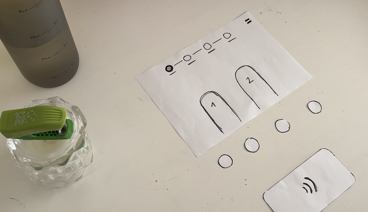
I handed each person a series of 7 low-fidelity sketches in the correct order. Next to the paper “station” was a bottle (the charger) and a taker (the EV). Below each screen sketch sat four real buttons. I asked them to imagine they’d just pulled up to a public charger and needed to top off their battery.
User Test 1: Sophie
- Choose Charger
Sophie thought the paper screen itself was the touchscreen. She tried tapping the display until she noticed the real buttons below. Because the screen elements were so faint, she assumed she was already in the payment step and held her credit card to the empty reader. - Verify Payment
Once she realized the three payment buttons lived below, she quickly picked “Credit Card” and instantly understood she needed to tap her card. - Plug In
The cable illustration on screen made sense immediately. When I “lit” the screen green for success, she smiled and said, “Great—now it’s actually charging.” - Charging Overview
Sophie grasped the countdown timer and energy bar at once. She even joked she’d never mind waiting with such clear feedback.
Key takeaway: Sophie’s background with touchscreens made her expect the whole area to be tappable. I need stronger visual cues, bolder borders or shadows, so she spots the physical buttons first.
User Test 2: Kathi
- Choose Charger
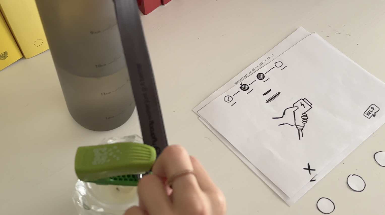
Kathi also tapped the screen, then grew impatient and pressed every button in turn, her usual “I don’t know what to do” tactic. After a few presses, she landed on “RFID Charge-Card” and paused. - Verify Payment
She tried to tap her card again before any prompt appeared. When nothing happened, she read more closely and picked her button first, then held her card when prompted. - Plug In
She confused the static “Charging” screen, thinking the top progress bar might also be buttons, until I introduced the cable illustration. Then it clicked. - Charging Overview
Once the final screen lit up with time remaining and a moving bar, Kathi relaxed and said, “Okay, I get it.”
Key takeaway: Kathi needed clearer icons on the first screen to recognize the charger slots. She also misread the progress bar as interactive.
What I Learned
- Visual Clarity Matters: Make charger-slot outlines, icons, and buttons bold.
- Step Prompts: Add a short text label—“Step 1: Pick Charger” instead of just a number.
- Non-Touch Expectations: Users often expect the whole screen to be tappable. I’ll accentuate the physical buttons with shadows or color bands.
Next Iteration
- Bold Icons & Labels: Draw clear charger shapes and label each step in large text.
- Highlight Active Buttons: Only light up the relevant payment button when it’s time.
- Test with Accessibility in Mind: Invite a visually impaired or wheelchair-using participant to see how the interface holds up.
- Prototype On-Station Mock-Up: Build a cardboard station with real cables at the right height and angle—so I can check reach, screen glare, and button feel.
My next post will share those refined sketches and fresh user-test results. Until then, I’ll keep iterating and learning from each tap, click, and cable plug. Stay tuned!