The pandemic forced museums to pivot quickly to digital platforms to stay connected with audiences as physical visits became limited or impossible. Virtual tours, online exhibitions, and digital programming became essential tools to engage visitors during this time. However, while digital engagement helped sustain interest, it became clear that digital-only experiences could not replicate the richness and depth of physical interactions with artifacts. This is where the concept of “phygital” arises as the key to enhancing museum engagement.
What is Phygital?
The term “phygital” merges the physical and digital realms, transforming how museums engage with visitors. By integrating technology into tangible displays, museums create immersive, engaging experiences for diverse audiences. The “Phygital Museum Scale” offers a framework for blending digital and physical elements effectively [1], while emphasizing storytelling as a “sensitive activation” of cultural heritage [7]. This approach helps museums stay relevant as audience expectations and technology evolve.
Exploring Phygital Innovations
Phygital strategies are reshaping museums worldwide. For example, the Markiezenhof Museum in the Netherlands uses augmented reality to animate historical artifacts, enhancing visitor understanding [5]. The “Phygital Museum Scale” identifies five scenarios ranging from fully physical to fully digital experiences, helping museums tailor their strategies based on audience and goals [1]. Projects like ExhiBIT foster inclusivity through community-driven curation and digital tools [2]. Phygital spaces integrate technology seamlessly, turning visitors’ gestures into part of the storytelling process, which demonstrates the potential of merging physical artifacts with digital technologies [4], [7].
Why Phygital Matters
Phygital strategies cater to various learning styles, broadening accessibility [3]. Digital enhancements such as virtual tours and contextual overlays offer deeper insights beyond what physical artifacts alone can provide [6]. Purpose-driven design ensures that digital tools complement material culture, while sensory and immersive experiences amplify the emotional significance of objects [1], [7]. Analytics from digital tools allow museums to tailor exhibitions, enhancing visitor engagement [4].
A Vision for the Future
Phygital technologies, including virtual reality, interactive holograms, and AI-driven personalization, promise to transform museum experiences [4], [6]. These innovations shift spaces from contemplative to performative, allowing visitors to co-create their experiences through interaction and narrative involvement [7]. The “Phygital Museum Scale” guides museums toward a balanced integration of physical and digital elements, as seen in projects like Ravespace, which bridge the gap between the two realms [4].
Conclusion
Phygital approaches revolutionize museum experiences, offering a bridge between tradition and technology. By combining physical artifacts with digital tools, museums create interactive and memorable experiences that foster deeper connections with cultural heritage [3], [1]. As the boundaries between physical and digital continue to blur, phygital museums will lead to audience engagement and cultural preservation [5].
References
[1] S. Debono, “The Phygital Museum Scale: Measuring and Designing Phygital Museum Experiences,” CHAIN 2022 Proceedings, University of Catania, 2022, pp. 25-34.
[7] A. Miano, “Phygital Museum Experiences: The Situated and Invisible Dimension of Technology as Sensitive Activation of Cultural Heritage,” Conference Paper, University of Campania “Luigi Vanvitelli,” 2023.
Interaction in museums is a dynamic concept that reflects the ways in which visitors engage with exhibits, staff, and each other. Historically, museums were viewed as spaces for passive observation, where visitors simply looked at objects or artifacts. Over time, however, there has been a shift towards more engaging and participatory experiences, allowing visitors to interact with exhibits and immerse themselves in the museum environment. This shift has broadened the definition of interaction in museums, highlighting the importance of visitor engagement in learning and enjoyment.
Digital Interaction
The use of technology in museums has significantly enhanced visitor interaction. Digital tools such as interactive touchscreens, augmented reality (AR), and virtual tours allow visitors to engage with exhibits in innovative ways. These technologies create immersive environments that not only provide information but also encourage exploration and curiosity. For example, AR allows visitors to see historical reconstructions or interact with 3D models of artifacts, fostering a deeper understanding of the content [2]. The role of technology has revolutionized how visitors can engage with exhibits, turning a passive experience into a more active, personalized learning journey [1].
Tangible Interaction
While digital interactions are important, non-digital experiences are equally essential in enhancing visitor engagement. Tactile exhibits, live demonstrations, and hands-on workshops allow visitors to engage physically and intellectually with museum content. These types of interactions create a more personal connection with the exhibits, offering opportunities for multisensory learning that digital tools may not always provide. Museums with such interactive elements help visitors build deeper connections to the artifacts, enhancing their emotional and intellectual experience [3].
Social Interaction
In addition to individual engagement, museums also encourage social interaction. Group activities, collaborative workshops, and guided tours provide spaces for visitors to interact with one another. This social dimension fosters learning through shared experiences, where visitors exchange ideas, challenge one another’s viewpoints, and build collective understandings of the museum’s content. Social interaction within a museum can lead to a richer, more nuanced interpretation of the exhibits and deepen the visitor’s connection to the material [5]. Museums are increasingly designed to promote these interactions, fostering a sense of community and collaboration among visitors [4].
Learning Outcomes
One of the primary goals of interactive experiences in museums is to enhance learning outcomes. Research has consistently shown that visitors who engage more actively with exhibits tend to retain information better and develop a deeper understanding of the subject matter. Whether through the use of technology, tactile experiences, or social interaction, active participation helps to strengthen cognitive and emotional connections with the material. This engagement leads to a more profound learning experience and encourages visitors to critically engage with content rather than merely absorb it passively [2].
Conclusion
Defining interaction in museums extends far beyond the traditional passive viewing of objects. Interaction today encompasses a variety of methods—digital and non-digital—that invite visitors to engage more deeply with the museum experience. As museums continue to evolve, their role as active, participatory spaces will likely expand, offering richer, more meaningful experiences for future generations.
References
[1] G. E. Hein, Learning in the Museum, Routledge, 1998.
[2] J. H. Falk and L. D. Dierking, Learning from Museums: Visitor Experiences and the Making of Meaning, 2nd ed., AltaMira Press, 2013.
[3] E. Hooper-Greenhill, Museums and the Interpretation of Visual Culture, Routledge, 2000.
[4] S. Macdonald, A Companion to Museum Studies, Wiley-Blackwell, 2011.
[5] L. H. Silverman, The Social Work of Museums, Routledge, 2010.
As my last research in neon-printed riso illustrations led to a dead end of my research I pivot and go straight to the source of it. A Modern Take.
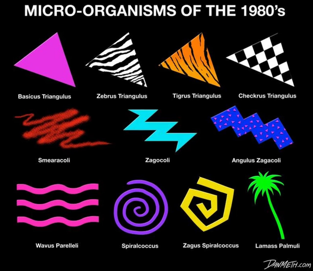
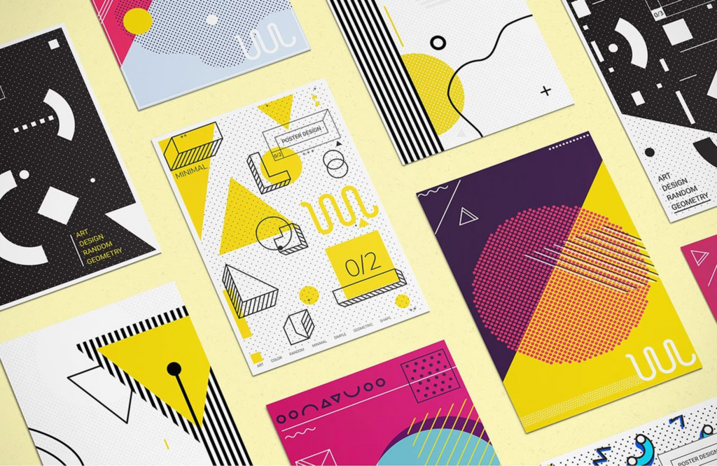
Graphic design in the 80s was bold and groundbreaking. Neon colors, sharp typography, and eye-catching designs defined the era.
With the rise of design software, artists could create 3D images and experiment with layouts, colors, and fonts like never before. This led to a new “Deconstructive” style, using non-linear, mixed-type designs. Geometric patterns, vibrant colors, and new tech gave 80s design a futuristic feel.
The Internet of the 80s
The Internet during the decade of the 80s was still in its developmental phase. The global Internet further developed in the academic space and for commercial use in the latter half of the 80s or the data exchange via the Internet, Fidonet, USENET, and the Bulletin Board System. In 1989, Tim Berners-Lee developed the concept of the World Wide Web, which he had been developing since 1980. In 1989, the Internet and networks of most first-world countries were linked to a global system of transatlantic satellites. These were the first commercial internet services available.
However, until the early nineties, the first website ever went online. On August 6, 1991, the first website in human history went online. The website was developed and published by Tim Berners-Lee.
Graphic design for website content during the 80s was nonexistent, as no websites were online. The only aspect of the internet influenced by graphic design was the font types and graphical user interface. Graphic design for the internet was mainly used in print ads to advertise the advancements of the internet.
The first generation of personal computers
In the early to mid-80s, the first mass-produced Personal Computers were introduced. The first color displays with mid to high res resolutions were developed then.
The display with a significantly higher resolution than the previous models and a color display, the first generation of Personal Computers, opened the door to a whole new world of graphic design.
The IBM personal computer & apple
One of the most significant dates in Computer history was August 12, 1981. IBM released on this day the first mass-produced Personal Computer, the model 5150. The model significantly influenced the PC market and became the industry standard. The majority of current PCs are based on this industry standard. At that time, Apple was the only competition from a non-compatible platform for IBM. On January 24, 1984, Apple, led by Steve Jobs, introduced the Macintosh 128k.
Raster graphics & gaming / Bits vs. vectors
Probably the best-known visualization system is the grid graphic. A grid or bitmap graphic consists of a grid-like arrangement of square pixels. Each pixel is assigned a color; if you put them together, you get powerful, color-intensive images. However, these raster images are not scalable and appear blocky and pixelated when zoomed in.
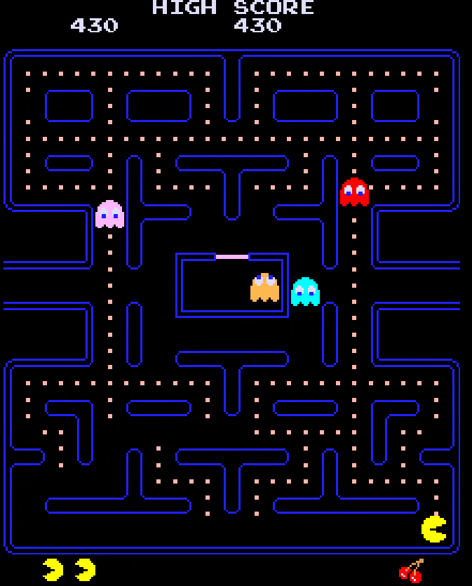
The arcades had introduced raster graphics very early in the 80s. The spectrum of colors was not extensive (unlike today), and the color palettes were limited. Until the mid-eighties, the colors were limited to black and white and 8-bit; around 1986-87, it was possible to use 16-bit.
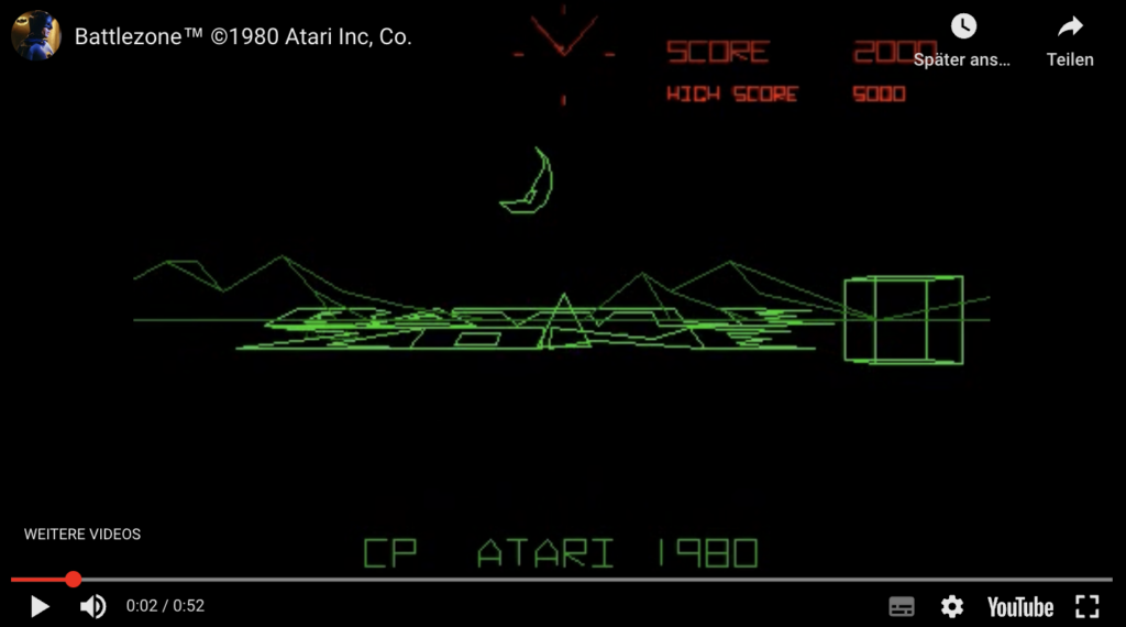
In games, vector graphics use an x, y coordinate system, like today’s designs. These systems made rotation and scaling easier. For example, tanks in Battlezone could appear more prominent as they approached due to the scaling feature. It was only possible to draw the vector outlines, but it wasn’t possible to fill the object with color at this point. You could only draw vector lines inside the object, which was only segmenting it internally but wasn’t filling the internal part of the vector shape with color.
Adobe Illustrator (AI)
Adobe started developing the Software Adobe Illustrator for the Apple Macintosh in 1985. The software was published and shipped in 1987. Adobe Illustrator was conceived as a companion product for Photoshop. While Photoshop was created for raster-based digital photo manipulation, the vector-based Adobe Illustrator was explicitly designed for typesetting and Logo Design.
The vector-based approach allowed the user to draw cúrves and adjust them with the Bézier Curve function, the perfect tool to create sharp and evenly curved lines.
The vector-based approach of Illustrator made the designs created with it infinitely scalable, contrary to the raster-based software programs.
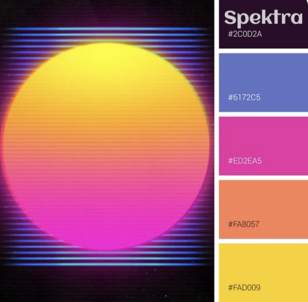
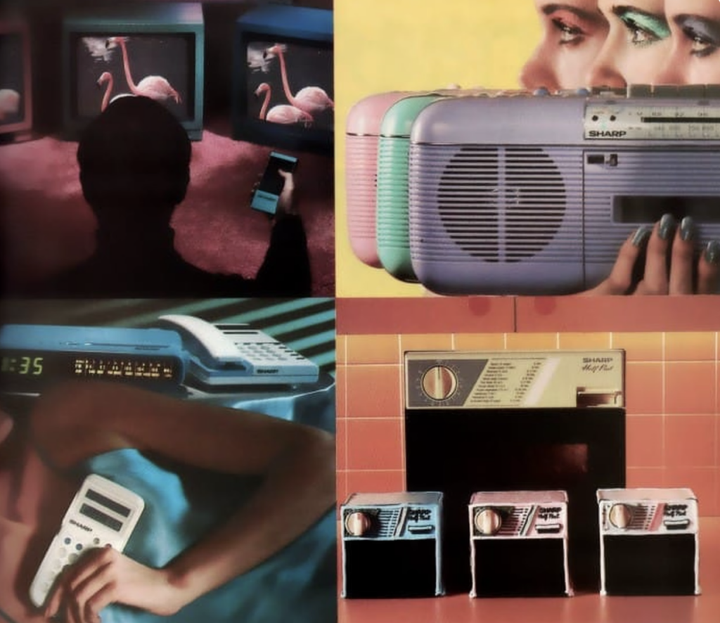
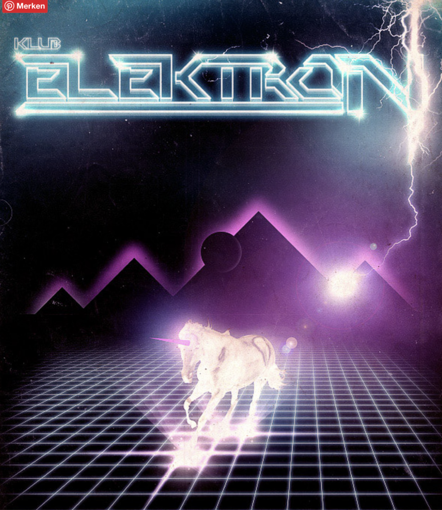
The neon color palette
The bright colors of the 80s design styles were dominated by bold and saturated neon colors and jewel colors. The background was often kept in dark blue, dark purple, and black and contrasted with saturated neon pink, neon yellow, neon green, neon orange, and intense saturated blue and purple hues.
It is no coincidence that the palette was used primarily in the cyberpunk film genre that emerged during the 80s decade, such as Tron (1982) and Blade Runner (1982).
Interestingly, the color pendulum swung back in the decade of the nineties to a deeper, more earth-toned, and subdued palette during the grunge period.
Typography
Typography in the 80s was bold and experimental. Before the technical advancements made available in the 80s, graphic designers had to go to a typesetter and get their marketing ads, magazines and newspapers printed. These graphic designers now had a personal computer, a laser printer with new graphic design software, and layout programs, which offered many options to align and stylize their lettering in ways that weren’t possible before.
The typical bold 80s neon color palette was contrasted sharply against a pitch black or a dark blue or dark purple background, making the bold letters pop even more.
The ’80s saw a strong revival of elements of art deco in design. This was also noticeable in a bold typography. The Art Deco revival typography of the 80s was sans serif, had thick, additional strokes, and displayed strong ornamentation, angles, and curves. Hard edges and chevron patterns were omnipresent. Many 80s Art Deco-inspired typefaces use only uppercase letters, and almost all display typefaces because they are highly decorative.
During the ’80s, chrome lettering was seen everywhere: block-like, solid letters with light reflections that imitated the chrome material. In toy commercials, video games, and movies. The look reflected advanced technology and progress, the euphoric look to the future because that is what the 1980s advertising wanted to convey, progress and the excited anticipation of the future.
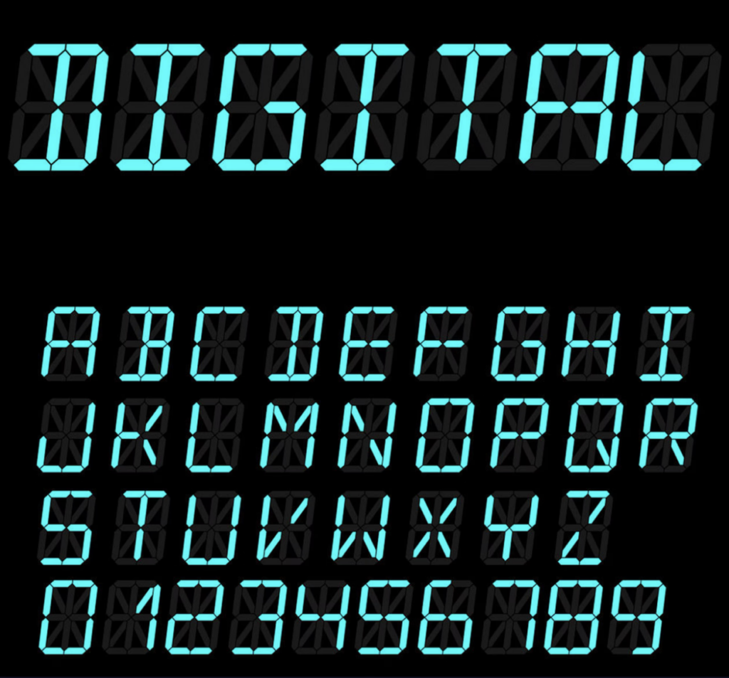
LCD digital fonts were all the rage during the 80s decade. The digital aspect of the font rode the wave of the 80s enthusiasm for all things progress and future related. The popularity of this font type symbolized the switch during the 80s from classic analog to digital watches.
The 80s pastel colors
Another prominent 80s color trend was pastel colors. Especially during the early 80s, the pastel color trend peaked, and the intense neon color palette later contrasted with the pastel color palette in the mid-to-late 80s.
It was a more subdued look than the bold neon palette. The focus was on softness and delicacy instead of progress and technology. One of the favorite patterns to combine with the pastel trend was flowers. Especially in interior design, the pastel trend was initiated by the home decors of Laura Ashley. The color mauve was one of the most popular colors. The movement for pastel colors, especially pastel pink combined with a pastel turquoise, was further initiated in the 1980s television series Miami Vice. The series paved the way for pastels in men’s fashion.
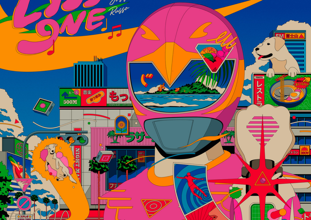
Bold Colors & Gradients: Bringing the 80s Back to Life
Most aesthetics of a particular decade often return in cycles, and retro designs are pick and further develop with a twist. In marketing, the term nostalgia marketing was coined. Especially the 80s nostalgia trend was targeting early millennials, as this decade represented their mostly analogous childhood. In this pre-internet time, you came home and watched MTV or played a heavily pixelated video game with a repetitive soundtrack.
But in 2024, it’s crucial to consider color psychology and accessibility. Understanding how colors evoke emotions and ensuring sufficient contrast for visually impaired users is essential. Instead of simply mimicking loud color palettes, designers can use bold hues strategically to create focal points or guide the user’s eye. Gradients can also be employed subtly to add depth and dimension to a design.
The influence of 80s design isn’t limited to theory. Here are some real-world examples of how contemporary designers are remixing 80s aesthetics for a modern audience:
The 80s craze suddenly perked up again with the launch of the super successful Netflix series Stranger Things. The series plays during the 1980s and is about a group of American teenagers confronted with supernatural forces. Almost all the posters paid homage to the classic 80s sci-fi blockbuster poster design during the Netflix marketing campaign for the series.
Conclusion
The enduring appeal of 80s graphic design lies in its boldness, playfulness, and ability to evoke emotions. By understanding the core principles of this era and reinterpreting them for a modern audience, designers can create visuals that are both nostalgic and fresh. So next time I am brainstorming design ideas, I will take a trip down memory lane and see how the 80s can inspire my next creative.